Time and again I seem to be required to craft two fully fleshed out final paintings for every single cover, mostly for Tor.com’s short online fictions, and it’s not a bad thing at all. Sort of. To date I still can only speculate as to the cause for this recent phenomenon, but I think if not fully on target, this theory hits close enough to brave an article about it. Not by request am I tasked to do this mind you, but by the process of making the pieces. Within this practice, at each turn are different causes for this seemingly time-wasting habit, which makes it hard to solve if solving it is even a good idea at all. So I’ll cleave out a few cases and hopefully you’ll see why.
To be fair to Irene Gallo, (my art director on these images), the initial issue is that I tend to make final pieces before showing them- note to you who are starting out in this business: DO NOT do this! Or at the very least try to avoid it. But if it’s just the way you work, find enough luck or providence to locate an art director or editor who will allow for this insane practice. It does, by cutting out the sketch process also cut their input out, and this can be troublesome for all involved. So if you work this way, you have to also understand you must be ready to work a whole brand new piece if the one you chose doesn’t fit the bill. It is the price of this freedom, but despite the excesses of work it creates, can be more than worth it. Sort of.
The practice of approaching a job like this will require of you two things- that A.) you complete the piece early enough to apply changes where needed to meet deadline, and B.) be prepared to do it all over again. This approach essentially cuts out the usual and essential preparatory process of thumbnails to sketches to painting that helps an AD or editor jump in and head off blind alleys or fuzzy themes, or any number of misfires an artist can do when crafting a cover. SO there’s that. And these days, most cover images are ultimately submitted through committees for approval. And this practice can foil the best intentions of that system. That said, personally I find after having done dozens of covers over the last twenty or so years, I can grok a cover fairly determinately through reading the story or full manuscript, (you should ALWAYS read the material if time allows- there is no better way to find the right image to pull from than doing that. Summaries and editorial suggestions never come close to the level of originative quality you achieve when the narrative speaks to your creative process directly). But in the case of Tor, Irene and I have a funny kind of simpatico with each other that allows for this to happen where in other cases it should not. She is a deft enough AD to know what appropriate assignments to throw my way, and I trust her enough to know that and her judgment when assessing my art for them. This kind of relationship is the golden ring of illustration- a practice best served by the alchemy of having one person wading deep out into the creative waters, and another on shore holding the tow-line to make sure the artist doesn’t get too far out or caught in the undertow.
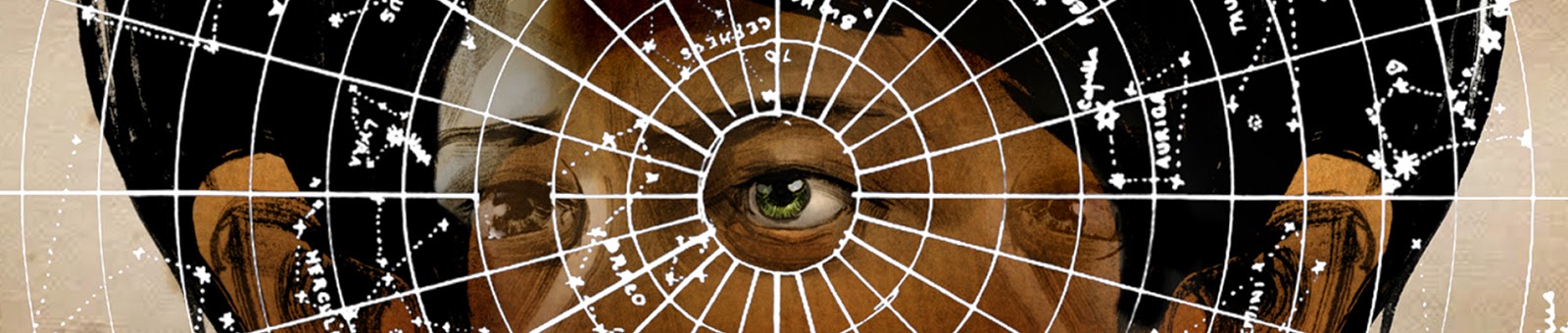
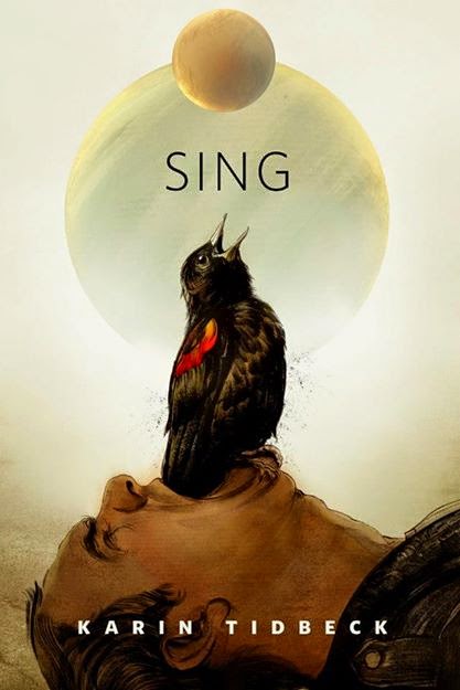
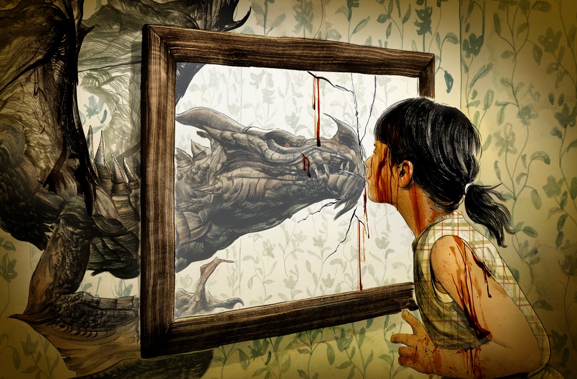
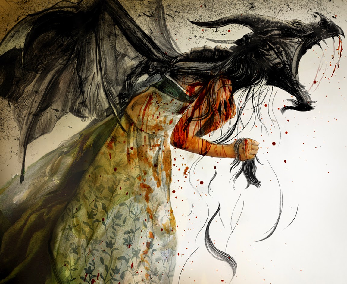
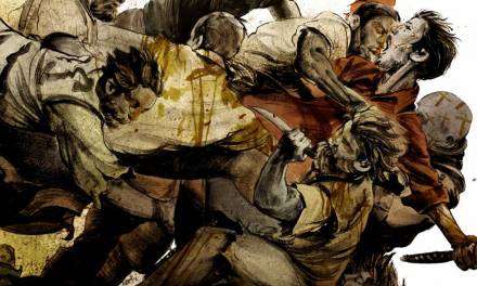
First up as evidence of all that I warn you of, is SING by Karen Tidbeck. Unlike many of the harder assignments I’ve gotten from Irene and Tor, this one was filled to the brim with potential visual cues. That can sometimes be a burden, and was so in this case. The first image as you see here, while being interesting to various degrees is breaking one of the important Manchess rules of good cover work: it’s saying too much at once. So the response to this, after pondering it from both sides, was a simple reduction. The thing I adore about Irene in this process is that she guides me to this by a well worn practice of imponderable quiet, or simply by saying it may say too much, both leaving me to find out how to fix it. Which is fine because that’s my job.
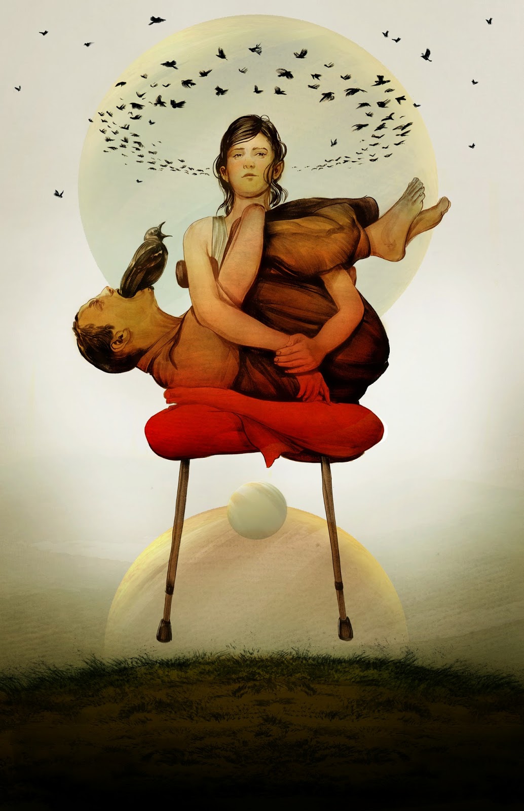
So as is my usual I begin wracking my brain for a solution- usually involving trying to utterly rethink the entire premise of my approach, a period of panic that leads me to realize that the solution, in this case, was already there in the picture: Just focus in on the bird in the man’s mouth. When you’ve got a case of an overly baroque piece like this, it is often true that the best way out of the bramble patch is indeed simply zooming in on one of the myriad pieces and making that the image. It automatically simplifies and by expressing a smaller more singular aspect of the narrative, (without spoiling it mind you), it reads better visually.
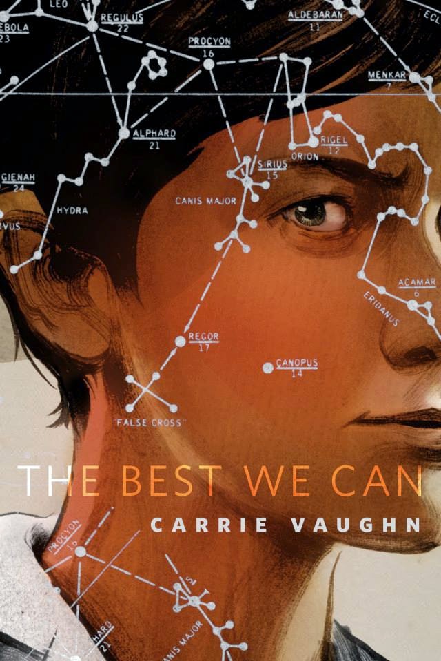
This was largely the case for my effort towards Carrie Vaughn’s truly extraordinary short story, THE BEST WE CAN, except that the simplifying resulted in a total tear down and rebuild. What made this story different, and such a terrific challenge was its main themes were essential un-illustratable: The disagreement of politics, the imponderable vastness of space, and the passage of time. This first image below does technically achieve hitting those key points all at once, but maybe too well. Perhaps feeling an uncertainty about any one of them I sinned against the singular again and included them all in a single piece, which always and inevitably results in an image that is muddled, or at worst, pretentious.
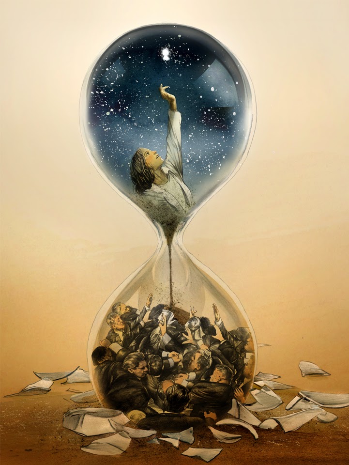
So, because this piece followed too closely on the heels of Sing, zooming in on the astrophysicist reaching for the barely seen approaching object was out- it simply would have too closely cleaved to the earlier cover, and double dipping should always be avoided, or at least done so with great amounts of time between the two acts. So in this case I found the solution in closing in on the scientist thematically rather than literally from the existing image. She needed to have more of a presence if we were to focus on her, and that meant her character needed to be addressed more fully, and in this case, totally reinvented. Especially if she was going to break the fourth wall and look at us, the reader. The result was in many ways a portrait of the scientist, and the focus of her works being more broadly expressed than specific to the object from the interstellar story. Which in the latter’s case meant leaving that approaching mystery to the mind’s eye of the reader, always preferable to hitting them over the head with it in my opinion.
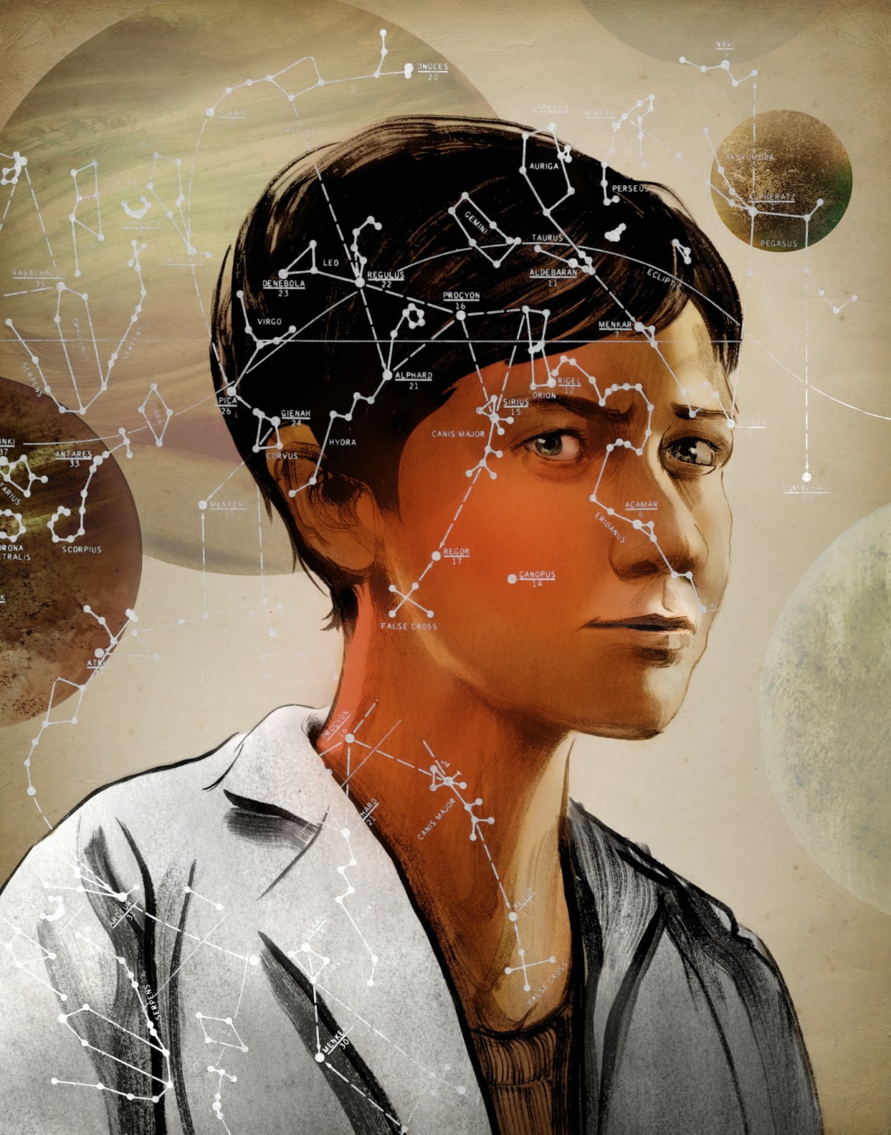
Ultimately, Irene stepped in unusual form and took the image a step further in cropping it as she did for the final- which I loved. Oftentimes you will find the need to paint portions of a piece that will get cropped out and never seen again. This is a necessary evil of the craft and a good thing in the end. It’s always better for the ultimate goal to prune back from too much than to have to try and build out from nothing. And oftentimes that extra stuff that’s never seen goes a long way to informing the final more cropped piece. Don’t be afraid to do this and be brave enough to let even the most precious little part of the overall piece go for the sake of the final effort.
Next up, in this farcical journey of overworking, we come to my favorite example, Lavie Tidhar’s really luminous DRAGONKIN. I’m not overly prone towards high fantasy, though I seem to have done a lot of it over the years now, but this was my first opportunity to draw a proper dragon and I was jazzed to try and tackle it. (Now for the record, this piece was created a good deal of time before the others above, but is I think the best and most extreme example of this madhouse practice, and as such, suitable for the end note). The theme of this tale that all three pieces share in common, is the notion of the story of a young girl who suddenly remembers she is in fact an ancient dragon hidden within human form. Great territory for drawing an image. My first go at it was to approach it as a portrait- which was predictable, pat, and ultimately terrible. But then, I went on to what turned out to be one of my most favorite efforts of that year… I was certain as anything it had hit it right on target. But it wasn’t. Irene brought up that as much as she liked it, it was the wrong piece for this story, it felt too young, and so on… which was totally right. At the end of the day our job is to absolutely service the story, whether we write it or not. Nothing else matters if the mark is missed. It doesn’t change how I felt about this drawing, but it did mean I had to do it again.
So nest up was to go for something older, more severe even if ultimately more on the nose. There’s an invisible target in this kind of project that you only know you’ve hit, when you hit it. And for this it took two broad misses to find the target. The previous one, no matter how much I liked it, didn’t get coupled with the story in the end, but I still had it, and it still got seen, and we can think the internet for this: there is always a place to put these things now. Everything can have a second life.
I had a painting teacher at Pratt who warned us all that in the early-mid stages of the any painting: If you have a favorite part, erase it. Any portion that you covet, should be removed. Meaning, don’t neglect the whole picture for the sake of one small portion of it. You could argue this all represents a lot of time wasted that could have been avoided by a sketch process or some more thought, and you’d probably be right. But you could equally contend that it took going through these previous pieces in order to find the final, and you’d be right also. Whichever is true I won’t tell. You can figure it out for yourself and (you’d always be right). But whichever way you swing it, make sure you do it on-time and hit your deadlines. Because if you don’t you might lose the chance to do this all over again.


Very informative article, and one I can relate to.
Bit of a criticism though, about your Dragonkin pieces. The dragons are dangerously close to being carbon copies of the Skyrim dragons. Was this intentional?
I never played it or even have a gaming console, but it's always entirely possible. For Dragon novices like me, there is far less inventiveness and originality to be found than from those who truly understand the whole genre. Much of my inspiration for these fellows comes from my son's excellent book, Dragonology. Worth a look if you're interested. Great stuff.
I love that book! Also I have a theory that recognizable dragons will ever relate to some other dragon design somewhere out there haha. I based a design off something between a horny toad and an armadillo lizard and then how to train your dragon came out and everyone was all OH a realistic toothless?
P.s. This was a very informative post, thank you!
I grew up around armadillos and couldn't stop thinking about them while doing these. Snapping turtles too. Hairy armored scales. But yes, we always see connections like that. Other times they literally occur simultaneously. It's interesting.
Can't help but think of Phillip Burke's method when he did caricatures for Rolling Stone. Sometimes 50 paintings until he comes across the one to use. Great post Greg. And as always great work.
Very interesting and informative post. Thank you. It's funny how simplifying can sometimes be the hardest thing.
First off, I really love the first piece in this article!
When I read that you finish pieces before showing the AD, I thought to myself:”how do you get gigs?”
OK you have Tor so that may save you, and if it works for you, hat down! What I learned when working with clients (especially AD´s) is that they love to be involved. In the beginning I also tended to finish pieces before showing them, but then I work digitally and could cut a few steps back and showed that to them – so that they have a little bit of the feeling they could control the endresult, when in reality I had a 90% finished piece. Today I´m a bit more relaxed, but I can relate to your process here.