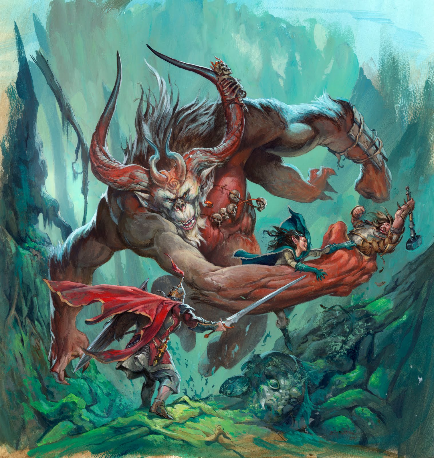
-By Jesper Ejsing
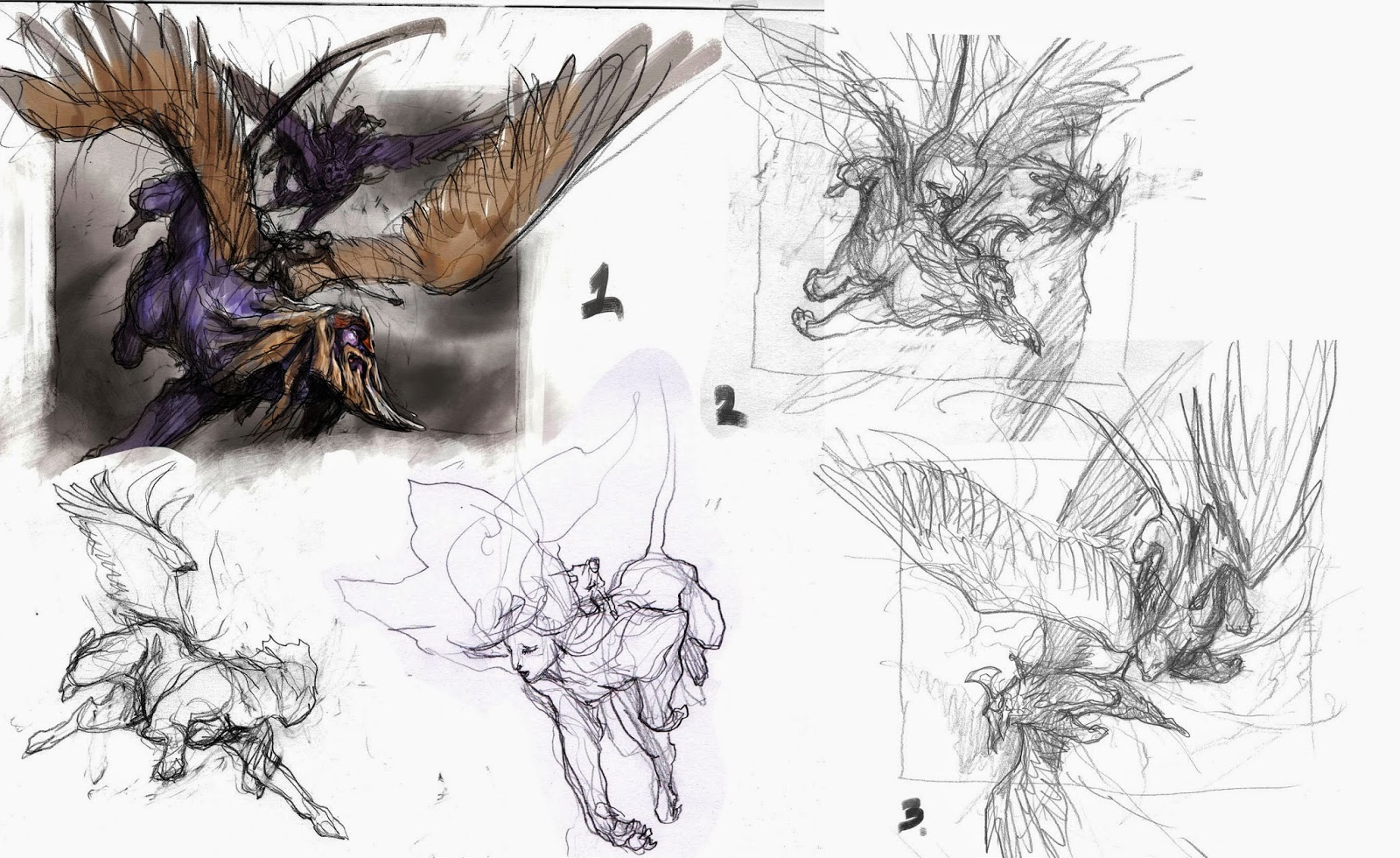
This is a magic card illustration for the set called Journey into Nyx. It is a setting much like the ancient Greece. I was asked to paint a card showing 2 sphinxes with tiny riders on the back charging down from the sky. When doing 2 figures on an image that is going to be as small as a magic card I always try to focus on one character and make the other less significant. It helps to create a clearer image. So I sketched a couple of lion bodies with wings in different dynamic poses. I was very positive with my first attempt; nr 1 and even added some colors before I was about to send it off for review. But then it struck me that almost all of the interest and the focal point would be very close to the bottom edge and suddenly it felt too squashed for me. ( yet again a victim off gut feeling ) So I tried to slightly different versions with the main focus more to the center. I did a huge mistake and sent the three of them off for approval.
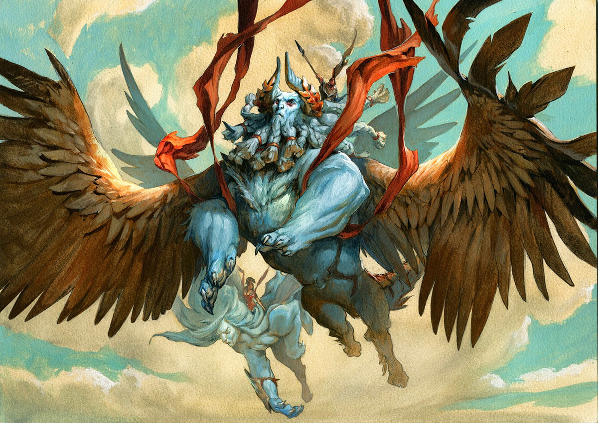
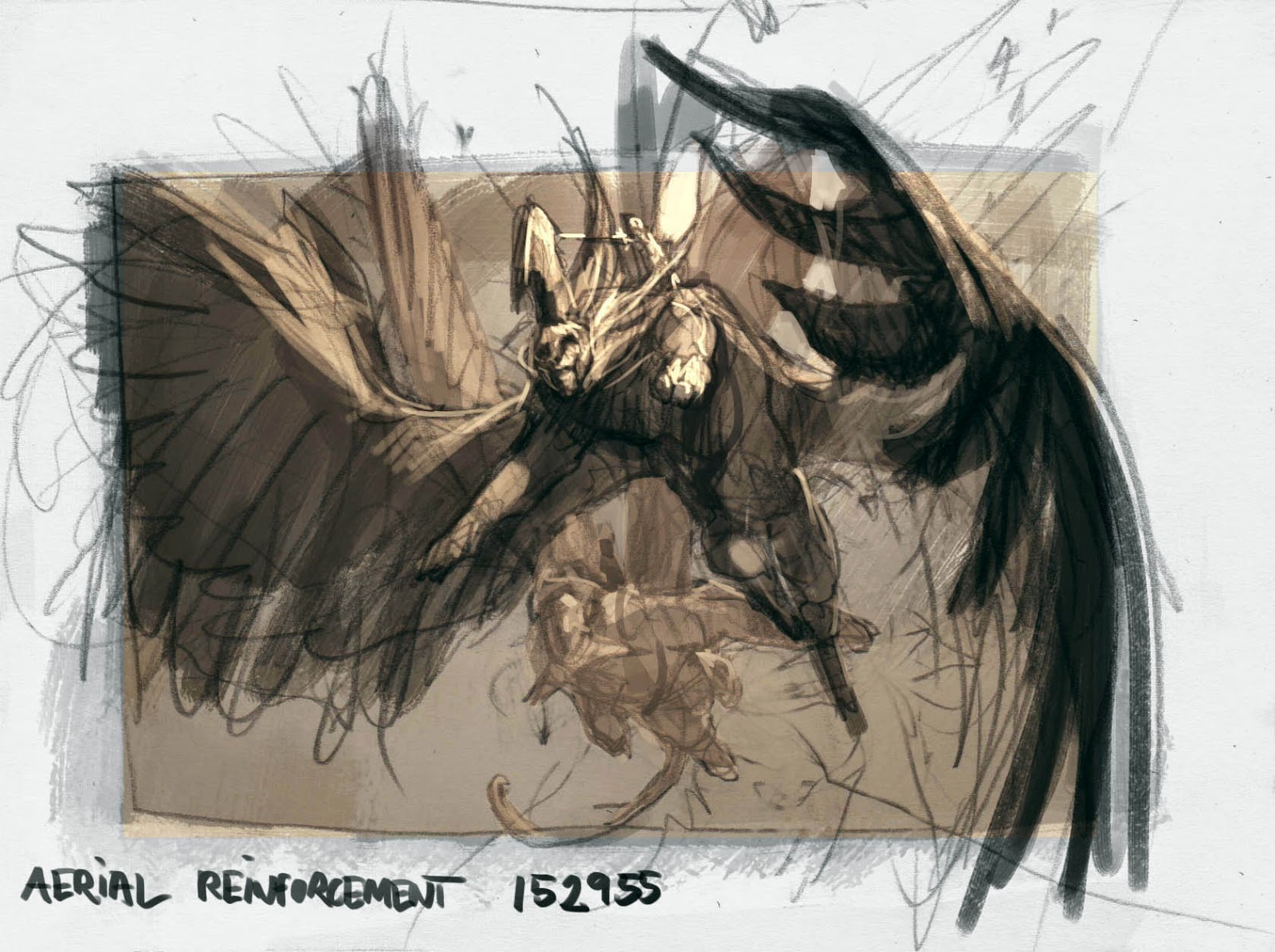
When I got back to the studio the day after and looked at the sketches on my table, a cold feeling of mediocre crept into my stomach and I checked the mail to see if I had already gotten an approval for any of the three. Fortunately not. This is possibly the only advantage about living in a time-zone 9 hours ahead of you art director. i had the whole day to sketch a new and better image before he got up. So I went back in and created a composition with the facial area to the top middle ( as I like best ) and with the wings out and filling the entire surface. I got an extreme foreshortening in on his left wing and used the wings to further frame the figure by almost circling him in. As soon as I got the effect in, like he was diving into us with the sun in his back, I knew I had something right. I wrote an email to my art director Jeremy Jarvis and asked him if he could ignore my email from yesterday and accept this new image as my submission instead. I gotta go with the new one, and started clapping my hands.
When the sketch is so loose and unrefined as it is, you cannot help to see all kinds of things in there in you mind, that is not necessarily put down in line in the initial sketch. you mind fills out the missing part and create an incredible painting, and sometimes getting that gridy sketch refined and made right is causing you more problems than needed. This is one of those times. For some reason, I couldn’t get the hunched shoulders to look cool. The paw in foreshortening and everything just kept looking awkward and when I added the beard to the head it became too big and made the figure look cartoonie in proportions. I am sure all of these thoughts are mostly feelings of insecurity and the probably have little or even nothing to do with the actual sketch, but relying on my feelings to guide me into “Right” I am left stumbling in the dark until I see the light. After a whole day of frustration abandoned the hunched pose and tried a more erect body, sacrificing much of the aggression and foreshortening for regal and dignified. The pose works well for a better facial portrait.
I transferred the figures to a watercolor board and inked the whole drawing with waterproof filt pen, added greytones in black acrylic washes and took a print for color rough.
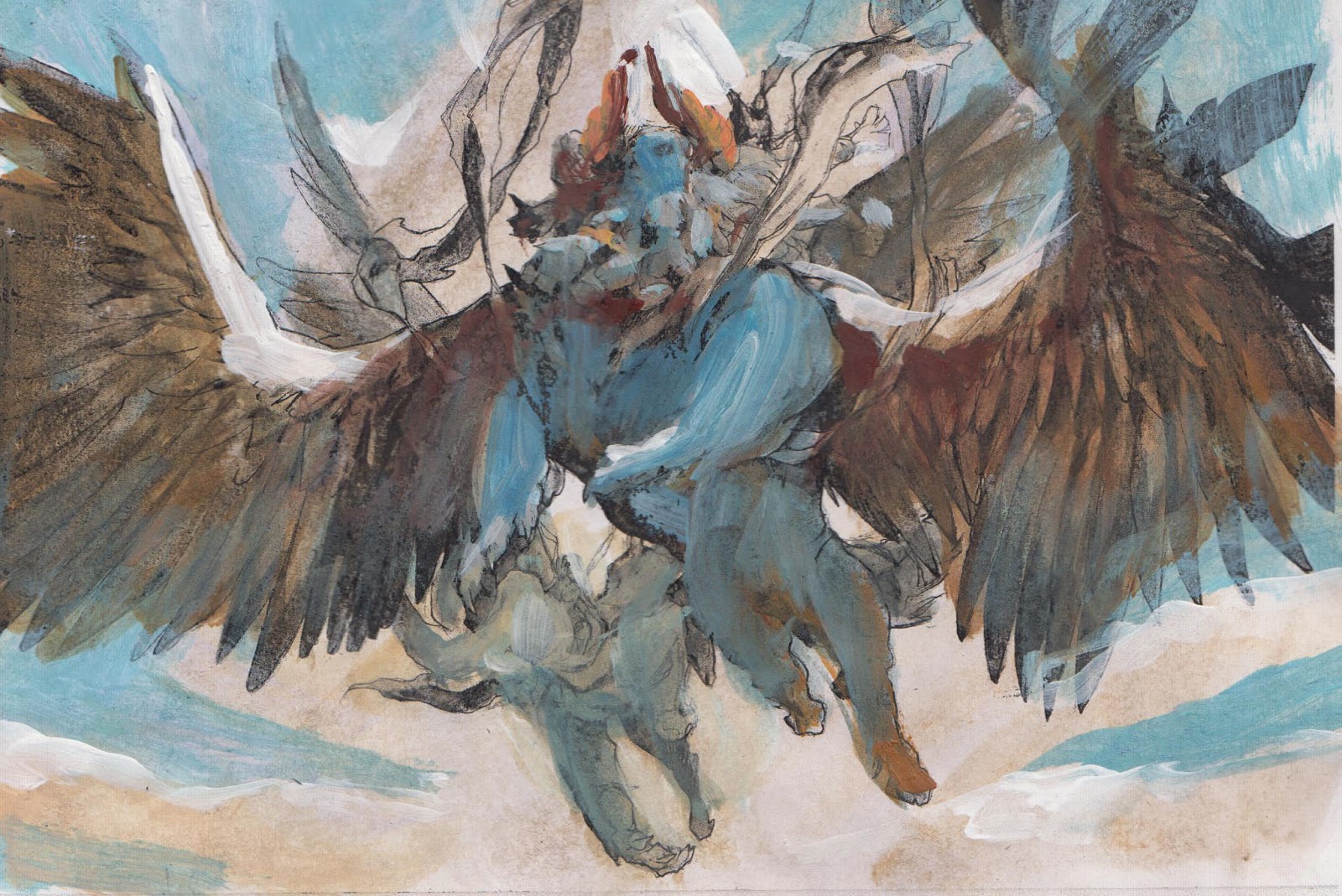
Since the scene was supposed to be a clear and sunny daylight-scene, I used the raw umber underpaint for the color of the clouds, by only washing a thin layer over the whole image. Then I went in with a slightly more opaque turquoise blue and cut the cloud-shapes out simply by painting sky color around them. This way the warm underpaint shines through random places and adds noise and texture.
After I finished the background I base colored the main figure in a dark burnt Sienna. If you zoom in and look around teh figure you can see all the areas, like the bottom part of the horn, or most of the wings, where the base wash is still visible.
When you compare the rough and the final the Orange cloth blowing in the wind, stands out as the most prominent change. The rough was very simple in how many colors I chose. It had only Warm Brown and Turquoise Blue. When painting I noticed that the image needed a strong extra color to add punch, but most important to avoid having the image look like it was a monochromatic light allowing the figures only to be shaped by a warm light source and a cold shadow color. The orange makes you read everything as local color and light instead of only light, and I kept the simplicity I liked.

Really great in depth post, thanks for sharing! I like the regal pose that you ended up going with for the sphinx; it's very fitting. The final illustration has great depth and an imposing elegance. Nice job!
Great piece, thanks for the process shots! This card absolutely destroyed me in the finals of a draft, haha
Neat piece!
-Jeff
Great piece! I'm not sure of this has been answered elsewhere, but on average, how long does a piece like this take, from when you get the brief to when you turn in the final image?
I would love to see a video of your process… So few content about acrylics in the internet.
Awesome! Thank you for sharing a tidbit about your process!
Hi Jesper… Beautiful work, and great posts on process! But I must give you a MALWARE ALERT — Since you apparently no longer control your domain name, the link in your profile no longer leads to your website. Whoever bought the domain is trying to install malware on visitors' computers (Fake Flash update download exploit). That may not happen on all clickthrus, but it happened on my first one. So, you'll want to either kill that link, link to another site, or get control of your domain back. Good luck! …Bob
Very Nice !!