 |
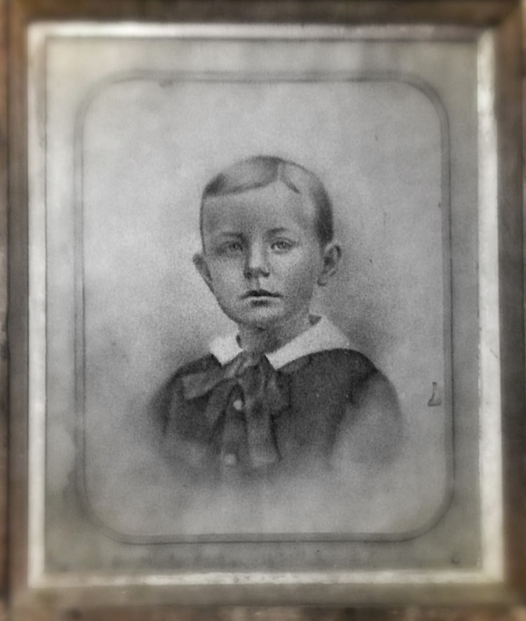
| 20×36″ lead pencil drawing in frame c. 1881 |
In the late 19th Century as the advent of photography ushered in an entirely new visual language that we still can see echoing through our times in the 21st Century. In those nascent days of the medium, one couldn’t take a favorite tintype and enlarge it, you had to hire a draftsman to make a pencil or charcoal likeness of the photograph. (At the time they could only make contact prints or directly expose chemically treated plates of tin or glass).
SO. In an act of current procrastination, and an honest attempt to jumpstart my work ethic after some time off at the end of August, I decided to finally take the plunge and apply my admiration for the hyper-realistic pencil drawing towards another (long overdue) series in my ongoing act of playing hooky, THE 52 WEEKS PROJECT. We had been up on the north coast of Maine, running around Schoodic Peninsula, my favorite place in the world and the combined rocky vastness and infinite fog of the place made its mark in this series to be sure.
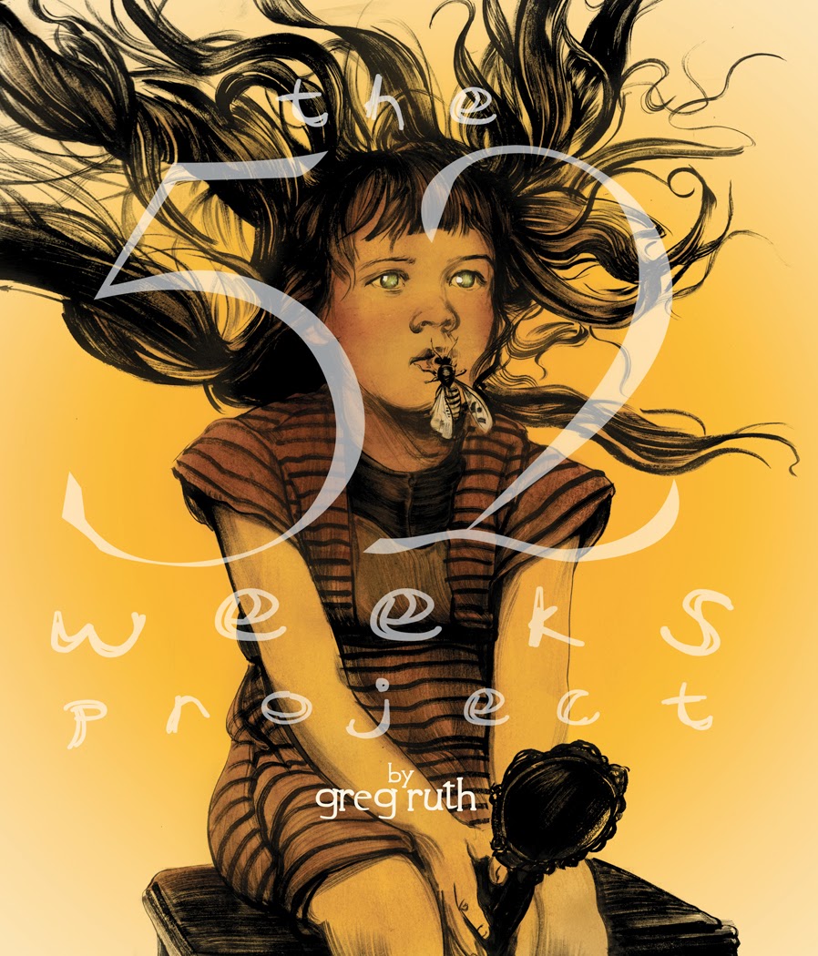 |
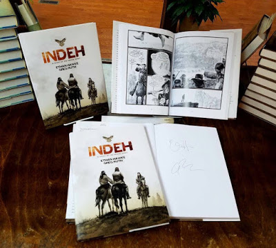
| Cover for the hardcover book collecting the first two years of the project. |
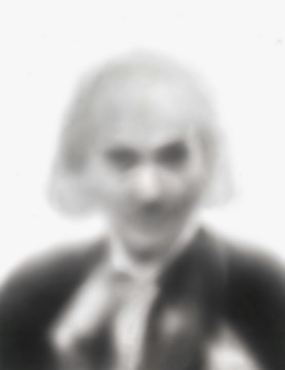
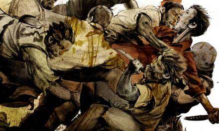
I had a commission that afforded me my first go at this, one of Bela Lugosi the most famous of Draculas on the big screen. Rather than doing a standard likeness I wanted to see about picking an area of his head to focus in on and let the rest drift back into the fog. I knew his iconic face had to be obscured, and wanted to see how much it could be done without losing his identity. The end result succeeded so thoroughly I couldn’t wait to get started on the rest.
 |
| FUZZY BELA (commission piece 10″x12″) |
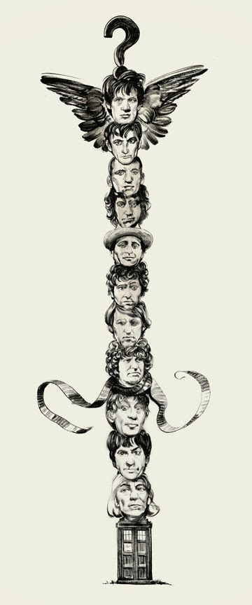
Moving on into the new series, the first step was picking a subject to experiment on. It had to be a limited series of portraits, all of recognizable characters (this I will explain later), and they had to have distinctive faces. Choosing to depict Doctor WHo in all his thirteen faces was an obvious solution, especially since this initial solution to replace a faltering actor has over time become an integral aspect of the character’s personality- almost more so than any other aspect. He his as a result, a sci-fo Kali, a God with many faces. So clearly perfect fort his. So I set three rules for the project: the materials had to always be the same-
1). Blackwing Palomino pencils, and eraser on paper, 8 1/2 x 11″, no photoshop trickery allowed.
2). They had to be the same pose and not a direct reiteration of any previously existing portrait.
3). They had to begin with the now, and go back in time as we counted down to William Hartnell, the very first Doctor.
 |
| #13 PETER CAPALDI |
 |
| #12 MATT SMITH |
 |
| #1 WILLIAM HARTNELL |
If you’d like to follow the series, you can do so via these online outlets. Only the originals will be for sale- no prints, (though there may very well be a folio series collecting all 13 Doctors when we’re done for SDCC) but the originals are at less than half their baseline prices in keeping with the Project’s continuing ethos:
The series will post on my website first and be archived there. Originals for sale in the storefront, each purchase will enter the buyer into a raffle to win the WHO TOTEM a 20″ x 8″ original sumi ink drawing created in the pre-Capaldi lands of 2013.
WEBSITE: http://www.gregthings.com/#!13-doctors/c1a60
FACEBOOK: https://www.facebook.com/pages/THE-52-WEEKS-PROJECT/250705653920
TUMBLR: http://gregthingscom.tumblr.com/
To purchase a signed copy of The 52 WEEKS PROJECT vol. 1 hardcover:
http://www.gregthings.com/#!untitled/c19re
Greg, I don't like to throw superlatives around but those blurred portraits are magnificent! Great reminder that we can make choices in our work, and aren't slaves to rendering every last detail. Wow.
Hah- thanks. Toss away- I don't scare easily. I like idea of encouraged steering of a viewer's eye. I mean we're always doing that with any image we make, but to boil it down so simply and letting the eye's manic desire to focus coralle the attention… that's pretty fun stuff. .
Love the portraits. When will they go on sale on your website?
Thanks- they go on sale the moment they post live, each and every monday by noon at the latest. Check here monday for the next… David Tennant I believe. http://www.gregthings.com/#!shop/c12c5
Very interesting. When I was doing my PhD in visual perception of shapes, there was some amazing research being done in this field (probably lead to modern face recognition technology). One thing that really stuck with me was that the general shape of the face, alongside of some very simple relations of features to each other was the most important in recognizing identity than detail.