I first met May Pang in 1974. I had just finished the cover art for the Ringo album and was working on a live action/animated pilot film for Ringo Starr and Harry Nilsson called, Harry and Ringo’s Night Out. May was John Lennon’s girlfriend during his eighteen month “Lost Weekend” as well as production coordinator for the Pussycats album John was producing for Harry. May is one of the sweetest, kindest and most compassionate people I’ve ever met. We’ve kept in touch over the years. Talking with her recently I learned she was having several upcoming exhibitions of her photography in Germany. And I said to her, what I say to virtually anyone I meet.
“You know what you need? You need some sculpture,” I said.
“Yes. I think that’s a good idea,” she said.
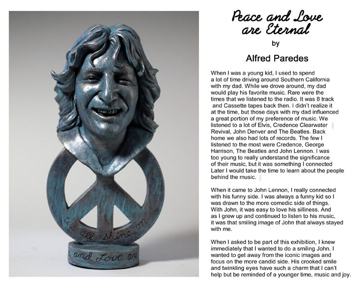
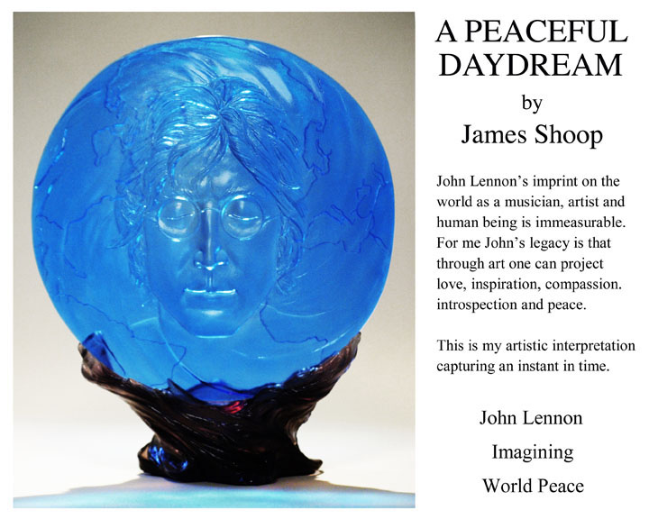
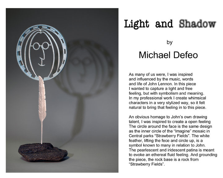
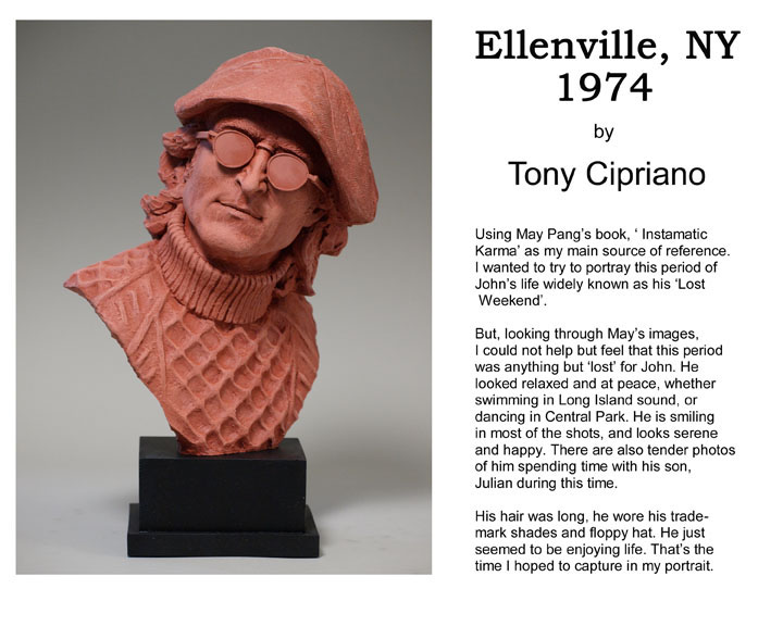
After the shock wore off, the wheels started turning. I contacted James Shoop, Tony Cipriano, Michael Defoe and Alfred Paredes to see if they’d be interested in joining me in creating half life size portraits of John Lennon. They all said yes. The only restriction was size in an effort to keep them all within range of each other. The results are amazing! The pieces will be seen publicly for the first time at the Chiller show in October and at the Krab Jab Gallery in Seattle, Washington next Spring , with the addition of five new sculptures and several pieces of 2D art, all Lennon themed.
This is an account of how my piece, IMAGINE, came together. I came of age in the sixties and the whole psychedelic experience really shaped the way I saw the world and my place in pop culture. So, I knew I wanted to do something that reflected that sensibility. And I wanted the piece to do something. The design bounced around for a few days until it stuck. It wasn’t until I got about half way through, that I realized I might have bitten off more than I could chew. I started with a clay rough. Chavant NSP medium.
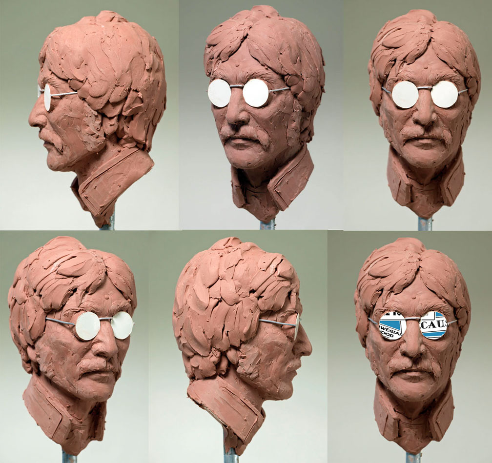
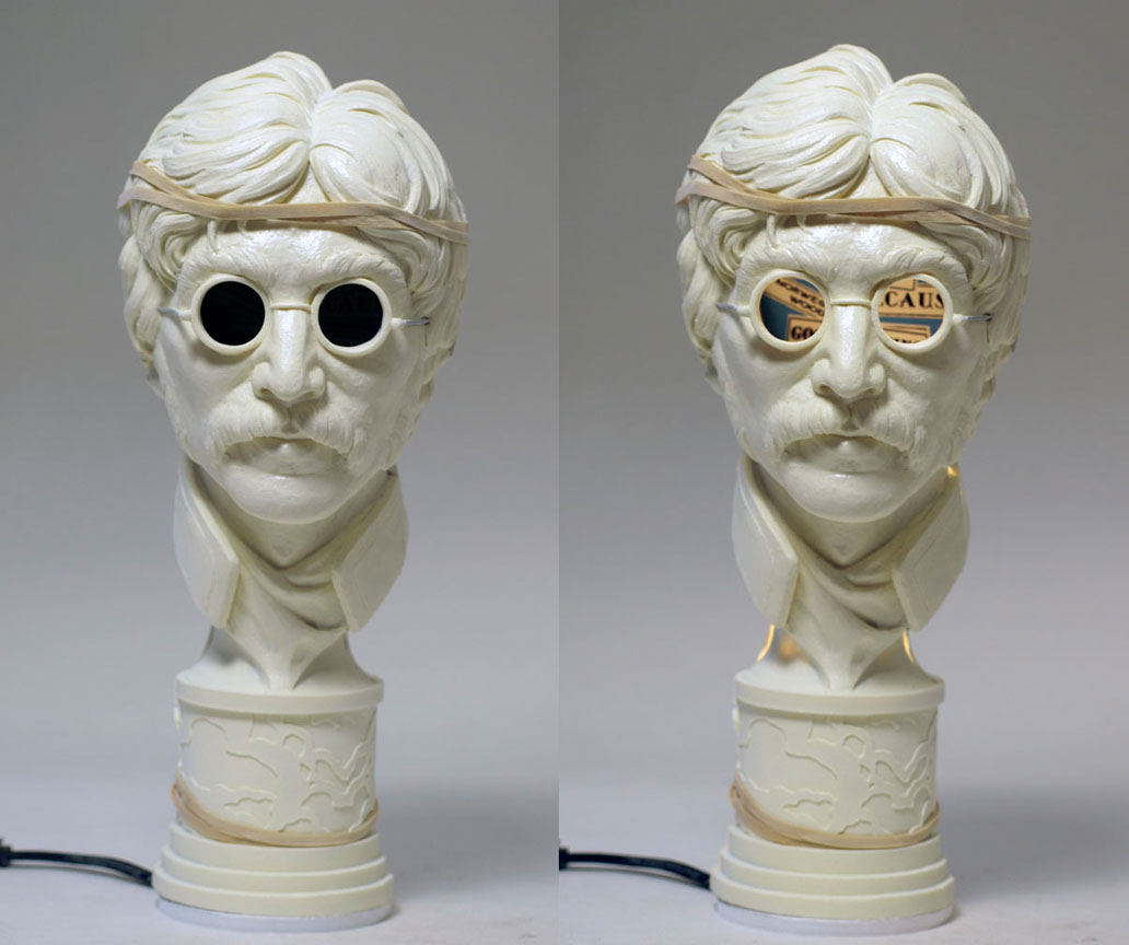
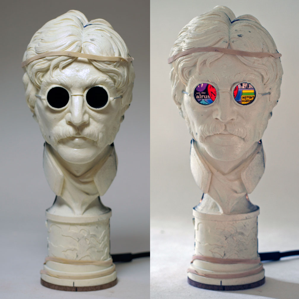
The plan for my piece was to have Lennon song titles floating in his head. You’d look in through the lenses of his glasses and see a collection of his songs and just reading them would conjure up melody and the piece would become more personal because of it.

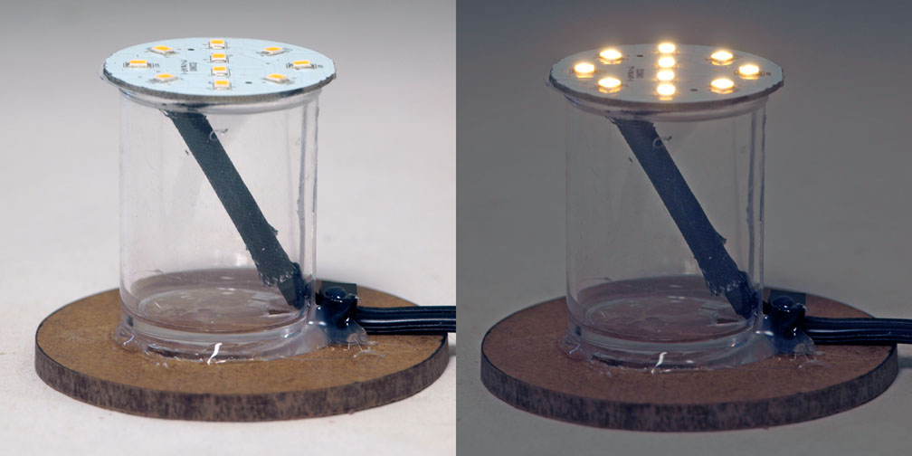
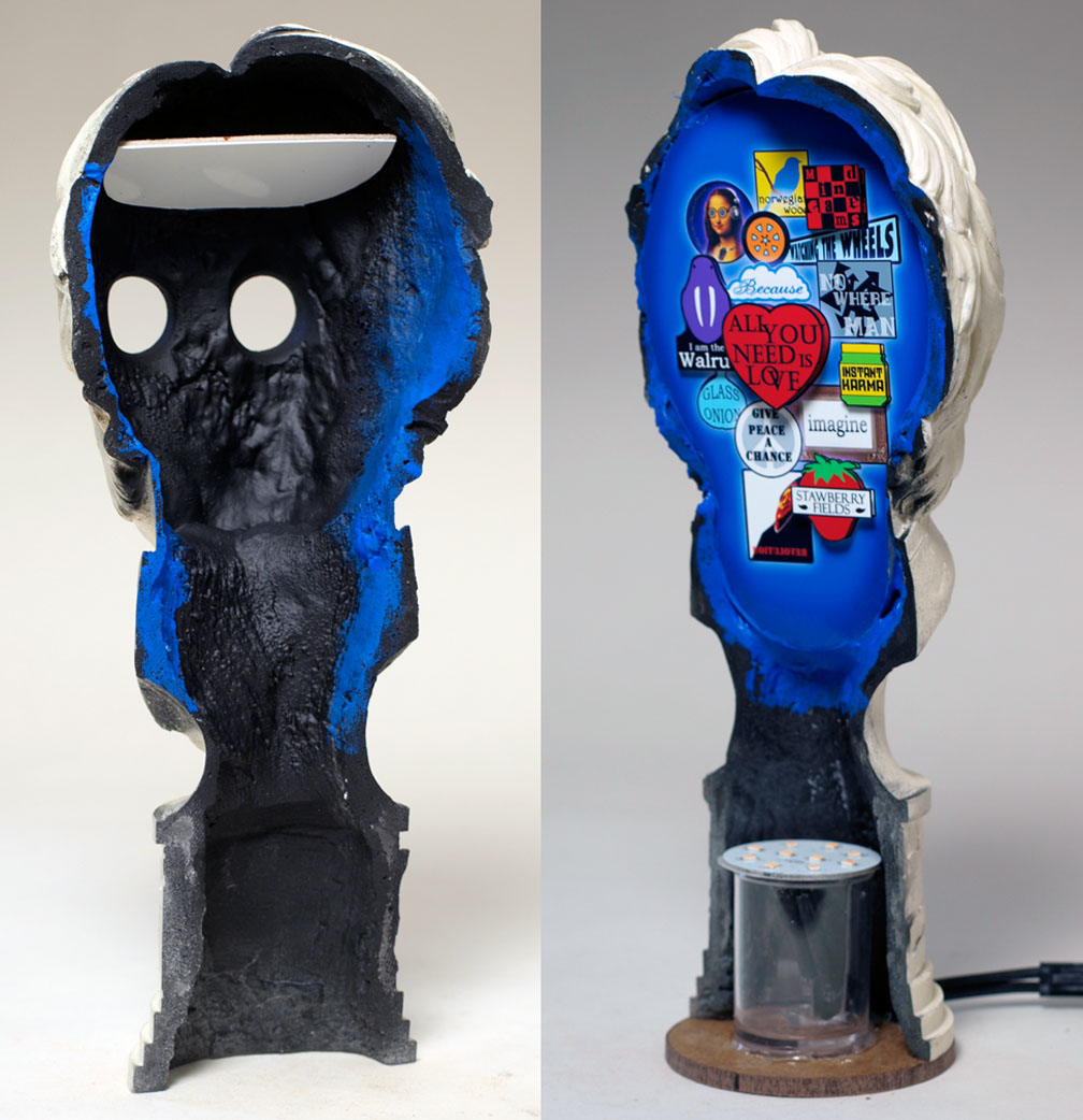
The original plan was to have a kind of skylight in the top of his head to bring light into the piece. The more I played with that idea the more I realized it wasn’t going to work. I’d have to light it up from the inside and because the full interior space would be used for song titles, I’d have to light the piece up with an LED in the base.

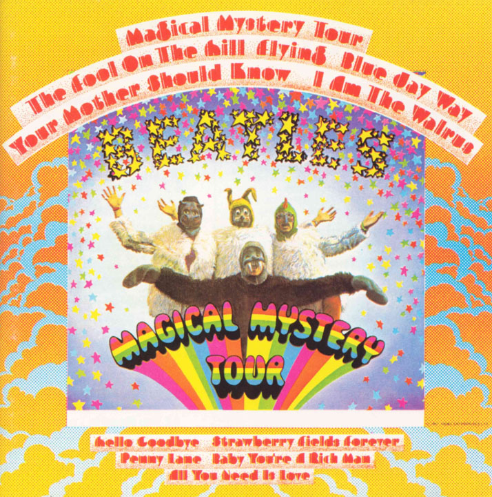
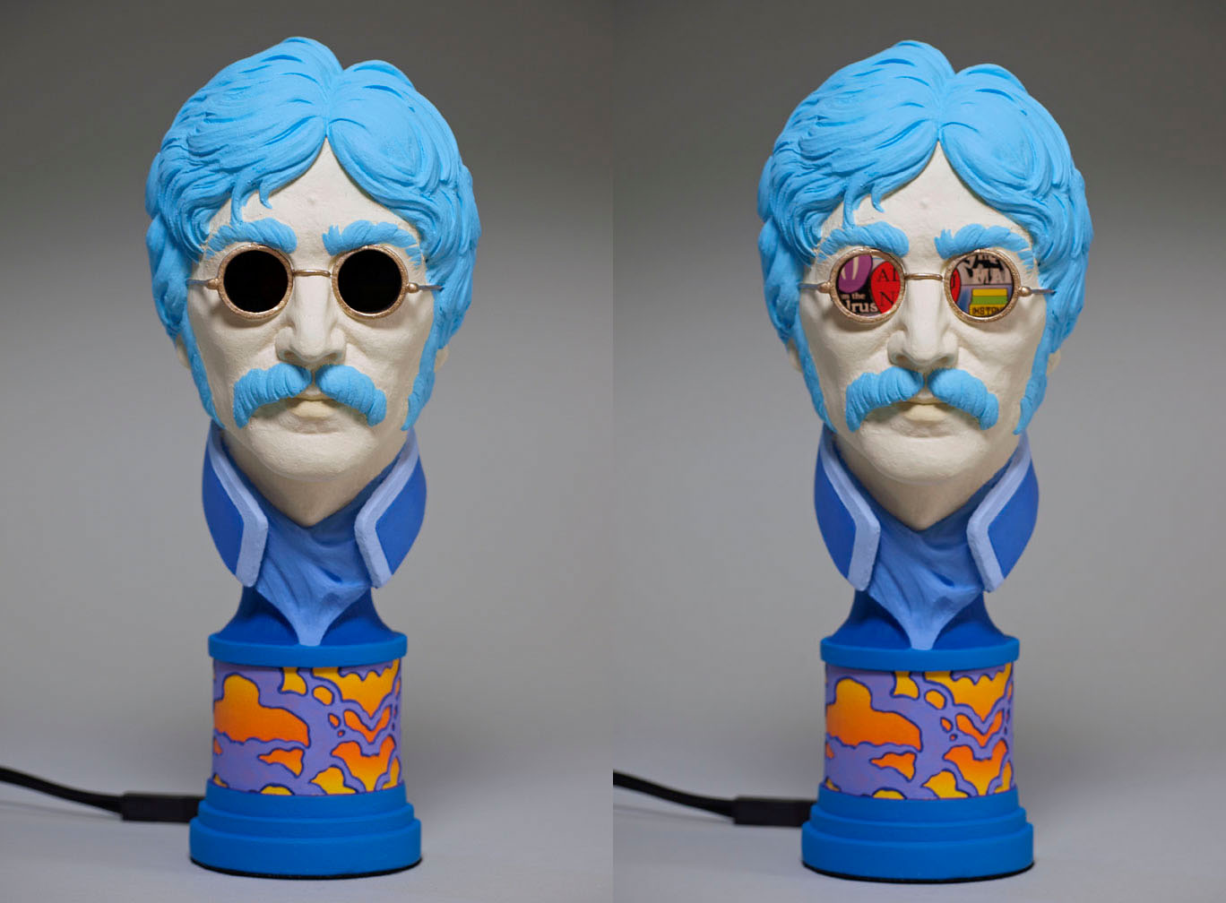
With the piece done, I gave it several coats of primer to check unity and then a few coats of mold release to prevent the primer from sticking to the mold. The design on the base was inspired by the cloud art on the Magical Mystery Tour album.
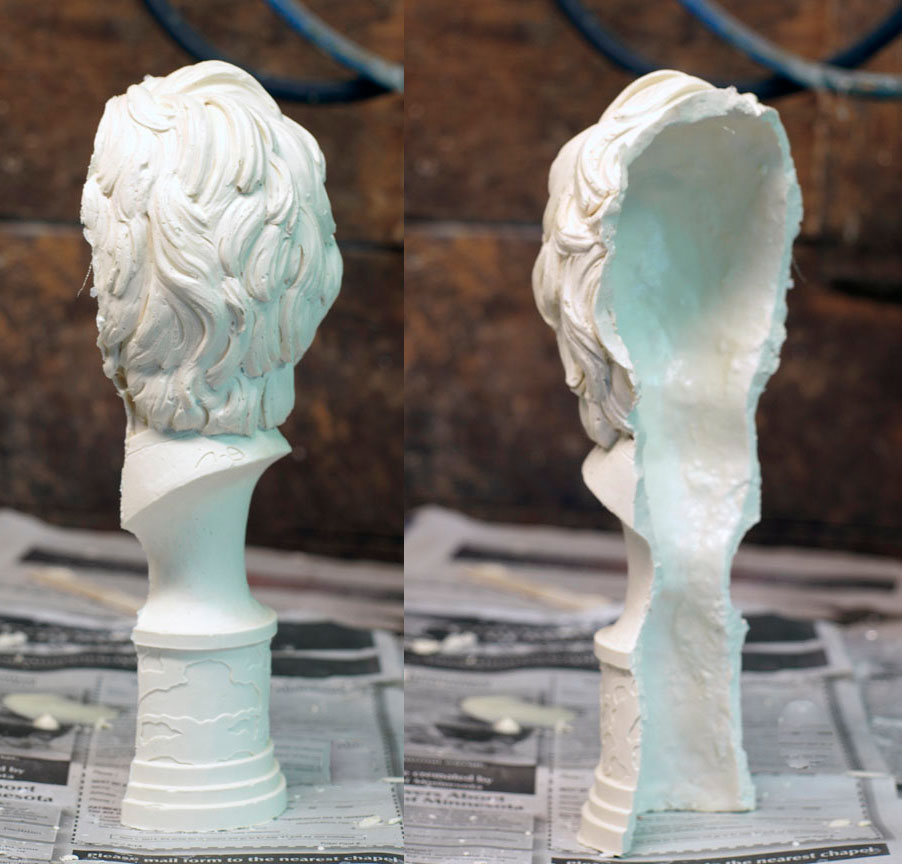
I miscalculated the molding. Initially I thought I’d shim the piece into two sections and mold each section separately but with the base constructed of PVC pipe, I didn’t think it would work. So, I marked the piece for cut lines and halved in that way. Not the best of choices.

Casting the piece presented the biggest problem. I’d thought about slush casting but I needed a fairly consistent wall thickness so that was out. I used three different resin combinations, two of which worked. Kind of. Using urethane 80331, I brushed on several skin coats to give me a consistent surface. Xtendospheres are micro beads used to thicken casting resin. You can adjust the density by the ratio of beads to resin. When I got a mixture thick enough to brush on, I laid it up and then added a smoothing brush-down coat of acetone.


The first lighting test worked okay using the mock up of my original song-title concept.
Getting the LED’s at the right height was a little tricky.
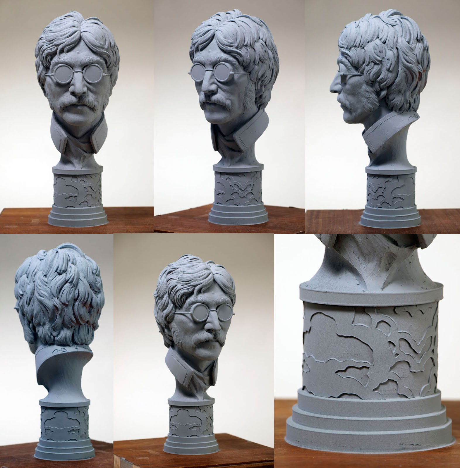
The more I thought about the song title art the more it seemed wanting. A bunch of mini print-outs with song titles didn’t seem to warrant the effort, so I decided to design logos for the songs I selected and mount then on a master, cutting out a few and mounting them on spacers to add a sense of depth.

The second lighting test turned out to be a bust. With the interior of the piece painted black, the reflected light I had counted on from the first test, with the white resin interior, disappeared. I tried small sections of chrome surfaced mylar, squares of aluminum foil and a polished metal plate. Nothing worked as well as a reflective card or Krome Kote spray mounted onto a piece of foam core. Light came up from the bottom of the base, bounced off the card and lit up the top most section of the art.
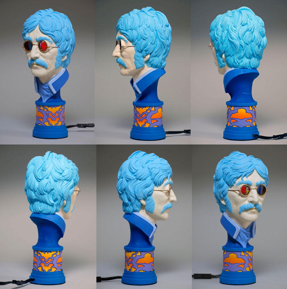
With the piece assembled and primed, it was time to consider the paint scheme. The base paint application would be based on the art from the Magical Mystery Tour cover. He was so stylized, a more natural color pallet seemed wrong. I can’t tell you how I came up with the pallet I used other than pure dumb luck and maybe a little ethereal guidance from Dr. Winston O’Boogie himself.
I was absolutely gobsmacked by the work the other artists produced. It is an honor to be part of this amazing group, all of whom were generous, gracious and supportive. I’m proud to introduce their pieces to you. If you’ll be attending the Chiller show, stop by and say hi to May. She’s a great dame, and I mean that with much love and admiration.
Freaking brilliant work.
This is one of the best pieces of art I have seen all year – beautiful work!
Amazing Tim! I agree with Kyle and Elaine…..it's brilliant. The best Lennon tribute I've ever seen. Thanks for sharing!
What a fantastic piece, I love the idea with the song titles seen through his glasses!
This is super fun. the see through glasses idea is not only really creative and appropriate, but you executed it flawlessly. You really nailed the Peter Max vibe too.
great stuff nice to see the full workflow. 🙂
It's awesome hard work, man!
bisnis kecil
penjual minuman murah
It seems that you make is a work of art that is quite complicated and challenging. I don't quite understand about the sculpture, but by looking at your work, this is an exceptional work of art. Congrats!
Stella
This is imagine ?
Most thanks for this articles ^_^
Regard
Pakar Bulus
Film Semi
Movies
Hot Film
Film Terbaru 2016
Film Kartun
Drama korea
Film Indo