Last year, I had the opportunity to work on several really fun properties/projects, but the just recently revealed special edition of Stephen King’s Salem’s Lot by Cemetery Dance might take the prize.
To begin, I’ll say that the illustrated novel as a concept is possibly my favorite niche of the sprawling illustration world. It’s a tiny niche these days, but the old classics have always grabbed my attention. Mead Schaefer, Howard Pyle, and Frazetta made some of my favorites, but N.C. Wyeth’s Treasure Island is my pinnacle. I’ve looked at those paintings for inspiration and guidance time and again, and never more than when working on images in a series.
In modern publishing, you can count on one hand the number of imprints making illustrated novels with any consistency and they are generally created as limited collector’s editions. Which is to say, jobs like that don’t come along too often. This has been my second to date. In a strange coincidence, the offer came in within a week of my having finished reading The Shining (love love loved it) and MAN was I on their wavelength.
One of the really exciting aspects of an illustrated novel is that, unlike so many typical jobs, most of the artwork is hidden inside. This means that the images are not just trying to grab a potential customer’s eye from the rack, but more to reward the reader as they enjoy the book. The images are not chained to type and design elements either, giving you total control over your composition without compromises. Most importantly though, the interiors need to be on tone with the story and hopefully unfold at a pace which adds to the experience rather than diminish it.
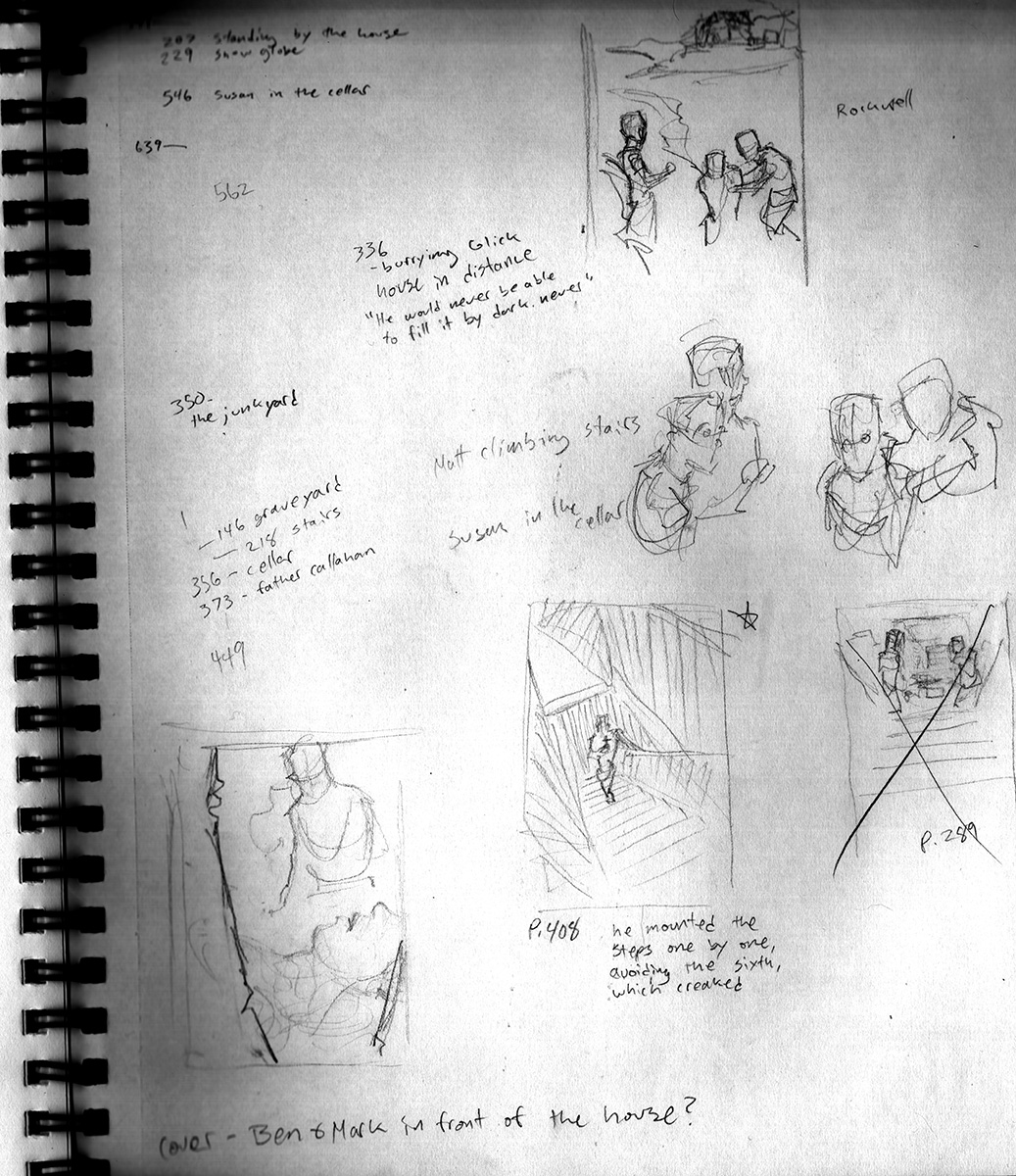
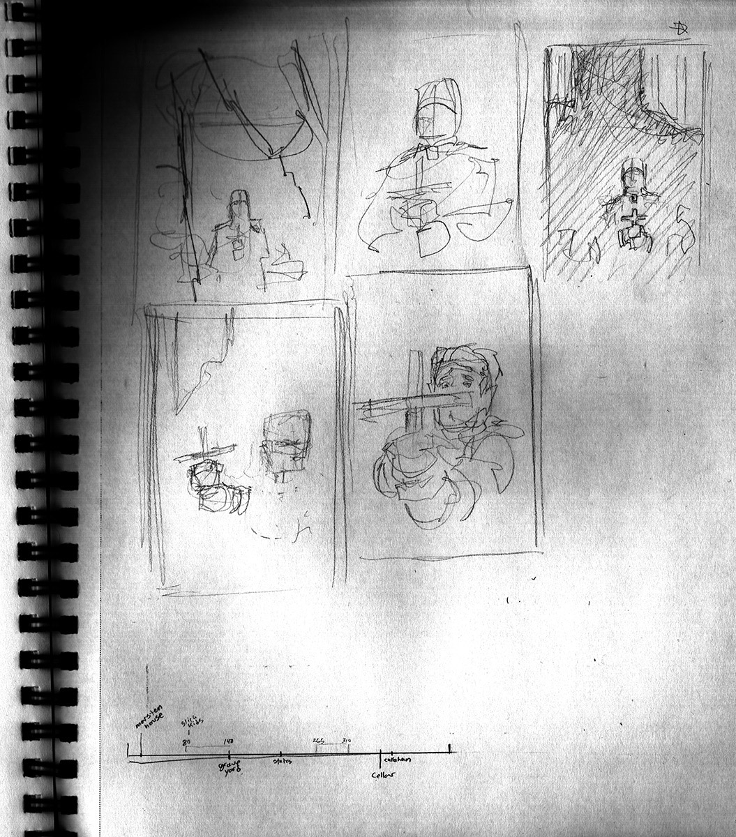
The first thing to figure out was what scenes to depict. Salem’s Lot is fairly crowded with great visual moments and I wanted to choose those which most spoke to my own natural aesthetic. I also had to be mindful of them not being too bunched together so they would be reasonably distributed through out the book. My assignment asked for only four interiors, but I started with a list of about a dozen that stuck in my memory. I noted page numbers and began boiling it down to help divide the four final scenes into early, middle, middle, and late. There was one scene in particular (Ben with hammer and stake in the Marsten house cellar) which I knew had to be included, and so I built outward from there.
A theme began to surface in my thumbnails. As I came to the final selection, it seemed clear to me that each of the four interiors would reflect a moment of dread. Though I wanted to make the four moments relate to the four most important characters, spacing them out was problematic and in the end I decided to let Ben, Matt, and Father Callahan have their scenes and give Mark’s (which was only ten or so pages away from Father Callahan’s) to a minor character early in the book which better fit the progressing visual storyline. Additionally, I am a big believer in the “don’t show the monster” theory of horror, so I aimed to keep the focus on our human victims and place the monsters and gore out of frame (and still firmly in the imagination of the reader). I absolutely did not want to show Barlow.
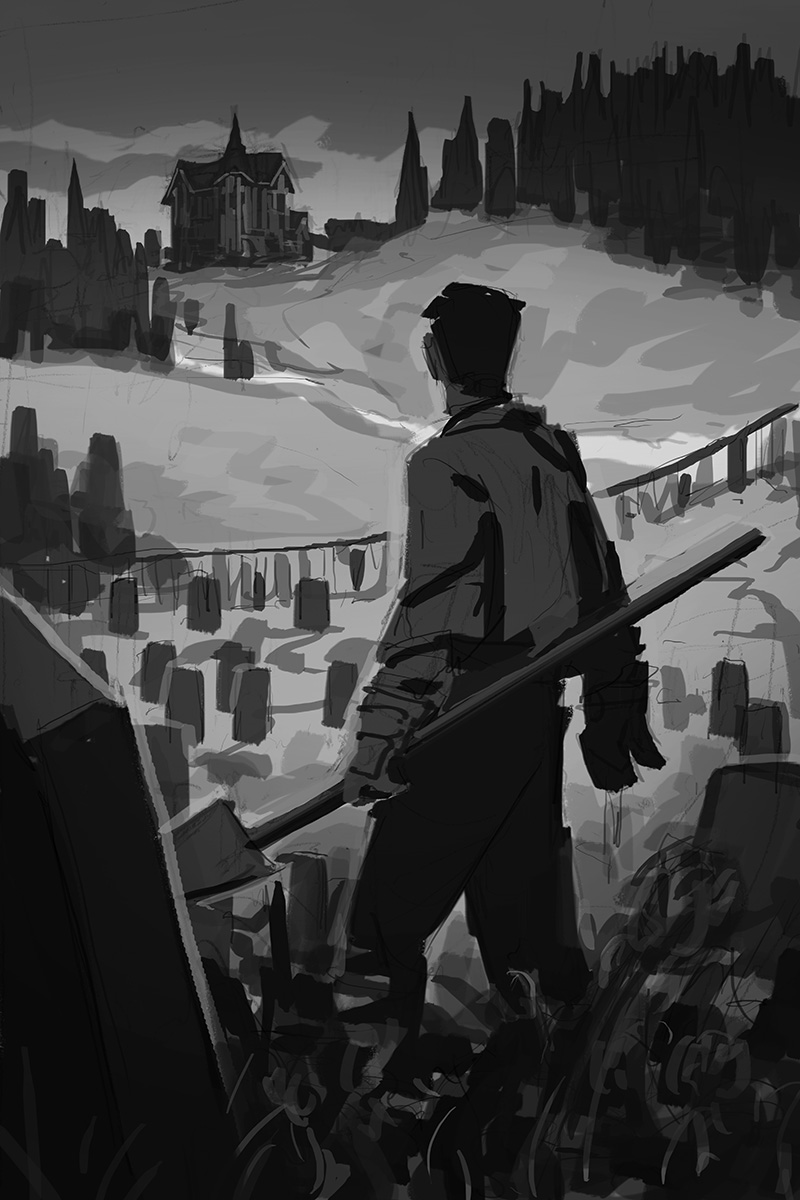
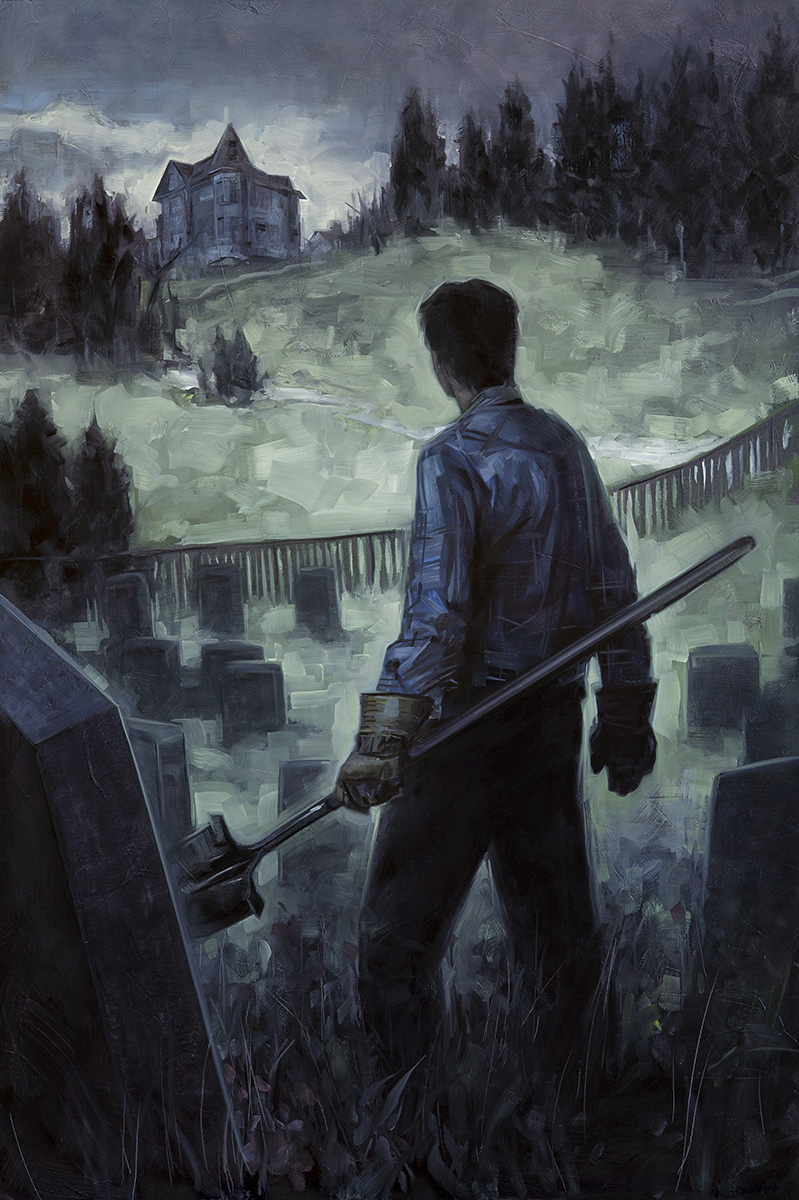
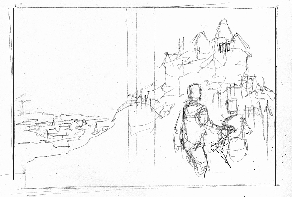
This first scene ended up being Mike Ryerson, the grave digger, looking up the hill at the ominous and lonely Marsten house. Waking from a strange trance, he realizes that the day has passed and a feeling of dread seizes him.
I wanted for the scene to have the muted blue tones of dusk. The figure stands out in silhouette but the dark is closing in on him all around and beginning to swallow him in the lower portion of the picture. Also, to add to the mystery and stillness of the moment, I turned his face away from us as he looks hopelessly at the gloomy distant house.
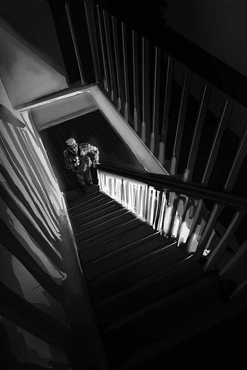
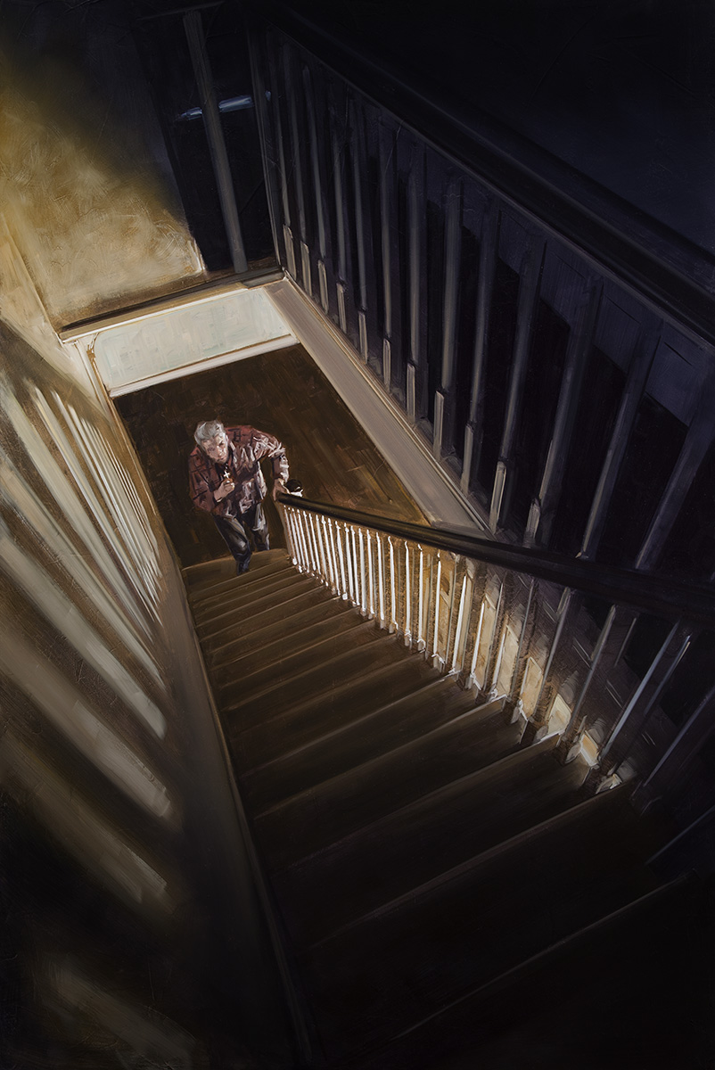
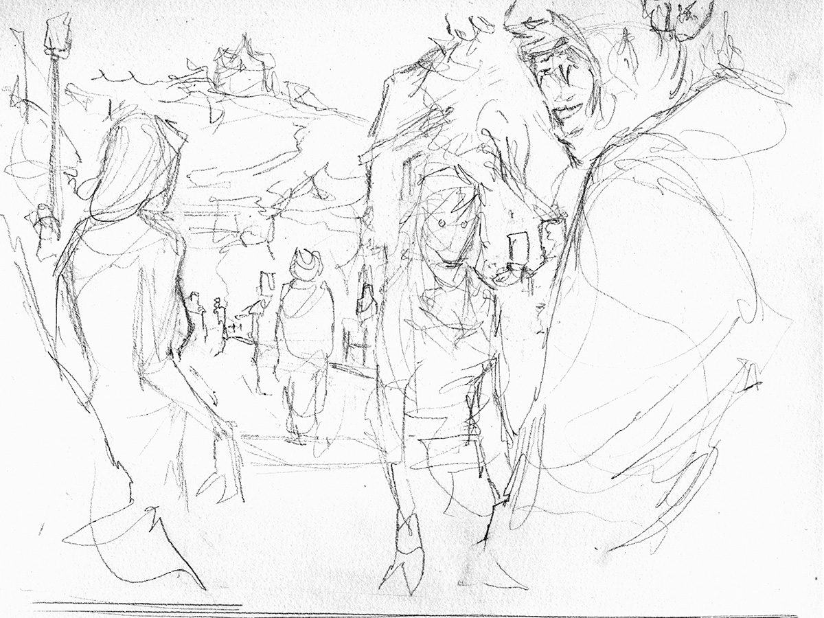
The next scene shows Matt, our first hero to encounter the vampires, preparing to climb the stairs to his 2nd floor guestroom where he knows something horrible is waiting for him. He holds a small crucifix but is overwhelmed with dread.
I loved this moment of a character dragging himself towards something that scares the crap out of him. I think I particularly related to this scene because of the universal experience of kids (and adults) facing a scary basement or attic or any other spooky place. I actually still get creeped out every single time that I vacuum my staircase (which is semi-regularly with three cats in the house) because I feel that weird sensation of a figure standing at the railing above and behind me, watching.
So for Matt’s big moment, I saw an opportunity to box him into this prison of bars and shadows, thrown off balance with a Dutch tilt. He is leaving the warm comforting light of the known (the only warm and comforting light in the series) and stepping to darkness and unknown. The upstairs has the same purple/blue tinge as the rest of the series, which means terror.
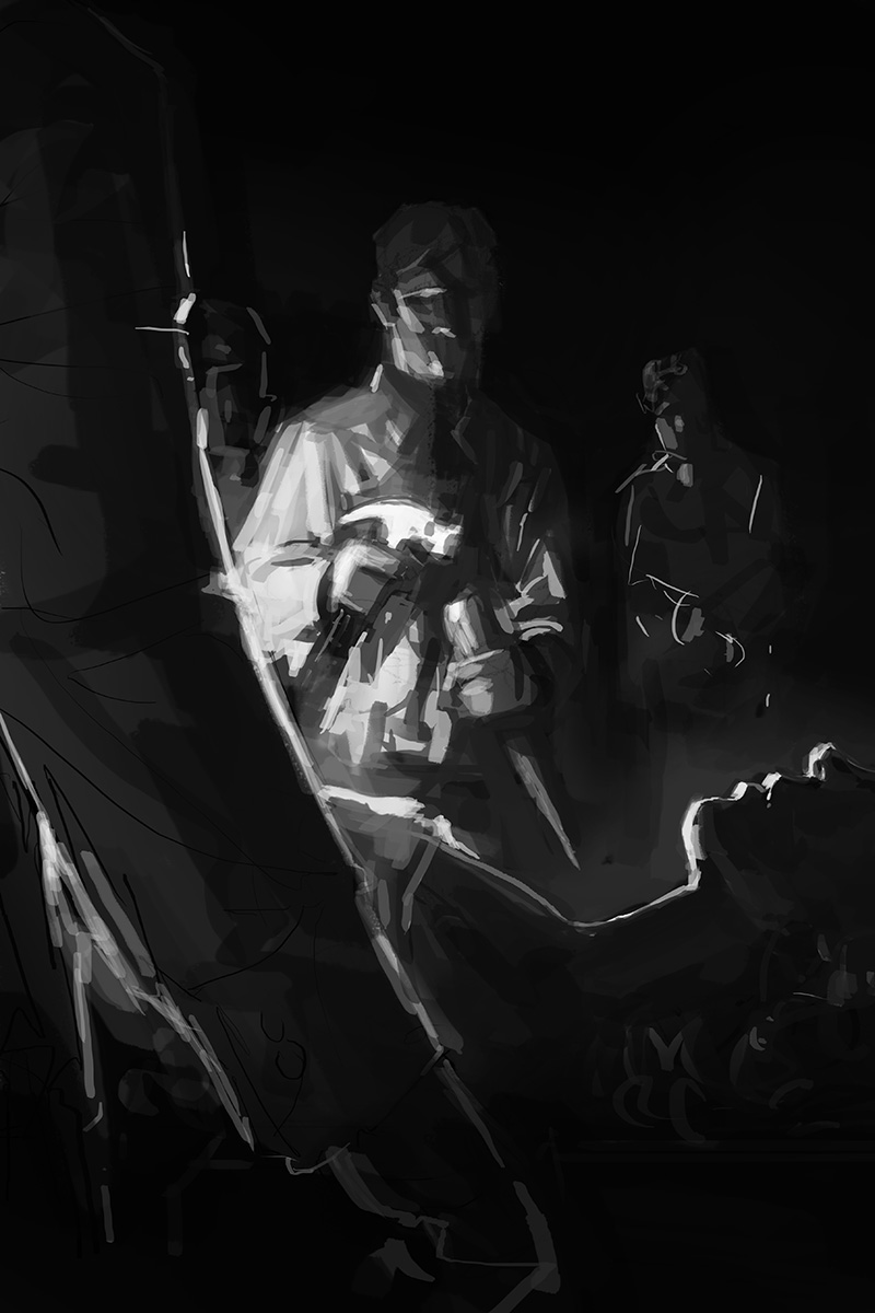
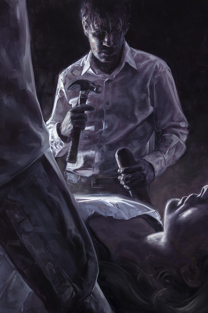
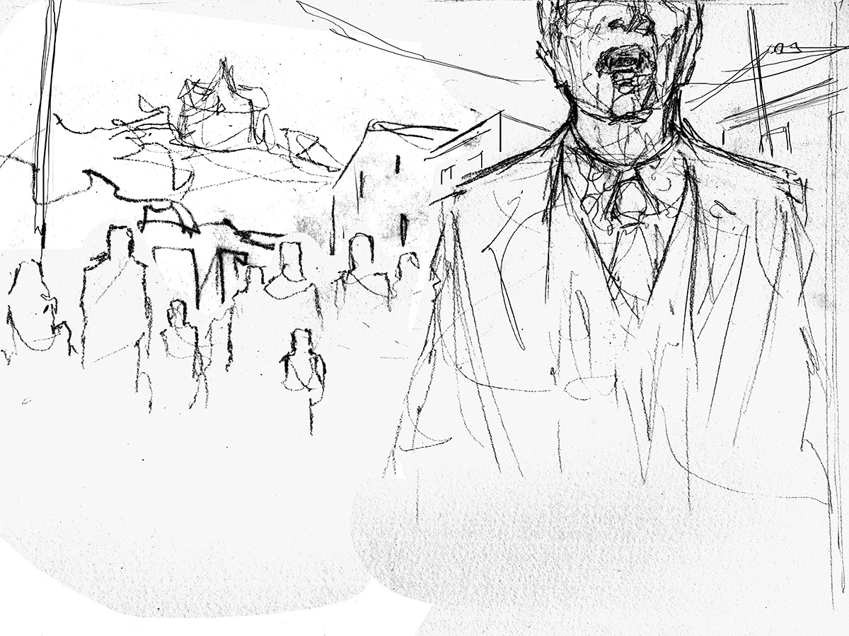
And now we come to the scene of Ben in the cellar, hammer and stake in hand, confronted with doing the unthinkable. For me, this is the purest moment of dread in the whole book. Terrible things happen to everyone else, but those are generally external circumstances or events beyond their control. This one, this moment, it is a choice and so he must take the guilt along with the pain of it.
I wanted to really drive home that this is not a triumph. In most stories, staking the vampire is grim but also has a sense of victory. In this case, it is only regret and sorrow. My initial sketch was not quite finding the emotion, so I pulled in closer. In the final, I removed the figures from the background to keep the focus on Ben and his pain.
For the final interior, Father Callahan learns that, as he had feared, his faith is brittle. There is hope in the beginning but, as he faces off with Barlow, he hesitates and knows in that moment of dread that he will fail.
This painting was one that I was very excited for. I loved the idea of the priest lit by the glowing cross. He is small, weak, and alone in a sea of shadow. There was a problem though which I was not sure how to solve until I shot my reference (always shoot reference!). I wanted him to be consumed by the shadow of Barlow, but in the sketch it is not entirely clear. It looks a bit like the shadow is his own, which not only ruins the story of the image but also is inconsistent with the light source. On shooting my reference, however, I saw how I could layer the actual cast shadow of Callahan over the shadow of Barlow and, in the end, it became my favorite piece of the whole project.
Besides the interiors, I was also asked to create two wrap-around covers: one for the regular edition and a second for the deluxe edition. A panorama showing the Marsten house with the town in the distance was something which the publisher and I both felt should be one of them. The second cover wasn’t as easy to nail down though.
For awhile, I wanted to do a companion piece to the view of the house and show the town streets full of undead with the house looming in the distance. I still really like the concept of this, but my sketches never found that right beat. Some ideas looked cool, but felt off tone. After a healthy pursuit in this direction, I decided to step back and, instead, focus entirely on the tone.
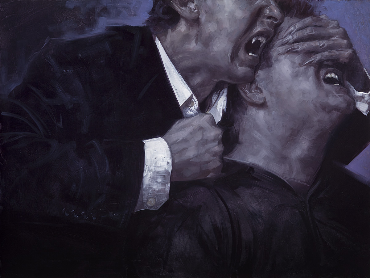
The vampires of Salem’s Lot are not sexy. They are beasts. They are violent, merciless, and hungry. So many modern vampire stories romanticize the monsters, but that was not King’s choice. I wanted to find a concept that spoke to that. This was how I ended up with my second cover. I wanted an image which was abstract enough to represent not a specific character or scene (the interiors already did that) but present the overall story. I wanted it to be simple and on a human scale. What better than an anonymous vampire exposing the throat of an anonymous victim, half a second before the kill.









Fantastic drawings . . . .
Great series! I love the thought process behind what you chose to depict.
My first and probably favorite King book. Great project Dave and great work.
You were definitely the perfect illustrator for this.
This story by King is the one that cemented my love of horror at an early age and when I first saw the artwork you had done for it I loved it immediately. Seeing the images laid out like this all I can say is masterful work. The composition of each piece is stunning.
Very nice stuff as always! What kind of size do you work in for pictures like these, if I may ask?
I'll also add a bit of a rant: It really is a shame that illustrated novels are such a rarity these days. I wonder why that is though. Obviously many people might feel that pictures intrude on the territory that should better be left to the reader's imagination, but I (as an aspiring picture maker) think this isn't really a problem for a thoughtful illustrator who knows what should and shouldn't be shown or explained. On the other hand, kids' books are often profusely illustrated. Is this then because children have no imagination to bring the words alive in their heads? Or because children, unlike us sophisticated adults, are a bit dim and in need of explanatory pictures to guide them through a story? For some reason moving pictures are ok for adult consumption whereas still pictures aren't…. Rant over. Thank you.
I always love Stephen King books with illustrations. I remember reading books like “The Gunslinger” and “Drawing of the Three” and just poring over those illustrations. Fantastic work.
I agree that it is a shame we don't see more of them. I do think that pictures in a book are often regarded as “young” for mainstream publication and so it may have a lot to do with tradition and what people expect a thing to be like.
More to the point though, I suspect a major reason has to do with cold hard budgets. For all but the very top rung authors, profit margins can be very slim on contemporary fiction. Multiplying the art budget by 3-10 times is a hell of a risk for most books. The publishers who do these types of releases regularly (Folio Society, Cemetery Dance, Centipede Press) almost exclusively produce superbly designed premium editions of genre and literature classics. The runs are shorter and the cover price is what you would expect for a limited edition art object rather than a bookstore copy. Basically, they are selling to a very specific minority audience who is willing to pay more for those extras (and not just art, but also fancy binding, slipcases, etc.). I doubt it would be feasible to convince a general audience that the cover price should be doubled or tripled for the sake of art when so many of them would rather just read on their Kindle anyhow, but there is a subset of readers (like myself) who pay 5x or more for that when it is the right book.
Oh, and regarding sizes, the interiors are all 20×30, the house cover is 24×32, and the vampire cover is 18×24
Thanks for the reply David.
Of course I, as much as the next guy, would like to think that I'm right and all the others aren't just getting how awesome illustrated novels would be, but yeah, your're probably right about the budgets. Event though expectations and conventions play a role, that, in the real world, isn't as important as the money side. For someone looking at the illustration field from the outside it's just quite easy to forget that budgets have a big effect on what's being published.
I just love your thumbnails, one of my aims when i get my own art to a professional level and earn money from it is to just buy artists Original Sketchbooks and Thumbnails, i honestly think its an art form in its own right, and your are some of the most superb
Who are you? Woah, amazing!
Beautiful work! The piece with the shadows and the priest is gorgeous!
Great stuff!
A fantastic look of how to convey and compose themes and feelings over specific actions!
These are really stunning. Thanks for taking the time to explain your thought process behind each one.
These are really stunning. Thanks for taking the time to explain your thought process behind each one.
سلام..
وبلاگ خود را بسیار خوب من خیلی دوست است … این وبلاگ واقعا مفید است
تو میتوانی انجام پايان نامه مديريت – مشاوره و انجام پایان نامه کارشناسی ارشد و پایان نامه دکتری و پایان نامه مدیریت و پایان نامه کامپیوتر و پایان نامه برق و پایان نامه مکانیک و پایان نامه عمران به صورت ویژه در سایت موسسه مشاوران مارلیک
I absolutely love these beautiful pieces of Art! My favorite book of all time! Nailed it! This form should be a springboard for a film and use the audible book in the background! I wish i could buy a piece and get it signed. I know I am late!