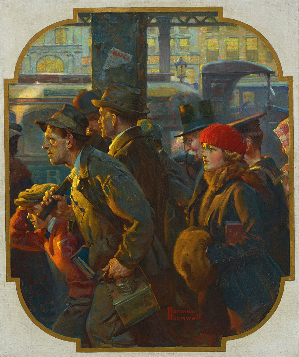
This was a cover for Literary Digest, November 1920. Most of his other covers then were 2-color until the mid-20s and didn't use models as much. Budget, tech and time are eternal issues!
You can really tell the J.C. Leyendecker influence in his earlier work. The graphical way he renders drapery and creates striated highlights. It's more subtle than Leyendecker for sure, but definitely there. Love this beautiful image!
Rockwell may have painted realistically, but he was always careful to use his imagination to infuse his painted characters with life rather than make them look like stiff, uninteresting things.
berlian88onBook Cover Trends thru Time (via DUNE)Online lottery is here as an answer to the demands of an increasingly modern era. Now, lottery fans no longer need to bother looking for a land bookie…
nusa88onBook Cover Trends thru Time (via DUNE)Trusted online lottery site with a minimum deposit of 100 silver, offers the experience of playing online lottery today and various other markets that…


Ahh Rockwell, a constant source of inspiration. Great post Dan.
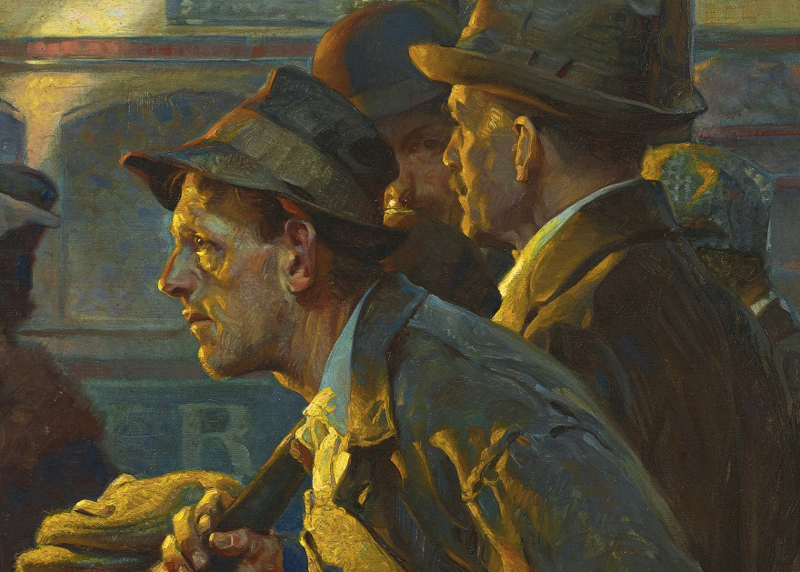
That guy with a hat totally looks like James Gurney !!!
http://vignette4.wikia.nocookie.net/dinotopia/images/8/81/Gurney_portrait.jpg/revision/latest?cb=20090226001757
Coïncidence? I think not!
Haha. He DOES look a bit like Gurney!
LOL! I thought the same thing.
This was a cover for Literary Digest, November 1920. Most of his other covers then were 2-color until the mid-20s and didn't use models as much. Budget, tech and time are eternal issues!
You can really tell the J.C. Leyendecker influence in his earlier work. The graphical way he renders drapery and creates striated highlights. It's more subtle than Leyendecker for sure, but definitely there. Love this beautiful image!
Rockwell may have painted realistically, but he was always careful to use his imagination to infuse his painted characters with life rather than make them look like stiff, uninteresting things.