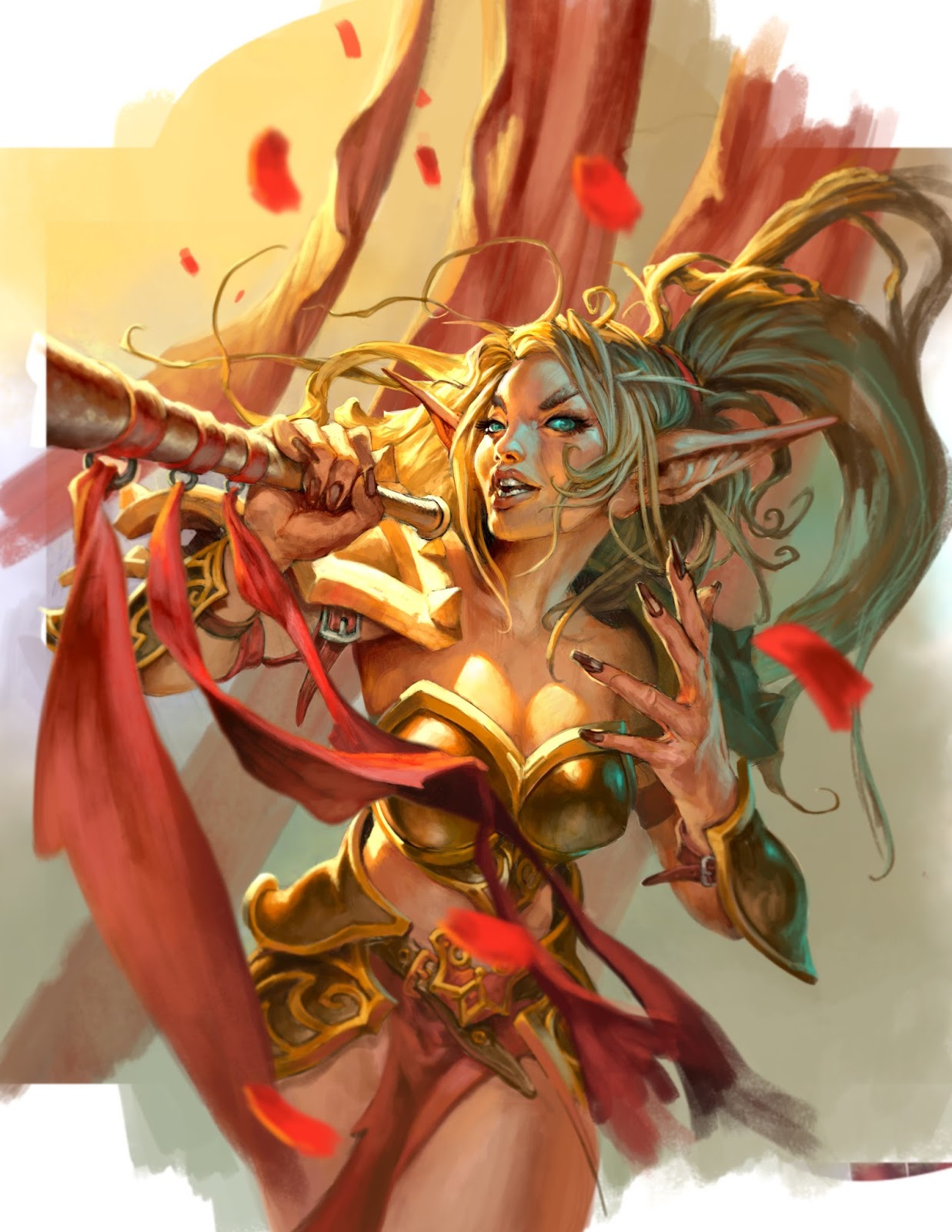
This Monday the new Hearthstone cards for The Grand Tournament were released. I have couple of cards featuring in that expansion, but the one I would like to share is the Blood Elf Commentator.
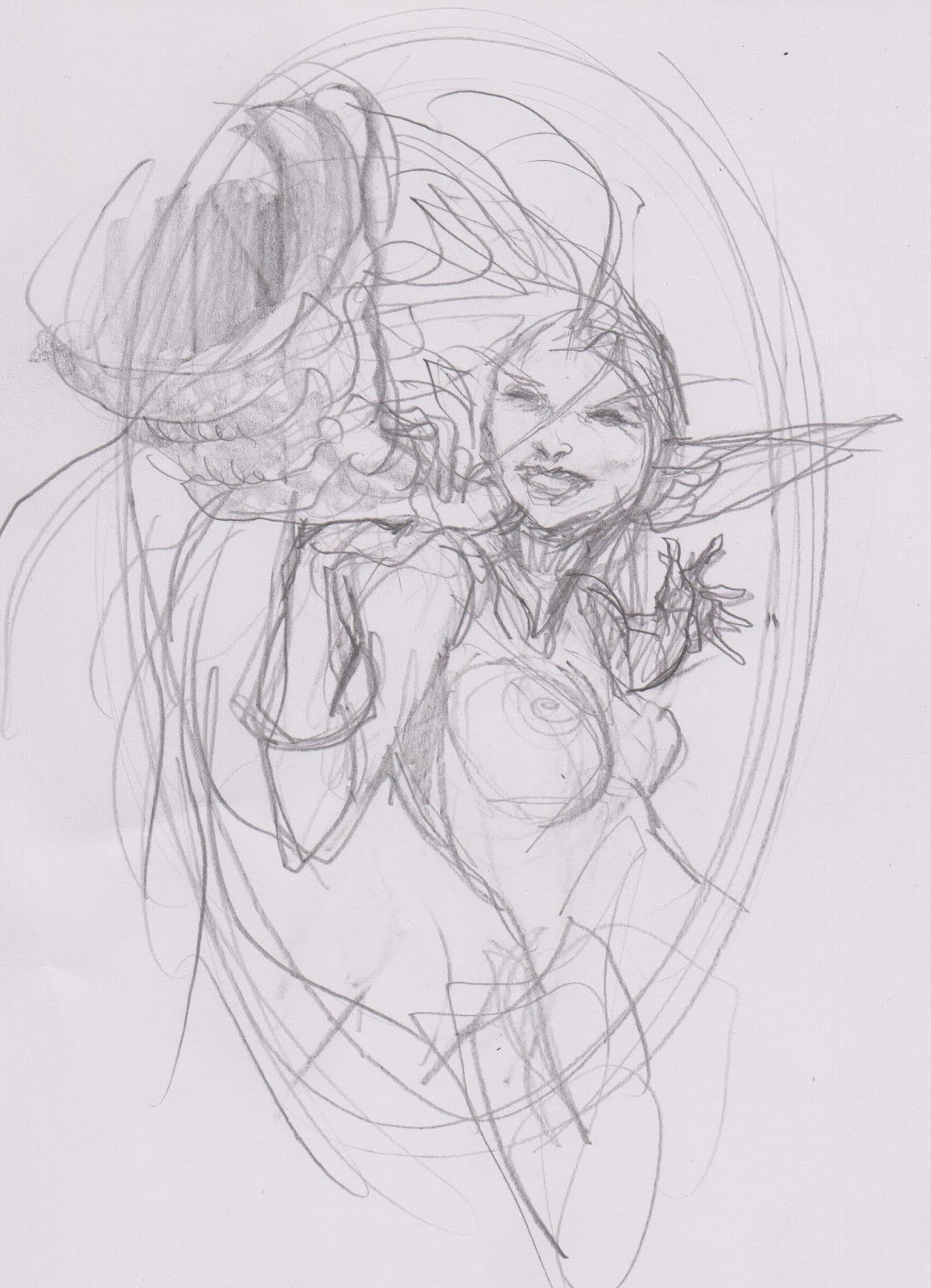
I submitted 3 sketches, with very different moods. The first one is super happy playful and reminds you of a cheerleader.
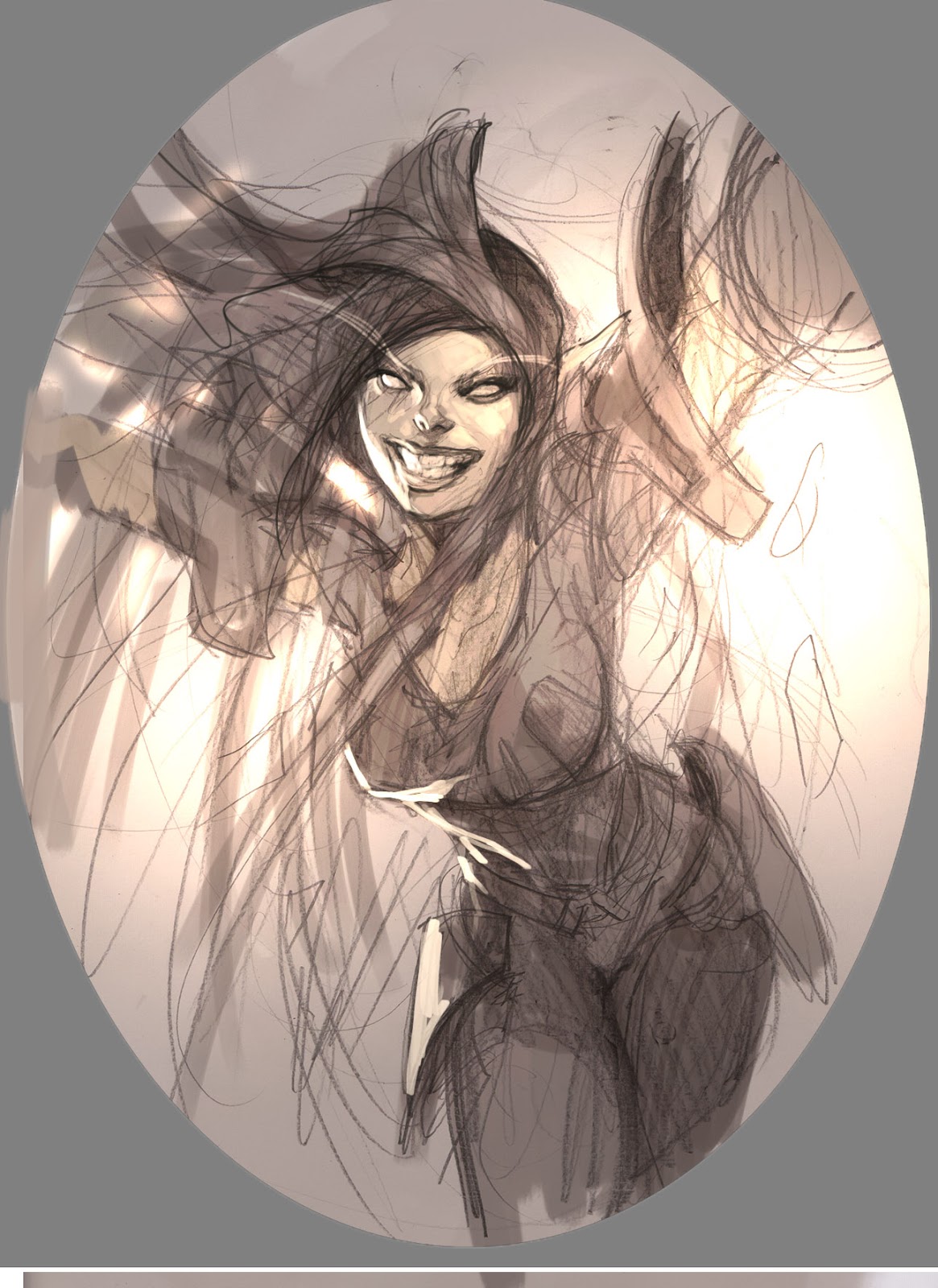
The second is menacing and mysterious as if she is revealing a nasty contender.

For the last one I thought of medeval heralds blowing horns and made a sketch somewhere in between playful and announcing.
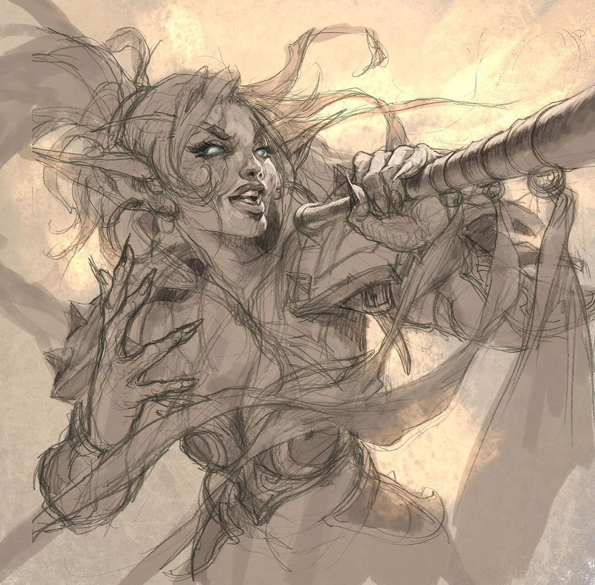
Jeremy Cranford, my Art Director at Blizzard liked that she had the horn/megaphone, so I turned it into a final sketch. I tried to make a beautifully twirled hair shape that kind of encircles the top and used the banners from the horn to frame the bottom. Ever since I was in Prague, and was exposed to Alphonso Mucha’s Slav Epic paintings, I have had a fetish for billowing hair strands and banners. I have found almost no image that wouldn’t benefit from a little added cloth blowing in the wind. it creates a movement that lends life to the picture. Same reason I added some rose petals and some larger banners to the background.
When I started painting I had in my mind a picture that was very bright and happy in colour choice, so I made up my mind to try to avoids darks altogether. I have had difficulty to reach the same level of full on colour in my digital work as I have in acrylics. When painting traditional I have always forced myself to add colours to all areas and leave nothing black ( thanks to a 15 year old advice from Donato ) I have accustomed myself to use colours in all shadows and have fun making up bouncing light everywhere. But in my digital illustrations I start out from solid grey tones. the image seem very strong in values but I have not the same boldness and bravura that I don brush and paint. I seem to make everything too dark and black and leave the shadow areas dead and lifeless. I blame it all on changing media and hope to work my way out of that problem. So when I started this I knew I had to anticipate and deal with dark colours and started out way way lighter than I used to. I scribbled in the pure white rim light and let it go all the way down to enhance the shape of her breasts. I try to use rim light more freely than just on the rim or edge.
As a bouncing environment light I went with a turquoise green that looks almost sick compared to all the orange and yellow. But it really does wonders when you use a cold colour as highlight on top of warm areas like especially the shadow areas in the hair or face. The temperature shift in the skin tones makes it look more 3d than only a warm skin tone would. Remember that skin are moist and reflect easier than cloth.
Really awesome colours and expression(hand and face). you have a great mix between exaggerated and realistic faces that never look to referenced and when you paint elf and other humanoid characters they never look like plain humans but there own race.
also ever since i saw that collab piece you did with Steve i could tell your a lover of Mucha's work to. but something ive realized lately is enough credit isnt given to your drawings, there super energetic and never to stiff even when you show the final drawings
Beautiful! Both the colour palette and the whole image.
Excellent post! I enjoy reading about your process here on Muddy Colors.
Amazing and beautiful! I agree that the neon blue adds a lot to the picture
love this, thanks for sharing.
thx