 |
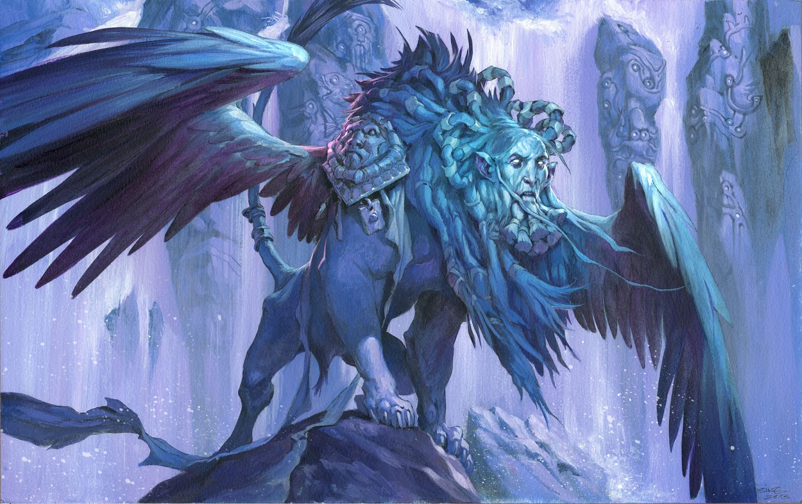
| Clear silhouette, contrast and details around the face, rest is toned down almost fading down to flat shapes. |
article previously about focal point. In the article I compared the painting with a
water surface. You drop a stone on the most important part of the painting and
the ripple it makes, is guidelines. The further out from the center the less
contrast, value, detail level and so on, you need. What I meant is you take away
stuff, so that the stuff left behind has the more impact. It is like a nice
dish; too many flavors and it all falls apart and you do not know what you are
eating.
was sketching an orc for fun. In the process I used the blur tool to even
strokes out since I did not want to waste time rendering. But; as I did so I
was reminded why the focal point is so important. The human eye works like a
camera lense. It can only focus on one thing at a time. So if you equally
render every detail of a panting with the same sharpness or detail, you kind of
ruin the illusion. I always wanted my artwork to be small windows into another
world. In copying the “eye” effect I add to the illusion, that the
image is real. If I dont mimic the “lens effect” my painting looks
flat, more like a symbolic representation. I am not saying at all that my
fantasy paintings looks like reality. But in using this focal rendering idea I add credibility to an unbeliveable universe. And, it
makes people look where I want them to and notice what is important in my
pictures.
 |
| The eye/lens effect |


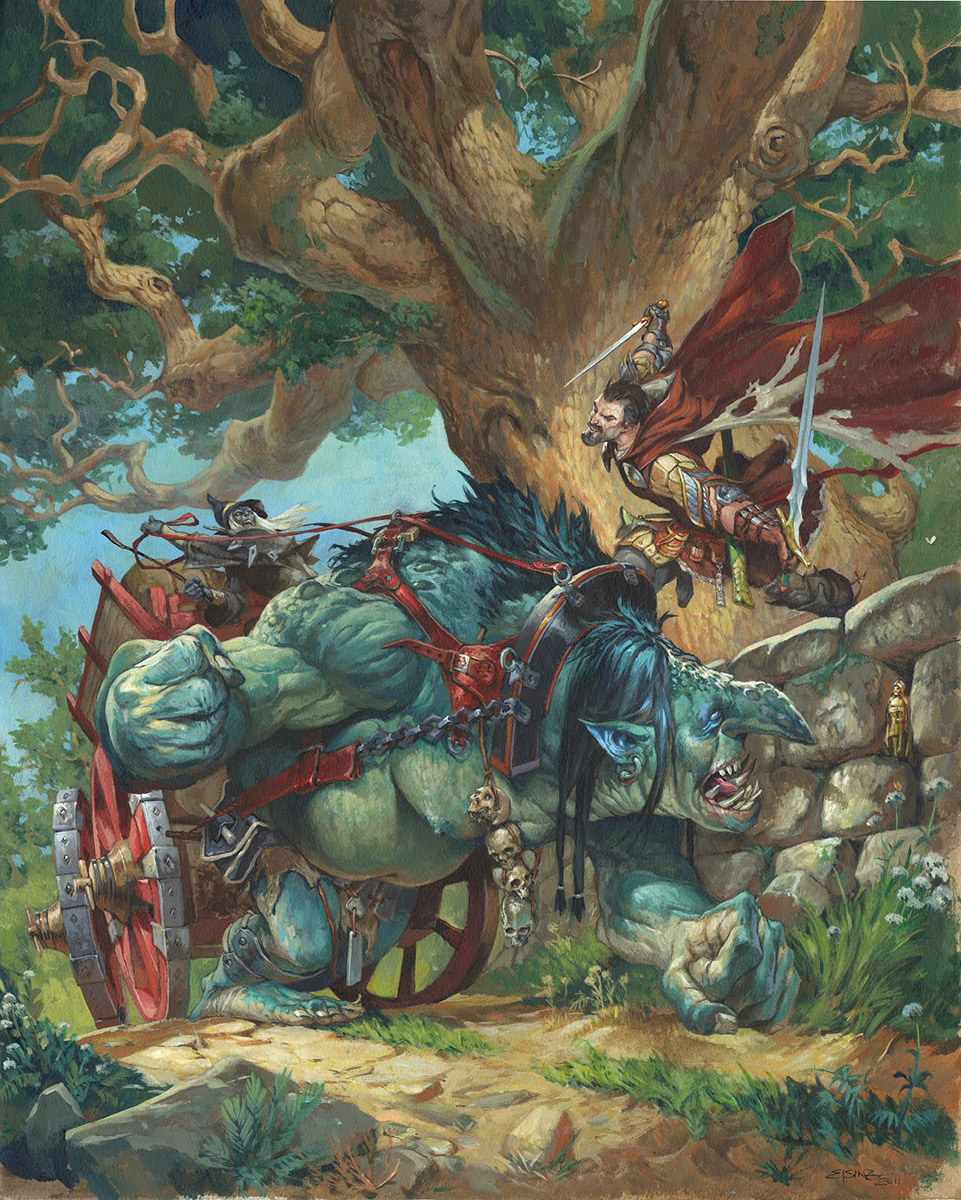
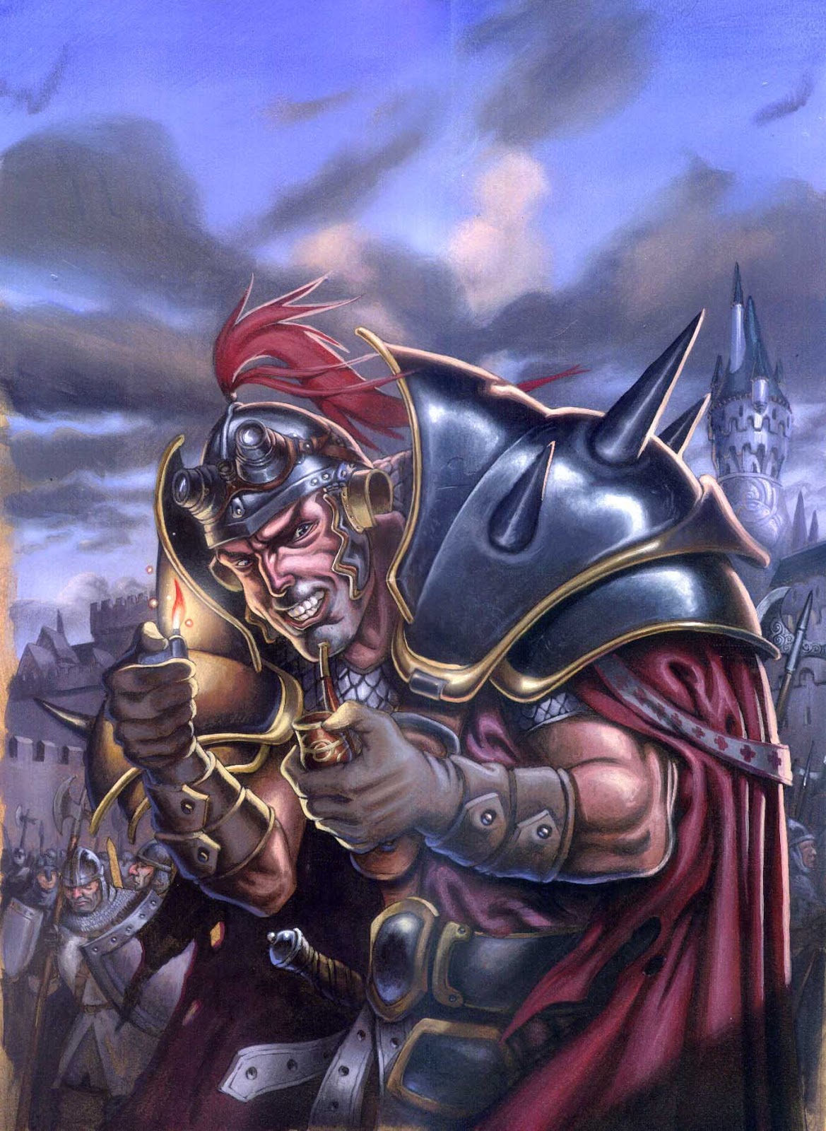

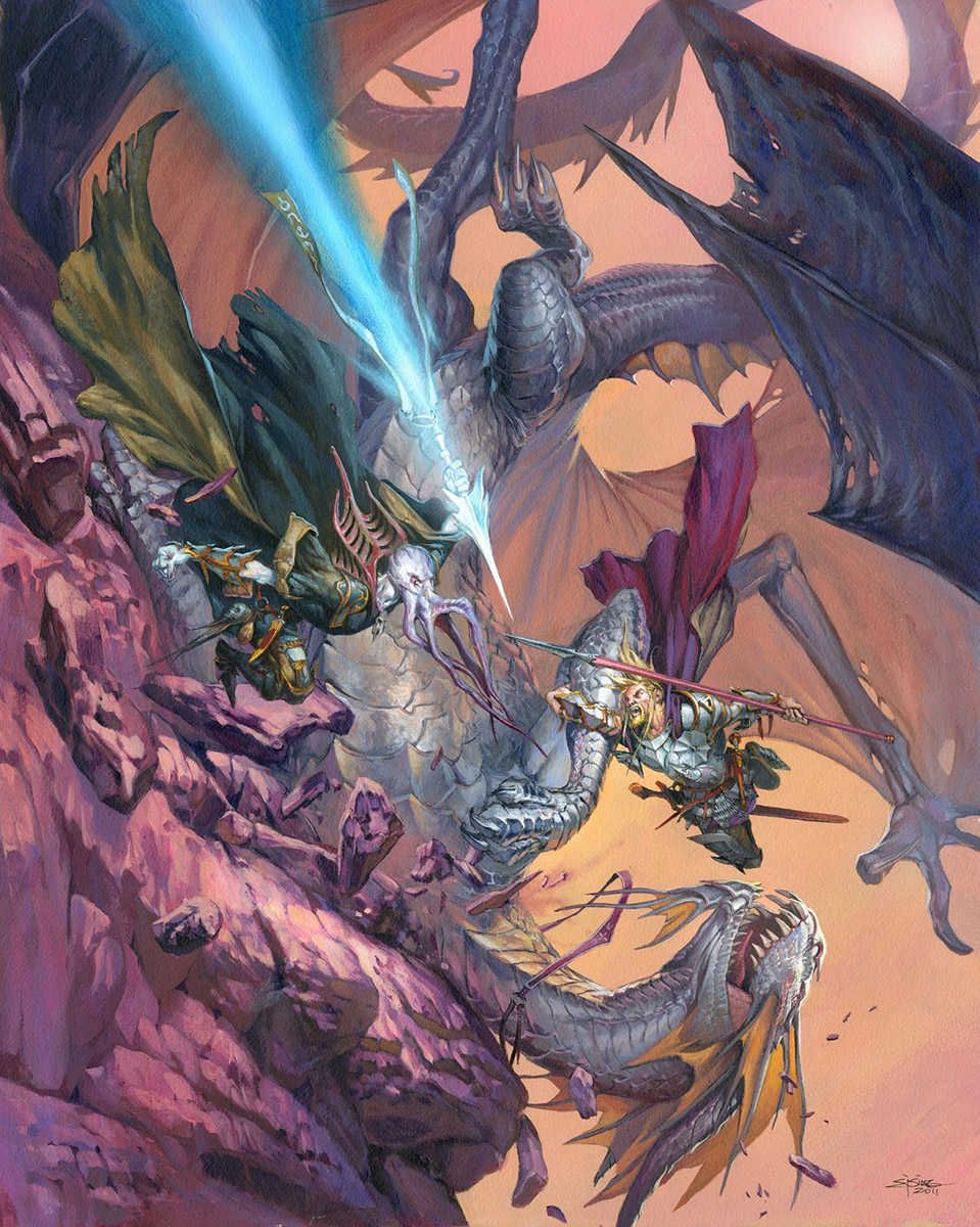
I definitely appreciate a more simplified image than one that is rendered ridiculously detailed. Add detail where you need and where the eye focuses. And then give the eye some rest. I've often felt overwhelmed and lost interest for an illustration that had insane amounts of detail all over the place.
Great post Jesper :)I was always struggling with focal point and I didn't know why. That help a lot
One of my drawing profs got me to see the point of selective detail–“use detail as an intensifier”, he would say–by showing me this lovely drawing of a city seen from a high vantage with its cathedral dominating. The cathedral was highly detailed, as were its immediate surroundings, but buildings became successively more abstract as they approached the edges of the city, until they were simple lines vaguely suggesting structures.
More thoroughly, even obsessively detailed renderings aren't necessarily a flaw or even weaker than planning work with selective detail emphasizing a focal point. In an interview in “Epic Magazine” in the eighties Barry Windsor-Smith made this observation about the Pre-Raphaelites almost accidentally pioneering the genre of fantasy art. One of their tenets called for meticulous observation of nature; you thoroughly paint everything before you. If you're paining a field of grass, you paint every blade of it as best you can, you don't organize it into clumps, as the eye naturally does. Windsor-Smith claimed the result was this dream-like, surreal vision which was not the Pre-Raphaelites' intention, but had a powerful influence on Romantic/Fantasy painters who followed them, including Windsor-Smith himself.
Then too the focal point approach, where detail progressively increases as you approach the focal point, i.e., the artist's planned point of interest, assumes the viewer fixing his attention eternally on that one area, which is no more how we naturally see than is taking in all details nature presents to us with equal weight. Our eyes are constantly darting around, taking in this detail, then that detail, constantly shifting perspective. Cubism tries to capture this aspect of how we “actually” see, with intriguing results.
I think what I'm trying to get at here is exaltation of detail, suppression of detail, depending on what you're going for, it's all good, but any approach is only going to at best approach the actual experience of seeing.
I agree with the comment, give the eye some rest. Most Portrait photograph need to be relax and comfortable, it will be show when you give your eyes a rest. Consider its contrast to produce a better color and light of the image for a good result to make it distinguishable.
I agree with the comment, give the eye some rest. Most Portrait photograph need to be relax and comfortable, it will be show when you give your eyes a rest. Consider its contrast to produce a better color and light of the image for a good result to make it distinguishable.
http://www.photoeditingcompanymarketing.com