-By Donato
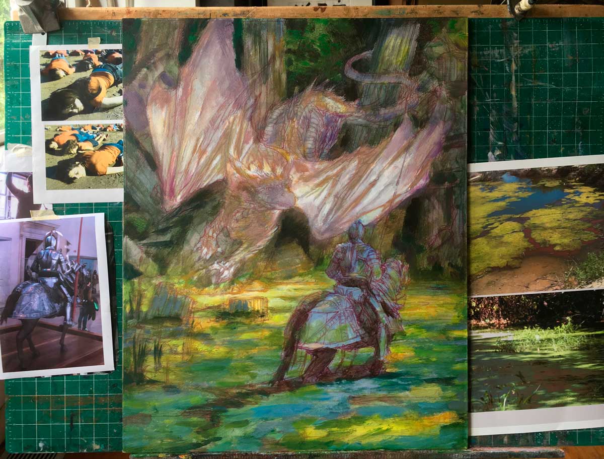 |
| St. George and the White Dragon Donato Giancola 24″ x 30″ 2017 progress Private Collection |
Sampling from good, tight reference requires a nimble and aware mind. Far too often an artist may become over enamored with the precision and beauty of their various forms of photographic references, mimicing and slavishly copying what is present in them as visual ‘facts’.
The truth is, photographs offer just one interpretation of reality, on par with the way a scribble or quick study captures information. Admittedly there tends to be an extensive level of detailed information regarding light effects, value, and structure within a high resolution photograph, more than what most artists need for their reference uses. Yet there is also information on a subject that is also not captured. It is for this reason the artist must selectively choose and cull from the references that which they deem relevant to fulfill the needs of their artistic expressions.
This painting of St. George and the White Dragon offers and excellent example of the various levels of sampling used to constitute the painting as a whole.
 |
|
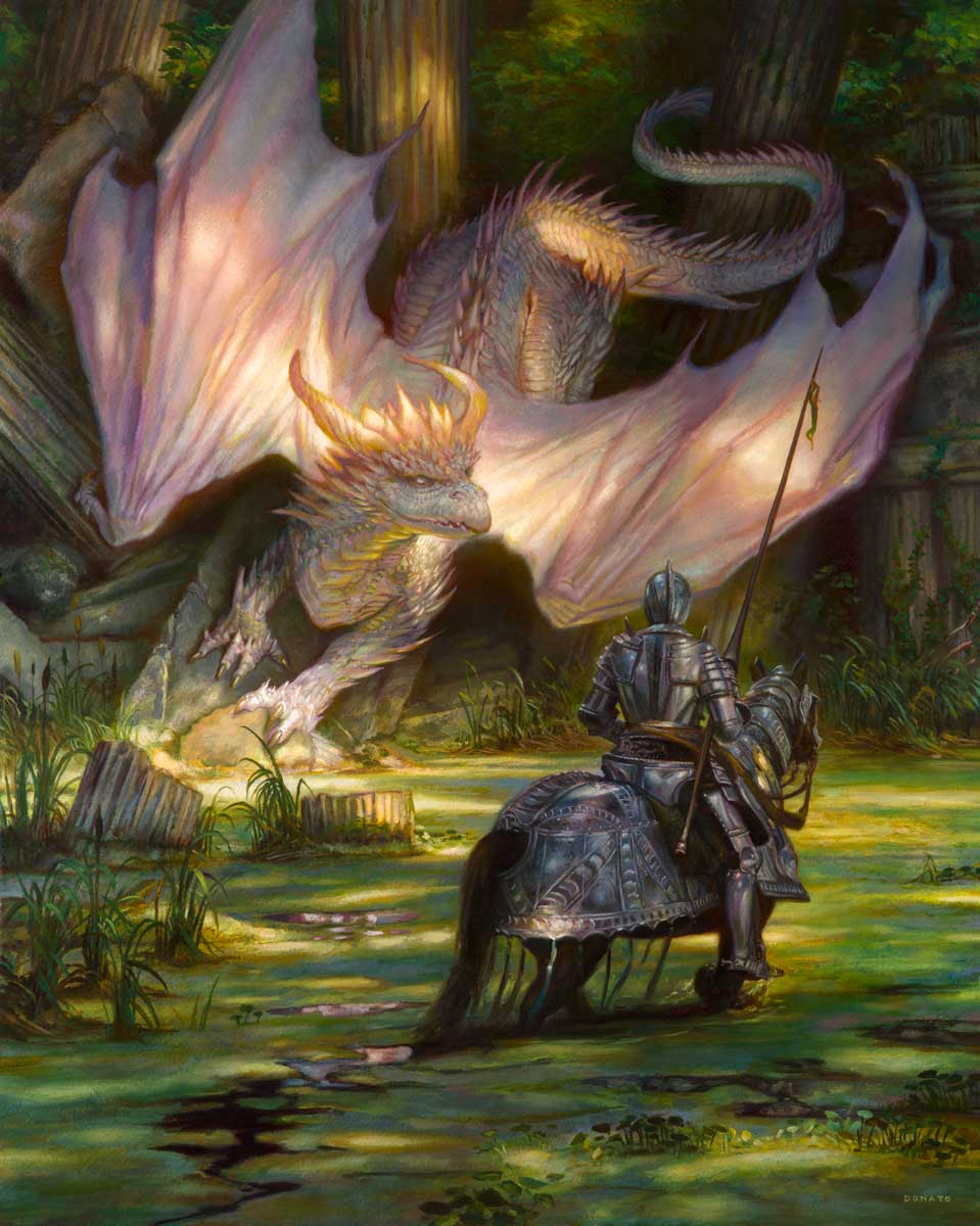
| St. George and the White Dragon Donato Giancola 24″ x 30″ Oil on Panel 2017 Private Collection |
The painting began, as nearly all my works do, with studies in abstract value and shape relationships as small thumbnails within my toned sketchbook.

Once I had settled upon the vertical composition, I began to gather visual references to inform the evolving concepts of the image. Various details needed to be resolved from the type of armor for the knight, to the style and anatomy of the dragon, and details of the swamp environment and background. The fact that this was a personally inspired work opened up greater freedom in how I could resolve so many of the issues and keep them malleable long into the final drawing and decision making process.
 |
| St. George and the White Dragon Donato Giancola 18″ x 24″ Chalk and Pencil on Toned Paper |
I nearly always create a final preliminary drawing before stepping into the oil painting process. Anatomical structures, precise placement of objects, overall design, lighting and movement are coordinated on a toned paper ground with pencil and chalk.
Following are some of the key references use to execute this painting.
Basically the knight is the most referenced object in the image (outside of the swamp grasses and surface algae). The figure is a composite of approximately six different photographs taken over the years of the armored knights at the Metropolitan Museum of Art in New York City. These knights and their mounts make great models as they never need to take a break!
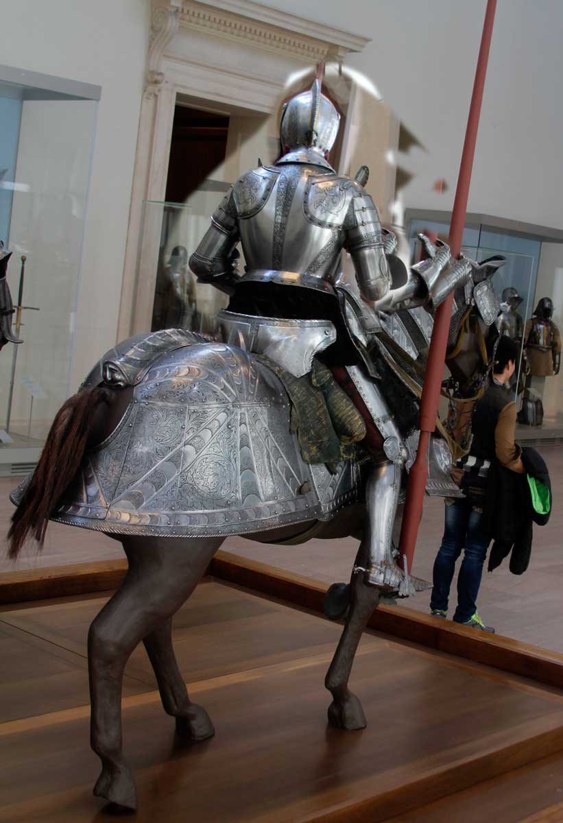
At a quick glance, a naive eye would state I just copied the photograph for my art and that is that. While it is true I did copy certain aspects of the photograph, there is a world of difference between what wound up in the painting and what was provided for in the photographic montage. I have provided a side by side comparison and a list to clarify. Please note that all of these changes were conscious decisions, requiring careful observation and manipulation.
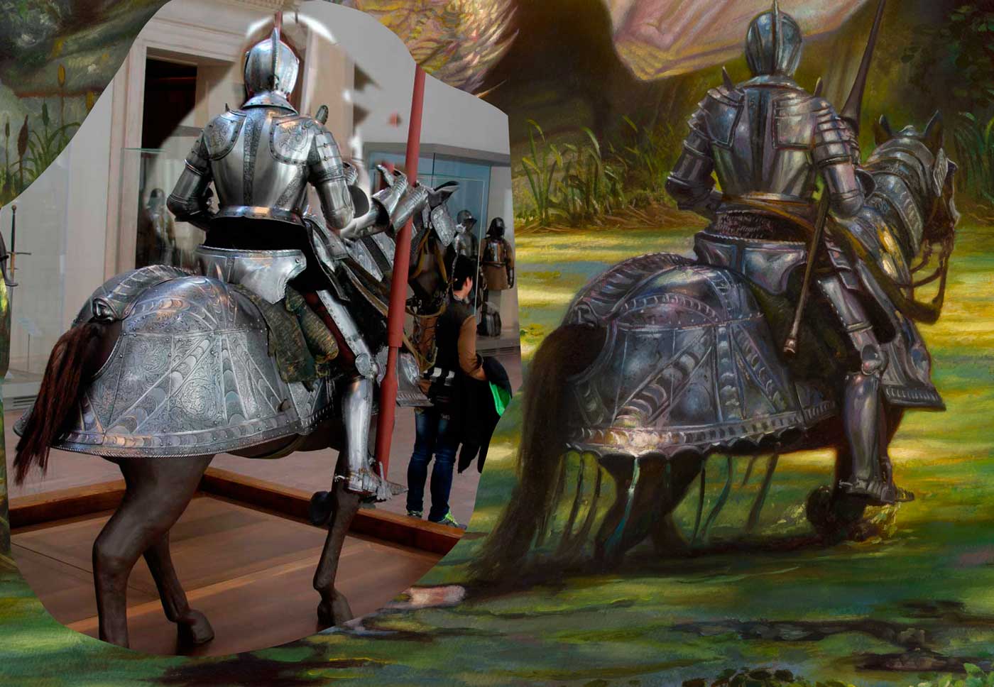
1. Overall darkening of the light on the knight and horse to change the visual effect of front light to that of a backlit subject as required in my lighting situation within the painting.
2. Enhancing and adding to the hot spots on the knight and horse’s armor to turn them into dappled light effects to marry with the references I had of swamps and my intentions within the final art to create an overall dappled light visual effect.
3. Lift the horses head to face in towards the dragon and environment, leading our knight forward rather than off to the right. Creating barding and straps and reins for the horses head.
4. Adding the lance and darkening the saddle fabric to allow the lance’s pommel to stand out in greater contrast.
5. Straighten up the posture of the knight, not as slouched forward.
6. Adding to the silhouette of the horses legs, splashing water, and small, wet trailing ribbons from the horse’s armor.
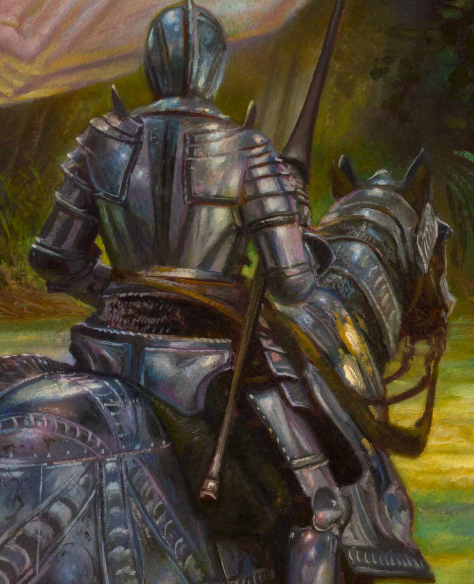
7. Hinting at reflective greens of the environment into the armor and creating greater contrast by adding purples in the half-light shadows.
8. Selectively dropping off the brightness of the knight’s foreleg to allow the light to concentrate on his upper body. Likewise dropping his helmeted head into shadow for similar effect.
9. Amplifying the blues in the shadow areas of the duckweed on the water to marry with the cooler blues of the knight. Adding traces of purples into the duckweed for the same.
10. Create halo color saturation flares around the knight and horse to enhance the back light effect and more effectively integrate the figure into the imaginary environment.
11. Avoiding over embellishment of the etchings on the knight’s armor so that the greater concern of value and color may be realized for the painting.
And there are other more subtle decisions made both consciously and unconsciously as I paint.
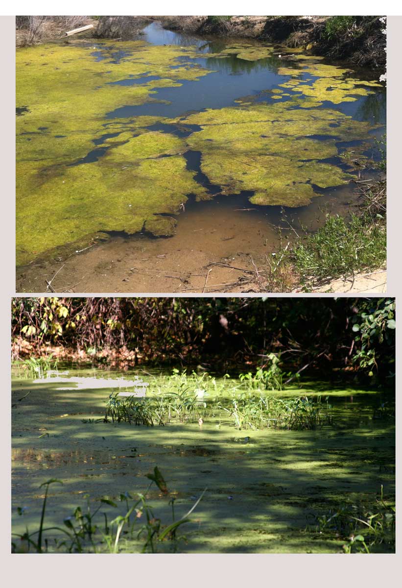
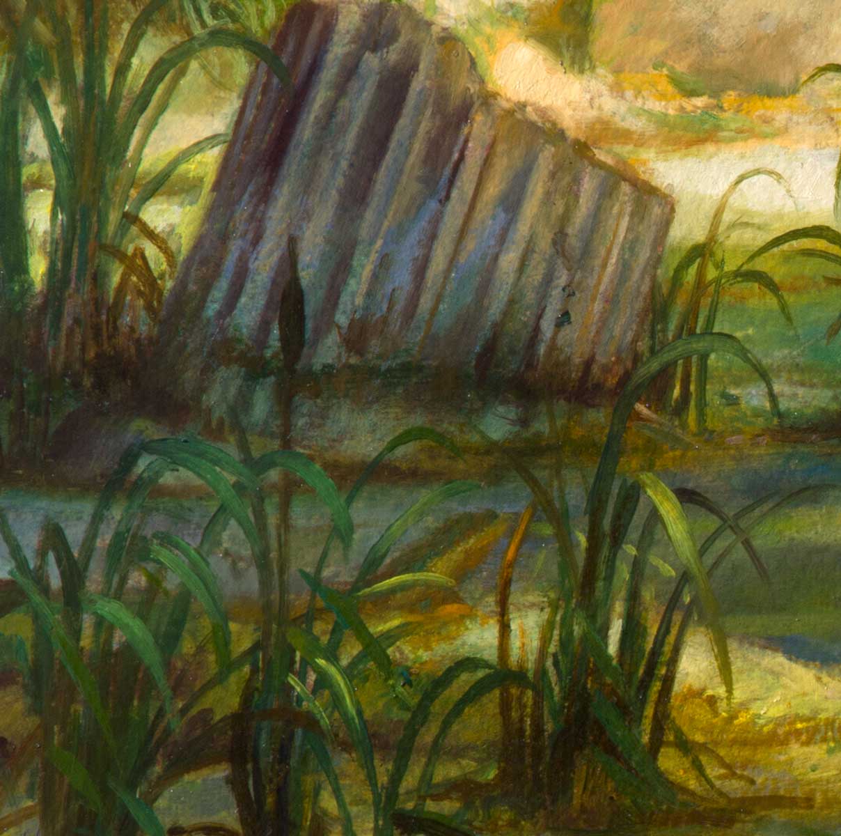
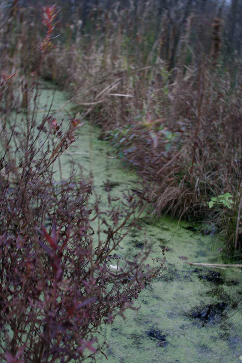
The same is true on how I manage selective sampling from my background swamp references which were taken years ago as inspirational source material, never knowing when they may be put to use.
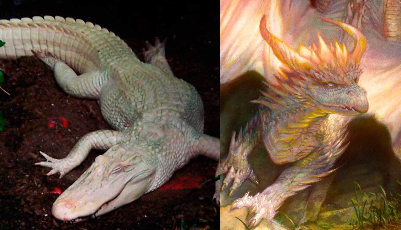
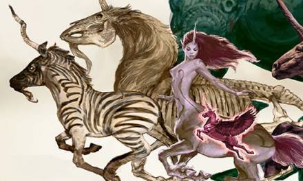
The greatest leap was creating a dragon from this albino alligator (google image search references). As you can see, there are some hints at color cues coming from the photograph, cool shadows, pink,warm lights, but it is a major leap to move from that slumping reptile to the dynamic , organic beast which becomes the dragon. That is a career’s worth of lessons in action drawing, anatomy awareness, color exploration and design. I’ll focus on what we can discuss today…
Thus while the knight is heavily referenced, I needed to strike a balance in how much detail to sample from those photographs knowing that I had an imaginary beast to create. Adding too many hard details for the knight would create a disparity with what would be going on in the dragon, given I needed to make up nearly every element of its anatomy and lighting effects.
Utilizing similar concepts of cool and warm lighting on the dragon, coupled with dappled light effects, help to create harmonic visuals sympathetic to what was going on in the knight and his immediate surroundings. These dynamic visual effects effectively merged the two spaces together while I let color and value provide the contrasts necessary for a dramatic presentation.
Nearly every step of development of my work relies upon observations typically supported by reference materials, but I am hyper aware not to let those materials become my decision making process. Without the initalizing ideas from the photographs and life, I would not have as nearly complex nor as coherent a finish to my paintings.My references help breath life into my concepts, but it is not what gives them their soul.
That last element is what an artist brings to the table before the reference is sought, and is what fuels the power of an artwork after all the puzzle pieces are brought into alignment. That is something much harder to teach and achieve…
Limited Edition Giclee Prints of this image are available:
Very helpful for those Instructors like me out there attempting to reinforce good work habits to illustration students.Thanks. Nice use of the Met's Knight. (I too have referenced these knights.)
Great painting! Love the breakdown on this as well, and how you used your reference.
Very insightful post, and as always a great painting. Your metal and armor have always been killer. Thanks, Donato!
Thanks so much for sharing! It's great to see what specifically you take from a reference, and what you leave behind. That's something I struggle with, especially when using multiple references because the final product sometimes won't blend together as a whole.
Fantastic article, thanks so much for sharing. Its wonderful to see a bit of your process. And what are the chances, I used that exact same lovely albino alligator in one of my own dragon paintings recently 🙂 Not that I could ever measure up but still, it was a nice surprise to see someone else looking at the same things I do lol. Thanks again for the insights, and for your art. Its a huge influence and inspiration to me, especially your robot series. The depth of meaning in the narratives, the details, all those wonderful colours and surfaces… Thank you 🙂