Unstable is a set for magic that explores the silly and funny side. It is not a tournament legal format, but is meant only for casual, fun play, and therefore the style and world is a lot less serious and way more twisted than what I am used to paint for Magic the Gathering. The best thing about Unstable is that I was a part of the art team that created the visual style guide for the set. I had the honour of creating some of the main characters and exploring the design of goblins and creatures.
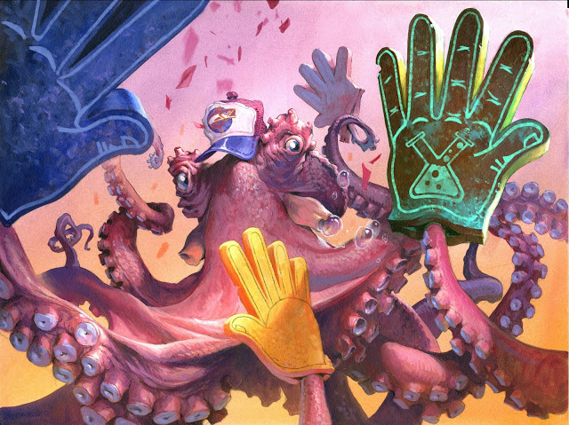
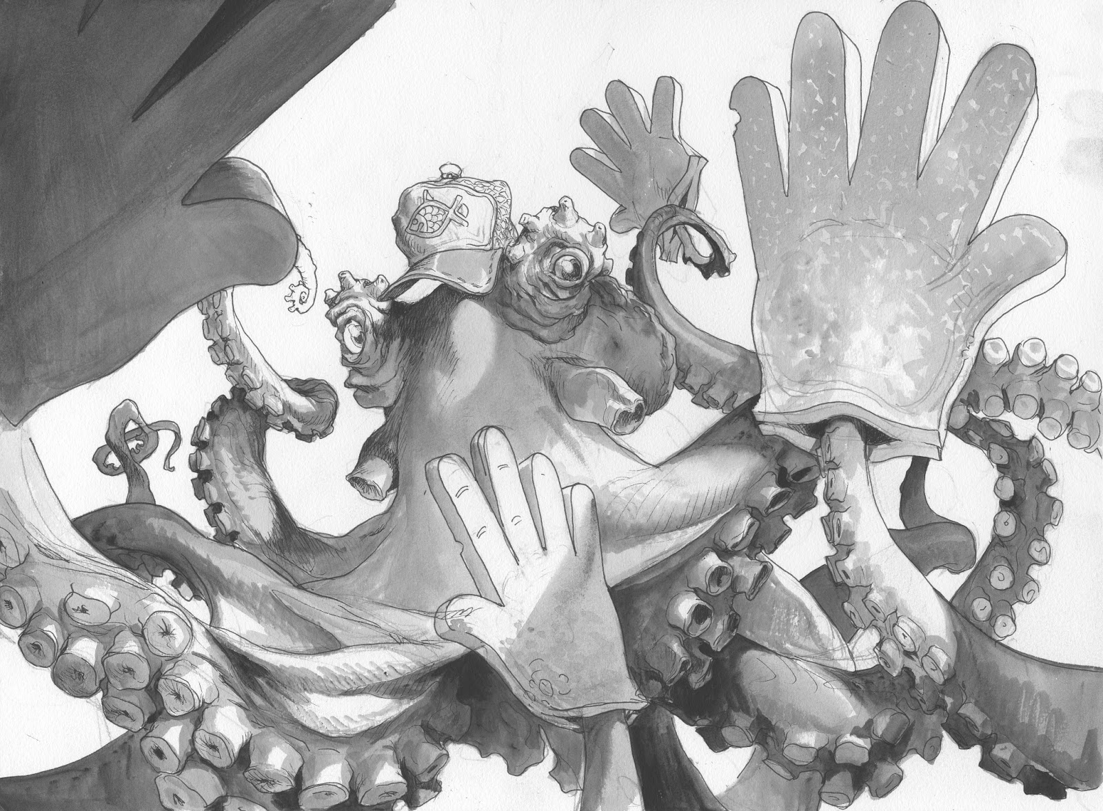
So when I was asked to do a high-fiving octopus wearing a baseball cap and foam hands for a magic card, I was not surprised.
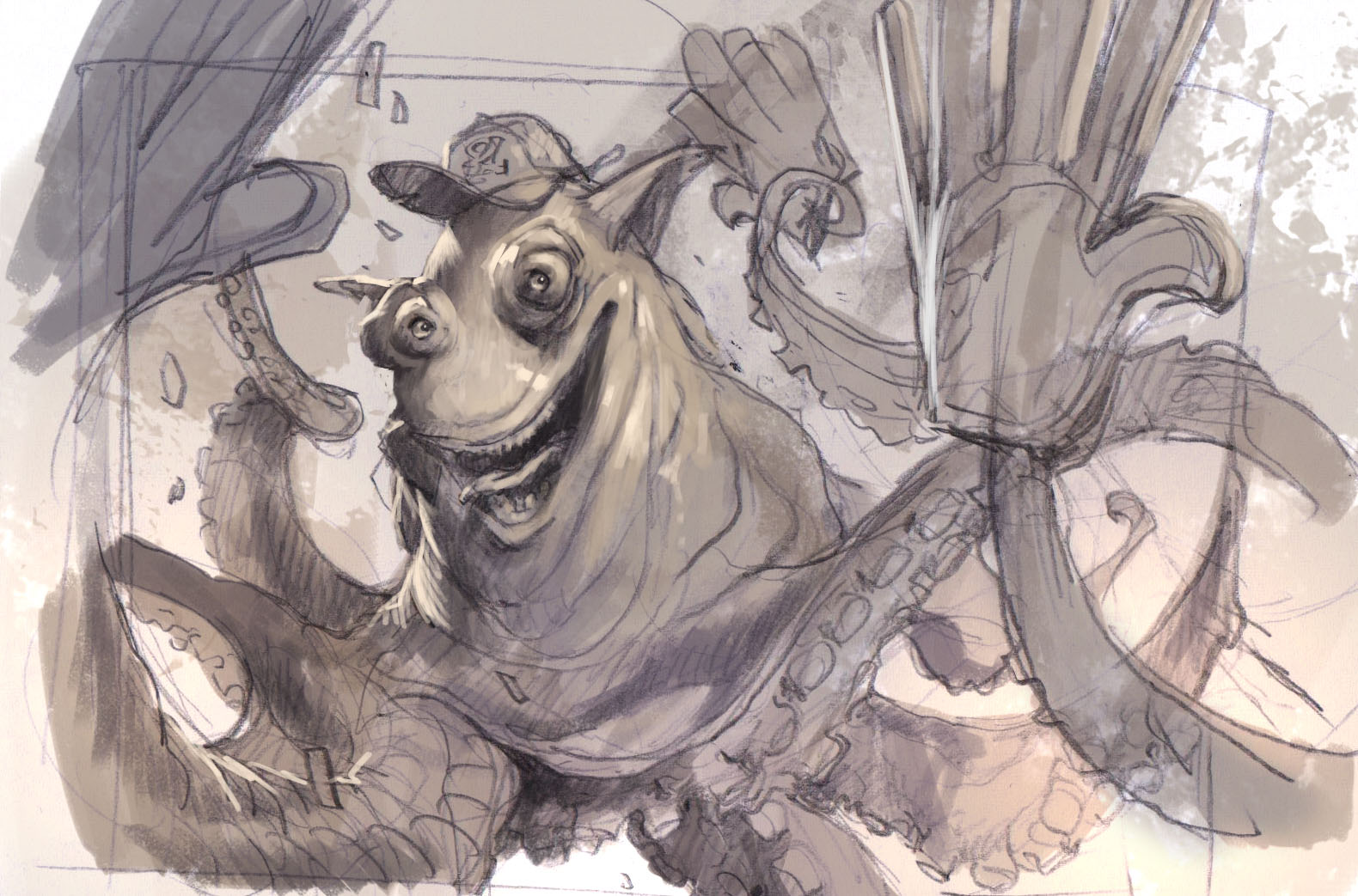
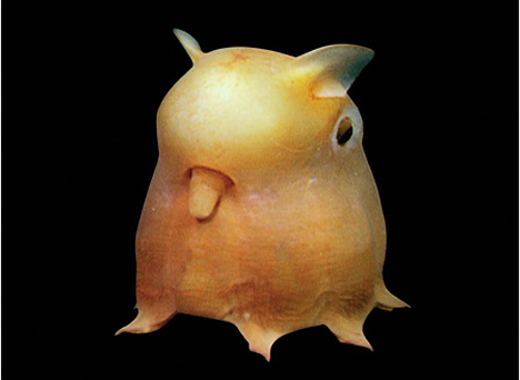
The 2 sketches I ended up with is very different. The ref I got for the octopus was a strange little thing that looks like it have a mouth on the side of the body instead of underneath and in between the tentacles.
ref
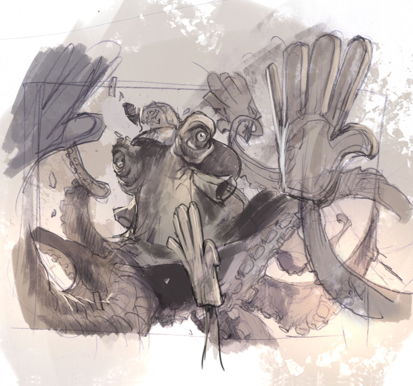
As you can see on the sketches I had a choice to make. The version I did using the ref did not look like an octopus, but rather like a slimy goo-like creature with tentacle arms. So I submitted a more ordinary octopus with no mouth and instead I tried to capture the emotion and personality and happiness in the eyes rather than a big smiling mouth. Happily Dawn Murrin, my art director agreed and I continued with the mouthless version.
The thing I concentrated on the most in an illustration like this is depth. Since the figure is a boneless creature with arms all over the place I knew it would get confusing. Also in zooming in and cropping the image I also knew I would end up with a messy mass of arms and elements with no ground connection to stabilize the reading of the figure in the environment. So the composition needed to be clear and readable. I try to think of the image in three parts: Ultimate foreground, middle ground and background. The ultimate foreground is nice to use to create a sense of a snapshot. When having something big, like the blue hand to the left in the picture it reminds you of a camera image capturing a scene in a split second, an image where you cannot coordinate the photo as you can in a Still Leben. I always think that ultimate foregrounds tend to do that: make a more snapshot like image and I rarely use it in covers or scenes where I need to capture grace or elegance or majesticness. This image has none of that. Next is the middle ground. I tried to frame the face with the foam hands to have the maximum focal point being the eyes and face of the octopus guy. The arms I adjusted so that they are both going into the picture and reaching out towards us, to create a sense of depth. The suction cups I used as a surface line since they are placed evenly. The way the arms twist and turns is a great way of showing movement and to show dynamics.
The whole background color I deliberately chose to add as just a fading wash all over the picture. I kept the background clear of elements in order to have the read of the figure as clear as possible. I was supposed to do a scene on the spectator seat of a baseball game, but decided not to add a bunch of figures to the background. I am sure we would not have been able to read the figure had the scene contained much more than it has now. The confetti flying through the air is an attempt to show the wipe of a baseball game.
I especially like the details of the bobbles blowing out of his tube-like thingies ( I did not know octopus had that, but found them on some of the references I used for the tentacles ) It is a detail that mixes well with the confetti and the happiness of the scene. It reminds me of blowing bobbles at a fare or something and it makes him look more playful and happy.
In the final I changed the fish on the hat from the Christian fish symbol to a sport fisher logo instead.
Jesper Ejsing was born in Denmark in1973. He first discovered fantasy through the works of Tolkien and got introduced to D&D on Christmas Day, 1986. Skipping through the pages of the rulebooks, he set a goal for the rest of his life: He would become a fantasy artist. He would make a living illustrating things that live only in imagination... one way or the other.
He studied Danish literature and Art History before quitting University for a freelance artist life. The early years as a fulltime illustrator meant drawing anything for money. Soon he weeded out the assignments that weren't historical, and after a while all he did was fantasy art.
When he finally got his first assignment for Dungeons and Dragons it was 20 years since that Christmas when the goal was set. He struck out on a journey, stubbornly, and at times ignorant to the realities of life, and 2 decades of traveling has finally brought him home.
Jesper Ejsing still lives in Copenhagen Denmark, with his 2 sons and wife, Lea. Along with paintings, he has written numerous books. "Jarvis – the Sorcerer's Apprentice" is the only one translated into English.
iGenicson15 Types of CompositionThis was such an interesting post—thanks for putting it together! Just wanted to share that I’ve been using iGenics lately, a…


Recent Comments