While I was in London for the Magic: the Gathering Grand Prix tournament in January, I had the chance to go a few galleries. Of course I have to share some of the highlights! A real gem was the Guildhall Art Gallery. If you haven’t been, definitely go when you next get the chance. I took photos of lots of the paintings, but most were behind glass, making it tricky get good shots. For those that either weren’t, or were in a good place to take some pictures, I managed to get some shots to share with you.
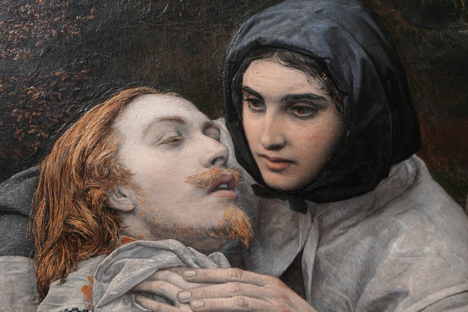
I have always loved the following image, The Wounded Cavalier by William Shakespeare Burton. When I first saw the image some time ago, I guessed that it was by Millais. It has the same meticulous attention to detail, especially in the organic elements. It also has the tiny, noodling brushwork like Millais, see the hair of the cavalier or the lichens/moss on the tree trunk. It looks like the poor fellow has been done in, his face nearly drained of blood. At least he has the gentle touch of a kind passerby to help him slip away. I also wonder if the butterfly, resting on the blade stuck in the tree, isn’t a religious reference to resurrection. It was a common symbol in Victorian times. The man in the back, maybe a Puritan?, looks as if he wants little to do with the man. Or maybe he is repulsed by the violence or death before him?
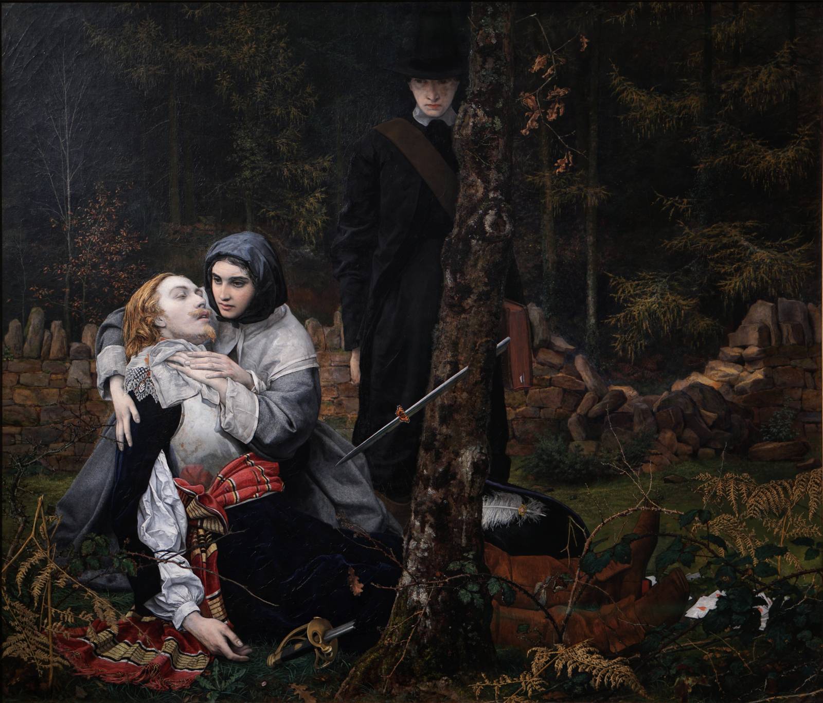
The orange blood on the handkerchief around his neck made my wonder if Burton didn’t paint with a fugitive lake pigment and it has lost some of its color. Maybe not, but interesting. You can also see where he painted over some hair at the top of his head, making a correction, but the raking light shows the adjustment.
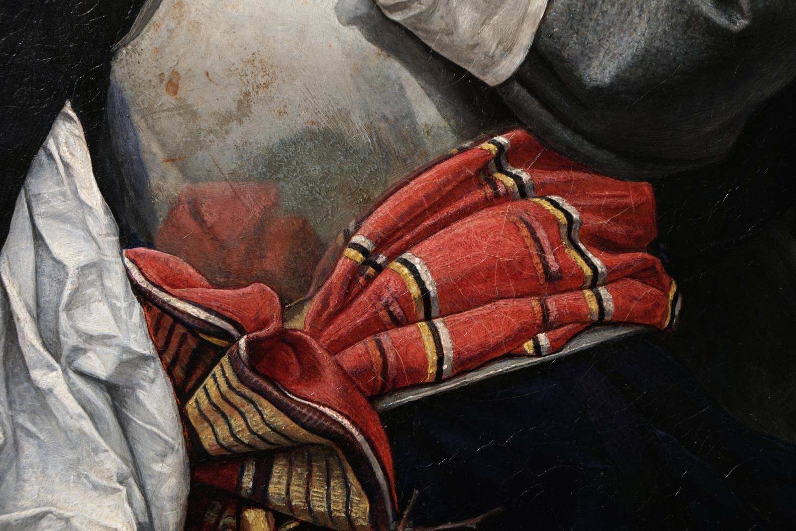
The surface of the armor is amazing. I love the bits of impasto, glazed over and wiped off the tops of the paint to give it some relief. The spots of rust and blemish on the armor also lend to it’s realism and are handled perfectly.
This piece was very striking in person. Hugh Goldwin Riviere – The Garden of Eden. Be sure to right click and open these images at full size. I love how simply the dew, or remnants of rain on the branches is conveyed. Little lenses focusing the light through them. Look how quickly and simply the branches and twigs of the tree are rendered. If you squint, or step back you can see the scrubbed and scumbled hints of buildings in the fog behind the branches.
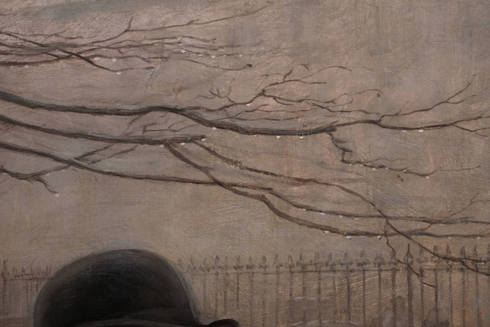
There is something about this woman’s face that is so appealing, as if she is frozen and moving at the same time. She is masterfully rendered with beautiful soft edges and a few hard edges here and there. Compare the hard edge on the left side of her collar, to the very soft edge on the other side. As you move around her head and face, take note of the edges and how the affect the form. Would you make the same decisions or handle them another way? 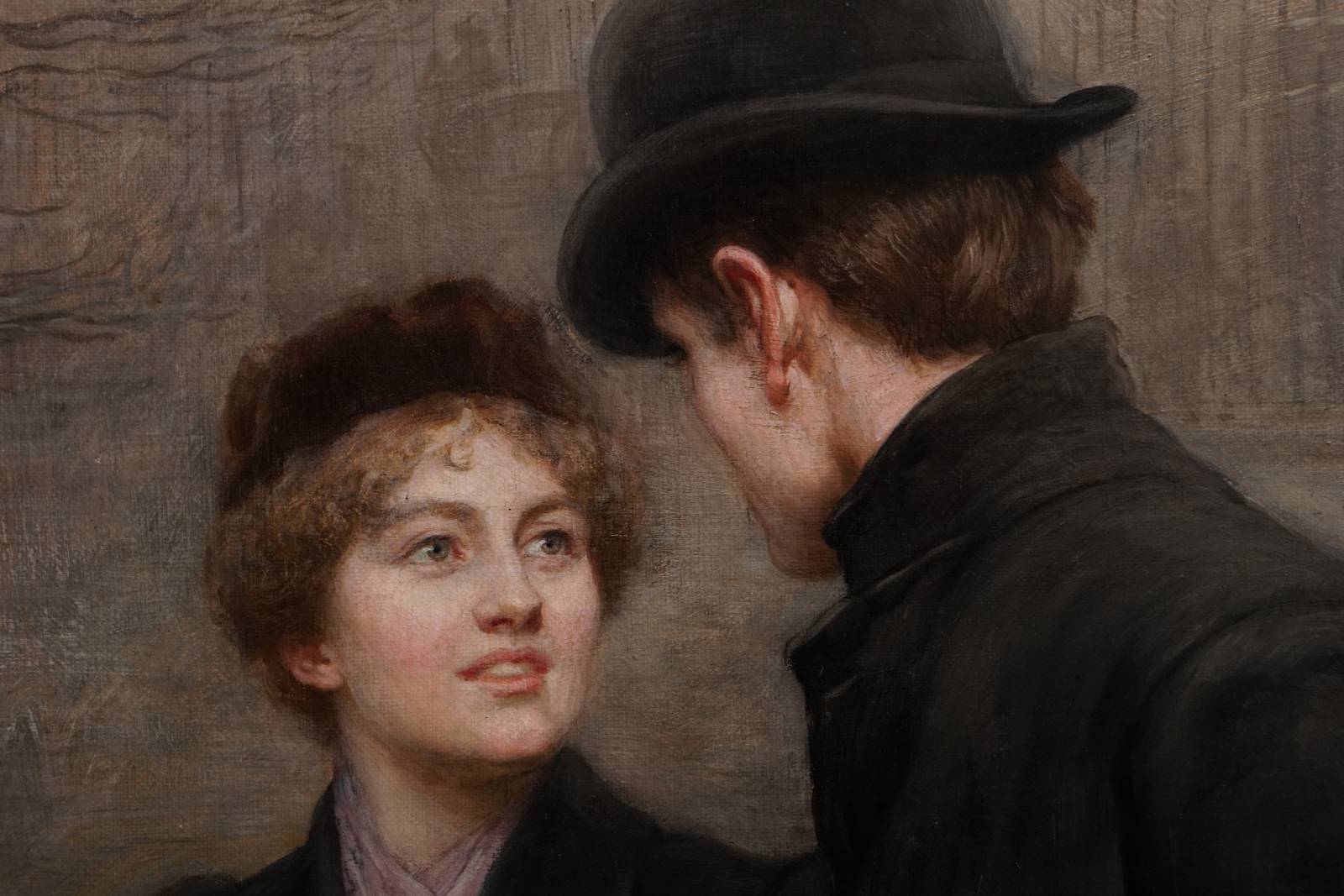
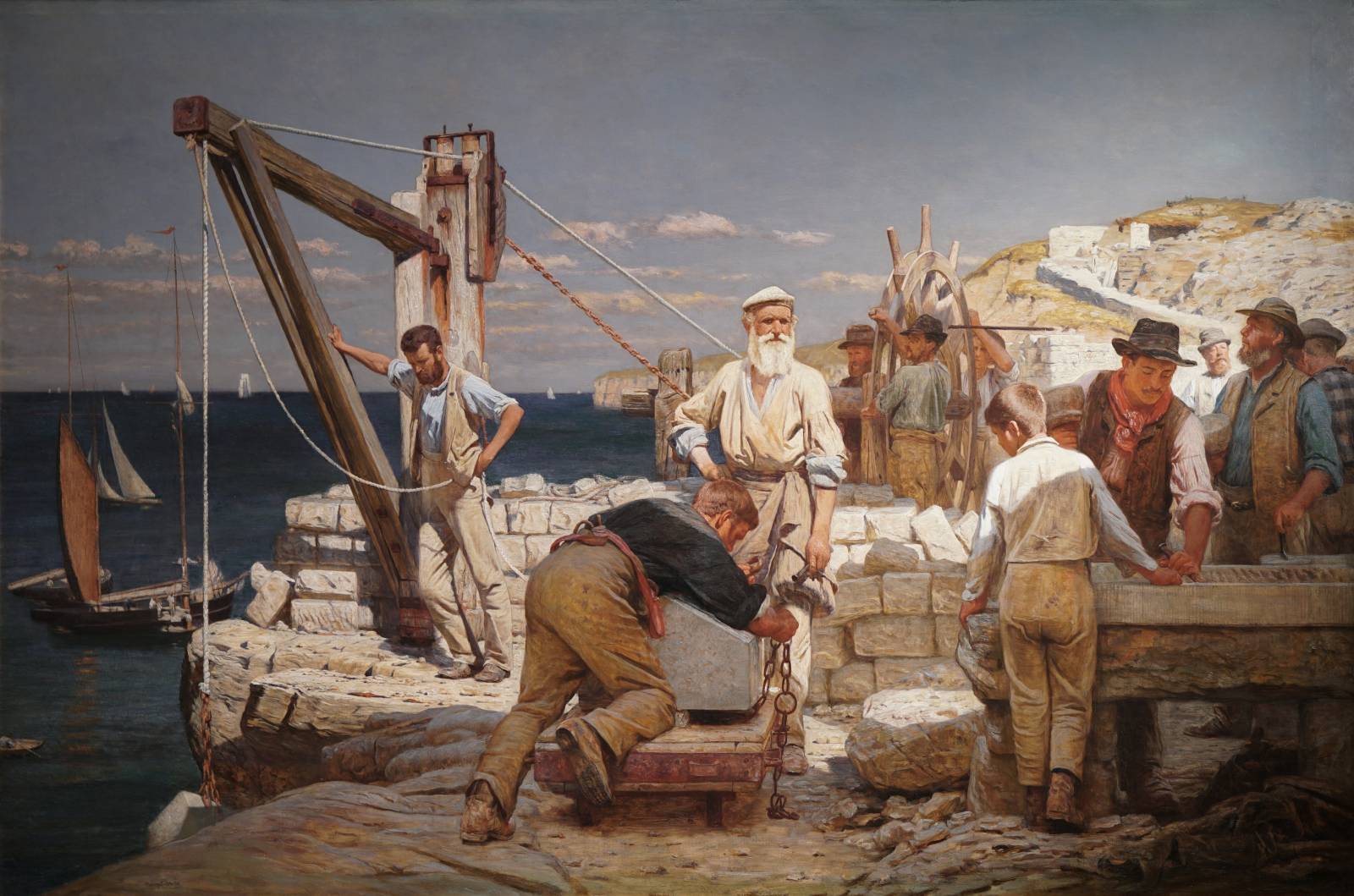
The piece below, Henry Tanworth Wells – The Quarrymen of Purbeck, was up high on the wall, so this image has had it’s perspective corrected in Photoshop. Still, I think it ended up a pretty decent capture. I love this painting. The sense of light and form, especially on the old bearded guy in the middle, is wonderful.
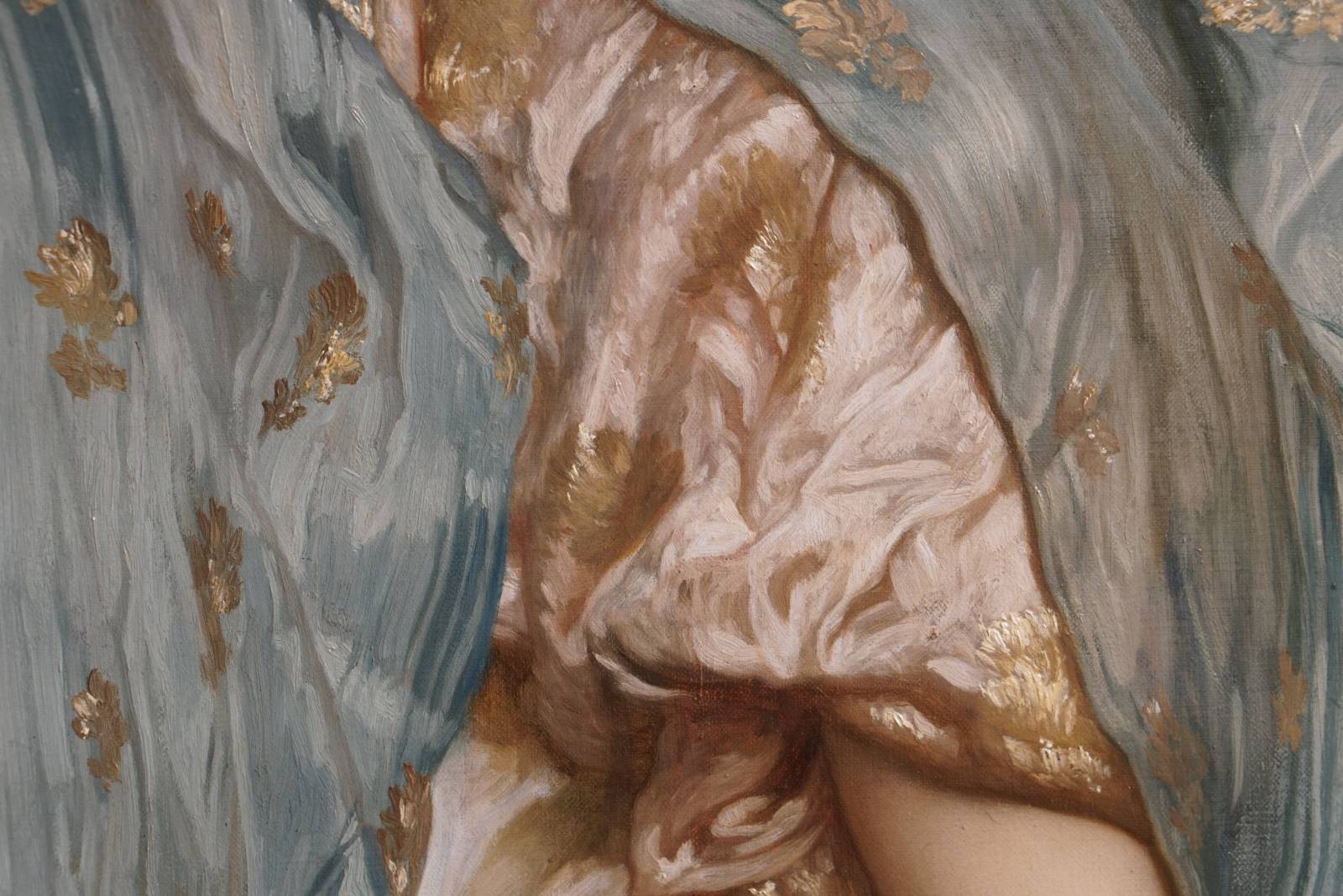
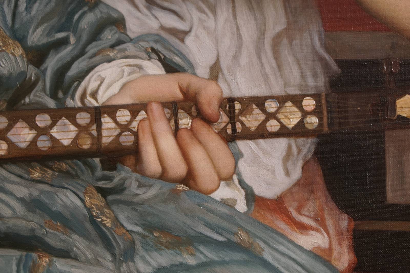
I am a big fan of Leighton, definitely in my top 5, so I was seriously excited to see this painting in person. Frederic Leighton – The Music Lesson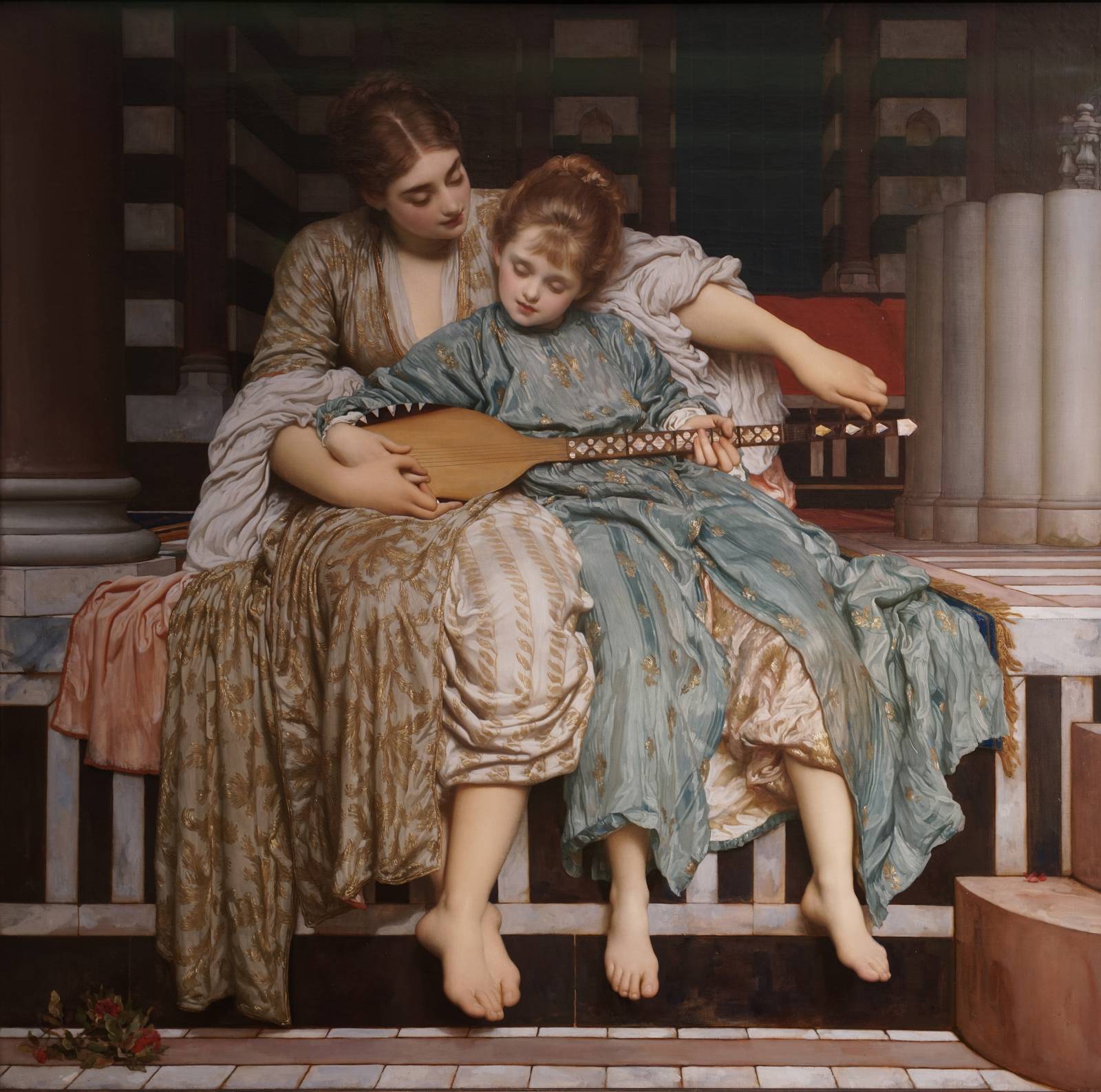
Look at how loose the brushwork is on this fabric, at least quite a bit more so than it appears in the small reproductions I have seen in the past.
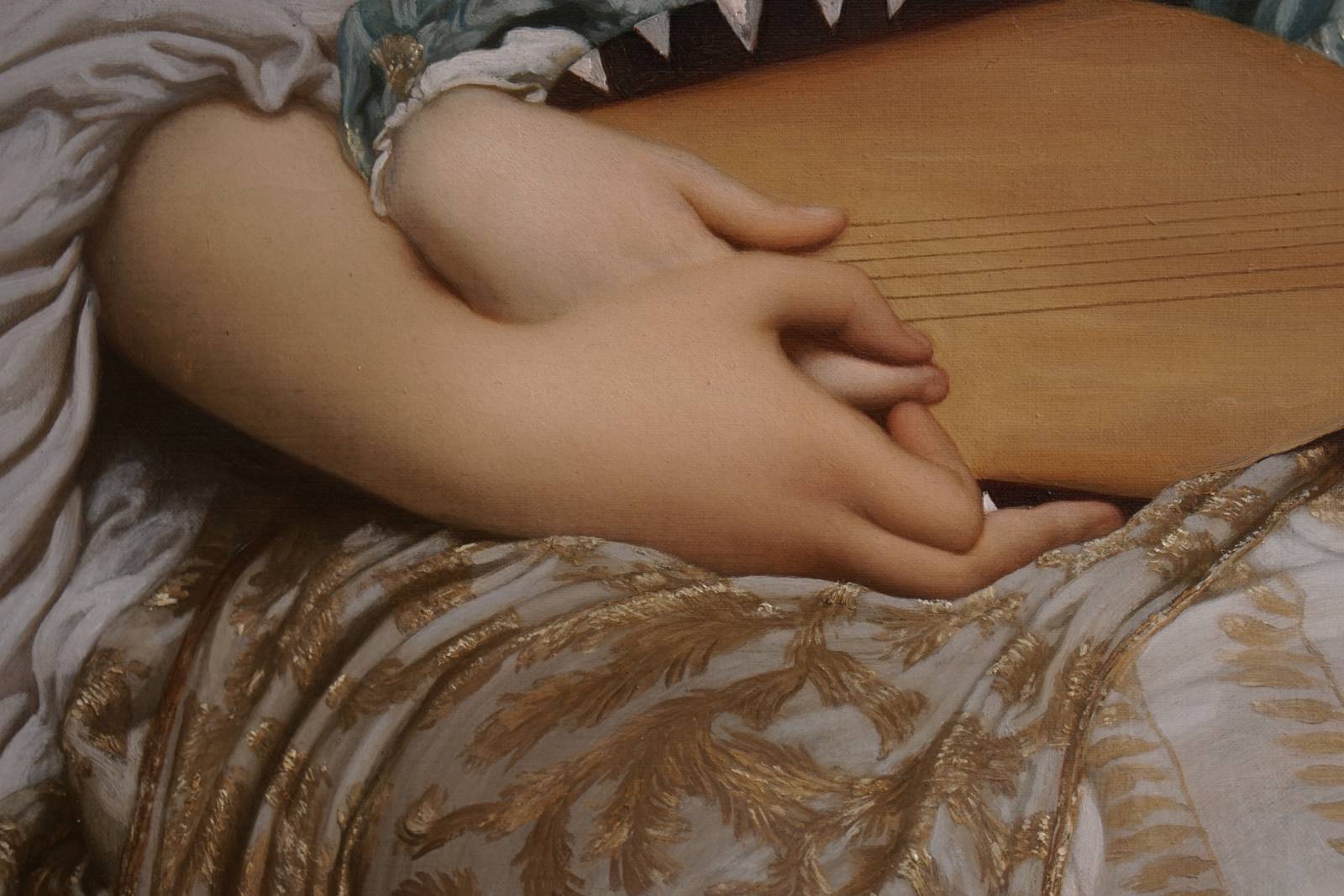
Photos don’t do Leighton’s handling of skin justice. His idealized and stylized anatomy is so soft and refined.
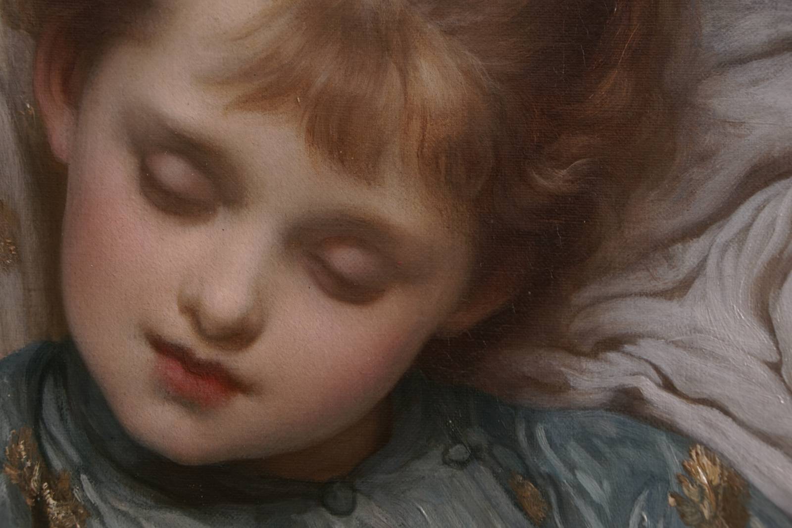
I actually don’t like the face here, not as a portrait, but I do love the handling of the hair as it blends into the forehead. Almost like fine diffuse feathers, rather than hair. There are only a few hard lines in there and just a hint at that.
I love this hand. Leighton removed almost all surface indications of bone beneath the surface, but still managed to keep a structure under there.
Another great detail. The temperature shifts on the fingers is beautiful. I also admire the very subtle changes in value to indicate planar changes in the fingers. It’s barely a quarter of a value change, if that, but it does the job.
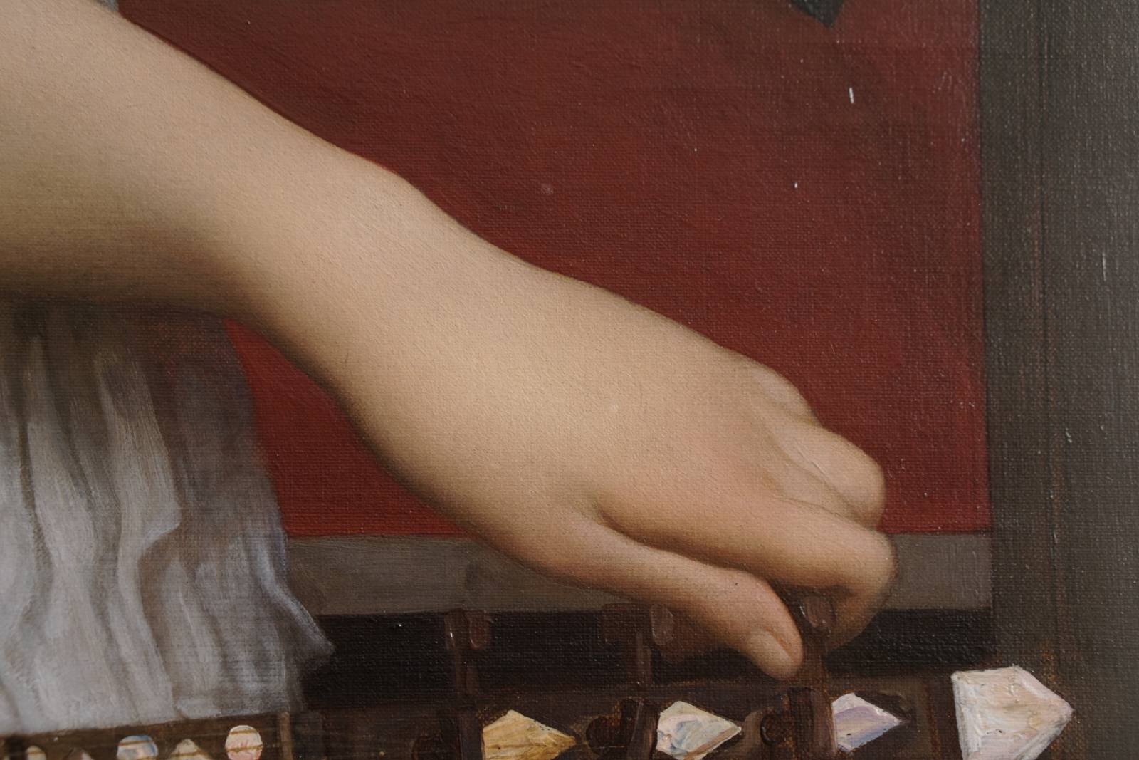
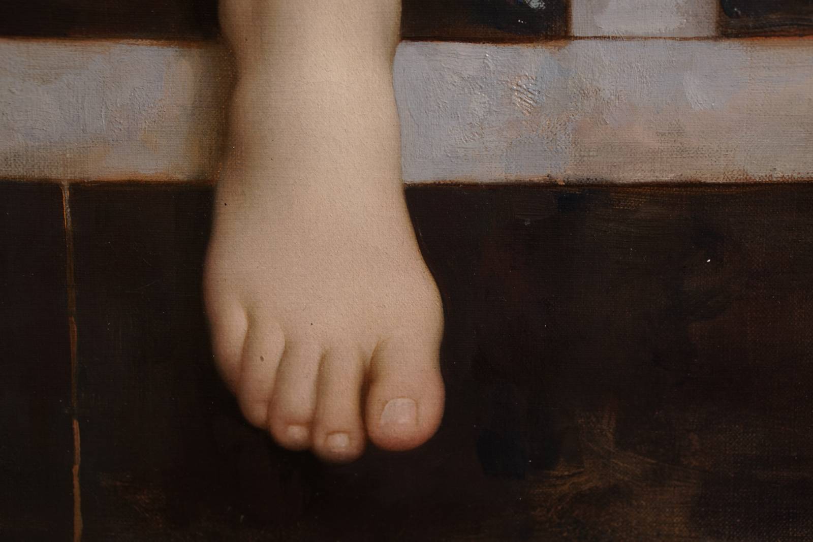
Let’s end with this foot. Also notice the thicker, heavier textures on the stone. Some of the imprimatura is showing through in places while in others the paint is thick and opaque.
Thanks for giving the post a read and hope you opened the images up all the way to see the details!


Thanks, Howard. I love that kind of work, too, so this was a treat.
Thanks for commenting and for taking a look at the post, Richard! This is definitely the kind of work that gets my artistic adrenaline flowing.
My favorite parts about your articles are you pointing out why you like them! I wouldn’t have even noticed the dew drops on the branches I think. Really makes them come alive, seeing them through your eyes.
Thanks, Dana! That makes me happy. I love looking at art, reading about it, and talking about it. It makes me happy that it is meaningful to anyone else. 🙂 Thanks for giving the post a read and for commenting!
Thank you Howard! <3
Great Wright up! This has been one of my favorite paintings for the last 25 years! I always took the young lady to be the brash young Cavaliers love and the priest to be there to administer last rights. The scattered playing cards and broken blade in the tree tell of a drunken game of cards gone awry. I always imagined the other cavalier, the one that slew him in the heat of drinking and cards to have been, if not a friend, at least someone he knew. Presumably both were drunk and boisterous (as is the way of young cavaliers) and that things went too far. To me, this painting always spoke of another young cavalier that fled after a regrettable moment of passion. One who at the very least had the decency to let a priest know that a man was dying. The priest in turn informed the young mans betrothed who has come to ease his passing. The priest watches as she holds her dying love. To me, the butterfly represented the quiet peace returned to the scene in the aftermath of violence.