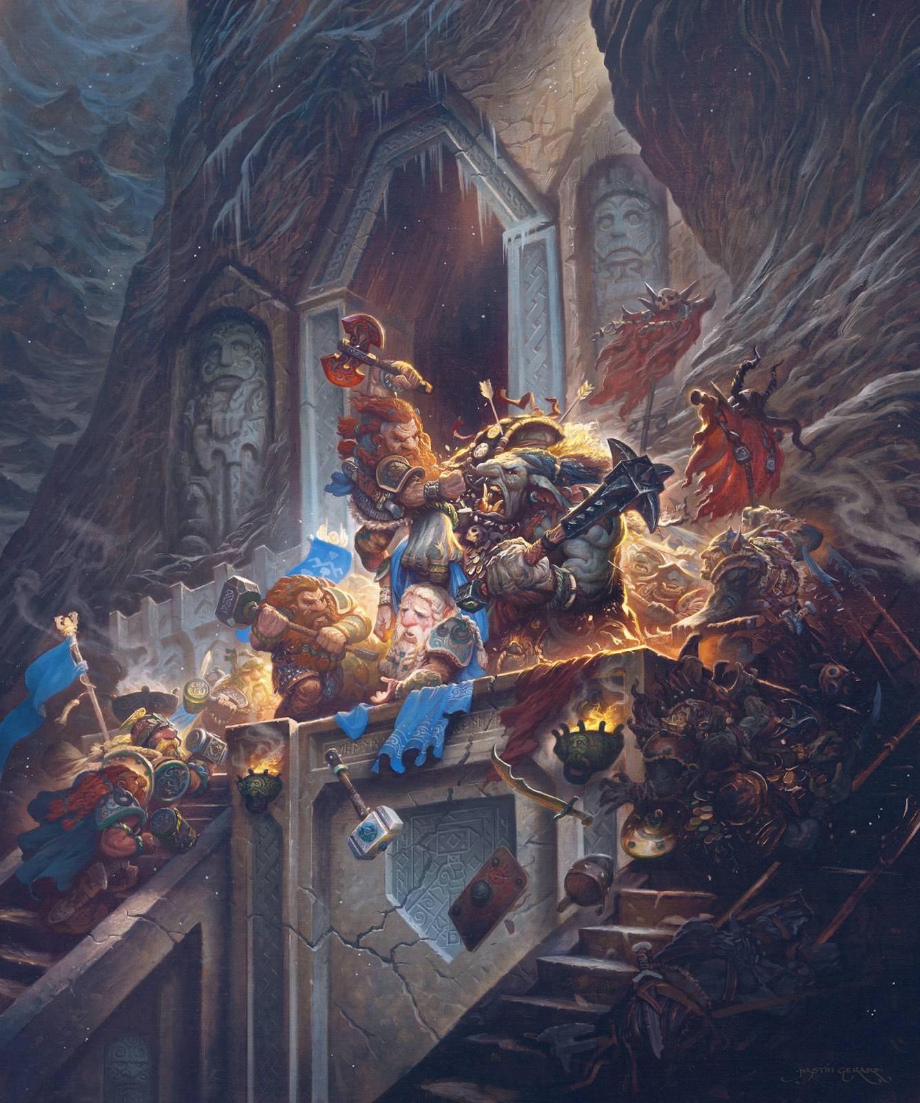
Welcome to Part 2 of Dain vs. Azog! Or as J.R.R. Tolkien referred to it, The Hobbit: Mortal Kombat. Today, I’ll be going through the process I used to paint this image in Photoshop using opaque tools and layer modes, instead of my usual bag of transparent layer mode trickery.
If you haven’t read part one from this series, you can do so here.
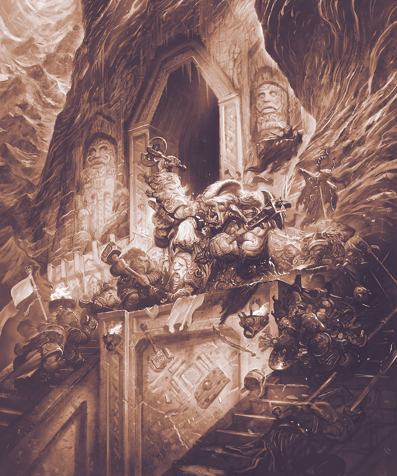
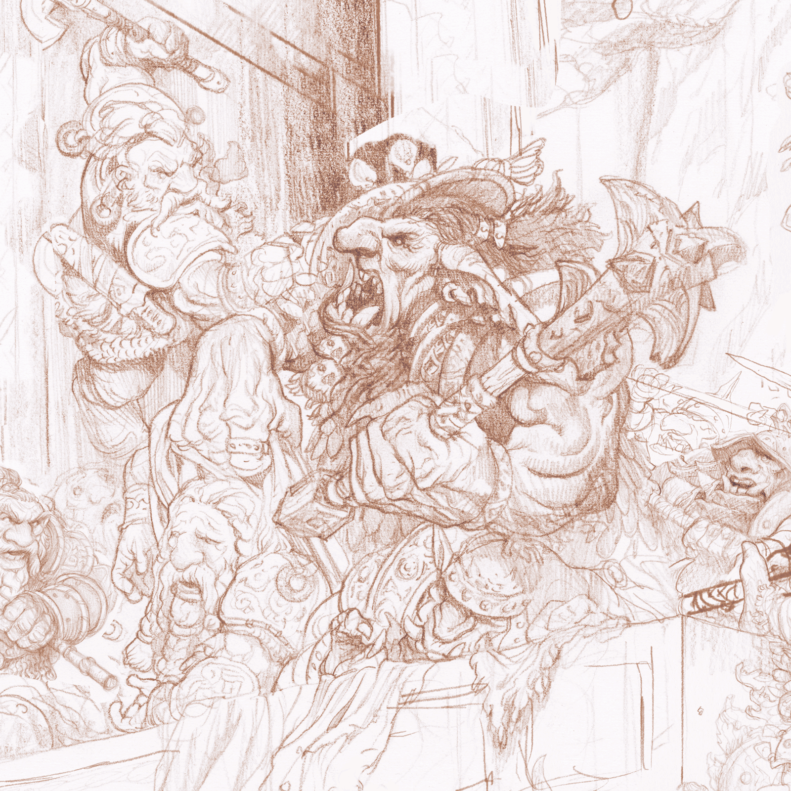
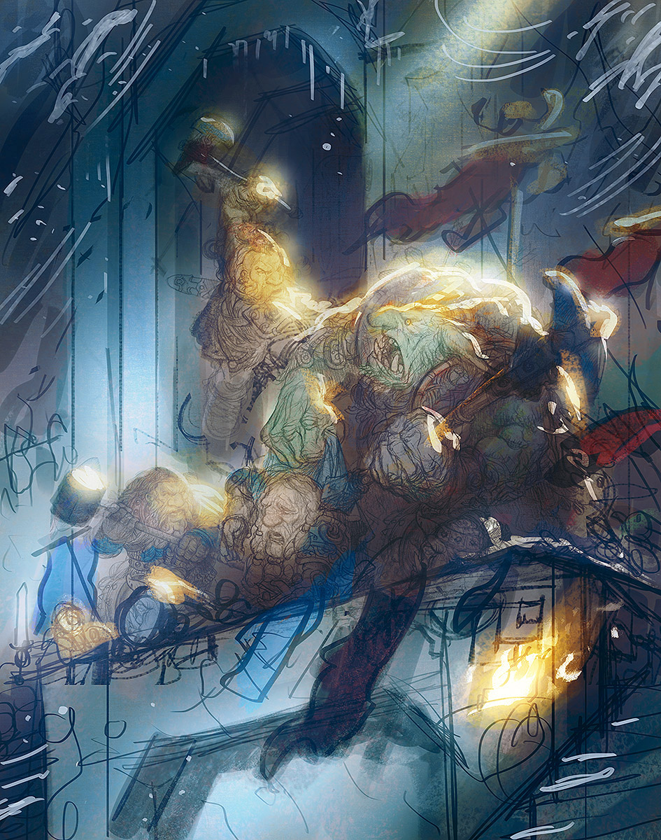
As with all my color work, I begin with a monochromatic underpainting. (If it was good enough for Rembrandt it’s good enough for me) To begin, I build up the shadows in the underpainting using dark tones on low opacity layers with low flow brushes. This lets me get my footing under me before they let the bulls loose and it’s all screaming and running and panic.
My Photoshop Tools:
As I mentioned in the last post, when I paint in Photoshop I am constantly switching between 4 specific ones which I have set to manually set to specific keyboard shortcuts. The Standard Brush Tool (B), the Mixer Brush Tool (N), the Smudge Tool (R), and the Eraser Tool (E). All of these tool presets have a similar texture and brush shape built into them, so the painting will have a nice overall consistency when you look at the details.
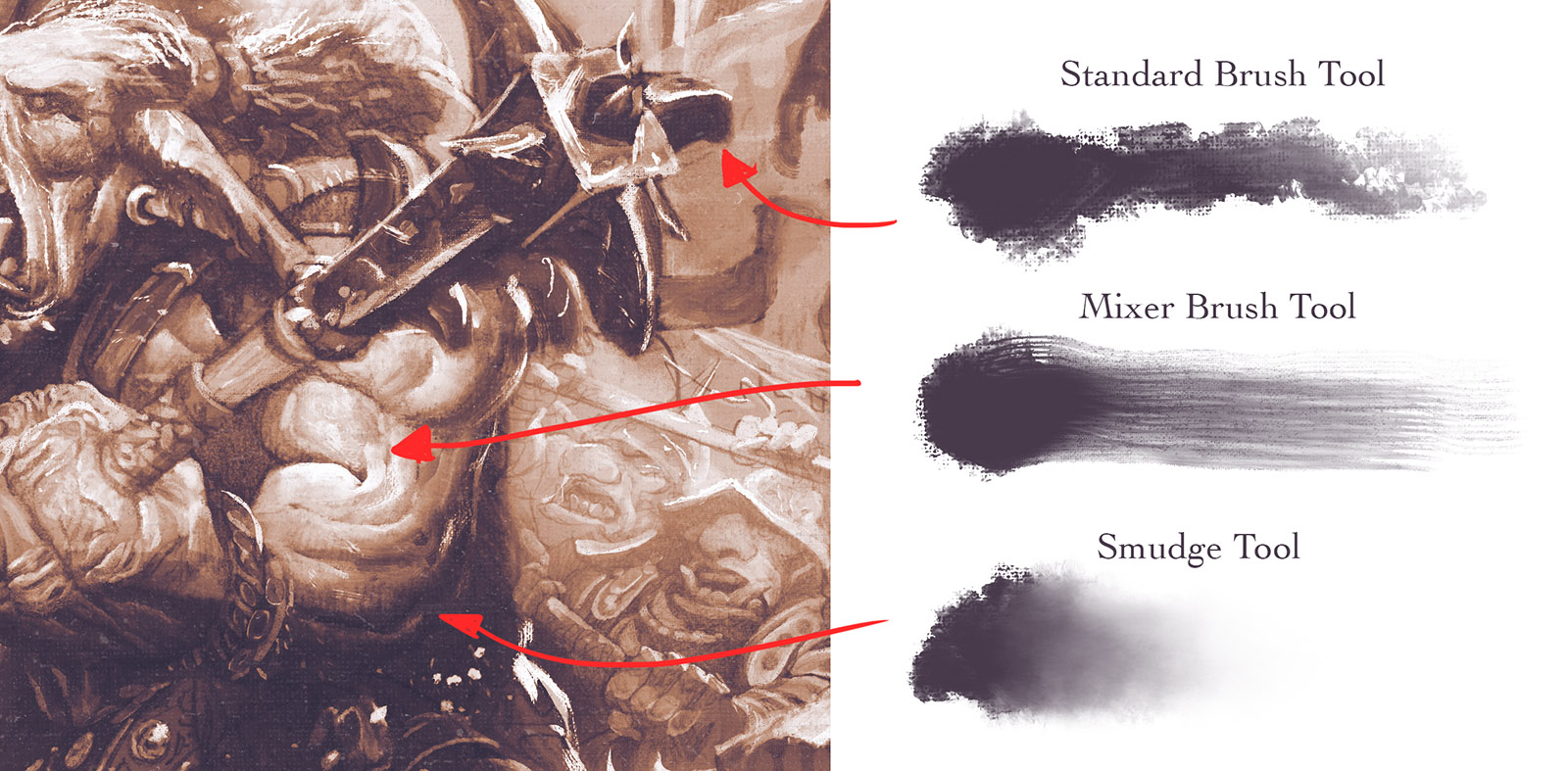
I work this way because I find it easier to use keyboard shortcuts to move between the tools quickly instead of having to constantly move my eyes from the painting to the tool menu to select a tool or a new brush type with the cursor. Typically, I will paint a stroke of paint with the (B) brush tool, like the highlight on the bicep above. The initial stroke will have too regular a shape, so I select the (E) eraser tool to clean up the parts that don’t belong. Lastly, I use the (N) mixer tool or (R) smudge tool to round or soften the edge of the stroke. This edge manipulation (pictured above) allows for subtle transitions that simulate traditional brushwork and give a nice sense of an object’s roundness. This makes everything seem more dimensional and “real” to the eye.
In the above GIF you can get a sense of the progress made. You will also notice that after the initial murky brushwork of the shadows I switch to sharper and higher opacity brushes for the highlights. That is because while shadows can be murky and smooth, highlights need to be sharp, crystalline and very sharp as more of an object’s surface texture tends to be revealed in the lit areas (and specifically in the areas between shadow and direct light). Since we are also attempting to guide the viewer through the composition with stage lighting (to create bright pools of light to act as focal points in the image), it is important that we make those areas very sharp and detailed as they will be wear the viewer spends most of their time.
COLOR!
I don’t always have a color comp, but when I do, I find that I succeed more often. Not every artist has the same result. Many note that when they have a color comp they find their overall results underwhelming and the journey there to be more tedious since much of the fun mystery has already been explored and stripped away.
But for me, I need a specific target to aim at. Even if I miss the target (and I mostly miss my targets, which is why I use hand grenades), I still tend to have better results. Without a clear objective I will likely muck about, playing with colors, inventing new brushes and spiraling into a caffeine-induced panic where I start painting kitten-mittens on all my main characters. What I’m saying is having a target is important. If you’re reading this you’re probably an artist. Artist’s have quirky temperaments. We like to explore, to experiment, to build new things. A color comp is a good way of locking yourself into an idea before the muse leaves you and you forget what it was that was so exciting about this idea to begin with. (and the muse will probably leave you at some point. You’re only human after all.) A color comp keeps you on the straight and narrow path.
Now that I have a general notion of what my target is, I make a 50% normal layer and start laying in cool complimentary colors with a full opacity / low flow brush. Since all the brushes I use are textured this leaves little moments of warmth that peak through the cooler tones. For each section of the painting there will likely be a dozen or so of these 50% normal layers. (I actually ended up making an action that creates a 50% normal layer for me since I was doing so much while working on this piece.)

When I first get into colors I try to work all of the tones up together, one color at a time. So here I am working in a Prussian Blue color. Next I will jump into a red, last I will work in yellows. This is the same method I work in when painting in oil. While there are practical reasons to do this in oil there are no such reasons to do this when working digitally. So why bother? Mostly it is just habit. But I also I do just like the look of color that is layered lightly over other colors. And I like the challenge of making my digital brushwork feel like my traditional brushwork. It may be a fool’s errand but it is like a mini-game I am playing in Photoshop while I slowly make my way through the main campaign.

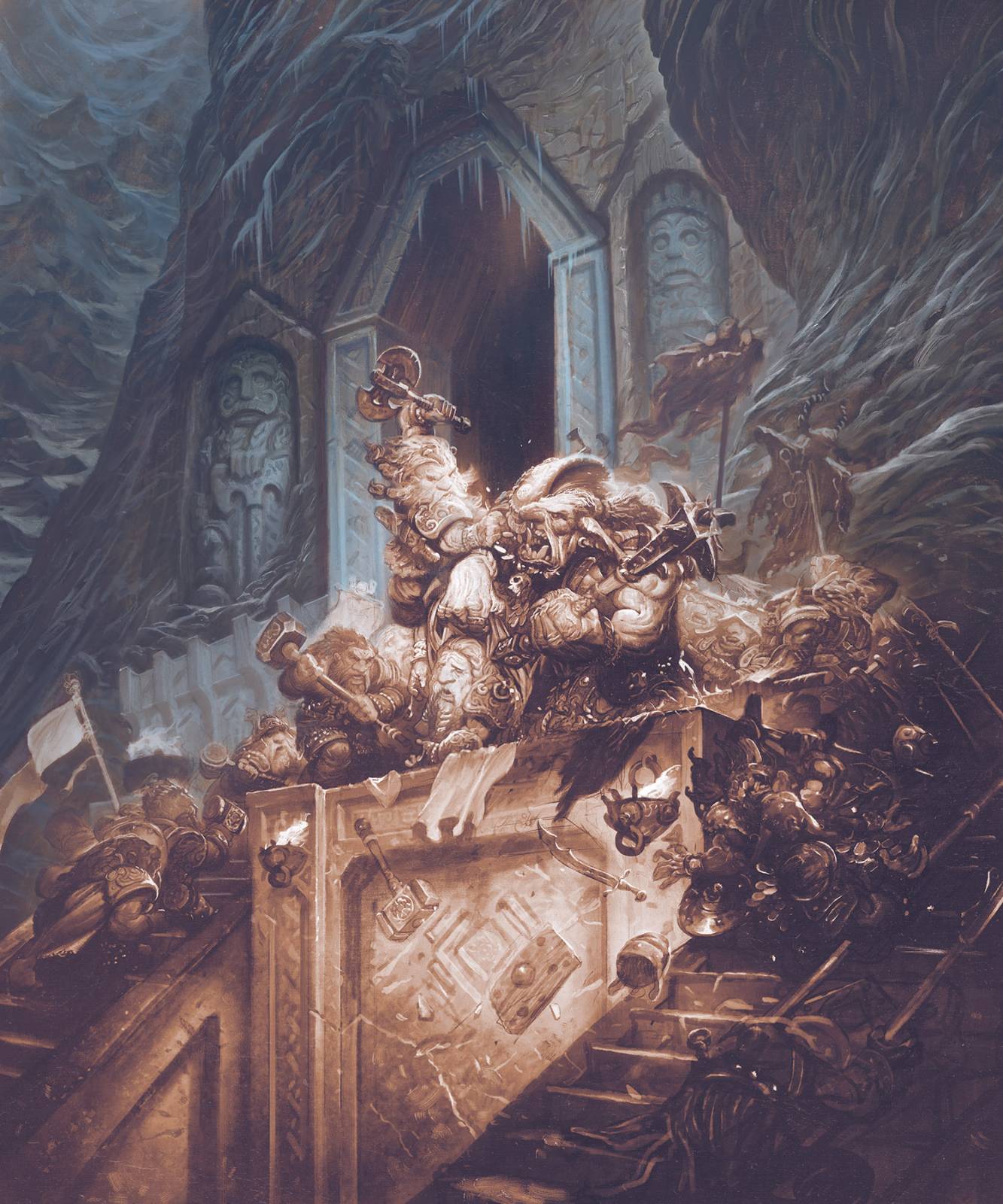
Once I have laid in the warm and cool tones I am ready to start noodling in local color and accent colors. I chose the shade of red (pictured below) pretty early on to be the third note in this split-complimentary color scheme. (For a great resource on formulating your color schemes, check out kuler)
Punch It!
Watching cartoons as a kid I always thought I would have had a lot of opportunities in life to yell “punch it!” before taking off at high speeds. Gotta say the future has been a bit of a let-down on that front.
Anyway, now that all my colors have been laid in I am noticing that my lighting lacks the *punch* it had in the color comp and I really liked that punch. So for this last little bit I switch to soft light and color dodge layers to ramp up some of the lighting. (Look okay, I know I said I wouldn’t use transparent layer modes, but listen! 96% of the image is on normal layers! I am rounding up to 100% okay!? Who cares? What, are you some kind of illustration auditor?? I’ve got receipts for each and every one of these layers!)
*ahem*
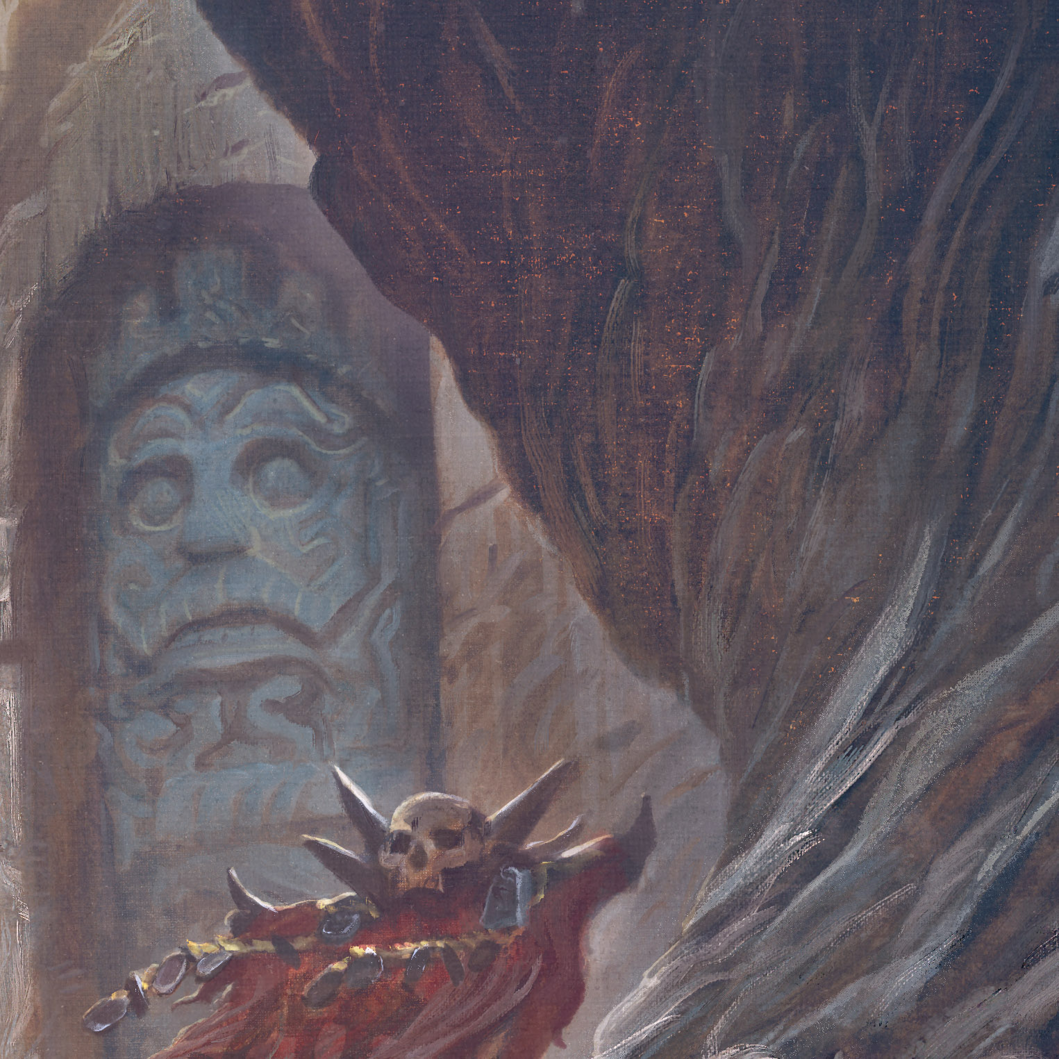
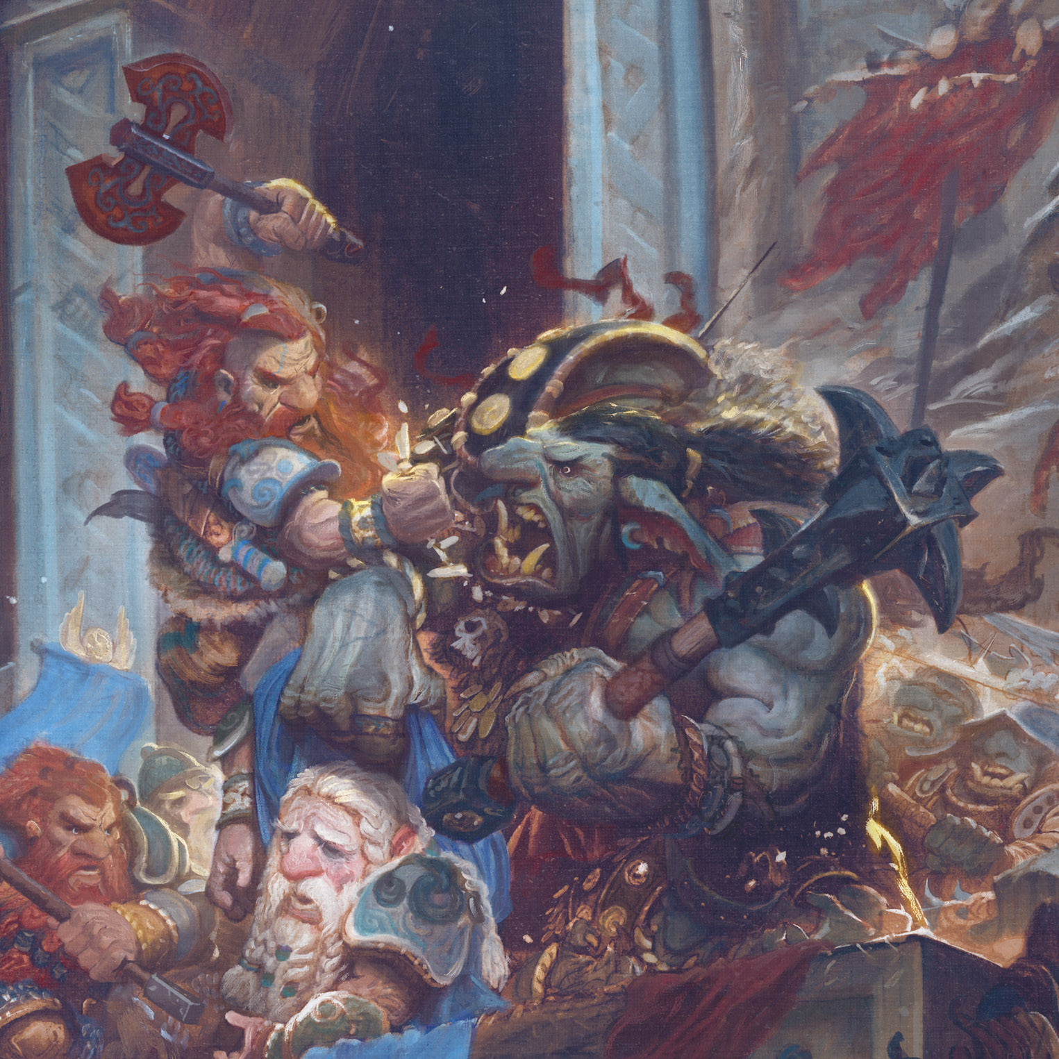
After I add in the brighter colors I now spend some time just noodling around. Changing armor from bone to iron, adding gold gilding and tattoos and fur and battle damage and so on. This is when it gets really fun again because you are kind of exploring once more. You can finally unmoor yourself from the shackles of your color comp overlord and get back into adding fun little narrative details that give the characters more dense back-stories. Never forget about this part! It’s the last 10% that takes a painting from B to an A++. It’s the sprinkles on the frosted donut. And it’s always worth spending a little extra time to get them.

I hope you’ve enjoyed this process demo. If you are interested in prints of this image, please visit our store here.
And as always, if you have any questions please ask. (Questions like: Justin, how did you get so good looking? or Justin, what’s it like being an International Photoshop Superstar? Or, Justin, do your cats know just how awesome you really are?) Those are some good ones, but I’ll also answer others about tools and techniques too.
Phenomenal post and great breakdown of your process.
If I could ask a quick question; It appears that your overall piece has the texture of a hand primed board or canvas and while you use very textured brushes would this texture come from an overlaying layer? Or just the result of the tried and trusted textured brush?
Thanks!
Hi Alex, The canvas texture is baked into all the brushes. I have a canvas grain (which I scanned in from some linen I have here) set to the same scale / brightness / contrast in the texture box on all my textured brushes so it remains consistent no matter what brush I’m using. This allows me a little more control than just doing an overlay at the beginning and end (though I will also do that sometimes too). Having the texture baked into each brush gives you a little more control to do things like give the highlight areas less canvas texture and more brushwork.
Great post Justin! Would you be willing to share your brushes with us? (Standard, Mixer, Smudge, Eraser) I’d love to give them a whirl.
Hi JRB,
I do sell brush sets on my site which have some of these. I am working on a new set that simulates oil brushwork right now. I hope to have that one out in a month or so. I also may do a free giveaway for a limited selection of these at some point too. I just need to get around to finishing up all the fine-tuning!
Thanks Justin, I just picked up your brush pack. I’ll give them a try!
http://www.gallerygerard.com/store/phoroshop-brush-set-watercolor
Fantastic! Great read once again and woah!!! … the artwork! From the amount of detail … yet keeping it all working together, to the light which is at times soft as a feather and other times hard as a chiseled rock … and finally the colour which makes things pop in just the right places. Wonderful piece, Justin!
You are awesome!
Thanks Nico!
Amazing post, my thanks for this!
This. Is. Just. Hypercool! 😮
would you mind if I ask you about how do you give this pleasant “faded” look to your pictures?
Even the underpainting is so soothingly faded
Wow so sick, the final image truly looks traditional! One question, out of the 3 brush sets you sell, which one has the brushes you use in this piece?
Thank you for sharing your process once again Justin, such a beautiful result!
What an entertaining read! And AMAZING piece of artwork!
The seventh image is really fascinating, how you can see some of the warm glittering gold coming through the other layers, beautiful work!
Thanks for the post!
Amazing. Your art continues to dazzle and delight, Justin. The more monochromatic version (starting point picture in this phase of your process here on part two) could be a image found on the walls of the mines of Moria. I’m glad to here you’re getting dwarfish gold for this. Make sure it doesn’t turn to pebbles once the gold grubbing little muggers get away with your wonderful work. Seriously, this is the sort of thing that makes me wonder when some savvy publisher is going to tag you to do an illustrated book of Tolkien’s work.