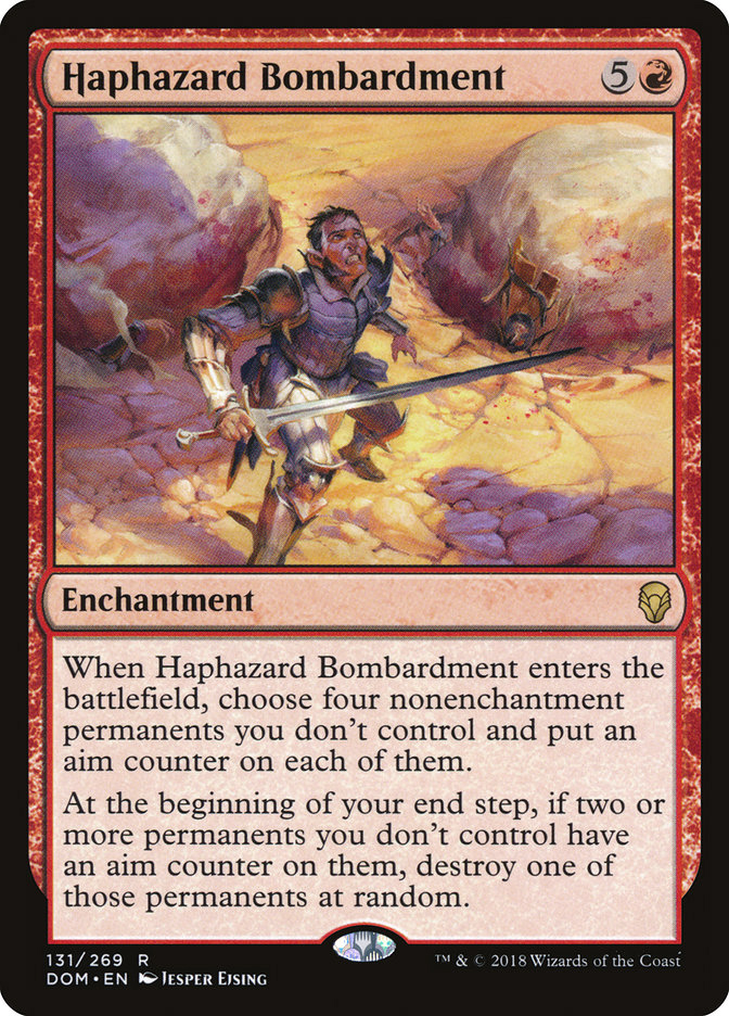
Here is one more of the card illustration I painted for magic the gathering the set of Doinaria. It is a little story illustration and most time I find them way harder to do than a figure portrait. I had lots of fun with this one.
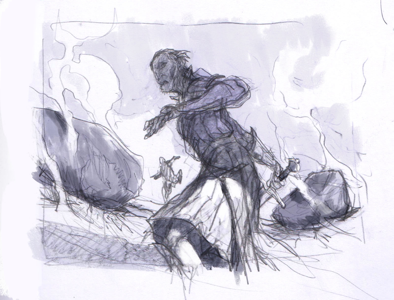
The description sounded easier enough at first. A group of soldiers being hit by boulders. Two soldiers has been hit by a massive boulder, one is running away and the hit misses and one is about to be hit by the third boulder. Great1 lets get to it. As soon as I started sketching I found out how hard it was to capture something like 2 boulders that had already hit, one is about to and also one guy slipping out of reach. My first sketch had a lot of it. The guy is half turning as if he is about to run the shadow on the top of his frame shows that he is properly not gonna make it, the other guy is running in the background. But it is not very clear that 2 has already been hit.
So Mark Winters my art director asked me if I would try a version where we were looking down at the scene as if we were the eyes of the boulder. This was way better. But no matter how hard I tried I could not make the escaping soldier fit into the frame. So I suggested that I made a shadow to the side to hint that there was a guy standing next to the target soldier: And Mark gave that one a green light.
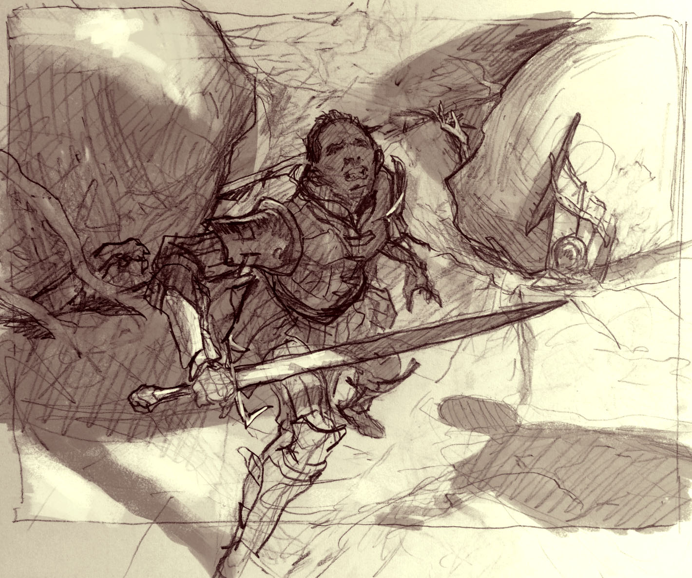
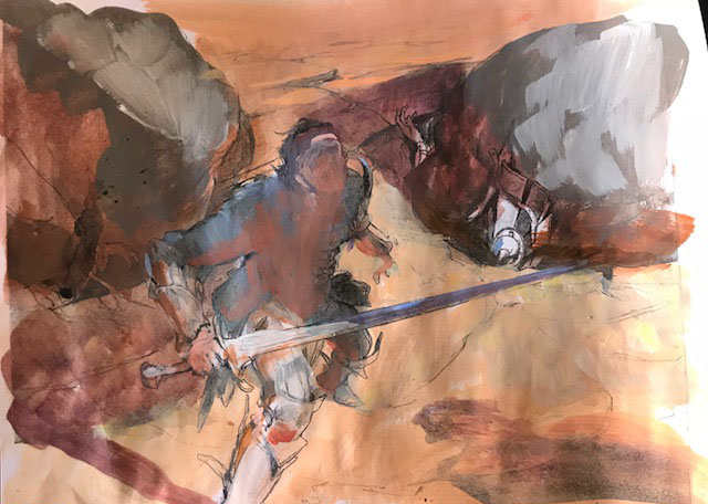
Now; as you can see on the thumbs sketch i already knew that the top of the soldier was gonna be covered in shadow from the incoming boulder. That meant I had to have a light background around him. In my mind cam ea scene that was very drenched in direct sunlight in order to justify the important drop shadows. So I knew I wanted a very warm scene with lots of yellow and orange. In my color rough I went with a warm grey for the boulders to make them stand out. had I made them orange warm Sepia like the ground they would have looked like rocks having been there for a while. they had to be a different kind of stone to go with the narrative.
When doing a very warm scene I always try to balance it out with some cold parts. The balance means that the warm areas looks warmer with a cold colour next to it. It makes the scene look less monochromatic and flat, I find. So to every shadow I added a lot of purple as if the light from the sky was reflecting into the shadows. Also I just really like purple and orange together even if they are both desaturated in this picture it is more or less only orange and purple.
When composing the light for the scene I deliberately chose to make the tip of the sword dark against a light earth, the light part of his thigh and arm was framed by a purple darker cast shadow, Head and shoulders in shadows, framed nicely by a sliver of light dirt around it. I really try to make these small edges and silhouette work to the best possible and most clear reading I can get. Of cause since the art is going to be set significantly down in size and needs to work very small, but in any case also just because I want my pictures to be clear and understandable. you cannot beat clarity in illustration.
Last thing I did was adding in all the orange bounce light from the ground. every surface that pointed downwards to the ground got a little stroke of warm colour. Also I made sure to use very light value in all of the background to make sure that the soldier stood out.
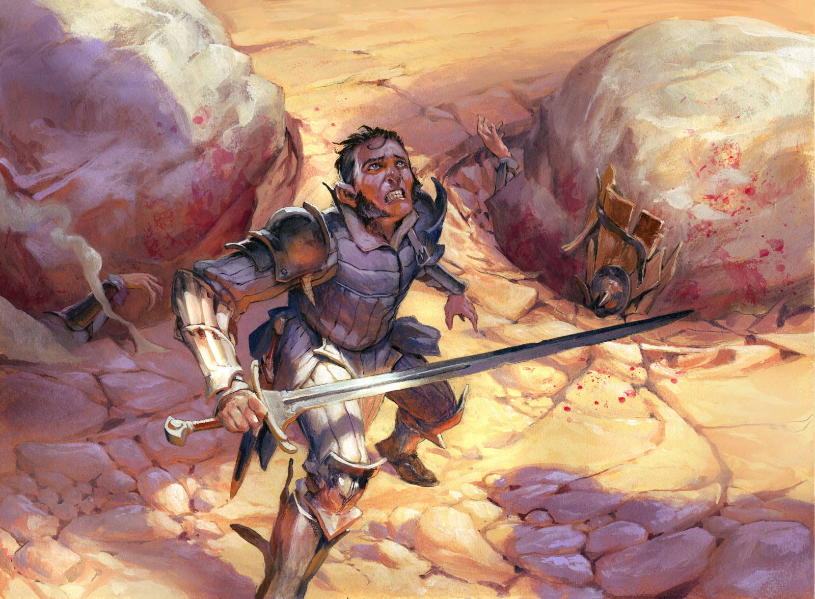
As a side note: When painting this, one of my friends at the studio said the soldier looked like a young Paul Bonner, so I did what I could to make it stay that way. “Look out, Paul. Dodge”!
Those steely blue eyes, splendid physique and resolute jaw-line…….a comparison easily made Jesper.
…And the panic in his eyes.
of goes….goes without saying. (ps great little painting by the way!)
Love this banter!
You’re my favorite MTG artist.
I was just admiring this over at Artstation. It was nice to come here and get a more detailed description. Thanks Jesper!