
It looks like a keyboard mistake. I still have no really clue of how to pronounce his name right.
Fbthlp, the Lost
Art by Kev ( the king ) Walker
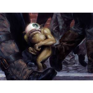
art by David Palumbo

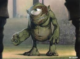
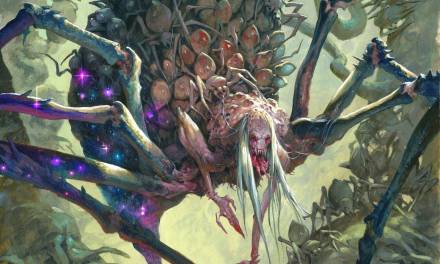
Humongulus from Ravnica Allegiance Not Fbthlp, but a similar Humongulus on steroids looking for him
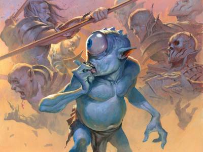
Today I am walking through the design process of my latest character portrait for Magic the gatherings fan favorite Fbthlp, the Lost.
This little guy has been featuring on many cards up until now, but haven’t yet gotten his own card. That was my assignment, and it was a bumpy road. First of all. There was no really concept art of him. People have painted him very differently over the years and I had a hard time finding out witch of the images I should base my drawing upon. David Palumpo has painted the most famous one and I really liked it a lot. It captures the scared dude really well. I found an illustration of a similar homunculus by Kev Walker, my all-time favorite Magic artist, and knew that this was the direction i would go. The proportion and the “design” I ended up with is slightly different than the Fbthlp from Davids card. Mostly in the shape of the mouth and the fact that i gave him a neck. The Homunculus from Kevin Walkers art had a thick robust neck and I really liked that: Mostly because there is so much gesture and feeling involve din the turn of the head and the neck posture. I knew I wanted to create an animated figure and that I wanted to focus on the feeling of the character and so I chose to go with a neck version. the choice of lipsize was easy for me. The smaller mouth seems more cute and doesnt take away imoirtance from teh big eye. Also I had a lot of other homunculus illustrations from the same magic world to look at and they all had that thin line of a mouth.
when it came to clothe I felt I needed to give him some sort of rack to cover his area of missing private parts. ( I am not sure, but i guess that homunculus cannot reproduce and have no reproductive organs )
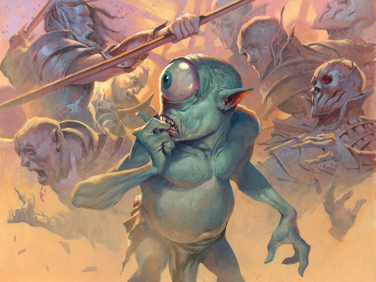
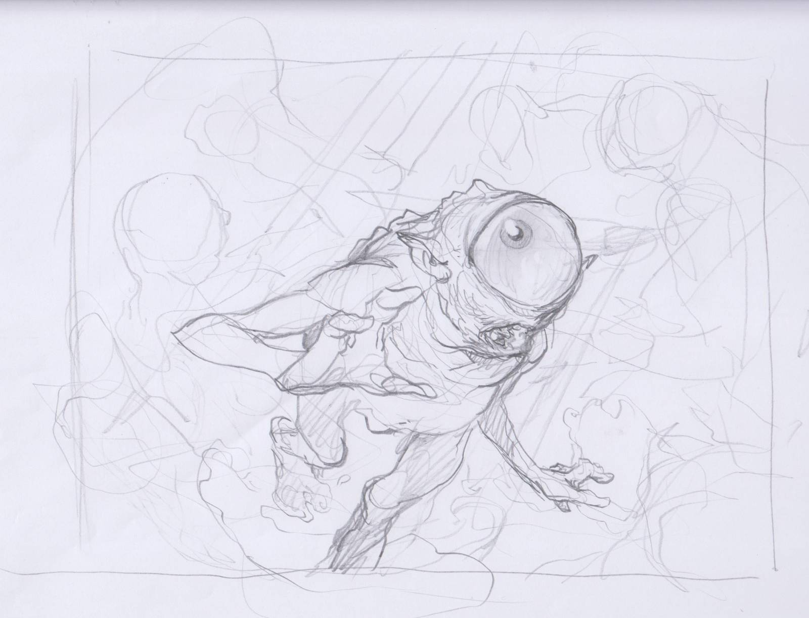
Well; the assignment asked for Fbthlp in the mist of a huge fight scene. like he has gotten himself lost and turns up in the mist of a battle clashing back and forth. He is of cause scared but unhurt and by luck seems to come out of it unharmed. Like no one even sees him. The difficult as i found out quickly was that I was either focusing on a fight scene or a figure portrait. i tried a lot of different solutions but in the end narrowed down on the sketches that had Fbthlp in the foreground as a 3/4 figure and the fight scene filling out the background kind of like a separate tapestry, not mixing too much with the main figure. That way I felt it was still a figure portrait and also included the fight scene.
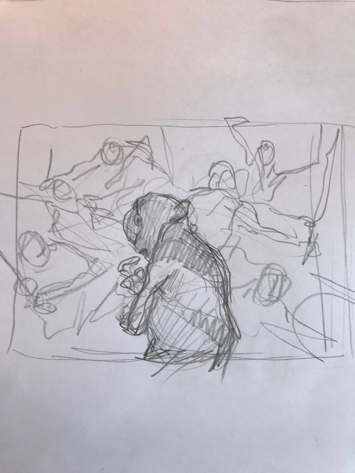
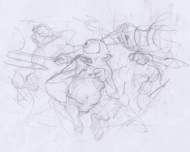
Here is a bunch of the sketches leading up to the final 2 choices.
Too scarred and actually looking like he is in danger.

I kind of liked the bottom one and was turning in this direction for the final, but i changed his body type a lot. he feels too big and elongated here.
 The zoomed in idea here was good, but the sword was too close looking like he was about to be stabbed. The hand to the mouth is one thing I ended up using
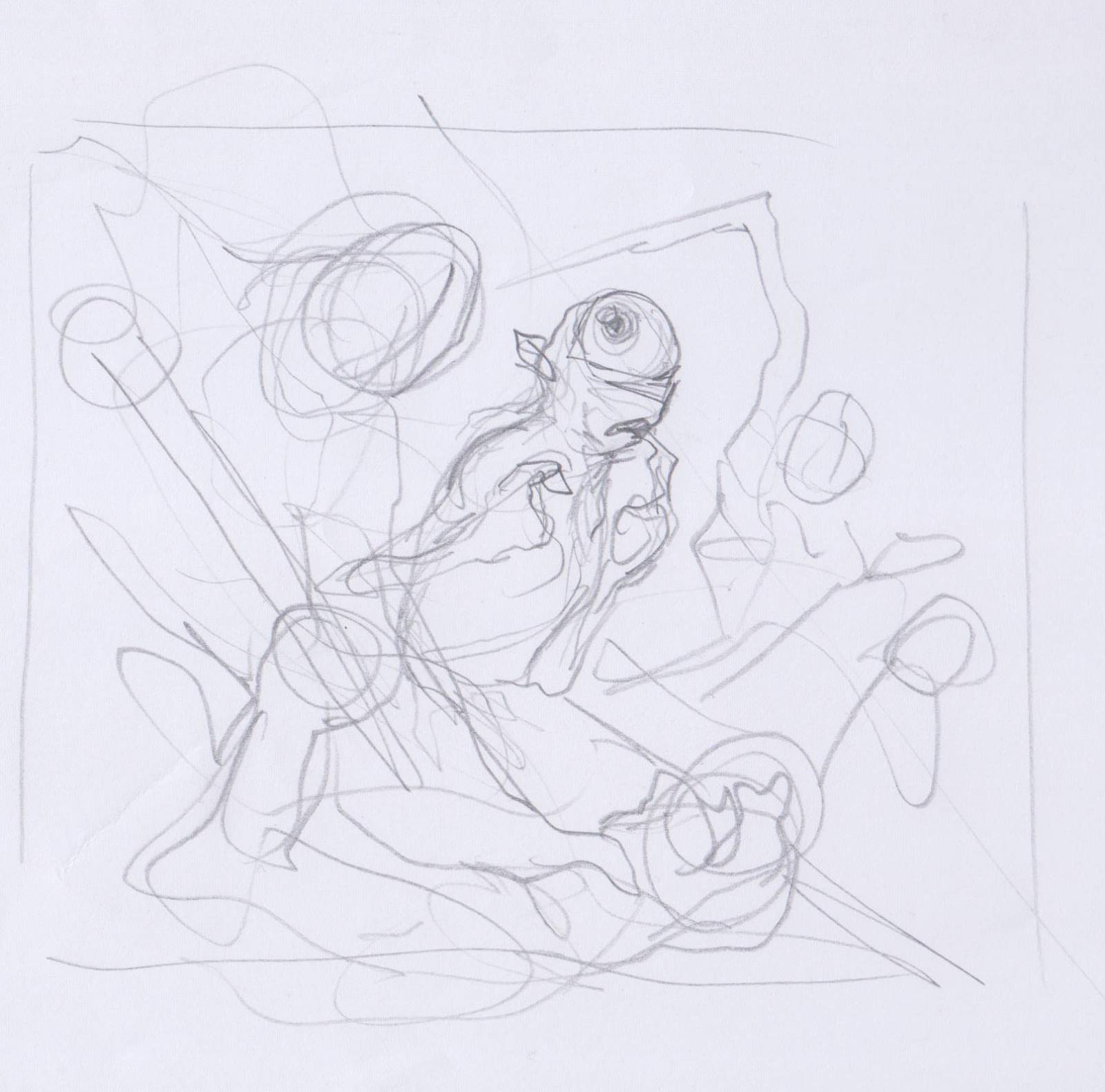
Too little focus on the figure.
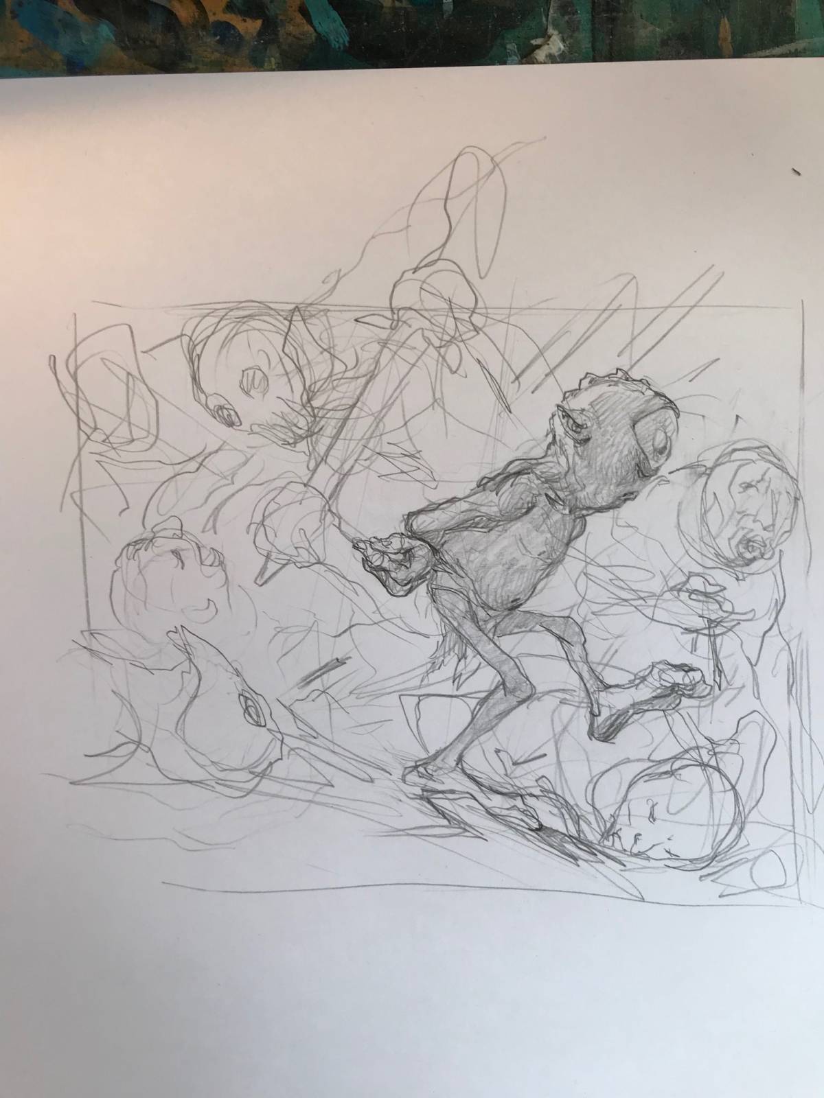
This one is just completely wrong and focus only on his Lost-ness rather than anything else. And he seemed bored. Well, sometimes I just need to try things out before I can see how wrong they are.
The 2 main suggestions I ended up with was these. i am glad that Taylor Ingvarsson, my art director chose the second one. It is a strange character portrait that only shows the figure from the back: But i was so focused on capturing his shy innocent personality that I focused too much on that rather than on what the card was supposed to be, mainly a character portrait.
When I am sketching a figure card like this I am looking for a clearly readable silhouette. It is so very important when the illustration is going to end up on a magic card that everything is simple and easy to read.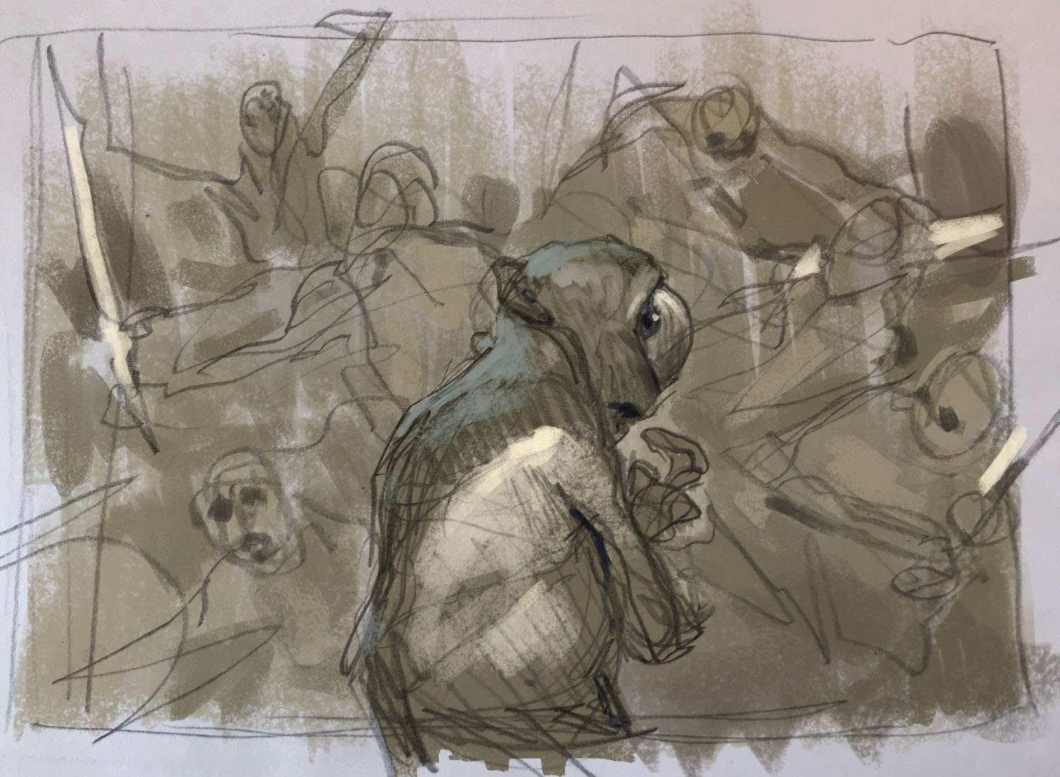

So the sketch I had going through the approval was a very clear portrait of Fbthlp, looking anxiously over his shoulder with a finger on his lips undecided where to go from here. I was very happy with the pose and the battle scene in the background was loosely sketched in and didn’t pose a problem yet.
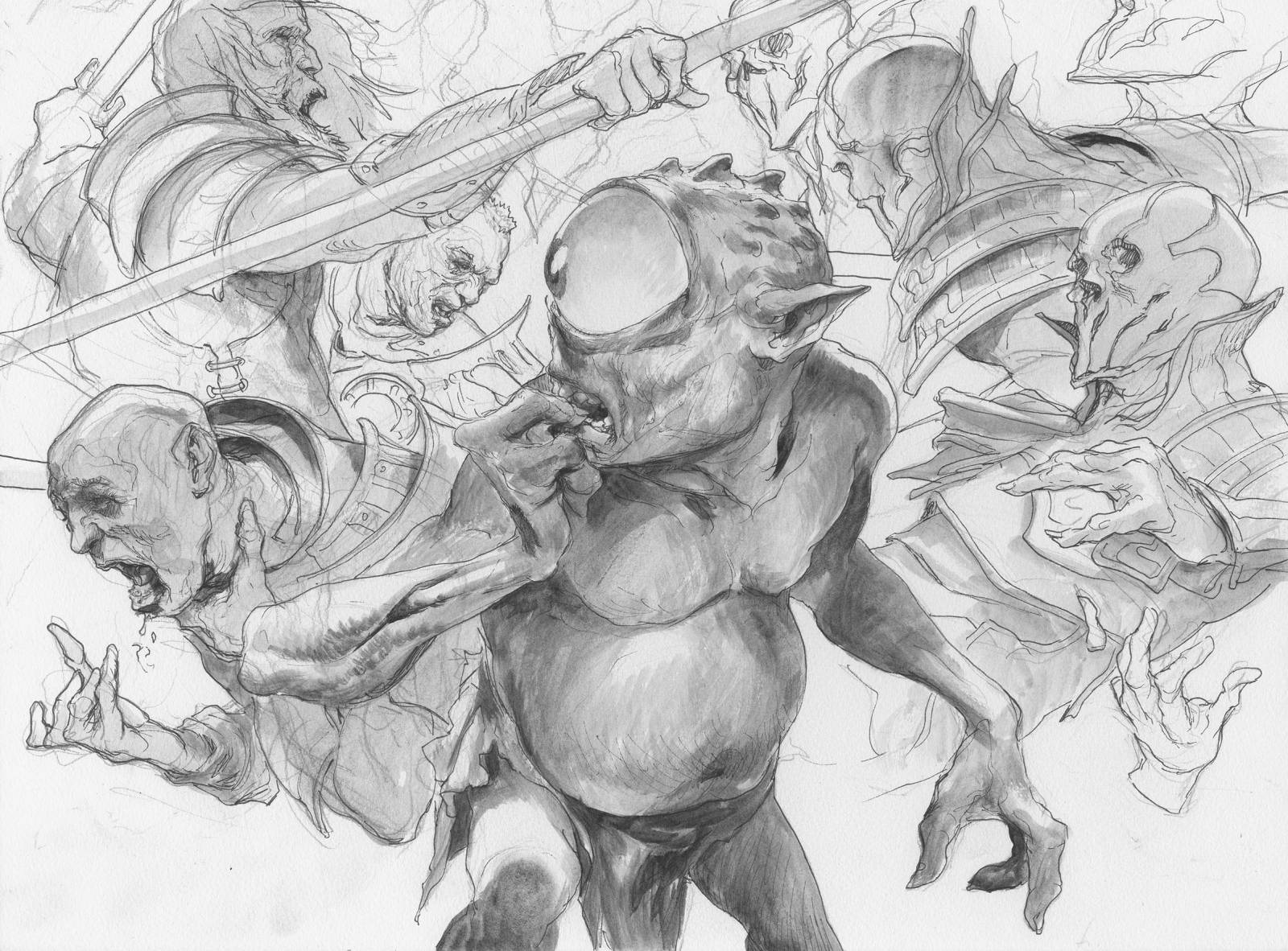
I transferred the sketch to board and drew out the fighting figures and inked it all in waterprooof inks. The face of the skeletal guy to the right i turned a bit so that it seems like he is at least noticing Fbthlp during the chaos. I did not wanted to show specific swords going through bodies or blood splatter.
Now The problems started showing up: I had a very busy background with lots of things happening and I did not want it to take away the focus from the main figure. I made up the decisions to sort the background from the foreground via a very contrasted color palette. A cold figure in the foreground with a very warm background: the whole battle scene I kept in yellow and orange and Fbthlp in a bluish hue to pull him completely apart from the scene. Orange and Blue is the 2 biggest contrast colors I can come up with. The scene is a more comical palette choice than a real lit scene: But when I turned the image in Taylor asked me to change Fbthlp´s skin color to be more green. And I ended up adding a bit more dust and spears in the background to make the battle seem bigger.
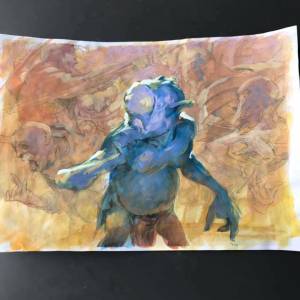
Color comp in acrylics
The eyeball I obsessed over endlessly. Changing the reflection and the pupil constantly in order for him to get the right side looking glance. it is incredible how different it is to make expressions with only one eye. I constantly had the eye looking too starring and dead until i figured out how to place the pupil right and add enough reflections to make the eyeball seem moist.
painted version without the corrections
I

This is terrific, thanks for sharing. Out of curiosity what was the rational for the color change from the finished painting to the final?
Cheers!
It’s “Fblthp,” pronounced “fibble thip.”
that character has unique name 😀