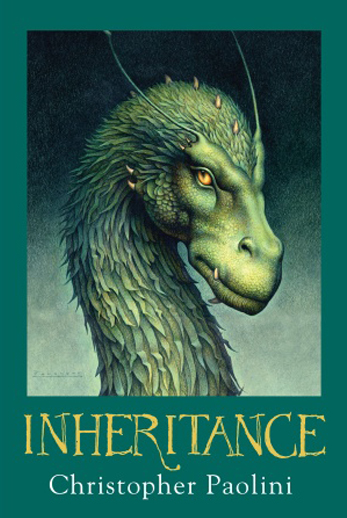
I’m so thrilled to finally be able to share this project with you. For all of 2018 I worked almost exclusively on a limited edition release of Gene Wolfe’s The Book of The New Sun for The Folio Society. This project was special for me in many ways, perhaps first and most importantly because it is one of my favorite books(perhaps my favorite book). I pitched this project to my art director, Sheri Gee, in the fall of 2017, which was also a first for me. I’m rarely given that sort of opportunity, and from the beginning this book felt as much a personal project as it did a commission.

The book is actually four volumes, cloth bound with a silver foil printed slipcase
Reading
If you’re not familiar with The Book of The New Sun, or Wolfe’s writing, it’s perhaps worth mentioning that his novels are layered puzzles. Characters are not always who they appear to be, and the narrators rarely speak to the reader in a straightforward way.

The Book of The New Sun might feel like a mystical, fantasy story, but it’s most definitely a science fiction world, and part of the fun is puzzling out what exactly it is the narrator Severian is describing to us.
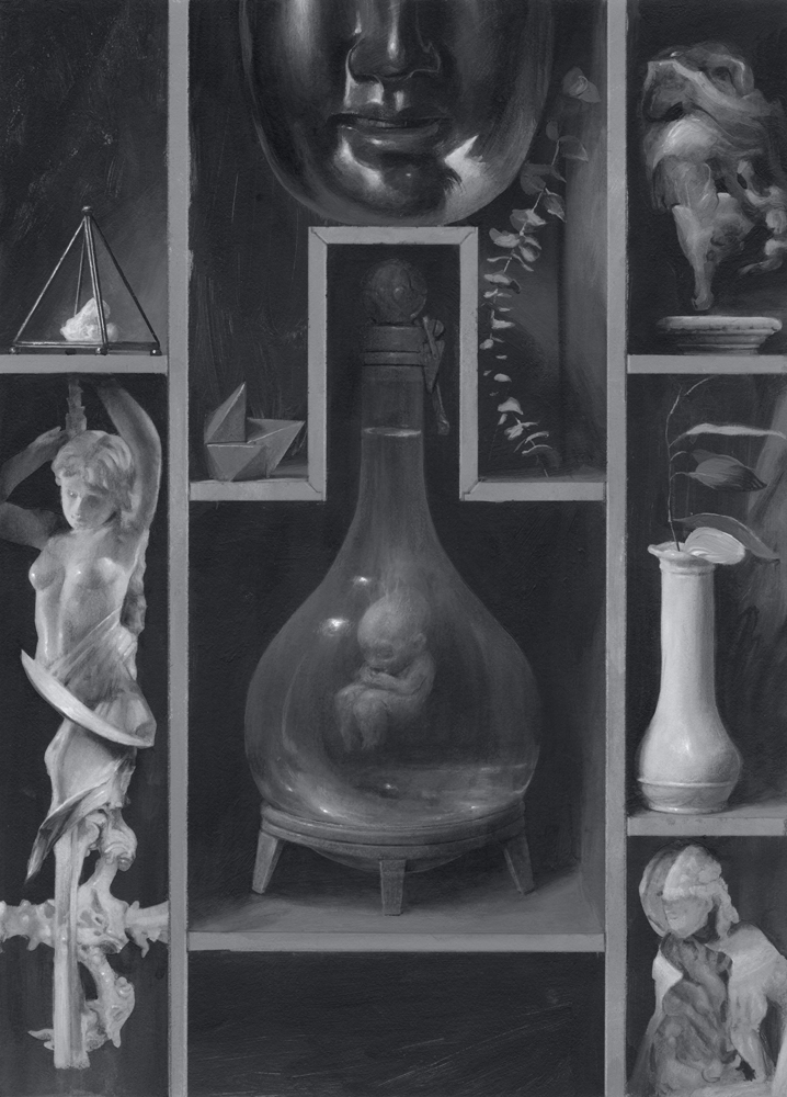
As an illustrator, this was actually really thrilling. I got to make a lot of creative leaps with both the characters and the setting. I envisioned this edition as something for fans of the work, and so tried as much as possible to fill every image with meaningful details.
Reading the novels again for this project was a wonderful experience, the books profoundly reward deep rereading, and I felt I understood them on a level I hadn’t before. I was left sort of speechless by all that I had missed and all that was there, and inspired to make pictures that hopefully manage to share some of that feeling with others.
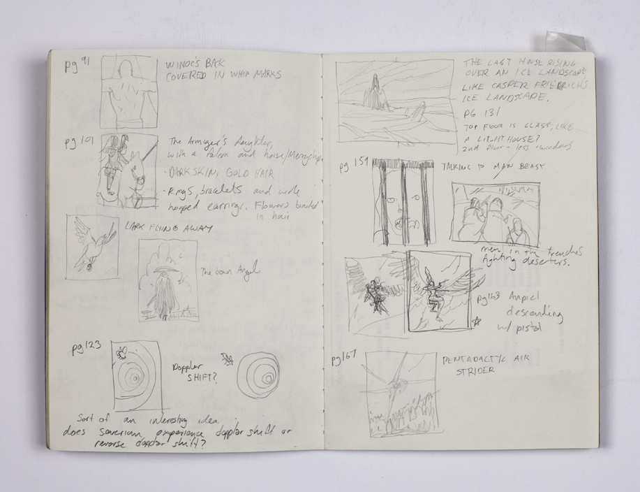
I kept a small notebook throughout, jotting down notes and small scribbles in the moment, before I even began sketching.
Sketches
The sketch process was really intense, I had 20 paintings and 4 covers to explore, and all in all it took me about 5 months to figure out what it was that I wanted to make for these books. I scrapped and restarted a lot of images, partly I think because Folio gave me essentially free reign. I knew that I needed to make these as artful, honest, and interesting as possible so that I could stay excited about everything through to the end. Making too many compromises can be daunting and often leaves me feeling defeated. I knew this was an opportunity to really try and say what I wanted about a book, and frankly it just took a fucking huge amount of time to do so.
Alternate cover sketches
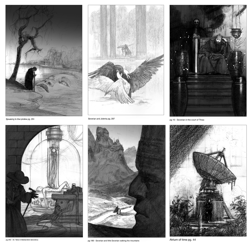
Sketches for the interior illustrations
Binding
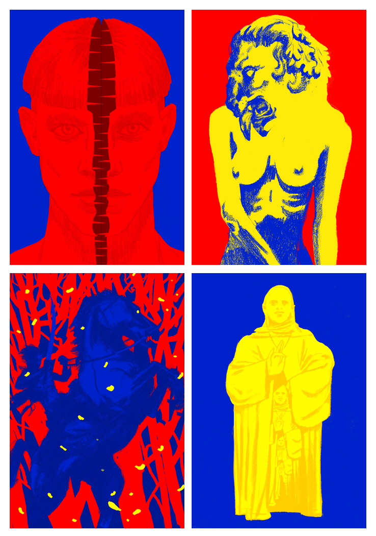
The bindings(covers) were as always a challenge to figure out. Folio is famous for it’s special printing and lux materials, to fully take advantage of those there are usually some interesting restrictions that inform the approach.


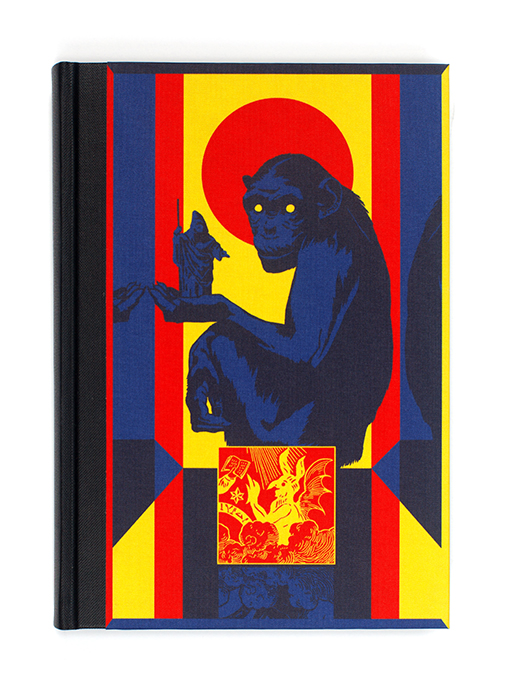
These flat, graphic images allowed us to use special inks and papers befitting a limited edition.
The challenge was of course retraining my hand and brain to think in terms of hard edges and bold shapes. I’m ultimately so proud of these covers. The intense, primary colors are a counterpoint to the muted, washed out interior illustrations, and each hue holds a lot of symbolic importance to the text. I found this contrast in saturation visually disturbing while at the same time quite beautiful, honestly a kind of tension I really like to see present in my work.
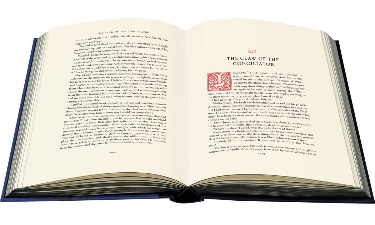
I also designed a set of 22 drop caps, printed in red and black at the beginning of each chapter.

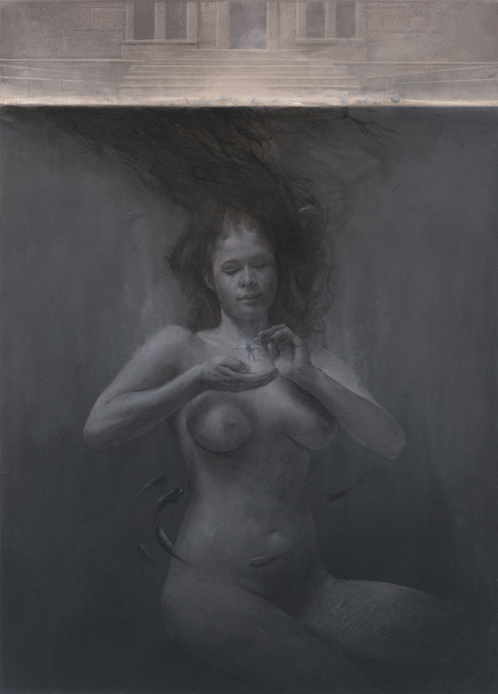
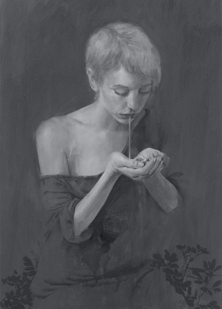
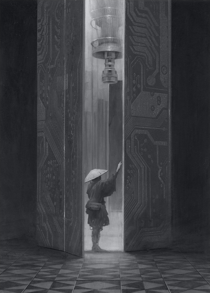
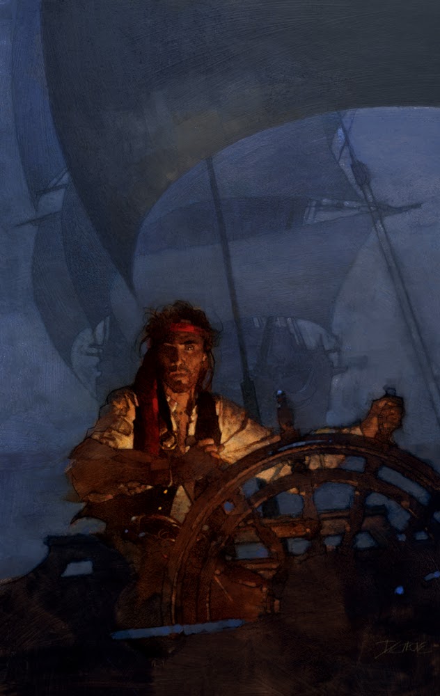
Paintings
I’ve been experimenting with acrylic painting for the last few years and wanted to use this project as an opportunity to finally try and make some finished work with it. Although I’ve enjoyed other materials, at this moment I think it is honestly the medium that I’m connecting with the most. I find its permanence and resilience incredibly relaxing, and love how immediately it can be applied. I found I was able to paint a lot more loosely with it as well, it’s quick drying time preventing me from overly softening brush strokes. Ultimately, I think the monochrome painting really suited the text as well. The final paintings feel evocative and mysterious to me in a way that I think would have been hard for me to achieve with a different approach.


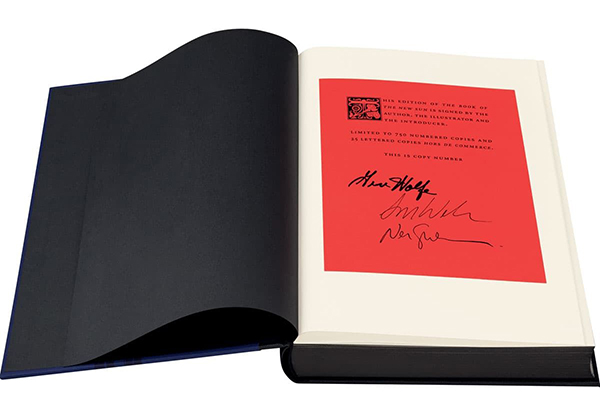
Each set is signed by Gene Wolfe, Neil Gaiman(who wrote the forward) and myself
I had hoped to end this post with a link for those interested in purchasing a copy, but to my great surprise the whole edition of 750 sold out in just over a week. Thank you so much to everyone who bought a book. I’ll be posting more art and photos over on instagram throughout the summer. I have a lot of original work that I’ll be making available, and plans for some prints as well, so if you’re interested in any of that you can find me there(@papercrake).
I’m a huge fan of the book and you did a great work. Too bad it probably won’t be published in France.
Beautiful work Sam! Vicki cued me in that you were working on a major project and I’ve been itching to see a thorough sampling of the work! Turned out absolutely stunning. Particularly that last set of images near the cabinet are ridiculous! The thumbs are inspiring and a real insight into your picture making. So amped!
Looking forward to seeing this Sam. Looks great from here. Acrylics can lure you in a weird way. Congrats
Absolutely stunning, Sam. Well done.
Absolutely stunning, Sam. Well done!
These are amazing. Very inspiring
I think this solidly enters the realm of what I love where my wife says no
This looks great! As somebody who has tried to illustrate the Book of the New Sun, I sympathize with your struggle. I also admire the fact that you came to the same conclusion that I did on what exactly the tipped over “sundial” in the Atrium of Time might be. You have definitely inspired me to go back to New sun and work on some art!
(It would have been nice if Mr. Wolfe could have seen some of these. RIP)
Fantastic work! I too really liked the series and this makes me want to go back to it
Đăng nhập xx88 – Sân chơi đẳng cấp cho cược thủ, khuyến mãi khủng mỗi tuần!
Had a similar issue with a client ghosting invoices. Someone pointed me to
Fantastic breakdown of *The Book of the New Sun* and your illustration process
great read
fantastic read
Thanks for this well-researched post. The piece reminded me how education access has been shaped by policy over generations — for students looking for scholarship guidance and resources, click here to learn more.
Fascinating history — the article highlights how economic control was used alongside political power. For readers curious about how modern currency markets and informal exchange rates affect everyday life, click here for recent rate information.
Exploring creative works like The Book of the New Sun reminds us how ideas and imagination shape communities. In a similar way, India’s PM Kisan Yojana supports farmers and nurtures growth across rural areas.
I really enjoyed this article on The Book of the New Sun by Muddy Colors — the detailed breakdown of how the special edition was designed and illustrated is fascinating.
Muddy Colors
The way the author talks about rereading the novels, uncovering more layers, and then translating that insight into art speaks to how deeply the story rewards thoughtful attention.
It also inspires me to revisit the series and pay closer attention to the language, symbolism and world-building in ways I previously skipped over.
Thanks for such a beautiful fusion of literature and illustration — definitely made me look again at Wolfe’s masterpiece with fresh eyes.