A funny thing about the business of illustration is that successful work can often lead to future gigs that are more of the same. Paint a cat well and before you know it, it’s possible you’re now the go-to artist for painting cats. That can be a blessing or a curse depending on how you feel about painting cats, but I guess there’s little to complain about if it puts food on the table. While I’ve been fortunate enough not to be pigeonholed in such a way, a job I did in 2017 directly resulted in a strikingly similar assignment last year. I wasn’t exactly happy about it though, and almost turned it down.
The 2017 job in question was a painting I did of a tapestry and because of the way I chose to paint that tapestry, I ended up causing myself a bit of physical pain due to repetitive stress on my wrists in the process of painting. If you’re curious, I wrote about that job on my own blog here, but the short version is that there was a LOT of fine detail, by the end my wrist was swollen and sore, and I didn’t ever want to paint a tapestry ever again. So of course that’s exactly what I was assigned last year. Still, after a chat with my art director (communication is a very important thing), I decided to keep on the job and see it through.
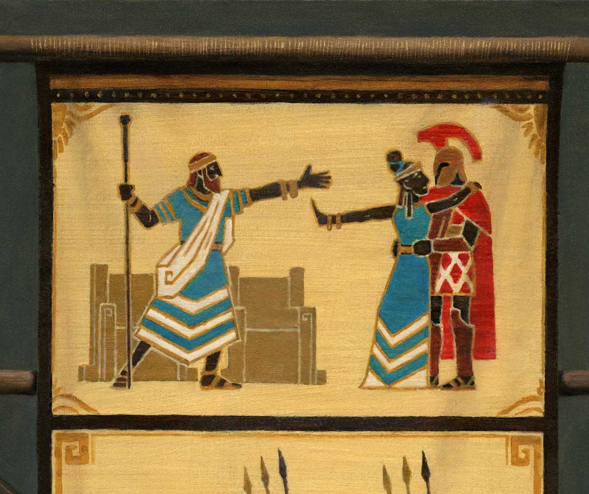
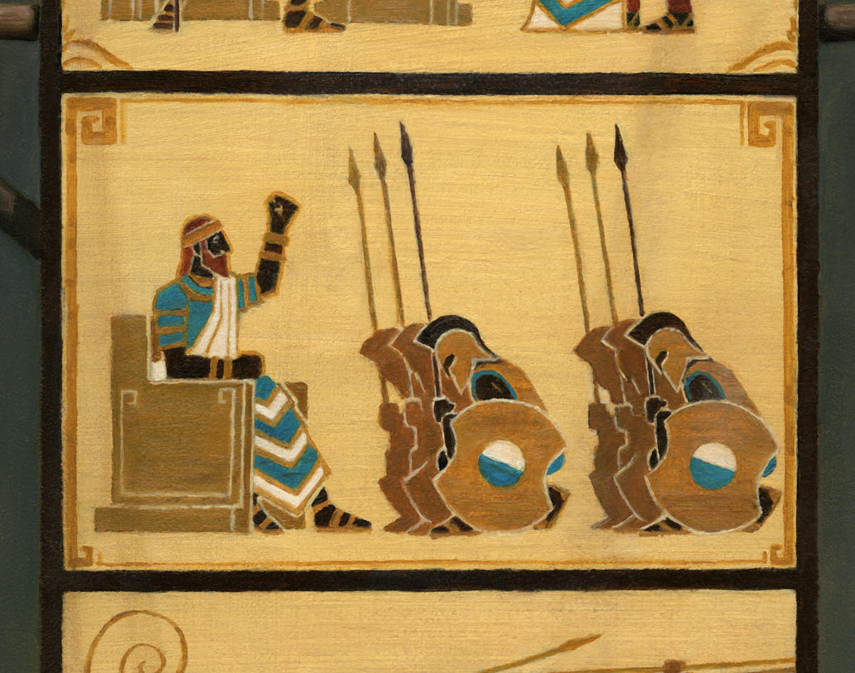
This new tapestry I was asked to paint was to be incomplete and woven on a warp-weighted loom. Depicted on the tapestry would be the story of a queen leaving her king for another man, the slighted king then raising an army to gain her back, followed by the ensuing battle. The tapestry would remain incomplete as the conflict was yet to be decided, the history unwritten.
If the story sounds kind of familiar, it’s because it’s heavily influenced by the Trojan War of Greek mythology. In fact, the the tapestry I was asked to depict is from Theros, a world from Magic: the Gathering that is heavily influenced by ancient Greece, its aesthetics, mythology and traditions. And so naturally, looking at ancient Greek art is where I started.

This is just one of MANY pottery images I looked at and all of them were extremely helpful in helping my focus on what details mattered.
For me, Greek pottery painting felt like a good place to start since it’s full of strong, graphic imagery that is very readable—something that is important on art that is to be reduced to less than the size of half a playing card. I thought that tying the aesthetic of the tapestry to that style of work made a lot of sense since a lot of tapestries start out as actual drawings first. Primarily, I looked at what is known as black-figure pottery (named because the figures were glazed almost as black silhouettes with details etched in before firing (and often finished with white and red paint after the fact)). It’s one of the older styles of Greek pottery glazing and is a pretty interesting aesthetic.
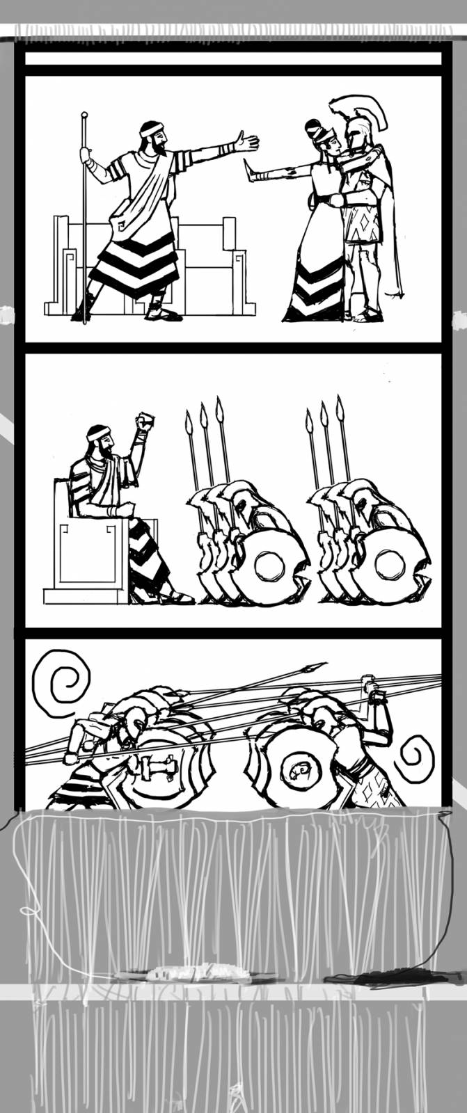
The image required a tall, vertical proportion and it was a natural thing to break up the story within the image into three distinct panels. So that’s what I did and I sketched this out:
 While pottery painting was absolutely a huge inspiration, it was the work of Jacques-Louis David that ultimately ended up bringing me to some of the gestures I settled on, owing to their emotive theatricality and clear communication.
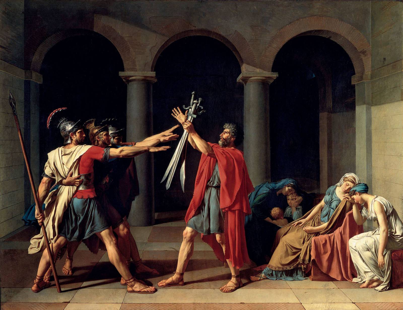
Oath of the Horatii
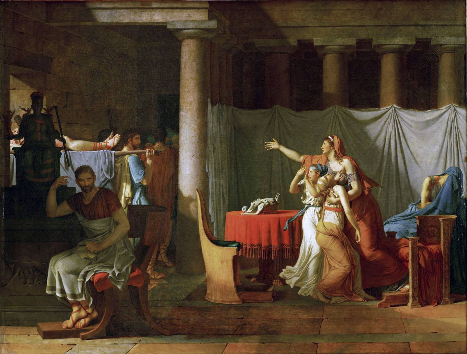
The Lictors Bring to Brutus the Bodies of His Sons
Fortunately, the fine folks at Wizards approved my sketch. Before I went to the final, however, I thought it prudent to talk color with my art director, Dawn Murin, since I felt that it could potentially be an issue. I’m glad I took this step, because the piece ended up drastically different than my original intention to utilize a more limited palette akin to that used by pottery painters. The broader palette ended up helping out quite a bit when it came to story-telling, and overall added more clarity than my own instincts might have brought.
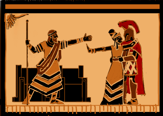
Yeah, the entire piece done this way would have been a mistake.
In the end, the piece came out thusly:
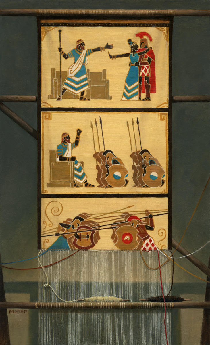 The finished piece is oil on gessoed hardboard and measures eleven inches wide by eighteen inches tall.
Rather than repeat the very tedious process I used the last time I’d painted a tapestry, I decided instead to utilize texture to create the feel of woven fabric. When priming the board, I used a three-inch, coarse-bristled brush and put the first coat of gesso down in parallel strokes going left to right. The intention was to keep the brush strokes somewhat visible and in a uniform direction. The second coat of gesso was applied perpendicular to the first going from top to bottom. The third and final coat of gesso was again done horizontally. I did a bit of sanding after it was all dry, but that was almost entirely limited to the areas of the painting where the tapestry wasn’t going to be. I kept the areas of the piece that DID contain the tapestry a bit rougher so that the resulting texture in the gesso, when thinly painted over, created a decent simulation of woven fabric.
The horizontal lines seen throughout the piece is all in the gesso and is reinforced by painting the beige paint in parallel, horizontal brush strokes. All of the large fields of beige paint were literally just thinly glazed over the gesso in one go and then allowed to dry.
Once the horizontal strokes were down, I painted the figures, motifs and borders in a single pass. Once all that was dry, I took a smaller brush and did a second pass on the figures in small, isolated, horizontally-oriented areas to reinforce the horizontal texture and to insinuate various passes on the weave, as well as different dye lots of thread. Well, at least that’s what I was going for. Either way, the second pass had to remain inconsistent in order to keep the striations within the weave apparent.
I tried to keep that coverage variation going throughout the “weave,” even incorporating it in the design motifs that bordered each story panel.
The result isn’t actually a full-on depiction of a weave, but accomplishes the feel of one. It’s planned visual noise that essentially is felt more than seen—especially at card size. Most importantly, it wasn’t something that got in the way and could easily be augmented or subdued as necessary.
When it came to the warp threads of the weave—that is the vertical strings visible at the bottom of the unfinished tapestry—I had no interest in painting them all by hand. I contemplated executing them digitally or with colored pencil, but decided on a different course. I painted the entire bottom of the painting as though the threads weren’t there—this included painting the bobbins of colored thread and the bits of visible loom. After it was dry, I created the warp threads by taking an X-Acto knife and using a very light hand, I ran the tip of the knife along a straight-edge ruler to carve through the paint, exposing the gesso below. Each gouge in the paint represented an individual warp thread, and I kept at it until I made it all the way across the tapestry. After that, I set the ruler aside and free-handed the bits of warp thread that were tied around the bars of the loom.
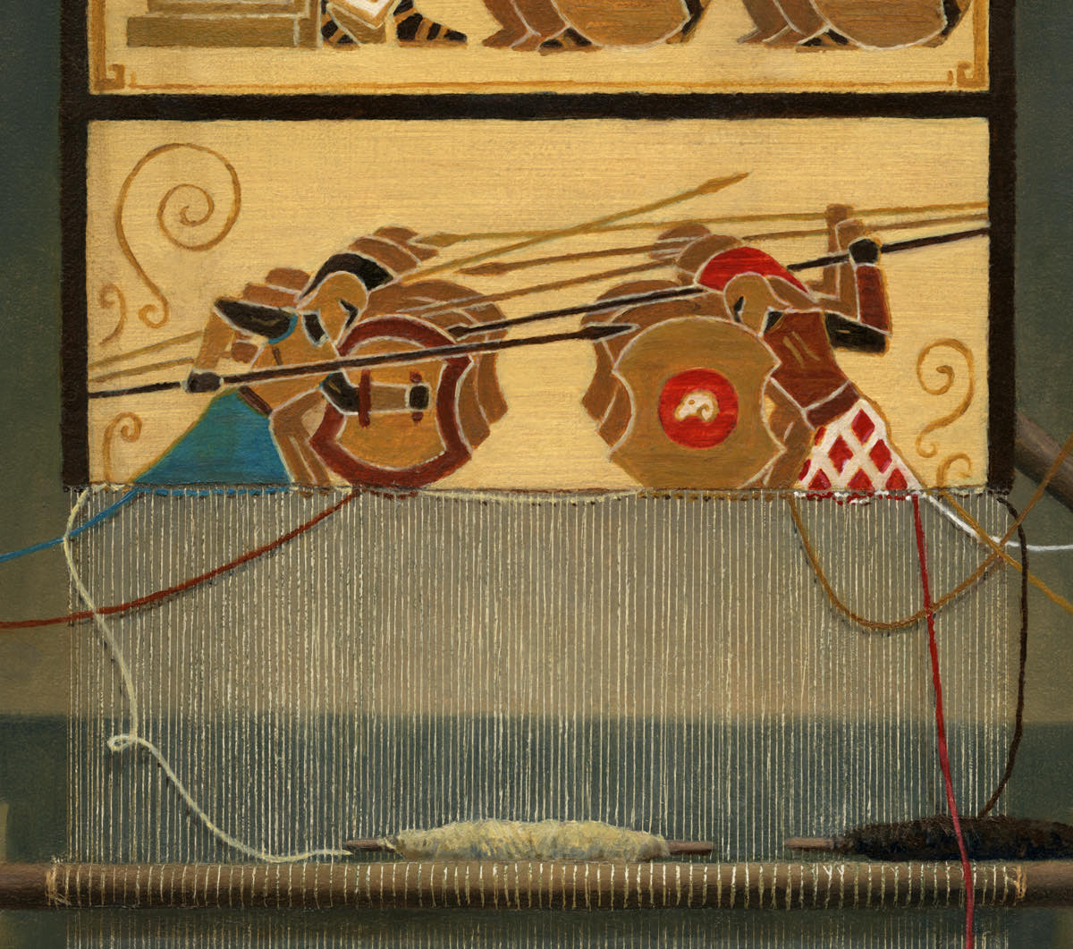
The texture from the gesso made for inconsistent gouges in the paint which I felt only added to the realism since it gave the whole thing a very hand-made feel in that the warp threads weren’t a uniform weight throughout. It also, in some way, insinuated the spin in the thread.
To complete the piece, I glazed in some ripples in the tapestry, dropped shadows over the warp threads where necessary and painted in the various colored threads on top of the warp.
Funny enough, this piece has garnered a lot of kudos from my fellow artists, primarily (I assume) for the technical achievement. In reality, a lot of the detail that folks think is present is merely insinuated or was accomplished through very simple means. It only looks complicated. A bit of forethought and preparation before I even started painting gave me a leg up once I finally started applying pigment, and the whole piece went so quickly, that by the time I’d thought to document it, it was basically finished. Funny, though, that often times things that we see as mundane in our own work are what amazes others.
If I could go back in time to 2017 and finish that other tapestry piece using the above process, I would. But apparently I’m the kind of person that needs to do things the hard way first and only then can find a shorter path to the same conclusion. On the upside, I actually found that shorter path. So I’ve got that going for me…which is nice.
Before I go, here’s an interesting video I found in doing research for both tapestry pieces. It’s a more modern loom being used, but the principles of weaving are the same. Regardless, I find the dedication and the process fascinating. Hopefully you do too.


I really enjoyed this post. I love your technique for suggesting the look of tapestry. And the video on weaving tapestry was excellent. Thank you.
Very cool Steven! A great piece, both in terms of storytelling, and technique. Thanks for the insights on how you pulled it off.
Wow amazing work! Went back and read your first saga post too. Thanks for all the info and insight. Very inspiring.