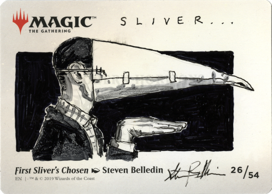
Last year, Magic: the Gathering put out a series of art cards that were exactly what you might expect. They weren’t playable cards within the game, but rather a series of cards that featured a selection of art from the Modern Horizons set (don’t worry, the set name isn’t important, it just provides some context) printed full-bleed on a card. This meant that the art ended up being a fair bit larger than is typically found on the normal, playable Magic cards. As an artist whose work was featured on one of these cards, I got a bunch of them which I were free to sell, embellish, embellish and sell, use to level a table or jot notes on…you know, all the things one can do with free stuff. The painting of mine that was selected for the art card series was First Sliver’s Chosen, which I wrote about the creation of here.
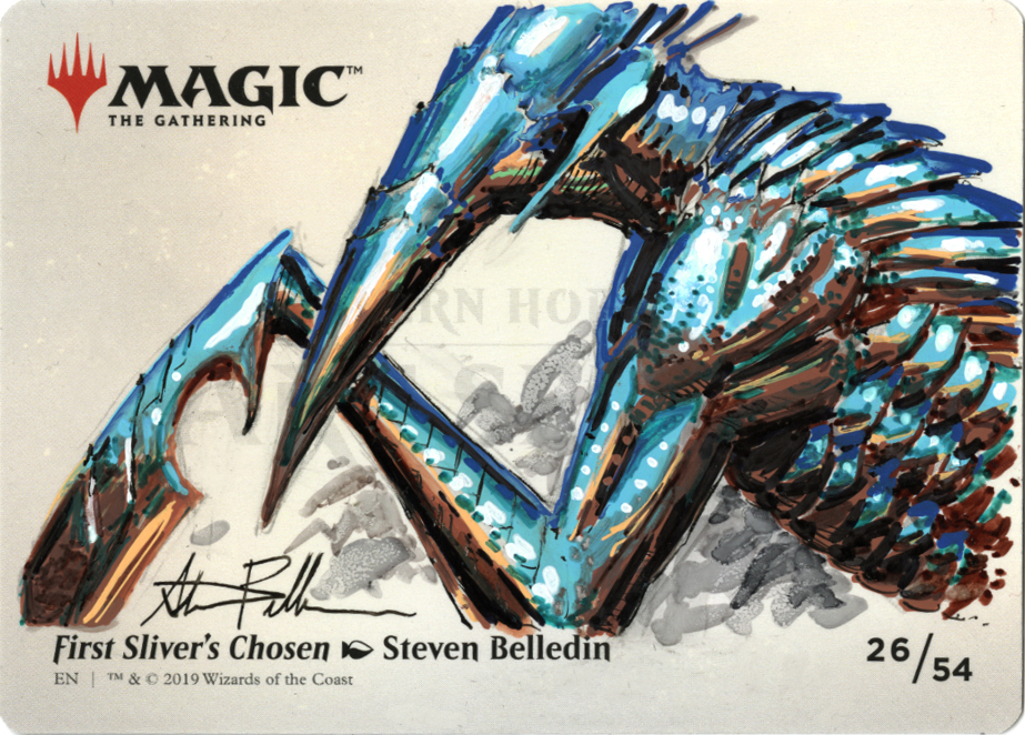
As a refresher, the art looks like this:
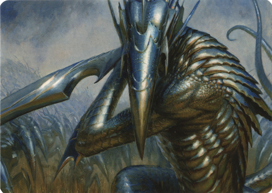
This is the image as seen on the art card itself, which measures three and a half inches wide by two and a half inches tall.
The back of the card looked like this:
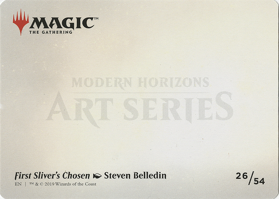
Obviously there’s the art title, my name, the Magic logo, and the designation that mine was the 26th out of 54 cards in the series.
Like all such cards I get from Magic, I set a few aside for my own collection and then decided to sell the rest. The problem was that there really wasn’t any demand for the cards themselves. So, I felt that the obvious thing to do was to put drawings on the backs of the cards. The only issue was that the back of the cards were a printed surface. Not only was the back printed, but it was glossy and so the cards had a very slick, nonabsorbent surface. While I knew it was possible that this could be a source of frustration, I also saw it as an opportunity to experiment a little bit. And so I did.
The tools:
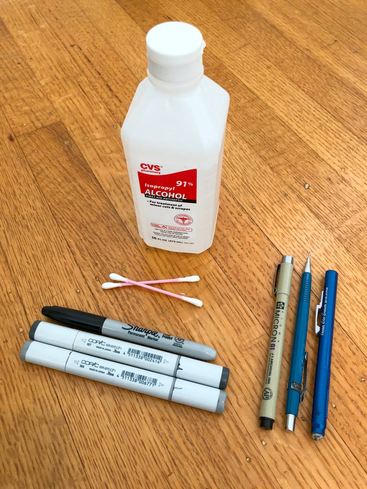
For black and white drawings, I had my trusty mechanical pencil, eraser, Micron pen, Sharpie and Copic markers. I also had some alcohol and Q-tips handy to see what they might do to the markers. This was an experiment, after all.

For color drawings, I added the use of Uni Posca acrylic paint pens and a range of Sharpie markers.
Truth be told, I haven’t done a ton of work with markers, so I have a relatively limited supply. The selection of sharpies I own is largely for the purposes of autographing things and use in organization. The few Copic markers I own are primarily for sketching in my sketchbook. I can count on one hand the number of times I’ve even attempted anything approaching polished in marker. I wasn’t expecting to be brilliant at it, but I suspected I could put together some pretty serviceable images in the end.
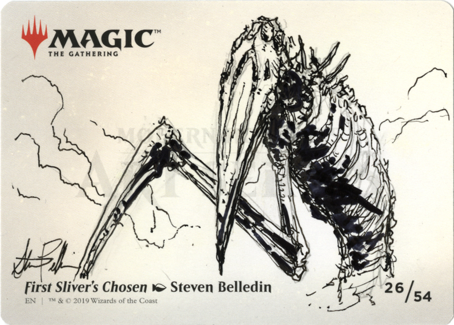
Anyway, I decided to do twenty seven sketches in total (I was furnished with 30 copies of the card), and I also decided to limit my sketches to variations on the creature contained in the art on the front of the card: the sliver. Here are some highlights and some details on my thinking and process. Keep in mind that these are not major works and were largely done as an exercise and a means of amusing myself.
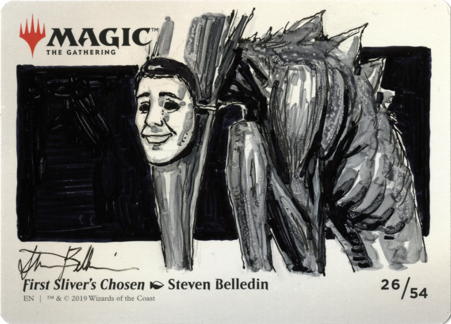
I started out with simple black and white sketches at first to see how the slick surface would take the various inks.
 Before long, I started to introduce the Copic markers.
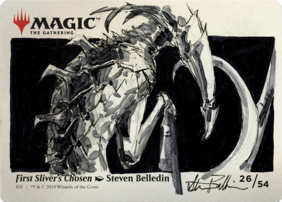 Finally warmed up, I got brave and started toying with an alcohol-soaked Q-tip. Given that the markers I was using are (for the most part) alcohol based, I surmised that I could reactivate the ink with the alcohol-soaked swab. So, I started out by laying out my values, and then I’d use the swab to blend and erase into those values. Astonishingly this worked better than expected and I was able to slide the ink all over the surface.
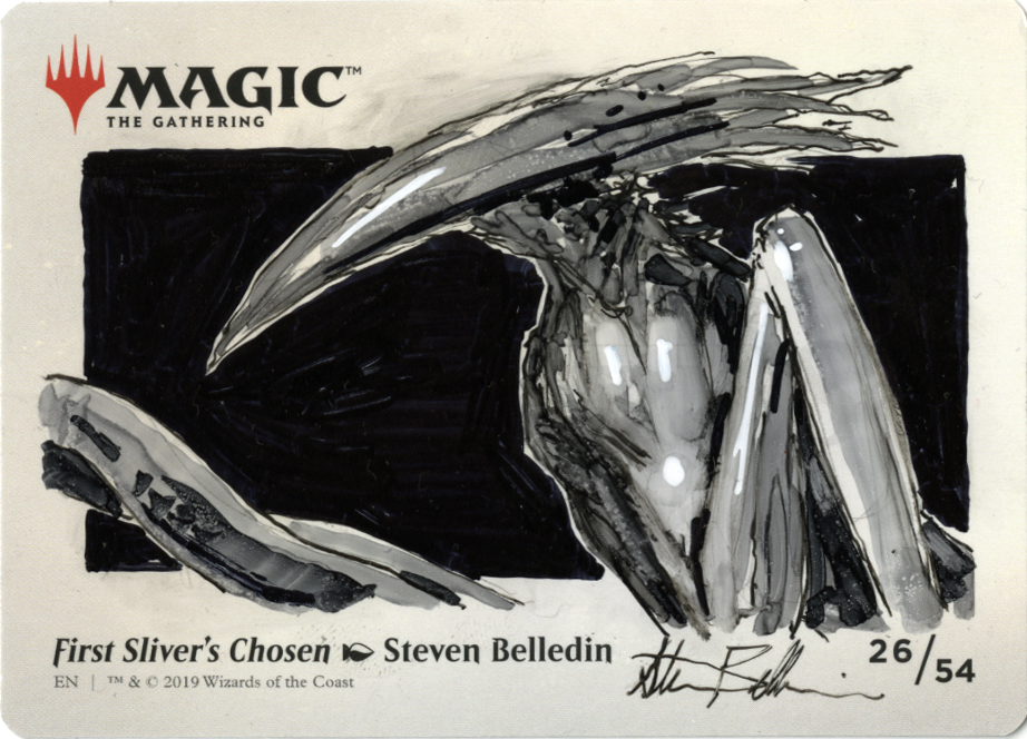
The musculature of the…shoulder(?) was entirely the work of the Q-tip dipped in rubbing alcohol as was the volume of the…bisep(?).
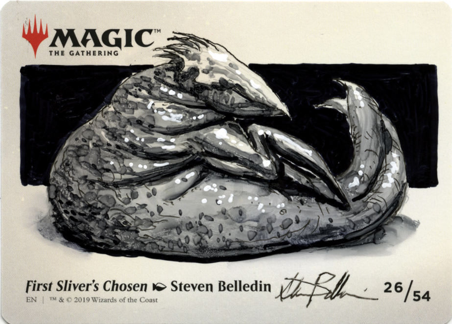
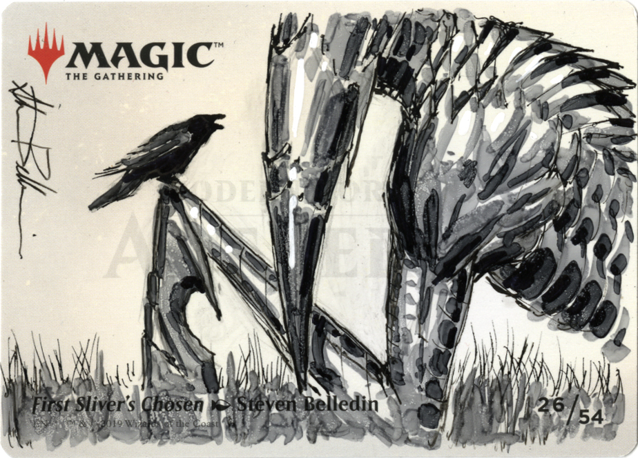
Again, same deal. The Q-tip made every fold happen and I went back in to accentuate them. It also allowed for some blending in the shadow areas. I finished this one up with a few glints of white paint pen.
Unfortunately, I’ve found that the rubbing alcohol trick doesn’t tend to work nearly as well on normal paper. The alcohol does reactivate the marker ink, but instead of lifting entirely, it just bleeds. The printed surface really was an important factor. I suspect that one could create a surface that it would work on, but that’ll take some experimentation with gloss mediums and such. If I ever do such experiments, I’ll be sure to report on any success.
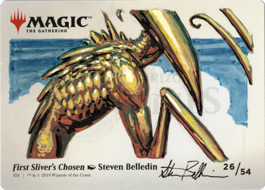
Anyway, eventually I ventured into color images to see what I could do.
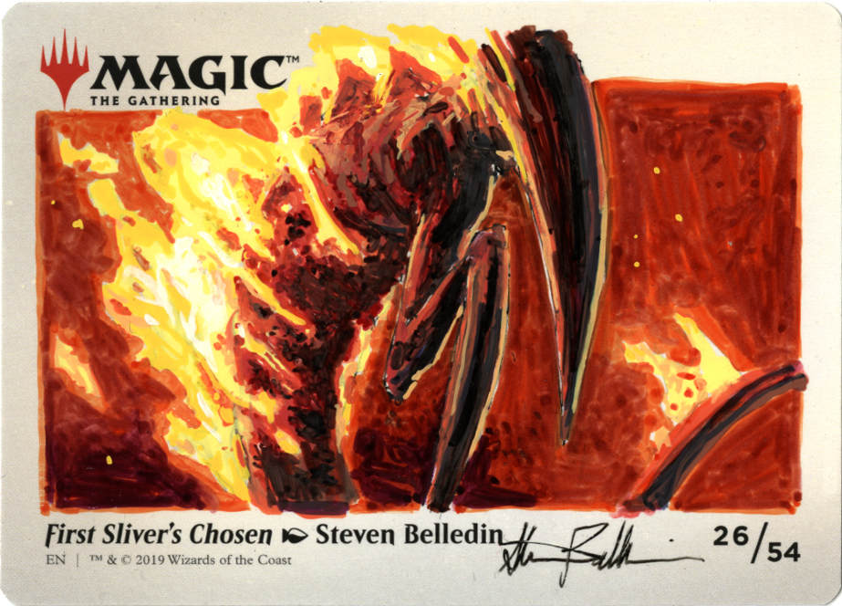
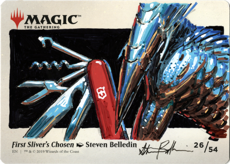
This was the first color image I did. I was marginally familiar with the Posca paint pens, but I wasn’t sure how well they’d adhere to the slick surface, nor was a certain about how well they would take layers of Sharpie on top of them. In the end, I was pleasantly surprised.
Process-wise, after a quick pencil layout, I blocked the various colors in with the paint marker (in this case it was the light blue, the dark blue, the brown and that light orange/earthy yellow color). After that layer was dry, I used Sharpies to manipulate the paint pen layer’s colors and values, as well as add detail and help smooth various transitions. I used brown, gray, blue-green and black sharpie. Lastly, I went back to the Posca pens to hit some highlights.
With each one, I gave myself a new challenge of articulating a new texture or surface. Given my relative unfamiliarity with the materials, I kept the challenges small so I could just concentrate on becoming comfortable with how the various markers and pens played with one another.
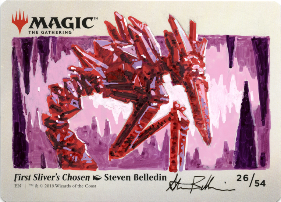
It was an interesting challenge to see what I could do with somewhat limited ability to blend and a range of colors that really couldn’t be mixed (not without ruining the paint pens anyway).
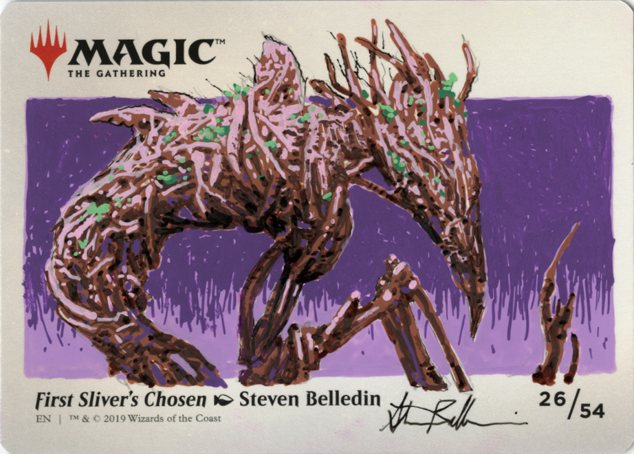
An additional challenge became figuring out how to utilize the colors available to me in ways that I normally wouldn’t consider. Here for example, I used a pink paint pen for the highlights on this sliver made of vines and roots. I likely would never have done that were I able to mix my own colors. Again, a minor challenge, but a fun one for me.
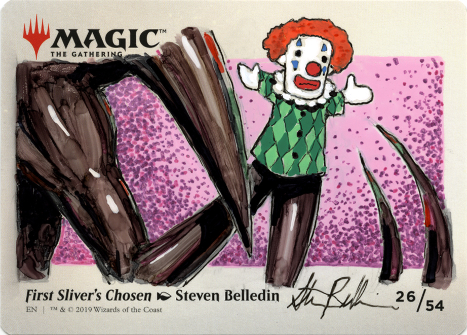
Mixed in among the various explorations seen above, I periodically threw in other pieces that relied more on visual gags.
So what’s the point of all this? The point for me was to challenge myself to work with media that I don’t typically work in and to see what I could create with those mediums in miniature (the cards are only 3.5″x2.5″ after all) while riffing on a single theme. I’m pretty comfortable with oil paints at this point to the point where I’m starting to feel a bit hemmed in. I didn’t always work in oils, but that has been my medium of choice for twenty three years now. But the itch to try new things and branch out is starting to become strong. While I’m going to do a deeper dive into other media and methods soon, the lack of certainty for me is…a bit maddening. So, rather than set myself up for failure and frustration, I find that it’s better to force myself into smaller steps at first to get a footing.
So, I turned to this very structured exercise. It was good opportunity to flex my brain, learn some new skills, relearn some forgotten skills, and try new things with something that essentially fell into my lap at a time between assignments.
In the end, of the 27 drawings I did, I think this one was my favorite. It combined a unique solution to the assignment, a fun visual delivery, and a rare opportunity to showcase my sense of humor.
Are these brilliant, award-winning illustrations? No. But they didn’t have to be. And that’s the fun of it. As seems to be a common theme in many of my posts, removing the pressure of achieving greatness can sometimes be a good way of getting there. As a friend of mine used to say, “you just gotta get in there and play.”
While I don’t think I reached greatness here, I had a heck of a lot of fun trying.
Loving these drawnings Steven 🙂 Looks like you really had fun. Are you sellting them now? I’d love to have one :3
This has to be the coolest post of 2020 till now! 😀