It is never an uncommon thing to get a follow up gig when things went so well the first go-round, but then doubling down on that gig with another concerning the same subject weeks apart is. And for good reason. It’s hard to capture lightening twice, but it’s not impossible. And if doing so stands any kind of chance at all, it demands that two essential ingredients be present: The subject is rich enough to suffer a return trip for second helpings, and the artist is able to cut bait and re-approach the material freshly with only the wisdom of the previous effort as a guide of what not to repeat. No mean feat, but that was put to the test in a big way this last fall when I was asked to make a poster for Bong Joon Ho’s marvelous crime noir, MEMORIES OF MURDER for NEON’s rollout campaign to release, and then again a few weeks after to do it all over again for The Criterion Collection.
When I was first brought in to do MoM for NEON, it was largely on the heels of my doing a similar thing for them all with PARASITE success. This alone was a little intimidating because lucky for me when I did Parasite, I had no notion that it would become the juggernaut that it did. Now I had to follow up on the heels of that rocket ship and frankly, that can make the parts lock up. But happily there’s always comfort in the process, and getting back down to it, flushing the brain toilet on anything but what you see before you helps. A well worn muscle I’ve used when getting to reimagine old favorite films for posters or Criterion releases… without it, it would be impossible. But lucky for me I had never seen Memories of Murder before, so I could con myself into the helpful notion that new-to-me was the same as new.
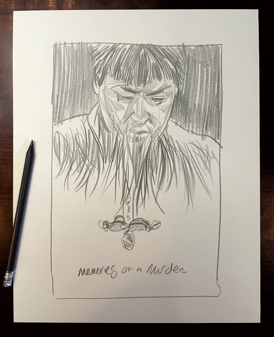
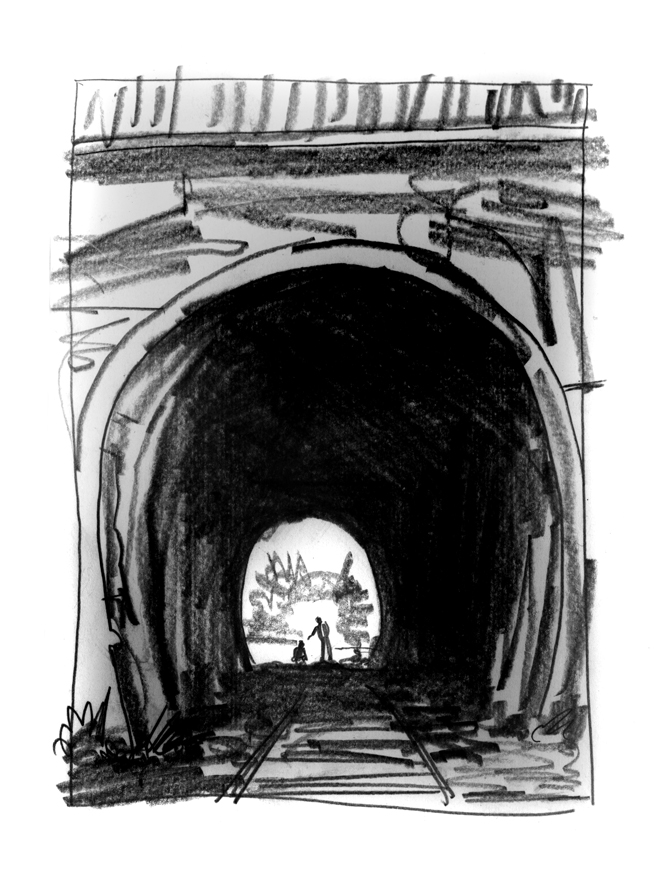
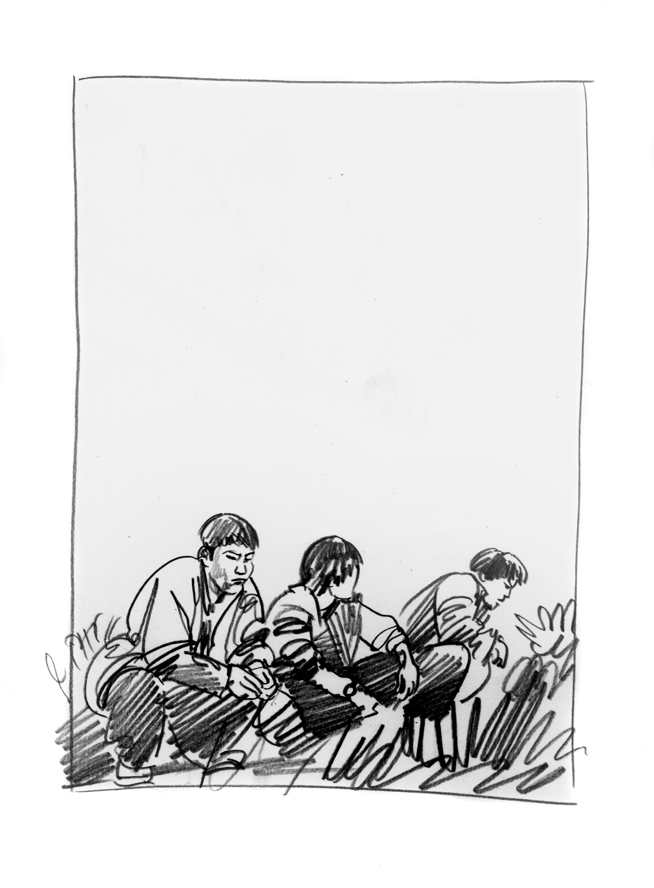
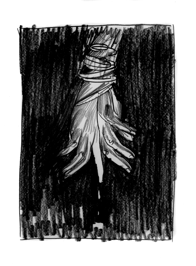
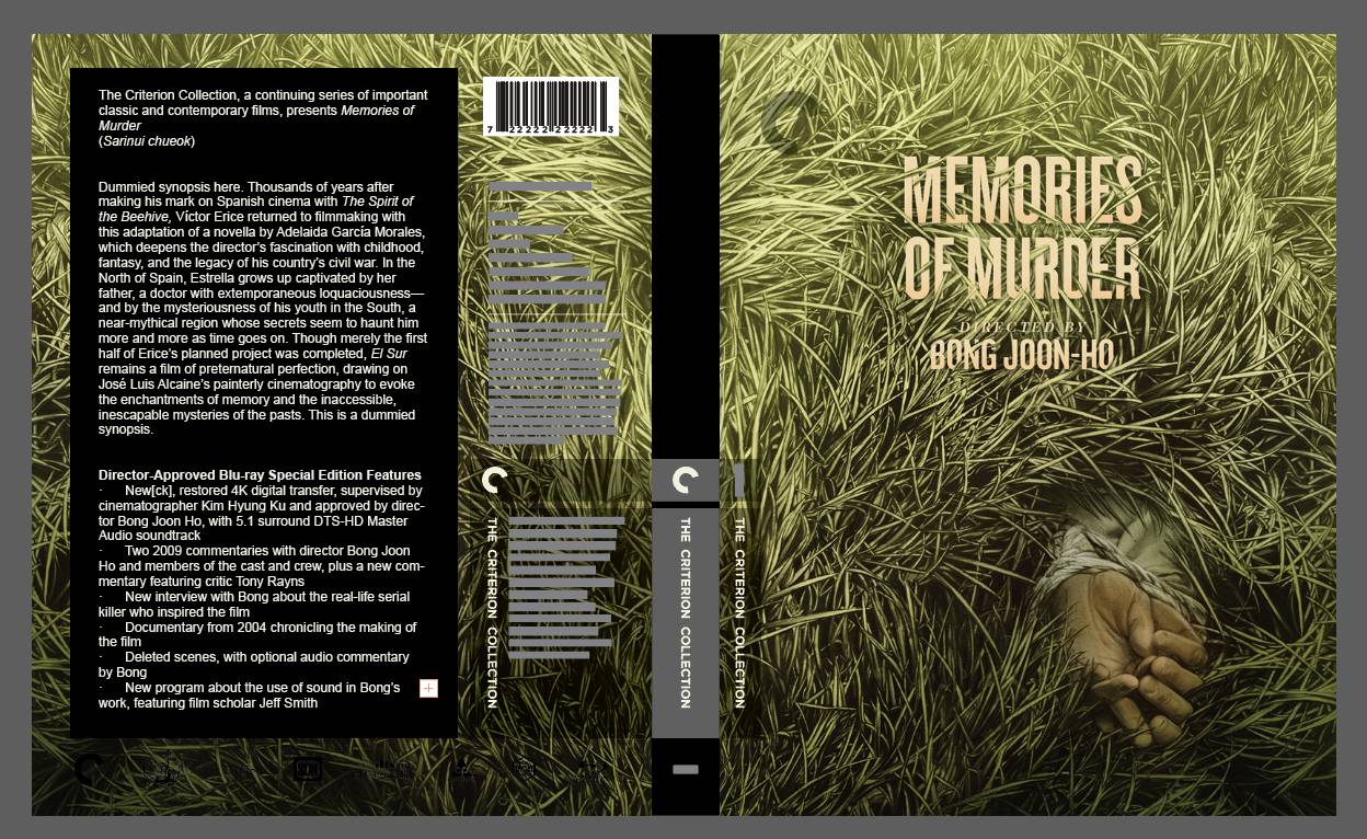
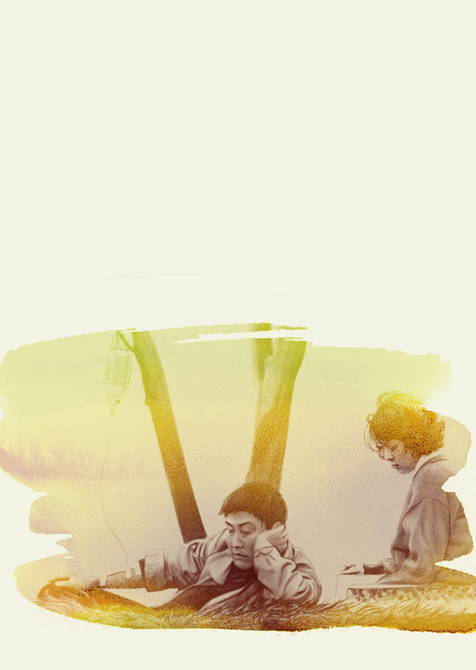
The first thing of course was to craft some sketches to submit. It’s a tricky film to draw on, much int he selfsame way Parasite was: it’s a character piece with large themes told through small moments, and covering a lot of ground without ever getting lost or being singular in its ethic. There’s no Luke-with-a-lightsaber moment to hang a hat on. So I decided to reduce the experience down to the lead detective, played by Bong’s own personal favorite avatar, Kang-Ho Song. Keeping Kang in line of sight and those fields of grass he returns to at the end and finds the first corpse tucked int he drainpipe at the film’s outset made a perfect two-element approach. Initially NEON wanted to redo the multilevel floating Twin peaks portrait approach we did with such success in Parasite… I resisted the expected pull in the spirit of trying not to over ride the same ground here, so offered a few options to go forward with as you see below:
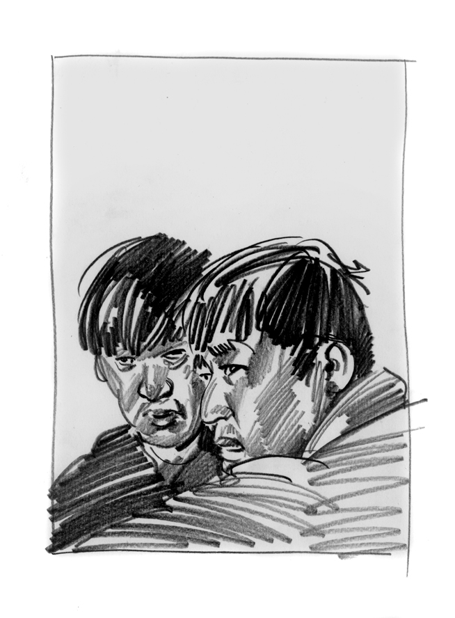
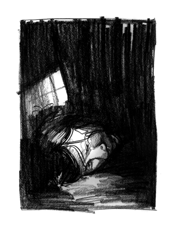
Unsatisfied with these I immediately followed up with a couple of others:
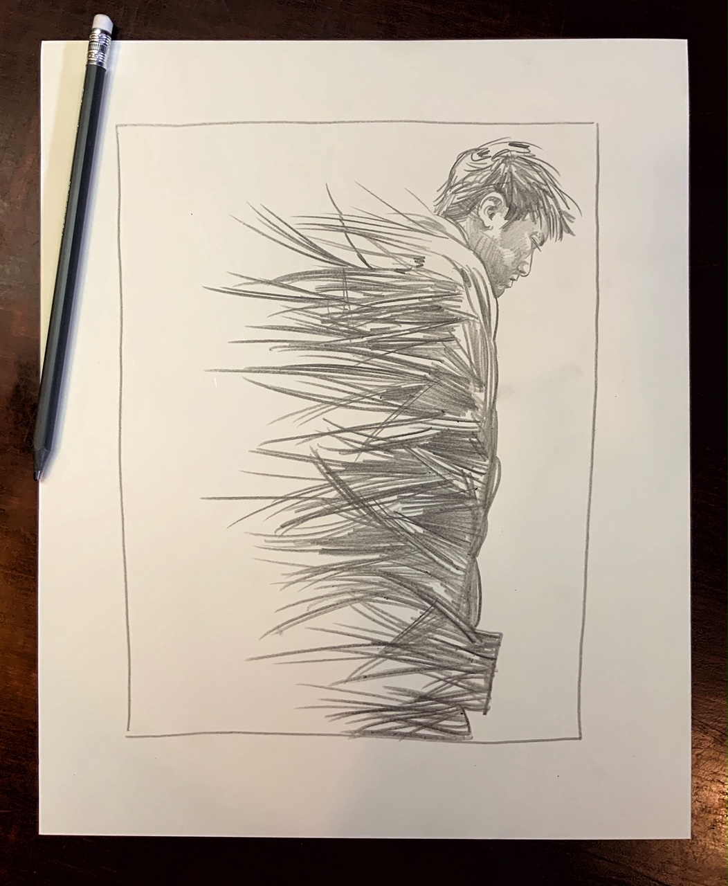

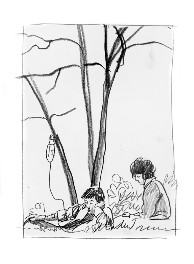
And then in an email suggested we take this last one, and turn it so the grass rose up, making Kang the victim of the experience, and likening him to the murders… and we were off to the races. Luckily NEON was happy to risk the horizontal format change, and so we submitted the final new sketch here:

And then I drew it, watercolored it and wrapped it all up with the usual mix of digitally applied practical layering to the final:

Now when we were all on the other side of this, Bong insisted I tackle the approach for Criterion and they got in touch to tackle the gig. Always a little funny when you’ve been working closely on both sides of the same equation, I have this ongoing experience in working on so many covers for Nnedi Okorafor’s books so it was familiar ground.
SIDEBAR- (It is essential however to make sure that regardless of the inside run you may have to keep to the respecting of the protocols. You don’t want to put your AD in a weird position because you’ve done an end run around him/her by going to to the director directly, nor vice versa. You think you’re making it easier or maybe even making your own wishes survive pushback, and you may in the short run, but it makes people crazy on the other end, and I think personally, betrays some of the important confidentiality these relationships live on. So if you’re faced with this dynamic, make sure you recognize the landscape and work the system as it presents itself to you. Remember, no matter how important a project is, how impassioned you may be about it, the relationship is still more important later. Burning bridges with short term thinking only harms you, and isolates you over time, so it’s important to be mindful of these social dynamics in a job like this if you hope to have the opportunity to dance with another later on).
SO. Memories of Murder revisited! Immediately my old pal and AD, Eric Skillman made clear on the outset that they wanted to not use the image we’d created for the NEON poster, and particularly the color tones. Funnily enough though they were initially operating from the film’s original print which had a vastly different color scheme than the newly restored version they then put through their own Criteri0-tron, (the don’t call it that but I will until they tell me to stop), So in the end the color palate came home to where we were… but I was glad to have the chance to start fresh for this one. It would have been simpler to do nothing and ram through the poster as cover and get paid twice for the reuse… but not my way. Why work for an hour when you can work for twenty, I say.
I thought the best way to re enter this subject was to pure all prior experience except as markers of where NOT to go, and screen the movie again and watch it with a new POV. It helped a lot to have the usual wide range of images to play with outside of the initial brief for a cover and a single insert piece. (I have a habit of making dozens over ask for these things. Oh well).
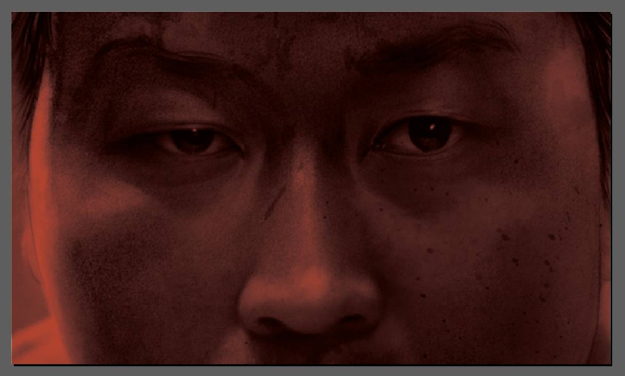
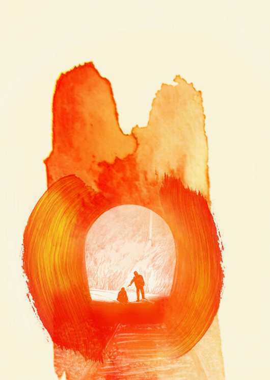
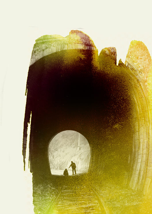
Criterion had a notion from the film coming in, and as is largely and often true, they are always happy to be outflanked by a better approach if one is available. Sometimes there isn’t, because they’re brilliant and typically get it nailed down early as a result… and I usually happily follow along. But the scene they were after, this red riding hood moment looking down on a decoy cop posing as a potential mark from the raining treetops as our killer perches like a monkey waiting to pounce…. it was inarguably an awesome approach.


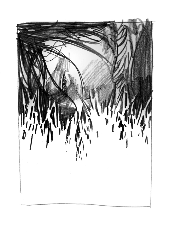
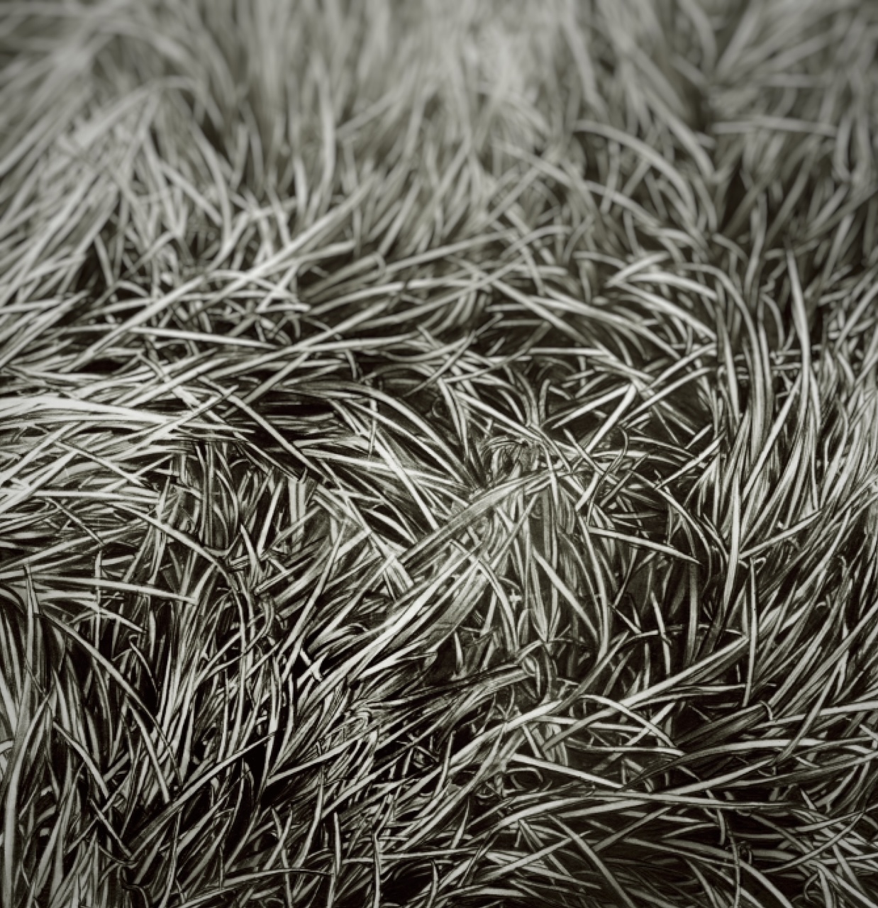
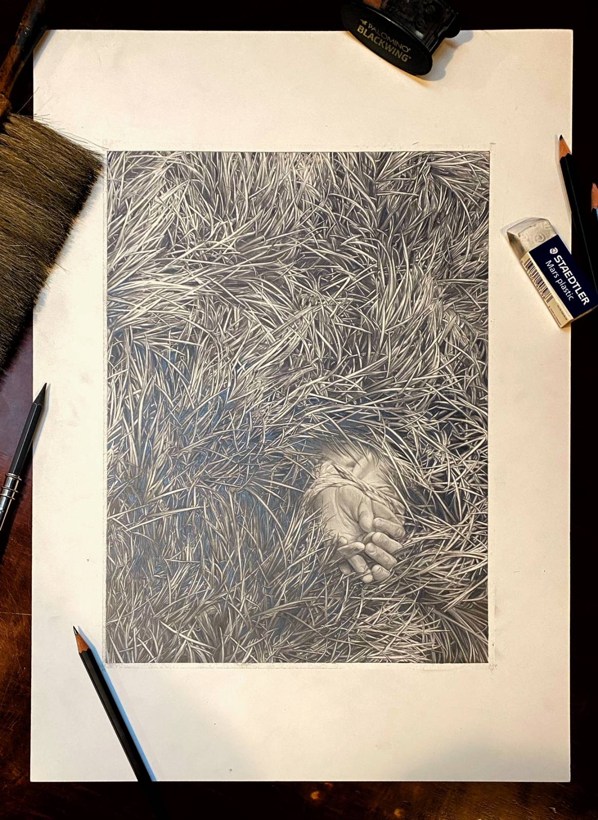
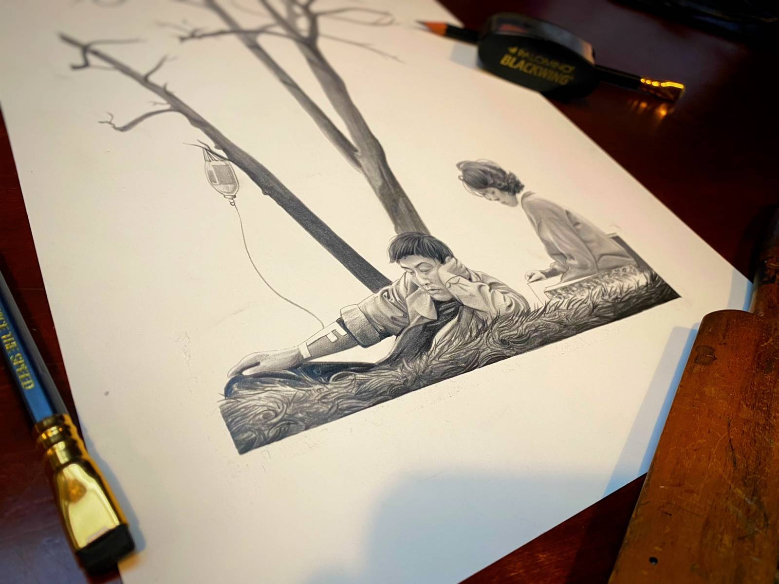
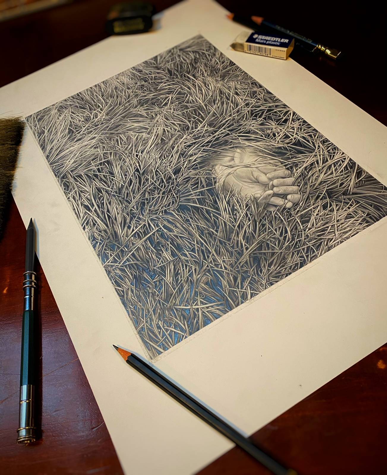
Nevertheless I couldn’t hear the music of it. Who knows why that is, but it is what it is. I submitted the usual panoply of thumbnail sketches with some notes for perhaps a better approach , one of the final notions was this idea of making the grass the character and hiding the murder in it. That moment of discovering something so grisly tucked away in, as Eric put it, a Miyazaki-esque playland, was to delicious to pass up. I knew it would be a tough one to draw, and an act of supreme patience to get it right. Still I had no idea how far off the mark I was. It was hell.
Because the design required a carpet of almost flat, uniform shapes, to the point of near abstraction, that meant there wasn’t shadows to hide in or crested distant hills to deceive with. It was a pattern more than anything, and one with a nasty little treasure tucked inside of it. It, the grass couldn’t be own its own ominous or grisly so as to counterpoint the bound dead woman’s hands it enshrouded. But it had to flow… one of the aspects of this scene is the wind through that tall grass. So it had to be a swirl, and feel like wind and motion while still basically being a pattern on a wall. Horrible.
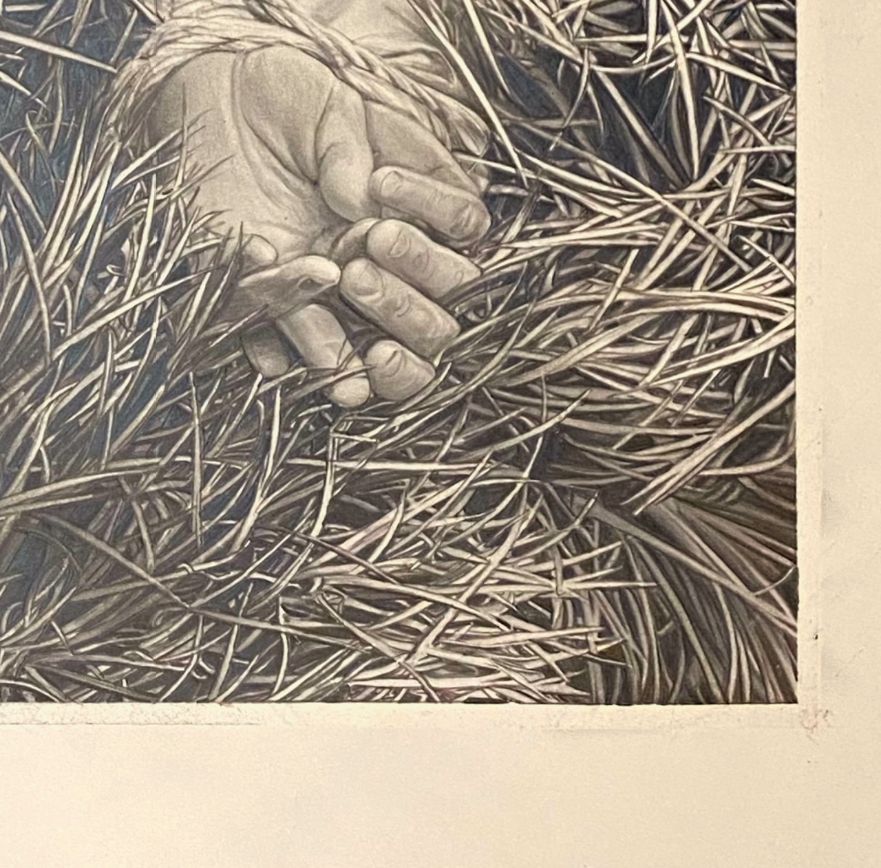
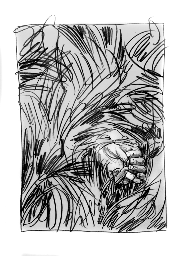
The crazy thing about this too, was that it was a Hail Mary pass. Sometimes you can deliver possible piece just fine with a sketch and a few notes, but this was not one of those times. IO felt sure the best way to convince was to do the piece, stick the landing. At least if I failed while doing it, no one would be the wiser. I took all the burden of blowback, Eric let me run and after three of the most tedious unpleasant and miserable days in a long time, I sent the WIP of the piece on the drawing table as you see.
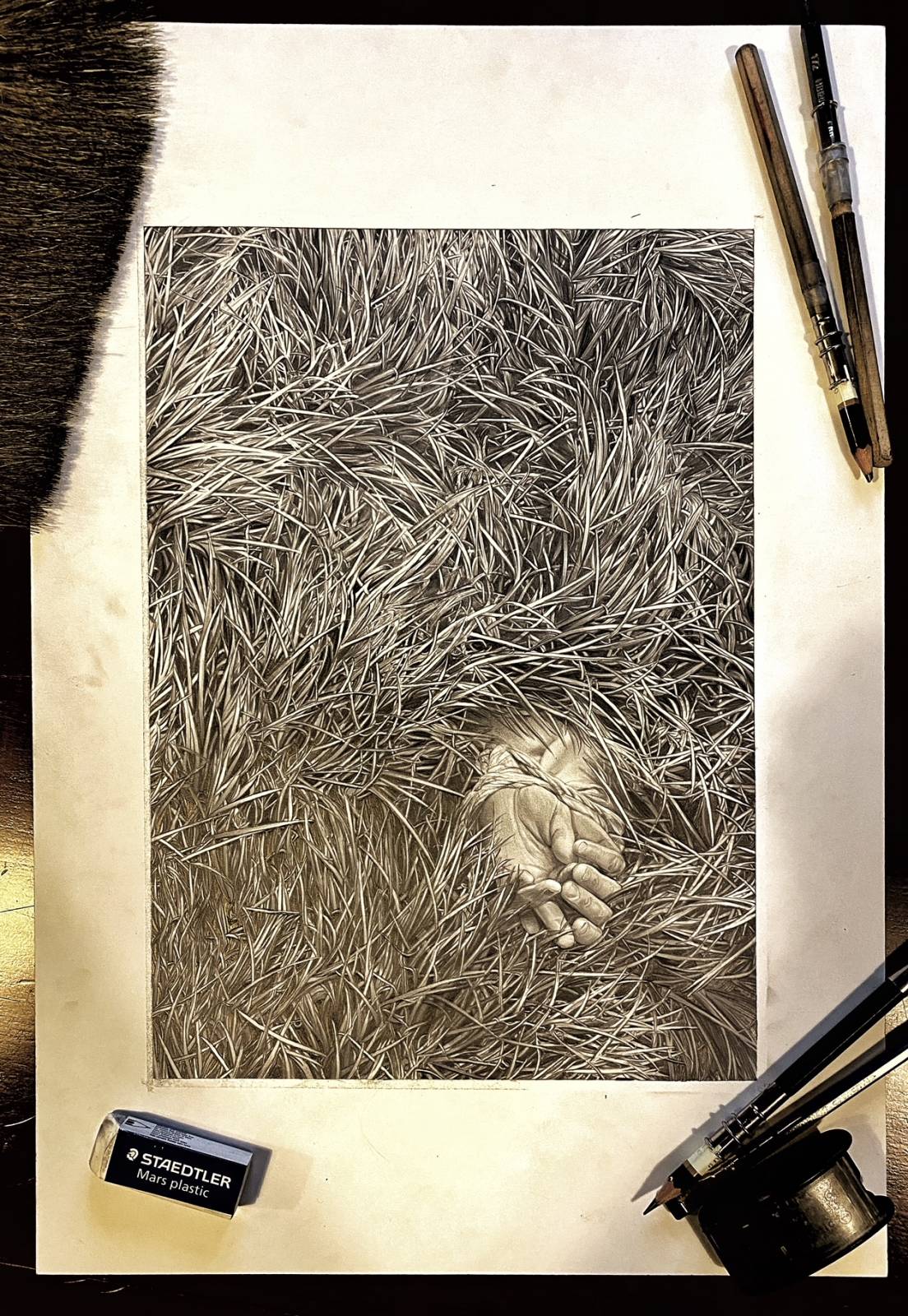
The thing that I found out about this aside from the reality that I did not enjoy doing the work of making it obviously, was the supreme endurance it took. The mental discipline to grind through it, treat every blade of grass without letting a brush stroke do it for you in a single swish. give it a place in a depth of field, cast shadows and have shadows cast upon it. Do this again and again and again and again and again… while also being mindful of the overall composition, and sense of flow as a whole wave of grass. In and out, face to the page close and pulling back like a helicopter fleeing a leaping sharktapus, and back in a again. I woke on these days happy until I remembered what I’d be doing, and went to bed exhausted and still strangely unfulfilled. It was after all, just damned grass. The discipline part really came in to fight back my own usual inner asshole, made drunk with power on the fact that again, Bong had approved this final grand tedious repetitive nightmare. It took hours to fully execute a single portion, then a break to sketch out the next quadrant, before returning to the prior arena to bring in the dark darks…. all the while my inner terrorist kept telling me what an ass I would be if he rejected it. What a damned waste.

I have drawings like this all over my studio- huge over grand gestures, that I just lose heart for and never see finished. Largely they get put down behind the woodshed, (the trash bin), to us both out of our misery. But lucky for me this time was not them. Bong loved it, everyone was happy and it was off to finish the project with the final interior notions. Getting the cover down early helps everyone. It’s always the premiere piece, but practically speaking it also means everyone can begin to design the needed title treatment, package design. hell you can even start promoting and preselling the book or blu ray on the cover alone so it’s a real boon all over to the thing to get r dun asap.
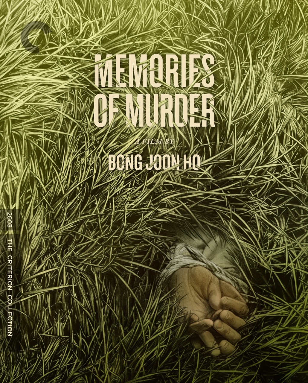
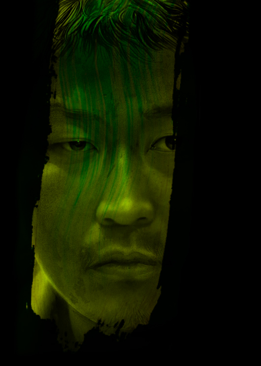
This was a cover and so needed to be in full color so I had to then go in and tackle that. There’s a tendency to just press GREEN and make it all so, but sadly grass aint that way. It’s got brown bits, lighter parts yellows dark greens light greens, and so on… Much of the way color could help or hurt too was how colorful the hands might be… whether to pop them forward or to make them hidden and unseen at first glance. I ended up somewhere in the middle. The hands took a few redraws to get the weight right… dead hands done’t rest like living ones do. Gravity effects their digits and muscle and flesh when unresisted by lifelessness. Just look at Michanghelo’s Pieta to see what I mean- the difference between the sagging emotional grief of Mary and the slumped cold corps of Jesus in that thing is remarkable. and in MARBLE! Gah! I always think of that sculpture when I have to draw a body. It’s a goal I’ll never reach, but am better for reaching to it. I did a few versions with different levels of color. It was nearing the holiday crush, and everything was busy, but it wasn’t due until Jan and I took a few days away from it to return to make sure I couldn’t do more. I thought it would be cool to interweave the grass into the title, and Eric had the same idea and did his magic. Bong was on set with his new film so we thought there might be a lag in final approval… there wasn’t! A lag I mean- Bong has been a tremendous cheerleader, and this is not an easy thing to do: be completely open to some stranger to take your baby and paint its portrait without your constant input and command… and mores for seeing it apart from your baby and delight in it. That to me is a truly amazing touch of grace and the best part about the job.
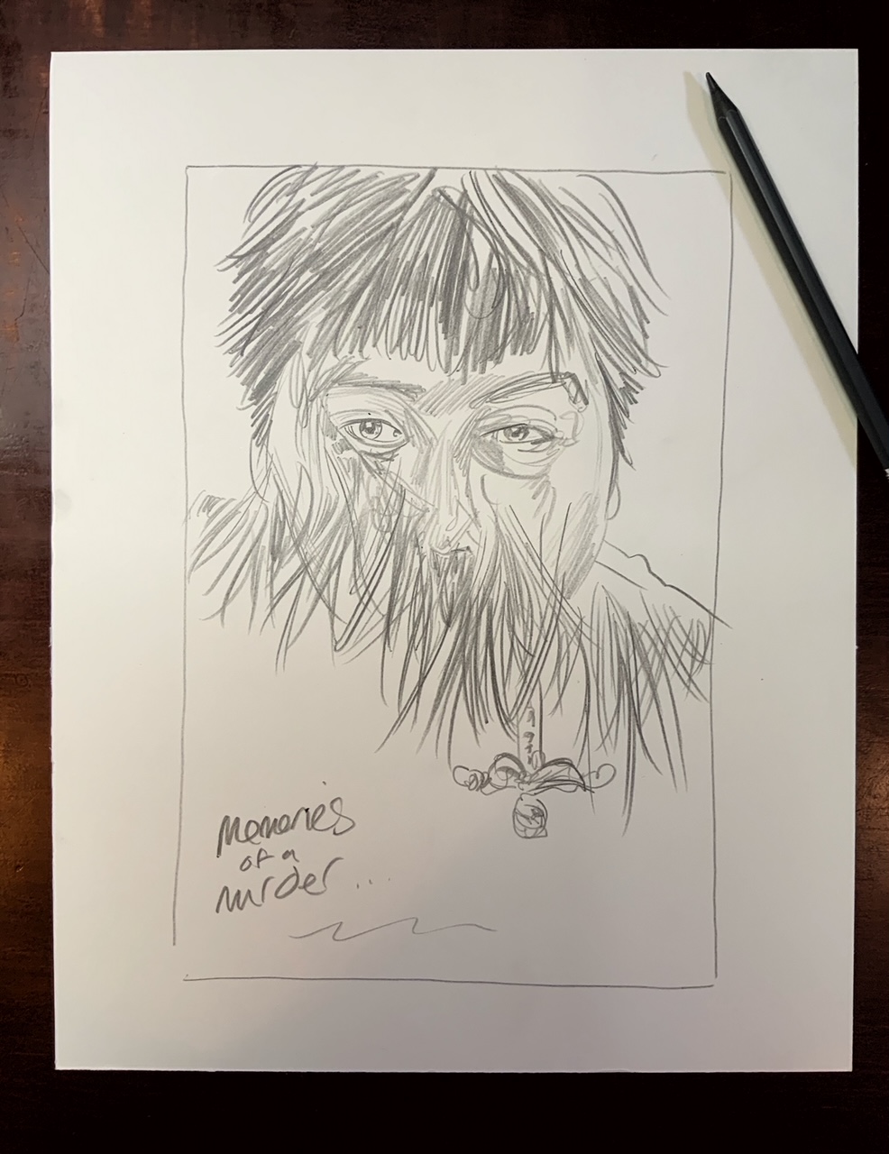
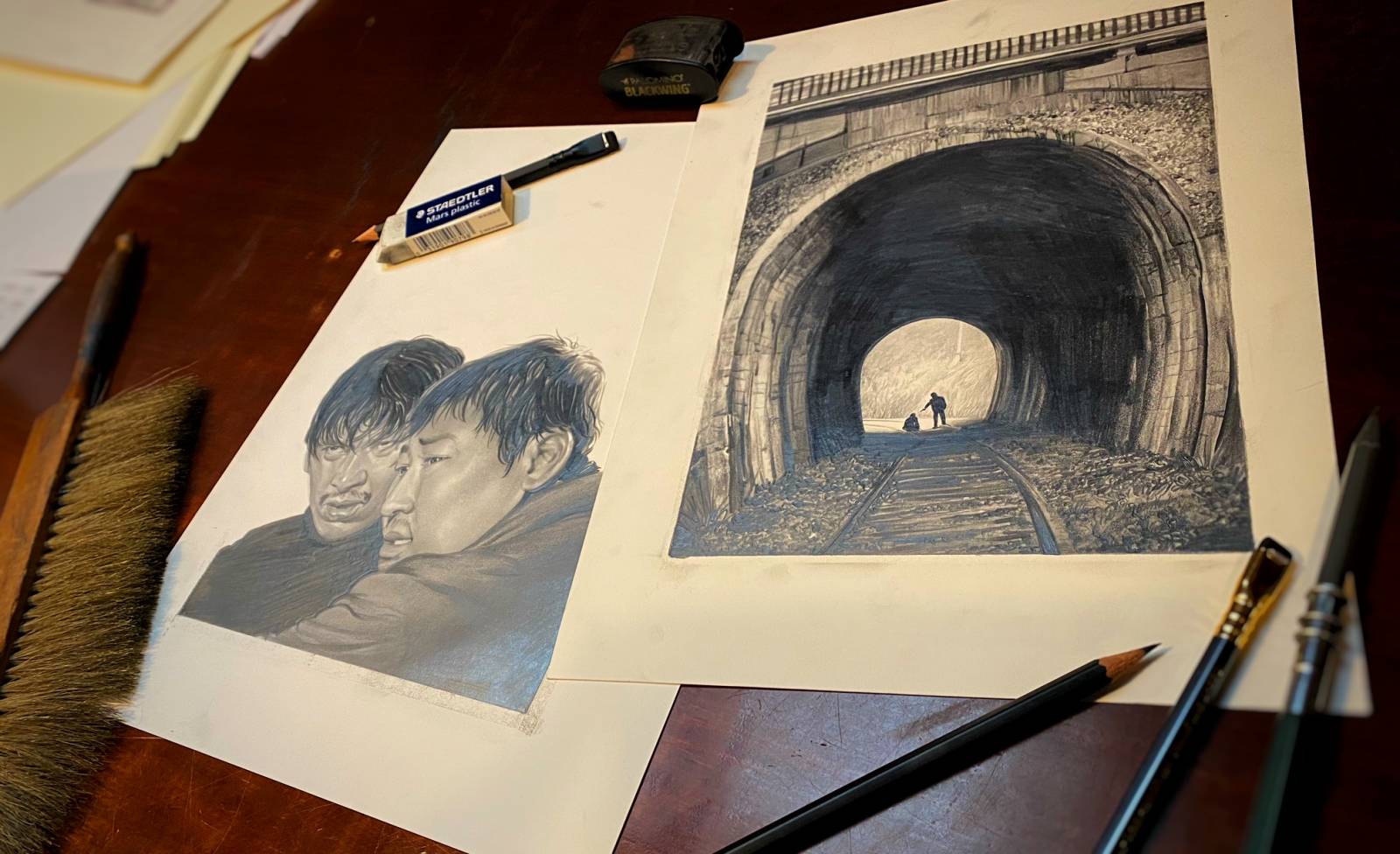
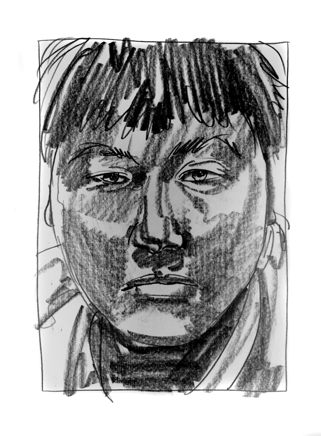
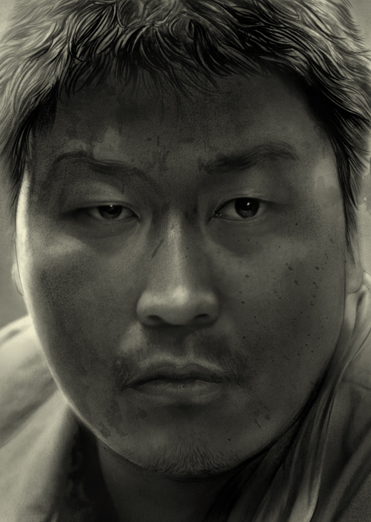
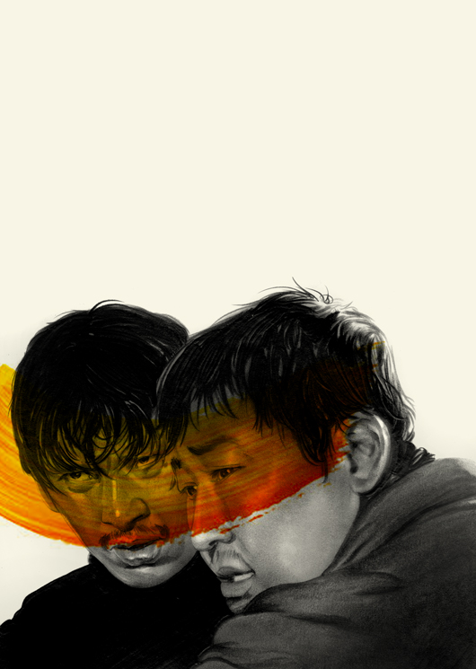
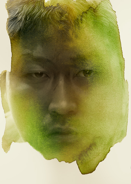
It for me cleared some space to play with the interiors. I think for the most part the chosen interiors were all of a piece with what Criterion wanted, save for the big close up on Kang- I sort of bullied that one through. His face is just… if you had to pick a human face to encompass the whole of our natural experiences, Kang-Ho Song is that face. It’s just all there. So for a portrait fanatic like me, given we lacked his presence up front as we did with the poster, it was important to try and capture if I could. Easier in no small part for having spent so much time with his face these last few years.
I tried out all sorts of approaches… some of these felt fine as graphite pieces, but for this project they all of them needed color as context. So I made some messes, scanned them in and played around until I sent over three or four sets of work all of these pieces as drawn, and then variations on their color approach. The holidays came and Eric also never not working, had at the advent of the new year picked a few that worked so brilliantly with the whole package design. No notes ever that I can recall. He shows you what he’s got in mind and that’s it- ready for press.

In the end it was worth it all, the struggle and horror of the piece for the new cover, and all in all the whole animal. It should not be ignored the level of deep intimate understanding you get aspiring this much time on a single film. Diving in scoping details at the bottom and launching up above it for the meta themes and plot and character. It becomes the most artful form of autopsy ever, and like my coroner friend once said… “You realize you have an intimate relationship to exceeds almost every other kind in the person’s life, except they’re not there to share it with you”. I think what made double dipping into a subject like this work aside from the depths of the subject making that easier, was my recent deep dive into my commissions work too. Not just the interpretive nature of them, but the side studies and multiple expressions of the subject laid bare by multiplying them. Again, the 52 weeks Project teaches something new. It always seems to, and I hope it never stops.


You really are good at what you do, aren’t you? Beautiful work here Greg.
Thanks Bill- Without ego or fear of an overspilling of vanity I could say the exact same thing about you and your work! Being good at what we do is our opening act, though, ain’t it?
Bravura work. Amazing as always. Thank you for sharing!
Thanks Sarah- Appreciate your taking time to say so.
Now they just need to commission you to do “Old Boy” 2005. A trifecta of Korean cinema!
I connect to your work on a deeply personal level. I see it and say “I want to be like Greg Ruth when I grow up”, like a kid watching an astronaut.
I LOVE Old Boy- that would be a terrific filling out of the trifecta for sure. I wouldn’t;t say no to the Host either. I think that might still be my favorite… simply perhaps because it was my first.