Never complacent to settle on a regular process and stick with it, I decided to paint an assignment in acrylic. Acrylic is not something that is foreign to me. In fact, I used acrylic paints as early as the fourth grade. I continued to use it throughout high school and college—either as a chosen medium to do class assignments, or part of a process that used a bunch of different mediums layered over top of one another. It wasn’t until I was a senior in college that I set acrylics aside in favor of oils. Even then I continued to do under paintings or small studies in acrylic from time to time.
Anyway, this was one of those assignments that asked me to work in an aesthetic that is not my own. It needed to be a decorative bit of design work, and the graphic nature of the piece felt like a good fit for working in acrylics to me.
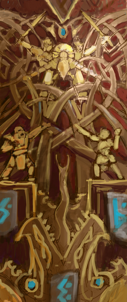
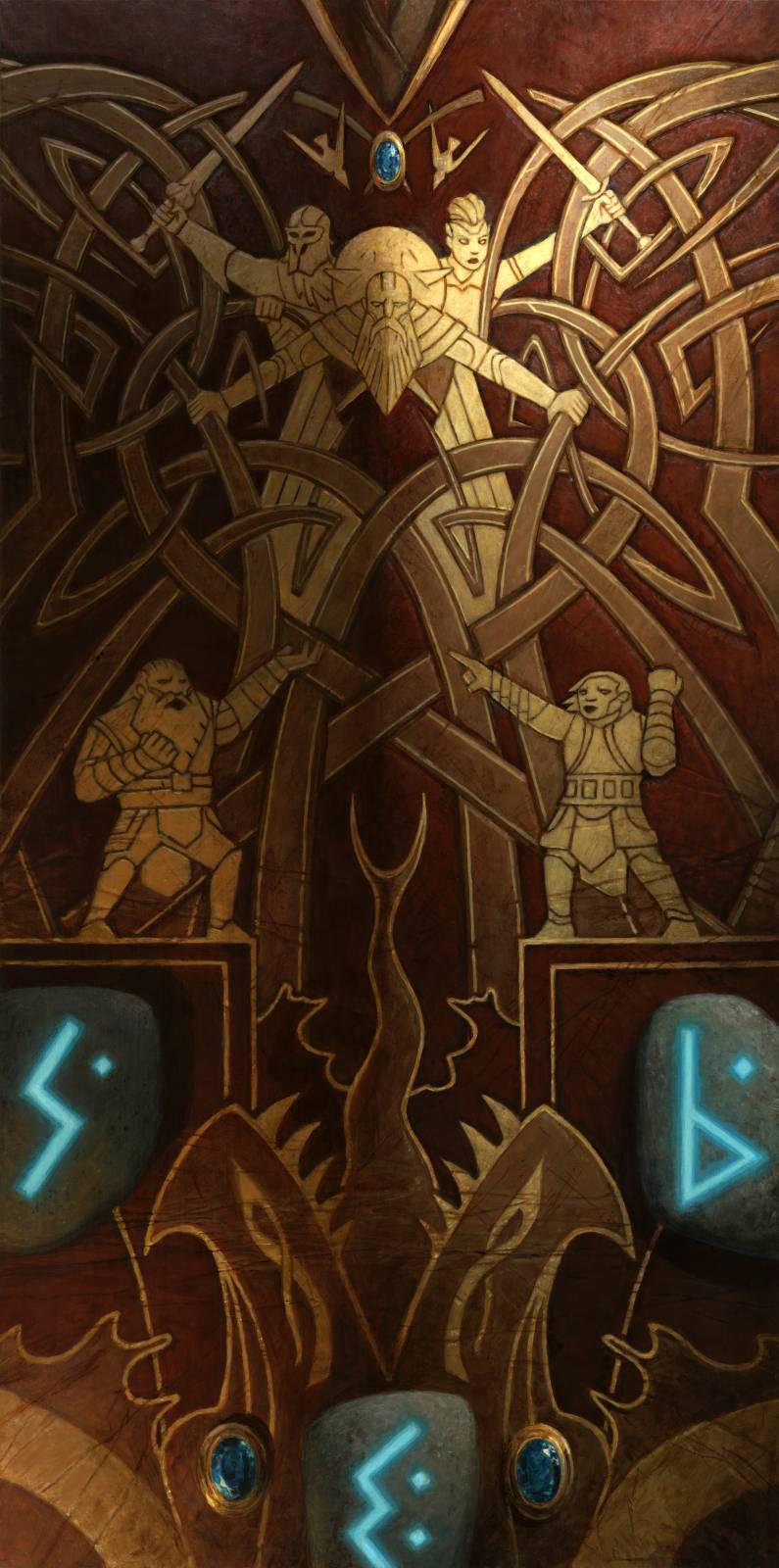
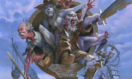
The image itself was meant to depict a bit of decorative leatherwork from a dwarven breastplate. The decoration in question needed to depict two competing dwarf story tellers (skalds) who are witnessing a battle between three gods and a giant leviathan. Adding to this, the piece needed to incorporate specific knot work motifs and stones with glowing runes.
All that sounds like…a lot. And it kind of is. So I had to take care to keep things clear.
Here’s what I came up with.
 How I arrived at the above is…well, I’m not sure. I knew I wanted to use the knotwork as a means of depicting the leviathan’s tentacles, and I knew that it would be cool to show the gods in the midst of those. I felt that it was better to err on the side of design over more realistic imagery, and so I leaned pretty hard in that direction and went with a bilaterally symmetrical image. The designs of the gods were all predetermined and so my task was more about finding ways to simplify them and make them more graphic. What the skalds looked like was basically up to me, but in reality, given the scale and the high degree of simplification necessary, all that really mattered was that they were clearly dwarves. The leviathan? I don’t know how I arrived at that. It feels really weird to me that I kept it, though.
Balancing all of these aspects was difficult and required a lot of refining. Within the digital file, I kept all the major elements separate so I could manipulate them individually and reinforce visual balance as I went. I added the runes last, as they were the least important element since they didn’t actually directly contribute to the image depicted on the breastplate.
As the color version above would indicate, my initial thought was to do this as embossed leather, but it was felt that it needed more color. So, I decided to incorporate dyed and gilded leather then whipped up this color study:
 This felt more like it and the fine folks at Wizards agreed. And so I was off to the races:
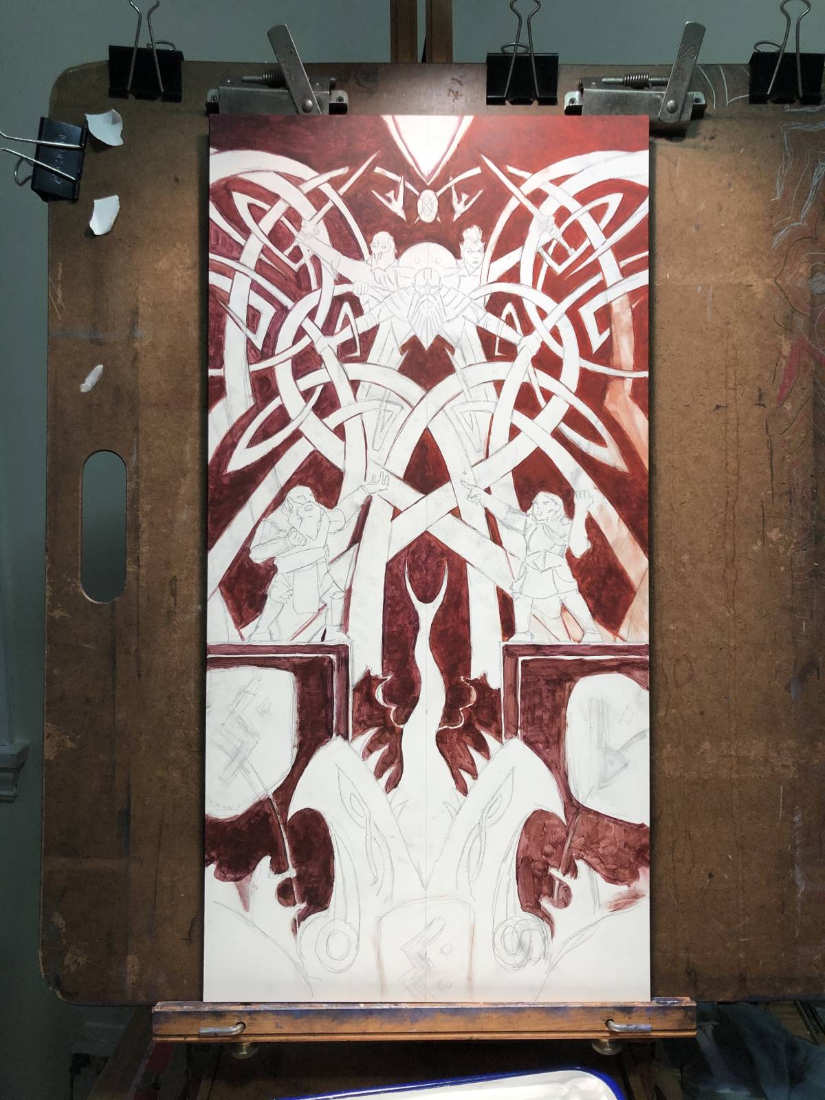 I started by doing a first pass on the red leather. In retrospect, it feels a little odd that I didn’t throw down a ground color to kill the white and possibly begin to nail down the value structure and lighting. Instead, I just started doing one color at a time and attempted to nail down the values as I went. I kept my color study up on my computer screen (which is located just to the right of the easel) pretty much the entire time, so I was constantly aiming to match that.
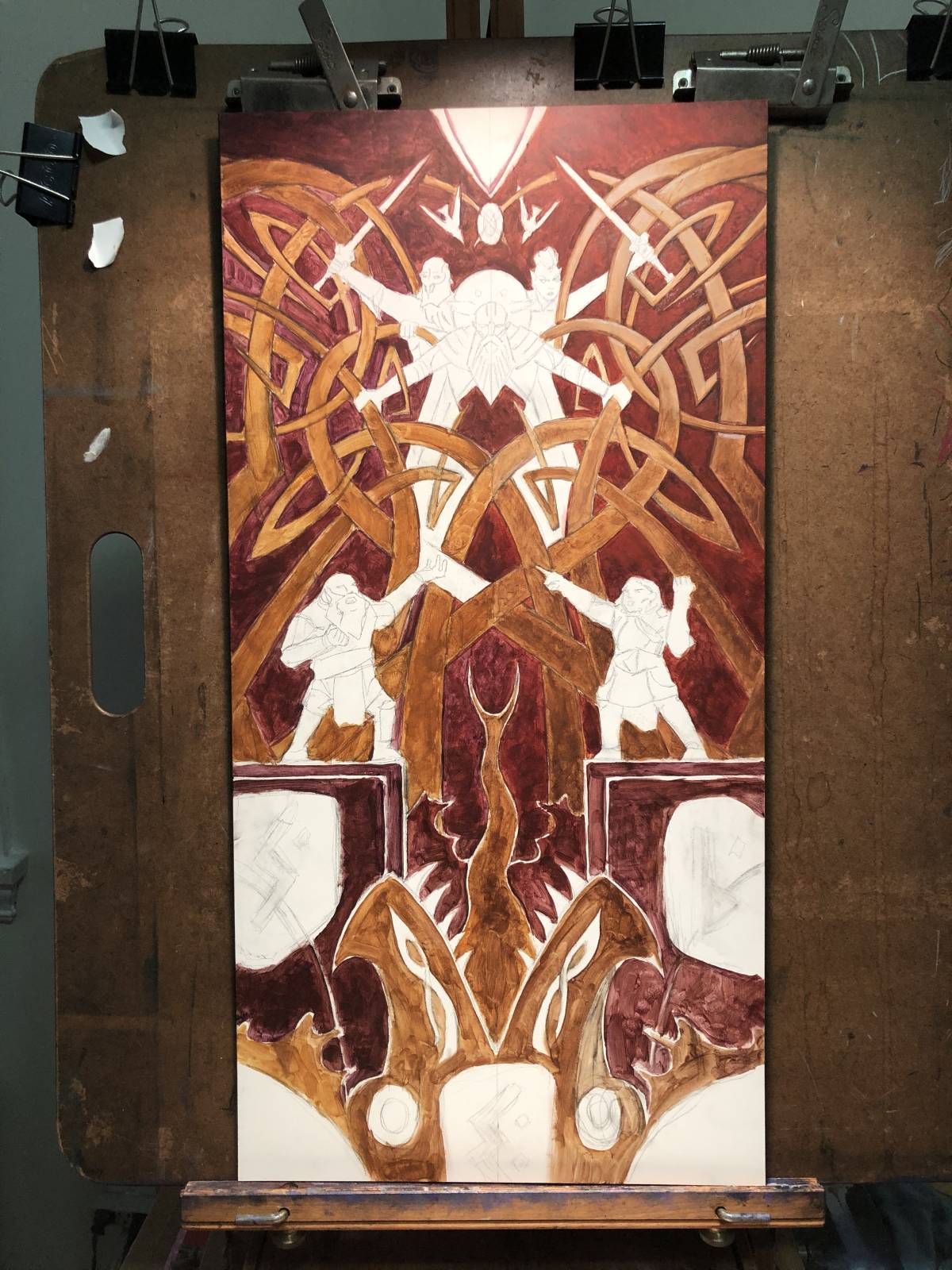 Next came the laying in of the brown leather. Again, I’m not sure why I didn’t finish the red leather and get rid of those scrubby areas toward the bottom, but those areas remained scrubbed in until pretty late in the process.
 As is often my way, I took a section a bit closer to finish quite early on. I tend to do this a lot and it’s usually the means through which I figure out how to actually do certain things and also to decide how far I actually want to take the piece in terms of detail. Once I know those things, I find that it becomes a bit easier to repeat and refine the process, so the rest of the piece becomes a bit easier as I go.
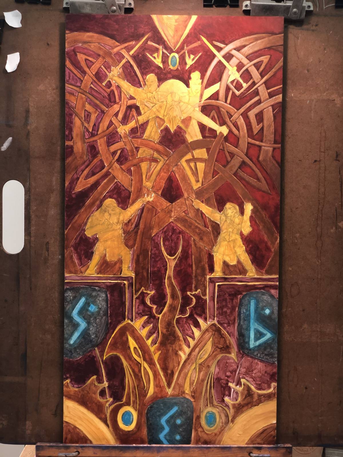 At long last, I finally blocked the rest of the color in.
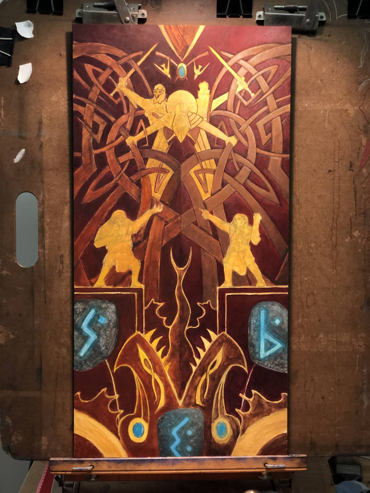 Then I just started doing another pass over everything in order to get a consistent amount of coverage.
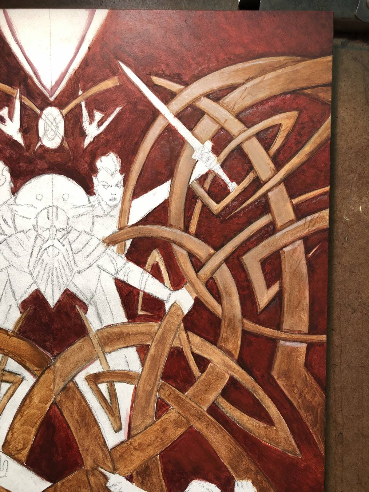
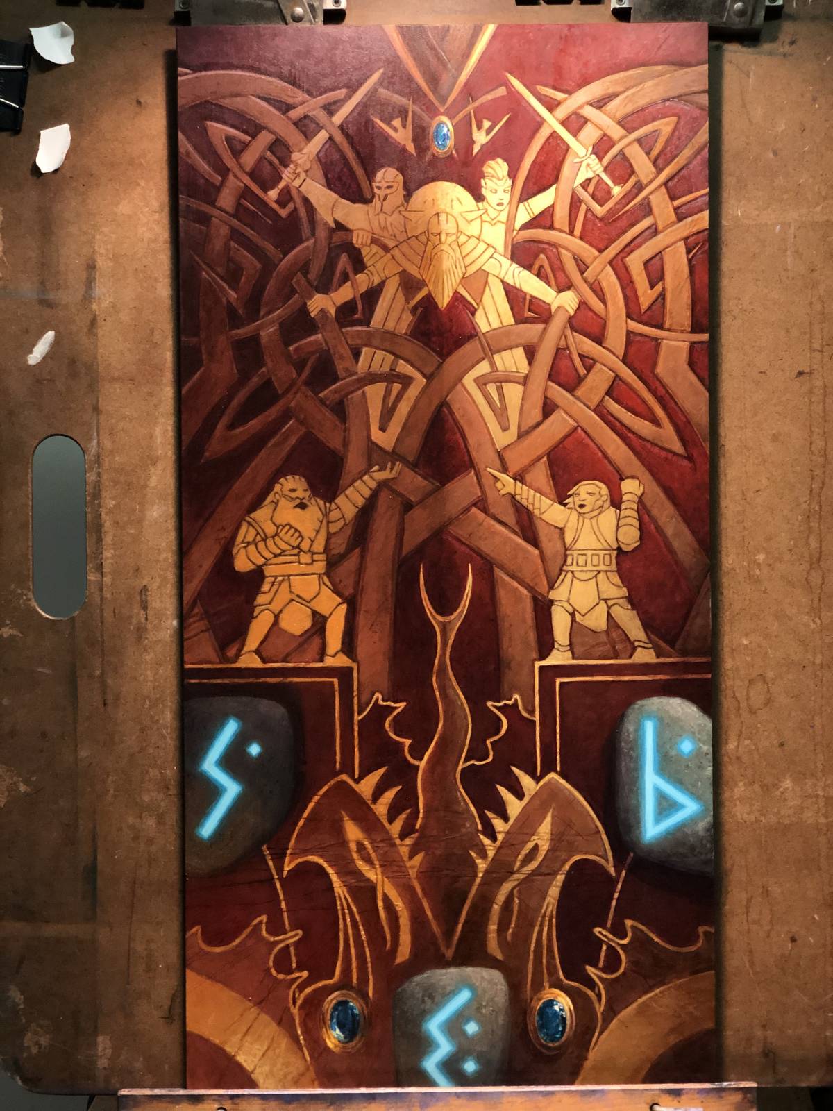
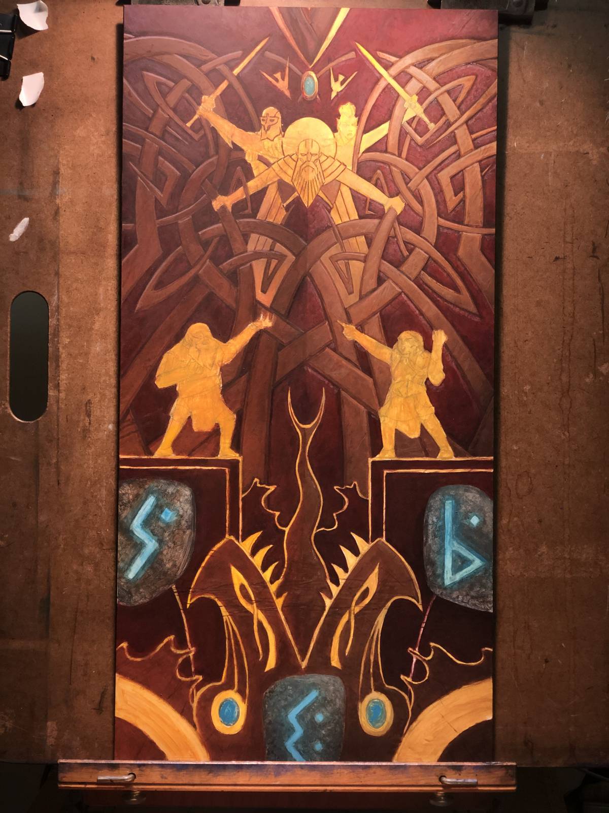 More passes, more refinement. Here are a couple closeups of the piece in progress:
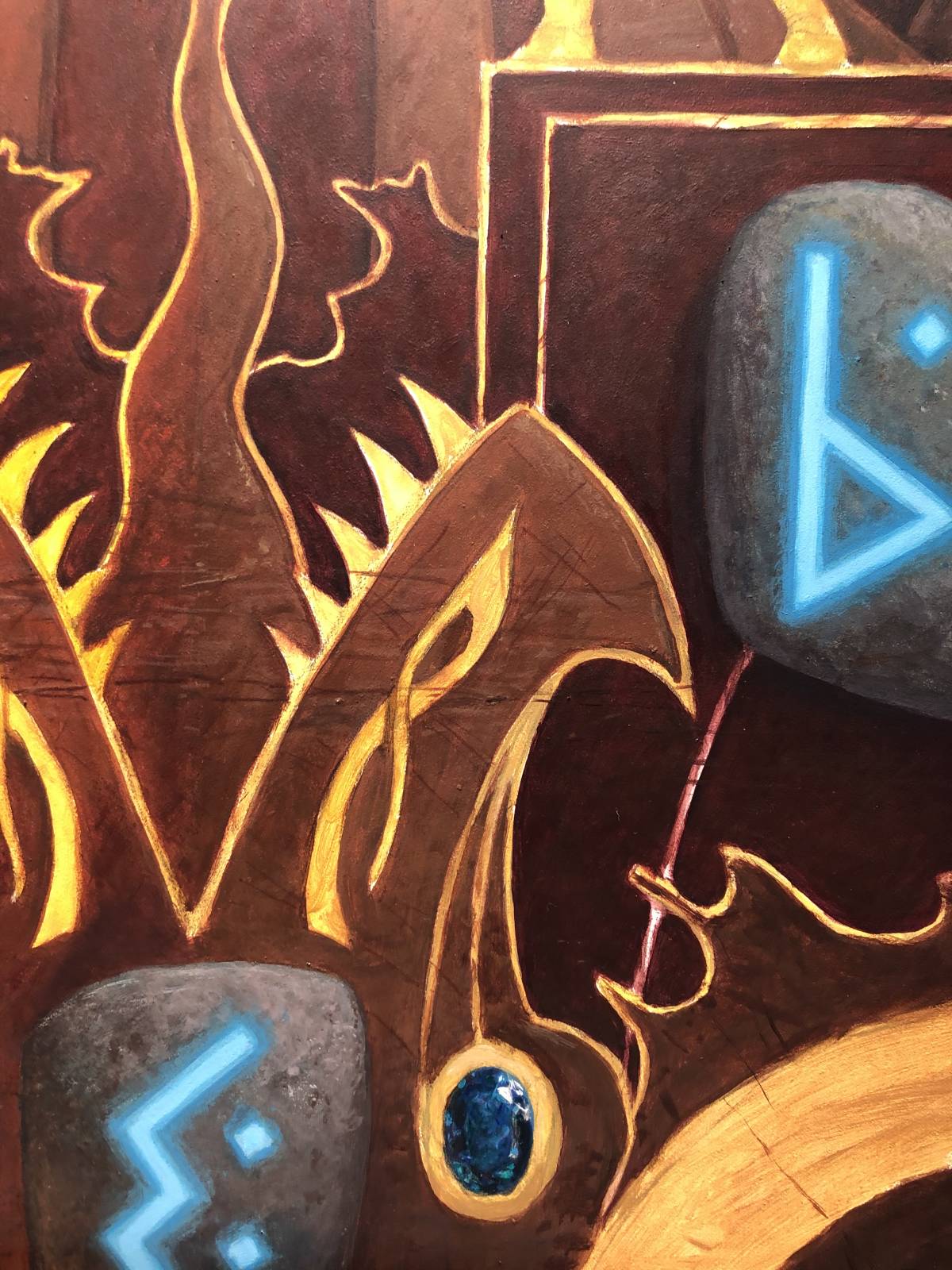
 The gems were pretty quick, honestly. It feels like they should have been painstaking, but they weren’t. That I had good reference to look at didn’t hurt. Some years ago, my wife bought these cheap bits of jewelry that had glass “gems” in them of various colors. They weren’t for her, but rather for me. They’ve sat in a drawer in my taboret ever since and I drag them out whenever I need to look at things like that. If those don’t help, I also have some parts of an old chandelier to look at. While I don’t generally like to keep a large collection of objects for reference (I’ve moved a lot over the years and I doubt my moving days are over), little trinkets like these have been well worth the little room they take up.
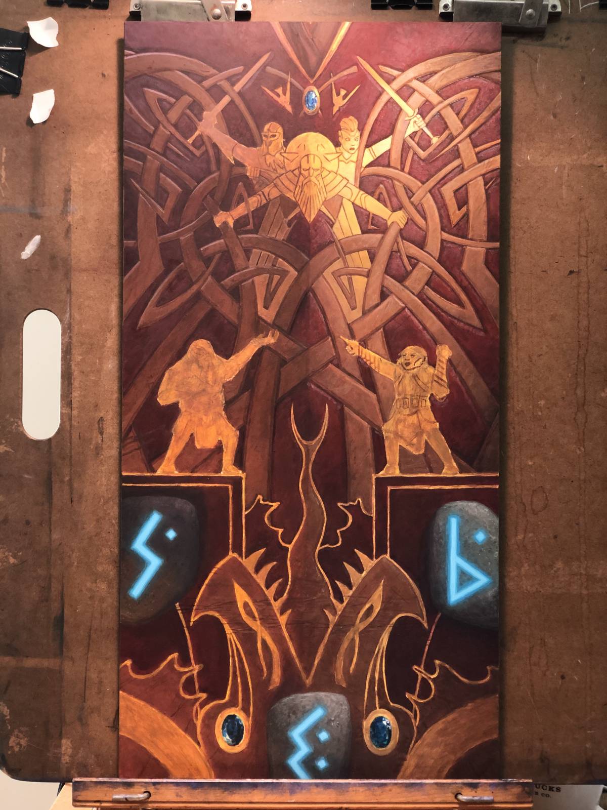 Continuing to refine and finish as I go. The stones with glowing runes look like they’re about done here too. As with the gems, the glow came about pretty quickly. Having a that bright, light blue among a host of darker, warmer colors made the blue really pop and created a convincing glow fairly easily. In fact, I remember being a little surprised how little I had to fuss over that.
 Toward the end, it was mostly about getting the gilding and detailing done within the design. It was somewhat precious work at times, but it was pretty enjoyable, nevertheless.
 Almost finished at this point and I had to make an important decision: I wasn’t completely sure whether I wanted to do further gilding on the tentacles of the leviathan. This uncertainty didn’t last long, however, because it was clear that the gilding needed to be better incorporated into the piece. And so, just as the color study indicated, I lined the tentacles and it came out like this:
 Yeah, I’m glad I put that gilded lining in there.
The finished piece is twelve inches wide by twenty-four inches tall. It’s acrylic on board and was art directed by Cynthia Sheppard.
This piece was a great break. It was a break from the kind of stuff I normally do and the medium I normally work in. It’s almost an other, if that makes any sense. Not really something that belongs with the rest of my work, much like the tapestry paintings I’ve done in the past. But such assignments really provide a great opportunity to stretch my legs and try new things. It doesn’t hurt when I actually like the outcome, either.
Some reading this may be curious about the lack of a signature on this piece. Well, it’s signed, and it isn’t. The truth is, nearly twenty years ago, a fellow illustrator and I challenged one another to find a way to work a really big version of our signature (or initials) into the actual composition of an assignment. I don’t completely remember why we made such a challenge, but we were young a silly. While he forgot about this challenge and stopped illustrating long ago, I somehow continued to hold out hope that I could finally find an assignment that allowed me to pull it off. This was that assignment, and the runes are my solution. Is it particularly original or creative? No. But I’ve checked that box and scratched that itch, and if nothing else, this piece will forever remind me of my life as a much younger illustrator.

Great article, focusing on overall step and technique. Very insightful, because it is a piece which has a lot of decorative elements. Thanks for sharing!
Hi Mr. Belledin, wanted to say thank you for this thoughtful write-up and detailed close-ups. Even before I found your article, I was working on an actual leather breastplate with your art on it, and as of yesterday I finished it: https://twitter.com/ReddHaring/status/1362601009277640704?s=19
Again, thanks for your work and commentary, they’ve been a huge inspiration to my leatherwork.