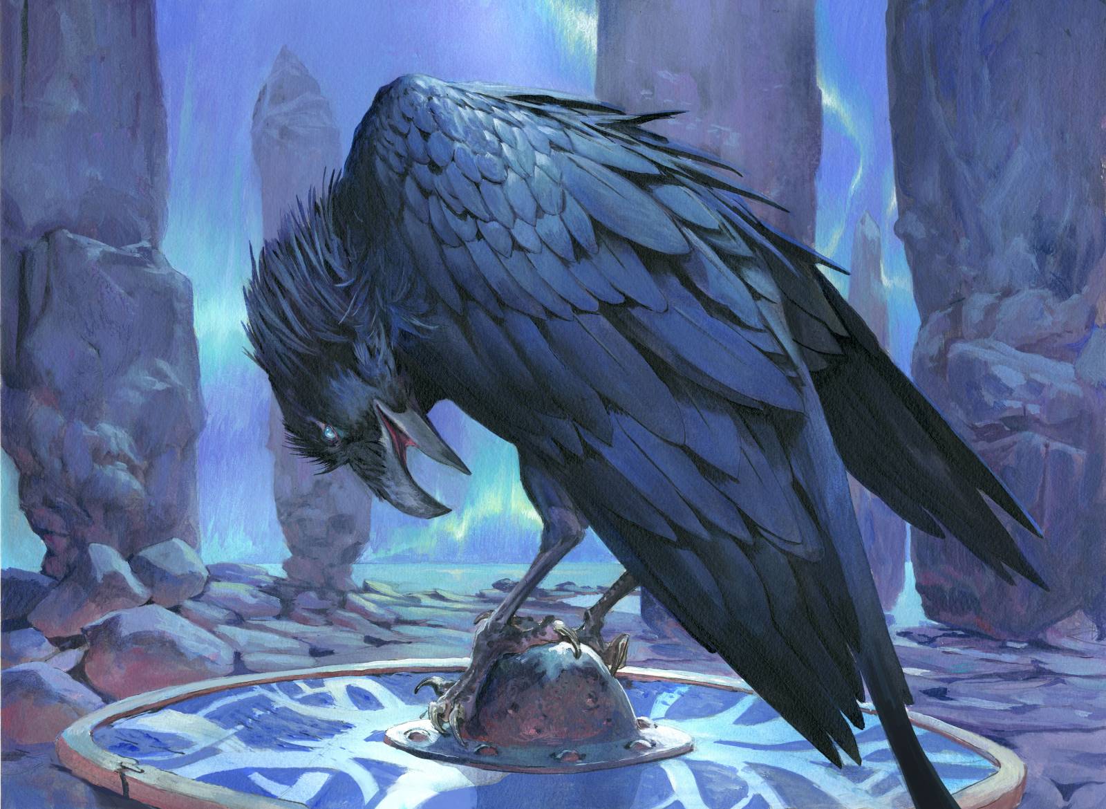
I simply love painting birds. Its how I started as an artists. I copied the drawings in my field books and went into doing bird drawings of the species I observed in the field. Over the years I have add so many different birds into the background of my magic paintings in a mix of honoring my childhood passion, but also as an effect to show movement and scale.
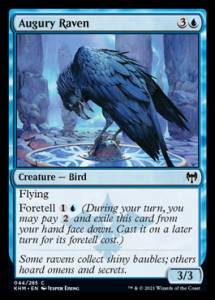
This specific magic card ( Kaldheim Magic the Gathering ) was a great joy since I did not have to hide the board away in the background. the bird was the main figure. The description was of a raven bird sitting on top of a Viking shield with the Aurora in the background. There should be a hint of him being a foreteller of future. Like an omen of bad things are a bout to happen… ( I think scavenging birds has gotten a bad reputation from eating of the battleground too often).
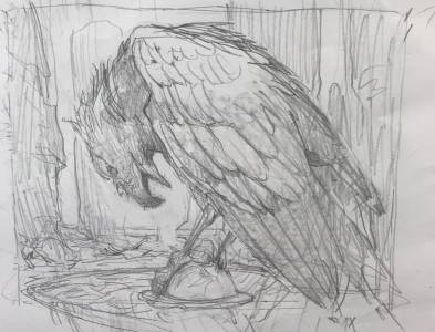
I went back and forth in my head to try and come op with a different way of posing body rather than a straight forward poise. I ended up doinga 3/4 from the back. I think the more untraditional angle gave me the right amount of “new” to keep an interest in it. I do need that. Something spicy of different that will keep me focused and that will challenge me.
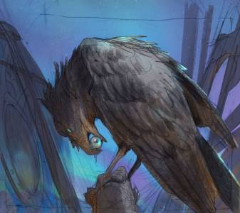
My pencil sketch was scanned and I added the aurora background digitally to see if it would work. My problem in my mind was that in doing a dark feathered main figure against a somewhat darker night sky would end up being a very difficult painting. Also in the digital version I tried to add shields and spears and weapons as if he had just landed next to the Armory of people getting ready to fight. I abandoned the idea because I thought he silhouettes would take up too much attention and draw the eye away from the Raven.
In my submitted sketch I had the idea that the raven was holding an eyeball in the beak and that it was somehow also missing and eye. As if he, like Odin, had giving up the one eye to see better into the future. But it ended up looking too grim and too much like a carrion bird and not a smart one bringing news and foretelling the future. So I removed the eyeball.

I tried 2 different versions in my color comp. One was with turquoise aurora and one with a more purple pink one. I do like my purple, but I was afraid it would read too much like flames and less like a night scene so I ended up following the turquoise rough. Digitally i tried the color out on a photo of my preliminary grey tone image so I would make sure that i would go light enough to keep a clear readable silhouette of the raven.
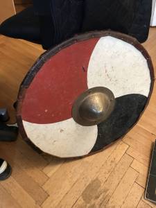
For this image I ,for once, had a perfect reference at the studio for the shield; namely a battle worn shield I got from one of my Viking enactor friends.
What I like about this painting is that it is almost monochromatic. I hinted at a warm light source somewhere in the purple/reddish light in the shadow side of the rocks and the rim and ball of the shield. The slightly different temperature shift in the colors make it seem less flat and “dead” in the colors as I think is often the case with pure monochromatic palettes.
Your love of birds shines through in how you rendered this. Thanks for sharing.
Love your work, style and the Raven. Seen a lot of Ravens rendered but not as good a job as you have done, I would have even loved that you kept whatever you had in the Ravens beak even more.