Last year I got an assignment from Magic: the Gathering that required me to revisit a subject that I first painted for a different card game almost twenty years ago. The subject? A lightning spear.
The assignment for Magic wasn’t a super complicated one. I was just asked to paint a spear made of lightning (who could have seen that coming?). But instead of being made completely of lightning, the spear had a metal handle in the middle from which the lightning was emanating (so, sort of a lightsaber vibe). There was no requirement beyond that really. I was free to include someone holding or throwing the spear, or I could just make it a still life of the magical object. The assignment was a rare, simple and straightforward one and I was grateful for this since I was tight on time. I really needed it to be a quick one.
As I mentioned above, I’d previously painted a lightning spear in 2002 (I assume since it was released in 2003) for a card game called Warlord. That piece looked like this:
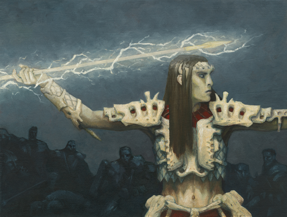
Thundercall Javelin, oil on paper, eight inches wide by six inches tall. Painted in 2002, art directed by Jim Pinto.
The elves of the Warlord card game sported bony protrusions above their ears instead of having pointed ears, were quite pallid, and wore bone armor. This is one such elf and he’s striking a pose that I stole completely from the classic, Greek statue “Zeus of Artemision.” A group of figures looks on beyond—a group that I’m pretty sure started out as an abstract shape that I sort of “found” figures in.
A quick aside: can we talk about the design of that javelin for a minute (or just a couple of sentences)? Wow. How uninspired. I really doubled down on the ancient Greek thing with that, since it’s basically just an ancient Greek spear. I mean, that’s a choice, for sure. But it’s…well…it doesn’t really feel like it’s from the same world. But there’s lightning around it. So I guess there’s that. Also interesting is the fact that the spear just sort of disappears off the left side of the page. Not enough room for the whole thing. I chose the figure over the spear, it seems. And I guess it never occurred to me to pull the camera back a bit and show more of…everything. Oh well. Choices were made. Checks were deposited. The world moved on.
Anyway…
Upon receiving the new assignment, I thought very hard about what I wanted to do with it. There was a big part of me that wanted to revisit the image above—even to some small degree. Ultimately, however, I decided to go a different route. The primary reason for my my chosen direction was preference, frankly. It turns out that for the most part (because there are always exceptions), when an image’s main purpose is to depict an object, I prefer that image to be a still life. This keeps the focus where it belongs: the object. Don’t get me wrong, it’s absolutely possible to make a piece about an object that includes figurative elements. I just prefer it when they don’t. This is especially true if I’m the one who is doing the painting.
In the end, I decided to give my art director two options—either of which I’d have been happy to paint.
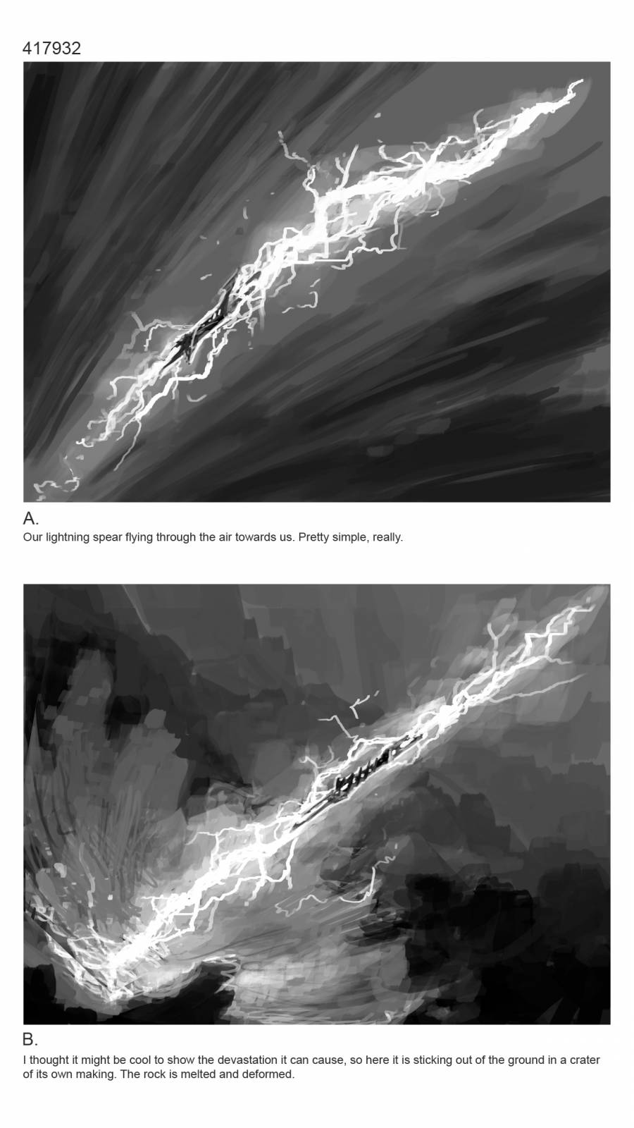 A challenge when presenting long, thin objects as the subject of paintings that will ultimately be shrunken down to only a couple inches across is not only fitting the objects within the box provided, but making those objects readable at that small size. I have found this to be a very difficult thing to achieve at times, honestly. In this case, I utilized two very classic solutions. The first solution is one that foreshortened the spear and (hopefully) added some frenetic energy in the process. The second solution, was placing the spear at a diagonal to allow it to spread the farthest it could within the space provided, and thus make it as large as it could be within those confines.
The other artists I showed these sketches to met these solutions with a certain degree of eye-roll. Rightfully so. These solutions are very well-worn territory. My primary concern was that within the image, it seemed to me that the actual spear handle was arguably the most important element and indeed the focal point as it is the actual source of the lightning, and thus the spear. Any solution I came up with had to support that handle’s significance. So, I went with the options that did that. Regardless, I think they worked better than my solution back in 2002, which was to just the javelin run off the side of the image.
Anyway, the fine folks at Wizards gave me the go ahead on option B, and my next step was to create a digital color study.
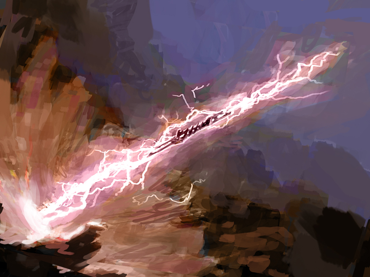 As I did the color study, I also tweaked the composition a bit to nudge it away (even to a small degree) from a true corner to corner composition. I probably could have pushed it further, but I felt a need to play it safe since I knew I was going to paint this piece pretty small.
Anyway, I went to paint. Unfortunately, I did a rotten job of documenting it. I was doing this piece while simultaneously breaking up large blocks of reinforced concrete in my backyard and I kept forgetting to take daily shots. Truth be told, though, this piece only took a few days, so I really should have been taking several shots a day.
 Before I got to the point above, I transferred the drawing to the board using my digital scanner and a 2h pencil. I then painstakingly painted around the brightest parts of the lightning in order to keep the white of the gesso clean and clear. I left the gesso bear primarily because I find that it’s far easy to knock the white back, but it’s difficult to get that level of brightness back if you cover over it from the get go, so my coal was to preserve the white as long as I could throughout the process.
Once that pink outlining was dry, I blocked in the general colors and values for the rest of the piece, which is what the above image shows.
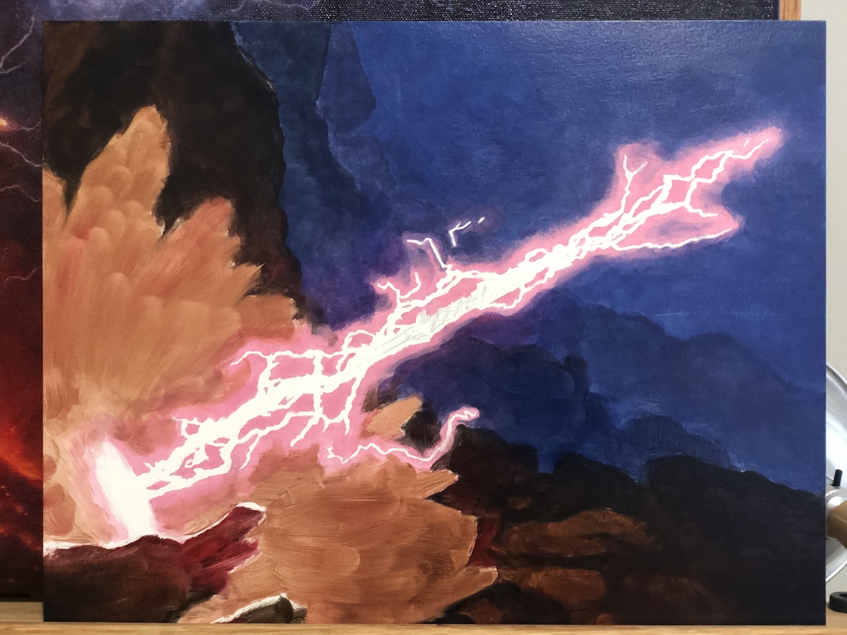
 After everything was blocked in, it was all about refining, rendering, and blending. At the point pictured above, I’d done another pass over the blues and dark browns and blended those into the the pink glow of the lightning spear itself. The background is pretty much finished at this point, and the middle ground is well on its way. Truth be told, it was only a couple hours of work after the above photo was taken that I completed the piece.
And here it is:
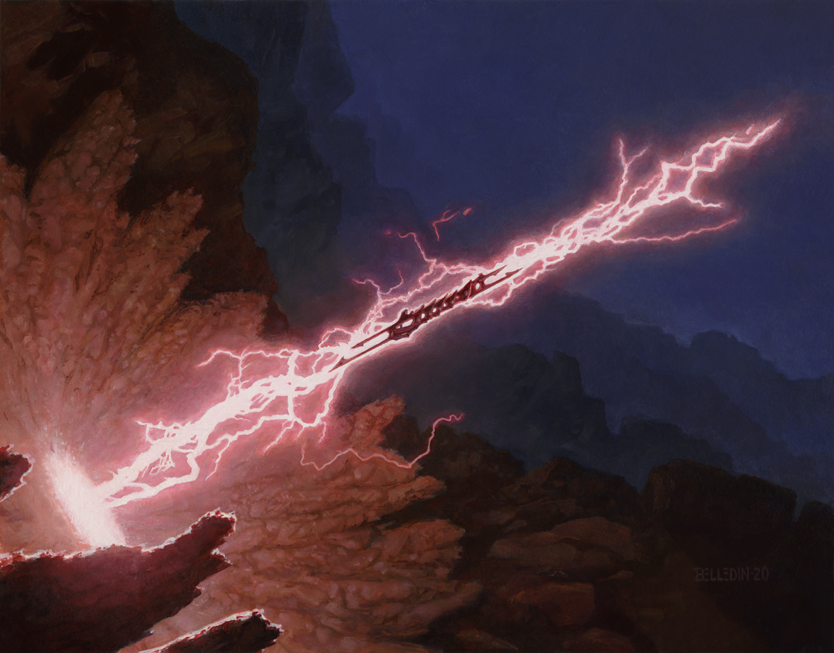 The last steps were just more blending, more refining, and getting in the final details of the melted rock (which was actually inspired by what happens to sand when it gets struck by lightning—seriously, you should look that up because it’s pretty cool).
The finished piece is called Lightning Spear, is oil on gessoed hardboard, measures fourteen inches wide by eleven inches tall, and was art directed by Cynthia Sheppard.
This is not a brilliant piece. But it’s an interesting one to me. Rare has been the occasion where I’ve been assigned something that is so closely related to something I’ve painted in the past. Eighteen years elapsed between the pieces and a whole lot had changed for me. That last statement is obvious. But I’ve personally found such things easy to overlook. Typically, I tend to feel like my work has made little or no progress. But looking at these two pieces, it’s hard for me to argue that nothing has changed or that progress has been microscopic.
How each of us measures our own progress is, of course, going to vary from person to person. Personally, all I hope for is that the paintings I do next year be in some way an improvement on the ones I did this year. If not better, than the things that challenged me this year need to be less challenging next year, so I can concentrate on addressing all new ones. The work needs to get easier, faster, or better—hopefully all three. That’s a lot to ask, really. But I’m content with feeling some movement in any one aspect. But I still try and strive for progress in all three areas. Unfortunately, oftentimes progress may be unnoticeable to me. If it’s happening, I’m too close to it.
And then a piece like this comes along.
Again, Lightning Spear isn’t a brilliant piece. But it’s a piece I worked on at the end of long, tiresome days of swinging a sledgehammer, and despite it not being a painting I was singularly focused on at the time, it still shows clear (and in my opinion, vast) improvement over its predecessor, which was absolutely the sole focus of my efforts at the time of its creation. Lightning Spear happened fast, it was easier, and I think came out better in virtually every measurable way than its predecessor. And I find that genuinely exciting.
That being said, there will almost certainly be folks who look at the two images and prefer the older one. And that’s totally cool. We don’t have to see the same thing, and frankly I’m biased because I’ve seen both of these pieces from the inside.
When I look at my journey, I often look at the last few footsteps. After all, they’re the most vivid in my mind and the struggles each of those steps represent are easiest to recall. While I can appreciate overcoming those struggles, most of the time those steps don’t exactly feel like they’ve carried me very far. Luckily, the old work—and the REALLY old work—is always there to provide better perspective. Much of that old work may be forgotten (or may even be something I’ve unsuccessfully tried very hard to forget), but it still has lessons to teach.
That perspective—the view from here to there—puts a lot of fuel in my tank. It also provides a bit of hope that I’ll see even more progress in another 18 years, while somehow taking pressure off of the expectation that I’ll see a lot of progress in the next 18 months.


I always love how deep and personal your posts about your paintings are. Loving the new painting, really it is awesome.
I always remember to include a Steven Belledin land in my green deck. We need more forests from you.
Thanks for this Sebastian. Fellow Magic artist Randy Gallegos was pontificating about how personal works can be on Facebook just the other day. My illustrations aren’t actually personal works, but they are invariably entwined with what was going on for me at the time I painted them and so those memories and feelings are often baked into the work (whether I like it or not). So in a weird way, they become personal. Rather than cut myself off from that, I embrace it. So each piece (and what I write about them) ends up becoming a slice of my autobiography. Sort of.
Also, I’m always open to doing more lands if they ask me to—especially forests. Maybe I’ll get another chance some day.
Thanks for sharing Steve. Always a pleasure to read.