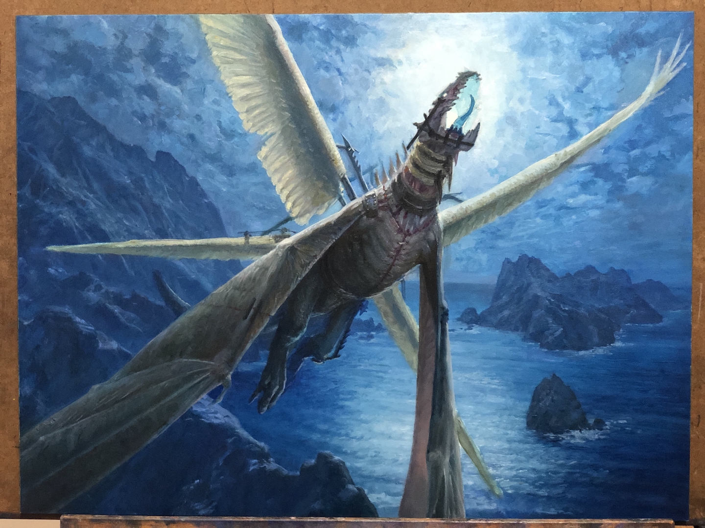
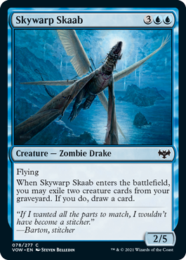
I’ve said it before and I’ll say it again, working for Magic is weird. It’s a good kind of weird, but it’s still weird. Take this assignment, for example. I was asked to paint a sort of zombie drake that was stitched together from a bunch of different things, but also included some metal structural elements, as well. It needed to multiple sets of wings—at least one of which needed to be from a bird.
See what I mean? Weird.
There are a lot of ways to take the design of the drake for this piece. Some folks would have totally started assembling various animal parts, cobbling them together to build a drake. And maybe that’s what I should have done. But my brain struggles with questions like, “is that really a drake, though?” If the assignment were to make some sort of false drake, I’d say that’s a great solution. For this, though, I felt it needed to be explicitly drake-ier. The request for the bird wings was specific and directed enough that the bird wings felt like they needed to be the outlier. Using a bunch of different critters to construct the drake would detract from those being so obviously out of place. So it should surprise no one that I kind of started with something that already looked like a drake and sort of deconstructed it.
I doodled a while and landed on this rather tragic pencil sketch…
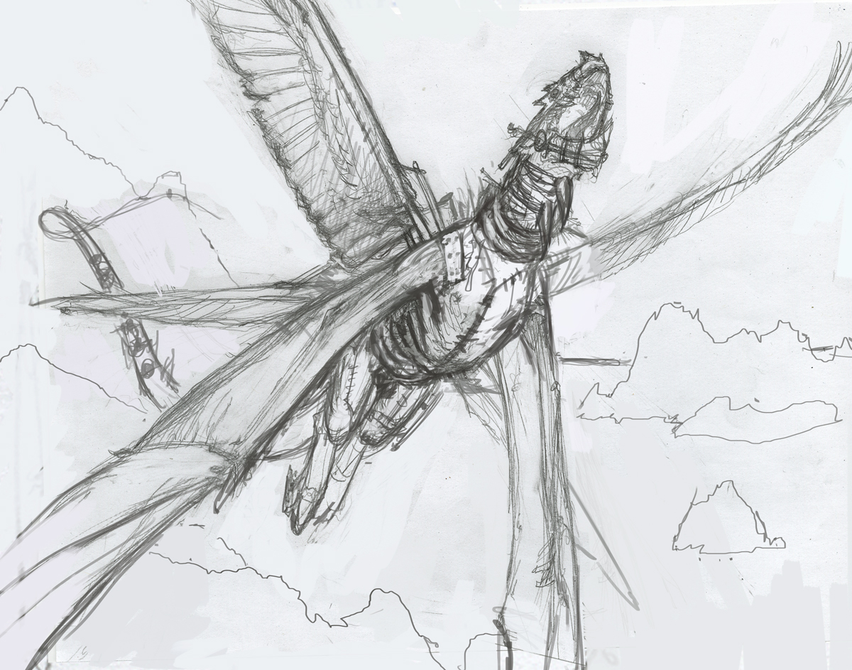
So tragic…
…then cleaned it up in Photoshop.
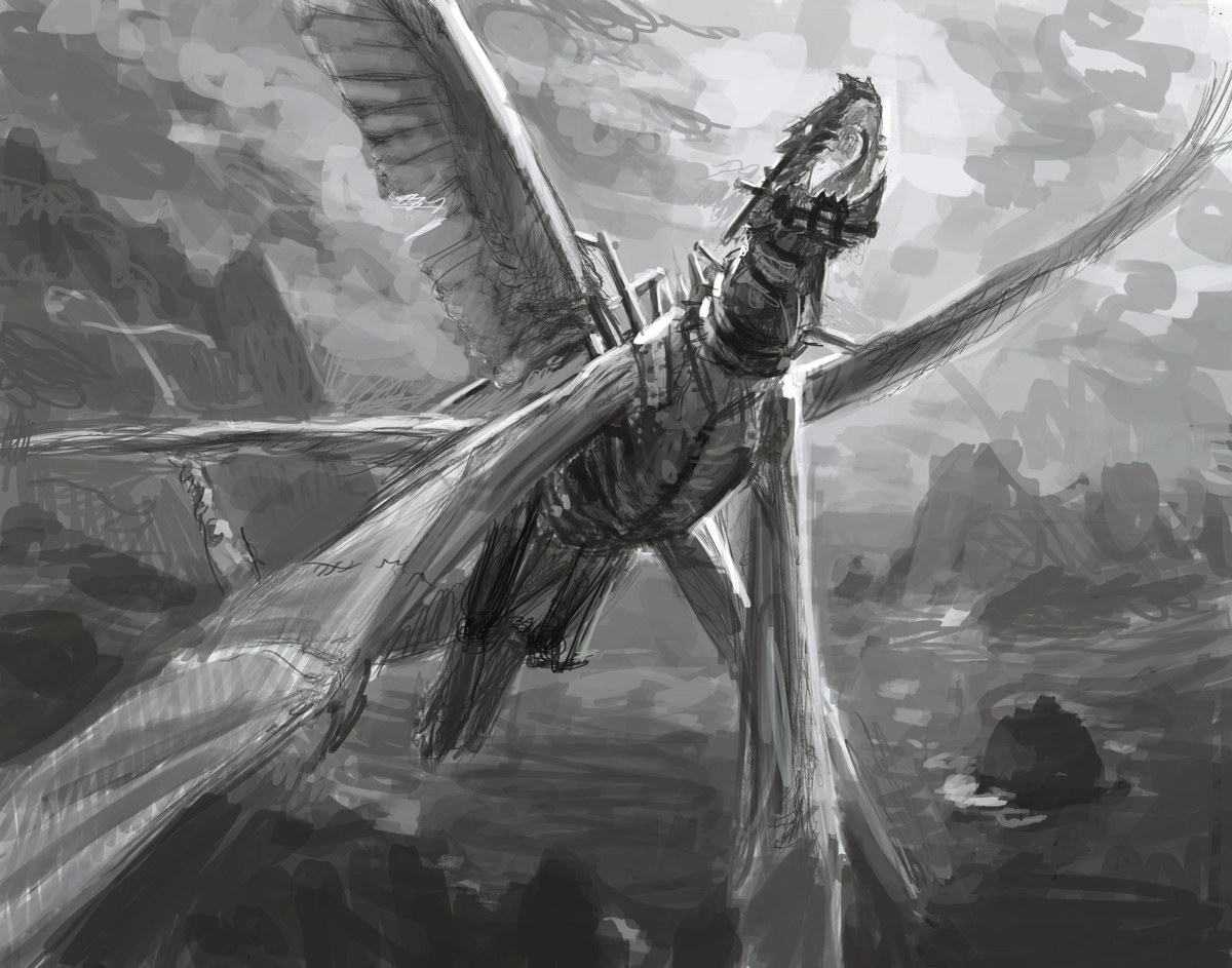
…now somewhat less tragic.
The fine folks at Wizards liked this image and kindly asked that it feel more explicitly like a night scene. While I intended that to be the case anyway, it was good to know that that wasn’t coming across in the sketch, so I made note to adjust my value range accordingly when I went to paint.
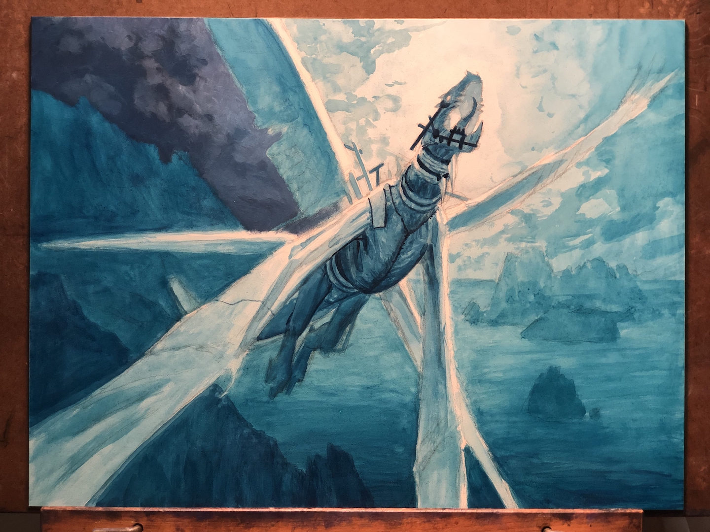
I took the above sketch, projected it to my surface with my trusty mini digital projector and then did something I hadn’t done before.
As I’ve noted before, I’m increasingly becoming interested in water-based media. Outside of tube acrylics, I’ve been rediscovering my love of how easy they are to put down. I’m not one to use a lot of thick, impasto paint, and I prefer a more fluid viscosity. A lot of water-based media have that fluidity baked in. One such medium that I’d not used before were acrylic inks. I really wanted to give them a shot, but on something where the stakes were fairly low. The underpainting for this piece felt like a great opportunity to get a very basic feel for them. So I bought a bottle of (I think) Prussian blue FW Acrylic Ink and gave it a shot.
Inconveniently, I forgot to document the full piece after a couple of hours’ worth of acrylic ink work, but I did get this shot of part of it:
 Now, is this brilliant work? No. But with relatively little time invested, I established a lot of details and some of the major landmarks I wanted to retain. Either way, between this underpainting and the (slightly less tragic) sketch, I had most of the kinks worked out and could confidently move forward. Nothing to do but finish the piece, right?
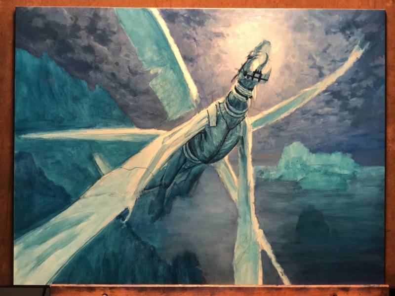
 This gives some idea on how far I went with the underpainting. Only the dark sky to the left of the upright wing is oils at this point, but I went for a fairly high level of finish pretty much immediately.
 Look! Up in the sky! There’s more sky painted…and some water kind of scrubbed in.
 Another thing I rarely do is work background to foreground. With this piece, it made sense to me to go this (more traditional) route because I knew that I’d be showing the wings as having some degree of transparency. There are some real subtle things that go on value-wise with semi-transparent stuff (be they feather or non-feathered wings), and before I tried to do the mental math of nailing down how those things were affected by light, I figured it’d be a good idea to actually nail down the light in the first place.
 The background is starting to really come together at this point. I mostly used a fairly large filbert brush to lay the paint down, then did a bit of clean up with a small round brush. The details on the mountainous coastline were initially done by carving into the paint with the edge of the filbert brush to reveal the lighter color beneath. Then I tightened up those details with a lighter color (as the underpainting showing through was the wrong color). I’d like to tell you that I used a lot of reference for the background, but I didn’t. I kind of just picked at it and kept the stuff that felt right.
 Finally. Some critter work. I confess that on some level, I really like how scrubbed in that wing on our left is. Of course I eventually painted over it but in retrospect there’s something about that scrubby texture that’s kid of nice.
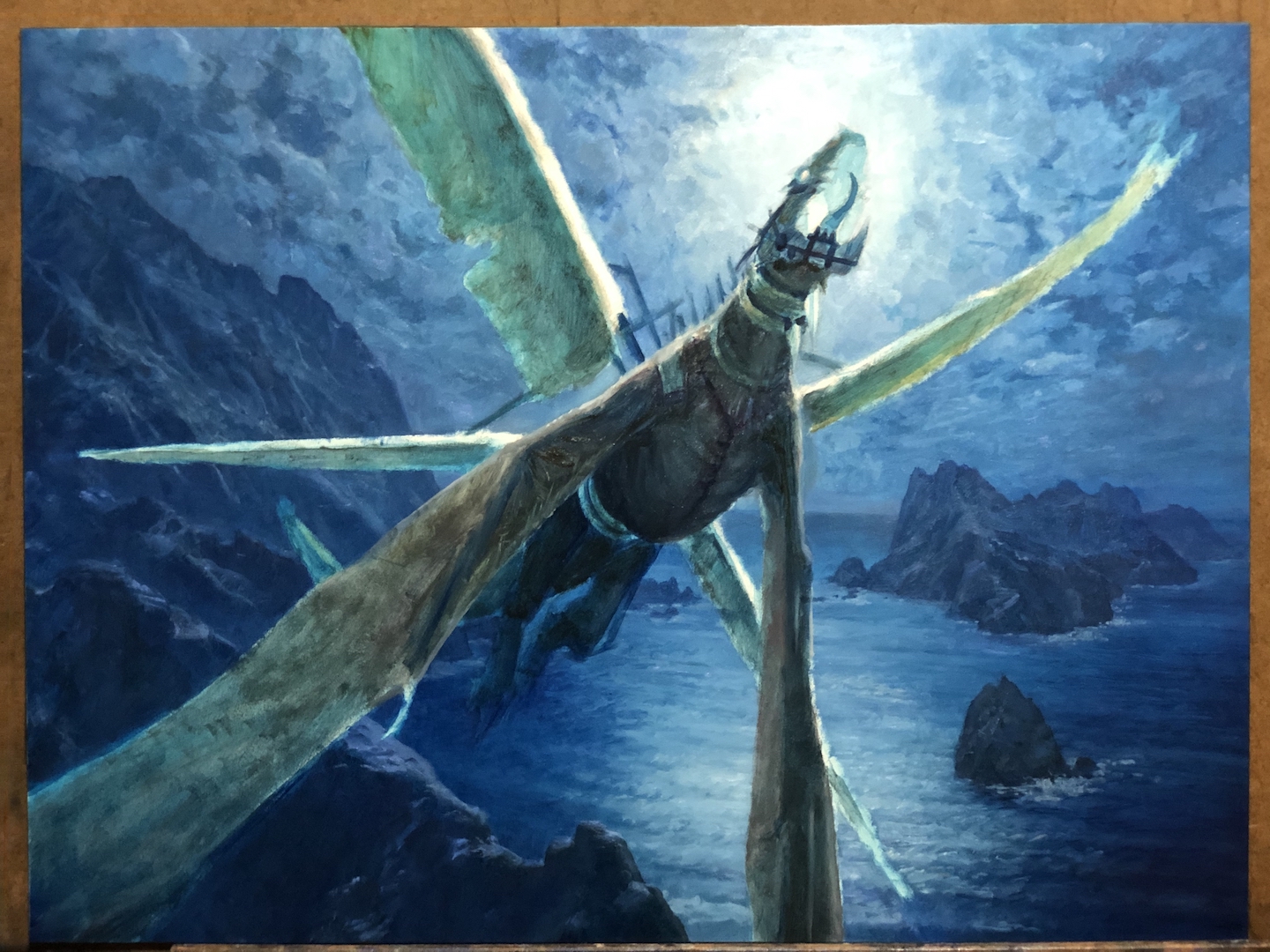
Like the background, I continued to try and nail down a decent level of finish as immediately as possible. For whatever reason, this is something I tend to do more successfully with smaller works. Larger works tend to find me picking away at areas and building up surfaces. The little ones, though, I just seem to bang out with less hesitation.
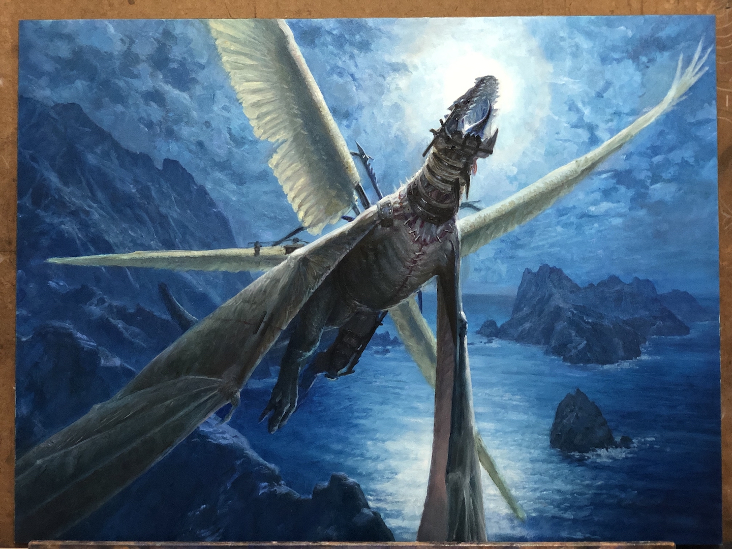
 I think if I had one struggle with this piece, it was color temperature and intensity. The background, while not actually monochromatic, has the feel of being so. And it’s a very strong blue. How warm to make the various parts of the creature was something I was constantly tweaking. I’m not sure I ever got it right, but I did get it to the point where it stopped bothering me. The above image is from before I got to that place.
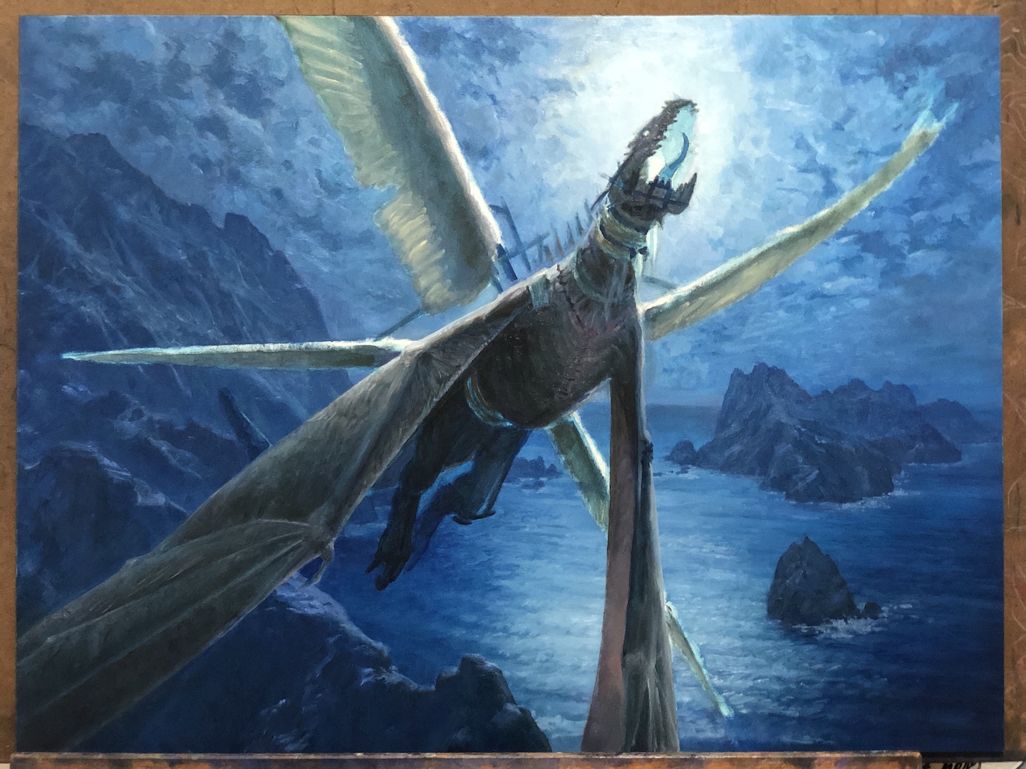
 Another thing that I wrestled with was the scale of the stitches and staples that kept the critter’s parts together. Were it not for reproduction at the small card size, I’d have painted them at a scale that felt proportional to me. But in order to make it read at reduced scale…well, I had to make them a lot bigger and more obvious.
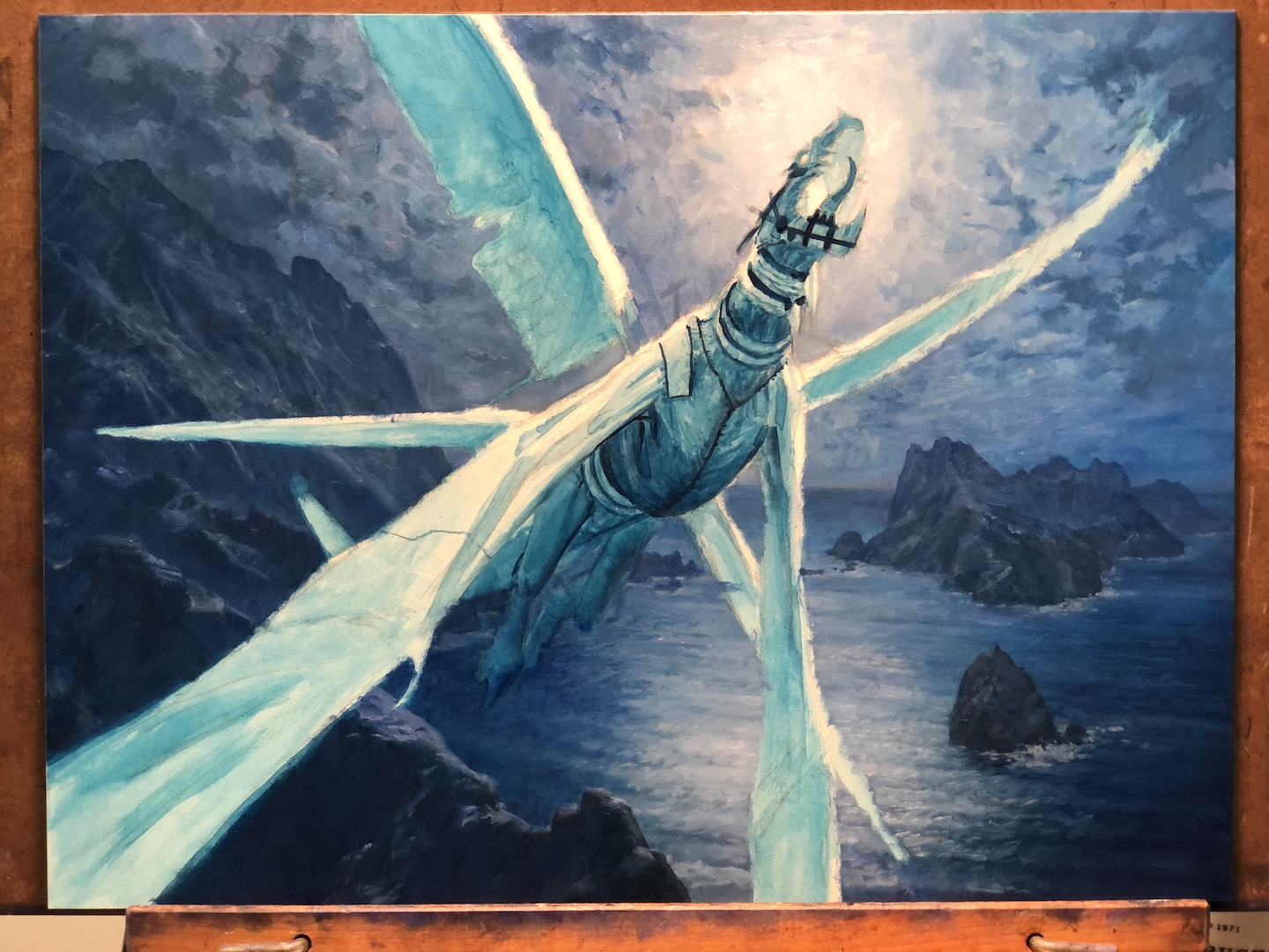
 Getting pretty close here. Mostly just little bits and bobs to finish and tighten up. A bit of value tweaking to do, as well.
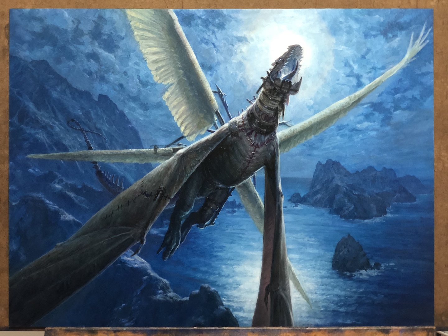 Between the last image and this one, I did some detail work, but the biggest change was some subtle work to push the background a bit further back. Were this not for such miniature reproduction, I’d probably have skipped this step or done it differently. But I wanted the silhouette to read well with minimal visual confusion, and the best way to do that was to slightly lighten areas of the background. If I were to do it again, I think I’d have kept the fore-most cliffs the darker value. At least I think I would.
Maybe not.
But maybe.
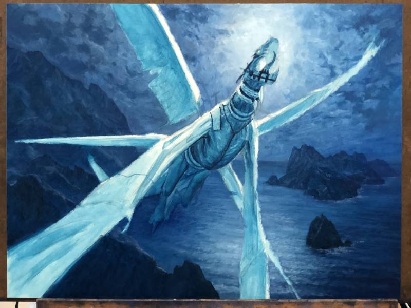
Anyway, it looked like this when I handed it in:
 The finished piece is oil on hardboard and measures sixteen inches wide by twelve inches tall. It was art directed by Taylor Ingvarsson.
The last major change I made to the piece was to repaint the inside of the mouth. Initially, there was a glow from within, but there was no real reason for it and also I felt it wasn’t working in combination with the backlight of the moon. I tried dulling it, but that didn’t really work any better. I did a few experiments painting over photos digitally to explore possible solutions. In the end, I felt the darkened mouth worked best, so that’s how I painted it.
That last change brought an end to the piece. All done. Yup. Nothing more I need to…
Huh? There was something I forgot?
Oh crud.
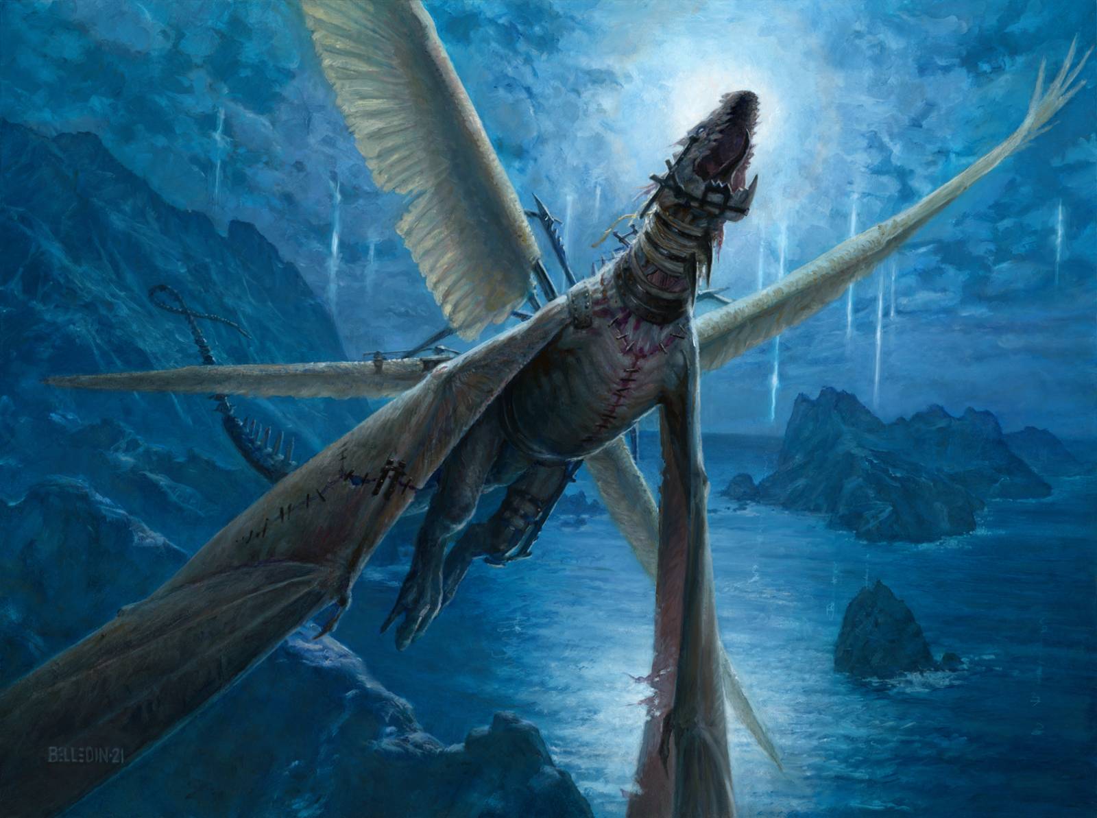
Style guides are important. I’ve found over the years that it’s a good idea to read through the entirety of any given style guide and retain as much as possible. Sometimes there’s stuff in there that affects my assignments that somehow got omitted from the art description and a thorough read through can help make sure I’m incorporating even the smallest detail. In this case, I did read my style guide, but I still failed to note that there needed to be these sort of streaming tears of light up in the sky. It was meant to be a running theme in all the art and so it was kind of important.
But like I said, I didn’t catch it.
Oops.
Unfortunately, I didn’t have the time to paint them in oils immediately, so I did them digitally and then later painted them on the piece to match what I did digitally.
This is what ended up being printed, complete with the digital version of the tears of light.
 Like I said, working for Magic is weird. I don’t think this is something I’d ever have painted on my own. In fact, I’m positive it isn’t.
But I enjoyed painting it anyway. Honestly, getting to paint that background alone was worth it. That part was silly amounts of fun. Plus, I learned a lot from the ink underpainting (something I’ve done more of since). So getting asked to do this stuff and effectively getting paid to experiment and learn, is not a bad deal.
So yeah. Zombie drake. Weird but worth it.

Nice article and thank you for the look inside your process. I enjoyed seeing your decision making through the process. I agree with what you did to the mouth. Although the glow looked really cool, it did look like a back light from the moon and darkening it did the trick; but it did look cool. Thanks for the insights.
Thanks for that. It can be hard to decide what to compromise on at times. That mouth was more of a distraction to me than something that contributed. So in this case it was easy. But sometimes it’s super hard. The piece I’m working on right now, for example, is brutal and I’m now repainting most of it because it just wasn’t working. I wish it was as simple as that darned mouth!
I am absolutely speechless at your results! I LOVE the final and its so fascinating seeing the small changes you made to make the dragon feel so real!
If I may ask, what skills did you study that you feel helped the most to be able to paint these types of illustrations? I LOVE dragon paintings but I really don’t know intellectually what I should be doing to get better at them. I’ve tried just brute forcing paintings and going through the motions hoping to find the answers as I go but keep hitting a ceiling. I’ve tried painting realism but I don’t know what to actively search for to make my studies any more than mere copies. when I read you talk about what the client asked for, if that were me I’d have no idea where to begin, like theres a set of skills beyond my understanding that I have yet to learn about. What painting exercises would you recommend for people who’s end goal is to do this kind of work? I especially don’t understand how people follow style guides as you say, since I’m mostly self taught I can’t escape my own limited style and to try to follow a guide like MTG, just sounds like (for a lack of a better term) magic to me.
Thank you so much again for the post! Its a huge inspiration!
This blog has excellent resources at getting better at this type of work in general. I also recommend James Gurney’s “Imaginative Realism” and “Color and Light” books. Aside from that, it’s mostly about anatomy. I have several sculptures of cat and dog anatomy (also human), and several books on animal anatomy that cover everything from bats, to cows to hippos. Really, it’s trying to find some way to ground things in some reality. That’s not to say that you need to paint things realistically, but rather that every painting is a viewport into your world and that world needs to have certain rules. Light works a certain way, weight works a certain way, etc. Here’s food for thought: Todd Lockwood, when designing the dragons for 3rd edition Dungeons and Dragons based the dragons on lion anatomy. Why? Well, he needed something to ground them and build them up from.
In terms of specific exercises, it’s hard to know what to prescribe without knowing what you’re having trouble with. That being said, drawing and painting from life never hurts. Copying anatomical diagrams, copying versions of dragons you like from other artists and trying to break down how they work and why.
As far as style guides…oh boy. Where to begin? Style guides, in my experience, exist not to dictate style per se, but rather to make sure that certain things remain consistent across a body of artists. Example: This is what the armor for the people who live at this castle looks like. It has these motifs and basic shapes. It’s not always about getting you to copy them exactly, it’s about you taking that information and translating it into your own aesthetic. How much anyone needs to cling to them will vary from client to client and even art director to art director.
I don’t know if any of that was even remotely helpful, but it’s what I can provide off the cuff at the moment.
Thank you for the detailed reply!
I think my question might be meant for a mentor, a lot of what you mentioned are things that I have tried but have yet to find a way of doing them that makes those excercizes useable. it wasn’t until I learned about how to paint relationally using warms vs cools and compressing my values did painting from life actually became doable. When I was told what to actively look for. The system I use to draw from imagination is different from what I do from drawing from a photo for example. I’ve heard people talk about drawing animals, but I don’t know what they’re focusing on that makes the sculptures, anatomy and photos become useable info for their creatures. Like how is it that they make dragons that have elements of a lion but when I do it It just looks like a lion photo manipulation? Although I loved gurney’s books, I felt like they were meant to accompany a lecture rather than stand by themselves. And many posts I find here are so advanced I feel like theres a skill set that is expected to be known before you read and to do these sub skills takes knowledge that by just doing them won’t always become self evident. A subtly thats understandably difficult to tell through a reply or even a blog post. I am hugely grateful for muddycolors, but I still feel 10 years behind to be able to use a majority of the info here, I hope I’m not coming off as unappreciative, I’m honored to take your time!
Thats fascinating about style guides, I’ve always lost hope after seeing them thinking I could never work professionally because I felt “if this is whats expected of me, I’ll never work!” Thats good to hear some are more lenient on style and that makes me hopeful!