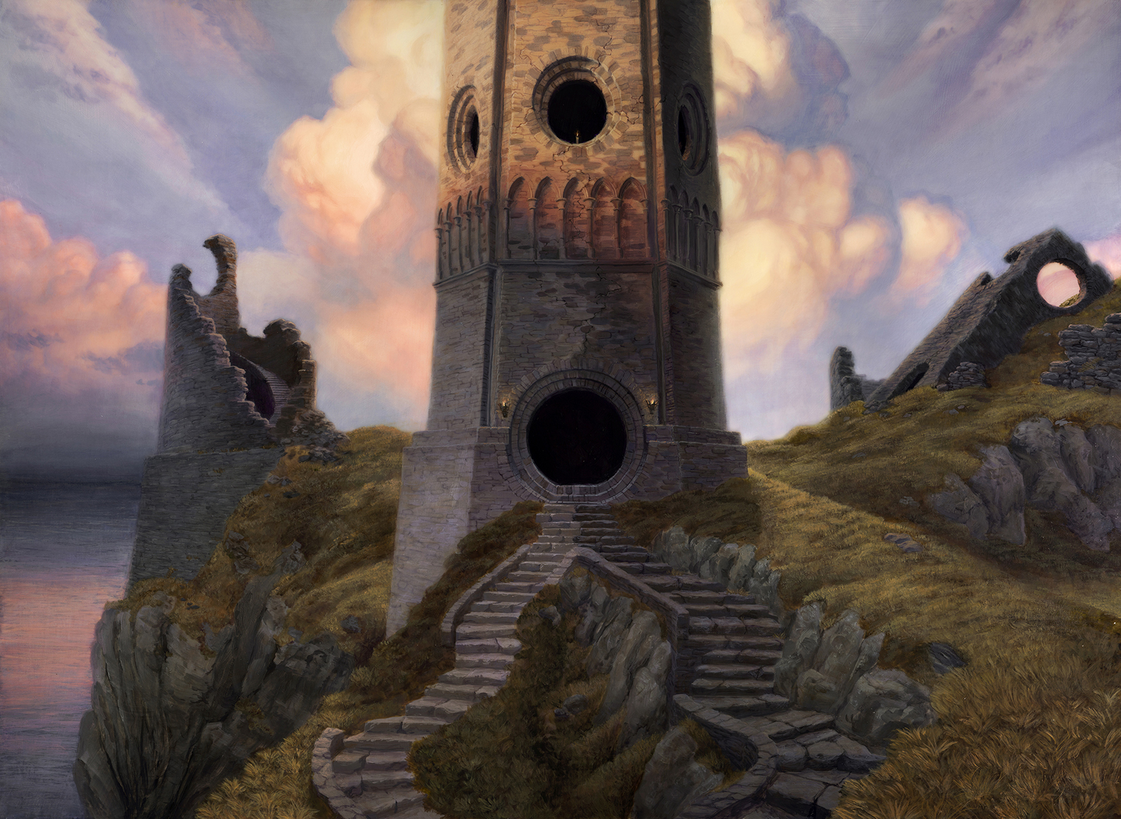
Narrative – 14″ x 22″, Acrylic
At IX this year, I was set up across from the room where portfolio reviews were taking place, and an artist I had been chatting on-and-off with came out from his review feeling let down and frustrated. He had received the feedback that he needed to put more love and care into areas of his backgrounds. He said he felt conflicted. If he put more work into those areas, wouldn’t they distract from the composition and possibly cause it to become overworked?
This struck me because I remembered having a similar experience several years ago. I had been given the advice to save my tightest edges, finest detail, and maximum contrast for the area of greatest importance and compositional focus. With this in mind, I had set off to create a few pieces before an upcoming portfolio review. I was very excited for what I thought was a major level-up!
Except, every portfolio review I had at the following convention had the same feedback: “You’ve put no care into these areas. You need to love the whole image.” I asked questions, but the answers didn’t make sense to me at the time. It contradicted the good advice that I’d not only heard from artists that I admired, but that I’d seen successfully implemented in their work.
Thinking back to this, I looked at the areas he indicated had been similarly critiqued, and I suddenly became conscious of what I had missed years ago. “Love and care” didn’t mean “details and edges,” but “design and intent.” Every part of your image, even those you might be tempted to consider unimportant, must lend value toward your goal.
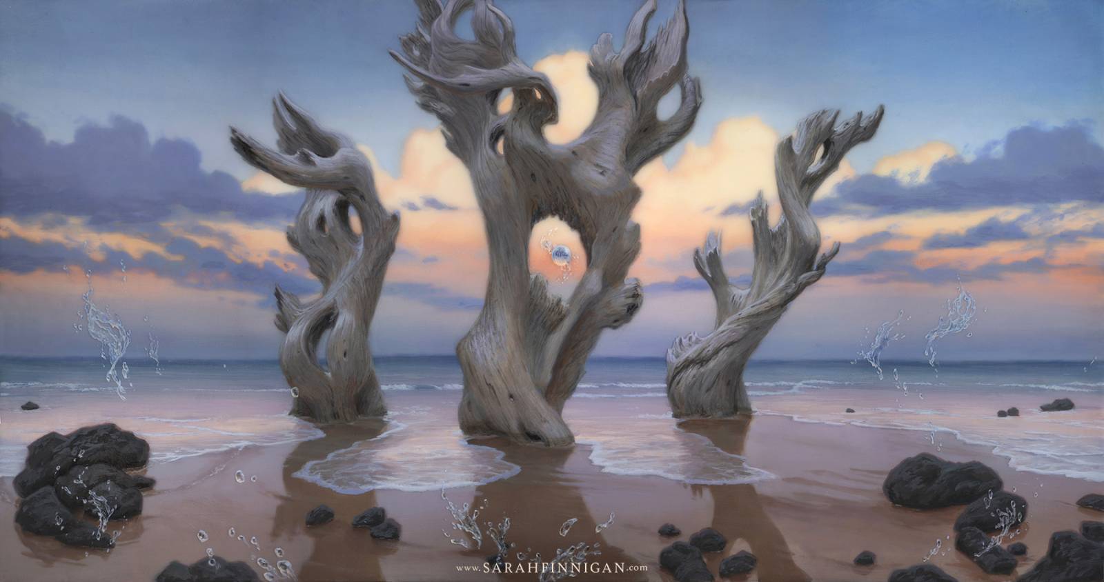
Flow – 10″ x 19″, Acrylic
How must the background lend toward the artwork’s goals?
-
- Indicate a setting
- Support the narrative of the artwork, if it is an illustration
- Set up compositionally-supportive lighting conditions
- Participate compositionally
- Create implied lines that intersect with the focus of the art, or frame it
- Group quiet areas together and visually busy together
- Support the subject with high contrast and low contrast where needed by placing light and dark in advantageous spots
- Create secondary visual interest
- Use of interesting rhythm in elements like rocks, leaves, mountain peaks, birds, clouds, etc
- Creation of interesting shapes
- Satisfying balance and gesture within the composition
- Set the tone
- Intimate, or distant and observant?
- Powerful or vulnerable?
- Inspiring outward awe, or introspective?
- Dynamic or calm?
- Unsettled, claustrophobic, wistful, triumphant?
- …Etc.
- Indicate a setting
I’ve heard it said that you must learn the rules of art so that you can break them. I think a lot of an artist’s ‘style’ comes from which rules they lean on and which they don’t. When I used to approach creating a painting from the top of this list down, it was like following a recipe to the letter, but never tasting it as it was coming along. The result was fine, I guess. It didn’t excite me, but it seemed technically cohesive. I followed ‘the instructions.’ But even if I accidentally made something deemed pretty ‘good’ as defined by other people’s tastes, I couldn’t reproduce it.
Now, I start from the bottom of the above list and work my way up, picking my flavors first and licking the spoon often. I come to a result that I love, even if it isn’t perfect and could be made better next time with the consultation of similar recipes. I have room to grow at the end, and the invested interest in doing so…not improvement for the sake of improvement, but because I cared about what I made.
Whether it is client work or personal, the first thing I ask myself is what mood I want to evoke. Making all the bullets above work together can be difficult…I suggest that starting with “what can I have in the background that frames the figure’s head and creates contrast?” is confounding and more difficult than “what setting would evoke the right tone?” If we work from the bottom of the list upward, we start with “what” and end with “how.” What do I want to convey, and how do I convey it?
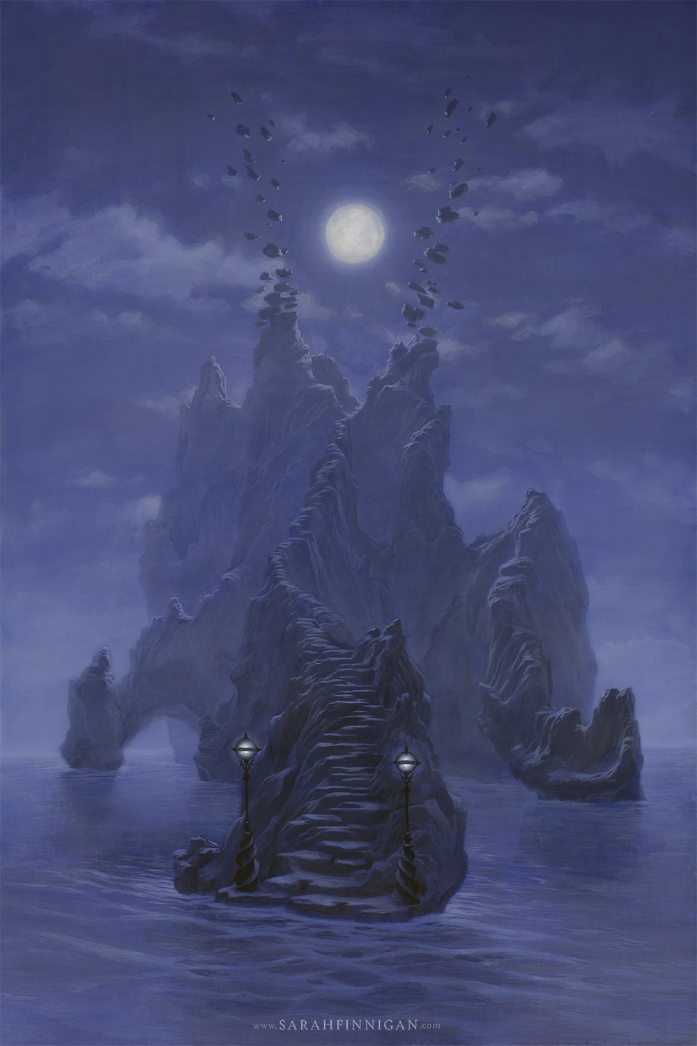
The Sapphirus Stairway – 12″ x 18″
You’ll probably never focus on the unassuming and unexciting clouds in this painting, but they serve an important purpose. I want serene, calm, and mysterious. I’m starting with what cold, gentle moonlight makes me feel and remember. A clear sky does calm in the same way a blank face does calm- more vacant than serene. Sometimes, when much of the rest of the painting is fairly active, all the background needs is a simple gradient for a sky and little else, like a rest in music; a space to breathe. A cloudless sky works really well for the Remington nocturne below, but for my moonlit painting, a cloudless sky would be too much monotony.
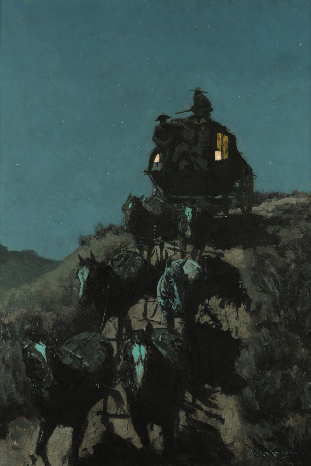
The Old Stage Coach of the Plains – Remington
Thin clouds that light can shine through and illuminate tend to feel ethereal, as opposed to thick, towering cumulus clouds as dramatic or powerful. I can’t help but feel small and humble in the presence of an imposing cumulus looming over me. Where I live, cumulonimbus top off above 50,000 feet. Take that, Mt. Everest.
Looming cumulus & ethereal cirrus
High-altitude, stippled clouds (or any with a more active rhythm) appear energetic. Radiating clouds may be perceived as exultant, and angled clouds more agitated- either with anxiety or excitement. For a serene painting I want nearly horizontal, but not so much so that they feel still.
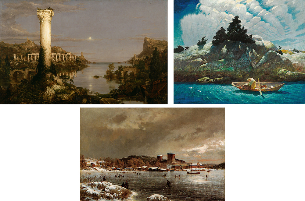
Desolation – Cole · Black Spruce Ledge – Wyeth · Olavinlinna – Munsterhjelm
With these constraints, it is easier to move up to the next bullet: creating visual interest. For the moonlit Sapphirus Stairway above, I played with the rhythm of the clouds within the boundaries already established: not too close together that it gets energetic, nor angled so much that they feel dynamic or agitated. How should the clouds best be distributed to balance the image? Next bullet up, we carry those decisions on and see how we can make the sky collaborate compositionally. Can we align the clouds so they point at or emphasize something important, or perhaps compliment the gesture within the image? Can the clouds be used to clarify the silhouette of the subject?
A sky is just one part of only some paintings. Whether you’re seeing a lot of sky or a lot of ground can be determined by where the horizon line is in the image. Does the camera point up toward the subject, or down as if viewed from higher up? The viewing angle can make your subject feel powerful or vulnerable, or the viewer feel present or only observant. Color plays a huge role too, but due to how difficult it is to articulate, I recommend you follow your instincts. In fact, follow them on all of the above. No doubt some will disagree with my characterizations, and I think that’s a factor in our varying tastes; some people will see your art and feel what you felt and wanted them to feel- and others won’t.
When the conception of a painting starts with emotional intent, the compositional decisions made in service of that intent come easier. The result may be a piece you’re happy with, not for how successful it is at checking off all the boxes, but for what it is striving to achieve.
Great article, Sarah! I think what I like best about that Remmington sky is that there actually are clouds in it, just very subtle ones you have to stare into it to see.
Excellent thoughtful information Sarah. I was not aware of your artwork until seeing this post. Very cool metaphysical landscapes! Thanks for sharing.
Great post Sarah! Really resonating with me after my own portfolio reviews at IX. Back to work!
Very clear article Sarah. If you would write a book about this subject I would definitely read it 🙂
대전출장마사지로 쉽고 간편하게 집에서 경험해볼 수 있습니다.