Hey everyone! Here we are, springtime once again. Looks like things are starting to open up a bit and life is slowly (at least for now) returning to normal. I’m cautiously optimistic.
Feels like the last two years kind of Compressed themselves into this endless loop of doom scrolling crappy news. I want a re-do on 2020 and 2021!
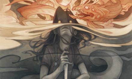
Went down to that three man art exhibition at Copro Gallery down in Santa Monica I participated in last Saturday. First show attended in over 2 years. Also, the first time I’ve left town since this pandemic started. Was pretty weird at first, but eventually interacting with people in person began to feel familiar again.
Carl and Shawn killed it. They both had a bunch of really impressive paintings hung in the show. here are some links to the work featured:
https://www.copronason.com/shawn/
https://www.copronason.com/dobsky/
https://www.copronason.com/coro/
Felt a little bit like the odd duck showing tree portraits, but they got a pretty good response. The crowd was enthusiastic to be out and about, and it was great to see old friends.
Even sold a few! Crazy.
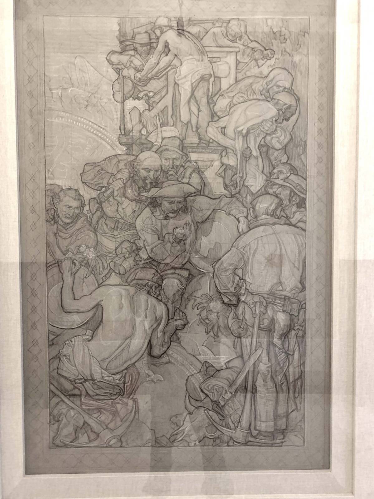
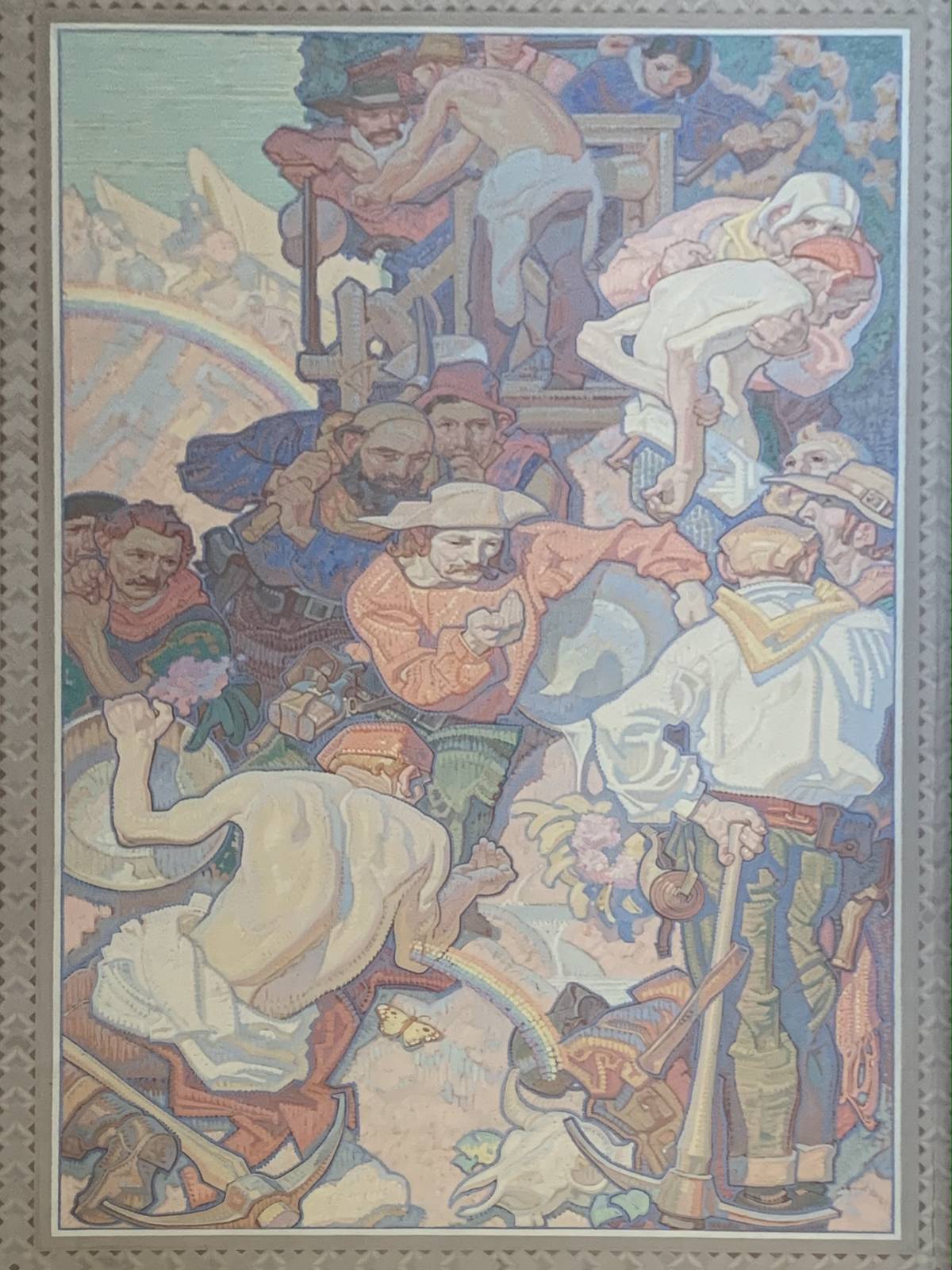
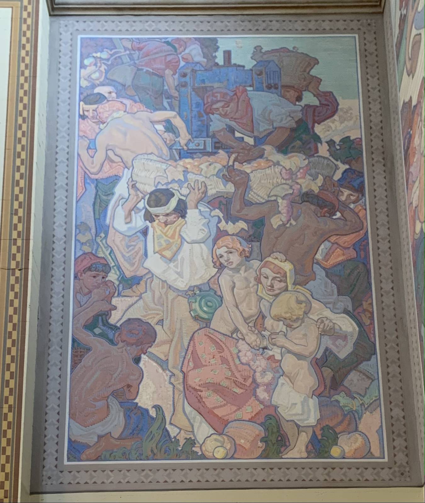
Also got to run down to the LA public library and check out that killer mural Dean Cornwell painted back in 1933. Wow that guy could draw and paint! So inspiring to see such an effort executed to such a high degree. They also had a couple of the studies framed. Was really cool to see the drawings, how he approached them and how they translated into paint. As impressive as the paintings were, I might have been more taken by these drawings. There’s no hiding in a drawing, and these were a true testament to his impeccable draftsmanship.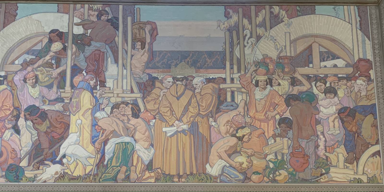
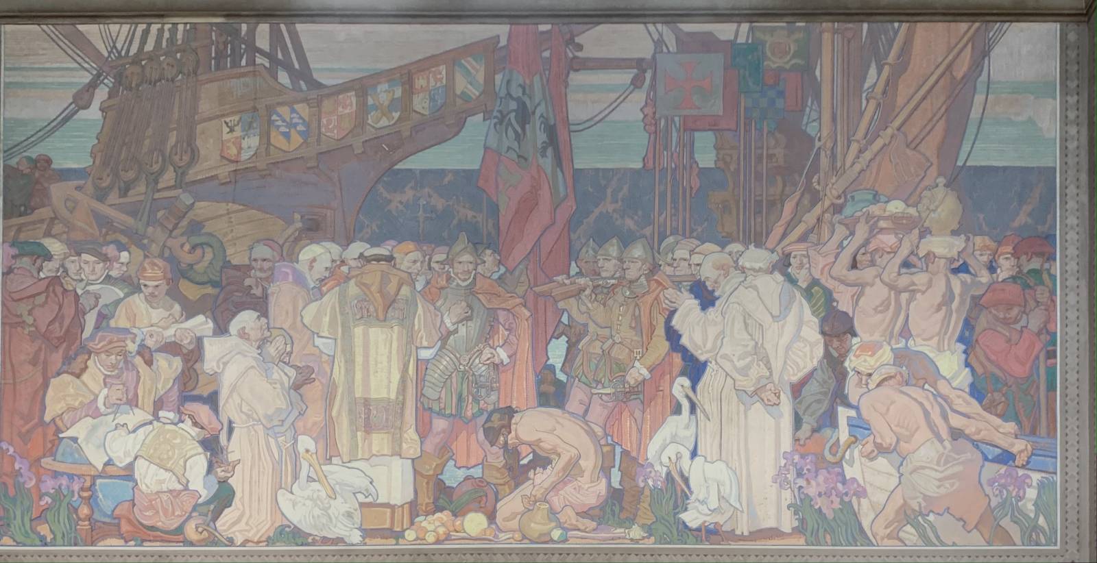
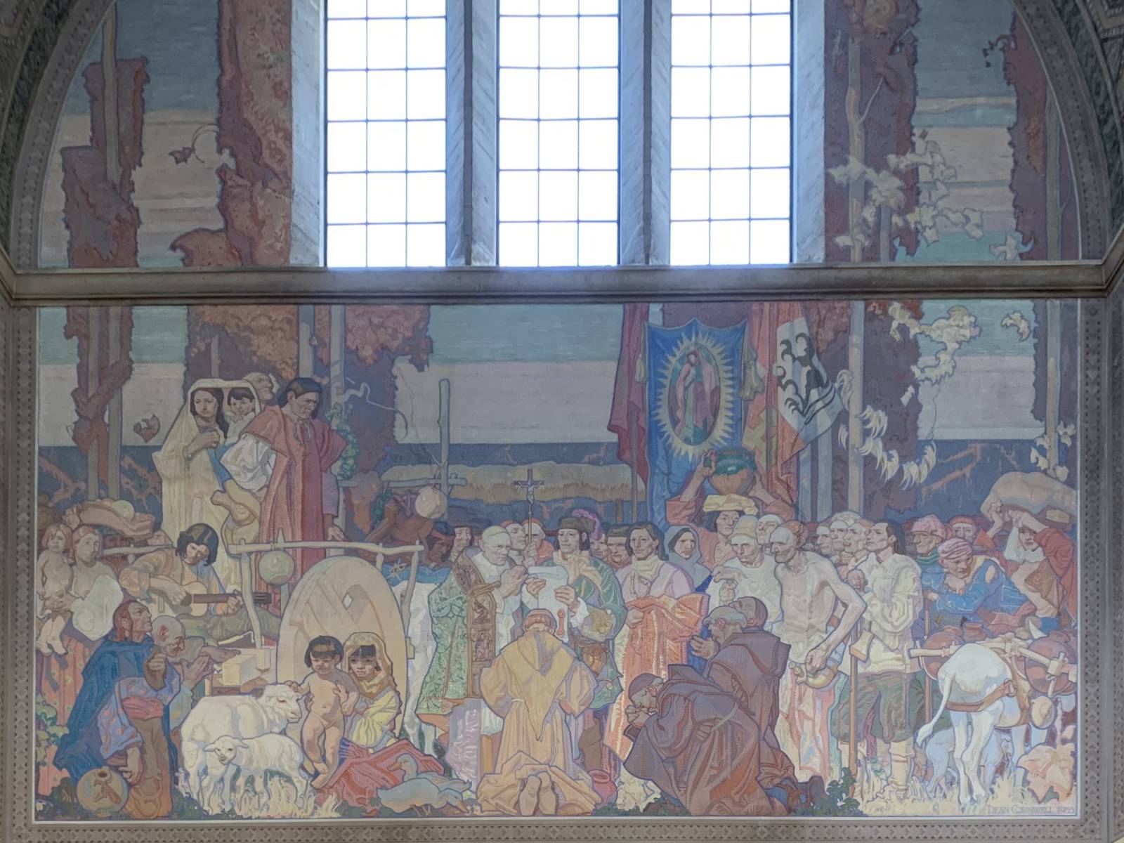
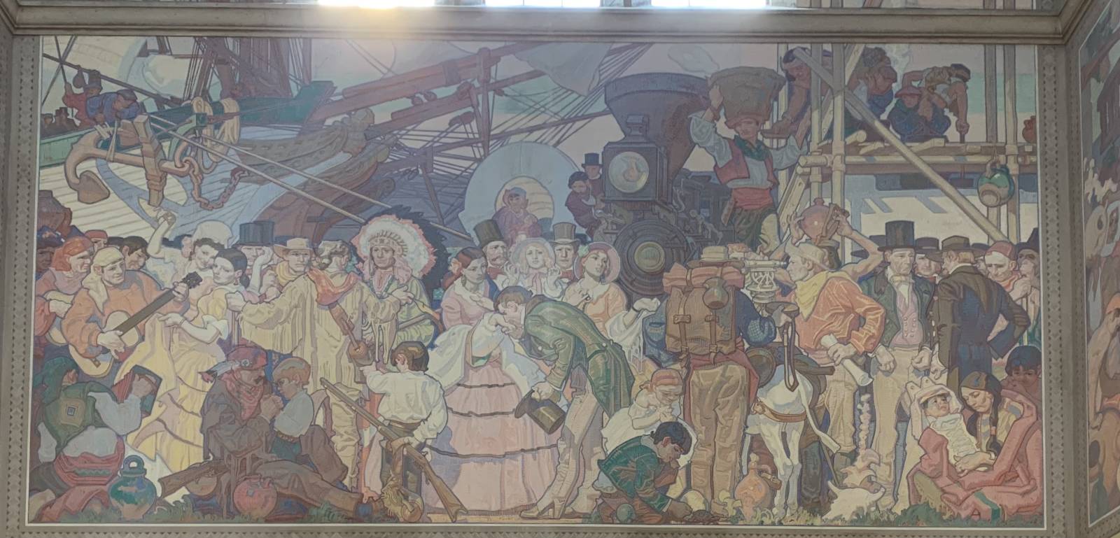
so cool to see how this translated into paint

the entire lower third of this drawing had been carefully cut out and reworked. was interesting to see how he dealt with something like that.
Well, it’s no Cornwell, but figured I’d post an update on the one I’d started last month of the beach near our place.

Once the value study was in and dry, I glazed some local color over the painting. Pretty basic at this stage, green over vegetation, browns and purples on the trees and dirt, and grays on the rocks along the beach. I use transparent colors for this part, and will usually mute them down by mixing them with their compliments. Transparent paint can appear very saturated. Don’t want to get too hot too early. Muting glazes helps the subsequent layers pop more. Heres a quick timelapse video of what that looks like:
Once that was dry, I hit it again, this time glazing soft shadows here and there, as well as beginning to differentiate the rocks into families of color. Bluish ones, reddish ones, even some purples and dull yellows here and there. It slowly starts to come to life once color is laid in.
When the transparents are dry, that’s when I get to come in with opaque colors. I’m much more exacting at this stage, taking special care to match the values and colors in my reference images, and detailing things more thoroughly. I will repeat this step several times over the course of about a month until I don’t hate it anymore.
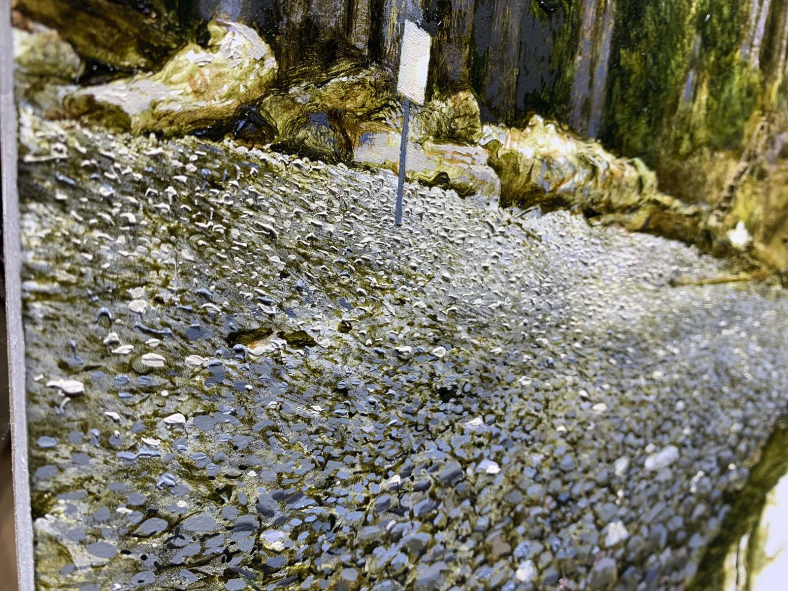
The rocky beach has proven to be the main learning experience with this one. I don’t want to paint each rock individually, but try to work the whole area at the same time, poking shadows here and there, laying on highlights, and gradually separating them out from each other. It’s been a process, and honestly it would have been easier if I’d painted it twice this size. But live and learn. Next time.
heres a closeup of them rocks:


Recent Comments