Continuing my work on the Hellboy-universe Castle Full of Blackbirds series, here’s my cover for issue #2!
 Many artists like to come up with multiple rough concepts for a given piece — and believe me, I wish I were one of them, since for me, there is often only one.
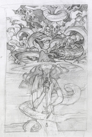
Even in a story like Blackbirds with a ton of imagery and complex themes to draw from, I’ll notice that one concept or motif feels “stickier” than the others — in this case the idea of visions, and the price that must be paid for them. Rather than trying to force my attention elsewhere in the interest of thorough exploration, I usually just lean into my single preferred concept and put a great deal of time into erasing and reworking a single thumbnail sketch to try to cultivate the fleeting hint of an image that that one concept planted in my brain.
The hope is always that the something that drew me to this particular story element will come through in my finished image strongly enough to snare the viewer as well.
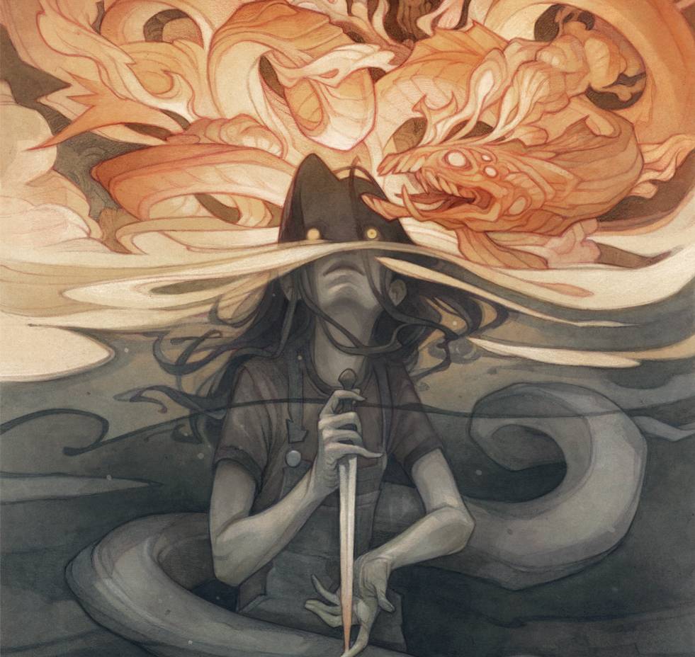
I felt that dualities were important to this piece: fire versus water, reality versus fantasy, secrets hidden versus knowledge revealed. I tried to carry that contrast through to the design of the piece: a bright, chaotic aerial scene set against a dark, silent underwater one, with the figure of Sarah May serving as the fulcrum that balances and unites those two worlds.
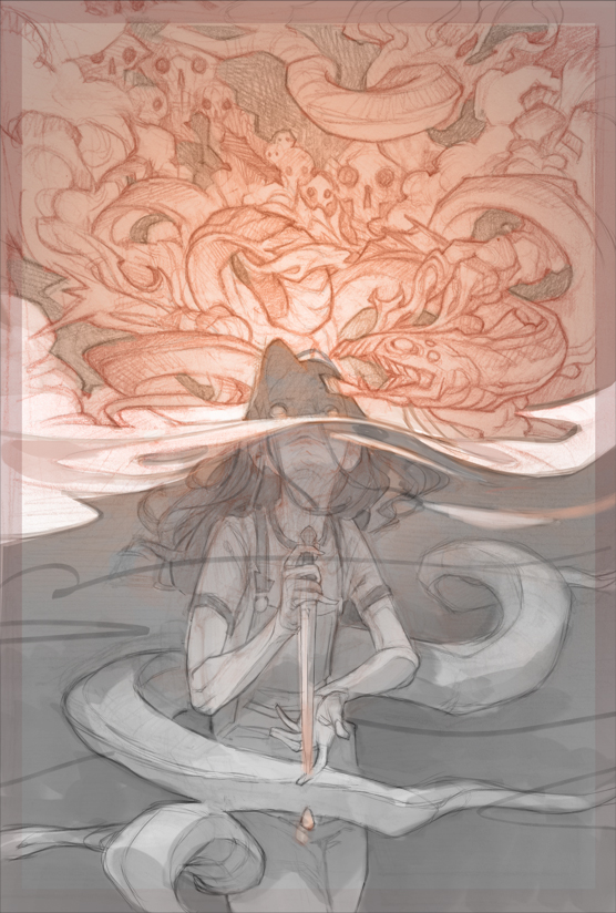
A digital color rough helped me work out the exact placement of values to deliver that statement with the maximum impact. I also took advantage of digital media to refine my drawing for the figure, and work out the exact details of the all-important hands and face (this is something I usually prefer to do in pencil, but tight turnaround times almost always push me to play faster, looser, and more digital with my process than I would on my own.)
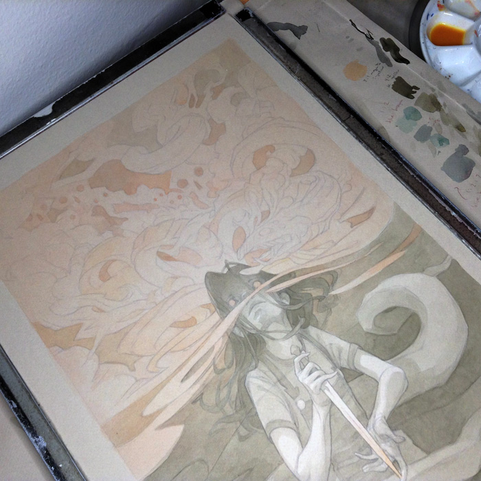
My painting process here will come as no surprise to anyone who’s been keeping an eye on my posts here for a while: innumerable layers of ink wash, built up over a low-opacity print of the lineart from my finished thumbnail sketch.
In a piece with such a rudimentary color scheme, I find the color and temperature choices to be especially important; in the image below, you can see just a few of the many color swatches that preceded the inking stage, wherein I tried to find just the right shade of “grayish” to offset the brighter oranges of the hallucinogenic sky dragon.
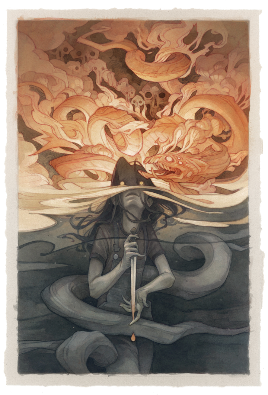
Here’s my art on the finished cover! While I always try to design my covers around a rough mockup of the type design, it’s always a thrill to see it in its final form… and overlaid with such illustrious names.
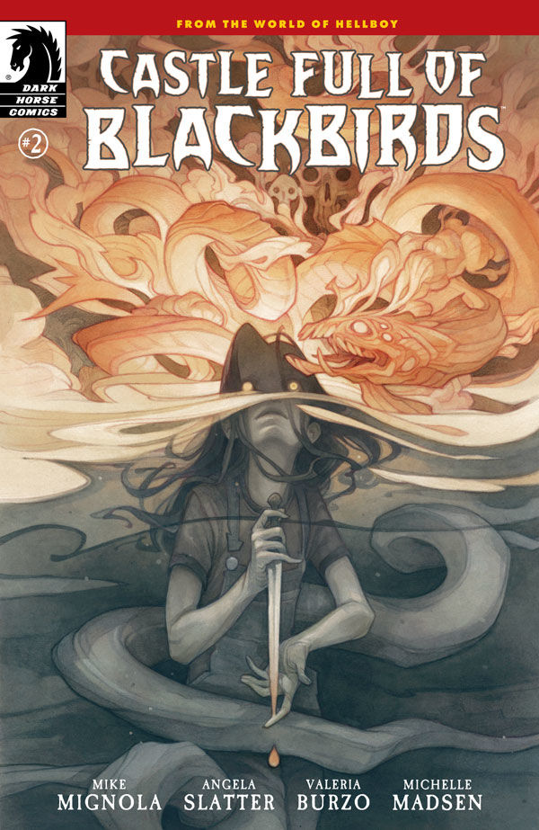
Castle Full of Blackbirds #2 will be released on October 19th! The first issue in the series is already out; you can check it out here.

Recent Comments