Hello my muddy colorers! Seems it my time again so figured I’d give a progress update on how this large portrait has been going…and well, its still going!
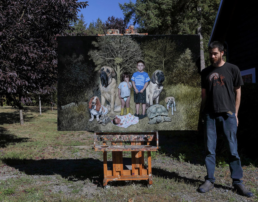
Been chipping away at it every chance I get. Since I work a day job I’m somewhat limited as far as how much time I can sink into it. Mostly weekends and the occasional slow night if I’m not cranking on production work…which in a way I think is kind of a good thing. It gives me time to step back and assess things with a fresh eye. Think I’d be a lot more burned out on it if I was going at it every day. Its weird, I used to like to fly through paintings, but the older I get the more I tend to like to let them develop slowly, let things sink in and come up with more of a solid game plan before I sit down to work on it again. My back also hurts more. Growing old is such a trade off.
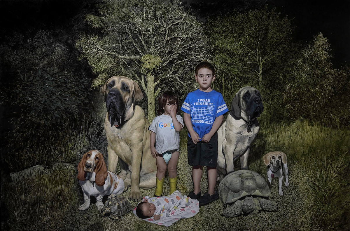
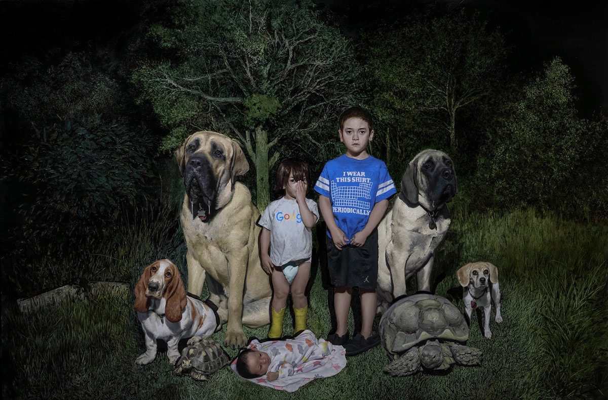
Pushing two months on this one now. Its taken a long time mainly due to the number of portraits. If there’s one thing I took away from doing comics its that the time you spend on a picture increases exponentially with every set of heads and hands you have to paint. Its always a numbers game. Think theres more paws and claws than hands in this one, but the rule still applies :). It’s also a size thing. While this painting isnt HUUGE, its a 4×6 foot panel, so while things arent life sized, it still allows you to really get in there.
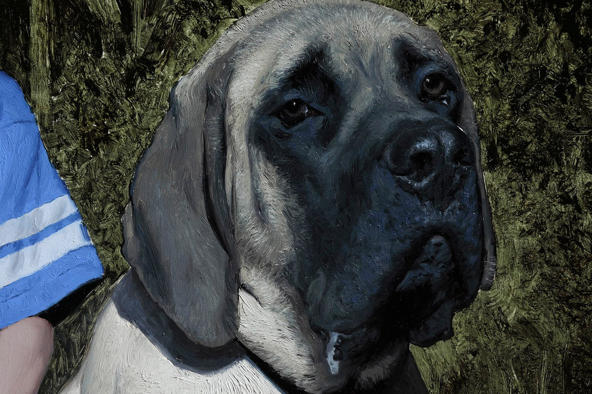
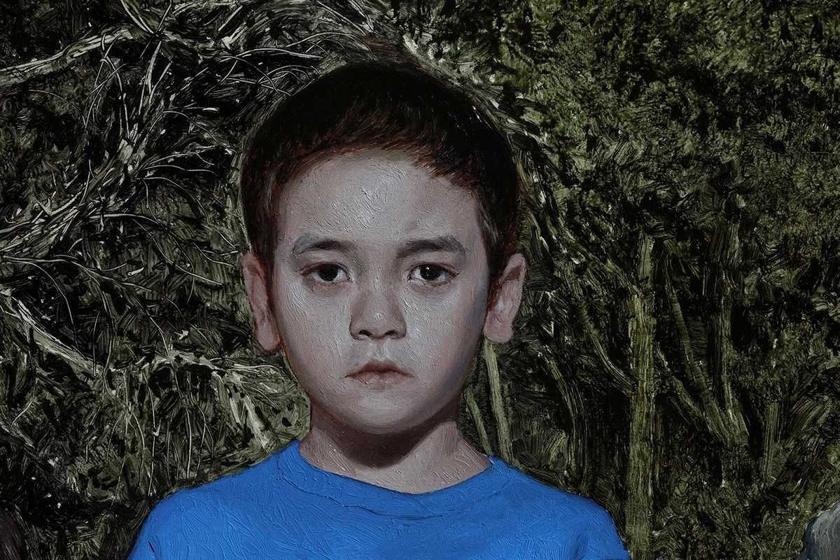
In a way this piece has had the added difficulty of trying to get these animal portraits as accurate as I can. I think I can get a likeness on a person with less reworking. I really want to capture their personalities as much as I can. Bob’s knowing stare, Kevin’s awkward sadness, Martha’s inquisitiveness, Katsu’s wide eyed and slightly senile gaze. Feel like painting likeness is one of the trickiest problems an artist can take on. You can’t just copy your reference. There is a certain amount of caricature necessary in order to push the personality and “life” in the sitter. Not enough and you get a statue, too much and you get a cartoon. It’s a delicate balancing act. I draw a lot of inspiration from ol Norm Rockwell with reference to this concept. Not sure many have done it better.
Throughout this whole thing, Ive been working left to right, and from bottom to top so I have blank space to rest my mahl stick on the panel. I tend to usually work like this for practicalities’ sake. I lay the paint in fairly thick, after which ill use natural hair bristle brushes to move and blend it around. I don’t use Turpentine or any thinners, and only dilute the paint with refined linseed oil. I like what this does to the paint in that it retains some body and doesn’t get too runny, and also the colors don’t sink as much as it dries… I’ve used this wet in wet method for a long time now. It gets me where I need to be quickly, allows me to be direct in my application, and creates a pleasing paint surface that tells a story.
This painting has become something of a bittersweet tribute, as sadly our Katsu left us last week. She hadn’t been doing well for some time, but took a turn for the worse and it was time to let her go. When she passed, she was the last portrait I had to block in. I’d wanted to get it in before she died, but sadly I didn’t make it. I can’t count how many times I drew and painted her over the almost 16 years we had her. Because to this, she was by far the easiest one to paint except for the fact that I kept crying haha. I’m such a baby sometimes.

Melvin’s shirt has presented one of the most difficult challenges on this piece. Drove myself crazy just trying to figure out how the hell I was even going to approach it. Better to go wet in wet, or just paint the whole thing blue and then go in back on top? In the end I opted to go the wet in wet route. The Shirt alone took me a full day, starting about 10 am Saturday til close to 4 am Sunday. I mean I took breaks and stuff, but id bet it took me about 10-12 hours total to get it all laid in. for the elemental numbers and letters, i let it dry and then painted them in on top a week later. why go to all this trouble over a dumb shirt you ask? well, he loves this shirt because he’s a nerd like his dad :), and it became this ongoing thing where every time he wore it, we would sit there at dinner and try to figure out what each element was. It happened enough that there was the need to commemorate it with paint 🙂
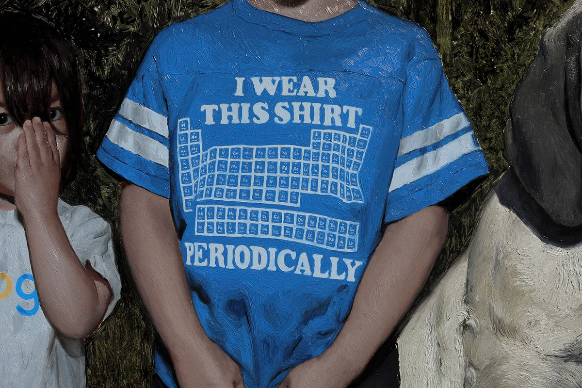
Touching on that a bit, I should mention that nothing in this pic is arbitrary. Every item of clothing, even down to the shoes and dog collars have some level of significance and tie back to this past summer in some way. Something I thought a lot about when composing this was that I wanted to include as many references to this past summer as I could in it, so in 20 years when the kids are all grown and the dogs are gone we’ll be able to think back to this past summer, and what a wonderful, magical chapter it was for us.
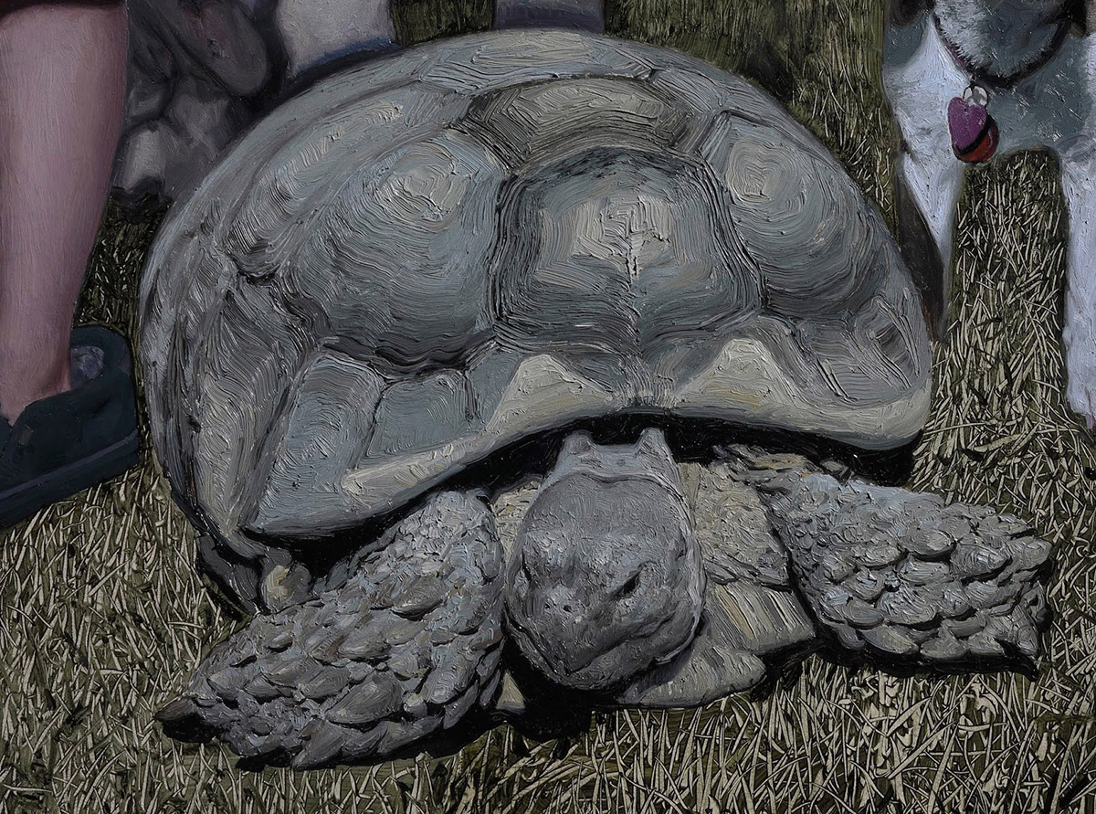
Next thing is to begin glazing some color into the background, some form shadows here and there and get those cast shadows laid in. this should go a long way toward tying the foreground and background elements together and will create a base I can start working back into opaquely, correcting drawing mistakes and refining details. Made a quick photoshop mockup of next steps before I start glazing in real life. Excited to get another pass in on the kids’ faces, the fur, and the turtle shells in particular. Thinking I might only have a few more weeks left on it, then i gotta figure out where to hang it!

Recent Comments