What is color theory? Wikipedia says: In the visual arts, ”color theory” is a body of practical guidance to color mixing and the visual effects of a specific color combination. This definition misses something important: color theory teaches the artist how light works and how to “see it” correctly. The information has always been there, we just have to learn to “see'” it.
By the Wikipedia definition, the visual artist learns how the colors they have mix, and how they work in combinations. This is true especially for a designer. The painter needs additional tools that many other artist types do not have to rely upon, the ability to judge color aka local colors of any kind of any object/subject under any lighting/atmospheric conditions.
The following list is an objective breakdown of the different levels of difficulty the artist will go through learning the science of color:
A. DRAWING
The Primer to seeing is the act of drawing form and learning the tools used to achieve this goal. We learn COLOR = VALUE
B. COLOR
When the student can render form in grayscale they are ready to learn color. Now the equation reads: COLOR = VALUE/VALUE = COLOR
1. Learn how to identify color in everything around us (How Light Works)
2. Learn how to find create the above mentioned hues through the primary color system from simple palettes to complex palettes (How Pigments Work)
3. Learn how to harmonize colors for pictorial cohesiveness (Color Gamut Control or Color Formulae/Recipes)
4. Learn how color emotionally impacts the viewer ((Psychological/Entertainment Effects of Color) (Color for Composition))
If you can find a school that still teaches proper color theory you are likely to learn the first three on this list, number 4 is rarely discussed.
Once drawing form is easy for the student, the first palette the student should use is a limited to black and white palette, paints that emulate the drawing experience. The palette is limited to these two paints giving the student a chance to graduate from dry materials to wet materials, the process of drawing is still the same.
Here is a simple palette progression list for the student:
Drawing Palette
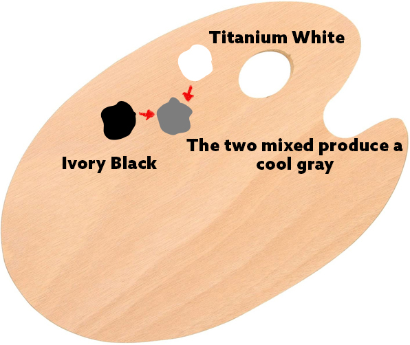
This palette emulates the materials used learning to draw giving the draftsperson a chance to transition to wet media while retaining the same skills and techniques.
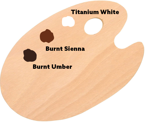
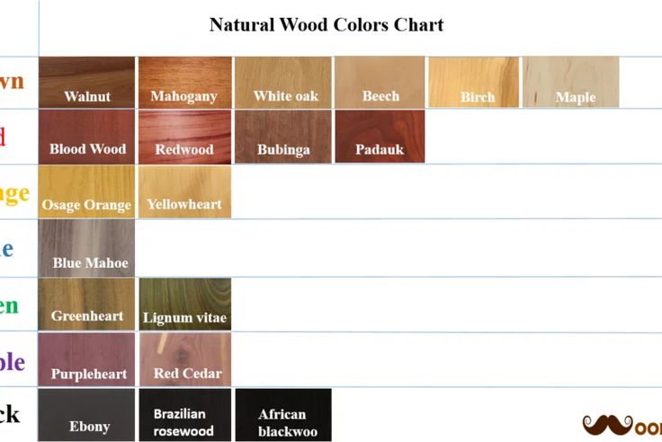
This is a color drawing palette, emulating the chalks one would use learning to draw in dry media. Another variant of this would be to use a venetian red as a direct translation of the terra cotta chalks used in drawing. The two brown hues are to be mixed together to negate the extreme temperature that either can produce alone, and to offset the extreme purpling or cooling off of the umber hue when white is mixed with it. Burnt umber also extends the value range that sienna cannot achieve.
Limited Color Palette
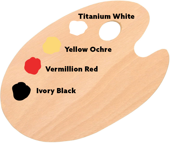
This palette is naively called the Zorn Palette, which is not at all the only set of hues the painter Andres Zorn used. This dates back to the Classical Greek period in western culture and represents what the Greeks thought of as primary hues. If you have not used pigments before, when white is added to the ivory black, a relative blue is seen in the mixture. While it is a very low chroma blue, it does work to a limited degree, especially if painting someone under fire light whether candle or fireplace, as Zorn did quite a lot of in those long and cold winter months.

This is a more academic palette which there are several variations of ranging from what are called primary colors, to a tinted and a low chroma version for various ranges of moods and atmospheric effects.
Enhanced Full Color Palette

This palette produces a broad range of hues as it has a warm and a cool temperature version of each primary hue. This allows for more range that the 3 hue palette above lacks the ability to produce.
Full Color Spectrum Palette
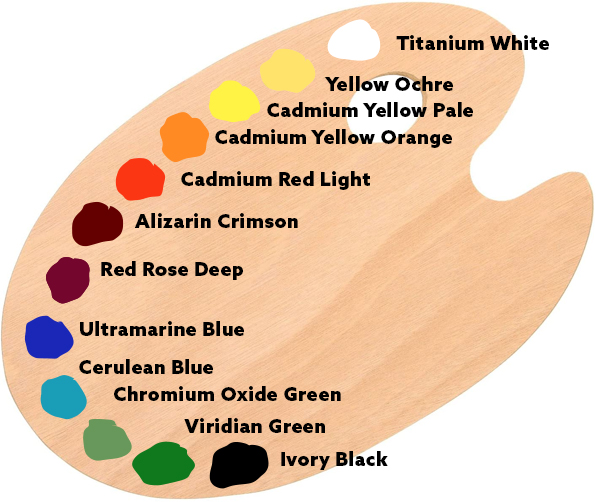
This is a full spectrum palette, advanced in its color range as it represents both the primary hues as well as the secondary hues that are starting chemically in a different state than a mixed version of these hues allowing for a broader range of color to be achieved from low to high chroma.
WHAT IS A PALETTE
A palette is a range of colors used to make a picture. For realism, the palette emulates the full range of the light spectrum, at minimum, this palette needs white and black, a tinter and toner, not colors, and a version of the three primary hues red, yellow, and blue.
A complex palette takes the above hues and expands upon them, adding in the secondary and tertiary hues, usually of a sort that cannot already be mixed by the master primary hues, the specific red, yellow, and blue used for the palette.
Illustration and Design palettes will vary from the above if the artist is intending to produce a gamut controlled image. This means that the palette will have very specific hues selected and black and white to adjust them for the entire range of value used.
Notice that the above palettes are all arranged in a similar order. Like a piano, each of these palettes represents a range of tone, and regardless of the range, they are all in the same order. Many mixing secrets are attributed to this order of hue, from righting a hue that is shifting temperature to adjusting a color to a different key of chroma. When the colors are placed at random, the benefit of these subtle traits are never revealed in such an obvious way.
FOR REPRESENTATIONAL ARTISTS: BLACK AND WHITE ARE NOT COLORS
There are many “fancy” whites and blacks that we can say are colorful, but for the realist painter, white and black are used to adjust hues to a higher or lower chroma point which would be equivalent to tints and earth tones, and they are used to adjust the hue value.
This does not apply to design or deliberately limited palettes (Gamut or Tube Controlled (designed)).
Black and white should be included on every palette. Without White, Tinting can only be achieved by the next lightest hue, likely the yellow family. Without black, dark values can only be achieved if the palette has a yellow, red, and blue dark enough each to generate the appearance of darker values without always looking purple. Red and Blue usually have a darker value out of the tube, mixed together they mix towards a purple hue.

LEARNING HOW TO “SEE”
As I have said before, color is objective and can be learned/seen through exercise. Everything lit is under the influence of some kind of colored light that can be seen with greater ease once acknowledged and seeing it is exercised. Every object has a local color. That color is totally influenced by the lights hitting it. As an artist, we are learning to see these different combinations of colors mixing together, separate them into their objective components, and pairing them with the hues we have on our palette to best represent them.
The first order of business is to learn how to see colors beyond the typical symbolic color we all think with, the color one perceives in their mind when told to imagine an apple as an example. This practice is done by extensive life training, painting from some kind of reference, whether that be a landscape, a still life object, a person, or an animal of some kind from life. The key here is “From Life”. Photos are convenient, but hardly truthful to the eye. No camera we have is capable of capturing what our eyes can see. A camera cannot equally balance what is in the shadows with what is in the lights, even with a 3CCD chip array.
The reason life drawing and painting is so necessary is because for most of our artistic careers, we will be reliant upon reference that can only be found in photos, and what you learned from life drawing experience will be used to replace what the photo reference does not explain, whether it is drawing, painting, or sculpting.
Below are several “From Life” exercises that can help you develop color awareness in everything around you. Gray is nothing more than a label for an object lacking chromatic clarity, and something we have to remove from our thinking or forever be crippled by it. These exercises are paint free and can be done anytime, some being more engaging than others. Learning is always and forever, and the more aware we are, the more we can learn every moment of the day.
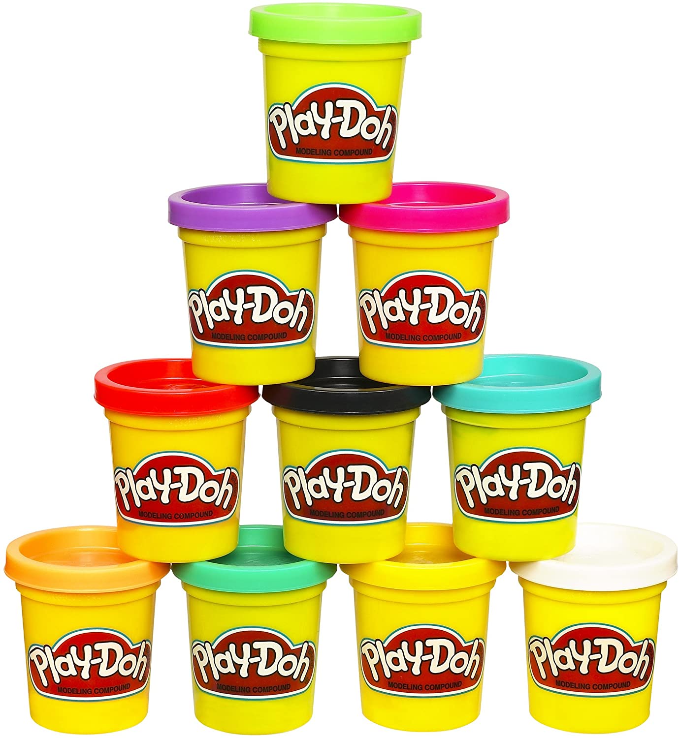
The Play-Doh Mix and Match Assignment
Get a standard set of Play-doh with these hues in it: white, dark( sometimes its black), blue, red, yellow. With this set you should be able to mix the colors to match almost any color in your household that is not extremely chromatic and colorfully unique. Match the wood of the cabinets, the chair frame, the shelves, the walls, the carpet, etc. Outdoors you can match the different colors of grass blades, leaves on various plants, the cement patio, the fence, etc. By doing this exercise, you will gain insight into which hues are used together to make the matching colors. This translates directly over to paint which shares the same pigments as Play-Doh. These exercises are “color mixing” exercises giving you further experience with the process.

This exercise is not just for kids, but hopefully you can appreciate the value in this exercise that is designed for children to learn to mix and match colors. This exercise is invaluable to anyone learning how to see correctly.
Play-Doh is a less expensive material most people fear less than paints and are willing to mush together without thinking about the cost of the materials.
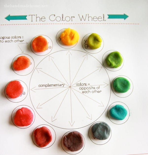
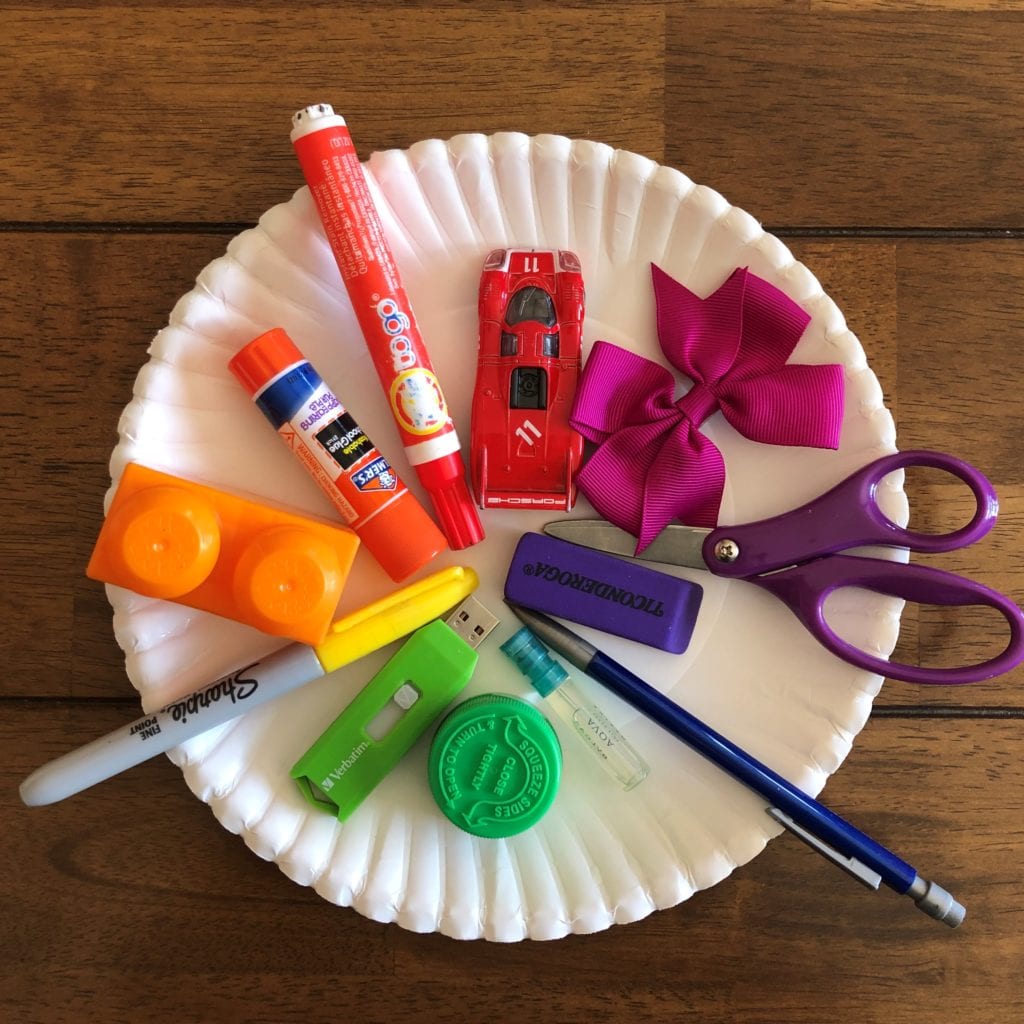
Play-Doh Color Wheels
With this same limited set of colors, mix an entire color wheel of 12 steps keeping the color jumps as evenly incremental as possible. This exercise teaches color mixing, where secondary and tertiary colors come from, and how to see colors in an orderly progression akin to a value scale. It too is a cheaper and effective means of learning color mixing.
What is the ROOT HUE: A Seeing Game
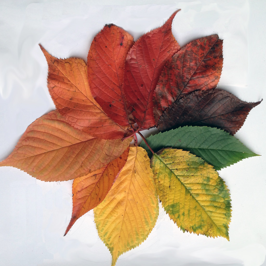
A “Root Hue” sometimes also called a “Mother Color” is the color origin, the inner ring on the color wheel where colors are labeled by their hue, like red, orange, yellow-green, etc. Every object can be identified by its “root hue” regardless of how gray it might appear at first glance. How do we identify this “root hue”?
Just like when drawing form, we compare or “associate” local values to each other before turning the form, the same is done when identifying a color through association of the surrounding hues. This means that when you are attempting to figure out which hues to mix together to make the color of dirt in your yard as an example, you want to find other objects in the vicinity that can be color identified and compare them. If the grass is green, what color does the dirt look in opposition to it. Does the dirt resemble the orange like hues in the flowers, or does it feel very different. What are the color differences or what is the color order according to the color wheel we use to chart them. Try tying the hues you label to measuring system, the color wheel, to help with the Hue, Value, Chroma adjustments.
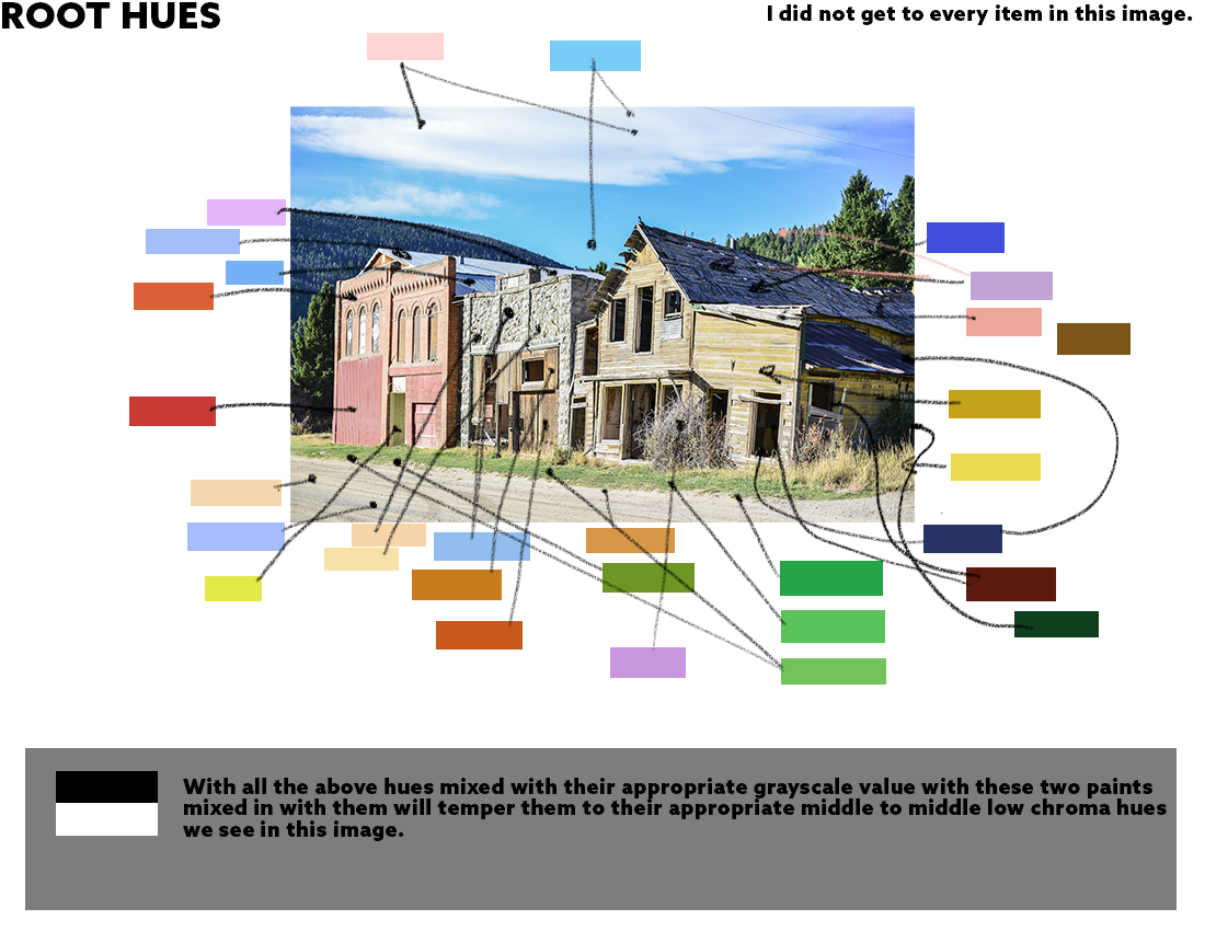
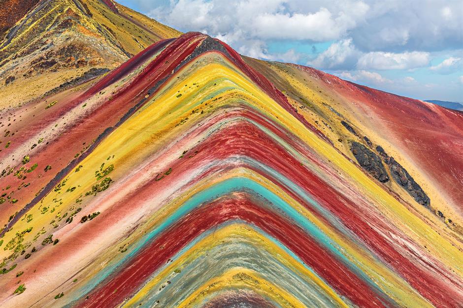
Here is a photo example of examining for root hues. I want to point out that because of this camera’s limitations, everything is bathed in the blue channel to a certain degree. There is no way the grass in the foreground could be a blue green with that much direct sunlight and that much bounce light from warm surfaces from behind. This is a limitation of the camera which if I did this image correctly, you would question my choices because they would not correctly match in temperature.
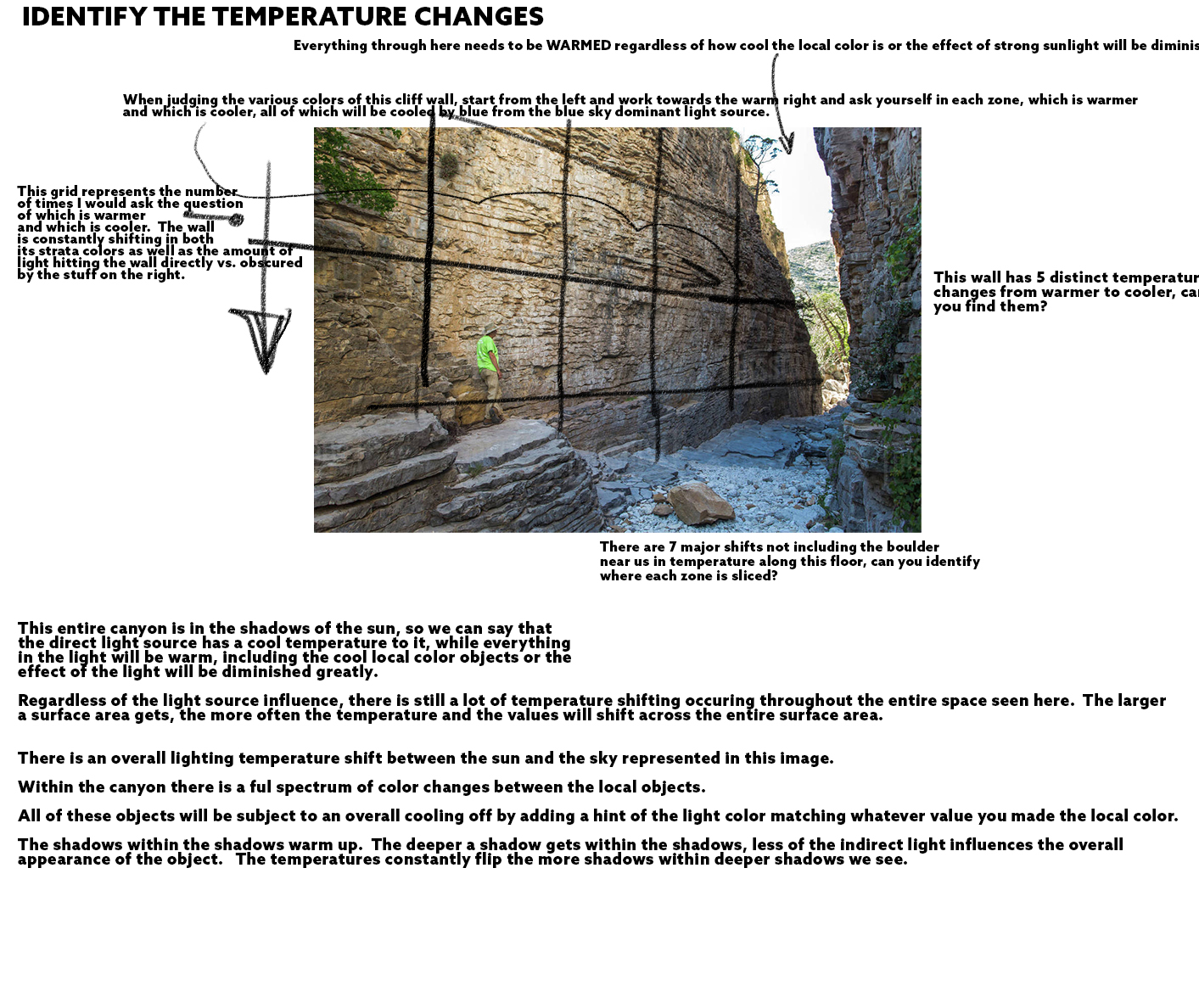
What Temperature Do You See
When the root hue is difficult to identify, even with the surrounding hues to compare, another helpful gauge to learn to use is the temperature gauge. How warm or cool is the object compared to its surroundings, is the object warmer or cooler than the surrounding objects. If it is warmer, the three basic color choices would be yellow, orange, red, and if the object is cooler then again there are only three basic choices, green, blue or purple. I find this method of deduction the most useful, especially when trying to identify the color space of a dimly lit or low lit environment when color is neither optimally lit by the sky or the sun and “everything turns gray!” Agent Orange
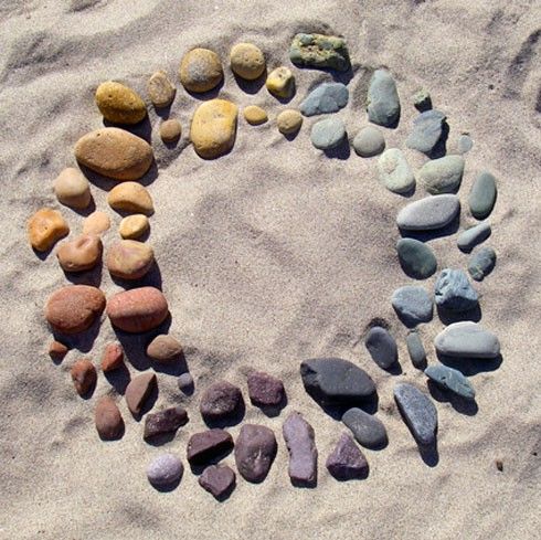
Nature’s Color Wheel
I once nerded out while hiking around a lake where I kept seeing different colored rocks on the trail to the point where I thought I could assemble an entire color wheel with them. Sure enough, it was not difficult to do with all the various rocks that were along that trail. What surprised me was how much more aware of color I was surrounding me. I really never paid much attention to the singular color of the pebbles or dirt very much until then. I was becoming more aware of the color in everything. I could label them objectively enough to paint them.
If you live in a city, this might be a little bit tricky, but I am sure you can find planter boxes in front of enough high rises or strip malls that will have decorative rock in them.
Build your own nature color wheel using rocks or dirt types in jars. This exercise helps you become more color conscious of your surroundings. It redefines how you look at things around you, and helps us look up more, live in the present, take it all in.
More Color Wheels
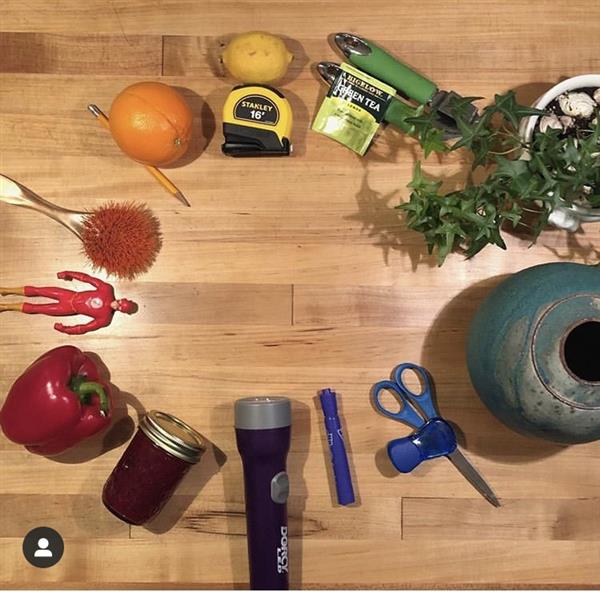
Can you assemble color wheels with other found objects in your house, outdoors, anywhere you go? To continue developing color awareness with your surroundings, build color wheels with other natural or man-made objects.
Try to assemble a color wheel using the various types of bark on trees, photographing a good patch of the bark that looks of a certain hue, and in Photoshop build a color wheel with the trunks.

This exercise gets easier if you have a Rainbow Eucalyptus near where you live, and yes this is real.
Do the same with leaves or grasses live and dead, plant leaves, sticks, with metals, and anything else you can collect or photograph that you once thought did not look like it had any color to it, and others of the same sort.
The point of these exercises is to develop and strengthen color awareness and color identification of everything around and use the skill intuitively and on command.
All things have color to them and it takes time to train the brain/eyes to calculate and grade them based upon the academic scales we use to measure them. There are many ways to turn on these abilities in both practical as well as academic settings and practices. The more we engage in our craft whether through practice or play, the less hesitant you are to engage in your craft regardless of whatever it is you create. Knowledge leads to an easier time leads to more engagement leads to more clever discoveries and level up moments your career has throughout the extent of it.


Hey Ron, I’m still working on my drawing chops (I can copy well, but I am working on 3d construction and keeping proportions consistent…then sharpening up on anatomy later this year) but am excited to try those drawing palettes as a way to transition into paint. The browns especially look fun. I’ve also been having fun drawing with just one fun color like blue or purple. Keeps me focused on drawing but also lets me feel the electric energy of a funky purple
Awesome, with that blue, hopefully it is Ultramarine. Most of the other blues are very difficult to work on top of, Ultra emulates the light of day which is a good base color to mix with the other tones .