Welcome back to my intermittent series: Turning Points, where I investigate the illusions (and delusions) involved when looking back on the Greats of Art History. As one of my favorite quotes about social media goes “Don’t compare your whole life to someone’s highlight reel” and that is very true of how we think of the Masters (capital M). These artists were as human as we are, and they had failures just like we do. Sometimes they were not even successes in their own lifetimes. Art History glosses over these dips and gives us an image of a career in a straight line. But memory is fickle and being remembered beyond your death is as much luck of what a curator decides to dig out of an archive as much as it is an artist’s skill. And while there are some depressing stories among the triumphs in these tales, overall that’s the takeaway I want everyone to get from these: You can’t control what happens after your death. We have almost no control over our “artistic legacies”. You can’t control what people will remember or how they will remember it. Hone your craft and enjoy your skill in your lifetime for your own satisfaction, that’s the path to being a fulfilled artist.
You don’t have to read these in any order, but here’s the series so far:
Turning Points: Alphonse Mucha
Turning Points: Sandro Botticelli
Turning Points: John Singer Sargent
(yes, I’m getting to Caravaggio next, I know people have been expecting him)
This time we’re not looking at the ups and downs of a single artist’s work, we’re actually looking at how malleable our Art History memory is. It’s bad enough that we have a very limited view of the breadth of an artist’s career — it turns out we can’t even trust the work that has survived to truly show us what the artist created!
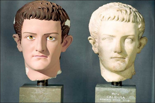
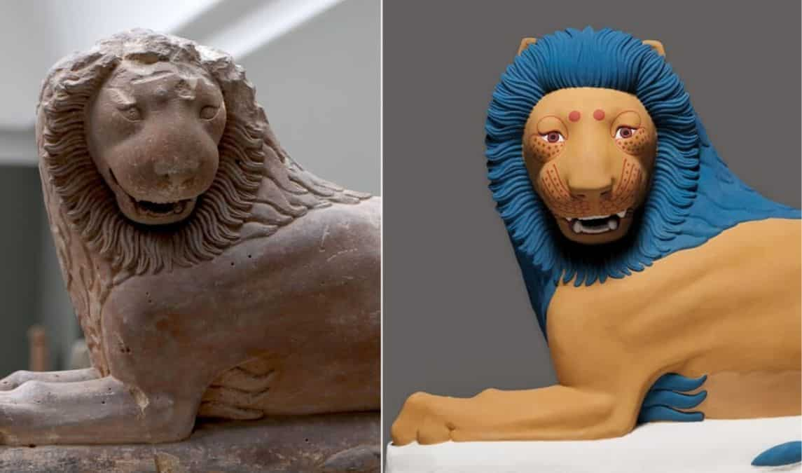
There’s a lot of examples of this. When we look at modern banks and government buildings we evoke an all-white Ancient Greece that never was. There is proof upon proof upon proof that ancient statues and buildings were painted. And they were painted in ways our modern sensibilities consider garish. I have traveled quite a bit in Greece and Italy and even in the Parthenon I am jarred by the statues painted to recreate the accurate historical style.
(Spoiler: It’s the Renaissance’s fault)
These images were researched and recreated by archaeologist Vinzenz Brinkmann
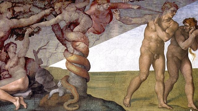
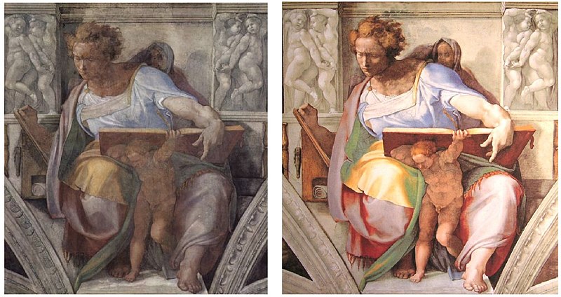
A more recent example is the cleaning of the Sistine Chapel ceiling and what a scandal it was in the 1980s/90s. After Michelangelo’s frescoes were cleaned they revealed bright colors that no one had seen since long before the birth of photography. The effect was so immediately jarring to people that a giant controversy sprung up insisting that the conservationists removed too much paint and stripped away much of his intentioned shadowing. I am not an expert in conservation, but the best conservationists in the world worked in the project then, and modern scientists stand by the restoration work now. When I was able to visit it was after the cleaning, of course, but I have no doubts that this was the coloring and shading Michelangelo intended, or at least very close. Do I think he fiddled with some of it on top after the original fresco had dried? Of course! Have you met an artist? But is the fresco missing an entire layer of shadowing on the whole? Unlikely. I have seen in my lifetime the dramatic cleaning of the ceiling of Grand Central Station and that was dramatic after mere decades. After hundreds of years of burning candles, incense, and pollution it’s incredible that we could see the figures at all.

This happens in old photography and films as well. I am endlessly fascinated by recolored photos and films of New York City, my hometown from the era before color photography. Of course we have modern movies and shows that give us a feeling of how the world looked in color back then, as accurately as they can — I just finished watching The Alienist which is a great example of a modern recreation of 1897 NYC—but it just doesn’t hit you as hard as news reels recolored:
And last but not least, my favorite topic — and one I deal with constantly when trying to get book covers to print correctly — the absolute fickleness of my favorite color, Green. In Victorian times, green was a very popular color…and it killed a lot of people because it was made with arsenic. It also didn’t age well because the compound degraded and leeched into the air. There were quite a few ladies sick from there green dresses. One fake flower maker who used the green dyes in her craft was so poisoned the whites of her eyes turned green. And there was unfortunately a lot of green wallpaper put up before people realized what was making them sick.

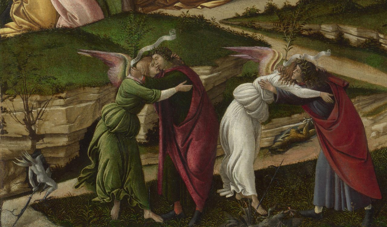
But the “green” example that’s more relevant to us fantasy artists and the folks that read this blog is Verdigris. Verdigris is a green pigment that’s made from copper and it was used extensively by Renaissance painters. Our friend from a previous installment, Sandro Botticelli, used it. But you wouldn’t know it now, because verdigris degrades to a puke colored brown. Thanks, copper!
If you’re feeling really nerdy there’s a great academic paper on this from the journal Inorganic Chemistry that breaks down exactly what is happening in the verdigris in Renaissance-era paintings:

The moral of the story is…memory is misleading, as is our grasp of Art History, and much more prone to emotion and manipulation than we’d like to admit. Don’t obsess too much over who is a Master and who isn’t, or getting your work to look exactly like Botticelli’s, because chances are good that he wouldn’t be thrilled with the version we’re looking at today.


Great article, thank you. I really like seeing the ancient colours of these revealed, especially that lion!
I know, it’s so completely different than how we’ve pictured them in our heads!