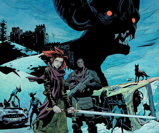
 The gods have heard your prayers, and taken mercy on your tattered souls: I have returned! Hello, Artist Community! I hope your brushes are sharp, your minds are sharp, and the resolution on that 15 year-old Wacom you still use is also plenty sharp. Know what else is sharp? Swords, my dear sailors! And fangs. And broken glass. I’m working on this comic called Impact Winter. (beautiful colors by Matt Hollingsworth!)
No, I’m not here to shill it, but I thought I would muse about the cover for a bit. Join me!
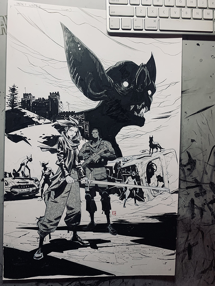
My keyboad doubles as a reliable paper holder
With my own drawing style, I’m trying to lean more into bold and decisive shapes, and a splash of storytelling. I also aim for bold dramatic black shapes, for maximum readability. I also like small areas of interest, perhaps via pattern or texture, to reward the viewer for meandering a little in the piece. With this cover, I went with three main elements. A vampire, some middleground elements, and a pair of heroes. Revolutionary? Of course not, but a classic idea executed well, like a favorite dish, can always delight with a little twist and variation. I still work traditionally. There are still blue pencil marks that just get photoshopped out. I love the feel of a wax pencil on smooth paper. I do 90% of my work with a sharp, sable brush, and some watered down Bombay Black. To be honest, though, I will use whatever. I will bludgeon my enemy to death with a splintery ax handle or slice him open elegantly, by way of a fine Japanese katana, as long as he’s dead in the end I don’t really care. I spent too much time worrying about tools, but maybe I’ll talk about that in another blog! Our heroes, Darcy and Godwin. I try to use thick and thin shapes in my figure work. I try to make things taper. I want islands of interest and places of quiet and rest. The grays and patterns here are traditional Japanese screen tones. I want to lean into the limitations and look of comic book art. You can see how the dots on the scarf rest on top of the washed out inks. Also some splecks (new word!) of white here and there, for purposes of adding noise and “activating” certain areas. The diagonal pools of shadows are here to glue stuff together.
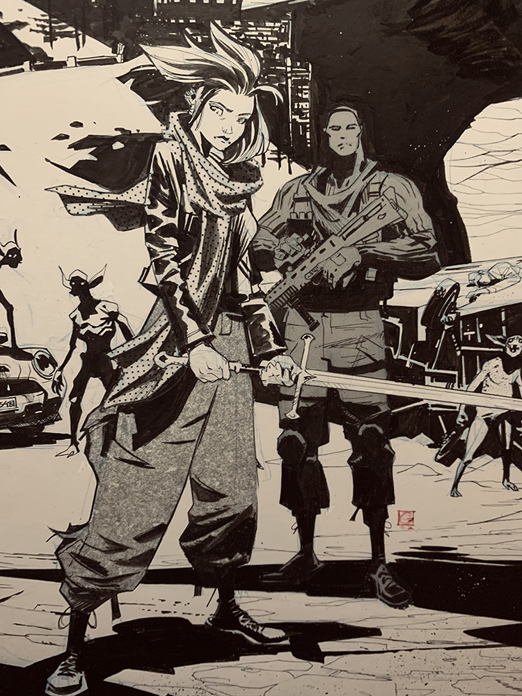
Maybe Cloud Strife was on my mind a little here
Our vampire friend. I put some wash here and there. There are some thumbprints if you look closely. He had some whiskers, but I changed my mind. It’s almost always a good idea to leave stuff out. The scribbly slashes form a rhythm. Sometimes I zigzag these marks, but I almost never cross-hatch. I like things to flow in one direction. I’ve never liked how cross-hatching freezes things in time. Does this make sense to anyone else?
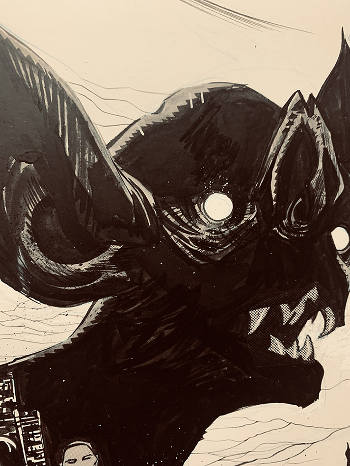
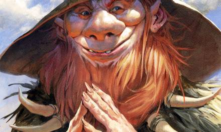
crooked teeth > straight teeth.
Sean Murphy once talked about his (brilliant) approach to background textures as “Organized Bullshit”. I will never forget that. That’s all this stuff is. Bricks, overcast clouds, an evergreen tree, a barren rocky hill- I’m “cartooning” here. With a little luck, you might get something more interesting or beautiful than the real thing. 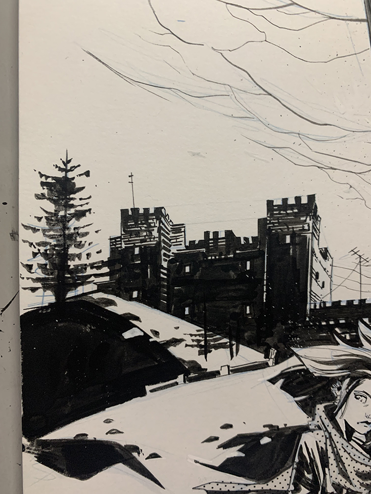
Thanks for having a short look, friends. I wish you strength and endurance on your journey on the road of art. Onward!

My my, a charming read ’till the last work. Cheers!
Japanese screen tones? Is that the same Zip-a-Tone screens I used back in the ’70s?
Not sure about Cloud Strife, but Andúril – Flame of the West from the LOTR movies was definitely on your mind.
These draws look so cool
amazing peice of art
führerschein kaufen legal, führerschein kaufen ohne vorkasse, registrierten führerschein kaufen erfahrungen, führerschein kaufen erfahrungen, führerschein kaufen ohne prüfung Köln, führerschein kaufen österreich, führerschein kaufen ohne prüfung österreich, führerschein kaufen ohne prüfung österreich, führerschein kaufen in österreich, führerschein kaufen Frankfurt, führerschein kaufen schweiz b
Not sure about Cloud Strife, but Andúril – Flame of the West from the LOTR movies was definitely on your mind.
Not sure about Cloud Strife, but Andúril – Flame of the West from the LOTR movies was definitely on your mind.