
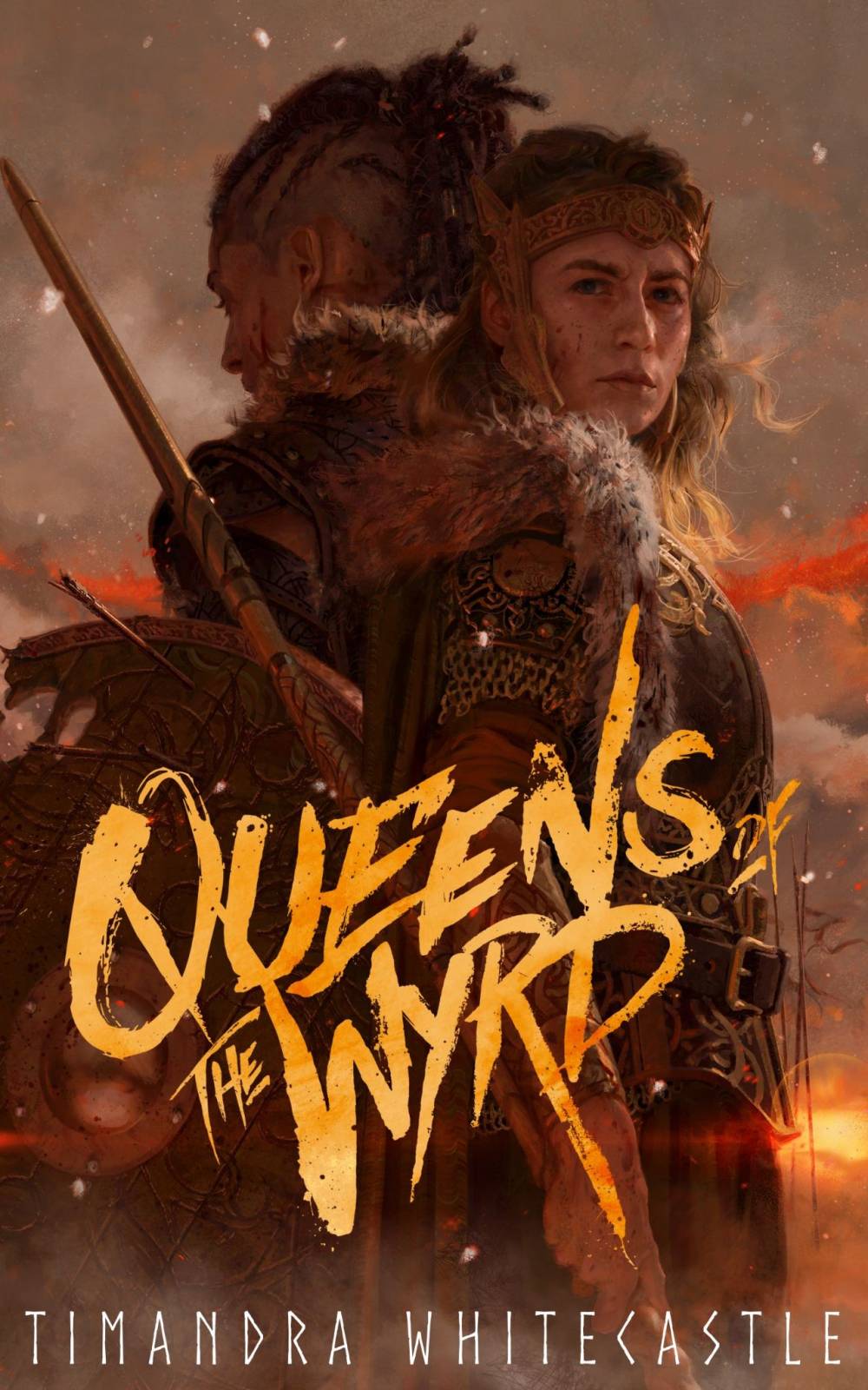
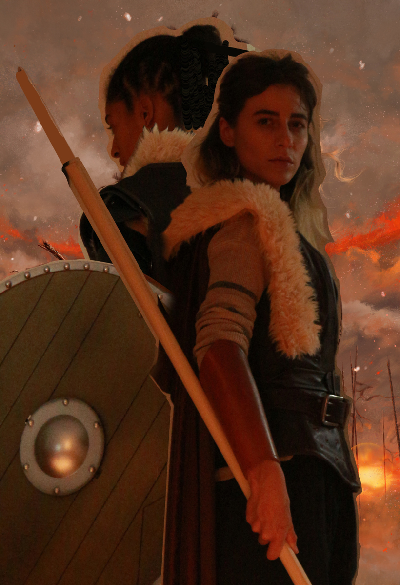
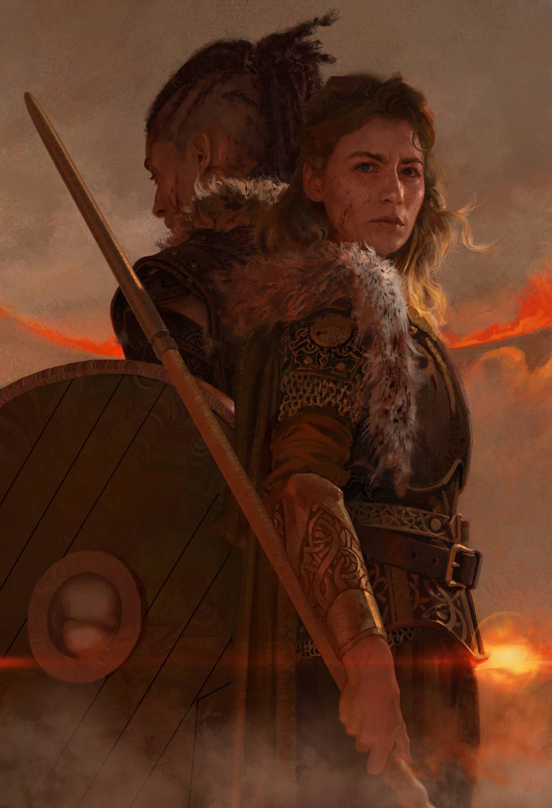
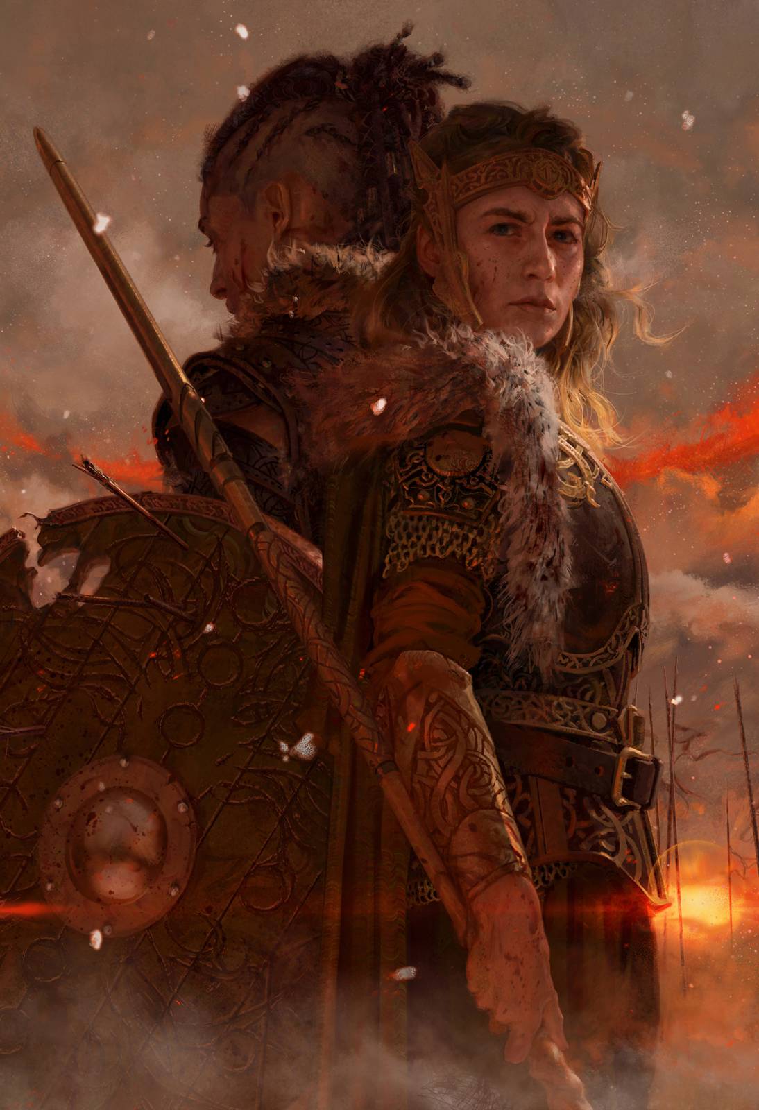
The cover, with a rad type treatment.
This was a book cover for a self-published author who I’ve worked with a number of times before, Timandra Whitecastle. She ran a Kickstarter campaign to bankroll the covering of the book and once it was fully-funded we were off to the races. Tim wrote a blog post on the process of working together to refine the direction, so I won’t retread the same ground here – but I will say that what she wrote is very informative and worth a read!
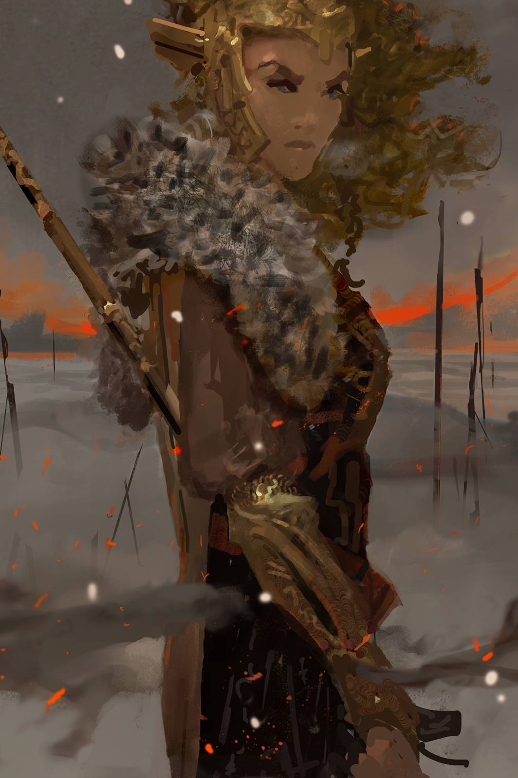
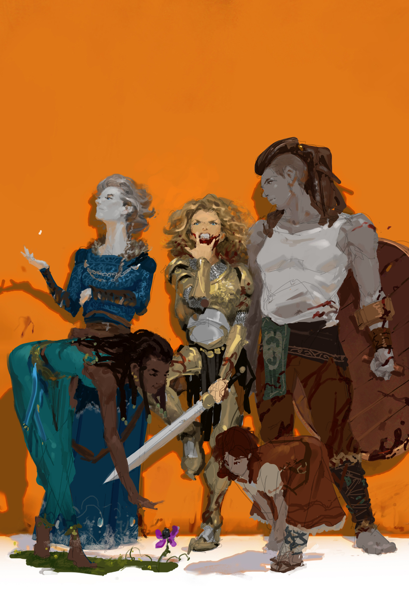
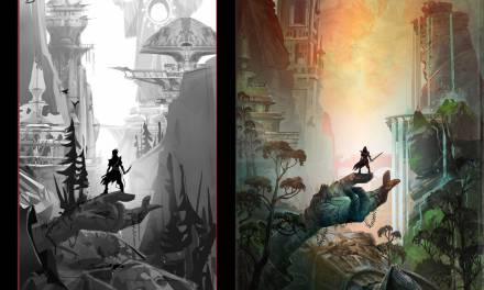
Tim’s post did leave out the final sketch, so I’ve included that here, along with the first two sketches. We started with two single-figure shots of the two main protagonists (the color sketches), then the feedback was basically “combine them!”

(Actually, there was a third sketch that I REALLY wanted her to go for, that I doubted she would ever go for, that I included for her consideration anyways: a sort of “ensemble” shot of the entire cast. Alas, she did indeed not go for it. In all fairness, it isn’t the most indicative of the mood of the book, but the book does contain a lot of funny moments and great character interactions happening among old friends – a sort of “Guardians of the Galaxy” vibe that I was channeling here.)
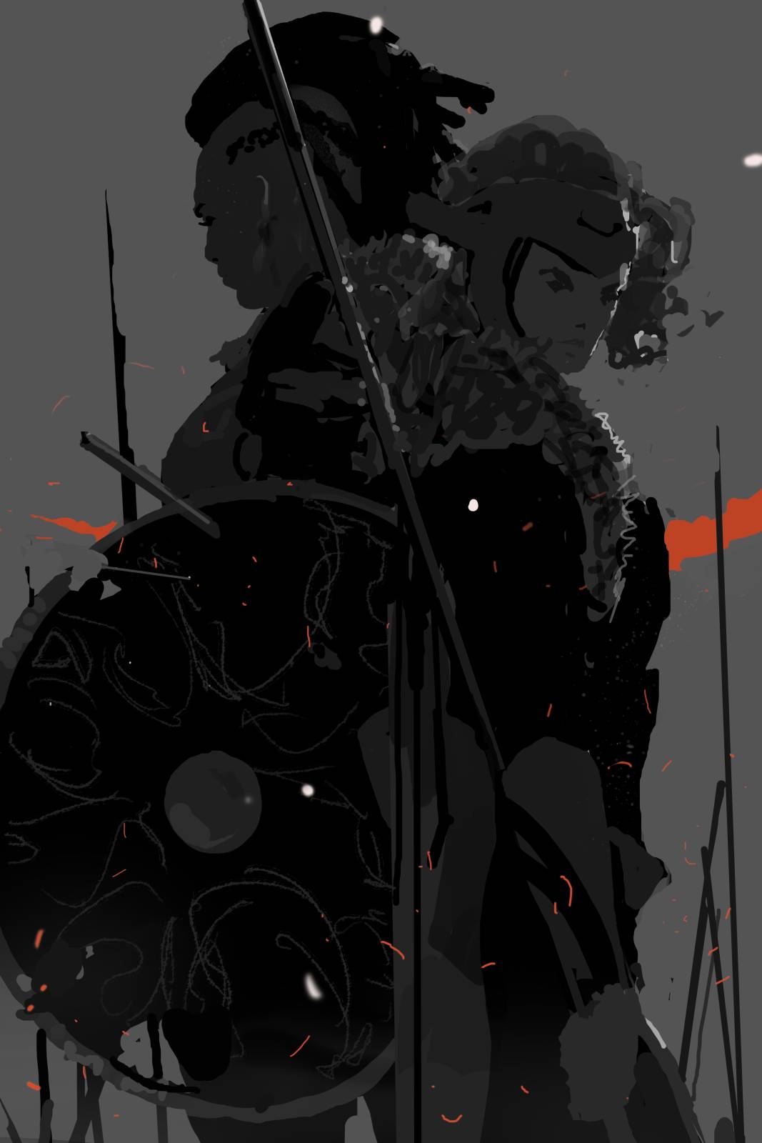
After the feedback of “Combine them!” the mood and color direction were already known (generally), so I re-sketched in only black and white, looking for the composition that would best allow me to group the figures into one “thing,” as a representation of their role as “dual protagonists.” The specific problem was where to pop light (and how to make sure that it could be “real” – Timandra loves down-to-earth, specific realism on her covers) to make sure the two figures could read distinctly while maintaining their feeling of “one-thing-ness” AND their graphic power. When you have a problem this specific, the amount of available options are few, and the final result often feels like “Duh.” This is desirable.
Next came reference. For such a close shot I knew I’d want some facial reference; I also used the shoot to nail down EXACTLY where the light sources were, because I had to set them up by hand. When inventing new information into a scene it’s important to know EXACTLY where in 3D space the light source(s) sit, but too often we don’t take the time to ever consciously decide and our paintings end up over-generalized. Setting up a reference shoot forces the issue. I included a pair of shots here so you can see that the shots are both simple, yet specific. Light is falling in the same key points I picked out in my B&W sketch. I also shot the figures separately since my final sketch was a bit butch, and I wanted to be able to combine the figures in any arrangement in the computer and still be able to see “behind” them. Here’s a shot of the final reference comp that sat in the file throughout the process:
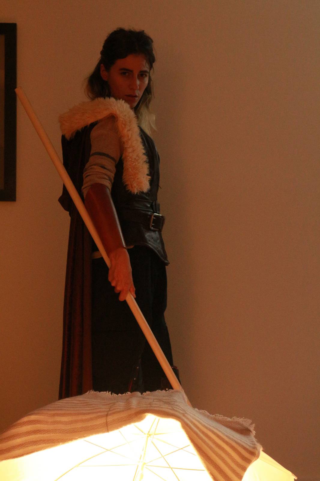
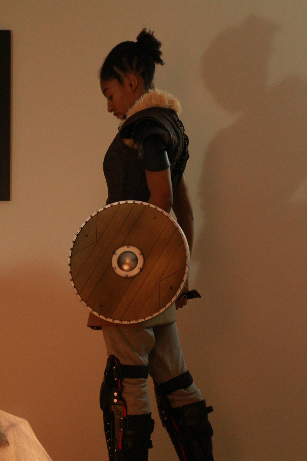
There’s a bit of cutting-and-pasting going on here, especially in the rear figure. This is why a clear idea is important to have before shooting reference – it gives you the conviction to abuse the reference in ways that suit you, rather than it happening the other way round.
I attached the painting process as jpegs to this post (they’re at the very bottom). As you flip through, you’ll see that there isn’t anything too fancy going on here. I attack the focal face first, and try to nail down the context. I think of context as the overall lighting, color, and value setting that the image is happening “in.” I remember fighting with this face for about two days, trying to gently age her up while also refining the lighting from the somewhat formless lighting of my reference. In painting, we want the lighting that best illustrates the structure of the item. In my photography, I had been so focused on the key lights I didn’t much bother with what was happening in the shadows (and that may have been too much to try and focus on anyways). It can be a big mistake to just “go with the reference” in this situation. Because a lot of what light does in the real world is just random information that either obscures or confuses actual form, taking the time to sort it out and develop formful lighting at the beginning is paramount.
Once the face was resolved, I knew how I’d modified the light to make things gel, and I used that information as I proceeded through the rest of the painting. I also had a perfect point of comparison for new information that I painted in – the resolved face. Things like the detailed shield, bracers, etc. were actually a cinch to paint once the face was done and the context was resolved. You may notice, and think it strange, that I painted the main character’s head out fully before adding the mantle later on, but in the mindset of “resolving” the forms and context first it makes perfect sense. If I was trying to invent the mantle at the same time as constantly changing the lighting, I’d have been fighting two battles at once. My difficulties would multiply and I’d likely have failed. Dealing with the face alone in the early stages let me reduce my focus, and made adding the mantle later feel almost casual, instead of like a nightmare.
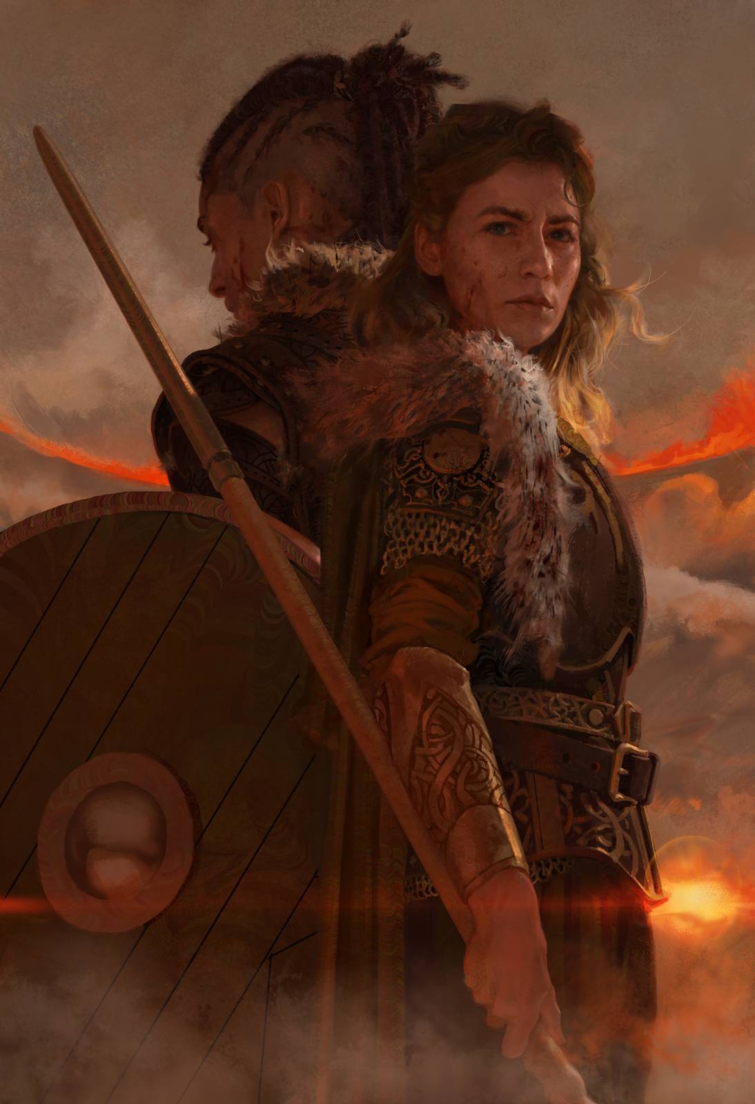
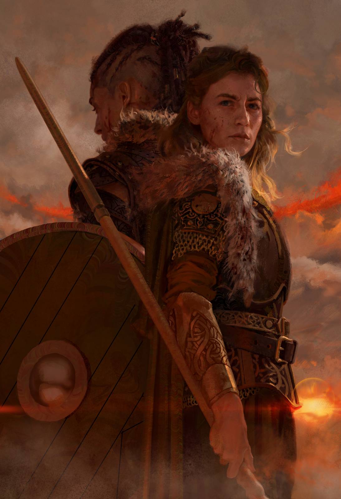
The final flurry (get it?) of changes was just me poking snow around. I’m super picky about where things like this sit in a composition, and I hadn’t really gotten it figured out at sketch.
–
OK! This has already been a lot, but for the intrepid among you: Timandra conducted an interview with me for her backers on Kickstarter, and as far as I know it’s only been posted there. I thought I’d post the full interview here too. Now that some time has passed, there was one thing I wanted to elaborate on for a more illustration-savvy crowd, so that comment has been added in with an asterisk and fleshed out at bottom.
Can you describe yourself in 10 words or less?
Curmudgeonly sweetheart; lover of art & science. Wilts without sunshine.
One of the major SFF properties (Star Wars, Star Trek, Marvel, LotR, CD Projekt Red, BioWare, insert whichever fandom you’re in here …) comes to you and wants you to paint for them. Who is it and what are you going to do for them?
Mu. Mu, as defined by Pirsig in Zen and the Art of Motorcylce Maintenance.
How do you refill your creative well?
Illustration is a unique form of art-making in that “the well” pretty much gets filled for me. I don’t have to decide what to draw*, for the most part, so I’m never “out of ideas.” But I might be “out of solutions,” and that can cause similar feelings of frustration.
I have to be up to the challenges that come my way, and be able to respond to them positively, with enthusiasm, and – most importantly – without fear. For that reason, training is what makes me feel good, like my well is “full.” I practice drawing: perspective, anatomy, whatever I’m feeling rusty on. And almost all simple linear stuff – just crappy little drawings. I don’t do anything finished or elaborate if you leave me alone. Drawing is a muscle you have to keep “on;” it’s not like riding a bike. So if I need to draw, and I’ve been drawing, I’m feeling pretty good.
How did you come to do book cover art? Was it something you always had in mind to pursue or was it just a happy coincidence that got you rolling down that path?
I was trained primarily by two different cover artists, so in some ways it feels a little inevitable that the skillsets they imparted made me well-suited for being, and *want* to be, a cover artist. But no, I didn’t start out in my pursuit of art with that in mind. I didn’t have any super clear goals, other than wanting to do some Magic cards at some point since I grew up playing the game, and it was my main exposure to “artwork” for a long time.
What’s one of your favorite book covers of all time (can be classic, can be a more recent cover) and why?
I don’t have any favorite book covers. See “curmudgeonly,” above. Although Sam Weber did a bit of art for a Tor.com online short story called Language of Knives that I have cherished for some time now.
What kind of work do you enjoy doing the most?
Figure drawing! Figure drawing is endlessly demanding, engrossing, and spiritual, all at once.
What’s a challenge you face as an artist? (can be general, can be specific)
Finished artwork takes a lot to produce. Who was it that said, “creation is a violent act?”
When I’m making a finished painting I often fail to keep up any sort of correspondence with anyone, I duck my email, my sleep schedule goes whack, my arm hurts – all of it. My brain can deal with nothing else during that time. Then when it’s done I come up for air and try to reclaim all the various, integral bits of self-care I’ve lost! I’m working hard to stabilize myself in routines that prevent this sort of tumult, but for now paid work still has a type of gravitational pull over me that’s a little bizarre.
Since painting is your work, do you have side projects that are just for you? Do you still paint/draw as a personal creative outlet or have you switched to something else? (I’m trying NOT to use the word hobby XD)
I am a completely obsessive being, in a way that I find positive and enjoyable – but it often leads to disappointing answers to questions like these. I really enjoy my job, and am constantly thankful for it. Painting for money, I don’t feel hindered. I used to, but with time I’ve realized how many of the limitations were in my own head. Now it’s just fun. When I’m not painting for money, I don’t paint other stuff (although I might once my arm is fully, fully, totally healed), but I do spend a lot of time looking at paintings, thinking about paintings, and talking with friends about paintings – these are my hobbies.
* As an illustrator you TOTALLY get to decide what to draw, but this is a choice many of us fail to make. As soon as we read the brief we picture an outcome we’ve seen before – another painting or bit of imagery we remember. Then we resign ourselves to painting a pale imitation of that memory. We paint other people’s paintings, and miss out on the chance to paint from our own reservoir. In order to last in this line of work you MUST paint YOUR pictures. I myself love to paint things that feel aggressive, dangerous, powerful, strange, badass, or better yet some combination of them all. As long as I’m channeling some of those things I’m golden, so inside of a brief I’ll seek out a way to say what the client needs said in those terms – in my own tongue, so to speak. Find your way, and selfishly stick to it! Miranda Meeks once said “Once an artist finds the things that they truly want to say, they never get tired of saying them.” In my own experience, this is surprisingly true.


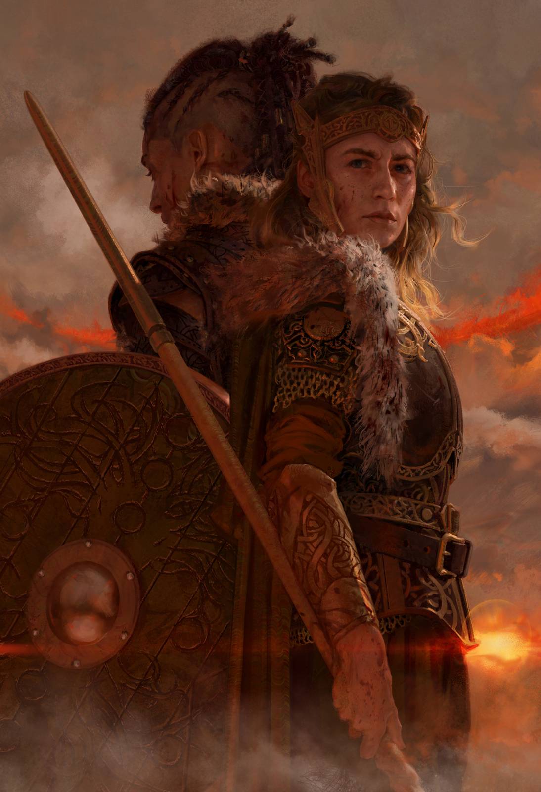
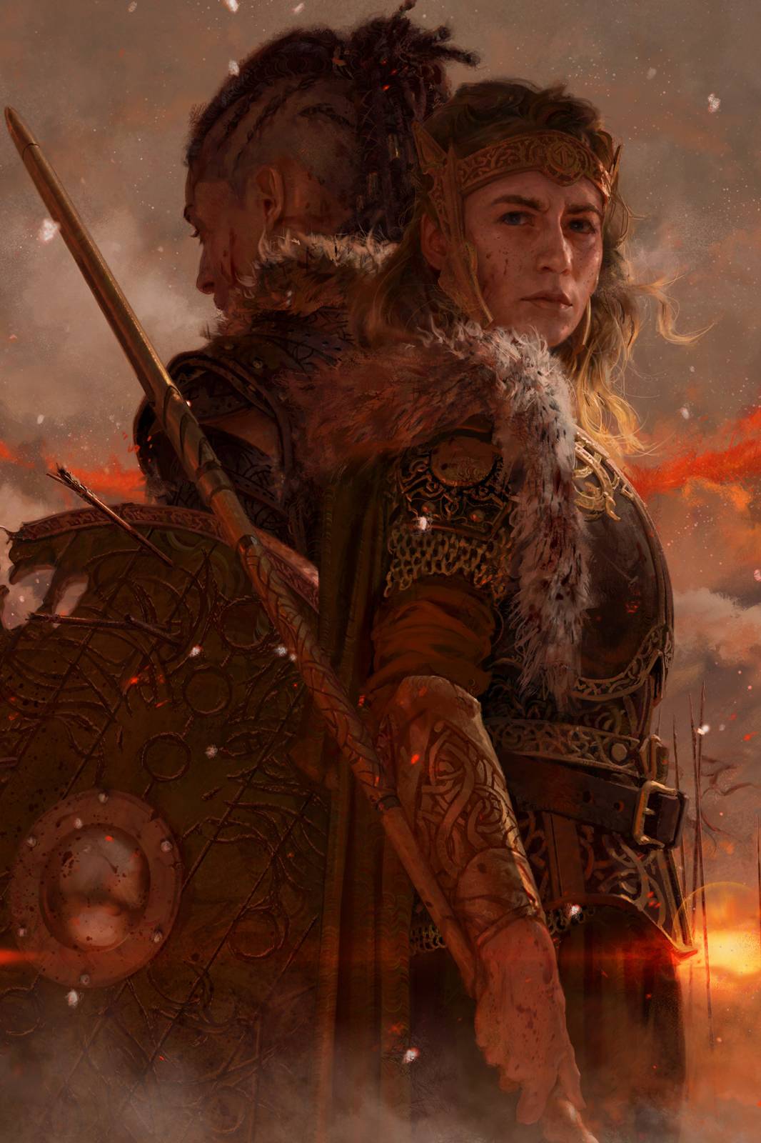
The final, snowflakes all sorted.

Tommy, was the undercut your idea or the client’s? Any thoughts on why the female half-shaved head is so common in SFF art today? Seems strange since it is long out of style IRL.
I think any part of the head being shaved looks great, no one cares whether it is “in style” or not. I certainly never have.
great post
Some good points here, though I disagree a bit. Have you considered the counter-argument to this?
It could add another layer to the discussion. Still, a great read—thanks for posting!
The artwork and theme behind “Queens of the Wyrd” are absolutely stunning — it’s the kind of fantasy that really pulls you in. As someone who runs a site offering highly compressed PC games, I always appreciate strong visual storytelling like this. It reminds me of the kind of detail we try to preserve in games, even when optimizing them for low storage. Loved the post and the visuals
Queens of the Wyrd evokes a sense of mystery, power, and myth, making it a strong and memorable title for a brand, creative project, or artwork. To visually represent something with such depth, design elements like bold typography, mystical symbols, or dark fantasy-inspired graphics could be used. In the same way, london logos are crafted to capture the essence of a brand, blending creativity with cultural and market insight to create designs that leave a lasting impression.
Looking at the illustrations of Queens of the Wyrd gave me the same epic fantasy vibe I often get while playing RPG and strategy games. The dramatic art style really makes the characters feel more alive and engaging. I play PC games myself, and I often look for fantasy-based titles where the story and visuals are strong. That’s why I even put together a ‘best PC games selection guide’ on my site to help others who enjoy fantasy and adventure genres.
Really loved the way you’ve illustrated Queens of the Wyrd! The level of detail and atmosphere you’ve captured is inspiring. I also work a lot with visuals, though in my case it’s more on the digital editing side. For example, I often use CapCut for experimenting with effects and styles while creating tutorials and guides on how to enhance visuals. Different field, but I could totally relate to the creative process you described here. If anyone here is into trying out editing tools alongside art, I’ve shared some guides on my site as well.