My heart sank when I read the feedback. I’d just turned in a wraparound cover for Christopher Buehlman’s The Blacktongue Thief for an illustrated edition by Midworld Press. While all details were faithful to my approved preliminary study, there was one major mistake. The scene was lit by a warm golden sunlight, but that scene in the book took place at night. Because the brief was very open and I chose this scene, it was my blunder to have overlooked this detail. Because my prelim was monochromatic, it was also totally reasonable for the editor to trust I would faithfully match the night time lighting as it was written.
The original sketch, oil on paper
While the author was very happy with the painting as it was, the publisher wondered if there was anything I could do? Short of redoing the entire piece, I could not imagine this was fixable in paint. But there was something I’d never tried and had always been curious about. It was a movie making trick called “day for night.”
Though this technique goes back to the very beginning of cinema, I learned about it from a special edition VHS of The Guns of Navarone. Before the movie, the tape ran a short feature on the restoration process. One scene that they discussed was a shot early in the movie which is intended to take place at night, but was filmed in the daytime for budget, safety, and technical reasons. This footage was meant to go though an alternate chemical process which would underexpose the image and cool the color temperature to give the feel of night. For whatever reason, prior home video releases had this scene play with standard daytime processing. The restoration team brought back the originally intended “day-for-night” look.
I was fascinated by this. Some time later, I saw a wonderful post by James Gurney on the color of moonlight in paintings and in life. In it, he goes into a fair amount of detail on the “Purkinje Effect,” which is an explanation for why our eyes see color and value differently by moonlight. After all, the moon is just reflecting the same sunlight that we see in the day time. But the light bouncing off of a full moon only provides 1/400,000th as much light as direct sun. In photography, the difference is roughly 17-18 stops, which is massive. In short, the world lit by moonlight is just the same as the world lit by sunlight, except much much much dimmer. And because our eyes begin to fail below a certain brightness threshold (again, the Purkinje effect), our color perception is skewed.
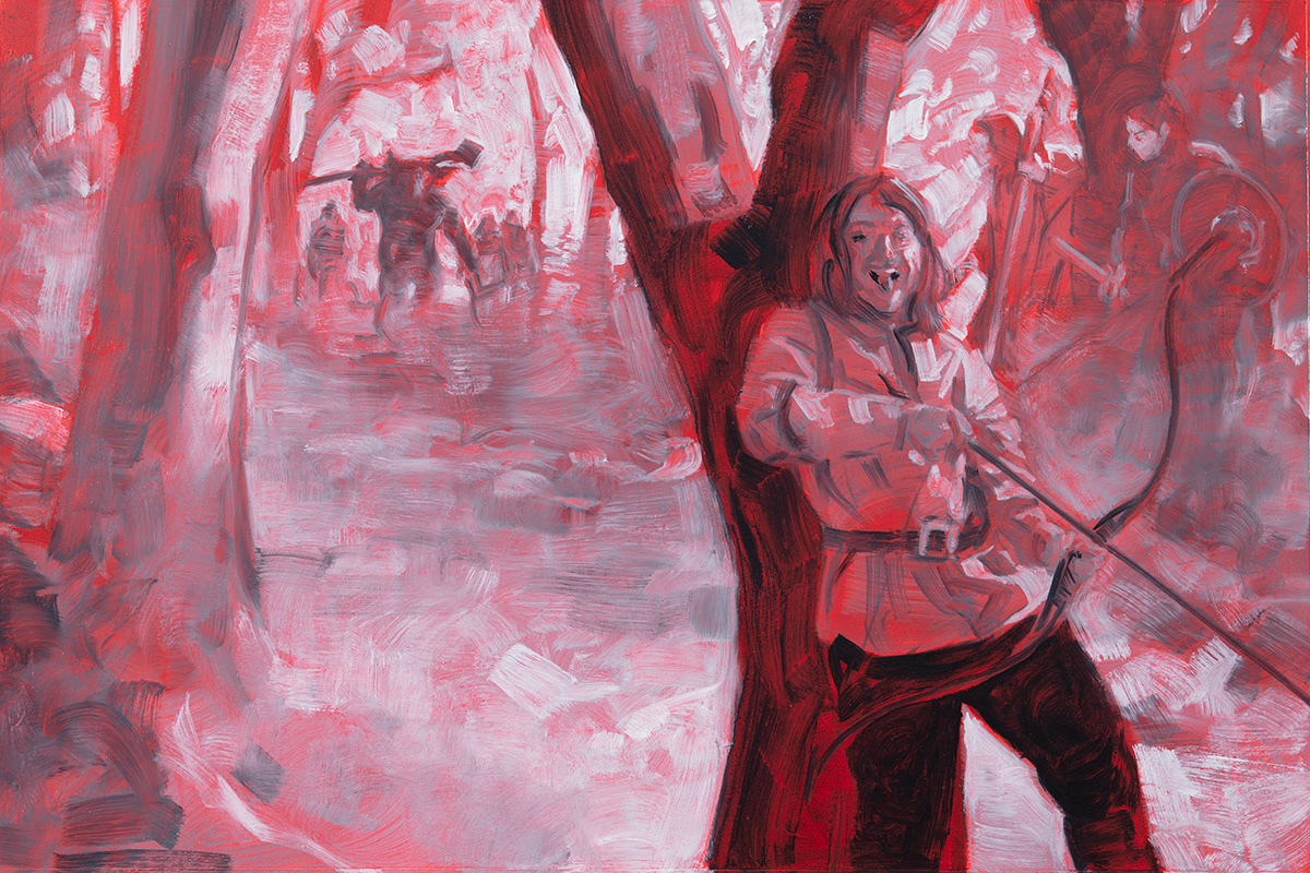
Which brings us back to my blunder on the Blacktongue Thief cover. Not really relishing the idea of beginning again from scratch, I decided to attempt my own day-for-night post processing with digital tools. Primarily, I knew I needed to do three things: modify values to give an “under-exposed” look, modify hues to emphasize blue tones, and desaturate.
Here was the painting in its original state:
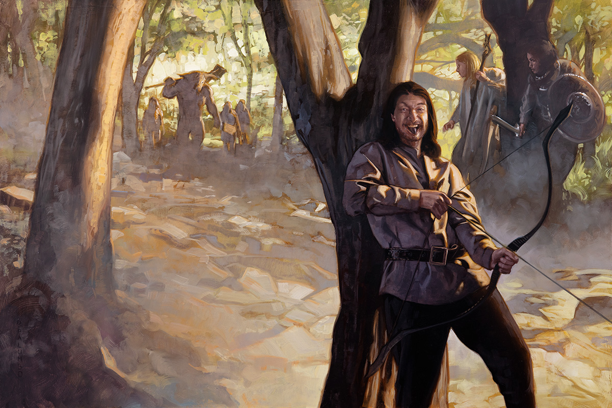
The Blacktongue Thief, 20×30 inches, oil on panel, 2022
The first thing I did was a hue/saturation layer with the saturation dropped to -27. On top of this was a selective color adjustment layer applying a massive -85% yellow and +78% cyan to all yellow tones. I intended to basically flatten the scene and kill the heavy golden cast without losing all of my local colors.

This was followed by a layer of solid color fill of a muted midtone blue, set to half opacity and then the layer type set to “color.” The blue effect of this overpowered local colors too much, so I switched it to an overlay layer and the effect was much better.
At this point, I was covering my intended basics but it still didn’t read quite right. The overall feel was too bright, light, and airy. In color film, those are the typical qualities of an over-exposed shot. I needed to underexpose. I duplicated my overlay layer but that just washed the image out and made my white balance feel overly blue. Cycling through other layer styles, I found that color burn was exactly what I needed. It crushed my values, stamped out any lingering golden tones, and introduced some beautiful and interesting color shifts into the lighter tones of the environment. True to Gurney’s assessment, the presence of saturation in certain hues while desaturating others improved the moonlight effect.
The only issue left to resolve was the overall values. This was looking a bit TOO underexposed and would certainly not print well, so a curves layer was added to bring some lift into the shadows.
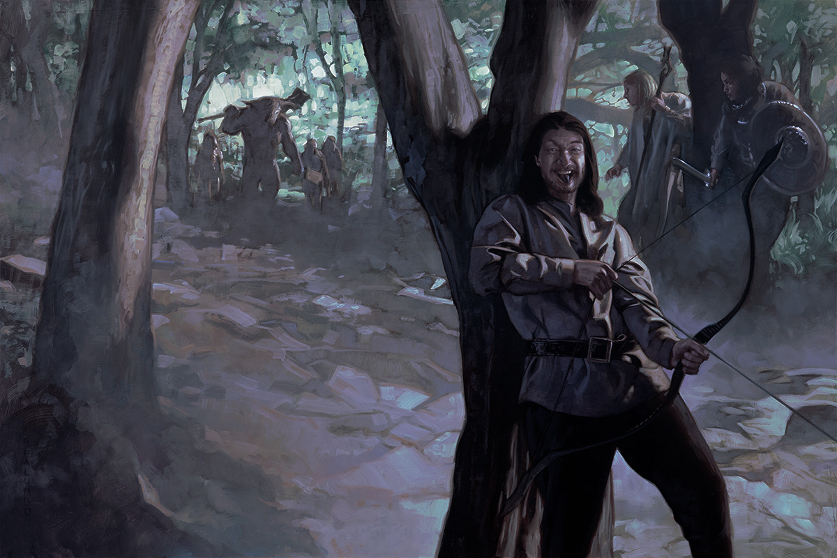
The final delivered version after digital color and value adjustments
Happily, the publisher and author were both delighted with the revised version. And much as it annoys me to say, I do prefer the moonlight version over the sunlit original oil. Much of this process was informed by experimentation I’ve done in digitizing and color correcting my own c41 color film negatives. As ever, personal curiosity finds its way into professional problem solving.


Recent Comments