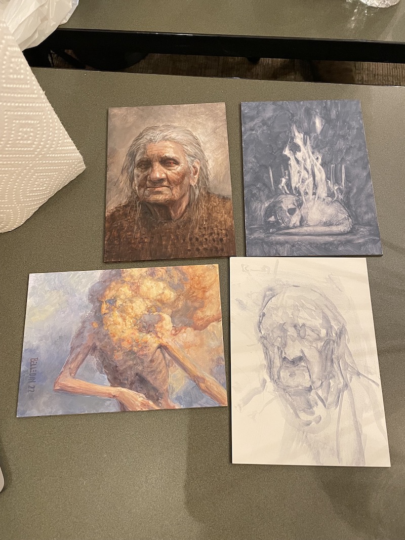
I wanted to drop in with a quick article on these pieces I recently did at an art retreat. Rather than work on assignments, I chose instead to just do some exercises. None of these exercises are particularly hard or intellectually challenging, but since a lot of my work of late has been more about juggling other people’s designs in predetermined settings in support of someone else’s story, I felt a need to flex my own picture making brain to keep it from atrophying.
All three are five inches by seven inches (one is landscape, the other two are portrait), and are some combination of the acrylic and gouache (but not acrylic gouache), but each picture was made a bit differently.
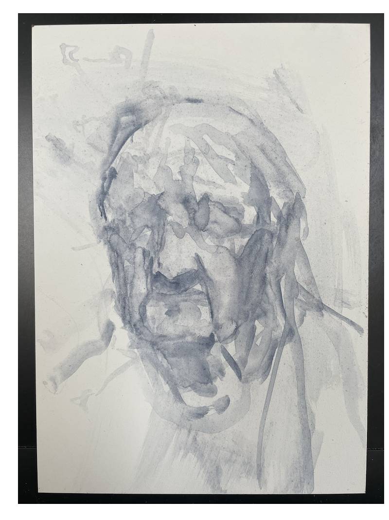
Exercise Painting 1: Cloud seeing.
I’ve written about this before, but normally I do this kind of thing in oils. The process typically goes like this: I thin down oil paint and start making marks. Sometimes they’re just strokes in various directions, other times they’re super swirly, directionless meanderings. Regardless, the purpose is to make something to react to, and “see into” the marks. I’m looking for something to build and image from. If I get to the point where I’ve covered the piece in marks and have not seen something to build from, then I begin to use rubber color shapers and brushes dipped in thinner to move the paint around until I start to see something.
While I didn’t have oils, I find that gouache (not to be confused with acrylic gouache) will work similarly when used on a gessoed surface. It will slide around quite a bit and can be worked into with a wet brush to bring the surface back to white. I figured I’d start with that and then once I had something I liked, I’d build the piece either in gouache or acrylic (or a combination of the two).
Now, those who read my article last month might recognize this piece, which is why I’m getting it out of the way first. I will point out, though, that it’s slightly different from last month and is now finished.
 Typically with this kind of image, I start out with one color and add to my palette once I gain a bit of traction. This piece was no different and I started with a blue gray gouache. I apologize that I don’t have process photos, but I can tell you that I started out a large brush and threw down some large shapes, then started breaking those shapes into smaller ones. I saw a hint of a face first, and I really liked the way it dissolved, so I decided to incorporate that. A random stroke suggested the placement for the forearm at bottom center and I built the rest of the gesture on that. With that in place, I switched to acrylic. My palette consisted of Titanium White, Ultramarine Blue, Burnt Sienna, and Naples Yellow.
Once I got it to a certain point, I did a brief reference search to help bolster what I wanted out of the piece and to help me nail a few details down. The final step was using thin dabs of Ultramarine Blue mixed with Burnt Umber to darken certain areas. It was pretty quick and straightforward painting.
Exercise Painting 2: Out of the head.
With this exercise, I choose a subject—be it still life, portrait, landscape, etc.—and I try to paint a version out of my head that is as convincing as what I’d paint from life or with proper reference. I attempt to use no reference at all but if I end up needing it, I try and use as little as possible as late in the process as possible.
I know what some of you are saying. Am I not paid to make stuff up and make it look real all the time? Yes. But I tend to use a fair amount of reference to achieve that. For me, the purpose of this exercise is both to push myself to achieve a certain level of believability with as little reference as possible and also to gain insight into what is lacking in my less referenced work—be it anatomical issues, lighting, or something else.
In this case, I chose to paint a portrait of an old woman. As with the previous piece, I started out with a quick gouache layer in that same blue gray color. Immediately, I ran into a problem. I kind of fell in love with the sketch I’d done and didn’t want to paint over it.
 Fortunately, I had additional boards with me so I was able to kept the original gesture and reproduce it (as closely as I could) on a new surface. And then I went to acrylic. The palette in this case was Titanium White, Cadmium Red Deep, Yellow Ocher, Burnt Umber, Ultramarine Blue, and Neutral Gray.
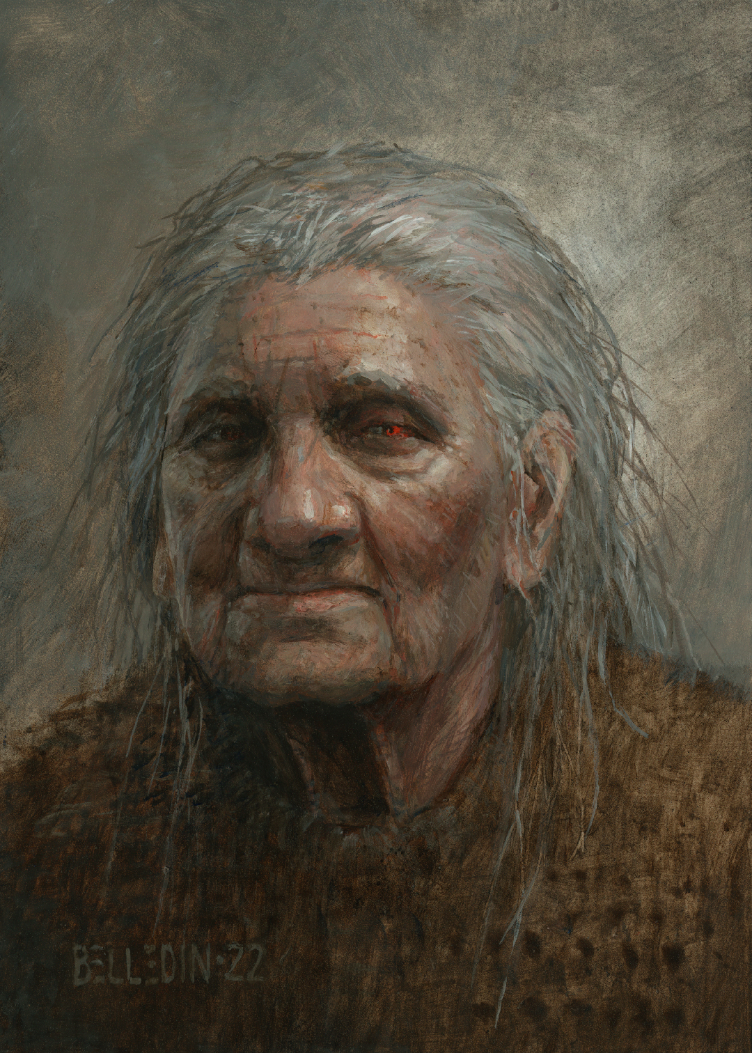 Again, apologies that there are no process images, but I’m selfishly kind of glad about that. This piece had a protracted ugly stage where I didn’t have confidence in it and it just wasn’t coming together. No matter what I did, it didn’t feel dimensional. Then I did something drastic and threw some darks down to better define the darker side of the face. It snapped into focus very quickly after that and it was all about making the details work from there.
So did I accomplish this without any reference? No. About two thirds of the way in, I broke and started using reference to help get the mouth and jowls to work the way I wanted to. I had the shapes I wanted, but it needed a little bit more anatomical specificity to take it where I wanted it to go.
Do I consider this a success? Well, I like the piece, so yes. It was FAR less referenced than my typical work and it came pretty close to what was in my head. It deviated a bit from my initial sketch version, but my work tends to as I do try and leave things to discover in the process of making the work.
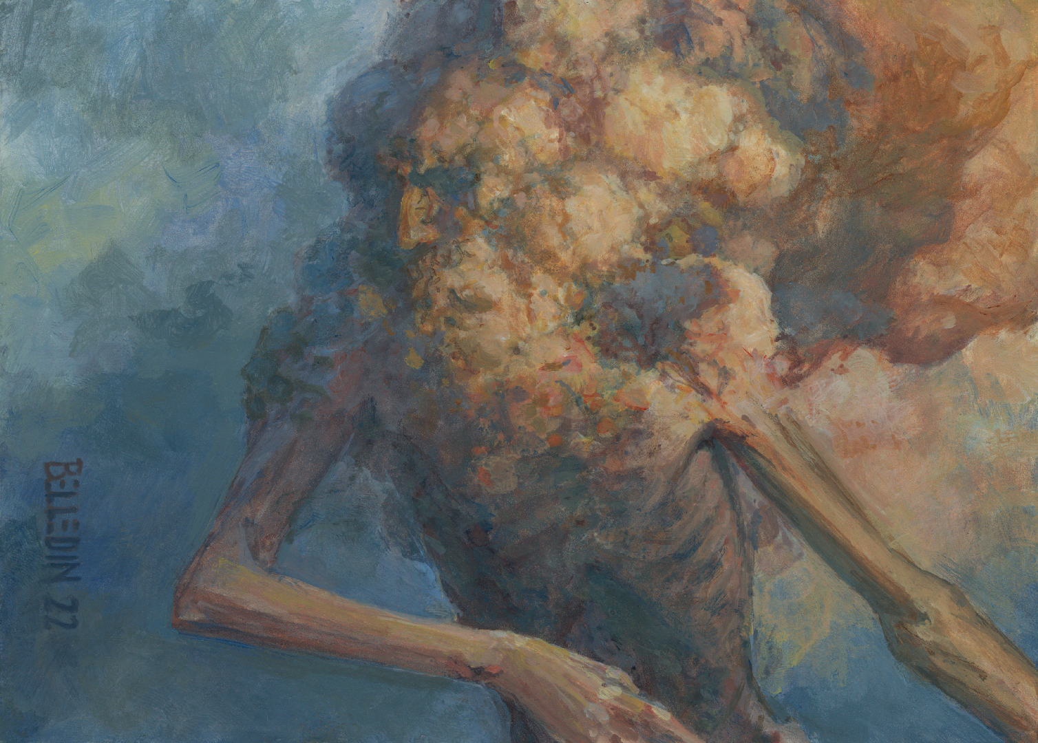
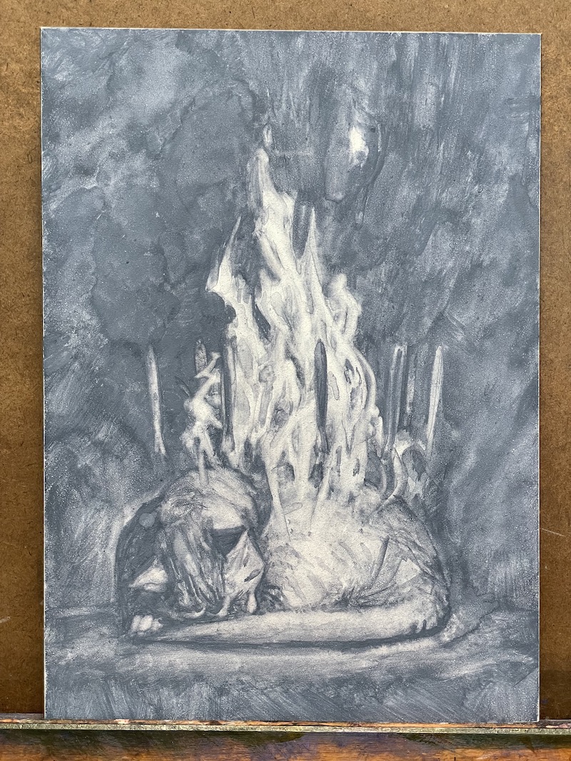
Exercise Painting 3: Yes and…
This one is all about utilizing the improvisational comedy rule of “yes and.” I start with an element and then I keep adding elements until I’m satisfied. For a lot of people, this is just how they put together a picture to begin with. I generally don’t, so for me it’s an alternate way of working and thinking about an image.
With this piece, I intended to try something. I wanted to experiment with a different technique. I’ve always loved the work of David Grove and over the years, I’ve gleaned a little about how he went about creating his work. I never met him or saw him put a piece together, so I only know what I’ve read. As I understand it, he would transfer his drawing onto a gessoed surface (sometimes this was colored gesso), and then throw gouache down over that (a lot of times this was mostly burnt sienna and blue) and then he’d pull the highlights out of the gouache using a wet brush, revealing the gesso underneath. Once that was done, he’d spray the piece with fixative and then do acrylic washes on top of that.
I wanted to see if I could mimic that process. It…uh….it didn’t work.
It began as a gouache piece in the blue gray color. I started with a fire (because of course I did) that I wiped out of the gouache. I added to that a sleeping cat. Don’t worry. The cat’s not on fire. It’s just sleeping. And the fire isn’t real. I don’t think. Whatever the case, this is where the piece sat for a while.
 When I picked it up again, I tightened a few things (the scale of the fire felt wrong and the cat was too undefined), then sprayed it down with several coats of Krylon’s workable fixative. A couple of notes: first, I don’t know that David Grove used workable fixative vs. final fixative, and I definitely don’t know his preferred brand. I used what I have and what I have is….old. I think this spray can is pushing 15 years at this point. Regardless, it was my hope that I’d sprayed it enough that the initial acrylic wash wouldn’t cause the gouache beneath to bleed. If I’d succeeded at that, my plan was to leave the piece be to allow the initial acrylic layer to dry and seal the gouache in, thus protecting it from the rest of the acrylic layers as I put them on. It didn’t work out that way. Most of the piece did not bleed. But a significant portion did. I was less than pleased, but I was undaunted. I simply just turned it into an acrylic painting.
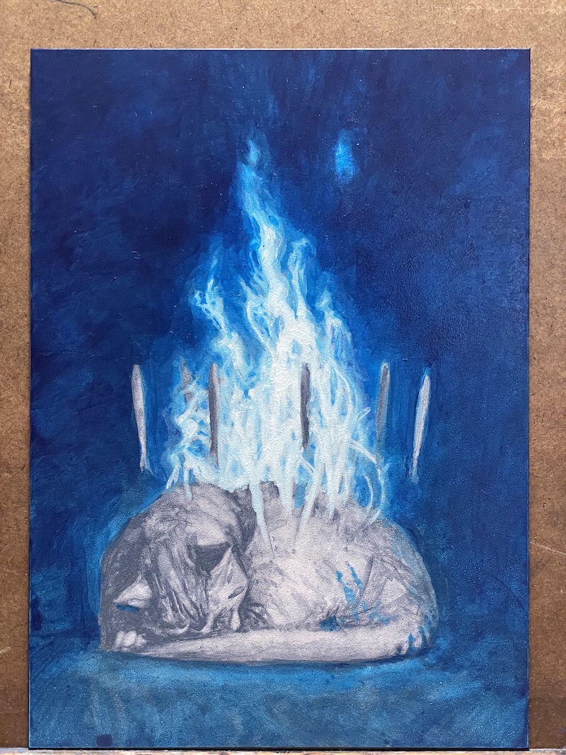 I failed to document it, but when I did the first pass of Pthalo Blue, the entire right hand side of the fire smeared underneath it. It was untouched everywhere else, though. Regardless, I let it dry and then did another pass on it in the same blue to start building color depth and intensity.
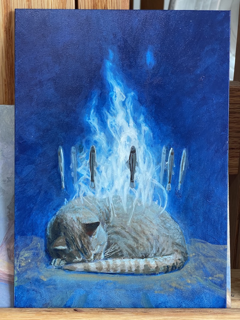 Slowly but surely making progress.
 More progress still. And finally I added one last element:
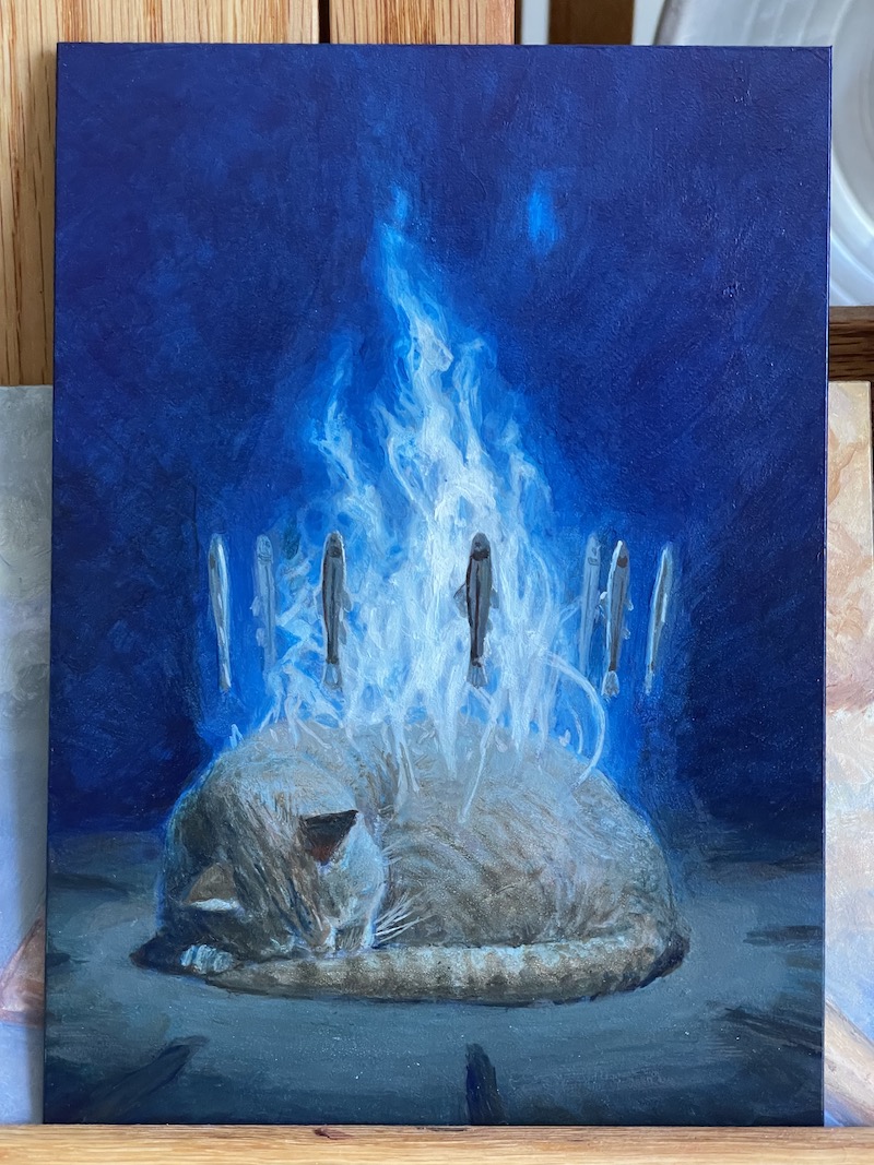
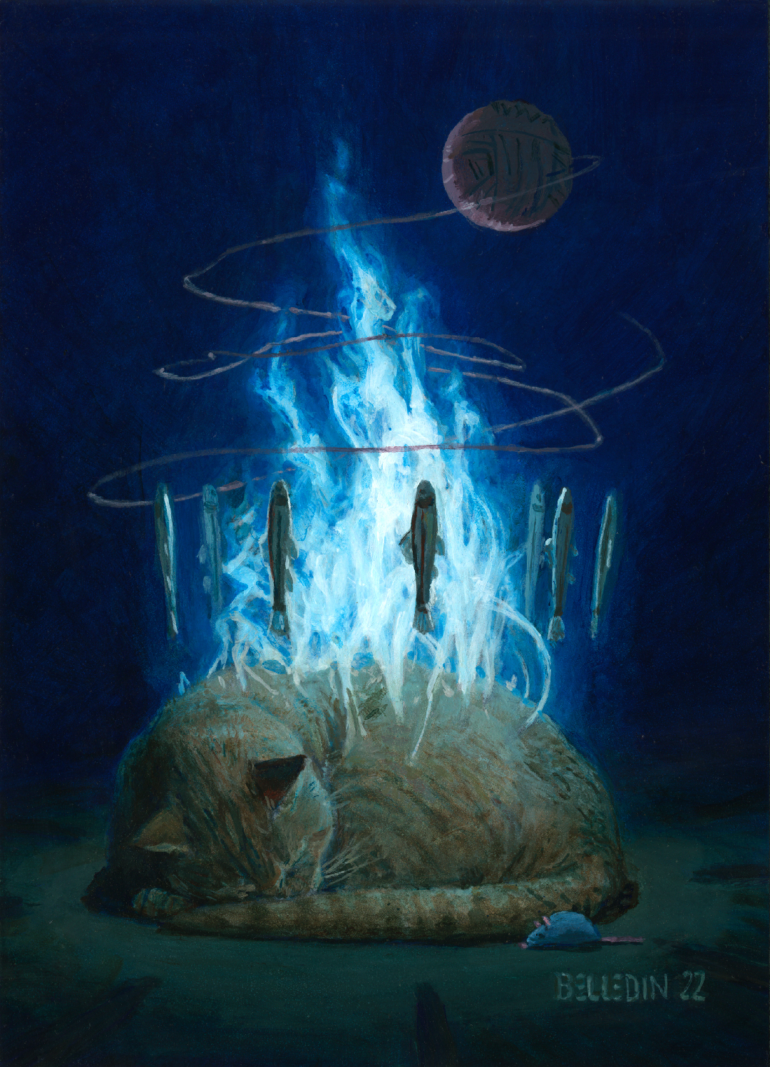 And that was that. —Oh! My palette for this one was Pthalo Blue, Burnt Sienna, Burn Umber, Yellow Ocher, Titanium White and a little Cadmium Red Deep.
Okay, so I failed at figuring out David Grove’s technique. Why bother to begin with? Well, in college, I learned a bunch of different methods with various mediums (and forgotten several of them), and I like to revisit those I remember once in a while to change things up, revisit my relationship to them, etc. The switch to oils came late in my art education. At the beginning of my senior year in college I was still using a multi-media process that utilized everything and the kitchen sink—something I guess I should talk about at some point. Regardless, in this case I’m not looking to make work that looks like David Groves’ (I mean, come on, I’m not that good), I’m looking to impose my own aesthetic and sensibilities on that process. I may take a crack at it again in the future, but ultimately I don’t think it’s for me anyway. Still, it’d be great to get it down so I could teach others if they were interested.
A couple of things before I go. When doing these exercises, I try to vary the imagery where applicable and not get hung up on a single kind of painting—I’m not looking to make all of them figurative, landscapes, or what have you. Personally, I’m looking to keep broadening the potential subject matter, not narrow it down. Especially when cloud seeing, my hope is to go into things with as close to a blank slate (mentally) as I can and really react to the piece before me. I don’t want to miss a potential still life because I’m determined to hunt for a figure in the mark making. That’s not to say everyone should do the same. Not at all. There are plenty of insanely skilled artists whose career consists entirely of painting the same subject matter over and over again, and I think that’s awesome (so long as they’re happy doing it). It’s just not something that interests me (right now…but who knows).
As I indicated at the start of this article, generally my client work has me juggling a lot of elements in each image, and it’s not always easy to balance the various elements, live up to other people’s designs, tell the story the client wants to see, and still keep focus where I think it belongs. These little exercises are great respites and they allow me to recenter and touch base with my own aesthetic interests and choices. Plus they have none of the pressure of the client work, so they’re super fun—even if there was an awful lot of hemming, hawing and spurts of frustration as I tried to solve various problems along the way. It was worth the effort and I really ought to do more.

Recent Comments