These days it is more important than ever for an illustrator to be self – sufficient. In that spirit, what follows is an updated version of a presentation I made a few years ago for my students and anyone else who might find use for it. It includes a section on how to set up and shoot repro quality digital photographs of paintings and drawings, a very short review of a few principles of photography as they relate to photographing artwork, and a bonus section on how to shoot your work when all you have is an iPhone. This may be helpful for anyone who needs to convert their physical artwork into a repro quality digital file when the work is too wet, too shiny, or too large to scan, or which just doesn’t “scan well”.
Why not just use a scanner?
The answer is one that is unique to every artist. However, I believe in a basic principle that the reproduction method should be built around individual artwork. I don’t think that it is an overstatement to observe that the techniques and scale of much of the analog work being done in contemporary illustration is influenced by need to accommodate the scanning process. It seems to me that we should use the process that lets us do our best work, and then adapt the reproduction process to the work. It is my hope that the techniques that follow may help some readers use materials and to work at a scale that might otherwise be precluded by the scanning process.
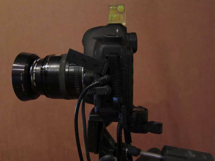
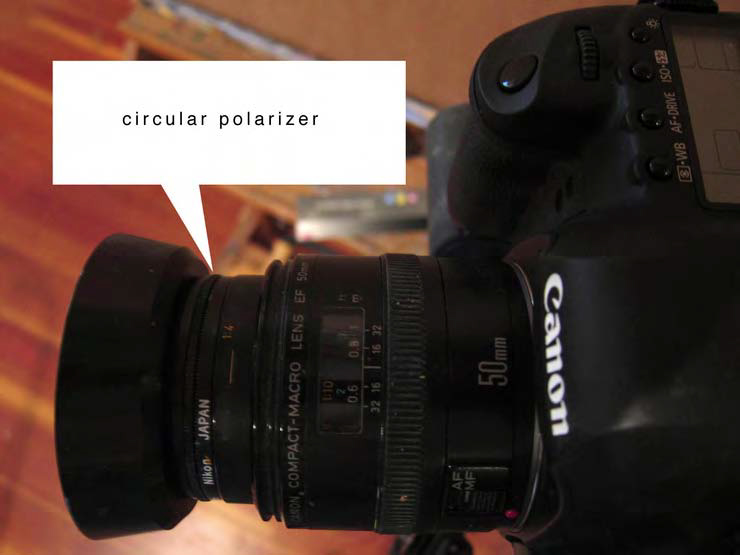
Canon EOS5D Mk2 w th 50 MM Canon Macro lens with circular polarizer. Note the sync cord and shutter release cables, so I don’t have to touch the camera when I shoot the picture. Camera shake is the enemy! Also note the level attached to the top.
Let’s start with the camera: A digital SLR camera is the obvious default camera- it should have the ability to shoot in “manual” mode”, use interchangeable lenses, and shoot in “RAW format. Nikon and Canon DSLR and mirrorless cameras are both fine for our task- I currently use a Canon eos5d Mk2 with a 60 mm Prime macro lens.
A camera that allows fully manual control allows far more creative control. An accurate exposure value – the correct exposure of a photograph of any subject- is a given factor that has relatively little latitude.
A good metaphor is to imagine a measuring cup under a faucet. The correct exposure value in our example (A properly exposed photograph) is one cup of water. How you fill the cup is determined by two things- how wide you open the faucet valve (the aperture) and how long you hold it open (shutter speed). The primary reason we care about this is that the smaller we make the aperture, our photo will have greated depth of field. So when greater depth of field is desired, longer exposures with a smaller aperture (ie higher fstop number) is the answer. It takes a longer time to fill the cup, but the resulting photograph will be sharper, as long as the exposure time is not so long that we have camera shake issues.
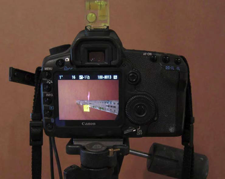
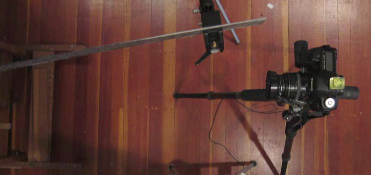
It is a good idea to familiarize yourself with the capabilities of your camera and lens. To begin, let’s test depth of field. For this test, line up a yardstick in the view of your camera at an oblique angle and focus on the middle point.
Depth of field test, from above
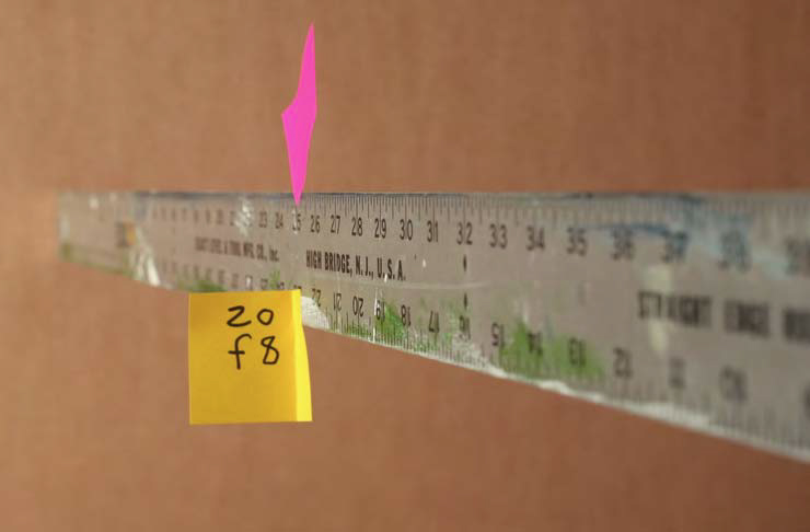
The focus point (pink postit) is at 25 inches, you can see that at f8 there is about three inches of sharpness in the foreground and one behind the focal point.
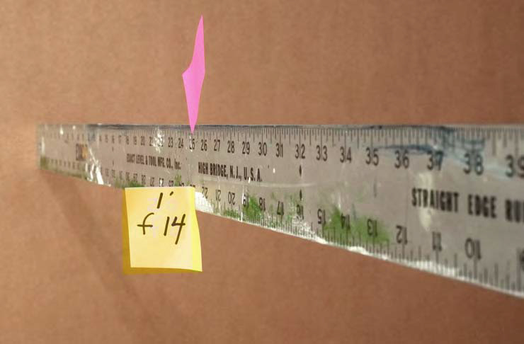
When we stop the lens down to f14, we seem to gain at least twice the depth of field. Notice that it skews closer to the camera.
As you can see, the smaller the aperture, the greater depth of field we achieve. Note that to get the same exposure value, I had to lengthen the exposure time. You can see that at 1/20th sec @ f8, we have about 4 inches of sharpness almost all in the area between the focus point and the lens. When we stop down further to f14, we get about 10 inches of sharpness. Why do we care about depth of field? Sometimes we migh be shooting art with texture and need greater depth of field, or shooting a sculpture, or a painting in it’s frame…and we want it to be sharp. Stopping down to a smaller aperture is the answer for that.
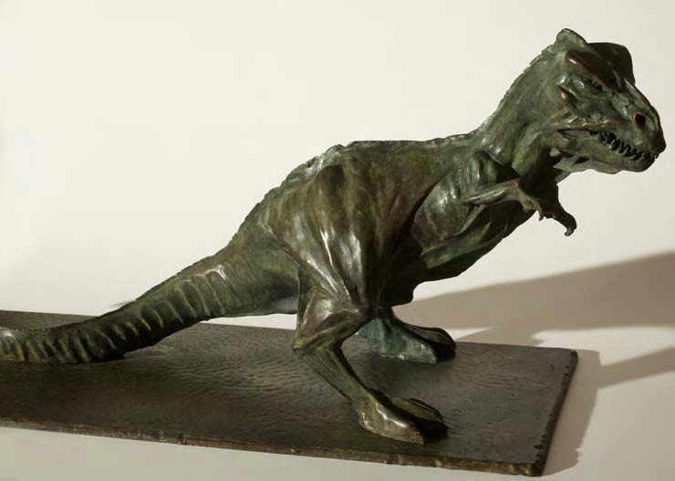
To photograph something like a sculpture, or a picture in a frame, or even a highly textural picture, its important to control depth of field. This was shot at f16.
Why would you ever want LESS depth of field, you may ask? Photographers use shallow depth of field to accentuate features of a subject, de-emphasizing others. The eyes for example:

The photographer here uses shallow depth of field to emphasize the eyes of the subject. There is about 1/2 inch of sharp field here. Fashion photographers use this to emphasize the eyes and de-emphasize features like pores on the nose. Here the same technique is used for a different effect.
It is not necessary to buy an expensive lens, but there are things to consider. The zoom lenses that many of us use in day-to-day photography are not ideal for shooting artwork, so if possible you really want to obtain a “prime” (specific focal length) lens. A “normal” prime lens on a full-frame sensor digital camera like the EOS5d has a 50mm focal length. Many current digital cameras have sensors smaller than the old 35mm film plane, so only the center of the lens is actually in use- which means a 35 mm lens is the equivalent of a “normal” lens on these cameras. In either case, avoid using a zoom lens if possible.
We want to take accurate undistorted pictures, so when you get a new lens, or contemplate buying a used one, want to test for pincushioning and barrel distortion, and corner-to-corner focus. An easy way to do that is to take a window screen out of your window and photograph it where you will be shooting your work. It is important that you use the same lighting as you will use for your artwork. Note that these tests are especially usefull when you are thinking of buying a used lens, or to test a new lens to be sure it works correctly. Once you have taken a sharp focused picture of the screen, then magnify and examine the corners andthe center – check for softness and lens distortion.
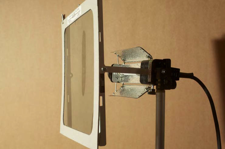
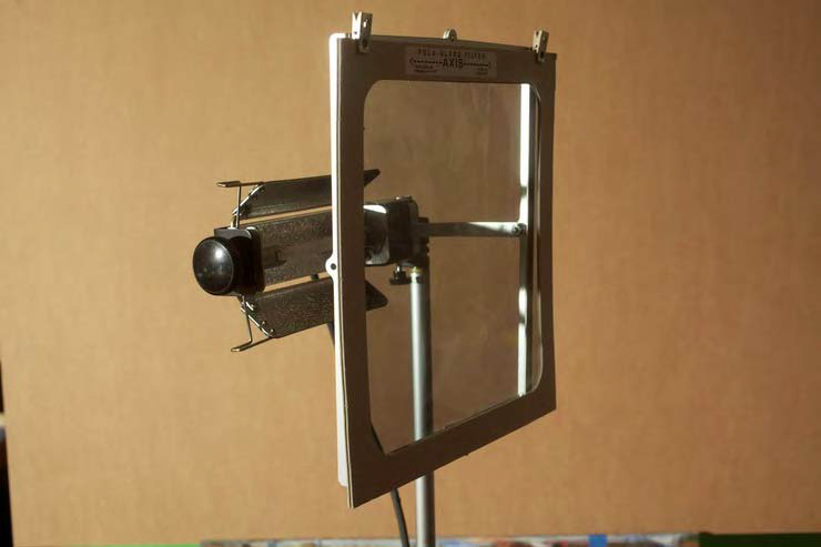
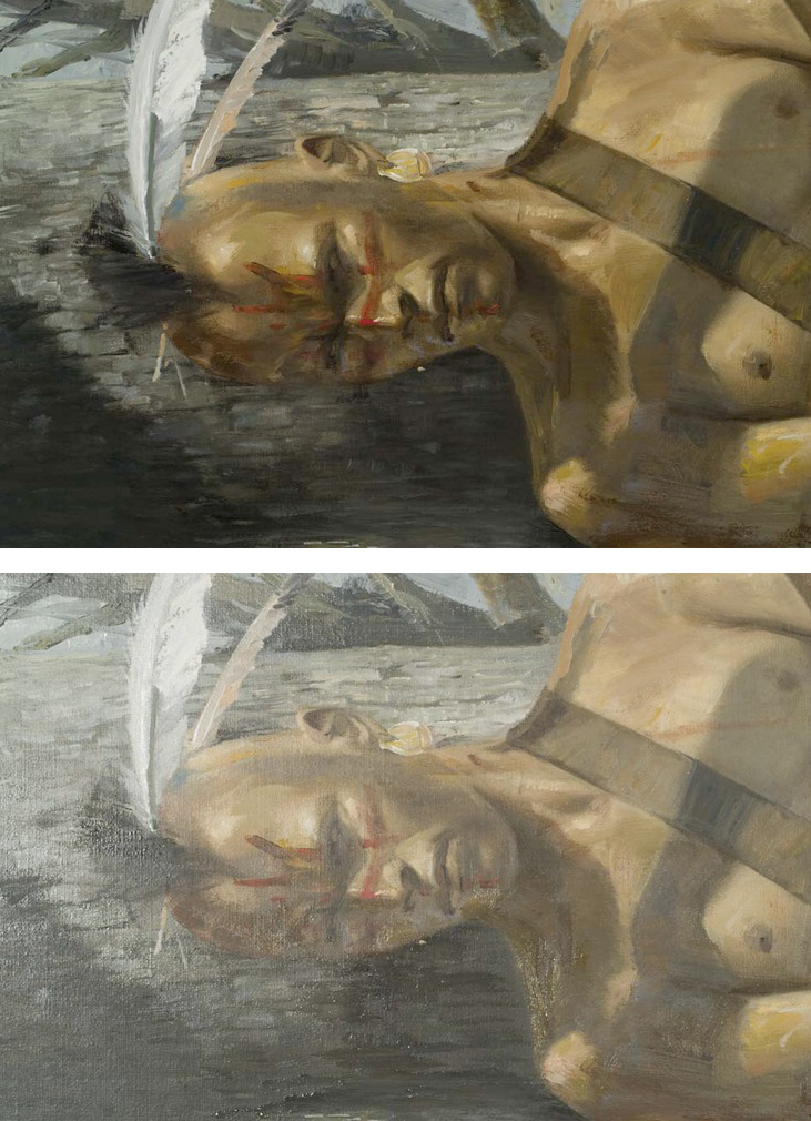
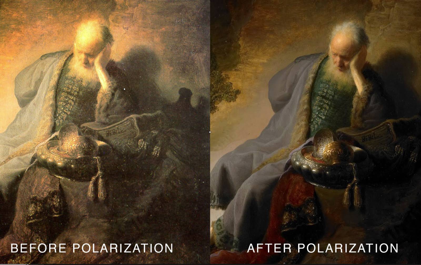
In addition to the lens and camera, we need a few more things. A circular polarizer filter on the lens is essential. This is a filter the attaches to the lens and rotates – when it is at the right angle, it will eliminate some of the glare coming from the lights and reflecting on your art. Once you polarize the light source as well, you will eliminate ALL glare.
Here are two ways to light the work. The method illustrated here uses two 500 watt tungsten lights, each with a polarizing filter in front of it, rotated to the oposite axis as the one which is on the lens. (ie if the lens filter is aligned horizontally, the filters on the lights should be aligned vertically.) Proerly aligned between the filters on the lights and the lens, there will be no glare in any photograph you take under these lights. To use this method, you want the lights to be equal distance from the art , at a 45 degree angle to the art, with their centers at the film plane height. A good rule of thumb is to place the lights at 1.5 times the distance of the diagonal measurement of the art. This does not have to be precise but is a guideline.
500 watt, 3200 degree kelvin tungsten Lowel Tota photo lights. Nice because they have a built-in large filter holder, making polarization easy. Note the large polarizing filter in front of the light. One needs to be careful not to burn these filters with the heat from the light.
A second method of lighting also includes the use of a polarizer, but instead of two tungsten lights, you could use a single strobe light. For best results, I moved the strobe to a distance from the art that gave me the same exposure value as my two tota lights give. That happens to be a distance of about 13 feet . As with the tungsten lights, It MUST be at a 45 degree angle to the art. I am using a vintage Norman 202 power pack and flash head with a polarizer clipped on the front. I am quite sure this is not the way it was internded to be used but it works very well, and quite consistently. More importantly, it lets me use just one light, so I can bring up a little more texture in the work that was possible with the two-lightmethod. Two strobe lights would also be affective, properly filtered.
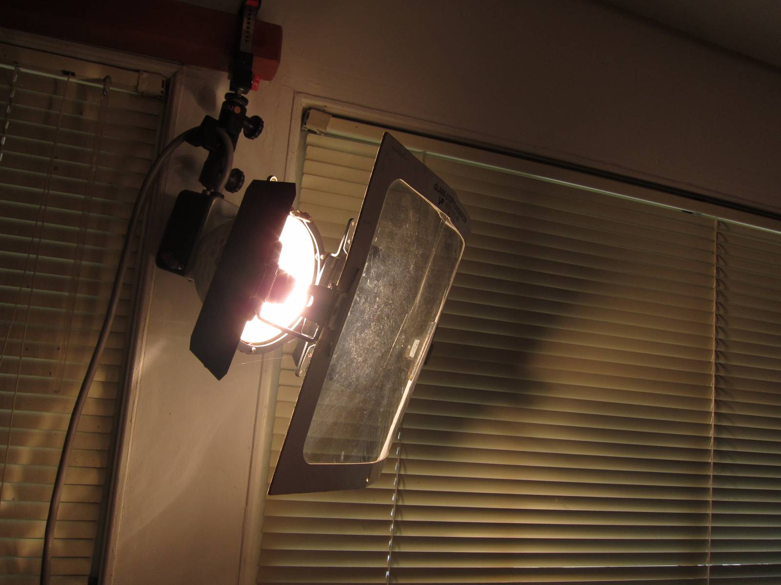
This is a vintage Norman 202 strobe lamp w th polarizing filter attached. It is attached to the camera w th a sync cord.
I suggest using a light meter to measure the light falling on each corner of the work, but I realize that few people have light meters…here is a simpler way to test the light is equal from each light- put your pointing finger on the middle of the art. The shadows on each side of your finger should be equal in value. if they arent- move your finger around to see where they ARE equal. It might be a little to the right or the left- that means you need to move one of the lights a little closer or farther from the art,until the center of the lighting is at the center of the art.
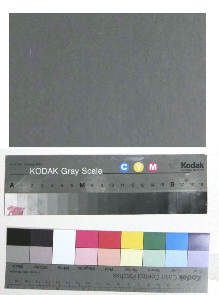
A kodak grey card and color and value scales. Invaluable.
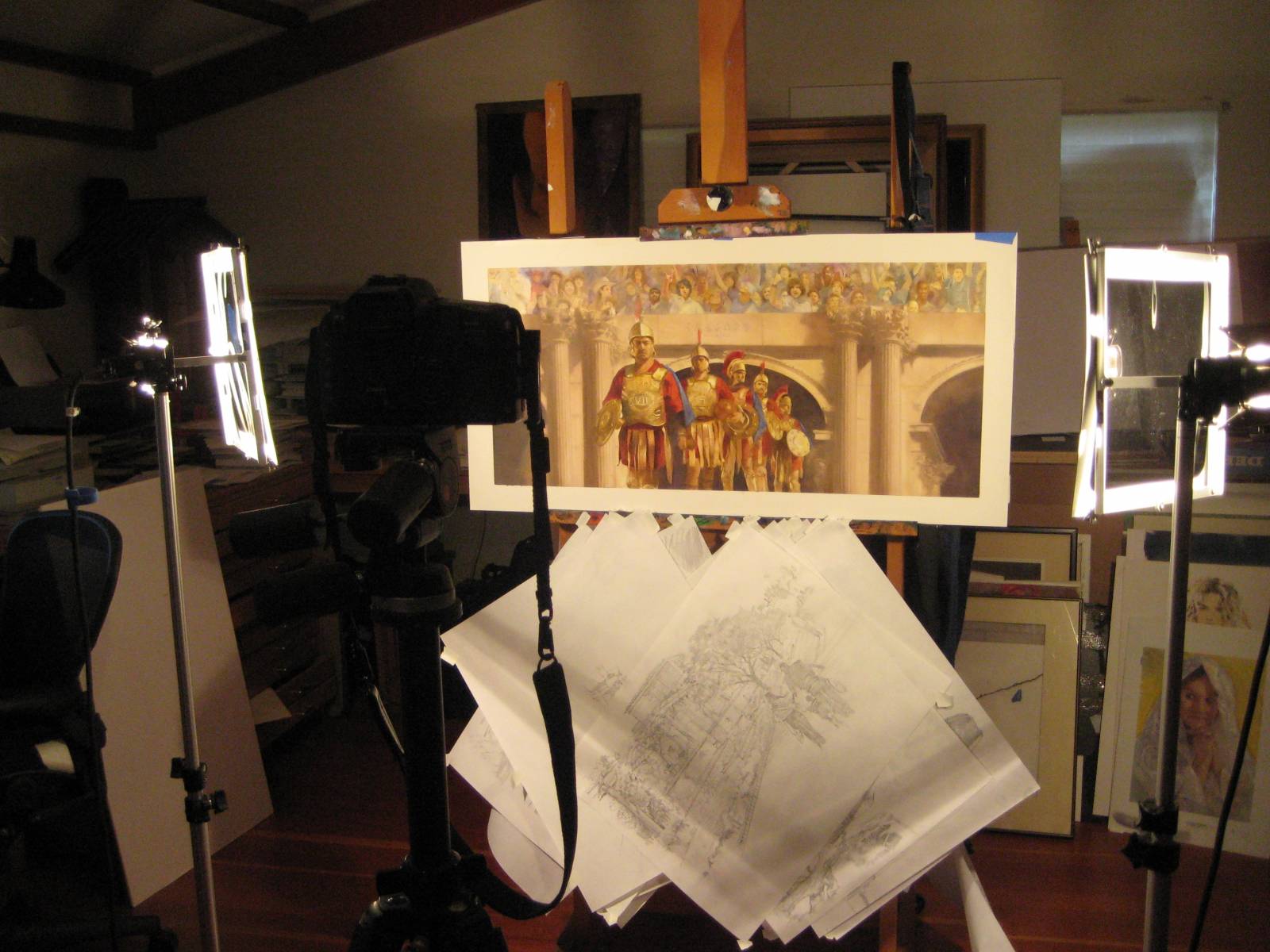
We have the camera set up, the lights are in position and working properly, with polarizers are in place. Place the artwork horizontally on the easel, wall or whatever surface you are using to hold it in place. The film plane of the camera must be parallel to the art and both should be level and square to each other. A very useful inexpensive tool is a on-camera level. Attach a second level to the easel. You will need to test your own exposure but once you get the right numbers you should have consistently useable exposures. Using my own setup, I find that with the ASA at 400, the correct exposure is between f8 and f11 (exposure varies a bit depending on how far the camera is from the art- due to the inverse square rule that less light reaches the camera the farther it is from the lit subject). You can objectively test your exposure value by photographing an 18% Grey Card (which is the value your camera is calibrated to render as the default average exposure). Shoot in RAW Mode : RAW MODE allows you to correct color temperature with photoshop while keeping the original RAW file untouched. Taping Kodak color bars onto the edge of the art will give you an invaluable color reference, and if left in the final file, an invaluable objective point of reference for whoever receives the files for reproduction.
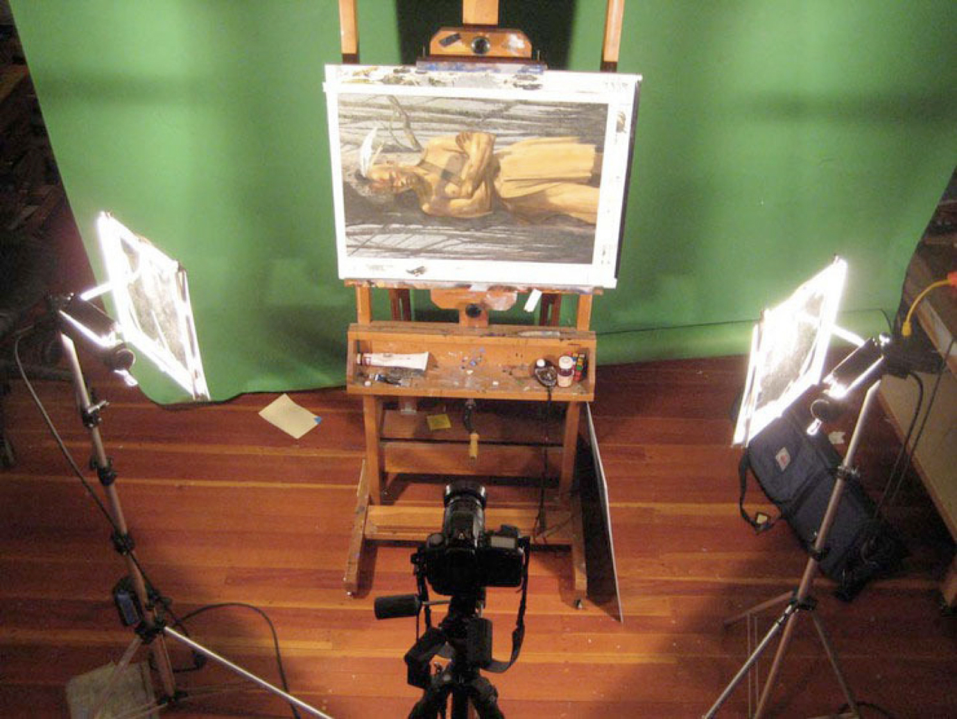
Two tungsten lights 1.5 x the diagonal dimens on of the art, squared up, locked down and ready to take the shot.
This method will also allow you to have consistent results with very few adjustments needed, so you can archive work easily.
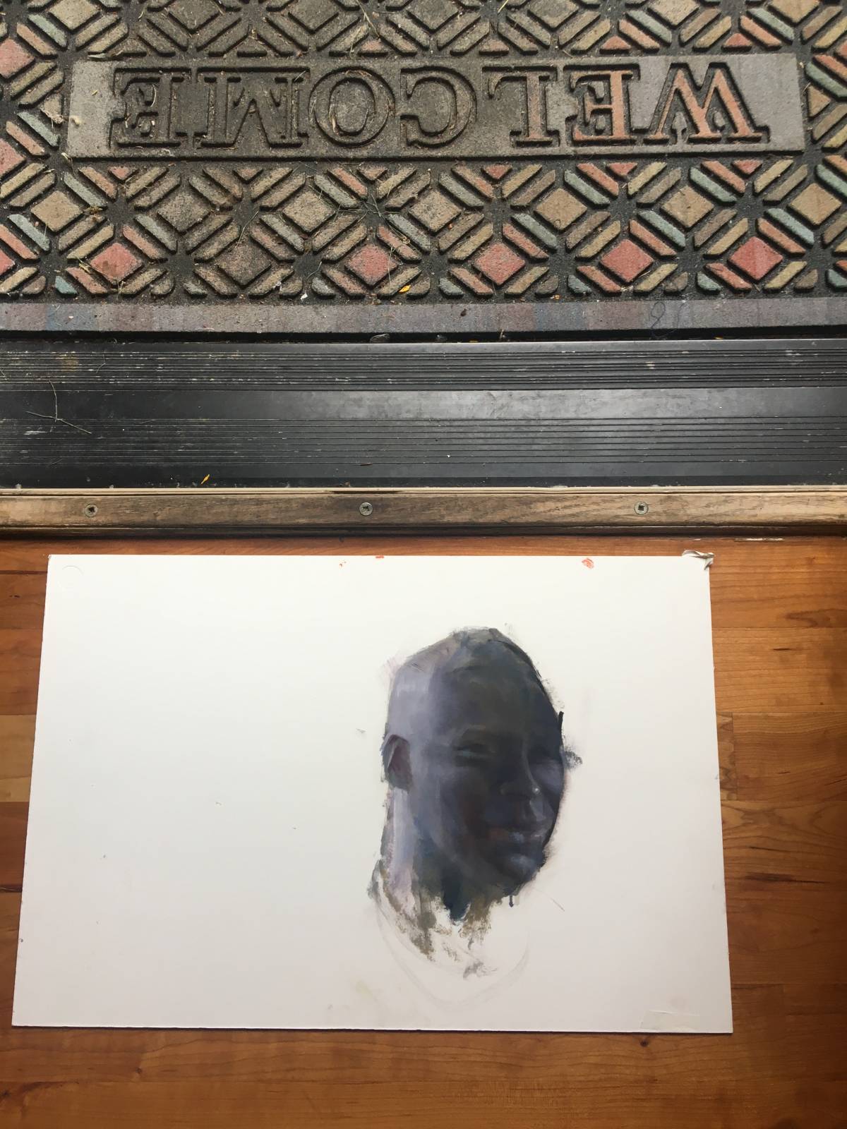
But what if you don’t have any of this stuff, youhvae to take a decent shot of your painting, but all you have is your iPhone?
First, find a doorway that opens out into indirect, diffused daylight. make sure there isnt anything very colorful immediately outside the door. Lay your artwork on the floor inside the doorway, horizontally.
A keen observer can see that there is little or no glare here, but there is a dropoff in the light from left to right. A good rule of thumb is that you should get the light to be within 1/3 stop side to side. this is about 1 stop, so we need to do something about that…
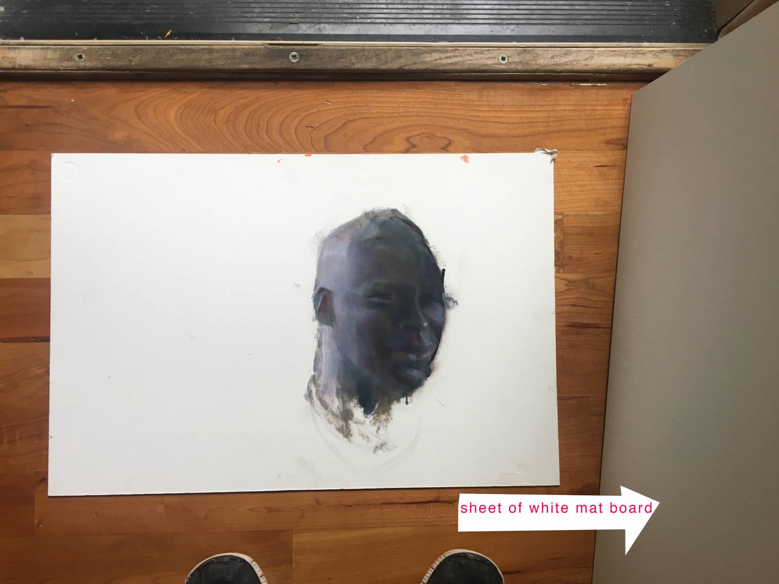
..by putting a sheet of white board in the darker side of the doorway against the door, I have bounced enough light in to fix the exposure. Use the iphone control to correct the exposure and white balance..
voila

The uncorrected image shot with iphone. 15 min to do the painting.
voila, not too bad.
When you need a quick shot, hopefully this will help. Note that there are several other articles on Muddy Colors on photographing artwork- check them out! Take care out there!

Wow. There have a been a lot of really great posts on Muddy Colors about photographing paintings over the years and yet it’s something I’ve always struggled with. I never thought to use polarizing light or to get a level involved. I feel like those two things right there will alleviate a lot of my biggest problem points photographing my work. Thank you so much for a wonderful post that covers both the detailed extravagant set up and the quick and dirty.
Vsco are the best editing tool for video and photo.