Today I’m going to talk about a few pieces I did a while back that tackled various visual problems. The problems I was asked to address with these pieces were more of the visual communication variety and in some cases utilized visual metaphor to convey something beyond a straightforward narrative. Whether or not I was successful at conveying what I was attempting to is—well, it’s going to depend on the person. In every case, though, there was a give and take between me and the art director, each of us presenting ideas, melding them, or adding to the ideas of the other.
All of these images were done for Magic: the Gathering.
Rampant Growth
This card existed long before I started working on the game and had had three different illustrations created for it to that point for various printings. The idea those other versions—and indeed this version—were meant to convey was well…rampant plant growth. Where my assignment differed from those previous iterations was in scale. The images done before mine all focused on showing the plant growth on a very human level, with the individual plants—giant or otherwise—doing the heavy lifting in the story. What I was asked to do was pull the “camera” way back and paint a wave of plant life invading a desert area that was devoid of life.
The word “wave” was what I immediately latched onto, and when I hear that word, the first image that comes to mind is Hokusai’s print, “The Great Wave of Kanagawa.” And so…yeah. I kind of borrowed a lot from that image—most notably by copying the large shapes in the wave itself, which are both iconic and iconographic.
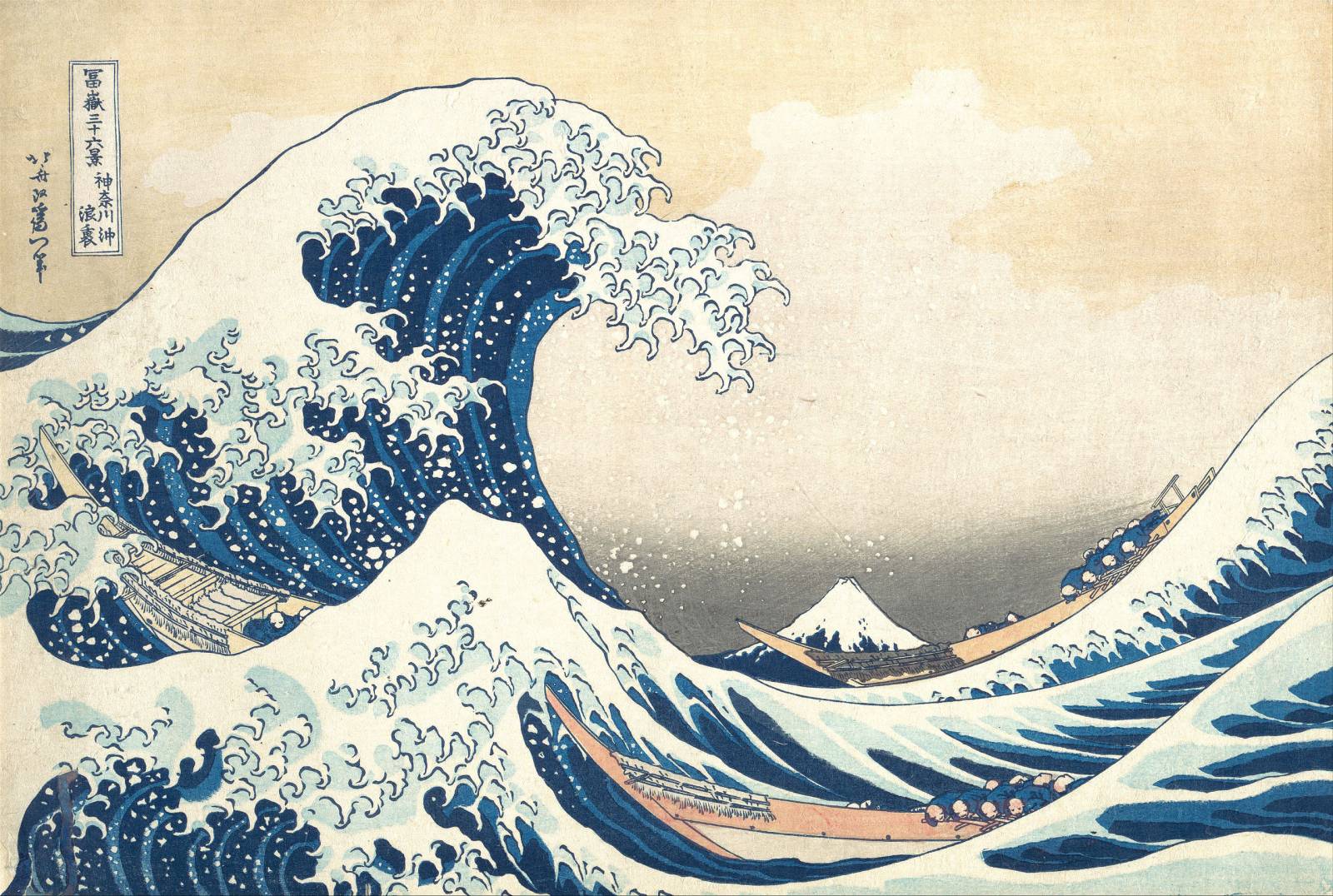
The Hokusai inspiration not only delivers on the surface narrative, but also brings with it the weight and depth of the original print. However, despite the fact that in the original the “yin” of the wave is balanced by the “yang” negative space around it, I chose to break up the negative space in order to favor the wave to add an even greater weight to the inevitability of the incoming wave of life.
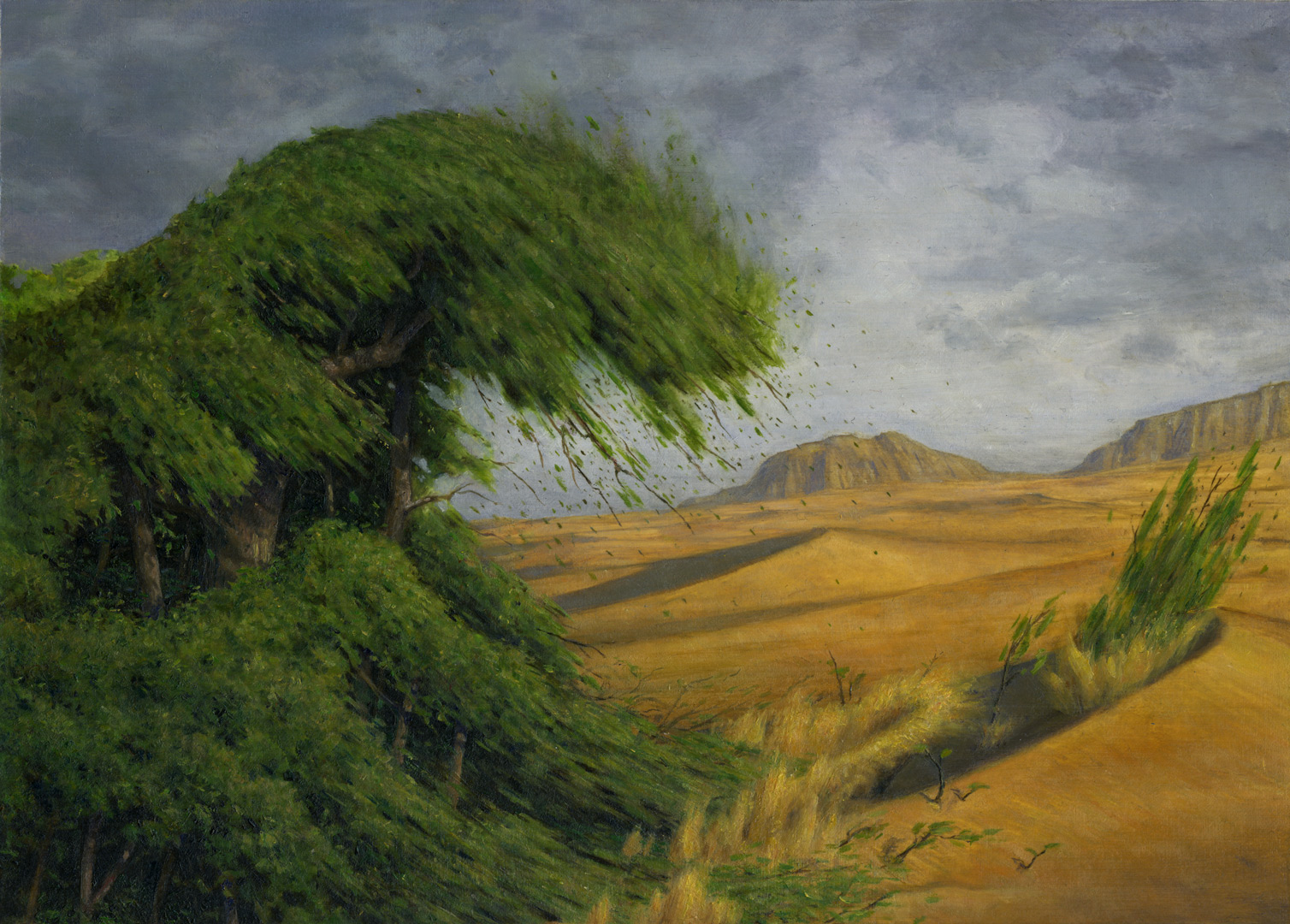
This is one of those pieces where I painted something that pretty much no one involved expected—including myself. I think there was an expectation that I’d paint something that was more straightforward or realistic. Don’t get me wrong, it’s still fairly realistic, but it’s jumping off point was far more stylized. Nevertheless, I knew it was the right way to go for the assignment and the image, and the fine folks generally seemed to agree. They used the image after all, and they’ve reused it in almost every subsequent reprinting of the card for the last decade and a half.
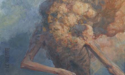
Treacherous Urge
This piece was the one and only time I’ve gotten an assignment where the description said: call me. So, I followed my instructions and called my Art Director (who was Jeremy Cranford in this case). The situation was this: they had an art description, but they weren’t happy with it and instead wanted me to somehow convey this idea: they wanted a character from white color faction being forced to harm itself, but they needed it to not be literal in order to cut back on the horror. As I recall, Jeremy suggested the use of a marionette to convey the manipulation, and then we riffed a bit and settled on the idea of the marionette sawing itself in half.
I love this job.
This one is both literal and symbolic. And it was—disturbingly—a piece that kind of poured out of me. I knew exactly what I wanted to do with it and the only thing they asked me to change in the end was to change the marionette string to barbed wire. I added the rust.
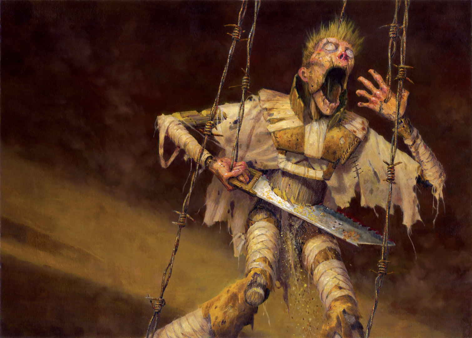
While still horrifying, the result avoids the graphic nature that a more literal interpretation might have required. It also presented the additional challenge of trying to make the audience feel for a carved hunk of wood and some scrap fabric. It’s wild stuff.
Did I mention I love this job?
Temporal Extortion
This was another piece where I wasn’t really given a description. Well, I was, but I couldn’t make sense of it and the art director had a tough time of explaining it to me. Once again there was a lot of back and forth about what the image needed to be (in email this time). Finally, I was told that they needed an image that somehow showed time slowing down for the person using the card, but speeding up for the opponent. That felt like a lot to deliver on, but it was concise and direct enough to get my wheels turning quickly.
One of the advantages to Magic art is that there’s a game outside of the card’s art boarder and that can be utilized and you can literally think about the problem outside of the box (please excuse that Dad Joke, there…I thought I was above it, but….nope). When played, the cards are flat on the table. Toward the top of the cards you play sits your opponent. Toward the bottom of the cards is you. I simply utilized that notion and divided the piece in half, dedicating the top half of the image to addressing the affect on the opponent and the bottom half of the image to address the affect on the player.
Now, I know that dividing an image in half is a huge no no. This is a fundamental rule of composition. But I decided that breaking that rule was the best way to provide the real estate I needed to convey both ideas at once.
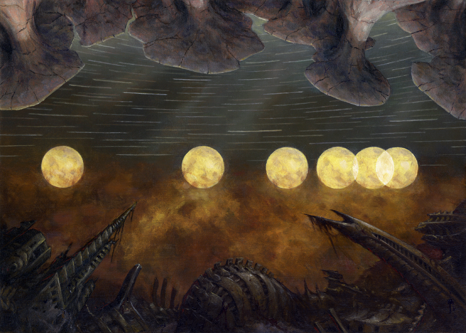
As you can see, across the center of the image I painted the moon repeatedly. From the perspective of the player the moon appears to be slowing down (at least when the image is read from left to right), while from the opponent’s perspective, it is speeding up. To add to that idea, the stars in the sky in the opponent’s half of the image are streaking by. The objects at top and bottom are two different landscapes from the set this image takes place in.
Is the end result a compelling image? Well…I think that’s going to depend on the person. Cutting a composition in half generally results in compositional stagnancy. I don’t really think I overcame that here—at least not completely. But I’m willing to overlook that to an extent because I like how I solved the problem.
Believe it or not, none of these images really had alternate versions that I sketched out and presented as options. I was pretty confident in my direction and my ideas. A lot of that has to do with my college experience where my illustration professors had a lot of book and editorial experience and helped me to hone my visual communication skills—often in less than literal fashion. Many an assignment relied more on visual mnemonics than anything. And so coming out of the gate I was more interested in those kinds of images. That’s changed as time has passed and I’m more interested in images that incorporate symbolism in a more traditionally narrative image…if that makes any sense. Still, I do love trying to solve problems like the ones above.
I guess what I’m trying to highlight here is that narrative isn’t the only tool in the toolbox. Symbolism, metaphor, visual mnemonics…they’re all there for the taking. Dont’ get me wrong, I’m a big fan of illustration that straightforward or literal in its narrative. But narrative illustration isn’t always the best solution for everything. When dealing with more abstract or broader ideas, such tools can be far more effective, not to mention powerful.
So how do you develop and sharpen these skills? Personally, I’m terrible at giving myself problems to solve. I can come up with imagery, sure. But actually giving myself some abstract thought to visually explore and explain? No. I’m terrible at that. Instead, what I’ve tended to do is read some stuff. Fund an article that I connect with and figure out how to convey the gist of the article visually. Maybe that article has an illustration already. All the better! It narrows my options even further, which will push me harder to find a solution. Maybe you don’t want to read—or don’t have time. Maybe just find an image that’s trying to communicate a more abstract idea and find a way to convey the same thing utilizing different imagery, different iconography…different points of reference. Into Magic: the Gathering? Look through Sorcery and Instant cards—there are TONs of images like the ones I’ve done (and those below). Try and crack the problems they present in your own way. Seriously, here’s a link to almost 6000 of them: link.
These exercises aren’t necessarily about making a finished image. In fact, I’d focus more on solving the idea—even if it’s stick figures and scribbles—even if it’s just text. The important thing is communicating the idea, increasing your vocabulary of symbols, and learning how to mesh it all together and make it yours. But hey—you want to go for finished images, do it. Flex the muscles, push yourself, and find your own way to make an audience understand your message.
Lastly, folks who are familiar with the game will note that the the illustrations I’ve shared above are all old images. The truth is, I’ve not been asked to solve these kinds of problems in quite a while. Magic: the Gathering has been around for 30 years (!) and it has evolved and is constantly changing, as is my place in it. Do these kinds of images still get made? Oh boy, yeah. I just don’t get those assignments. And so rather than highlight just my own work, here are some images done by other people along this same vein for you to peruse—and by all means feel free to peruse those at the link above. Maybe one of the images you see will get you exploring or thinking outside of your own box.
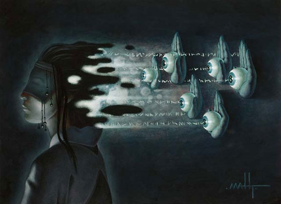
Evermind, by Matt Thompson

Thoughtseize, by Chuck Lukacs
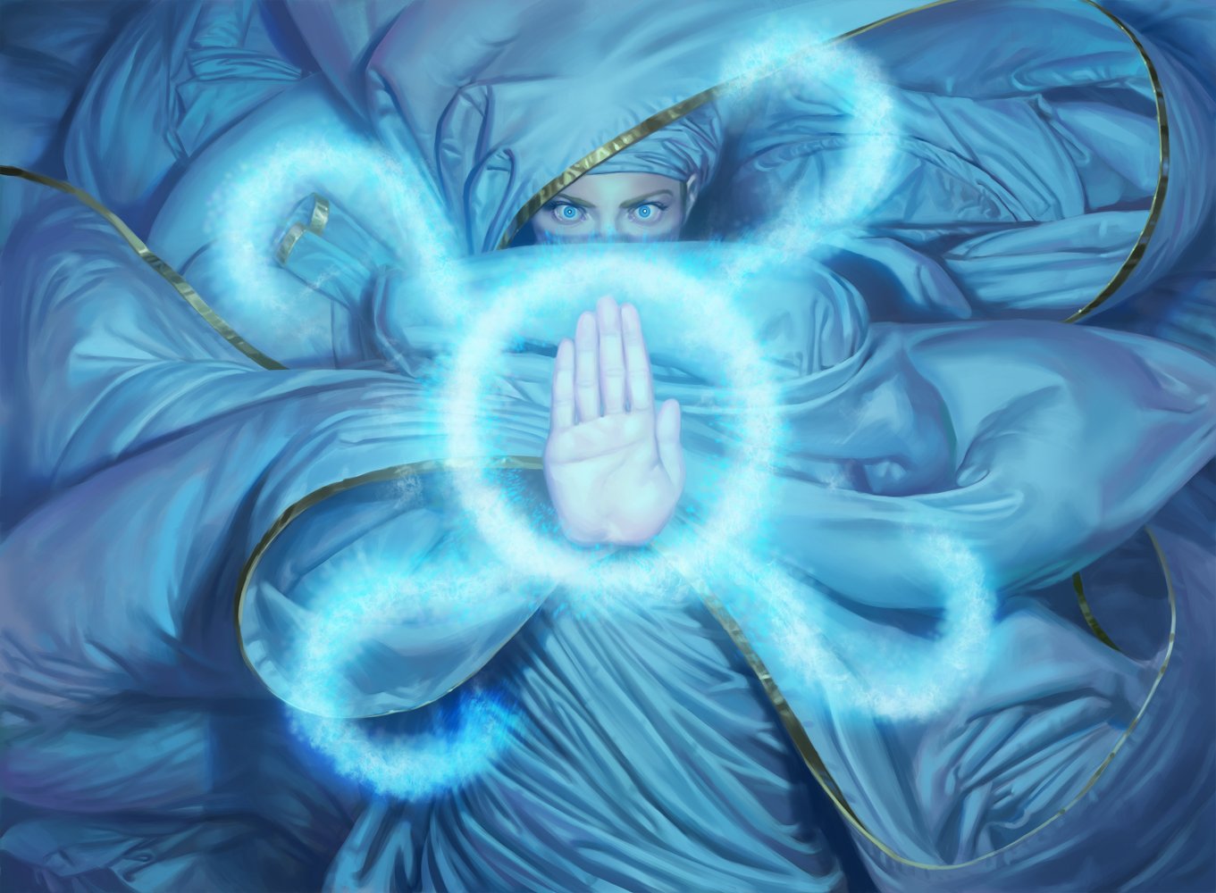
Cryptic Command, by Jason Rainville
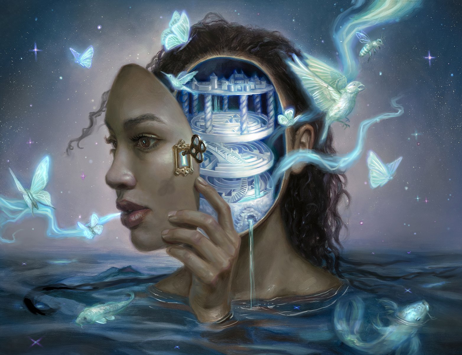
Sublime Epiphany, by Lindsey Look
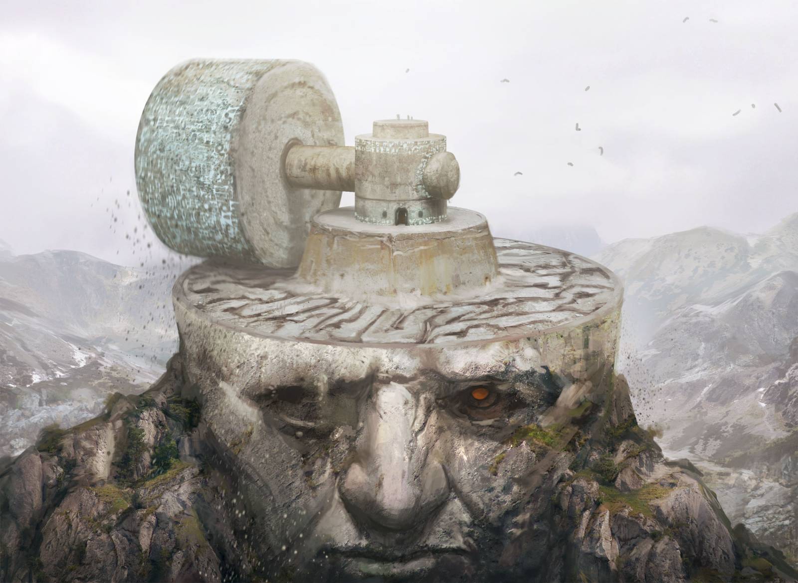
Millstone, by Yeong-Hao Han
Scour the Desert, by Tyler Walpole
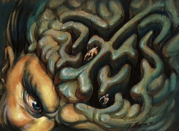
Meishin, the Mind Cage, by Thomas Gianni

Mind’s Desire, by Mintthu Hynninen
The moon card is gorgeous and abstract! Thanks so much for breaking these down.
Este artículo explica cómo Steven Belledin resolvió distintos retos visuales en varias ilustraciones para Magic: The Gathering, usando metáforas, simbolismo y composiciones poco tradicionales para comunicar ideas complejas. Habla de obras como Rampant Growth, inspirada en “La Gran Ola” de Hokusai; Treacherous Urge, donde una marioneta simboliza la manipulación; y Temporal Extortion, que divide la imagen para mostrar efectos opuestos del tiempo. Belledin destaca la importancia de explorar soluciones visuales más allá de la narrativa literal y recomienda ejercicios para mejorar la comunicación simbólica en ilustración.