I’m super excited to finally share one of the projects I’ve been working on behind the scenes over the past few months: a new series in the Hellboy universe, Castle Full of Blackbirds. I’m a big fan of Hellboy (anything Mignola, really!) so this was one of those dream projects I couldn’t pass up… even though the commission showed up while I was in the midst of an apartment hunt, and the deadline for the first cover landed squarely on moving day.
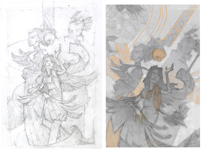
As with most of my paintings, the early stages are pretty unglamorous. My initial thumbnail sketch is mostly about getting an idea on the page — figuring out what characters and thematic elements I want to include in the image, and how they might fit together compositionally (this is the hard part).
Once the “what” is dealt with (below left) the “how” (below right) becomes a lot more fun. I like the flexibility of digital for this stage — chopping up my thumbnail sketch in Photoshop to get the layout just right, and starting to think about values and the extraneous elements and decorative details that will pad out the main content of the image. This more resolved thumbnail is the one I sent to Dark Horse for approval.
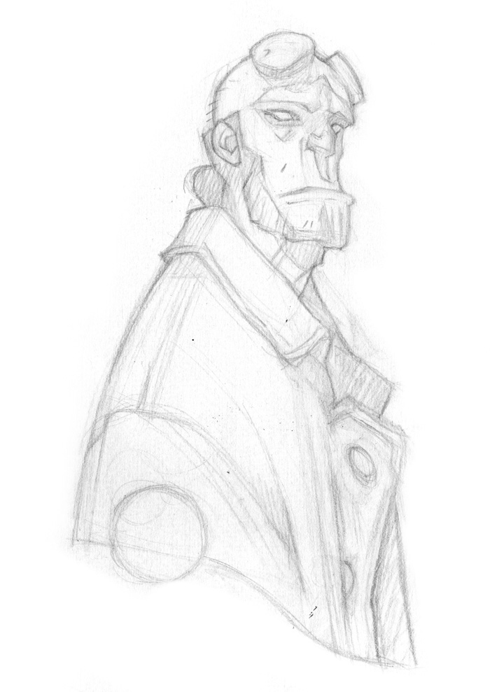
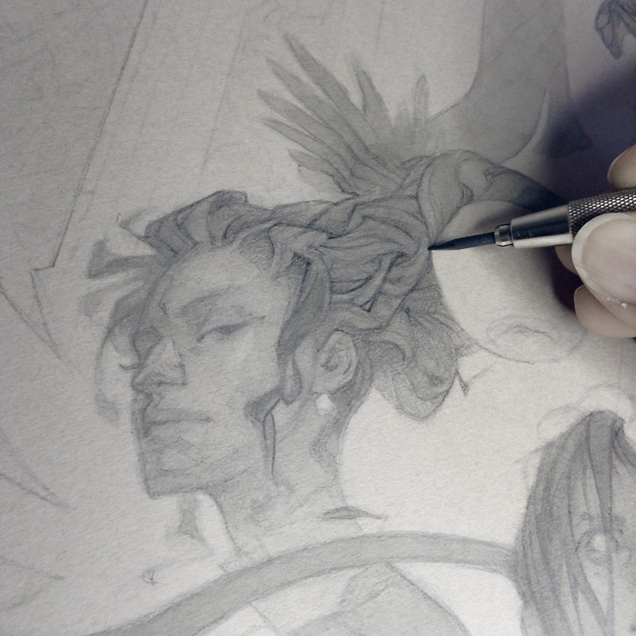
My process tends to involve a lot of erasing and reworking, especially when it comes to faces. Lately, I’ve found that I can bypass a lot of this frustration by isolating each character from the rest of the image and allowing myself a few rounds of sketches to figure them out — an easier pill to swallow than erasing an acceptable (but not fantastic) face from an otherwise nicely-finished drawing.
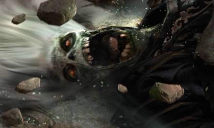
Although Hellboy isn’t the central character in the series, I felt that his presence (and his misgivings over the witchy goings-on) was important to setting the scene. Plus, who could pass up the opportunity to draw that craggy, geometric face?
In an ideal world I’d do a fully-realized pencil drawing incorporating all of these disparate elements (both for the fun of it, and as a test run to see how everything fits together before moving on to the final) but since time was of the essence here, I had to make do with a digital composite – the best of my character studies spliced with some digital sketching to refine the other elements from my thumbnail.
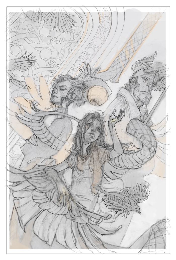
The resulting line drawing is printed at low opacity on toned paper (I use Canson Mi-Teintes) to guide a gradual buildup of values in ink wash. I’m aiming for soft, smoky washes without any obvious hard edges inside the major silhouettes, and since I’m planning on using some digital tweaks for the final values, I’m holding back on the strength of the washes compared to what I’d normally use in a standalone traditional piece.
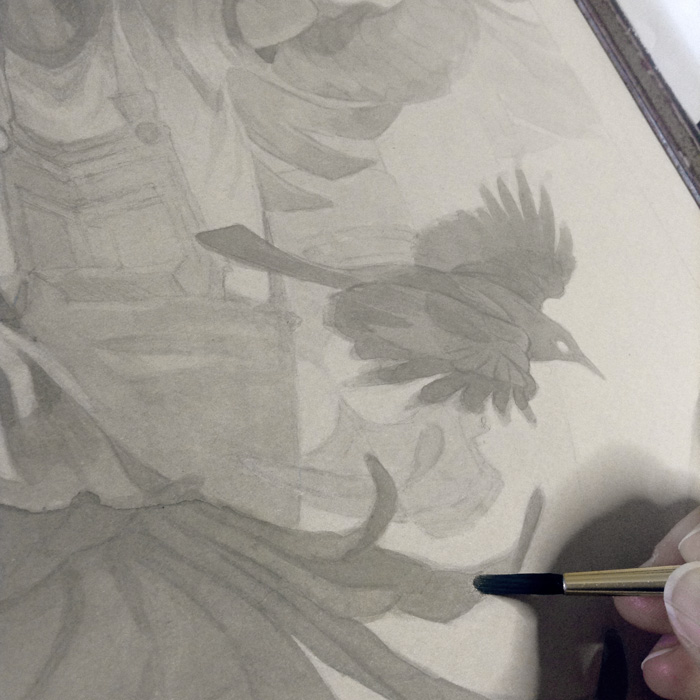
Once I have the values inked to about 75% of their final intensity, I start to render the image in pencil. Normally, I’d use black or gray Col-Erase pencil for this stage, but since Prismacolor is discontinuing them, I used normal HB graphite (mostly out of spite).
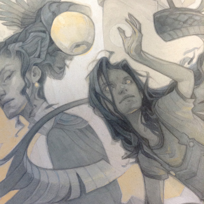
Color on this piece was pretty subtle – some blue tones added in watercolor and diluted acrylic (mostly over the pencil lines) and some spot-color yellows in gouache (its chalky opacity being a better fit for the graphic effect I was going for.)
Much as I prefer working traditionally, it’s hard to match the speed and convenience of digital when a deadline is looming. Thanks to its influence, I was able to get the cover submitted a generous 16 hours before the movers showed up on my doorstep… plenty of time to start packing!
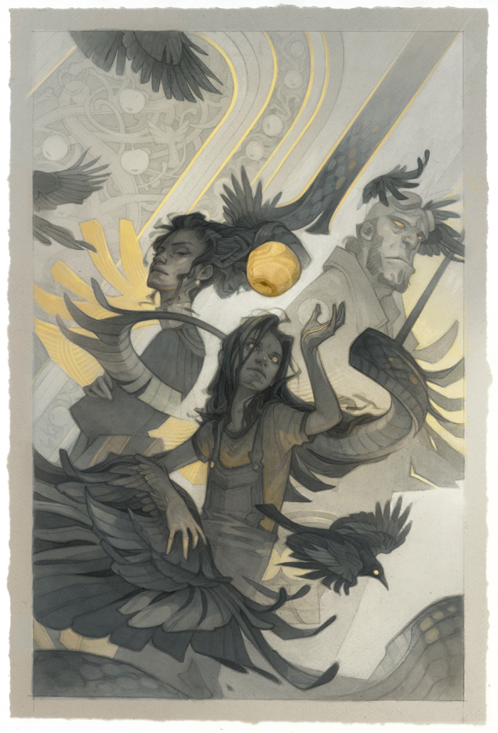
You can see the digital tweaks that made the the traditional piece cover-ready below:
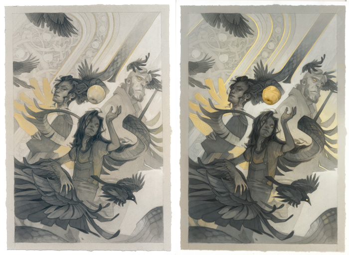
And, the completed cover layout!
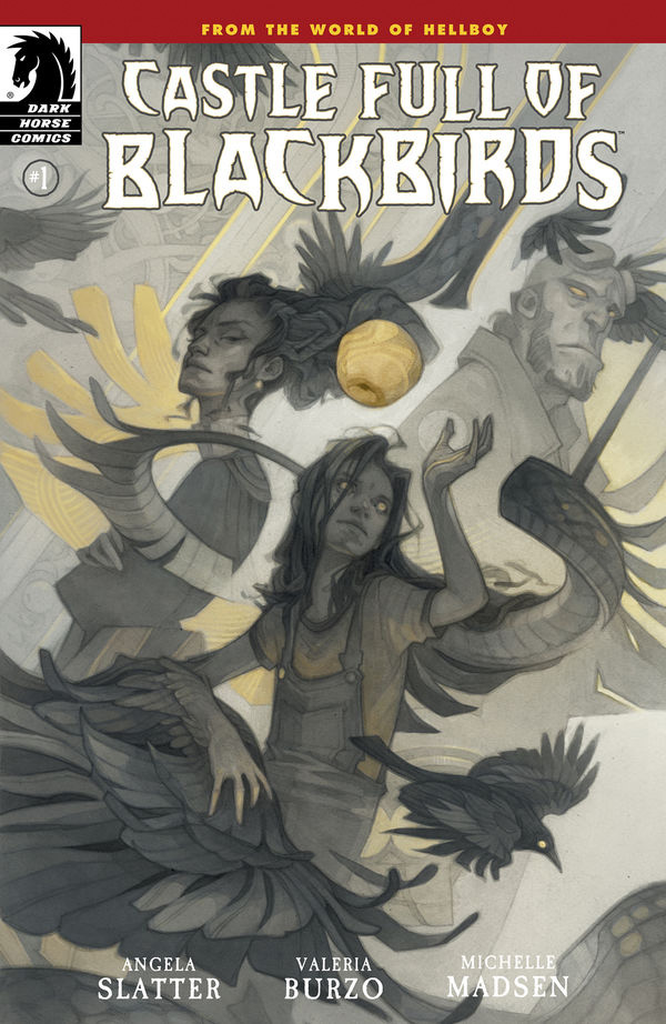
Castle Full of Blackbirds #1 will be released on September 14th, with the remaining issues (featuring more of my cover art!) to follow.
Amazing cover, Wylie! I find jobs like this have a way of causing stage fright, but you nailed it!
I WAS TERRIFIED
amazing work Wylie! 😀