
Now, let’s wrap up this saga.
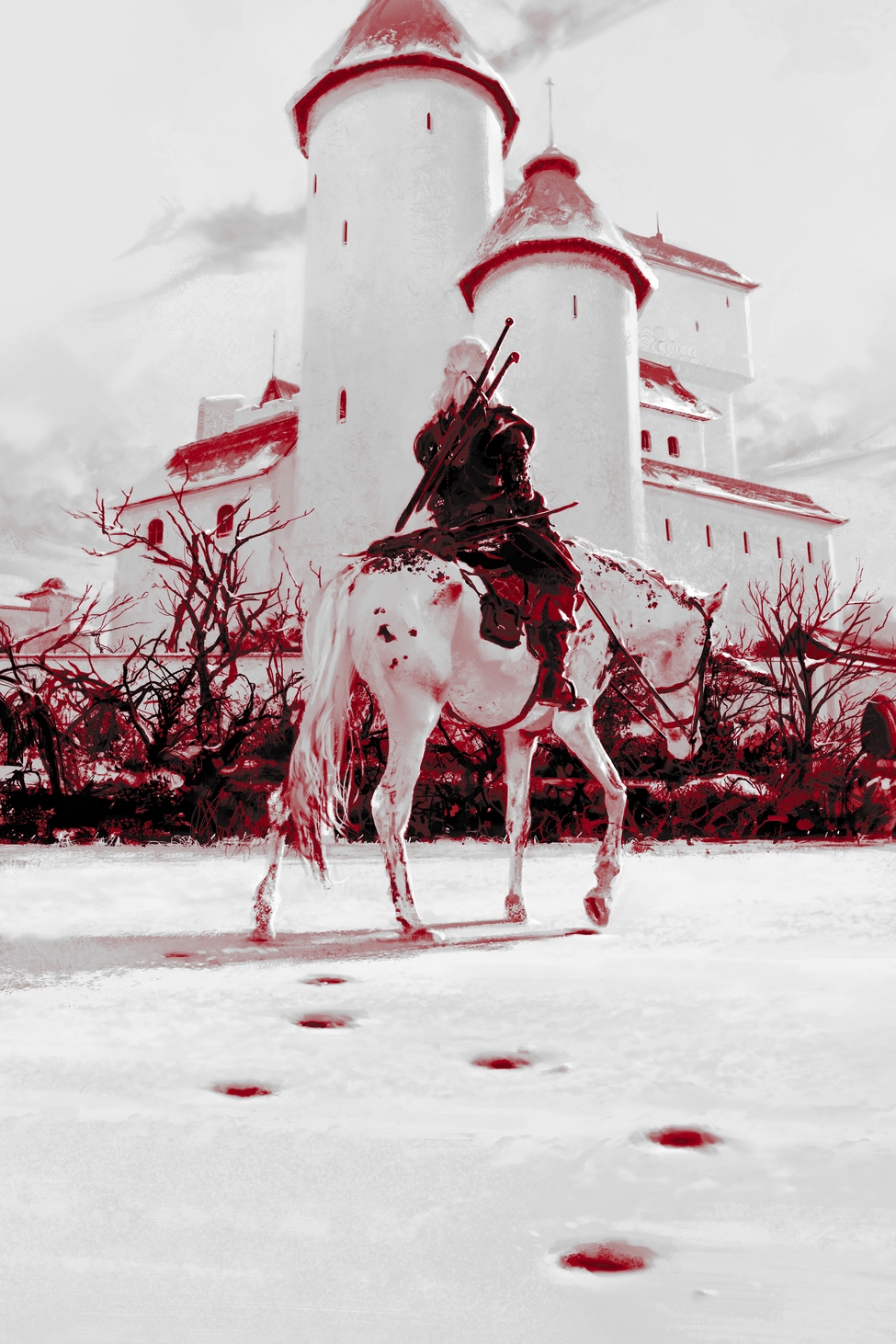
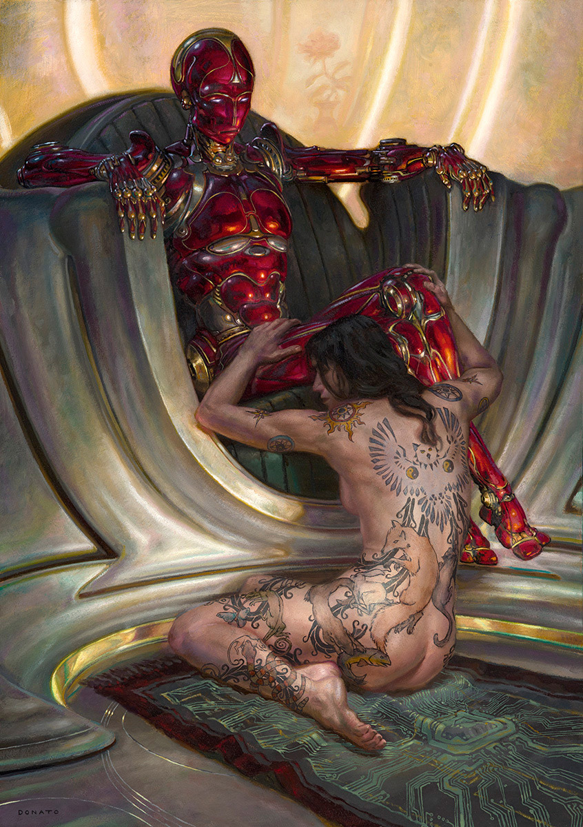
Sketch B
You’ll remember from Part 1 that the publisher (Orbit), approved “Sketch A” for the cover, but also approved “Sketch B” as an interior piece.
The tricky thing about that was that the interiors had to be painted in “duotone.” No, I’d never heard of it before either. Duotone is a file type inside Photoshop, much like RGB. But as the name suggests, instead of three channels you only get two. And you can specify what colors you have in your two channels (it’s sort of like screen printing).
(In this case, the publisher wanted the colors in the artwork to match the colors in the rest of the book (logical), so they dictated which colors we had to work with: Black, and PMS 185C.)
Oh – and there’s one other trick to working in duotone: you can specify a custom “curve” for each color, to dictate at which values that color will most express itself. Here’s a screenshot of the duotone option dialogues:
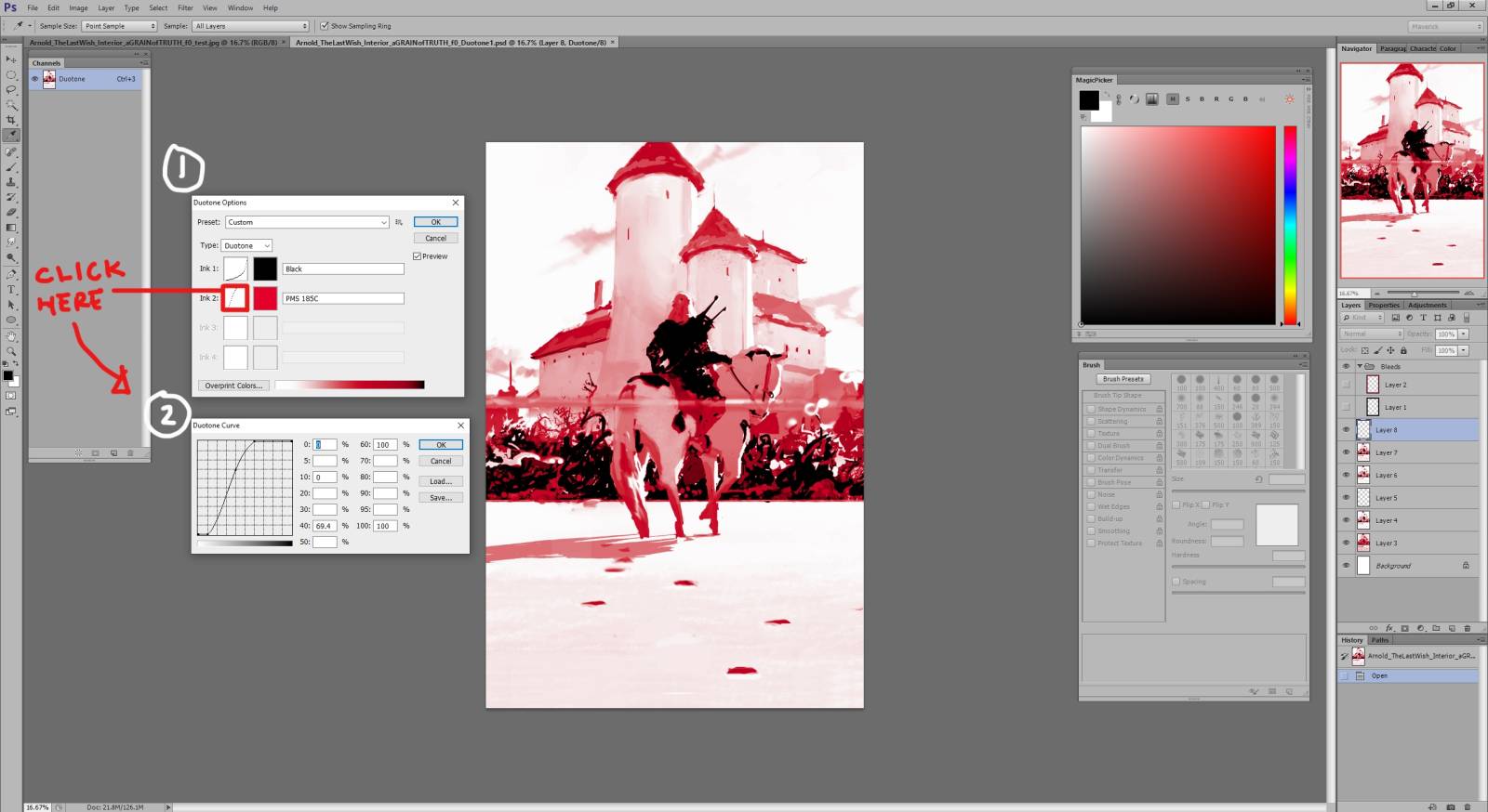
When you press [Image>Mode>Dutone] you are presented with menu “1.” You can click on the color squares to change what’s in your two channels. If you click on the curve boxes, you get menu “2.”
So this was going to be…complicated. Ish. You remember how I also said in Part 1 that black and white pieces always come with their own challenges? Well, this was pretty much that.
Here’s how the piece looked as soon as I flattened the file and switched the file type to duotone, using the necessary channels:
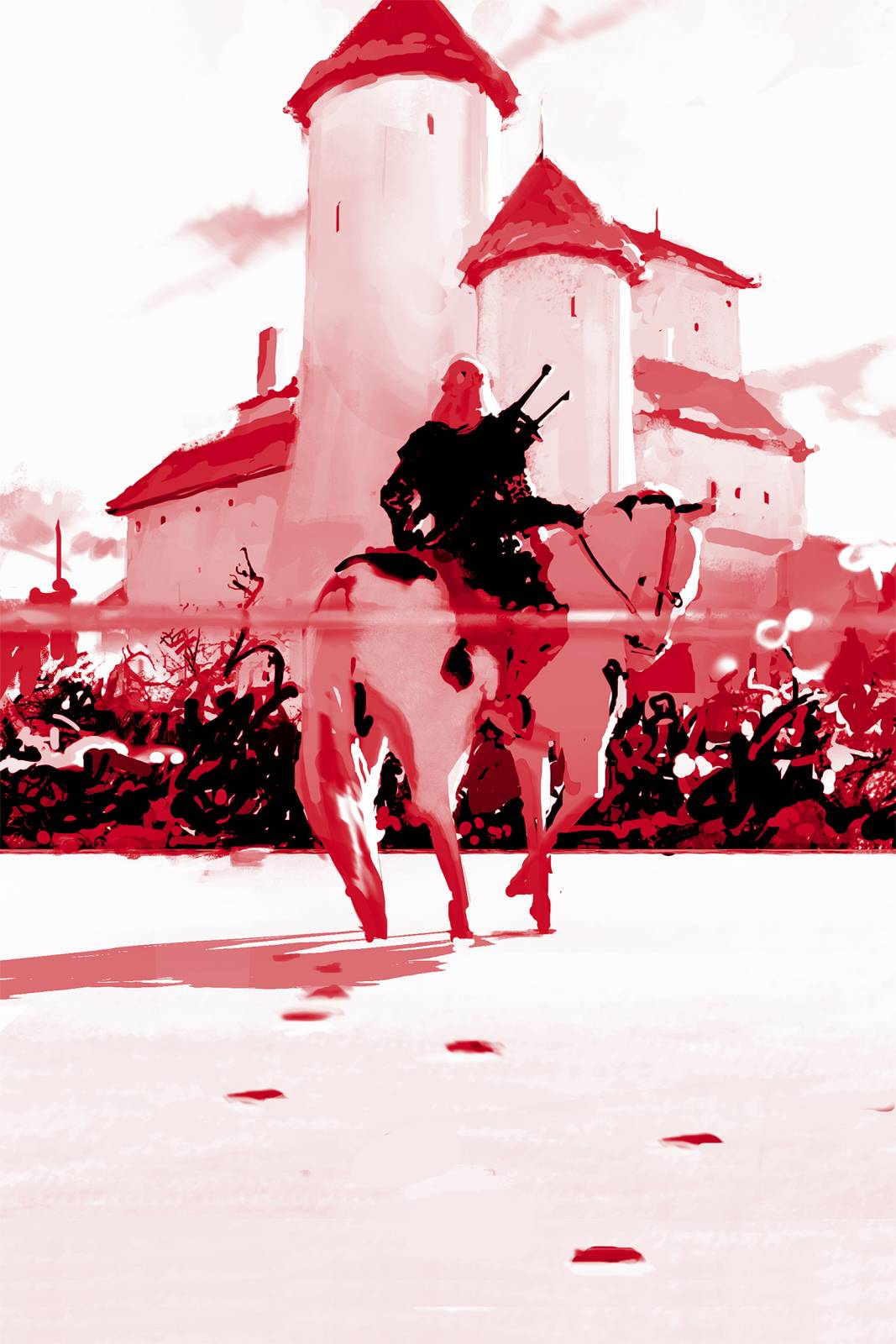
Yeah, not great. First of all, the subtle temperature differences I’d planned for could no longer help give me extra depth. So I was going to have to achieve depth almost exclusively through drawing. That was actually not so bad, because I’d already designed this piece with Pattern in mind. I don’t know if I’ve given a formal definition of Pattern here, but basically: thinking of the entire composition of an image in only two values. In this case, all my dark reds and my “actual” blacks were grouped as “Black,” and everything else was conceptually grouped as my “White.” This is a wonderful compositional tool! What it requires is just that you pay attention to the balance and placement of light and dark shapes from an abstract point of view (always looking for balance and interest). If you take a look at many of the greats – Cornwell, Fuchs, Sorolla, the list goes on and on – you will find that they kept this tool close at hand.
But the piece was still going to need a lot of little changes. Not only that, but I pretty strongly suspected that the lens flare would have to go. Normally I’m a big proponent of letting the desired outcome dictate the method (I think I even talked about that in Part 2). But in this case, I had a set method that I had to use, so the piece actually had to bend a little bit to accommodate that. This was more about finding a common ground between what I had anticipated painting, and what I was able to effectively paint.
Before getting started, I rustled up some basic reference of castles from around Poland (since the author is Polish, and I’m a really deep and sophisticated guy). I also pulled some reference for horses, but in this case I used a few pictures of my own. Earlier that year a few friends and I had gone on a trip to Cumberland Island, off the coast of Georgia – a place where there are wild horses:
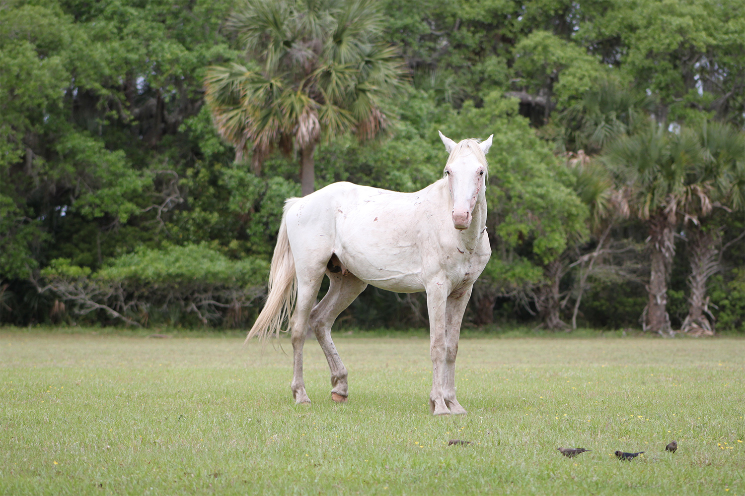
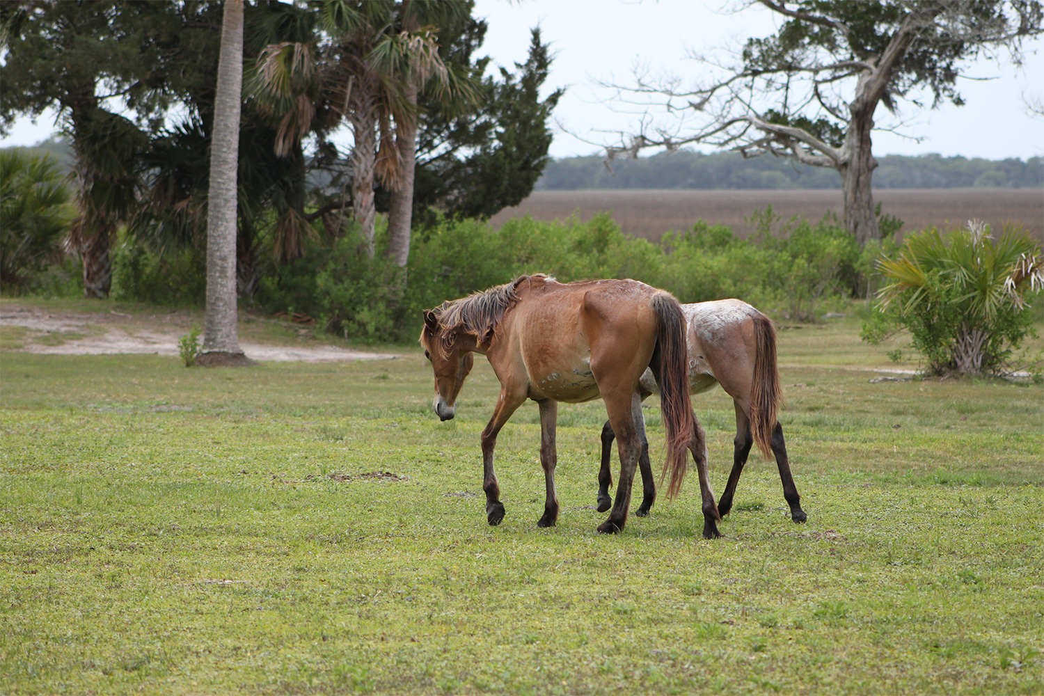
After seeing them, and then reading The Last Wish, I thought it would be really cool if roach was sort of feral looking, to show off how he and Geralt are always going through such tough times. I looked at the photographs I had taken on the island a lot while painting this, but in the end I think almost all of the horse was sourced from this second photo:
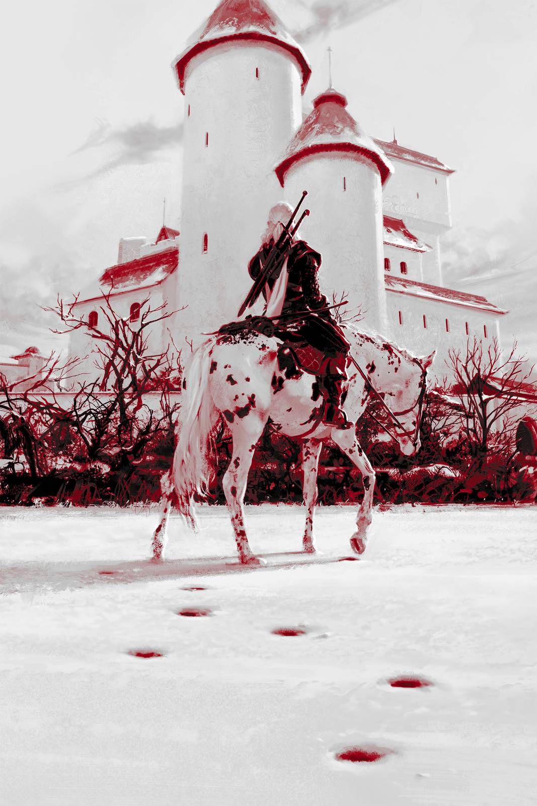
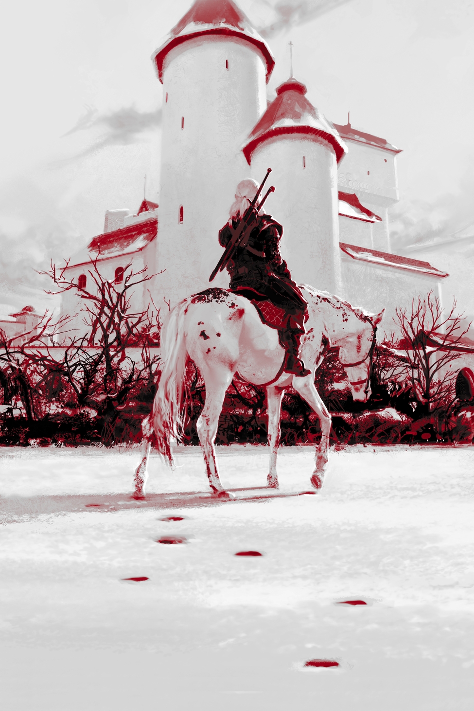
If you flip through the WIP progression at the bottom you can see that the first few stages of the work were somewhat handicapped by the original curves I’d set. Everything is feeling too Red and Pepto-Bismol:
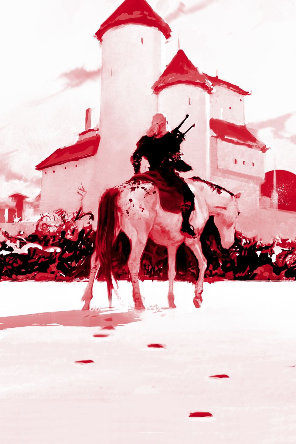
WIP 3
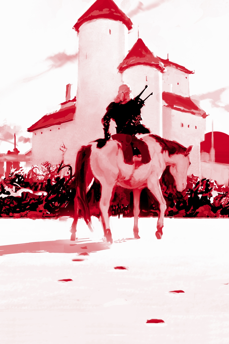
In addition to values following a Pattern, colors can also be thought of as following a Pattern. In this case, I’d anticipated that the Reds would be yoked to the dark values of my Value Pattern, but the curves I’d set were just not supporting that concept. As you flick through the WIPs: if you see an image where all that changes is the apparent brightness, or redness, or whatever – that’s just me fiddling with the curves.
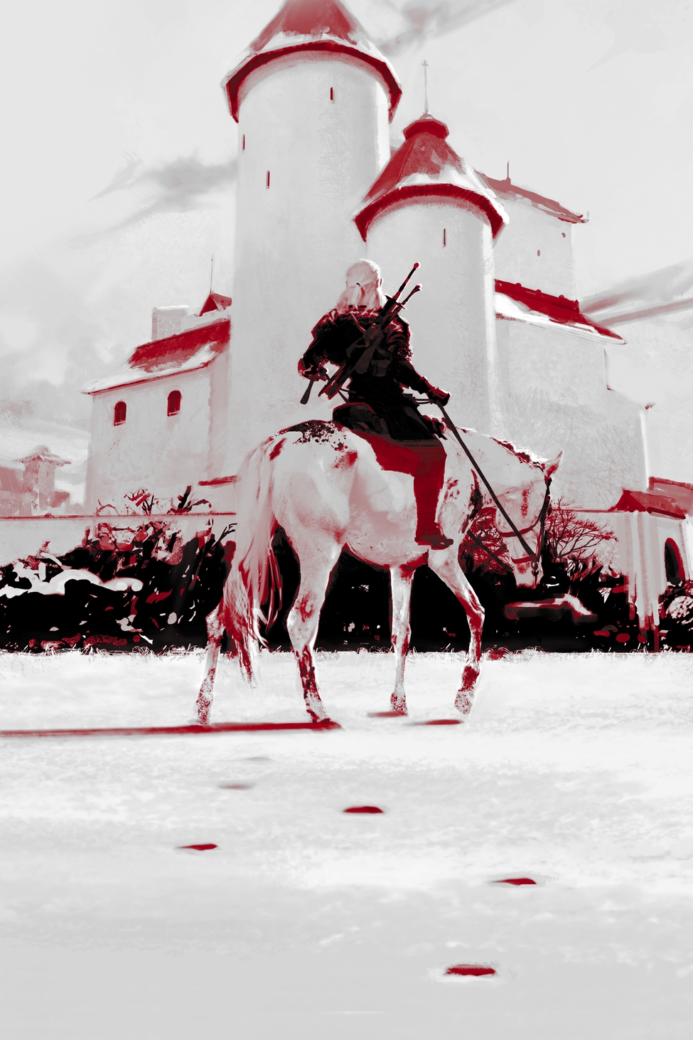
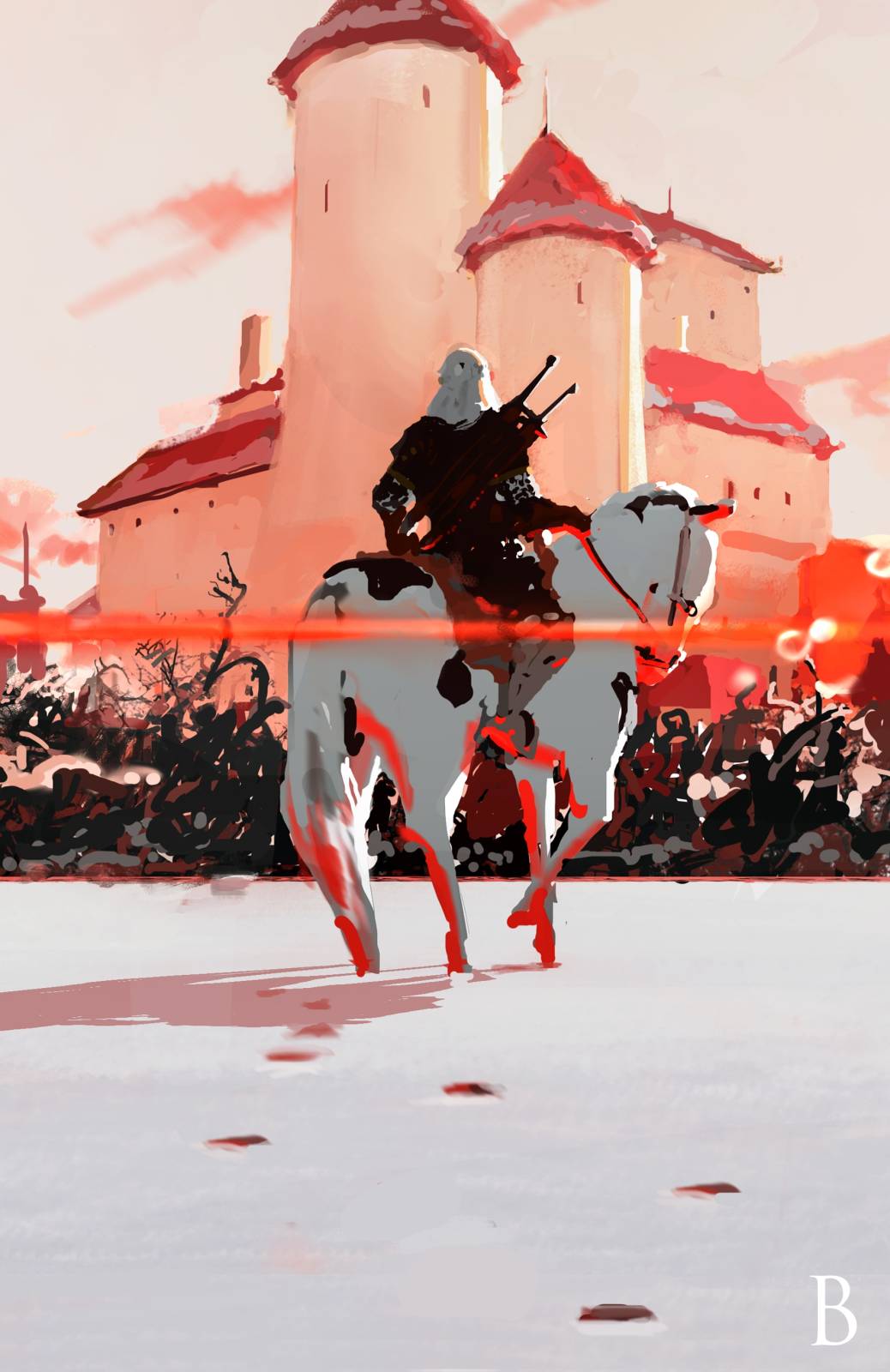
WIP 6
Here, in WIP 6, I finally get the curves nailed. I won’t lie, the first few days of working on this were basically just trying to figure out how the hell to work on this, and it was really frustrating. But, I can’t go around talking all about how we have to lean into difficulty and face our frustrations and our fears, and then not do it myself, now can I? Also I had a deadline, which has been my own most effective form of motivation for several years now. Honestly, without deadlines I would probably just mutate into a jellyfish and float away into the aether of thoughts, and never actually get down to painting…heh. Even though I love painting. What an enigma.
Once the curves were on point, this was relatively similar to other painting processes I’ve used and described here. Sometimes little back-and-forth changes in each area show in the WIPs, and other times they don’t, but I pretty much painted every area with the “non-linear” mindset I described in Part 2. Because I didn’t have exact reference for anything going on here, my main guides were perspective and pattern. If something felt good in the pattern, I kept it. When something felt bad, I scrapped it.
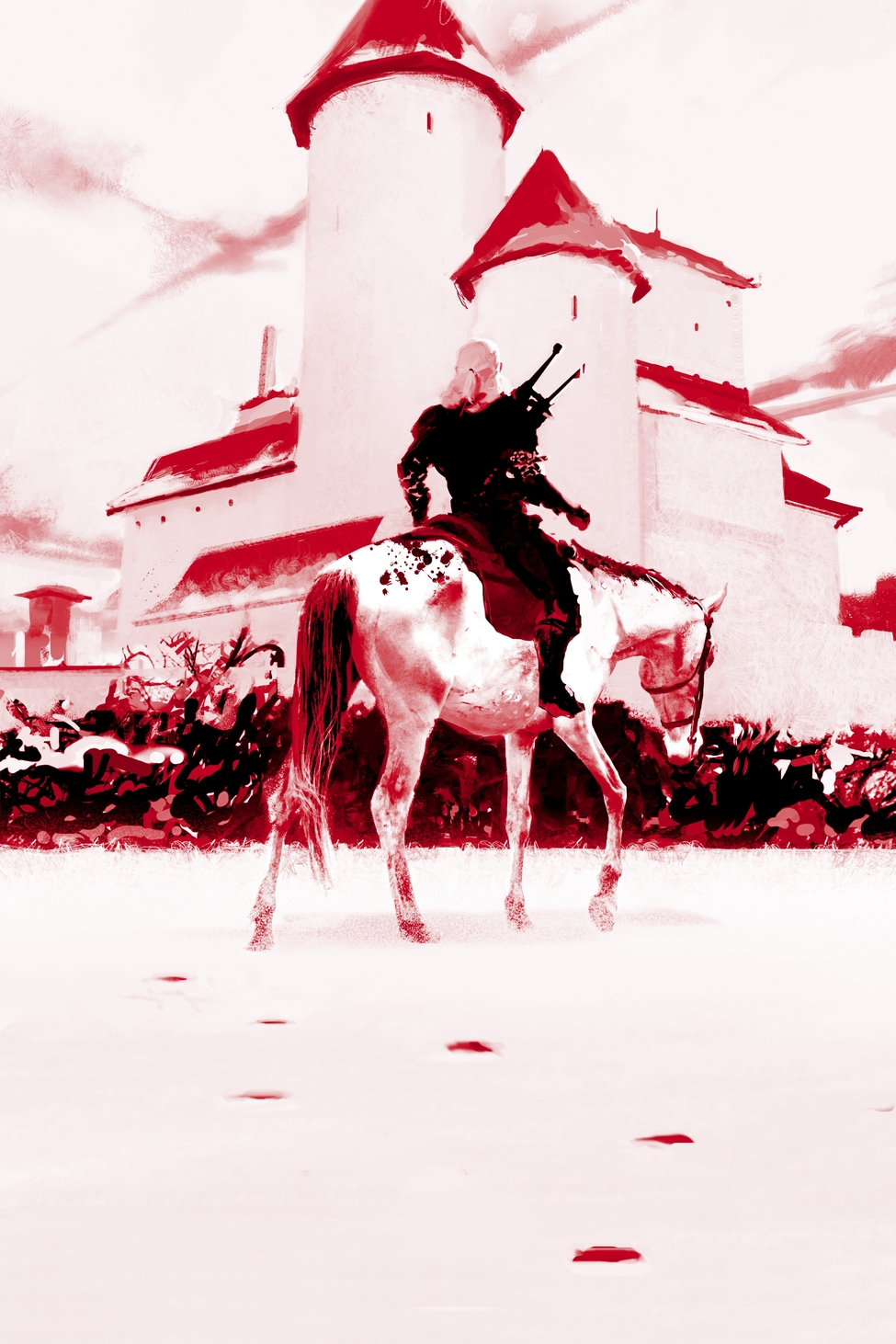
WIP 9
Something “feeling bad” usually manifests itself in my head as a feeling of frustration. The piece is just frustrating. Once I’ve begun a painting, it is often trying to resolve that feeling of frustration that keeps me going just as much as my deadline. I am hunting the sources of that frustration. You can see that even at WIP 9 – about 70% of the way through the painting – I decided to redraw the figure from scratch. Sometimes you need a day of painting inside frustration just to muster up the courage to scrape that figure that isn’t working, and begin again. But what you find on the other side of that choice is always worth it. After I changed the figure, the pattern was feeling a little blocky right there in the middle, so I added that sliver of white cape and some other items that I hadn’t originally intended on including just to break that area up a little.
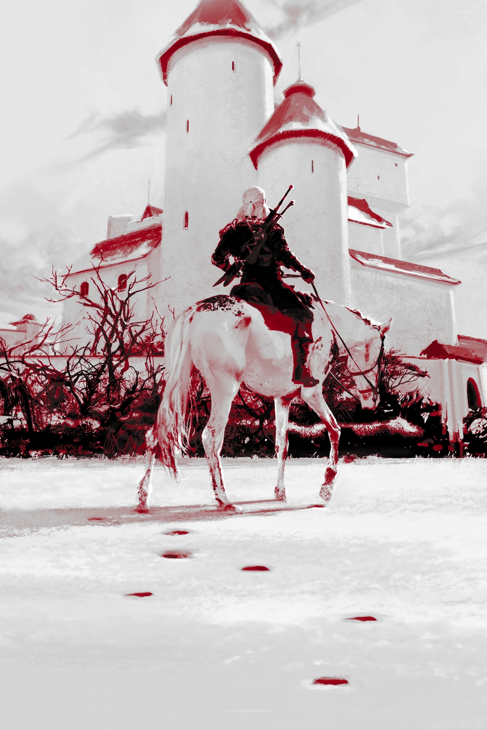
And that was it! I think this one took about six days, if I remember correctly. You can see that so much of that time was invested in things that didn’t pan out, and in just figuring out the curves. But in the end, I really had a lot of fun “figuring this out.” I honestly don’t know if I would recommend it, but if you like the look: now you know how it was achieved.
Saga concluded!!!
And for the last time, don’t get eaten.
Tommy
_______________________________________
Once more with feeling – here’s all of the WIP shots in order, for easy scoping:


Recent Comments