Last year I got the opportunity to revisit a couple of older pieces. I wasn’t being asked to reinvent the wheel with new versions, however. In fact, part of the gag was that the subject matter needed to be exactly the same and recognizably so. The difference between the original iterations and the new ones would be that the new versions would be presented almost as DaVinci sketchbook diagrams of the artifacts depicted in the originals. Seemed like a fun departure, honestly. And so I jumped at the chance.
The first piece was a redux of a piece I’d done in 2017 called Mox Amber.
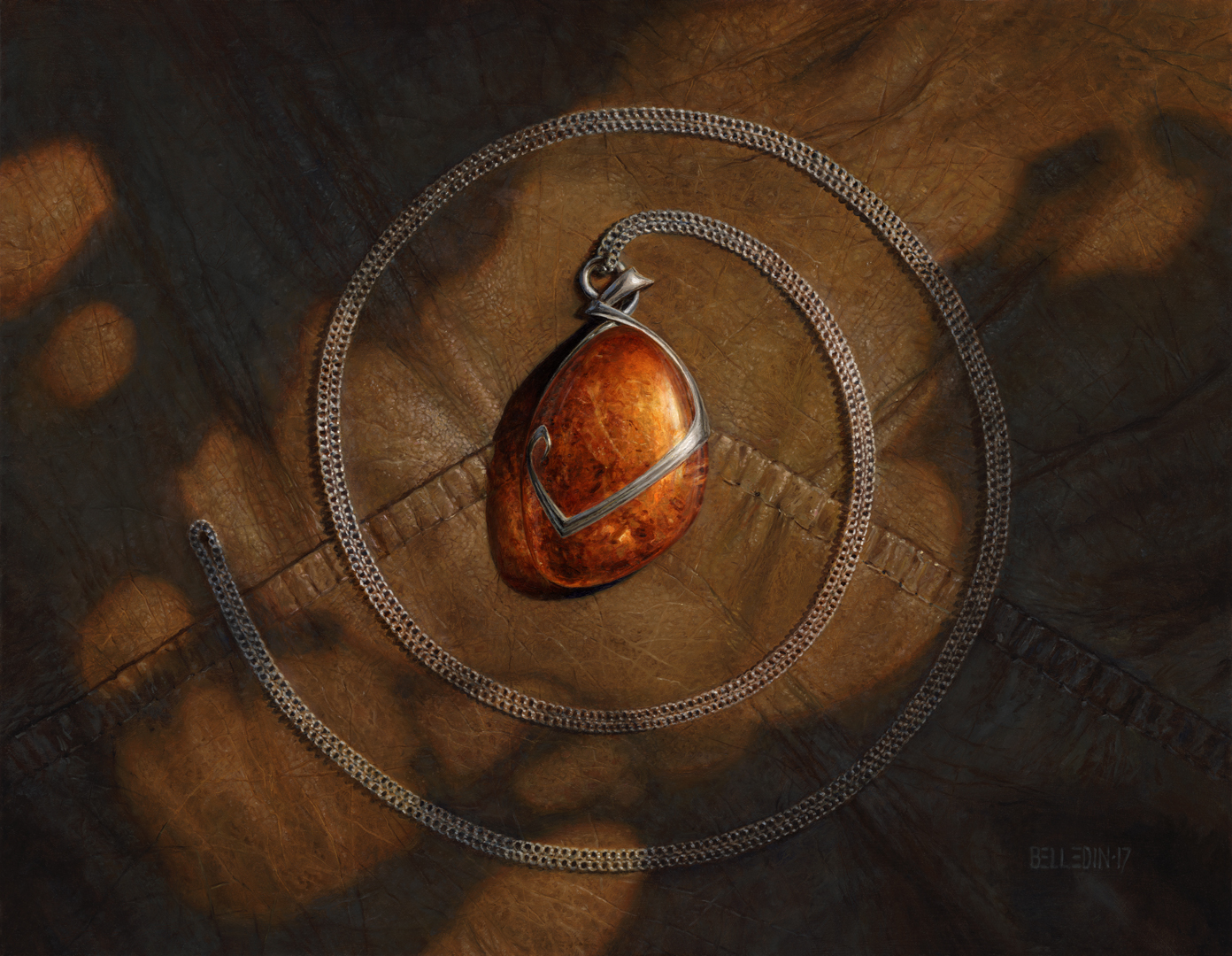 This piece is oil on hardboard and measures eighteen inches wide by fourteen inches tall. It was art directed by Mark Winters, and I’ve previously written about it on my own blog here.
To do these pieces, Wizards of the Coast was kind enough to provide me with similar pieces, as well as an excellent image of parchment paper to base the surface on.
Putting together a sketch for this felt like cheating, and maybe it was in a way. Still, it felt like the obvious way to approach the piece. I simply took an image of the above, put it on its own layer in my sketch file, and set that layer to 10 or 15% opacity. Then I just drew over it on another layer. The result is embarrassing, but it got the job done.
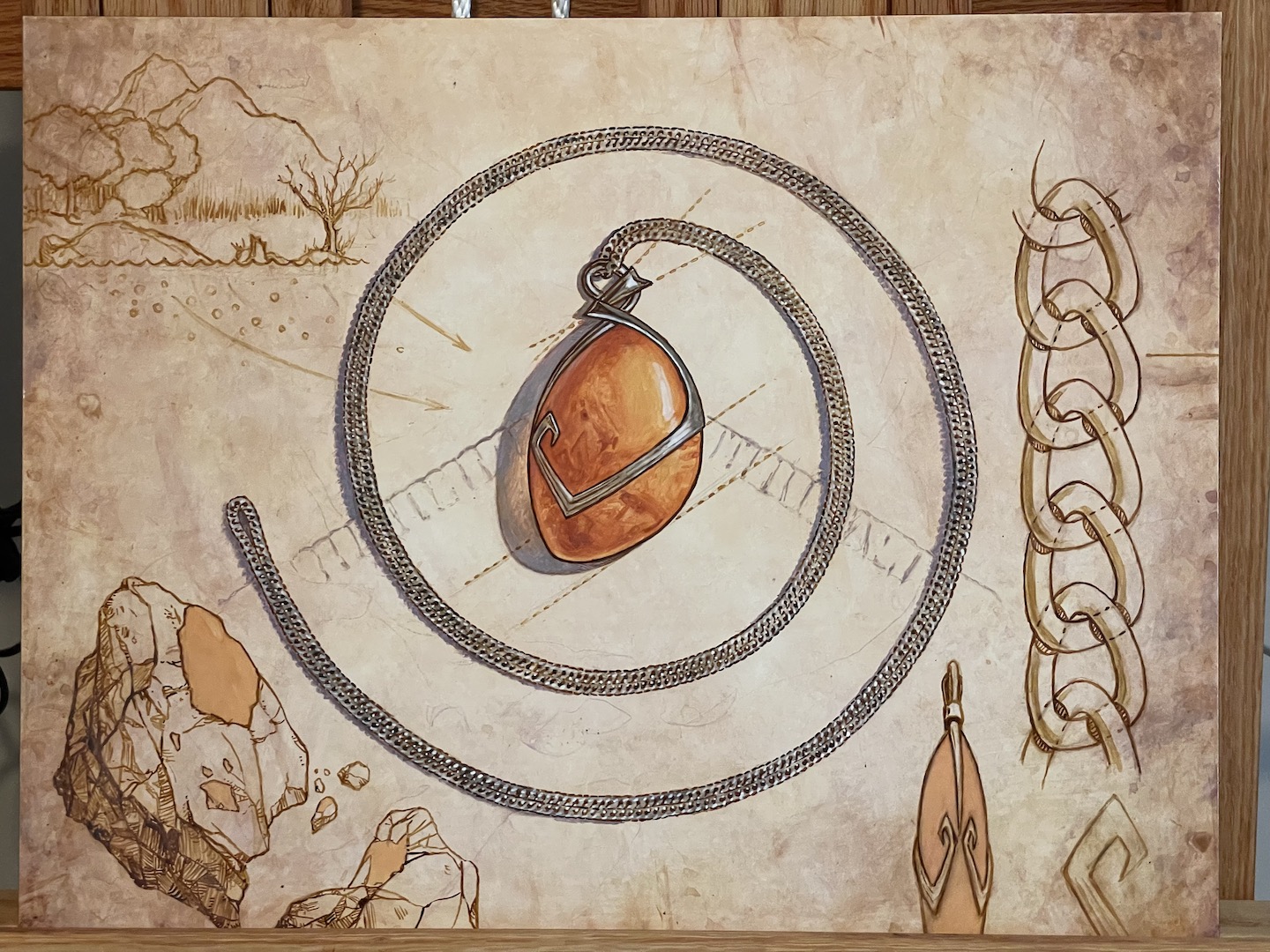
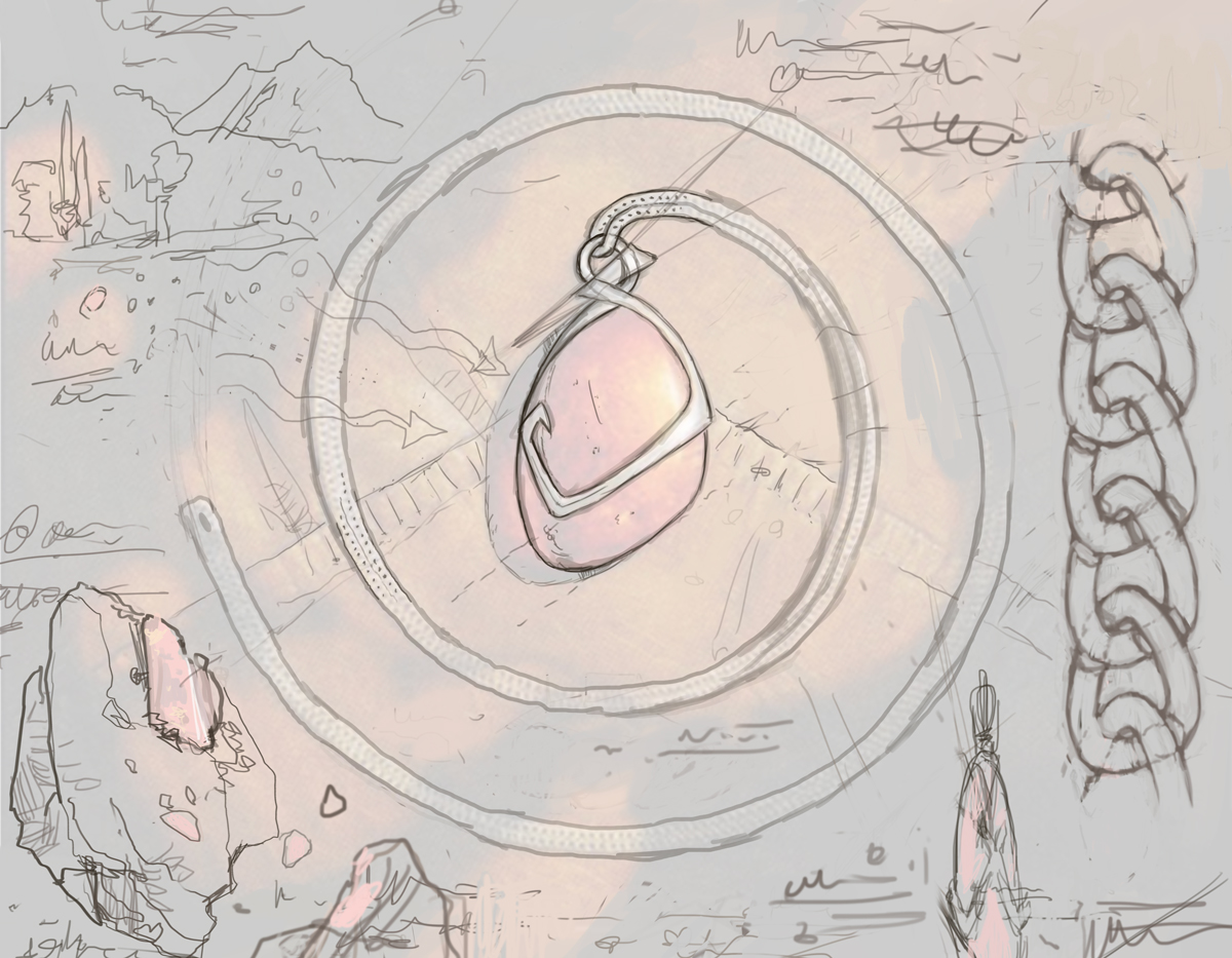 So what was my thinking here? Well, the idea was to add context to the original piece in terms of its creation and purpose and so I thought it would be cool to show a closeup of the chain links, maybe an image of the raw amber embedded in stone, an alternate view of the amulet and maybe try and show the world’s mana going into the piece. Then I just kind of tried to arrange those things in an interesting way—or at the very least in a way that I might were I sketching all that stuff. In addition to the images, there needed to be written notes done in a language that doesn’t really exist, so we needed to avoid clear letter forms and any kind of legibility.
Anyway, despite its mediocrity, the sketch above was approved and I was allowed to proceed to final. But before I did that, I decided to perform a test.
 This piece felt like it called for a process different to my usual oil on hardboard. I was considering very seriously about doing it on paper or illustration board instead, and more importantly, I was considering doing it in watercolor, ink, and gouache. My reasons for switching it up was that I genuinely felt I could get better results in those other media. I also figured the process would be faster. I think I was right on both. However, after doing the above test, I decided not to do the piece on paper. Instead, I opted for clayboard, which is a very smooth surface basically designed for acrylic and watercolor work. I just thought that would hold up better in my flatfiles.
With those decisions, I was off to the races. Well…sort of.
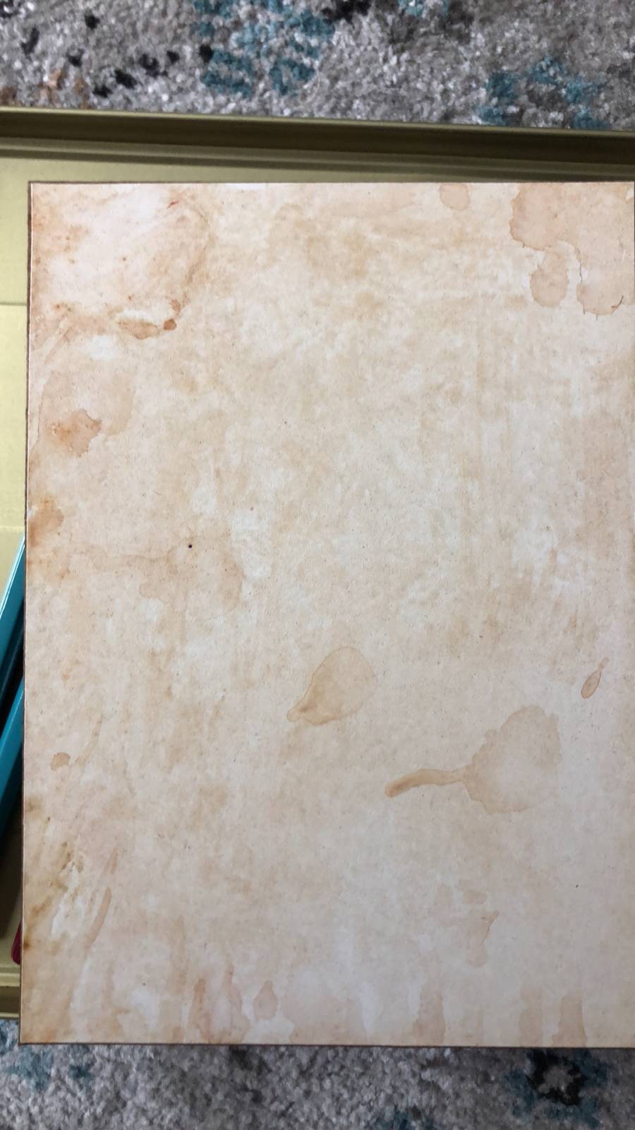 My first step, unusually, was NOT to transfer my drawing. Instead, I built up the surface of the piece in an attempt to mimic the surface of the parchment in the reference that Wizards provided. That particular piece of parchment had a fair amount of foxing and a good number of water stains and I was trying to mimic those things. Once I did that, I then transferred my sketch using watercolor pencil so that as I completed areas, I could effectively wash away any underdrawing that was still exposed.
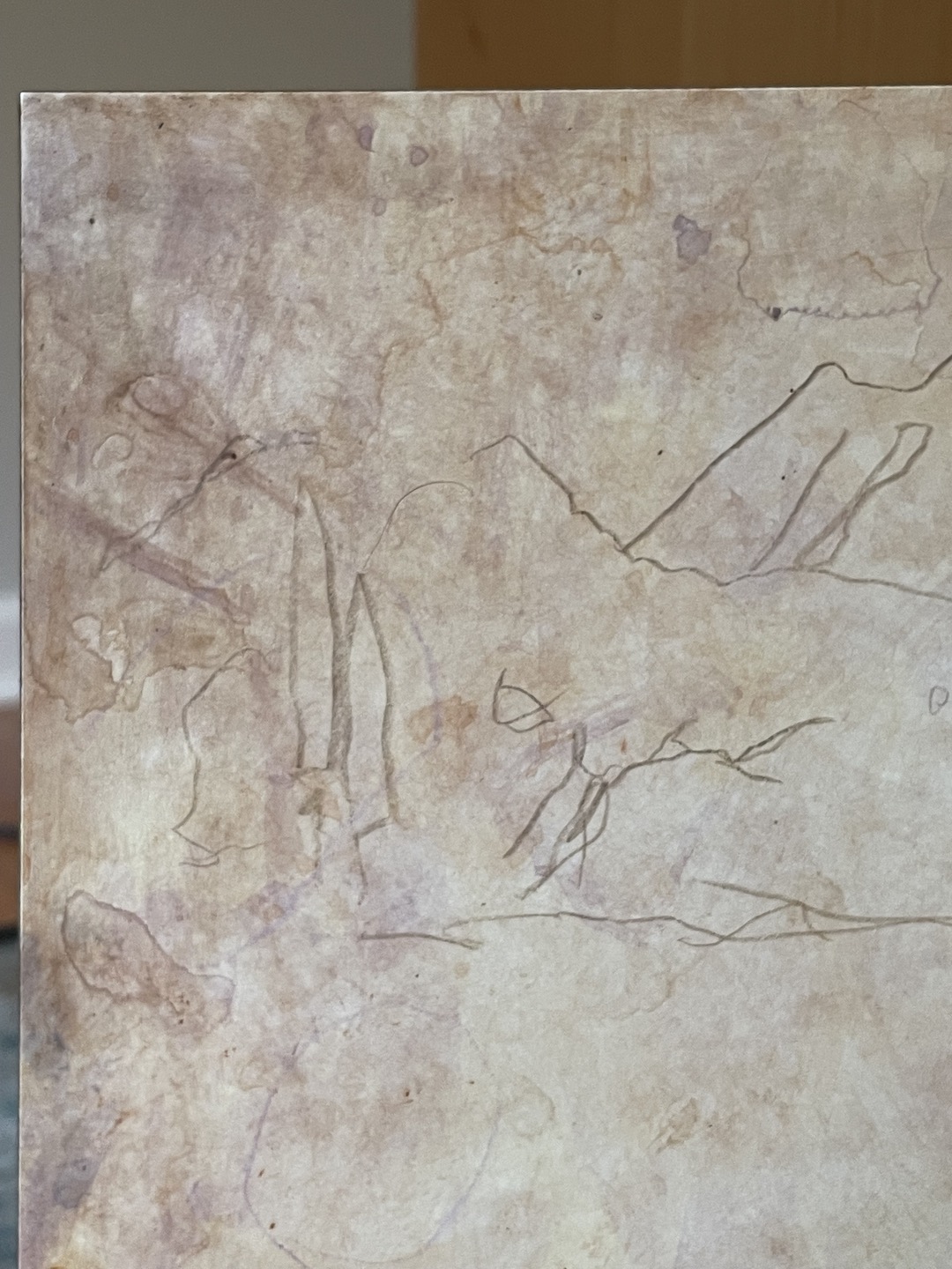 Here’s a closeup of the upper left corner of the piece with surface and drawing down.
 Once the drawing was down, it was all about tightening it up in ink. For this, I used a mixture of FW acrylic inks and, depending on the area, either a dip pen or a small brush to apply it. Obviously I didn’t wait very long to paint the actual amber amulet itself. I did this in gouache because I knew I’d be able to push it around the surface really nicely to indicate some of the amber’s details (but not too many).
 After that, I just kept putting drawing things in. Nothing revolutionary or difficult to grok. It was kind of like inking a comic page drawn by someone who’d laid downs some terrible pencils.
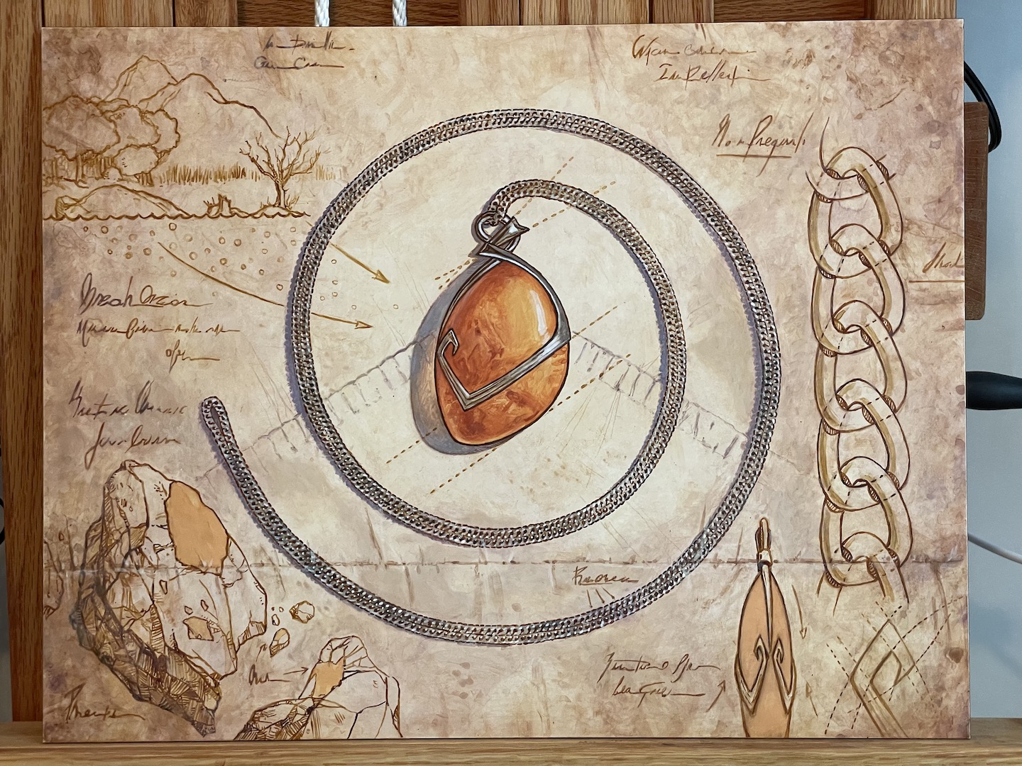 Once the drawn elements were done I added the notes. Once it was all dry, I wiped away what little watercolor pencil was still visible and walked away.
But then I came back because I felt like the piece needed one more thing. The image of parchment that Wizards was kind enough to supply had folds. While there wasn’t a request for those folds to be incorporated in some way, there also wasn’t anything requesting they NOT be included. In the end, I thought it worth adding to the illusion of paper and added a fold going across the bottom of the piece. While that ended up being tangential to some of the drawing in a couple of places, I still don’t regret it. In fact, I think it makes for a better result.
The last thing I did was a light wash over some of the drawing to knock it back a bit and fade it. The final result was this:
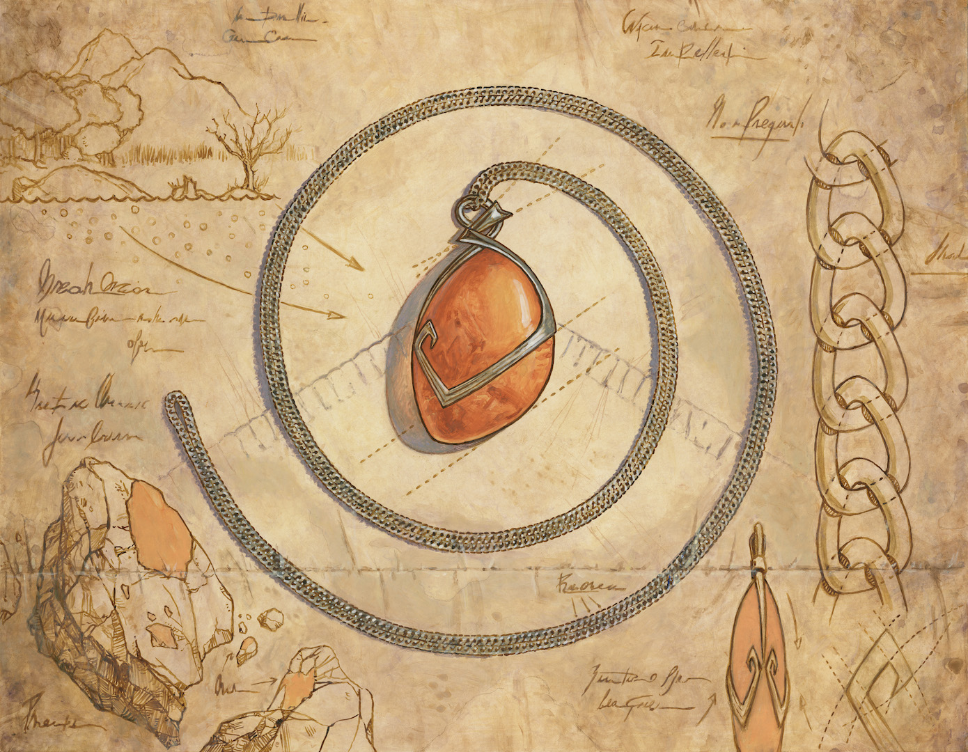 The finished painting is gouache, acrylic, ink and water color on clayboard. It measures eighteen inches wide by fourteen inches tall and was art directed by Sarah Wassell.
After handing Amber Mox in, I was given the assignment to revisit a painting I did in 2010, Ichor Wellspring:
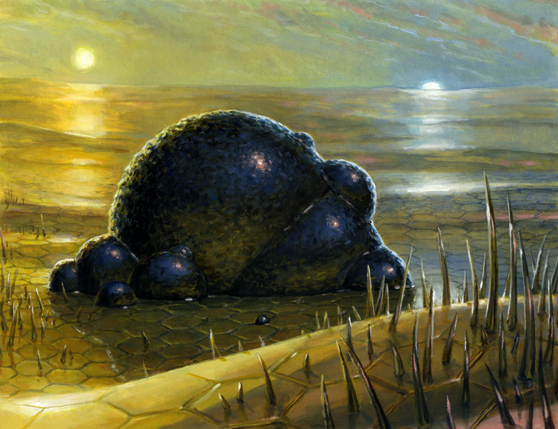 The original finished painting was oil on hardboard and measured nine inches wide by seven inches tall, making it one of the smallest Magic pieces I ever painted. It was art directed by Jeremy Jarvis and I’ve previously written about its creation here.
What can I say about this piece? It’s bubbling goo. And that’s about it. Still, I had a job to do and I needed to add context, so I offered up a couple solutions done in a similar way to the sketch of Mox Amber above.
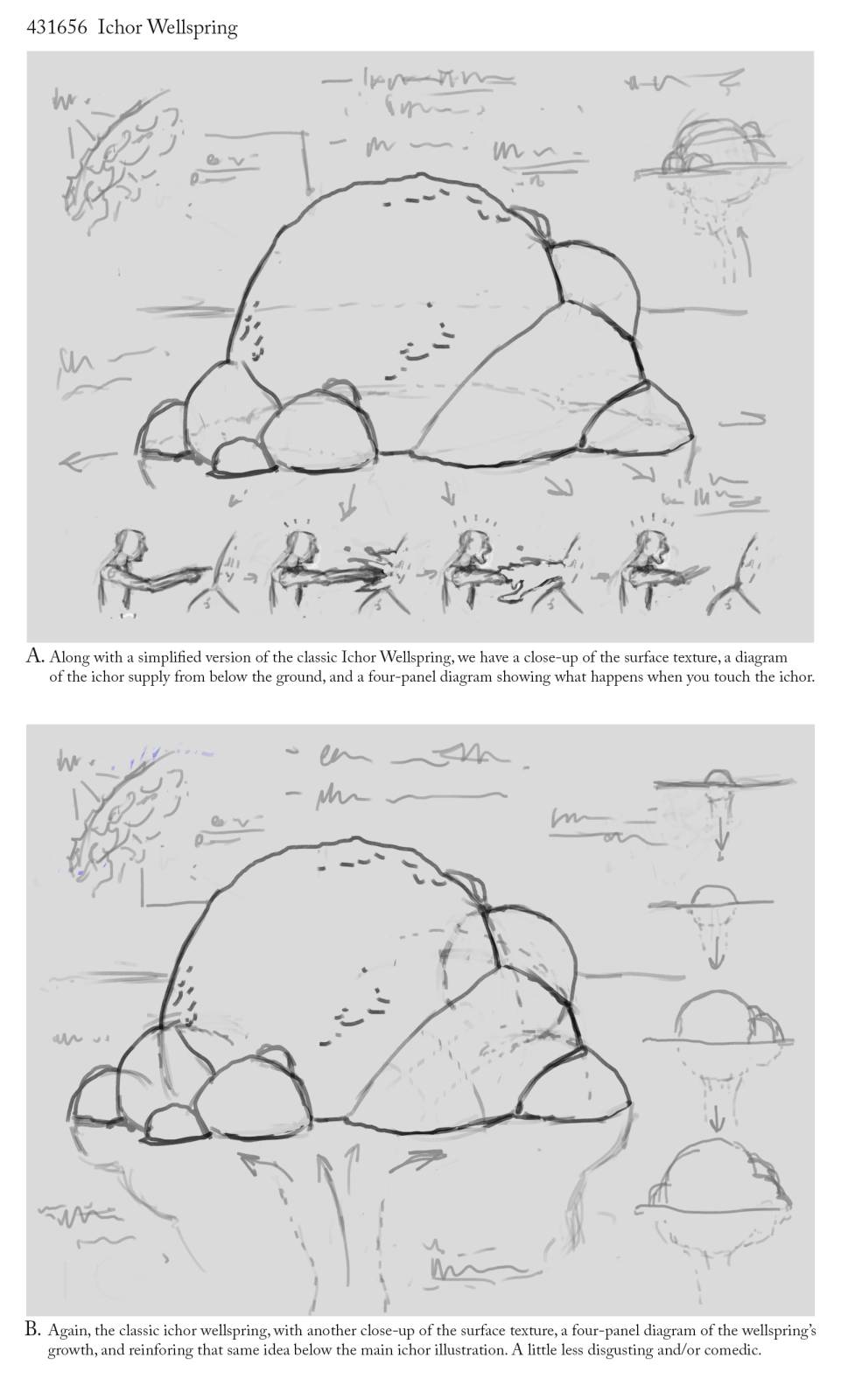 These two options are not radically different—not by a long shot. But, I felt it necessary to offer several different elements for their consideration. The fine folks at Wizards chose the top one.
Because the process of painting this one was remarkably similar to the above, I took very few images of it as I painted it. The only major differences are that in this case are that I worked smaller and that I did not use any gouache or watercolor, sticking only to acrylic and acrylic ink. Beyond that, the process was the same.
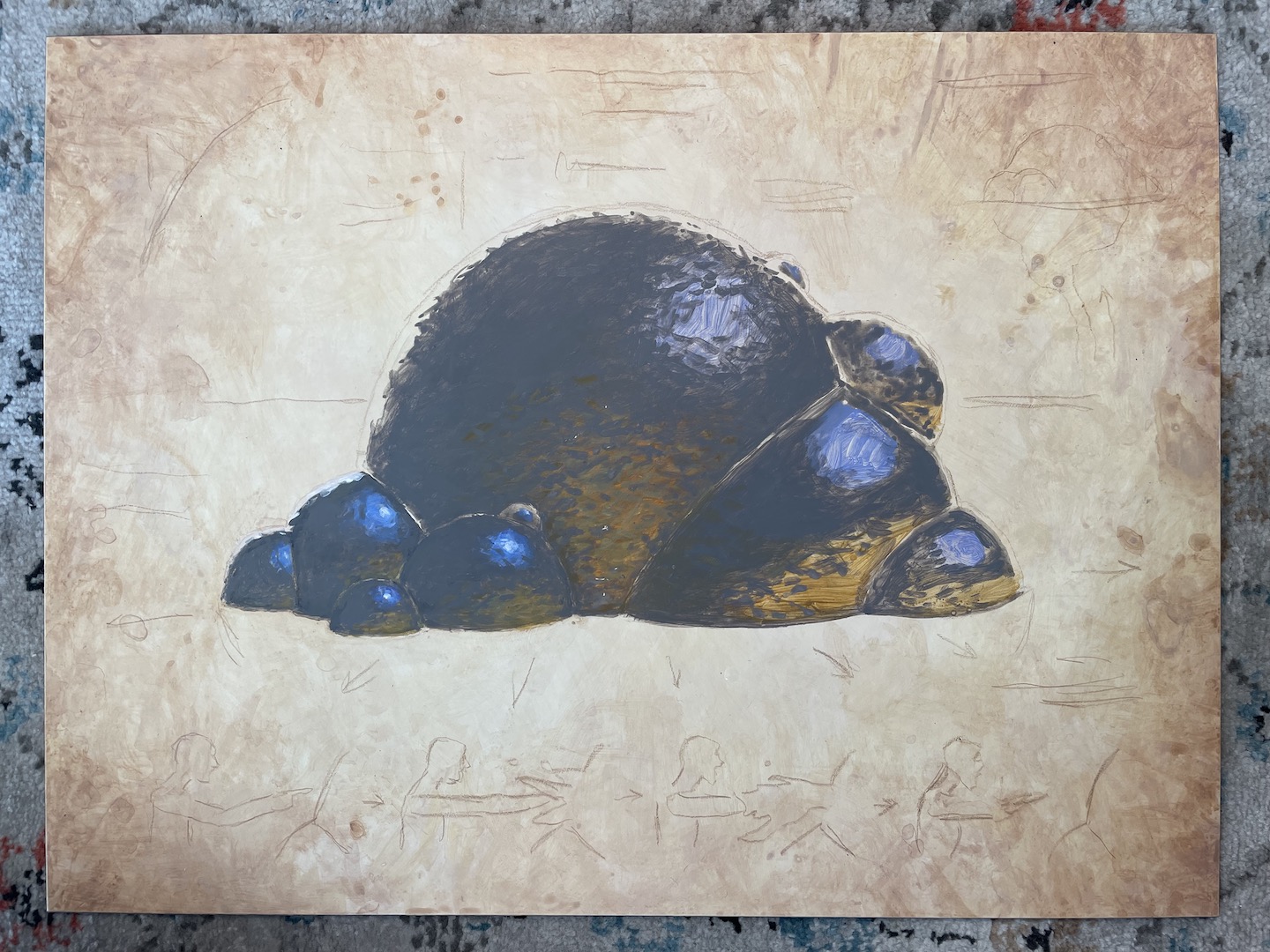 Here’s the piece after the drawing had been transferred (once again with watercolor pencil) and before I’d completed painting the blob of ichor itself.
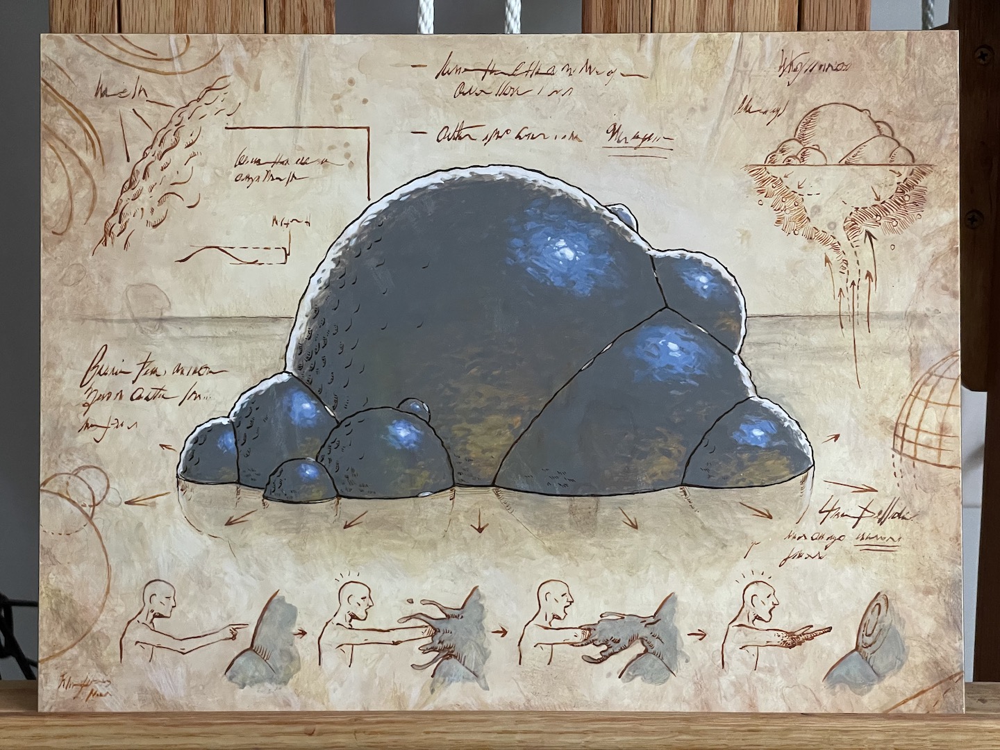 And here it is again, but shortly before I completed it. The story-telling at the bottom is probably my favorite thing about the piece and deciding how far to push it was a weird internal conversation to have. Still, I regret nothing.
Anyway, here’s the finished painting:
 Ichor Wellspring is acrylic and acrylic ink on clayboard and measures sixeen inches wide by twelve inches tall. It was also art directed by Sarah Wassell.
These two were fun. Seriously. They were a nice combination of interesting, challenging and fast. They also included another interesting quandary: with the written notes needing to be comprised of a non-familiar letterforms, it meant that my signature would be a bit obvious and undermine the illusion both pieces were attempting to create. So, I decided to find a way to sneak my name in on both pieces. If you look closely, my last name appears in the second row of text at the top right of Mox Amber, and identically, just to the right of the bottom of the blob in Ichor Wellspring. Not brilliant, but at least I got to keep the illusion (for what it’s worth) going.
Anyway, hopefully you got something out of this or at least enjoyed my ramblings. Until next time, be kind to yourselves and keep at it.


Great work on these!
Really glad I have all three versions (original, new and sketch in old border) of Mox Amber now. Very useful card with awesome art.