Hello again! I hope this year is meeting you with inspiration, my friends. I’m currently at work on some projects with NDA’s, so I grabbed a commission drawing to springboard a little process chat from. Maybe this will be a pleasant way to slide into your Monday morning.
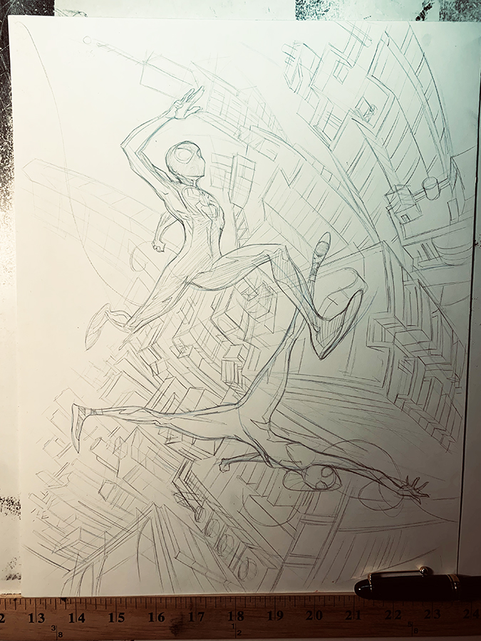
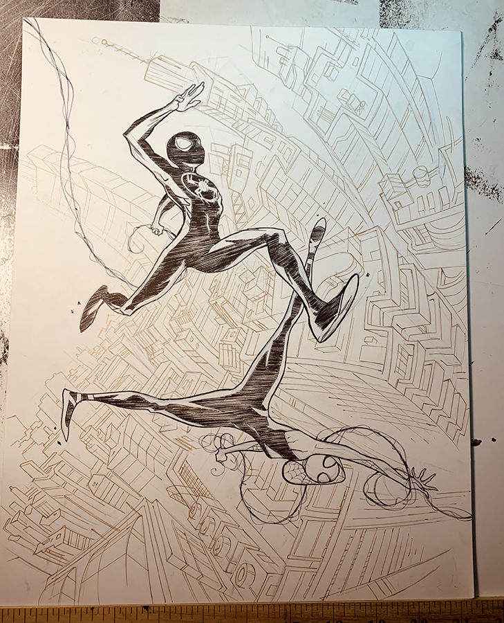
This request is Miles Morales Spiderman and Spider-Gwen. I work in comics, but I’m more of an indy comics guy- I’m no superhero anatomy virtuoso. These are fun characters, and a good opportunity to reengage my figure drawing muscles and test a few new pens. To get started, I made some small layouts in my trusty sketchbook. I’m not going for anything high concept here, just kinetic characters looking cool- that’s what most collectors want at the end of the day. I don’t always do a background with these, but this time I wanted to throw a faux-fisheye cityscape. Raise your hand if you like drawing vast rows of repeating architecture? Ha, that’s about what I thought! Why not try doing it with some character?
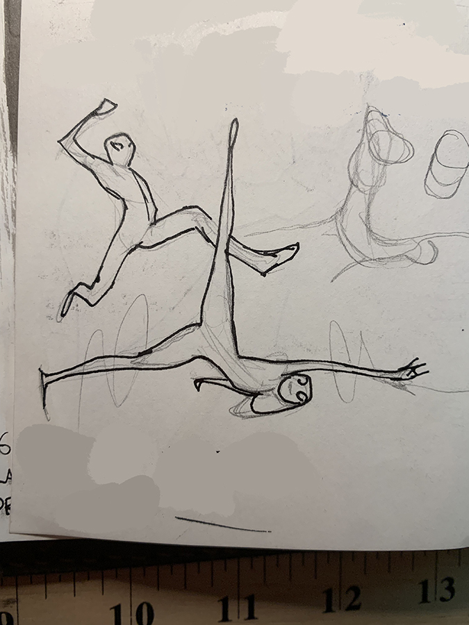
I did a lot of little poses, For some reason these clicked
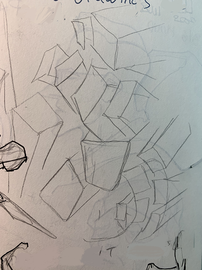
Perspective insanity. Also a ghost image of coffee shop portraits
I wanted to do this one with minimal tools, namely pen. Ingredients list:
- Mechanical pencil 2B
- Strathmore 400 bristol board, smooth
- Zebra felt-tip brush pen, the turquoise one
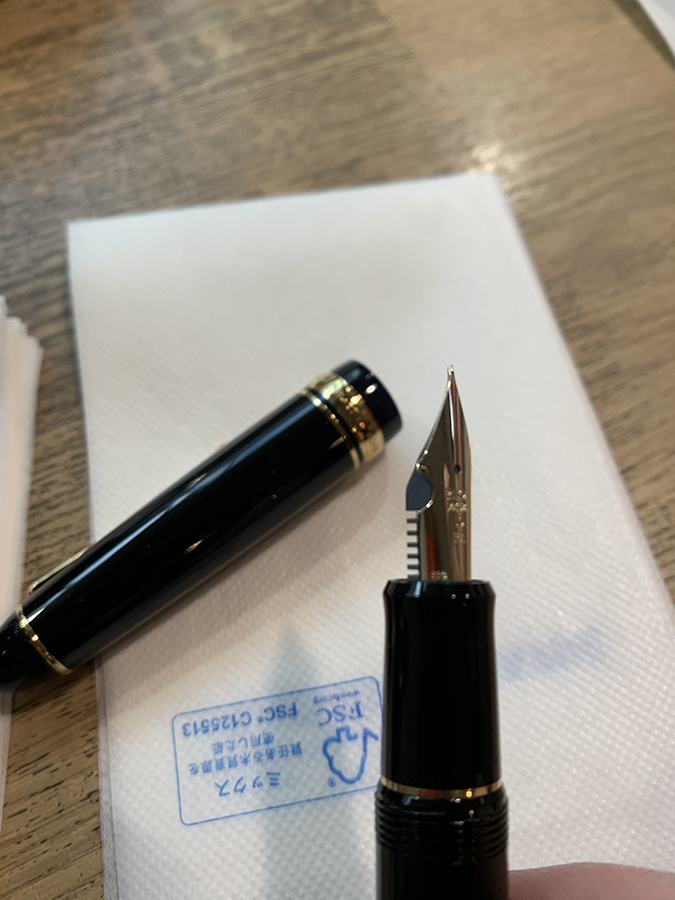
- Pilot fountain pen, Falcon Nib
- Sarasa gel pen, gold
- White Posca marker for corrections
- Matcha tea with grass fed butter whisked in, a la Tibet

I picked this up at an astonishing five-story art supply store in Tokyo
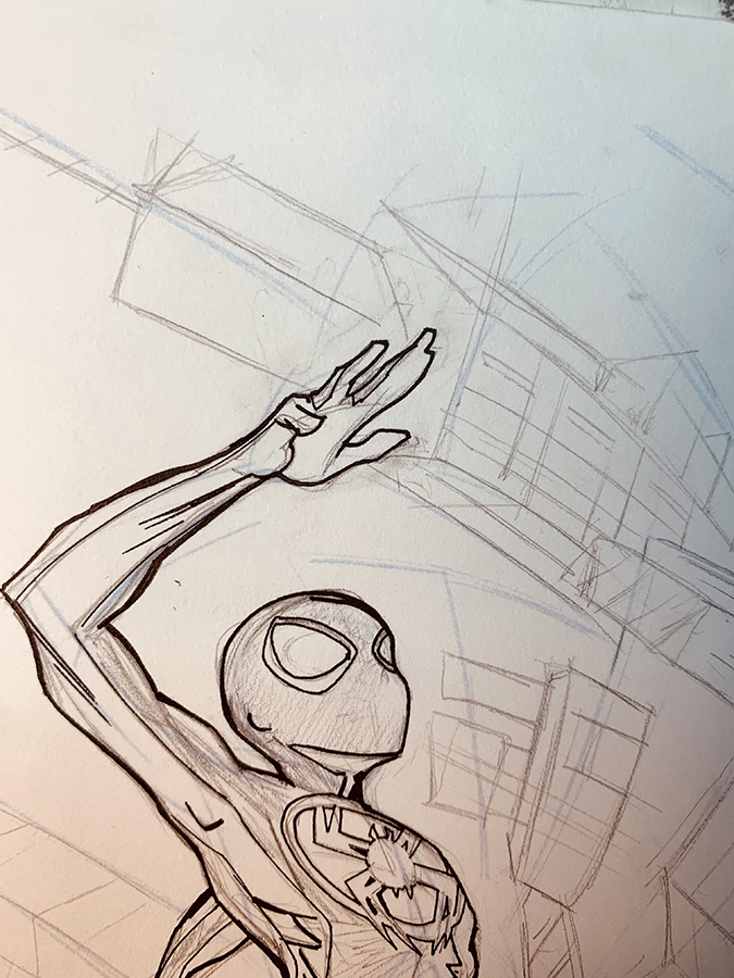
I penciled everything in with a soft pencil- it barely sits on the paper. I never want a hard pencil that digs in- those impressions will haunt you like a 10 year old tweet when its time for inking. Soft 2B pulls right off the surface for changes. Yeah it smudges, so watch out. No reference for the figures here, I just let the gods guide me on this one. I did look at some shots of Tokyo rooftops for building shapes.
I leave some problem solving for the inks
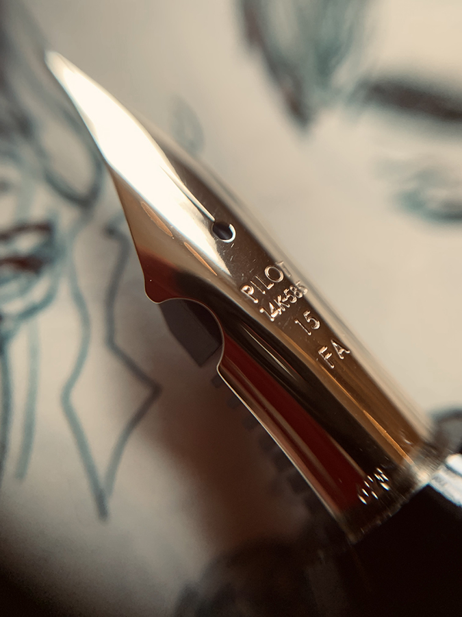
One more shot because pens can be beautiful
To ink this one, I reached for my Pilot pen. It’s got a wet, flexible nib. It’s a lot of fun to take for a drive, but sometimes you don’t know how it’s gonna do on any given paper. I decided to throw another board over a lightbox to see how the lines looked. This is an easy way to do a few passes on something without fouling your original drawing. Lightboxing is an old trick that I’ve forgotten about, but as I double down on physical media in response to that abhorrent technology that shan’t be named, I find it’s an indispensable tool and timesaver. Almost immediately, there were some “bad” lines starting out. A true Stoic, I kept going anyway, because of a two important facts: 1) lines don’t exist in isolation, it’s the picture that matters and 2) If you get a few bad lines down, you can the relax and get to the real work of forging the picture to the best of your ability. Fix it with white later. Everything is gonna be OK.

you can see the mild texture of the paper quite well here. I like that
Because these characters have minimal facial detail, I wanted to make sure that the hands had interesting, expressive silhouettes. I drew them slowly and deliberately, remembering to enjoy myself, and with gratitude that I have a cool job.
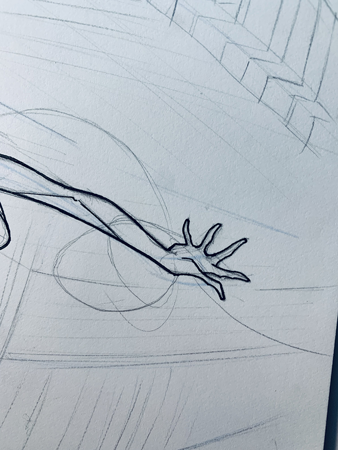
tapered fingers
welded digits
For the black areas, I wanted to continue to experiment with what my friend Nick Derington calls “crunchy blacks”. I love Bob Peak and Robert McGuinnis and that sixties scribbly black look. It’s inefficient, but filling in black areas with a brush isn’t very fun to me, so I find I enjoy this more, and it can add a little pep to a simple drawing. For that I used a Zebra pen, slightly dried up. I wish it was dryer. I save them after the point goes dull, and use them for tasks like this.
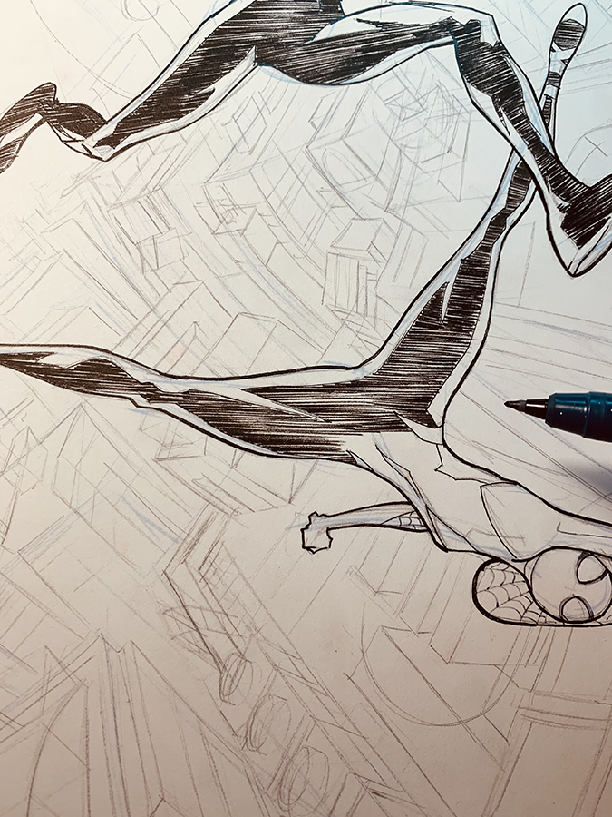
the directional lines reinforce the motion of the figure
With the figures done, I move on to the cityscape. I wanted this to read as a pattern more than anything. This part was drawn with a gold gel pen. It serves as a middle value, receding into the background. Sometimes the inferior qualities of an art tool become their own quality. Sometimes the gel ink will form little globules. Hopefully the fun and expressive way I chose to draw these buildings will negate any of the numerous imperfections and wabi-sabi will prevail.
I added some gray ink in the figures for accents and to add even more contrast, and then clean up a few errant marks. It’s done. I’m satisfied. This entry may lack some of the hyperbole an bombast from previous entries. Next time. I wanted to do something simple and take a minute to enjoy making the work. Try to remember, you can retreat into your art and discover satisfaction and tranquility in abundance.
almost done
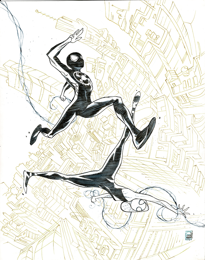
The gold doesn’t scan very well, but looks cool in person


Lovely piece Stephen!