Happy New Year to you, I hope that it has started off in some positive way for you. I intend to write articles delving more into ideation and finishing pieces, but for this first installment I have something that demonstrated in a recent workshop I taught, and I’d like to share with all of you. This concept or tool set is very useful for when you have found the perfect subject, but not the perfect reference and need to embellish what you’ve found to fit the composition or design you are developing.
I’m referring to T.O.D. or Time of Day painting, often called Day to Night design/painting in the entertainment biz, a tool that is used by the production painter, storyboard artist, and the environment designer for controlling the lighting, mood, and feeling of a shot or scene.
Because of the variability in lighting, in architecture or natural setting, the time of year, and with the weather conditions, we need a process that can handle all scenarios without too much stress. This process can be done in two big stages, values only then colorizing the values, or one stage which is going in and blocking out the colors at their correct value and with no influence of light and shadow.
Identify the local values of each object within your picture space, and block them in flatly with the value that best represents the local color(s). For study purposes or for doing a quick comp of the subject, start without line and definitely do not get caught up in plotting any perspective. This will add additional tasks to this color challenge we don’t need at the moment.
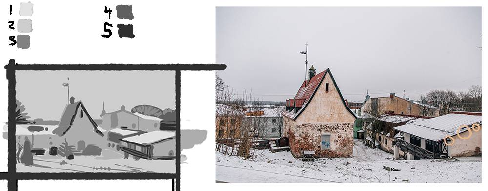
A solid composition is made up of 3-5 total local values across the canvas. By condensing the number of values in the overall picture space the composition is easier to read.
This posterized image is now the ideal template for any lighting scheme. With no shadows set in place, the light can be positioned anywhere, add as many as can be controlled, and shift the temperatures for the most ideal moment for the image.
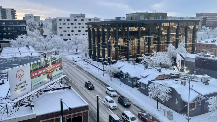
I recommend repainting the original inspirational image to work out the process. This particular example is the most ideal image I could find that embodies the no shadow effect. The scene is lit by the uniform sky that goes on and on, lighting these buildings from every direction uniformly. With the white ground bouncing that light back up from below, the ground shadows and occlusions are not as easy to spot and the walls of each building look the same from top to bottom with the exception of the eaves where we have ambient occluded spaces. These are the only real shadows visible in the space.

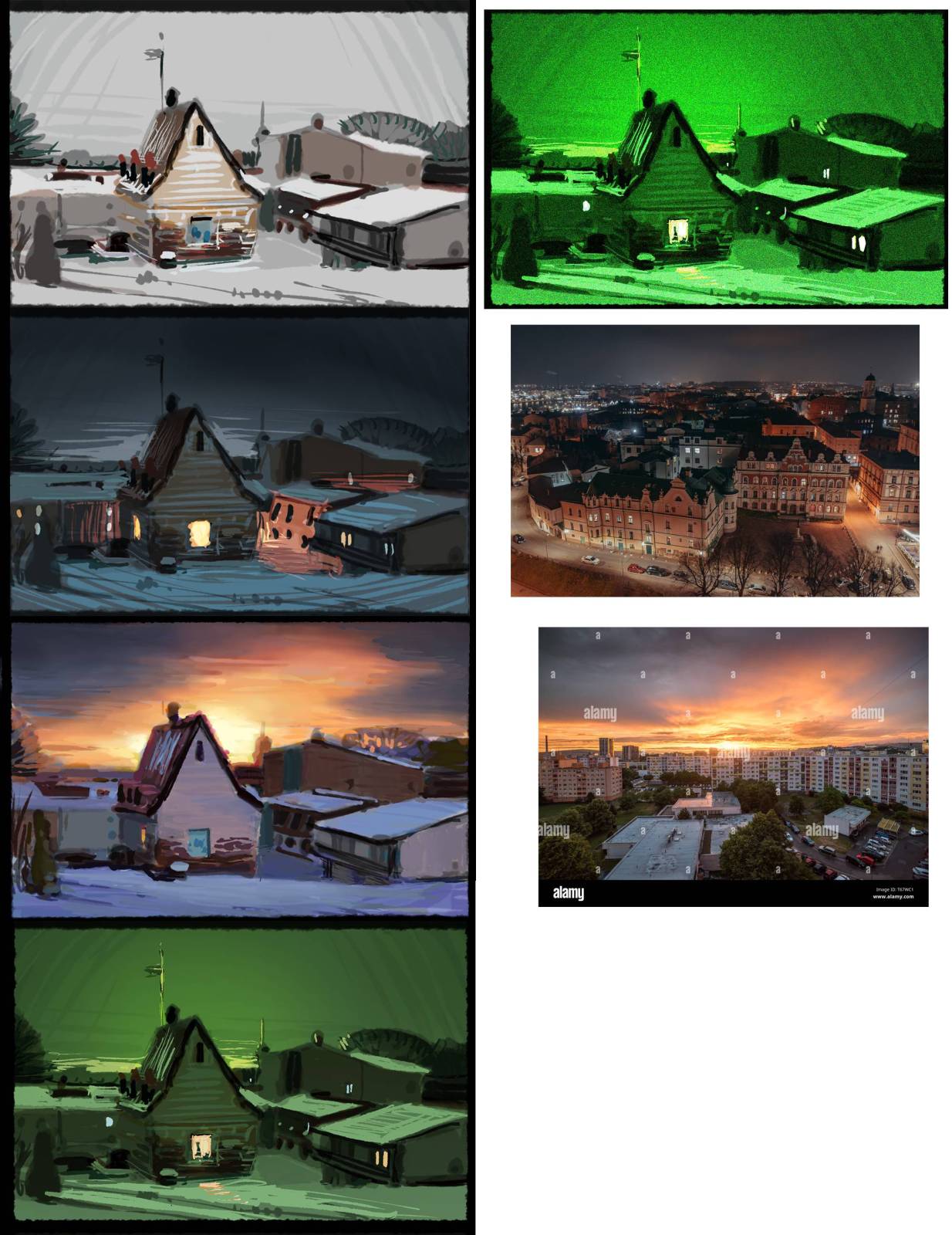
The values that have been found for all the objects in the picture remain the same lighter and darker values regardless of the lighting conditions. The first painting, the control is a learning tool to become familiar with the subject matter, its shape, form, local value/color, and the relational values between all the objects in the scene and their overall proportional color influence on the overall composition.
To change up the lighting conditions, start by relighting the focus form, relocating the shadow side to another side of the form. This is done by using a layer set to multiply for the blending mode. Multiply is the best blending mode for adding shadows to forms. Use the color of the indirect light as the gray in the shadow value for a more convincing looking shadow.

Once the shadows are in place, a new layer is added with the blending mode set to overlay. This is the best blending mode for generating lighting conditions on the objects. Pick the sunlight color best suited for the time of day you are attempting to establish. It will look way too colorful and washed out, and that is where the opacity slider for the layer comes in handy. I usually drop the opacity of the sunlight layer down to around 35 – 50 % opacity. This gives the sunlight, or the light side of the form a convincing appearance.

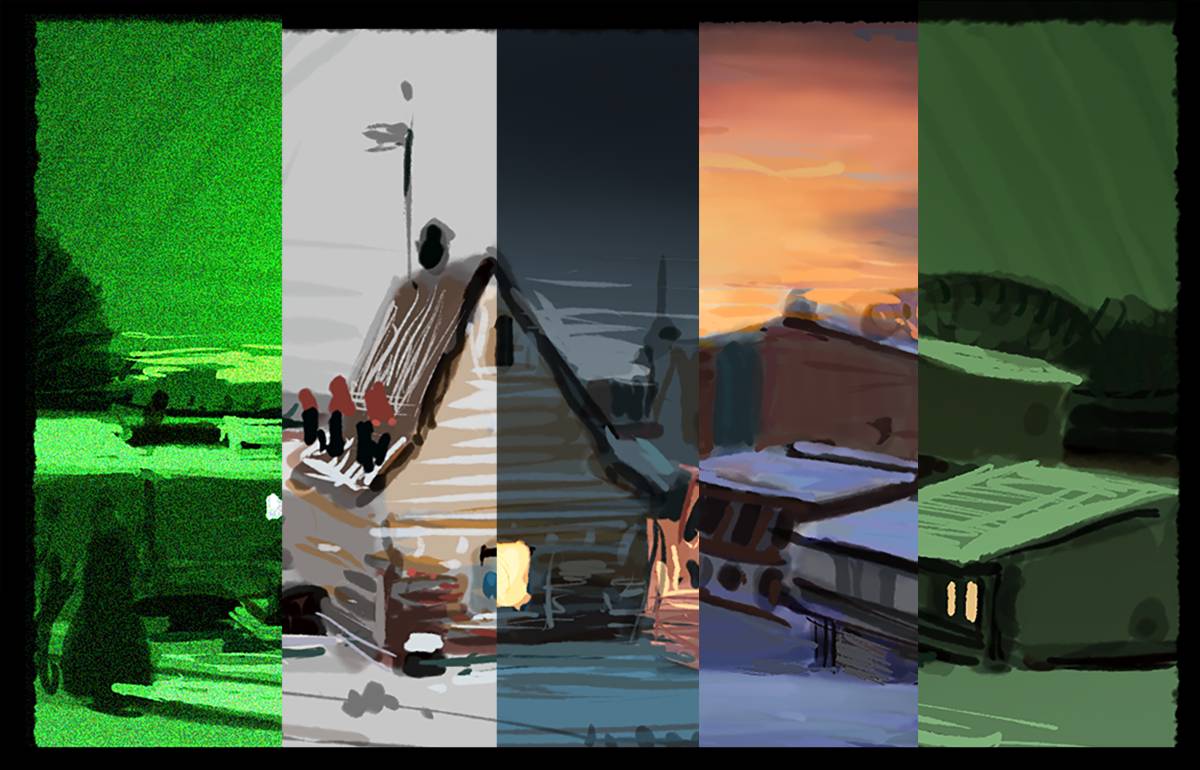
The two green examples were made up entirely, the first one was the green sky, and from that image I did the night scope color scheme. The other two images on this page were inspired from other images. The colors were arranged to support the building in the center as the primary focus. Again, with the initial local color sketch, I have a fantastic tool that will allow me to plan and play with lighting until I find what I am looking for.
Side Mission: A Quick Way to Block in a Posterized Image Without Drawing Lines and Using Perspective
Massing is a quick and dirty process of blocking out the picture in all of the objects local values without using line and without perspective. It is a very liberating way of drawing a picture quickly. Use an uncomfortably wide brush to block in the shapes. At first it will feel impossible, but with practice does become an enjoyable challenge to work out in as few flicks of the wrist as possible, or changing the stroke direction never lifting the brush from the surface to complete the shape.
Here is a process for placing the shape/values in the picture grid without using perspective to start the picture. This is called massing. Massing is drawing big shapes filled entirely all at once. For some, this is easier to do than line drawing, and judging its proportions is a much easier task because of it being filled in graphically.
For a building that has many angles to its silhouette an example being the perspective of the top and bottom receding edges of the side, front, or whatever other sides we are viewing, start with a rectangle that fills in the entire space of where the building will be located. Then using the background, or neighboring values, cut back into the square to generate the angles. Do a close side by side comparison to see how accurate you painted them. You can see this as an example in steps A and B below.
Do this same thing with each of the other big picture values, each done on a separate layer so the other shapes you have designed remain unaffected by the other new shapes that are added and adjusted.
When each item is finished it should represent all the sides and big value changes that fit within its occupied space, but there will be no changes in value from one side to another within the form. We will add these changes that help build out the forms when we add the shadow layer and the primary light layer in the next few steps using whatever light source or sources you intend to add to the image.
A. Sky and Focal Point Values Established
B. Blocking in All the Facades, they share a similar Value so they become one large complex shape.
C. Roof Values
D. Values 3 – 5 are included in the darker smaller shapes in this image

Here are three examples of the rooftops being lighter than the sky, images to support the answer to the first question in the chat below.


Nitty gritty question for you: In your example of massing in, you have the roof value lighter than the sky. It looks great but I’m wondering why that is, since normally even an overcast sky is going to be providing more light than anything else in an image (I think?), particularly if there’s no secondary light source.
I’m not saying you’re wrong, I’m saying you’re right and I don’t understand why. Does the snow reflect that much more light?
This is a great tutorial on technique and I expect to make heavy use of it. Thanks!
Hello Halloran, thank you for the kind words, and thank you as well for great question.
I have provided two links to what I am doing with the roof tops. The conditions I painted here are all similar, with the sky mostly filled with atmospheric cloud cover. If these clouds are dense at all, they will be darker, but will still filter light. Light objects will receive that light and brighten up as a result of that light. For much of the day, the blue sky will appear darker, and the filtered sky filled with clouds will be darker than light things closer to our eyes. I am reflecting upon that concept in the images I painted out.
I have also assigned the lighter values closer to the focal point and highlighting the subject of the piece or giving it more focal attention than the sky/atmosphere.
Thank you again for writing and I hope you have great success utilizing the tools.
Hmmm, links did not post so I will post them into the article at the end of the article.
Thanks very much for that explanation and the extra images. This helps!
CricketID247.com is the ultimate destination for anyone looking for a trusted online cricket ID. They provide the best online cricket ID with a seamless and secure registration process. Whether you need cricket online ID for live matches or a reliable online cricket ID provider for betting, CricketID247.com has you covered. Their platform is ideal for obtaining a cricket bookie ID or an online book cricket ID, ensuring you have access to the most reliable betting options. For a smooth and hassle-free experience with a cricket ID online, CricketID247.com is the go-to choice for beginners and experts alike. Don’t miss out on getting your online cricket satta ID today from a provider you can trust