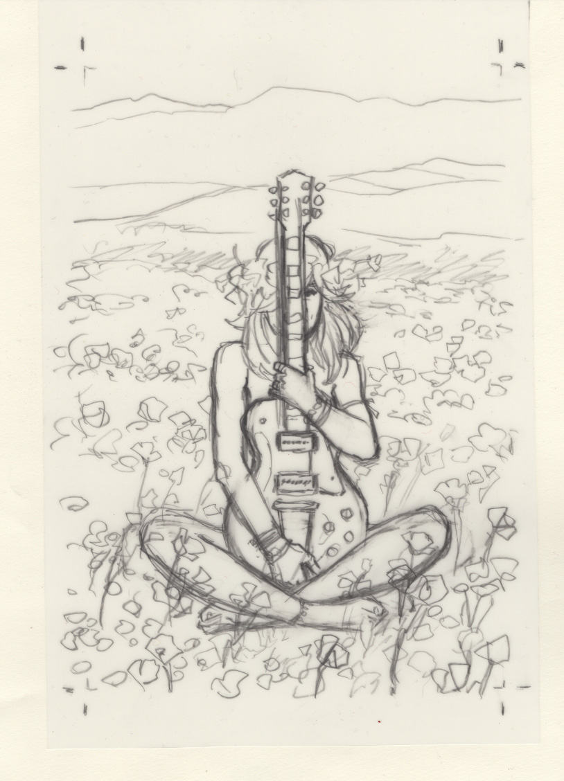
I’ve been doing a lot of experimentation with watercolor and combining it with other materials, after finding that I love the wildness and difficulty watercolor brings. It’s invigorating working in a medium that hits a point at which trying to finesse it will spoil the beauty. But sometimes I want a little more control over details.
I used resist crayon in the background of my previous cover for a Cut Flowers chapter.
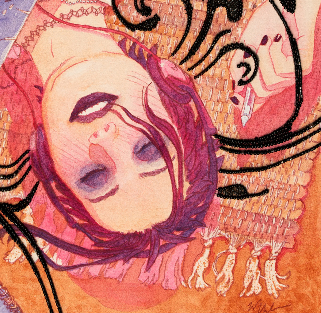
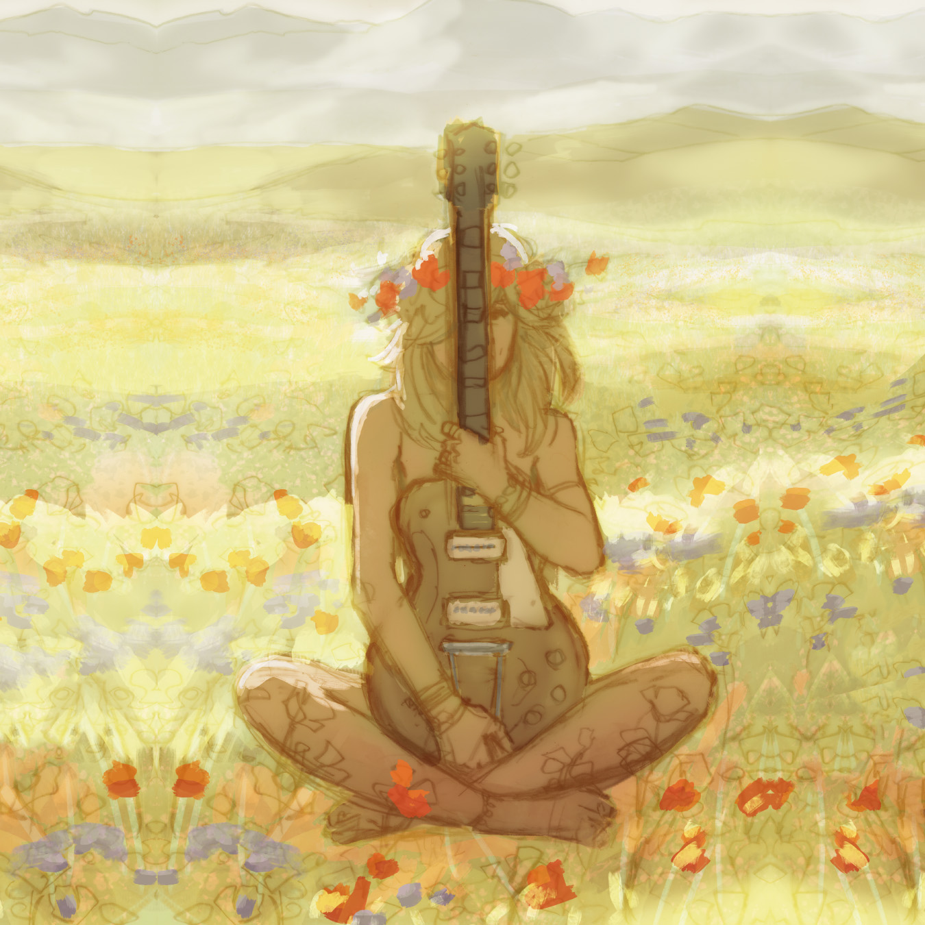
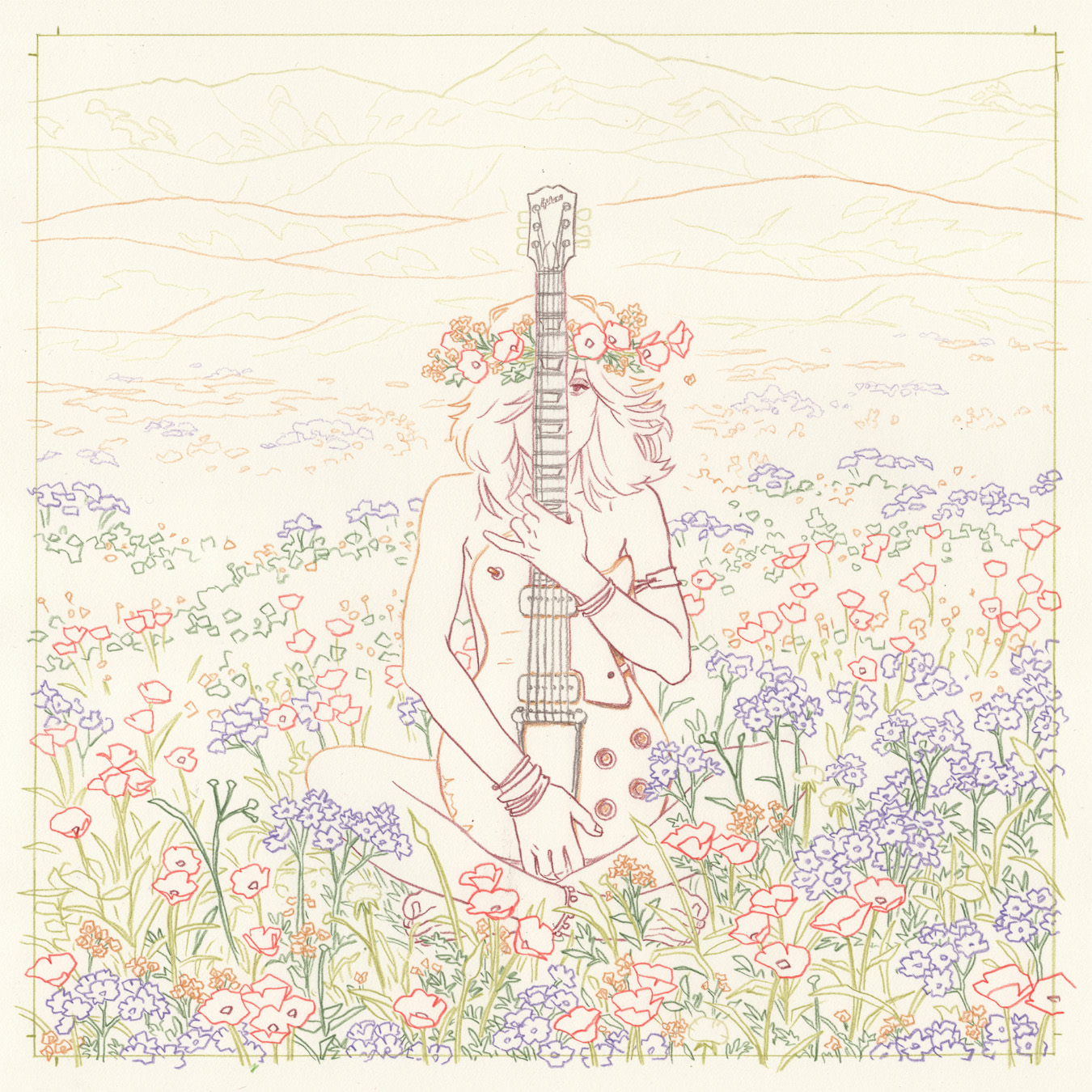
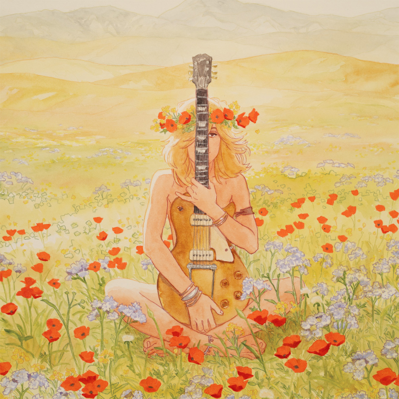
Now that Chapter 3 is underway and I knew the cover would prominently feature a particular album cover from the story, I wanted to paint the album cover in question ahead of doing the final composition. And I felt that a similar resist effect would be amazing done in color instead of clear wax. I wanted the flowers to have a lot of vibrant pop and sharp edges, which can be done in watercolor but they’d need to be painted last, and I still wanted to be able to adjust the yellow/greens around them without risking the red contaminating the other colors.
First I tried Crayola crayons, and they worked brilliantly, but after a little investigation I learned they’re not light-fast. So I spent a little time looking for a professional-artist-grade crayon, finding various versions of pastels or colored pencils which were either A) not thick enough to resist the watercolor very well (Prismacolor colored pencil – it resists a little but it takes a lot of pressure to apply in the amount that resists, and even then it’s weak) or B) were designed to be water soluble, not water resisting.
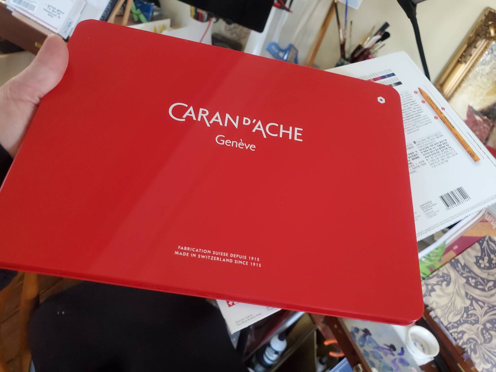
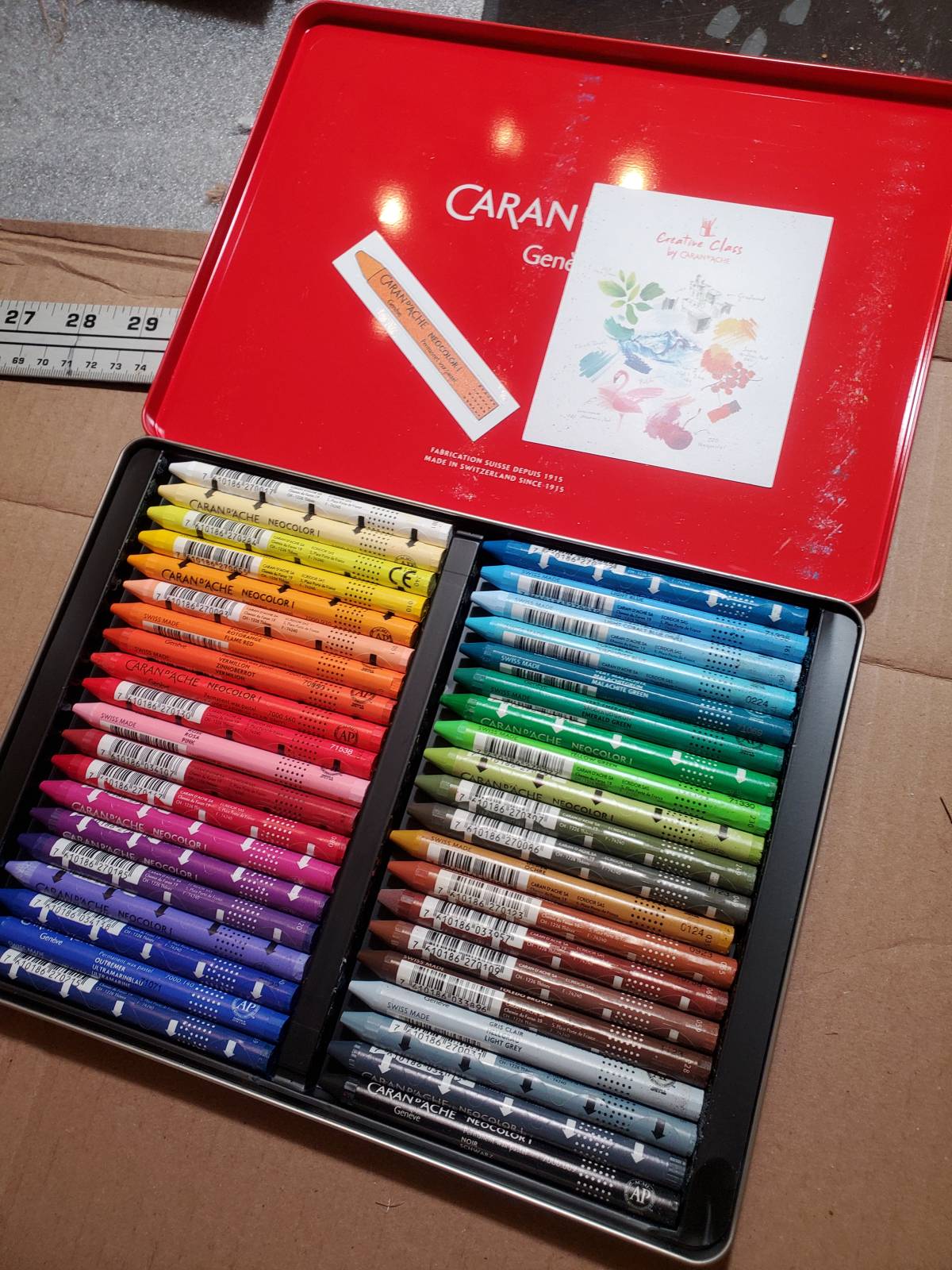
Finally I alighted on Caran d’Ache Neocolor I wax pastel. These are exactly like fancier Crayolas – they’re powerfully pigmented, a bit more brittle but still creamier than a colored pencil, and they resist water! I bought a few individual crayons of the colors I thought I’d need. I did a test patch on a small Prisma pencil line drawing of some flowers, and ended up using a color called Flame Red for most of the poppies (it looks a lot more like an orange than a red, but in the color comp I worked up digitally I knew orange might end up being the answer). The other colors tested were Periwinkle Blue, White, and Lemon Yellow.
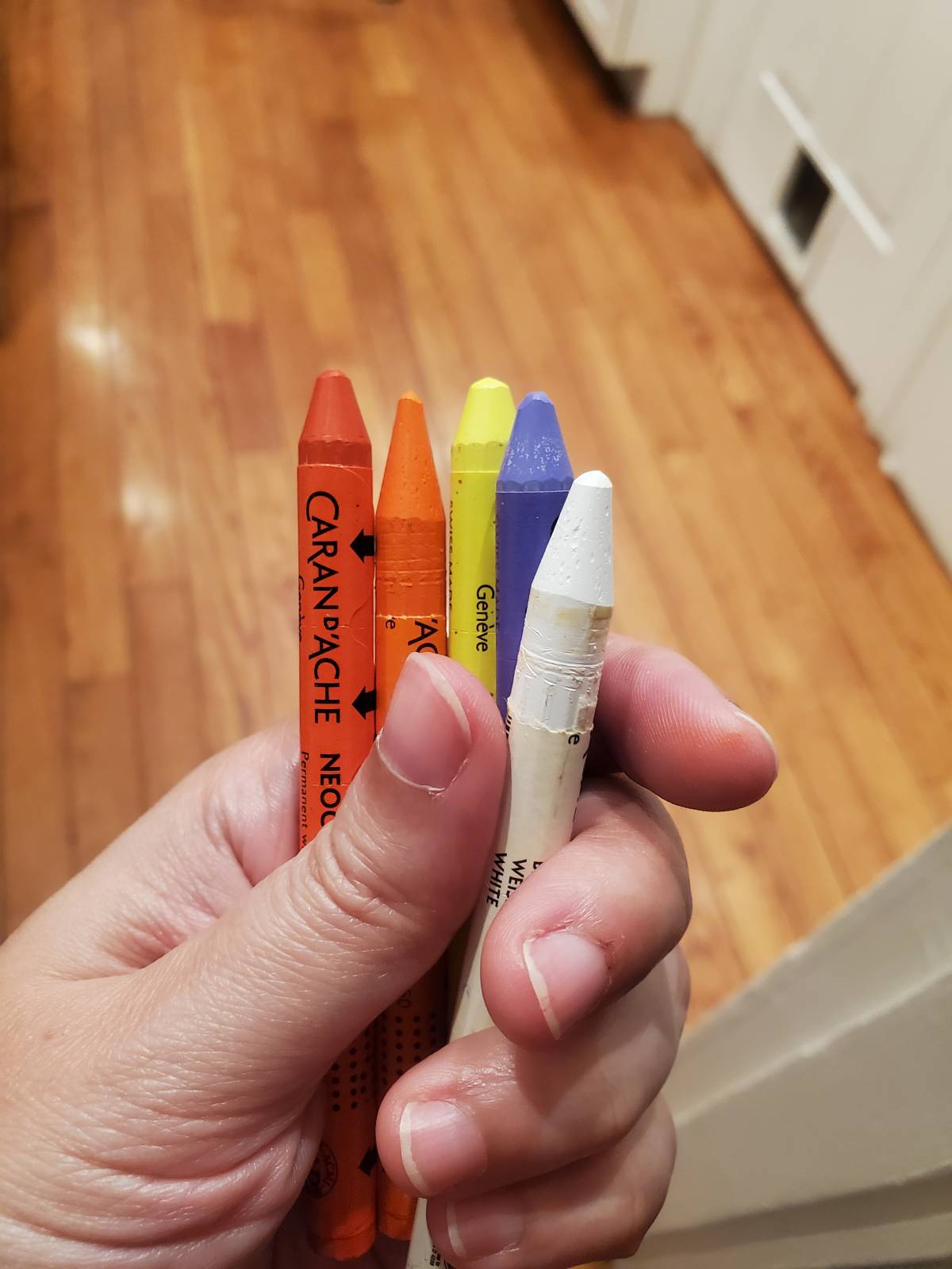
They can be sharpened, as you can see I’ve done to two of them here.
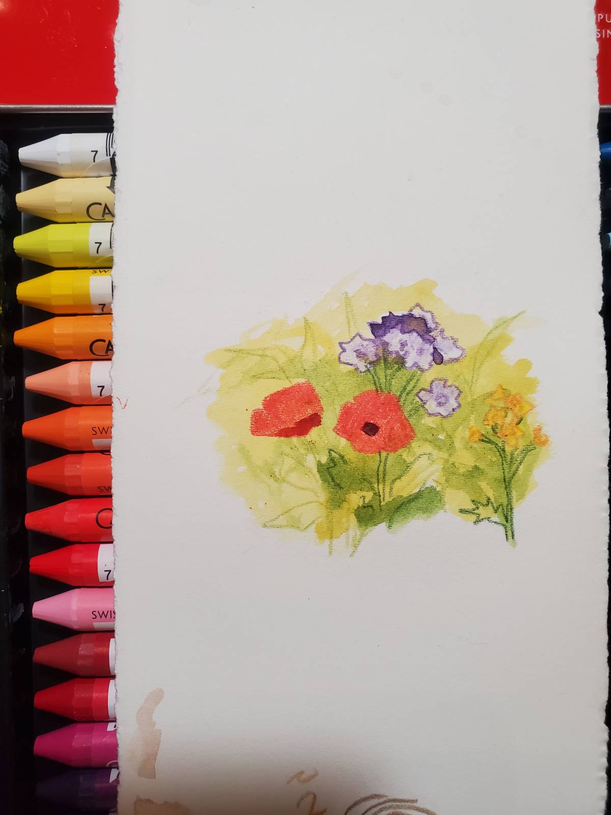
In the test, the flowers were colored with wax pastel first, them a wash of watercolor over them. The wax did its job and resisted the watercolor!
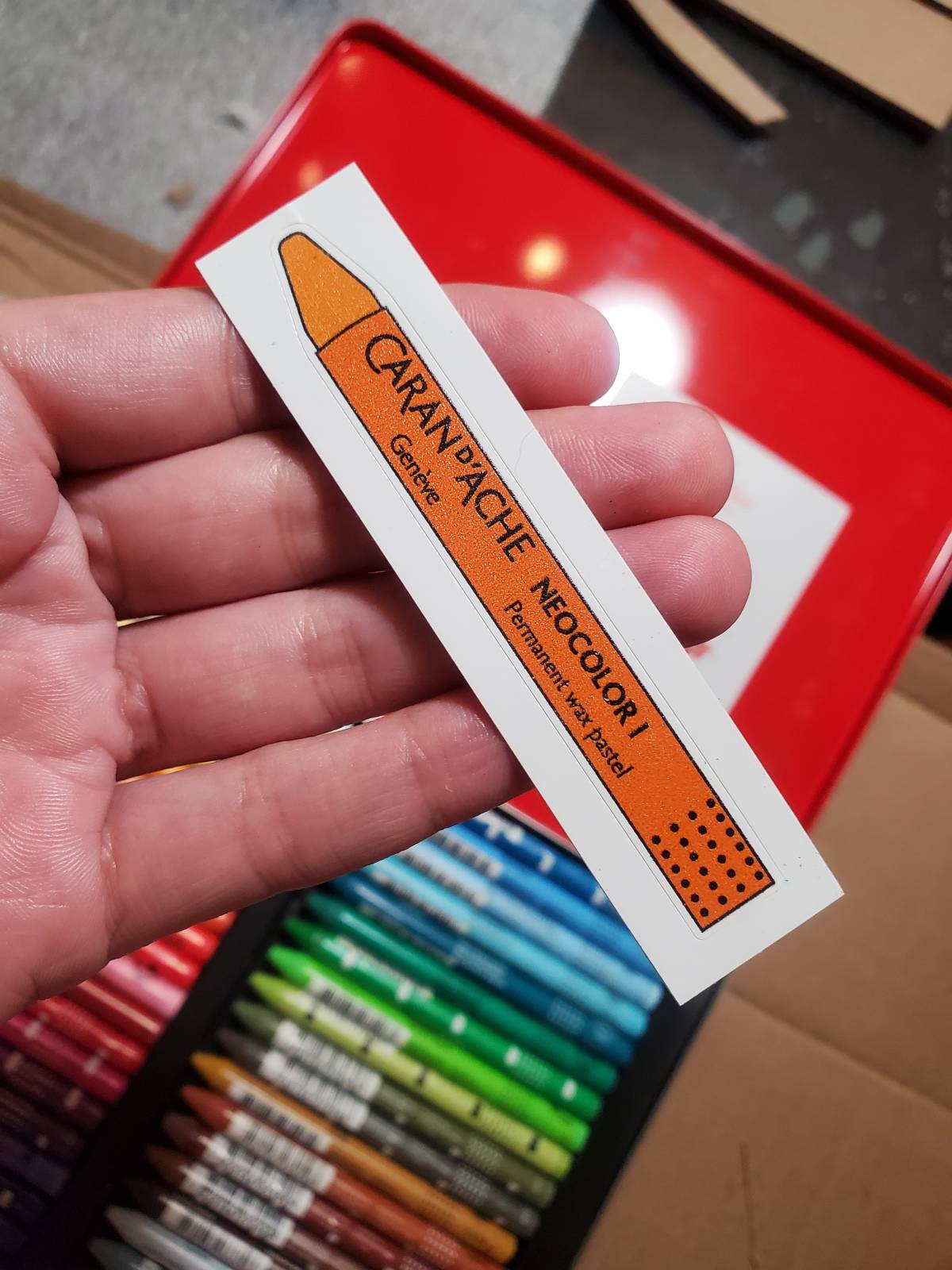
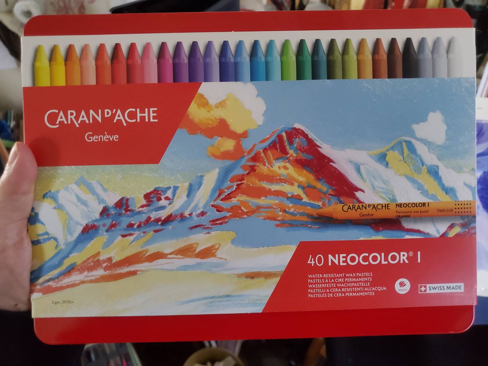
I liked them so much I ended up ordering the full set, and charmingly it came with a sticker of a wax pastel in it, in exactly the color I used for all the poppies – Flame Red (which looks orange to me). Destiny? A coincidence? Or do they all come with the same color sticker?
Here’s how the album cover painting came out. I imagine this band sounds like hard psychedelic rock.
Come and see the original at IX! Chapter 3 is still months away, I’m afraid (one has to take a break and make money in this life) but it is in progress. Chapters 1 and 2 are available in print and online here!
ᴄᴀꜱʜ ᴇᴀʀɴɪɴɢ ᴊᴏʙ ᴛᴏ ᴇᴀʀɴꜱ ᴍᴏʀᴇ ᴛʜᴀɴ $700 ᴘᴇʀ ᴅᴀʏ. ɢᴇᴛᴛɪɴɢ ᴘᴀɪᴅ ᴡᴇᴇᴋʟʏ ᴍᴏʀᴇ ᴛʜᴀɴ $3500 ᴏʀ ᴍᴏʀᴇ ꜱɪᴍᴘʟʏ ᴅᴏɪɴɢ ᴇᴀꜱʏ ᴡᴏʀᴋ ᴏɴʟɪɴᴇ. ɴᴏ ꜱᴘᴇᴄɪᴀʟ ꜱᴋɪʟʟꜱ ʀᴇQᴜɪʀᴇᴅ ꜰᴏʀ ᴛʜɪꜱ ᴊᴏʙ ᴀɴᴅ ʀᴇɢᴜʟᴀʀ ᴇᴀʀɴɪɴɢ ꜰʀᴏᴍ ᴛʜɪꜱ ᴀʀᴇ ᴊᴜꜱᴛ ᴀᴡᴇꜱᴏᴍᴇ. ᴀʟʟ ʏᴏᴜ ɴᴇᴇᴅ ɪꜱ 2 ʜʀꜱ ᴀ ᴅᴀʏ ꜰᴏʀ ᴛʜɪꜱ ᴊᴏʙ ᴀɴᴅ ᴇᴀʀɴɪɴɢ ᴀʀᴇ ᴀᴡᴇꜱᴏᴍᴇ. ᴇᴠᴇʀʏ ᴘᴇʀꜱᴏɴ ᴄᴀɴ ɢᴇᴛ ᴛʜɪꜱ ʙʏ ꜰᴏʟʟᴏᴡ ᴅᴇᴛᴀɪʟꜱ ʜᴇʀᴇ…
.
ᴍᴏʀᴇ ᴅᴇᴛᴀɪʟꜱ ꜰᴏʀ ᴜꜱ —————————➤ Cash43.Com
ᴄᴀꜱʜ ᴇᴀʀɴɪɴɢ ᴊᴏʙ ᴛᴏ ᴇᴀʀɴꜱ ᴍᴏʀᴇ ᴛʜᴀɴ $700 ᴘᴇʀ ᴅᴀʏ. ɢᴇᴛᴛɪɴɢ ᴘᴀɪᴅ ᴡᴇᴇᴋʟʏ ᴍᴏʀᴇ ᴛʜᴀɴ $3500 ᴏʀ ᴍᴏʀᴇ ꜱɪᴍᴘʟʏ ᴅᴏɪɴɢ ᴇᴀꜱʏ ᴡᴏʀᴋ ᴏɴʟɪɴᴇ. ɴᴏ ꜱᴘᴇᴄɪᴀʟ ꜱᴋɪʟʟꜱ ʀᴇQᴜɪʀᴇᴅ ꜰᴏʀ ᴛʜɪꜱ ᴊᴏʙ ᴀɴᴅ ʀᴇɢᴜʟᴀʀ ᴇᴀʀɴɪɴɢ ꜰʀᴏᴍ ᴛʜɪꜱ ᴀʀᴇ ᴊᴜꜱᴛ ᴀᴡᴇꜱᴏᴍᴇ. ᴀʟʟ ʏᴏᴜ ɴᴇᴇᴅ ɪꜱ 2 ʜʀꜱ ᴀ ᴅᴀʏ ꜰᴏʀ ᴛʜɪꜱ ᴊᴏʙ ᴀɴᴅ ᴇᴀʀɴɪɴɢ ᴀʀᴇ ᴀᴡᴇꜱᴏᴍᴇ. ᴇᴠᴇʀʏ ᴘᴇʀꜱᴏɴ ᴄᴀɴ ɢᴇᴛ ᴛʜɪꜱ ʙʏ ꜰᴏʟʟᴏᴡ ᴅᴇᴛᴀɪʟꜱ ʜᴇʀᴇ…
.
ᴍᴏʀᴇ ᴅᴇᴛᴀɪʟꜱ ꜰᴏʀ ᴜꜱ —————————➤ Salary7.Zone
ʜᴏᴍᴇ ᴄᴀꜱʜ ᴇᴀʀɴɪɴɢ ᴊᴏʙ ᴛᴏ ᴇᴀʀɴꜱ ᴍᴏʀᴇ ᴛʜᴀɴ $500 ᴘᴇʀ ᴅᴀʏ. ɢᴇᴛᴛɪɴɢ ᴘᴀɪᴅ ᴡᴇᴇᴋʟʏ ᴍᴏʀᴇ ᴛʜᴀɴ $4.5ᴋ ᴏʀ ᴍᴏʀᴇ ꜱɪᴍᴘʟʏ ᴅᴏɪɴɢ ᴇᴀꜱʏ ᴡᴏʀᴋ ᴏɴʟɪɴᴇ. ɴᴏ ꜱᴘᴇᴄɪᴀʟ ꜱᴋɪʟʟꜱ ʀᴇQᴜɪʀᴇᴅ ꜰᴏʀ ᴛʜɪꜱ ᴊᴏʙ ᴀɴᴅ ʀᴇɢᴜʟᴀʀ ᴇᴀʀɴɪɴɢ ꜰʀᴏᴍ ᴛʜɪꜱ ᴀʀᴇ ᴊᴜꜱᴛ ᴀᴡᴇꜱᴏᴍᴇ. ᴀʟʟ ʏᴏᴜ ɴᴇᴇᴅ ɪꜱ 2 ʜʀꜱ ᴀ ᴅᴀʏ ꜰᴏʀ ᴛʜɪꜱ ᴊᴏʙ ᴀɴᴅ ᴇᴀʀɴɪɴɢ ᴀʀᴇ ᴀᴡᴇꜱᴏᴍᴇ. ᴇᴠᴇʀʏ ᴘᴇʀꜱᴏɴ ᴄᴀɴ ɢᴇᴛ ᴛʜɪꜱ ʙʏ ꜰᴏʟʟᴏᴡ ᴅᴇᴛᴀɪʟꜱ ʜᴇʀᴇ.
ᴍᴏʀᴇ ᴅᴇᴛᴀɪʟꜱ ꜰᴏʀ ᴜꜱ ————————- Payathome9.Com
My last salary was $8750, ecom only worked 12 hours a week. My longtime neighbor yr estimated $15,000 and works about 20 hours for seven days. I can’t believe how blunt he was when I looked up his information…𝙗𝙞𝙜.𝙧𝙞𝙘𝙝𝙟𝙤𝙗2.𝘾𝙤𝙢