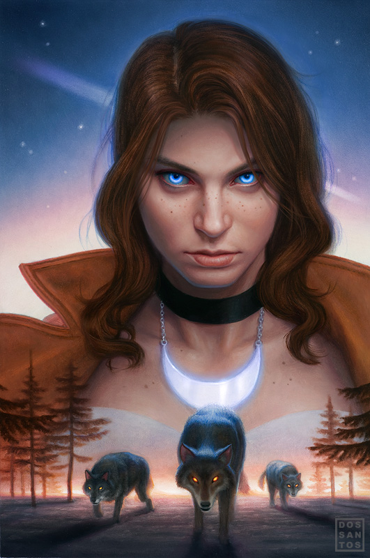
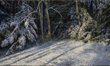
Here is a piece of mine that just went public not too long ago. This painting is for the cover of the graphic novel adaptation of ‘Alpha & Omega’, by Patricia Briggs.
I wanted to share this piece with you because it is a really good example of why value and saturation control is so important.
I often get asked how I get my colors so bright. Well, I’m going to show you how.
Most of you probably understand the concepts of contrast when it comes to value and complementary colors. For instance, if you want something white to stand out, surround it by black. Likewise, if you want something blue to stand out, surround it by orange. But there are many other means of contrast, and in this case, saturation is doing the heavy lifting.
I knew I wanted to have glowing blue eyes in the image, in fact, the entire concept revolved around it.
But I also wanted to have a blue tint to the background. This means I couldn’t rely on a complementary color to make them pop. So instead, I had to do it with value and saturation.
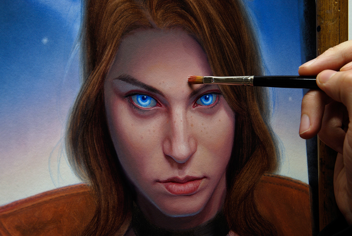
By placing the darkest values right in the pupils of the eye, I made the whites appear much whiter than they really are. Even at the drawing phase, the whites of the eyes already appear whiter than the board they are drawn on. This is obviously impossible (and in fact they are actually a little bit darker than the board), but our eyes perceive it otherwise. Go ahead, zoom in on the image above. You would swear the eyes are whiter than the rest of the image, but they are not.
As I painted the image, I took special care to make sure every single color I mixed was just a little darker, and a little grayer than I would normally paint. The duller I made things, the more the eyes stood out.
So how I get my colors so bright?
The secret is… I don’t.
If you want something to look bright, you just need surround it by really dull stuff.
(I’m sure there is a politic joke in there somewhere)


Beautiful piece and awesome post! Relativity is probably the most important facet of color theory.
As a digital artist that's just starting to break in to oils, this is a great reminder of how important that control and overall planning is. Can't wait to try painting some glows!
Wow… Beatiful painting, man.
And advice, i'm struggling a lot with color yet, but the tip gave some enlightenment.
Thanks and great piece, Dan!
Leo
Another great piece Dan! Correct me if I'm wrong, but the surrounding 'warm' colours are also helping the 'coolness' of the eyes appear more brilliant?…much the same way it makes her necklace shimmer.
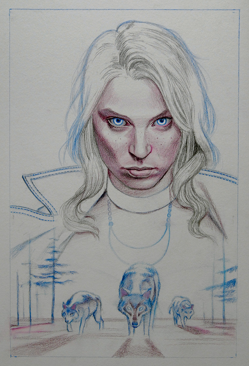
Dan, I don't think I've seen you use coloured pencil(?) before in your drawing stage..is this a new technique that your trying out? and is there a purpose for it?
Cheers,
Rick.
Hey Rick,
Yes, it's something new I've been trying out. I tend to work pretty thin, and the pencil usually shows through in the final painting. Regular graphite always gives an unfinished look when seen through the paint. Whereas colored pencil blends right in, and is far less noticeable.
And you're spot on about the warmth of the face. I thought about that after I posted.
Such a simple concept, for such a noticeable effect. Thanks for sharing. Can't wait to try this out!
Just wanted to say I love this article. Very insightful. Thank you for posting.
G'day Dan,
Well, I'm glad that I mentioned about the cool eyes warm face then 😀
That's an interesting idea about the coloured pencil, can't say I've heard of that one before.
I see where you've incorporated the coloured pencil in the lighter areas of the hair, the wolf's back and the necklace, I can see your thought process there.
I also find it interesting how you used the red pencil for the shading on her face and in the shadow of the wolves ears.
If I was a betting man, I'd say you were using water colour pencils. Am I right?
Oh yeah, I love the freckles!
Cheers,
Rick.
A great insight, Dan – it put me in mind of something directly related that I read in Loomis' “Creative Illustration” just the other day: to increase the perceived brilliance of colours by putting the more intense saturations along the transitions from light to dark, leaving the lighter areas and shadows more washed towards their natural grays. It lets one hold back the values and yet still create the impression of rich colours. Looking at the painting, I can see that you seem to make strong use of this technique throughout the picture.
Plenty to think about here…the colored pencil tip is a great one, too – thanks!
Another great piece Dan. That tromp l'oeil thing with the brush and had on the bottom piece, while well done, is a bit cheesy though don't you think?
Great post Dan, thanks for the insight.