
The brain wants to organize the chaos of the world. It wants to clean up clutter by reducing things to flat pattern, especially in two dimensional paintings. Repeating pattern can be interesting, and this is fine for certain types of graphics such as wallpaper, floor tile, fabric designs.
But to gain a sense of depth to an image, elements need to be returned to their chaotic state to reflect their source in reality. Randomness needs to be reapplied.
The term ‘crumping’ came from a lecture of mine at the IMC where I inadvertently misspelled the word ‘clump.’ It sounded awkward and funny, but turned out to be an easy way for the attendees to remember this very important aspect when composing.
When we turn difficult learning into fun experiences, we learn to remember much more easily, like learning complicated lists by singing them. Like kids do with the alphabet song.
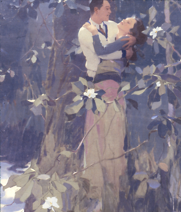
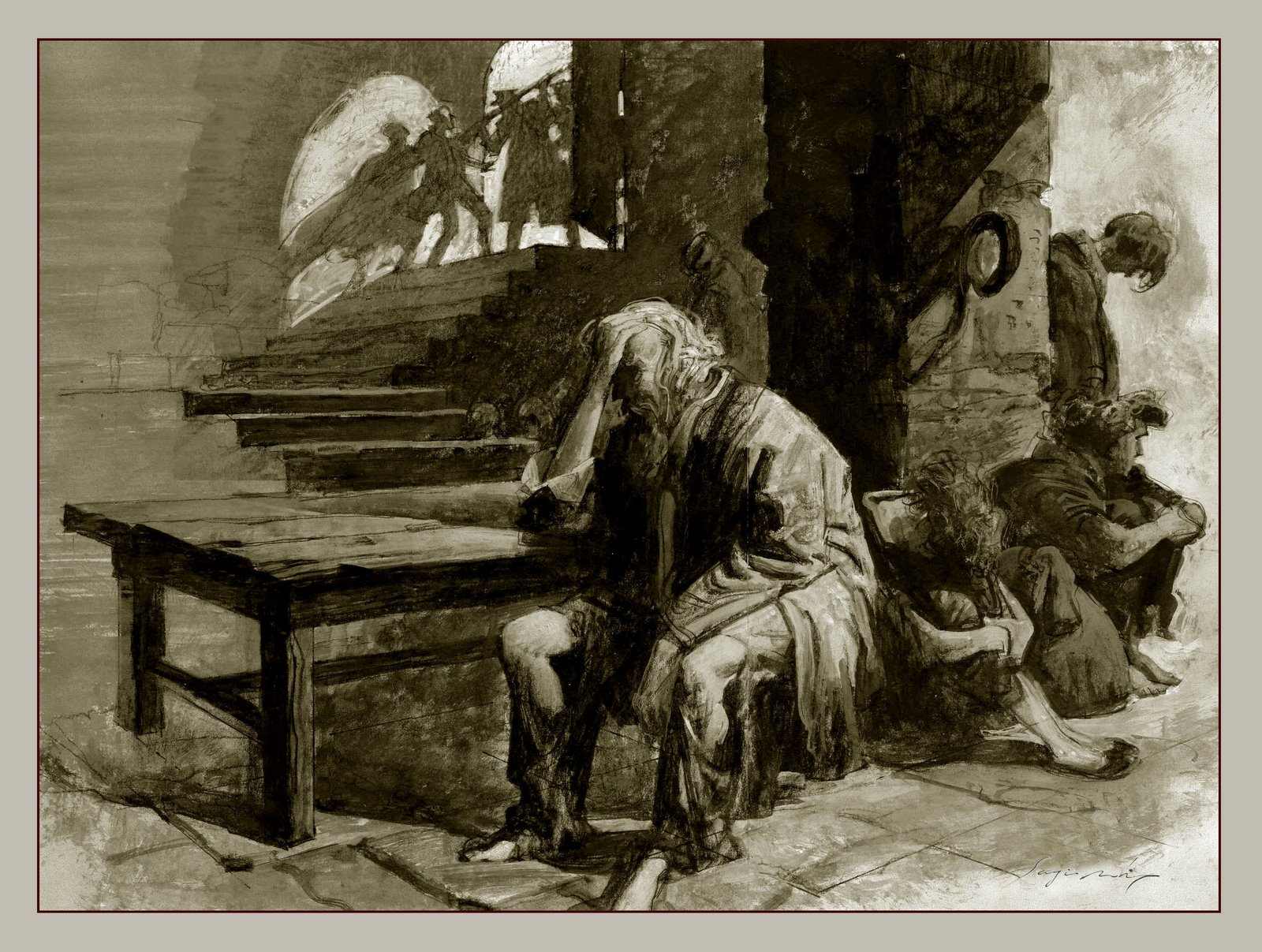
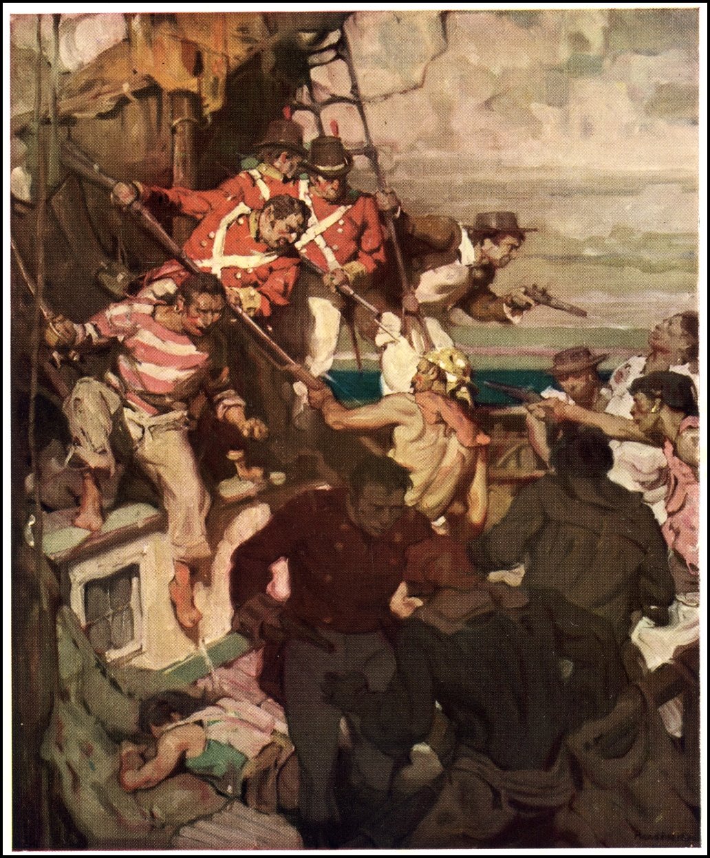
The idea behind this is to clump forms together to make a pattern that reads rhythmically. Alternate repeating forms so that they push and pull the viewer, driving them in and out to create an easy path for the eye to follow.
When you get to a tough spot while composing figures, landscapes—almost anything repetitive—and you need the composition to get stronger, more interesting, then think of crumping elements together.
1. Break up patterns.
The brain wants to arrange chaos, and it’s easy to allow it to happen when we paint. Look for similar patterns in the elements of a painting and break them up by adjusting the space between them. Some close together, some farther apart. Break it up.
2. Clump them together.
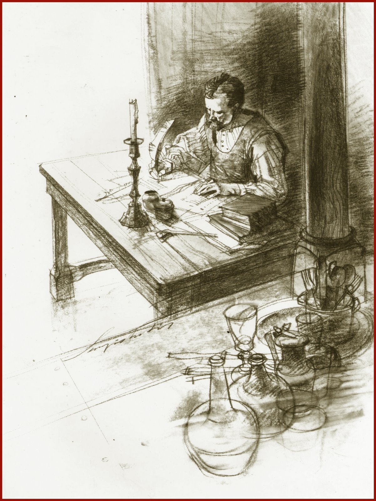
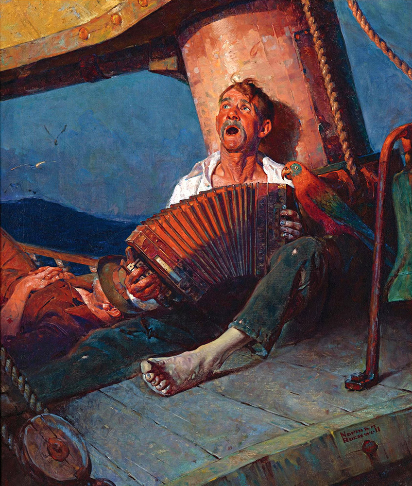
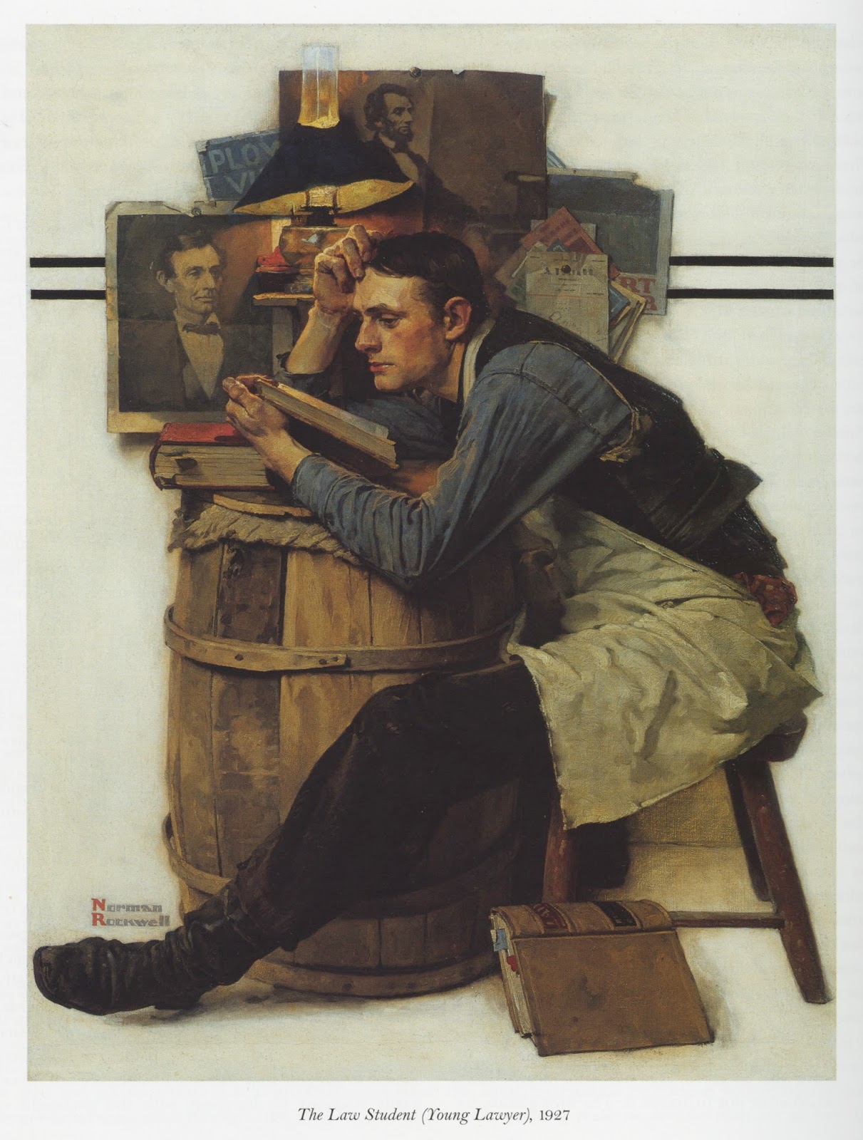
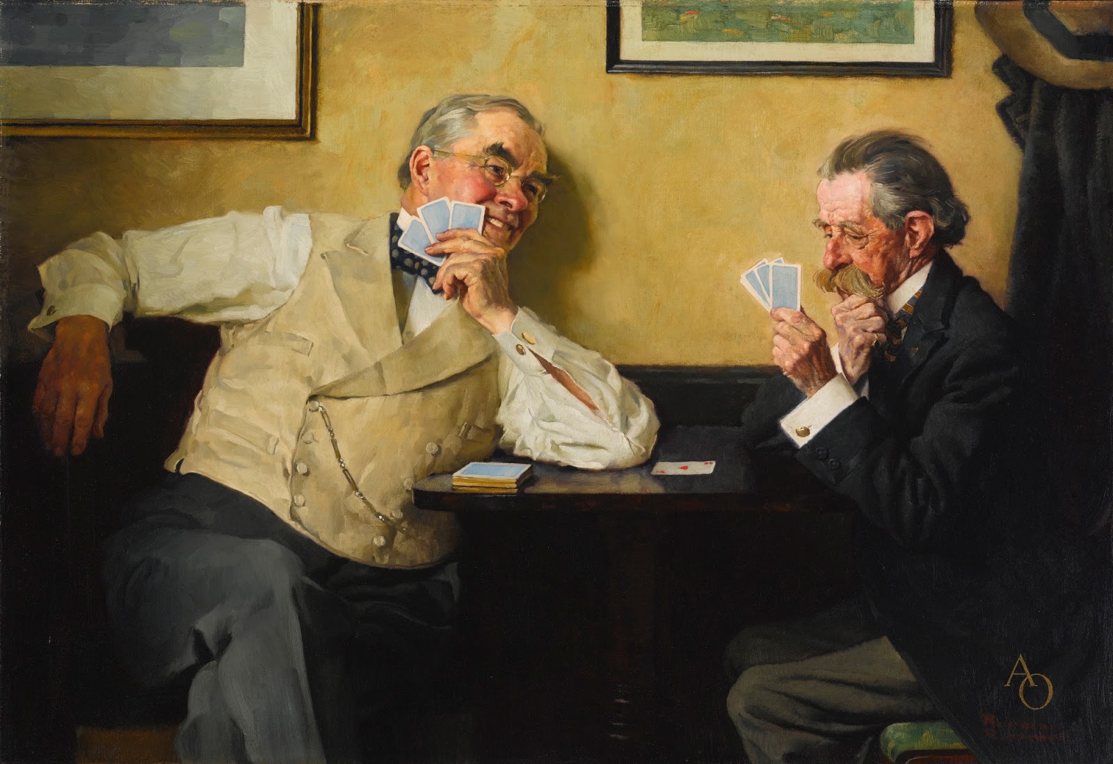
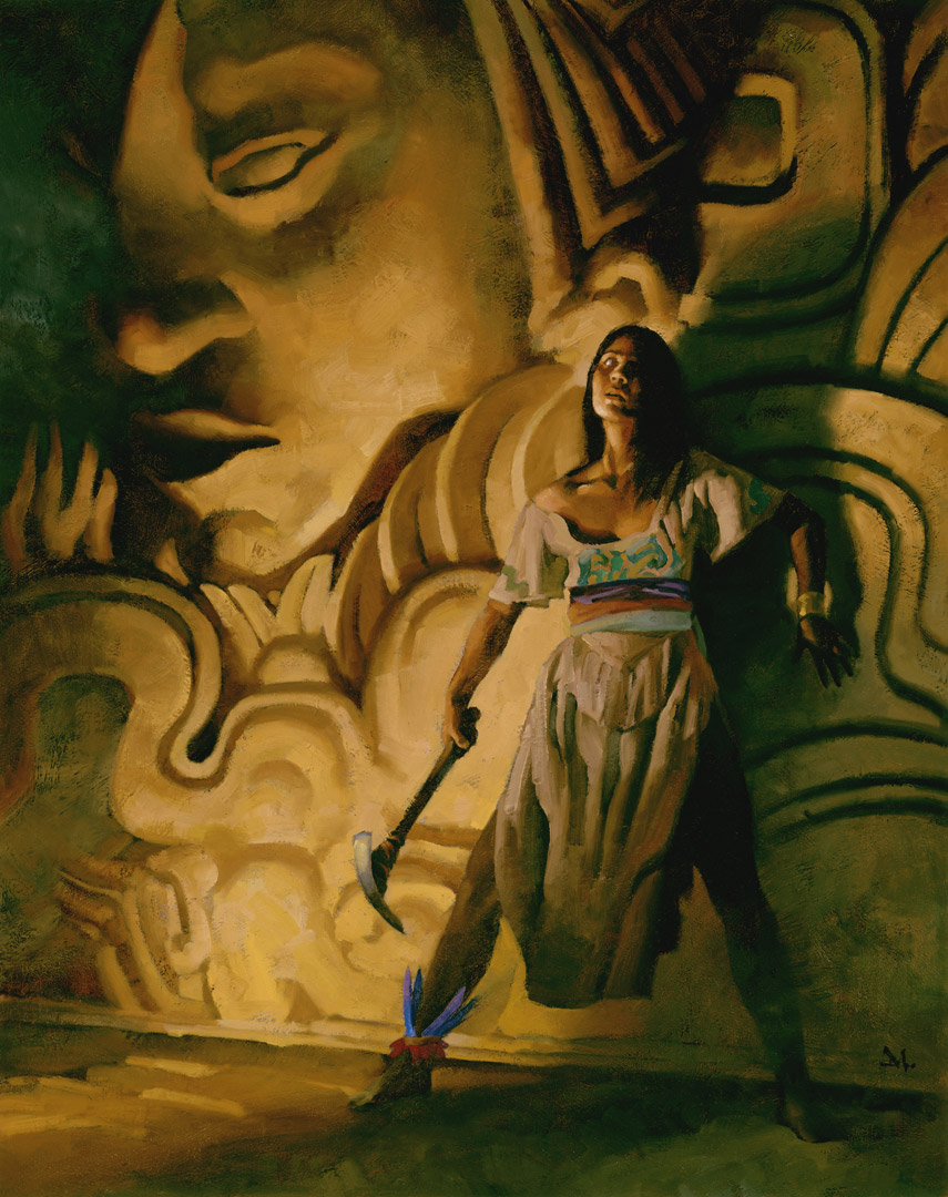
Now pull them back together, clumping them a little here, a lot there, a bit more here. Don’t worry that we can’t see all of each individual form. A few isolated forms will allow the viewer to understand that shape and will be able to easily decipher, yes even be intrigued by, new shapes that grow from repeated ones.
3. Two’s & Three’s.
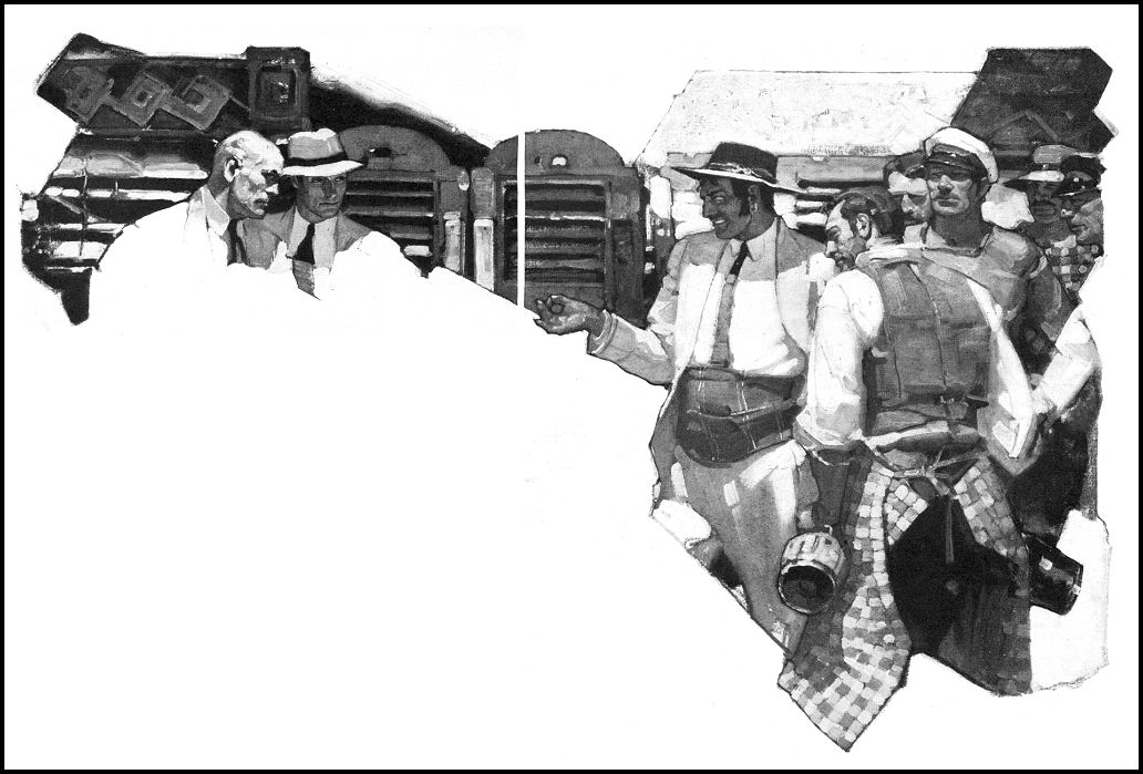
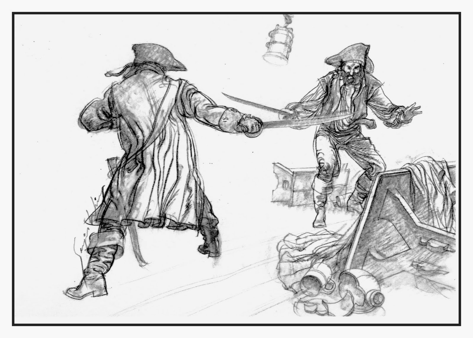
It’s easy to remember to pull repeating elements apart in two’s and three’s. Three heads closely composed here, another two there, one isolated, two more again, etc. You can go as high as five, but odd numbers of elements tend to work well.
4. Crump repeating forms.
Shirt sleeves. Dress fabric. Hair. Light rays. Tree trunks. Cloud shapes. Rocks. Waves. Dunes. If you are seriously trying to understand painting, tell me you haven’t encountered trying to get these repeating forms to look interesting. Go ahead. I’ll wait.
Uh huh. I thought so. It’s exasperating, I know.
Look, push some forms close together while separating others farther apart. Simple.
5. Crump repeating objects.
Birds. Leaves. Fence posts. Bubbles. Mountains. Grass. Flowers.
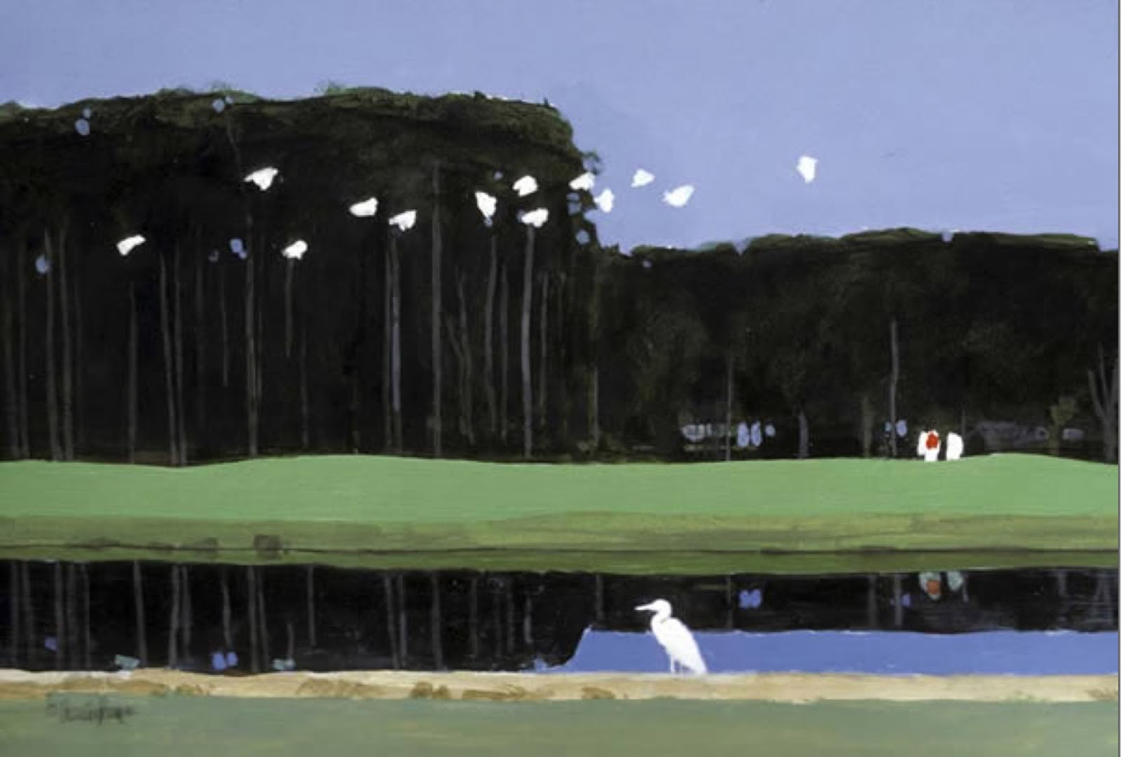
Flying birds? Pull some together, push others away. Overlapping forms is key (another 10 Things topic to come…). Works the same for each of the items mentioned above.


6. Crump repeating values.
Interesting paintings create depth by varying the values in the elements of the composition. A grey sky does not have the same value all the way through. Or a grey building. The variations can be so subtle they are only ‘felt’ by the viewer and not detected.
Lots of grass in a scene? Vary the values in the greens by crumping values together and apart to vary the passage and gain interest.


7. Crump repeating color.
Sky color does not have to be pre-mixed and applied evenly. This tends to flatten the illusion of depth. Trees tend to repeat the same color across a landscape, and certainly skin repeats similar colors across a bodyscape. The idea is to break up repetition by adding subtle variations in the same color. For example, warm flesh against cool, or warm greens against cool greens.
Mix the color as you go so that the color is ‘broken.’ You can pre-mix colors, sure, but mix piles of the same color in varying temperatures and values. Then, crump strokes of these colors in varying degrees.
8. Deal with space.
Many average painters do not understand how to break up space. They worry that an object needs to be completely seen in order to be understood by the viewer. It usually leads to an uninteresting use of space. Nothing hangs together.
I tripped over this concept initially, too. My early compositions appeared ‘spotty’ and I was told so by seasoned professionals. Art school never talked about this concept in my training because the instructors had no clue about its basics. (They were “rebelling” anyway so they had no use for it.)
Try this: Sprinkle seven elements, perhaps figures, into a new composition. They are static until you allow the forms to bunch up in places, and spread out in others. Crump them.

9. Design across the page.
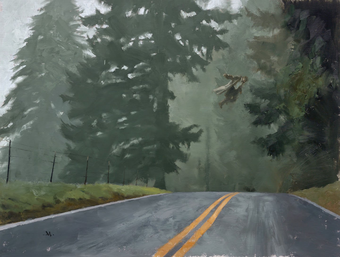
Composition works from top to bottom, side to side on a page. It also works from front to back, as in foreground, middle ground, and background. Crumping objects from side to side will give you clues about developing depth from the picture foreground to the picture background.
10. Rhythm, through Crumping.
Breaking up the space in a composition creates a rhythm for the eye to follow. This can be made to drive the eye forcefully, or to allow the eye to comfortably travel through the image.
Crumping multiple elements in sporadic clumps allows this to happen easily and swiftly.
Once you try it, you’ll be elated as to the number of different combinations that create not only a rhythm to your compositions, but exquisite depth as well.
(top montage image is another of the Swanwick series available on Tor.com. I can’t recommend these stories enough. Very well told! It begins with The Mongolian Wizard.)

an art lecture so clear even i can understand it. thanks 🙂
Your lectures are great Greg. I got a lot out of this one and the talent lecture. Thanks for posting.
This principle applies in animation as well. Just another visual medium.
Been waiting for you to post on composition, and it doesn't disappoint!
Incredibly insightful! Thank you Greg!!
Hey Matt….here's a couple links to earlier 10 Things about composition, even though I didn't title them that clearly. Some of the next 10 Thgs will cover different aspects of composition. It will be collated in the book based on this series, possibly coming up….: )
http://muddycolors.blogspot.com/2012/08/10-thingsabout-planning-pictures.html
http://muddycolors.blogspot.com/2013/12/10-thingspainting-like-writer.html
Thanks, too, you guys!
And Thomas….that's intriguing about animation! Share some thoughts about that? Would love to hear what you have to say. (I'm a huge animation fan from way back…: )
This one will take a while for me to digest… Thanks once again, Greg!
Many thanks for this and the other posts: much needed and inspiring wisdom for struggling artists like me, and it's not easy to find it expressed in such a clear and concise manner. You're very generous to share all this for free.
Thanks, Rob. It's really about sharing with the artists such as yourself.
I didn't get ANY of this with my journey. I had to learn it bit by bit over years. The idea when I started was that drawing (and especially illustration) was dead and why bother? But I learned, even as I knew within myself, that people love images, and especially narrative images, and telling them well is a skill, not a talent. And we really can't get enough imagery and story!
And also because, one day, you'll carry on and share these things with other growing artists. We are a very small faction of the human race. Let's bring all artists up to speed and doing great things for the species. Together.
It's just not about the “loner artist” struggling and trying to be understood. That's an old and tired paradigm. The computer and the internet have us all growing at remarkable rates now. Let's use it. And that means sharing.
Sorry to get all woo-woo on ya! : )
Hi Greg, Thank you for a very timely Ten Things….
I’ve been working on a sketch book project and there was simply something wrong with a sketch and it was bothering me until I realized after someone in the IMC group page posted a Crumping picture from IMC2015. Light Bulb! I didn't Crump!… and then Ahh Crap, I didn't overlap… I think I fixed the issues in some form. This project is being done before work, at lunch, after dinner, before bed… 5 minutes here, 10 there, and usually I’m fatigued, so the compositions can get away from me if I'm not careful.
Crumping Values, I never considered that intentionally, what a wonderful and amazing thing to do. I’m going to need to work my values with some more thought.
As always, very much appreciate your (and all the Muddies) willingness to share your art experiences and knowledge. It was great to see some of your lecture at IMC2015, and to at least say a brief hello to you afterwards. Cheers,
Mike Perusse
First, sir, thanks for the great post. I love the painting choices you made to illustrate the concepts. This is why I have the site bookmarked for my daily visit.
I create a lot of storyboards and animatics for clients in technical fields. Two of the chief requirements are keeping it easily editable and relatively primitive. It's all for the ideation stage before they take their projects to their clients to pitch and/or on to a production house to build for real. Basically, I'm their sketchbook, building the thumbnails to color comps/roughs of what they'll give to a production company to shoot or animate in 3D.
When trying to convey a range of elements — density, activity, depth, and time — clumping…crumping, is a key factor in achieving the proper look.
Simplest example is attempting to convey particle effects in an animatic (before the move to real animation software). We craft a series of objects in clusters of one, two, and three and then set them to slightly varied paths and speeds, maybe even different rotations, then duplicate them and offset the paths and objects' scales. You turn 3 objects into a seeming dozen, hundreds, or thousands of objects. Once you have a handful created, you simply duplicate them again, and then tweak the timing a bit. Sometimes dramatically. So a stream isn't constant, but rather has sporadic bursts and a seemingly organic, natural, random ebb and flow.
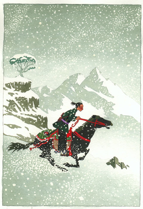
As this is animation, not static, crumping becomes an additional conveyor of time. A picture is a moment in time. The snow falling in the Nascimbene piece is a good example. We're looking at snapshot of a single moment. If we animated the environment in that piece, we'd want all of the motion elements to move at different speeds. We'd have some snowflakes falling faster than others, some moving almost as much sideways as downward, some with stuttered falls. Some would move toward us and increase a bit in scale, others move away and become smaller. Some would wiggle. None would move in a perfectly straight line. They’d overlap. I’d even add varying layers of transparency and contrast to increase the sense of depth. All of that is in mimicry of what we expect to see from our experience in life. Snow falls, but it doesn't fall uniformly or even constantly. And that’s just the falling snow; not what the horse is kicking up as it runs.
To make motion seem natural in animation, we have to manufacture randomness. Crumping is key to achieving it.
We’re obviously using numbers 1–5, 8, 9 and 10 in the example above. I’d say we’re utilizing 6 and 7 as well when we add some atmospheric overlays.
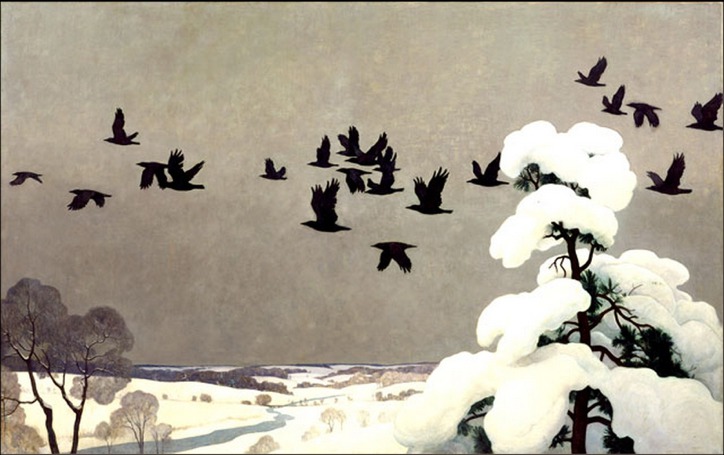
Back to the static world of a painting, crumping in the composition is not just denoting position. You touched on it when you mentioned rhythm: when we crump objects the viewer understands to be in motion, it conveys a sense of time. The Wyeth and Cunningham birds in flight have a real sense of motion not merely for the varied poses, but crumped as they are, we know they’re moving at different speeds. The approach applies equally to fleets of spaceships as well as snowflakes, schools of fish, and city crowds.
So I’d maybe make that #11 (or at least 10.5) for crumping. Convey motion over time with crumping.
Hope that wasn’t too much a ramble!
This is a saver! Great post, mr. Manchess! Thanks!
Oh nothing to be sorry for, I actually have to thank you also for taking the time to comment! I'll bear your words in mind and keep watching this space for more inspiration and tips!
Thanks, Mike!
And Thomas…..WOW! Thanks so much for that amazing explanation! Dead on! Appreciate your willingness to share. I'm sure there's some animators viewing this and gaining insight…
This article is really fantastic and thanks for sharing the valuable post.
Signature:
Jugar juegos de frozen en línea gratis, los nuevos de princesa de Disney juegos frozen – la princesa encantadora y linda. Divertirse frozen!
Yes, I have been looking for this all day better now than never!
deck flooring supplier in india
So much valuable information! This has helped me resolve a very sticky composition problem and by using this information, I've gotten excited about my current commission for the first time. A million thanks.