 |
| Seed of renewal, Magic the Gathering |
I just recently did a workshop in Florence about creating illustrations. It got me to think about the many thoughts that is put into an illustration, both consciously and on autopilot. The auto pilot thing is the hardest to put into words because so many of the choices you make comes from routine or experiences. You draw something a certain way because you found out that works well and this is ” how I do it”. But doing a workshop makes you think harder on these things and you are being forced into putting the autopilot up for inspection.
One of the things I find useful is to analyze my own paintings. This is best done a good while after you have finished one -not the weeks after, where you still remember everything about it and you are still not able to look at it with fresh eyes. After half a year when you pull out a painting you can almost look at it as if someone else painted it and this is where you get to see the real thing taken out of the intention you had when you painted it. Instead you see what you got.
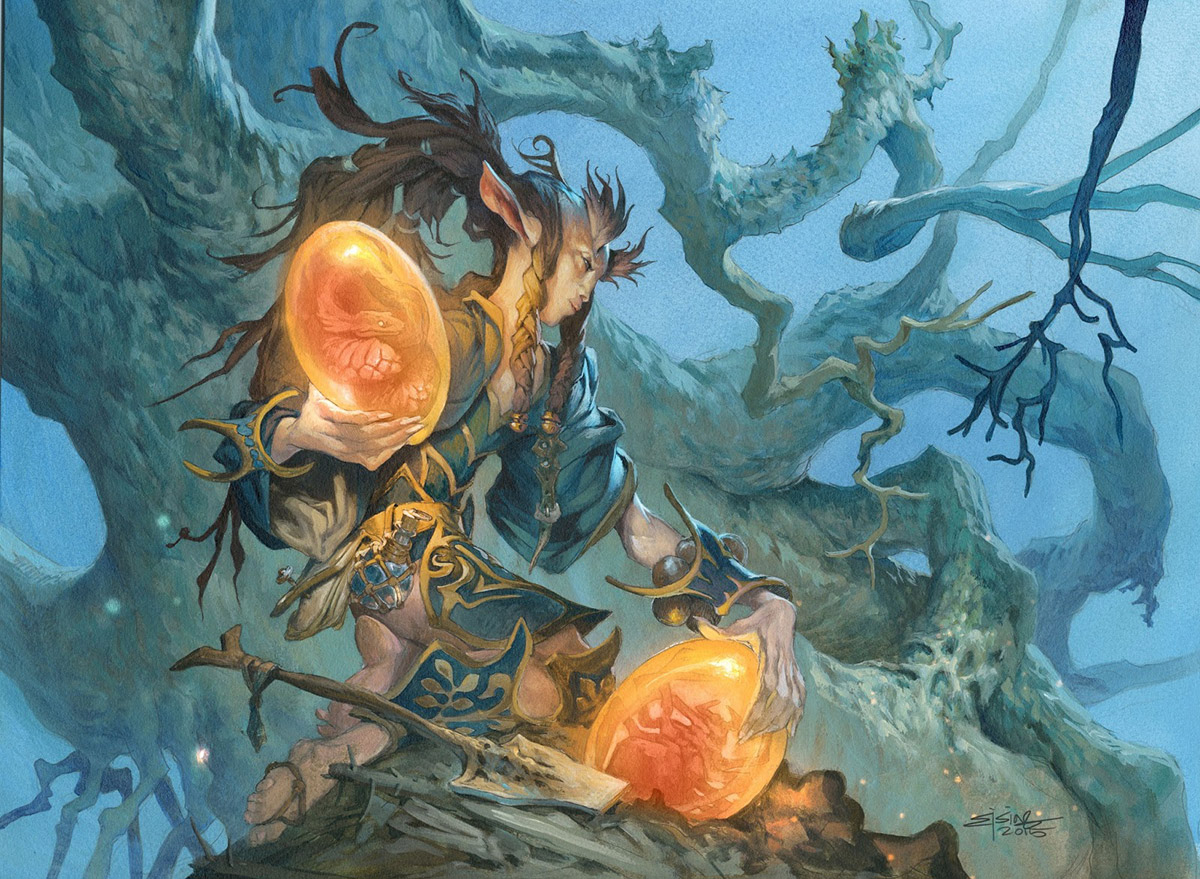
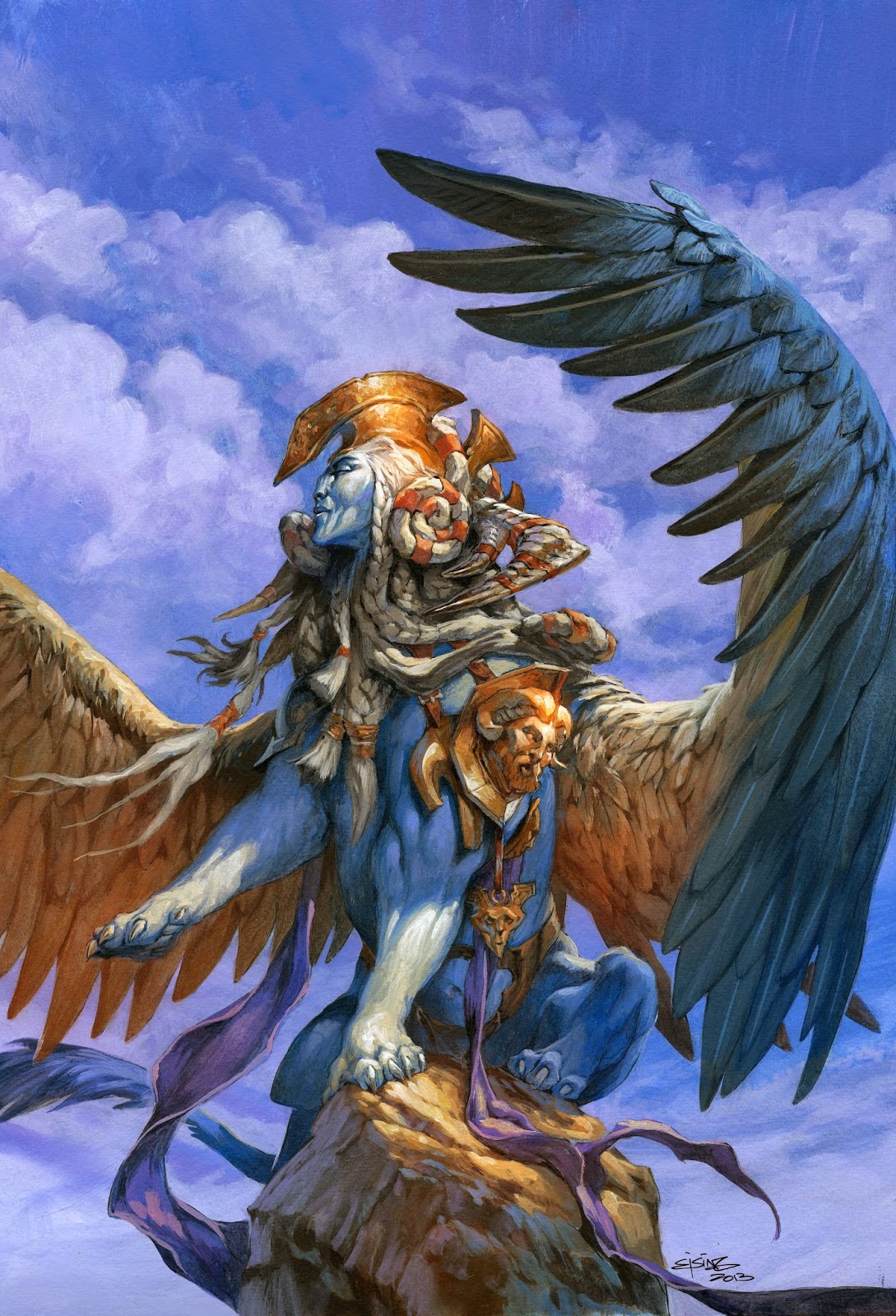
Here is my thought about a painting from last year done for a Magic the Gathering card.
The bad:
First
Right away I dislike the lowest hand a lot. The light on it is wrong. The top of the hand is way to light and lit with equal value as the bottom part. Wish I had made it darker against the light from the egg. Now it looks almost transparent because of my insecurity in litting it right. Perhaps this is one of the times where I should have taken a reference photo to help in getting the light effect right.
Second
is the feet and leg position. It worked well in my sketches but here it is almost impossible to see where the legs go and which is in front or on top of the other. Yes, I did choose a strange half kneeling/sitting pose, that is not quite easy to show well, but I did it to add a little interest and coolness rather than a straight up kneeling pose. But looking at it now I wish I had used more surface lines and cast shadow rendering to establish the leg position right. I am glad I did not render the legs with dabbled light but kept them kind of muted down so that you do not really see the unclarity.
Third
The strap behind the braid creates a perfect tangent. It is almost impossible to not read the braid as a long braid with a belt buckle in the end. This is an uttermost rookie mistake. I might have thought ” Arhhhh never mind, I will fix it with colors” but just never did.
Forth
I think the outfit he is wearing is a boring standard 1 elf costume. I wish I had choosen more deliberate clothing for him – something that would have established his profession better. This is hovering in-between a wizard ( sleeves and flask ) and a fighter ( body armor and greaves ) I know that this comes from not going off from a style guide, since this card art is for a card out of the usual Magic the Gathering settings, but that shouldn´t have kept me from making up a design myself. I have no problem with classical or traditional fantasy, I really like it, and do not think it is boring, but I still think a characters costume should tell you something about the guy and not look like a costume.
Fifth
I wish I had made it clearer that it is a guy and not a girl. Instantly we read it as a girl because of the long hair and the elegant pose. Just saying: guys can have long hair too and be elegant, but I have to accept that there is a reason why 95% of people referring to this painting says ” elf-girl…”
The good:
First
First thing that strikes me is the colors. The contrast between orange and blue is a really strong temperature difference. Having a background in a bluish tone and a foreground in a warm tone establishes the planes in the picture very clear.
Second
Further more the silhouette reading of the figure is very strong. The dark hair and the big brows against the light background makes his face very easy to read.
Third
The composition of the branches in the background is helping in seeing the figure clearly. The branch that circular frames his face is nice, and the big non detailed trunk acts as an easy backdrop for the figure. The details in the background is well off from the figure to not mess with the silhouette.
Forth
I am still happy with the facial design. The brows, long forehead and the ears makes him a more personal version of an elf.
Fifth
This is one of my better versions of rim light. It is used only where it matters. In the face it creates a temperature difference that helps in giving him a more three-dimensional look. On the arms the light creeps into the shapes and becomes a cylinder shape that acts as a bridge between the warm light from the eggs and the moonlight from the background. I like to have an area that pulls something from the background into the foreground, thus placing the figure better into the environments.

Wow, I love this piece.
Love this piece Jesper regardless of it's faults. But I don't really see the fifth bad point as a bad thing. I think it's good to challenge people's preconceived notions of portrayal.
Reads as a guy. I never once thought 'girl.' It's in the hands, and arm and face. Standard elf costume makes easy recognition for a card. If it were more challenging, then it opens up the mind for too much other interpretation. Sometimes you have to do those things for illustrations' sake: the recognizable outline, etc etc. Besides, the colours are great. Yeah, the braid looks like a scorpion braid with some wicked weapon attached… 😉
Men are prone to cave retreats – a strictly prohibited zone with 'trespassers will be snarled at' sign posted by the entrance. We know that, having lived with them and endured it all. Yet each time it happens Love Commands Review pangs of betrayal consume the peace out of our minds, and dealing with that becomes just as big a challenge as the annoying closed door. Despite all the retrospective understanding, not being able to 'deeply' connect drives us to an irrational negativity that is completely uncalled for.
Hey Jesper Ejsing you are one of my favourite ilustrators and realy Love your pieces!
I just wanted to thank you for giving us the chance to read your analysis on this awesome piece! One has to be always its hardest critique and learn from its “flaws”, that will surely bring you even further on the future. I Love this attitude!
Keep on #Happypainting!