 |
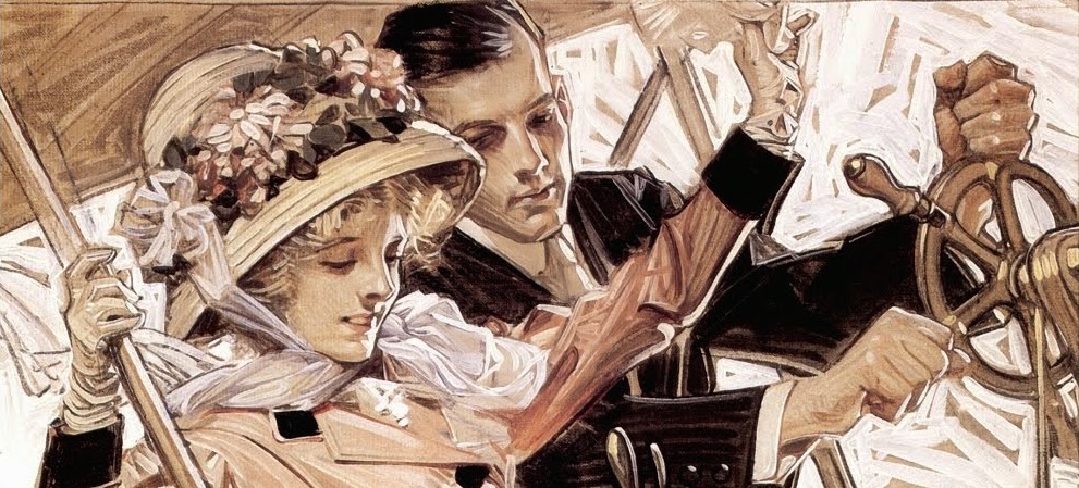
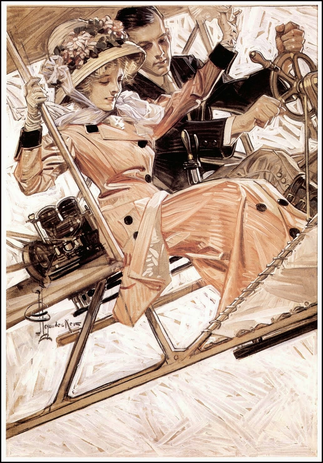
| “A good cover has a distinct silhouette” – J.C. Leyendecker |
Creating images with punch is almost universally important for illustrators as our work must constantly compete for the audiences’ attention in a sea of distraction. As Leyendecker stated in the above quote, one of the best methods of grabbing that attention is drawing the viewer in with an interesting silhouette. Even if the story is not clear from that silhouette, even if the content isn’t quite clear, the abstract shape of it should be interesting enough to invite closer examination. In Leyendeckers case, his use of the silhouette was frequently very literal with figures posed over simple or nonexistent backgrounds, yet even in complex environmental scenes the philosophy holds true. Every image can be broken down into basic shapes and value and understanding how to control these core compositional elements means creating more solid and powerful paintings.
If you are careful in your use of shape and make sure that your image still works when streamlined to three values, you are off on the right foot. Images that succeed in these qualities will be immediately engaging as well as work at any scale from postage stamp to mural. For this reason, I employ a sketch development process which forces thinking in big value shapes fairly early on. As early as thumbnails (which, by their nature, tend to be somewhat abstract) these are among my chief concerns. Sometimes I may just add shapes for balance or flow without any idea what they represent knowing that I can figure the details out later.
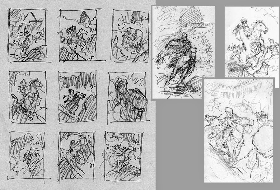
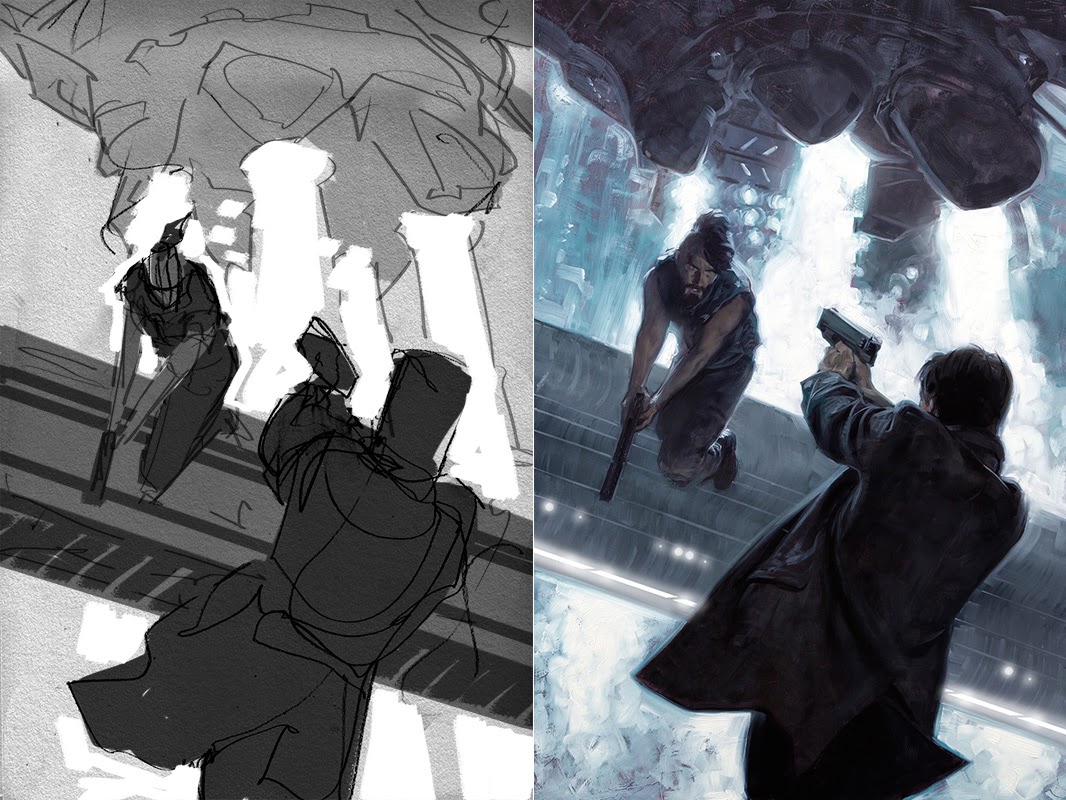
After monkeying with thumbs a bit, I’ll start sketching roughs. These are essentially linear diagrams of shapes which, once I find one that pops, I’ll then scan into photoshop and build up with value layers. To start, I often drop the paper value to a midtone. On top of this I will add a 50% opacity layer and begin adding the shadows with solid black. To create more midtones in between, I just duplicate the layer and keep refining. Above this, I can now add another layer of white highlights. This will give a fast rough value plan that should make sense before I start further developing the details and subtleties. Actually, this is in many ways a direct parallel to how I execute the actual painting: midtone/structure (the order these happen can work either way), add the darks and lights, refine where needed.
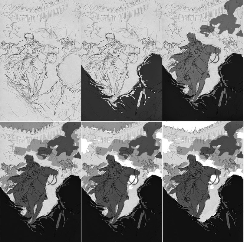 |
| Adding layers of value in large shapes and adjusting some details after the final step |
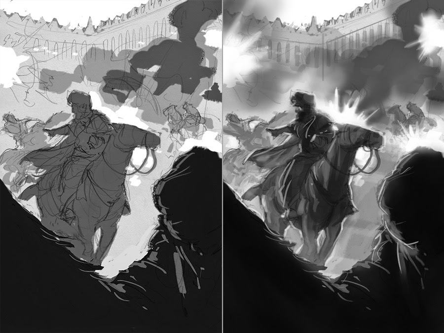 |
| Developing the rough value plan into a more presentable sketch. |
Along these same lines, I also find it very instructive to examine my favorite paintings using certain photoshop filters which simplify values and shapes. By breaking finished works down in this way, I can easier identify some of what may have been early planning and thought process. One method is the “Cut out” filter, which will simulate the effect of having the image made of paper cutouts. These can be hit or miss, but often with a low Number Of Levels (2-4) and a high Edge Simplicity (5/6), I can arrive at a nice minimalist deconstruction.
 |
| Ilya Repin reduced to simple abstract that still maintains interesting shape and balance. |
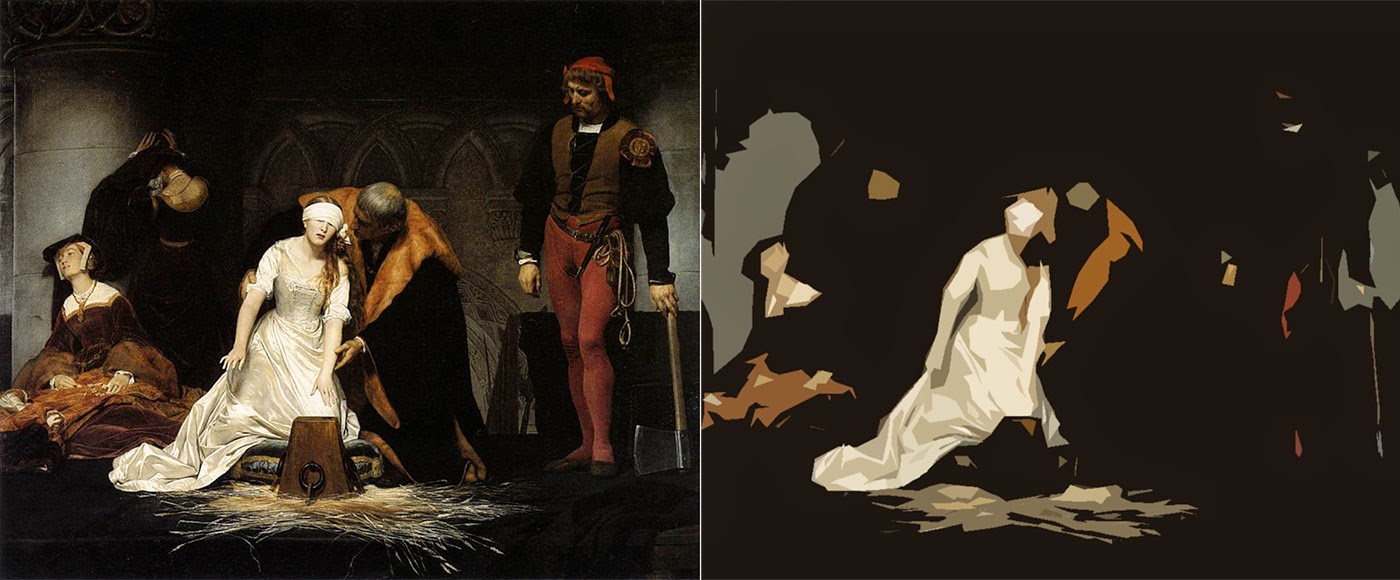 |
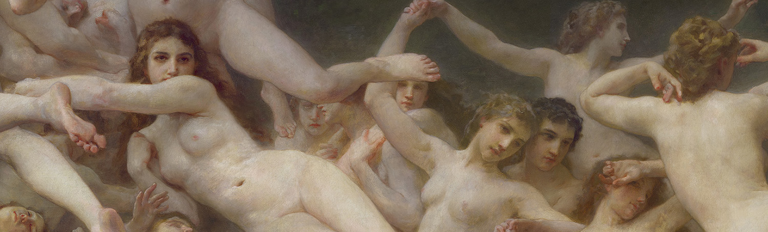
| Paul Delaroche throws an obvious spotlight on the woman in white, but what might be overlooked is his ability to keep the very interesting supporting cast present, described, and yet they remain peripheral. |
Another tool which I find useful is the Threshold adjustment layer. This will let you slide to a point on the histogram and all values above this point are rendered flat white while all values below are flat black. I’ve found this very useful in studying the illusion of values which appear brighter or darker due to adjacent relative values, but actually exist in a very controlled value shape. Figures with internal detail but which read as silhouette because their highlights are darker than the darkest surrounding value for example, or peripheral details which are controlled by compressing their value range so as not to compete with the focal areas.
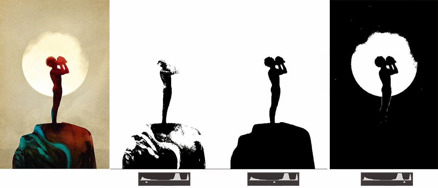 |
| Sam Weber never fails to deliver subtle and riveting value structures. This piece is one of my favorite examples of localized value shapes because it functions almost as three distinct silhouettes. When we eliminate all but the darkest values, we see form in the boy and rock. At mid value however, this information is lost and the image is a very bold silhouette. None of the interior values are as bright as the background, and yet we can still read both. When we lose all but the highest values, the silhouette changes again and we now see just the boy silhouetted against a sun or moon. Looking from the midtone threshold and the high key threshold, it is like was see the same scene at day and at night. Of course, all of these layers fit together into a beautifully understated final image. |
And so I’ll close with a side by side of one of my own value roughs with the finished piece. Keeping all of these things in mind, I aimed for an image which would present a bold silhouette while still having depth. An image which landed an immediate punch of shape as well as containing a slower reveal of internal form. Thinking abstract and minimal in planning representational work can lead around some interesting corners and the more I explore it, the more fascinated I become.


Perfect, simplified, needed, and appreciated. Thanks!
I have long been of the opinion that Frazetta was the master of this technique. Indeed I go as far as to say it was his composition & not his painting or anatomical knowledge which sets him makes him the greatest of all fantasy artists.
There are many examples to cite, but I pick a few here, you will probably need to copy & paste the links.
https://www.nerdist.com/wp-content/uploads/2014/03/Frazetta1.jpeg
https://www.nerdist.com/wp-content/uploads/2014/03/Frazetta2.jpeg
http://frankfrazetta.net/images/Frank%20Frazetta-Barbarian.jpg
http://www.artistsuk.co.uk/acatalog/MongolTyrant_Frank_Frazetta.jpg
http://www.middian.net/Galerie3/Frank%20Frazetta%20%28Warrior%20With%20Ball%20And%20Chain%20HD%29.jpg
http://th09.deviantart.net/fs70/PRE/i/2013/364/9/8/egyptian_queen___frank_frazetta_tribute_by_richardhanuschek-d700fry.jpg
ha, how did that last one sneak in there! Yeah, I've always admired his ability to mass in interesting shapes, particularly his often atmospheric shadow masses and nowhere more than in his b&w inks:
http://2.bp.blogspot.com/-z0D_wavBVlA/UeH_ORJfRiI/AAAAAAACJ18/6zJ6YA9KNX4/s1600/frazetta_06_a_godsofmars_intothearena.jpg
No doubt all of his years in comics played a part
My mistake, I just grabbed a bunch off google, oops. And yeah, working in the essentially black & white medium probably does hone your composition muscles 🙂
Two perfect examples are also Gary Kelley and Mark English, their work is mindblowing, and its always about creating a collection of interesting shapes. Thanks for the article, Dave!
One trick is understanding what makes the shape work dynamically. If a shape interlocks into the background like a jigsaw puzzle piece it's much more dynamic. Frazetta used this technique masterfully.
great breakdown!
Really great post, and such essential truth. Thanks for taking this on!
This was great, thank you so much for sharing your knowledge!
Finally somebody else noticing the power of the threshold tool! It is also very handy for looking at reference to find out the general mass shapes.
William Mortensen talks a lot about these contents in his books, have you ever read him?