This is the next short story installment in Michael Swanwick’s grand series of The Mongolian Wizard stories for tor.com, art directed by Irene Gallo. If you’re not familiar with them, they are a must-read for any lover of genre.
The Hugo and Nebula Award winning author has created a magnificent late 19th century world of mystery, weird war-time history, and magic, with a touch of steampunk and lots of fabulous creatures and characters. (One of the main characters is an officer in the Werewolf Corps. I love that.) Michael brings a sense of literary class to the entire series.
I’m completely sold, and so it adds a bit of excitement to create the images to work with the themes. So many things overlap, and using a montage to tell these stories has turned out to be just what the visuals thrive on.
I read each story at least twice. Once for the general story, then again for details, and sometimes a third to understand what imagery to use to pull in the viewer.
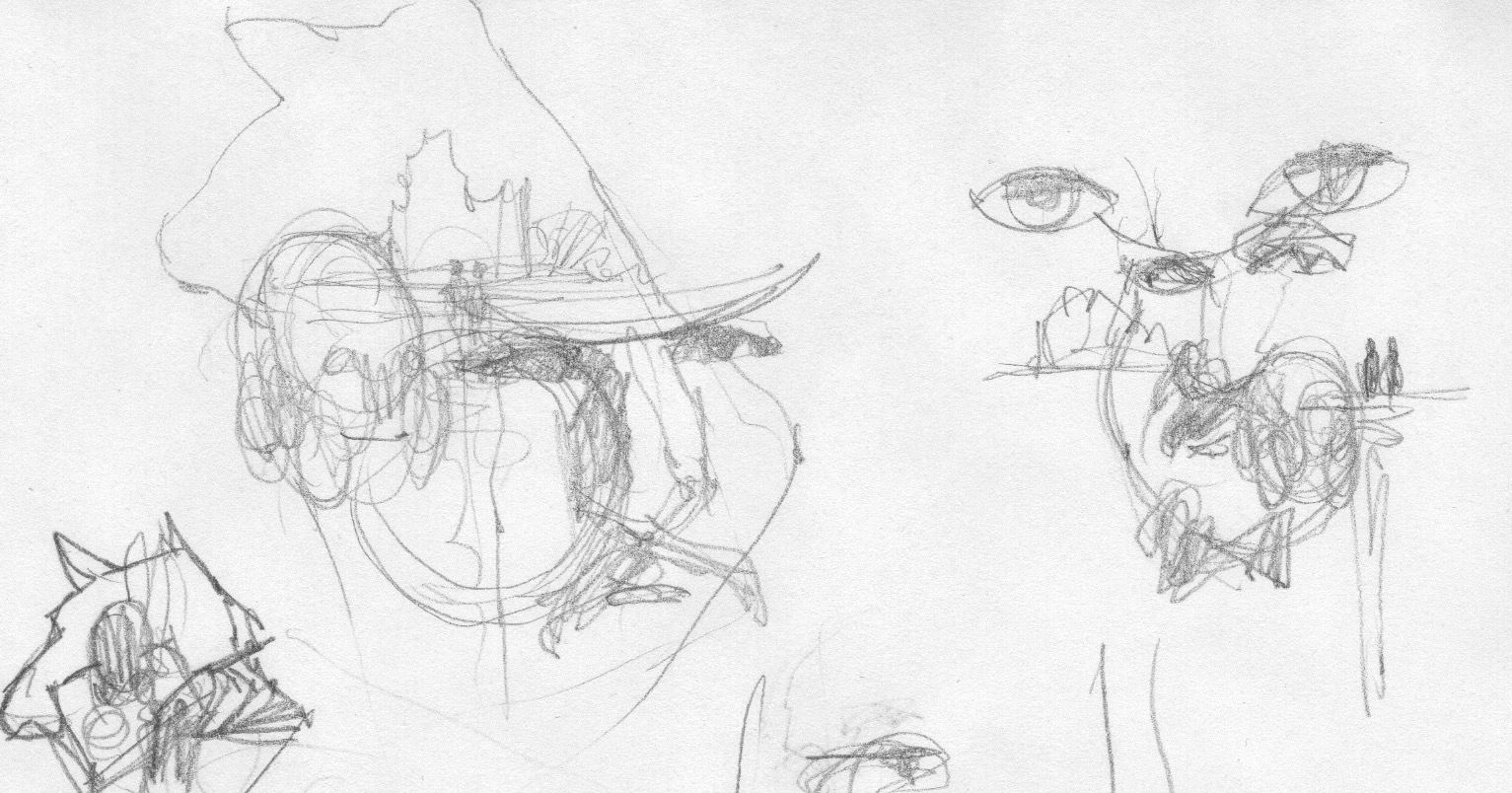
As always, I started with some pretty vague thumbnail sketches. This stuff looks like junk and is pretty primitive, so I hope you take away the idea that good imagery is built from foggy impressions and disjointed feelings. This is where many illustrators believe that their “initial ideas are the best ideas.” Not exactly true. Sure, impressions are correct because they’re built from background intuition, the stuff you’ve been storing since birth. But these things are subtle and it takes focus and work to bring them forward for good imagery.
That’s where the work comes in. Yeah, many ideas can ‘pop into mind’, but usually after brewing over time, even on unrelated projects. Getting to the paper is what puts those ideas into context, and at that point, all the problems of composition and shape appear.
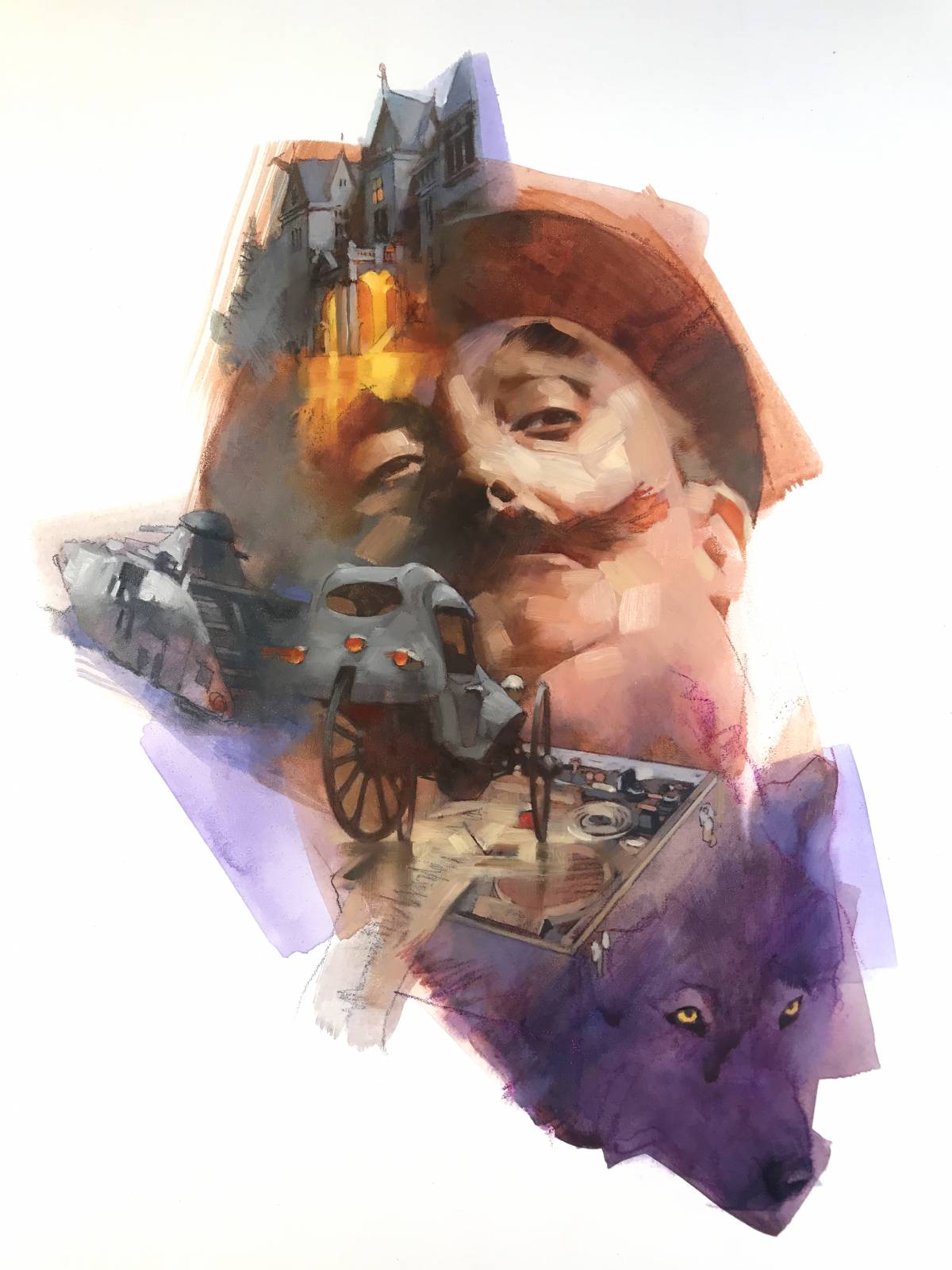
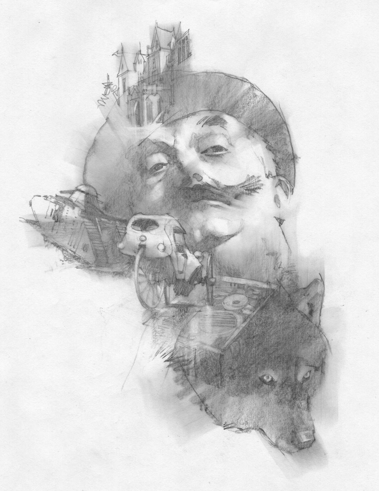
Spook House example: these miserable scribbles allowed me to determine what I really wanted to portray for this particular tale. The ideas started to merge as shape. You can see how I was beginning to rearrange shapes for first and second impressions in the montage. I had some ideas of what those elements might be, but…how to arrange them? Sir Toby is a major character within the world and I hadn’t shown him so much over the series. I wanted to get a nice close-up of his swaggering attitude. Initially I’d thought about having the wolf character as an overall backdrop shape to play everything else against, but eventually dropped the idea.
Montage is coming back, by the way. Once a dated style, it is still being used because it answers visual problems in a way that can cross time, add dimension, bolster character, and focus intention across a complexity of elements. The technique doesn’t define a period of illustration. It is a viable concept of visual storytelling. So think of it as a principle you can use to engage viewers.
After creating a list of the objects needed for the visual, I used scale for building the focal point. Alternate size of the individual elements. This not only adds interest, but can be used to tell story. In other words, to pull the viewer through the composition while pointing out necessary story points, leading them by the nose.
Next is the spine or through-line of the composition. Think of the different pieces as hanging on a visual line that winds through the overall composition. Attach the pieces to fit in and out of this main direction. Scale back and forth for emphasis.
Think about pushing elements closer than you believe is comfortable. That’s right, push them into one another. You’re not trying to tell the entire story of each element. This is what can kill a good composition and make it spotty. Fall in love with the right parts of those elements and don’t try to explain them by rendering everything about each.
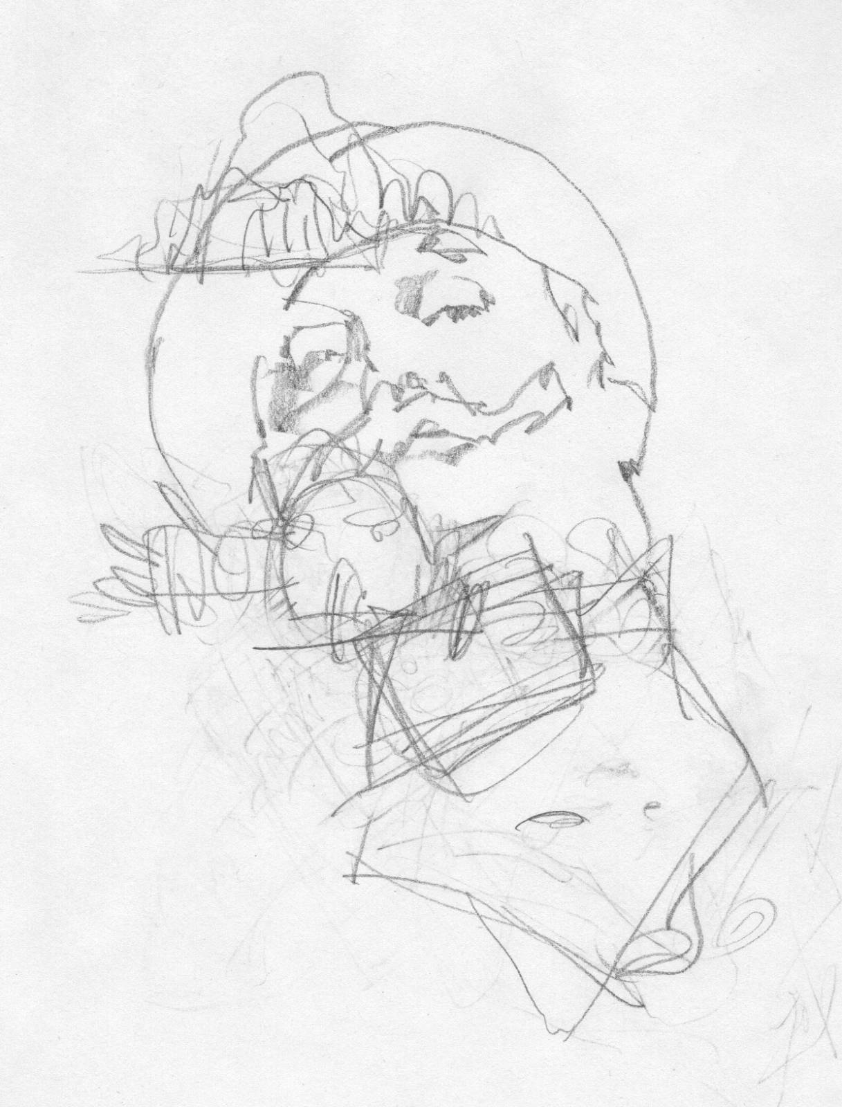
Spook House example: I collected my reference and started arranging, both side-to-side and enlarging and reducing. Big Toby head, fitted with smaller elements invading his face, adding secondary characters, in this case, Freki, the sentient wolf that takes orders telepathically from his owner, Junior Lieutenant Ritter, of the Werewolf Corps. Smaller elements lend a sense of place and a sense of time. Plus…they’re just cool.
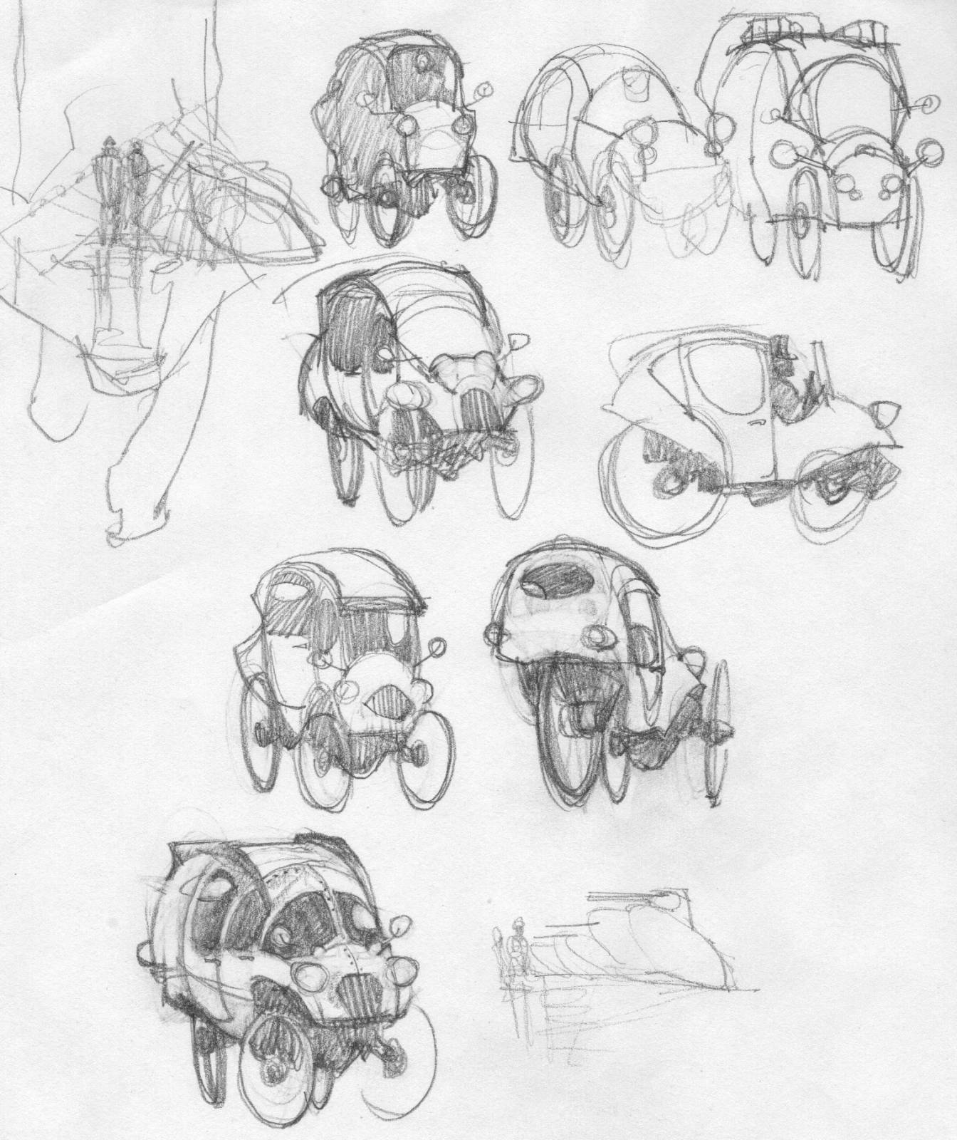
I did some separate sketches of some of the story elements such as the manor house, and the newly invented cross between a carriage and an automobile. An early form of polygraph sounded fun to suggest and of course a strange version of a WW1 tank.
Once I had that general layout, I could move things around, enlarging and reducing to find a pleasing shape. After this, I projected the general impression sketch so I could keep the relationships similar, and began my finish sketch.
Spook House example: smearing the sketch allowed me to plan for loose washes to set everything against. Yes, I design these washes, too. Ever notice how some paintings have such a comfortable feel about them while others feel edgy and awkward? It’s because some just scribble background strokes anywhere, thinking loose arm motions makes it look “free.” These areas are just as important to design for the general composition as well as any of the other elements.
Finally, I projected my finish sketch onto a piece of Gessobord and drew it off with graphite and colored pencils. Next I used acrylic washes to run and cover all of the drawing, and used a few layers to build color to a minor level.
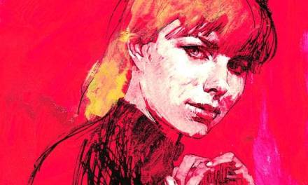
Next, I waited for those layers to dry, then I started oil painting on top. This time, starting with Sir Toby’s head. As for color, I was thinking of alternating between warm browns and cool greys, with accents of yellow and some warm purple washes. Irene asks that I keep the colors moving by working with a broad range to accent different stories. I’ll have to repeat some color themes as Michael plans for about nineteen stories altogether!
This tale hasn’t been released yet, but will be soon on tor.com. Eventually, Michael plans to develop a novel that interweaves all of them. I hope to be a part of that and provide even more visuals for his fantastic world.
The links above will take you to the individual stories in sequence.

Thats a beautiful picture. I love hearing that the montage is making a comeback. Like you said, it’s a great way to unify complex story elements into a singular visual design.
Great piece, Greg. Love the David Grove vibe.
Great work, and thanks for the in depth description.