
Taking inspiration from other artists is a core component to the creative process. It’s why I feel art in any form is a living and vibrating thing. We feed off of the buzz around us and add our small voice to the sprawling conversation. Whether you need a creative spark or a solution to a visual problem, you can always look to good work for guidance.
I was planning to talk about turning to my bookshelves for help but, as luck would have it, I’m currently spending a week with about a dozen amazing artists. So instead, I put the question to them…
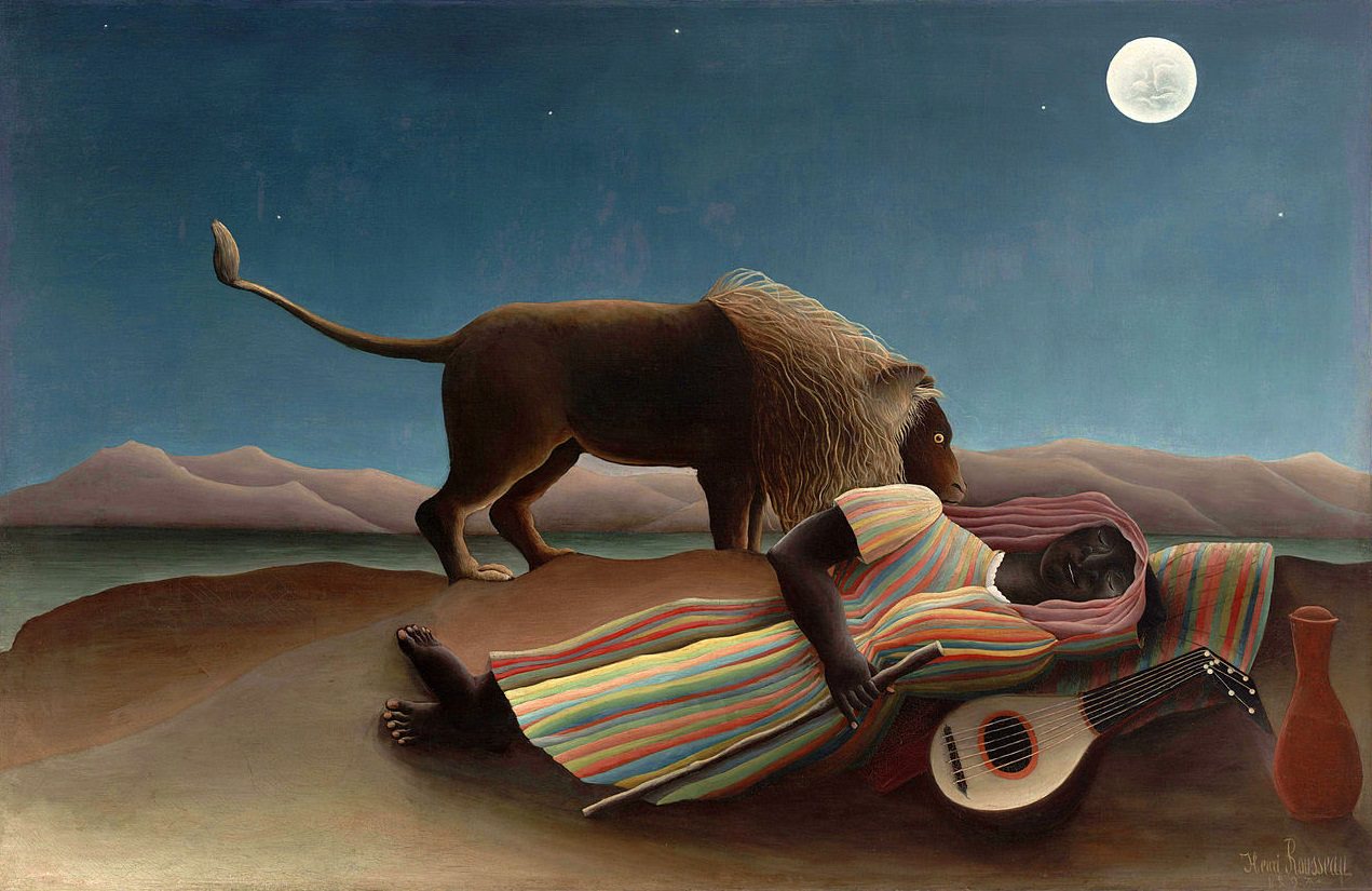 |
| “The Sleeping Gypsy” by Henri Rousseau |
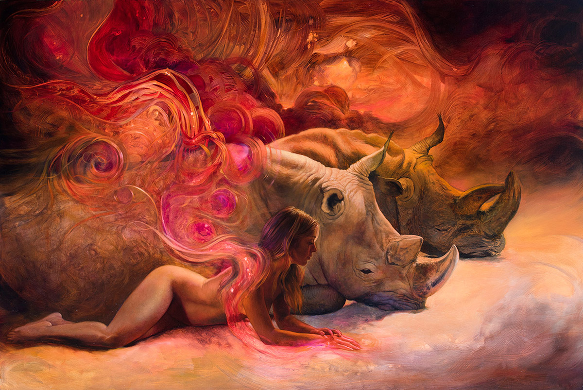 |
| “In Circes World” by Julie Bell |
Julie Bell
Julie first saw this Rousseau painting at about seven years old and she still remembers the feeling of peace and wonder that it gave her. She remembers thinking about being in the desert at night, the temperature of the air, and the deep spiritual bond one can feel with animals and the natural world.
As Julie has pursued her personal work in recent years, she describes the world that she is creating as “a paradise of people and animals.” She remembers Rousseau at times to help express that same emotional connection she felt as a child.
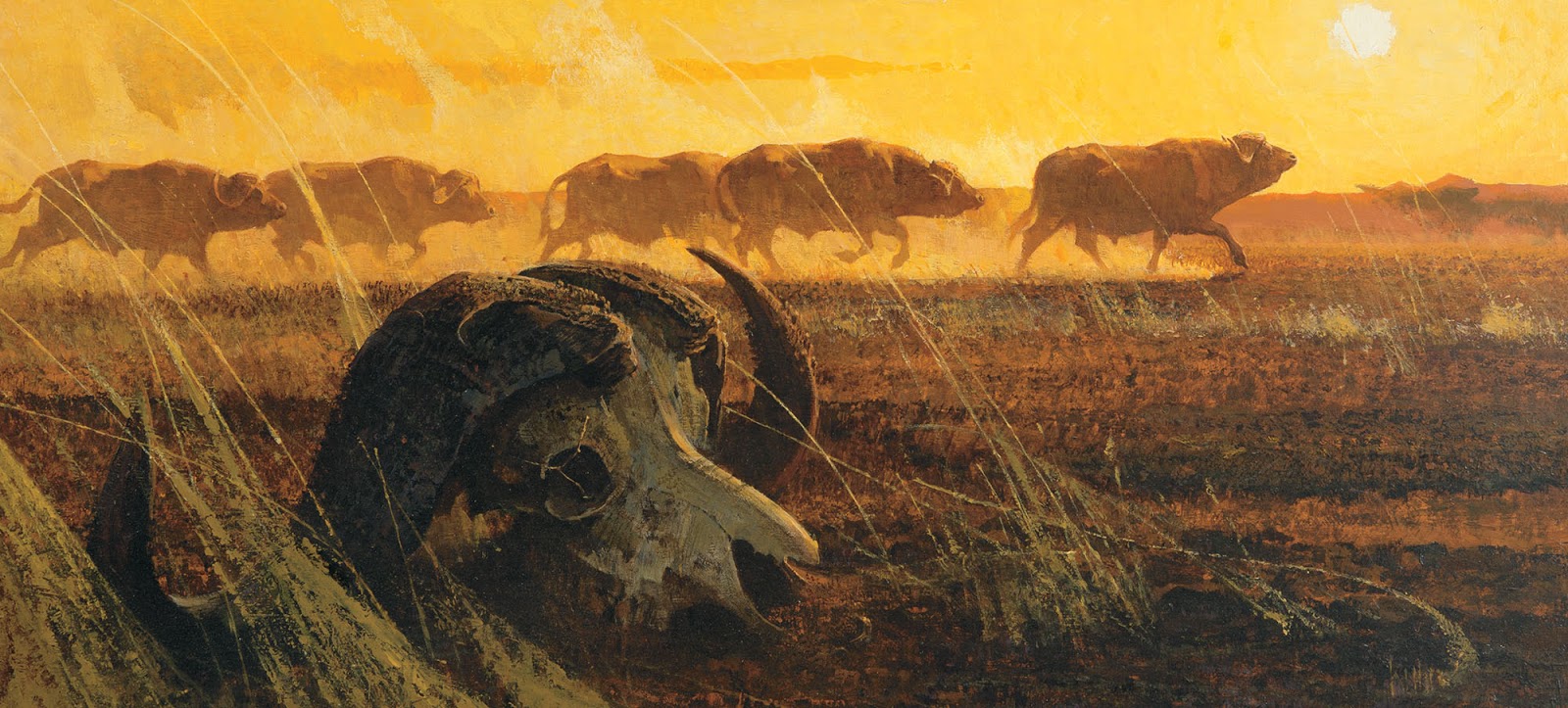 |
| “Cape Buffalo” by Bob Kuhn |
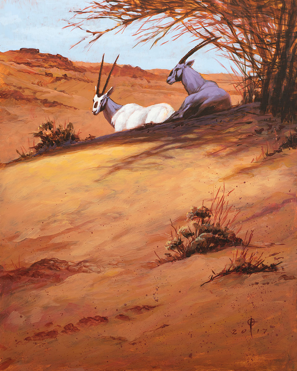 |
| “Oasis Shade” by Daren Bader |
Daren Bader
I’ve known Daren’s work for years and strongly associate it with a vibe of African wildlife and landscape. Whether the creatures in the painting are real or magical, they almost always carry that note. So it made perfect sense when he introduced me to Bob Kuhn’s work for the first time and I could immediately see a connection.
Daren takes notes from the colors and design of Kuhn’s work, but it is specifically his application of materials that he finds instructional. There is a poetic quality to rough painterly textures that are also extremely accurate. When Daren makes a point to simplify and avoid getting lost in unnecessary details, he’ll think of Kuhn.
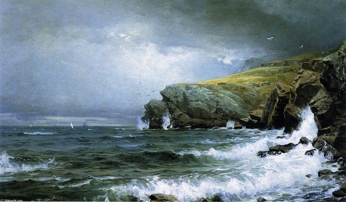 |
| “Seascape – Coast of Maine” by William Trost Richards |
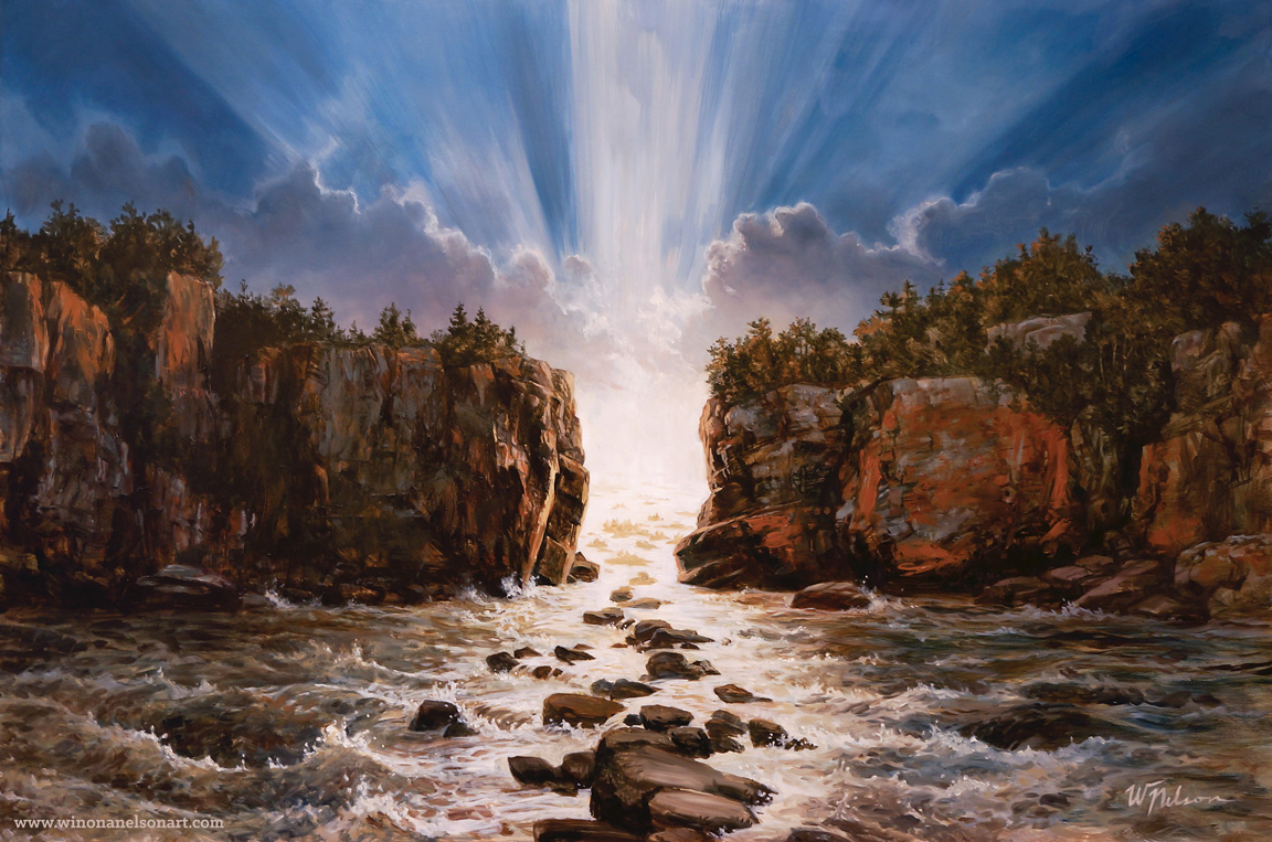 |
| “The Path” by Winona Nelson |
Winona Nelson
Winona doesn’t typically paint landscapes, so when working on this personal piece she went seeking some inspiration. She had the composition and concept already fixed in her mind, but wanted to see how some other artists would approach the rendering of rocks and waves. This brought her to Richards, who was definitely something of an expert on the subject.
Studying his pieces, she noticed that he used color gradients to give the forms scale and drama. She also took notes from his brush calligraphy in how he used bold marks and hard, chopped in edges to describe rocky cliffs.
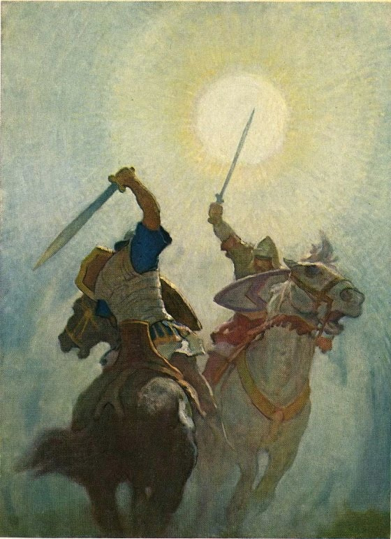 |
| “Legends of Charlemagne” by N.C. Wyeth |
 |
| “They Came from the Sky” by David Palumbo |
David Palumbo
I was recently hired to illustrate a story about the first Spaniards to arrive in Texas and, while reading the story, I had this image in my mind of back-lit figures cresting a hill that had the intense sunny feeling that I remember from trips to Texas and the Gulf Coast. This brought to mind the Wyeth piece.
Looking at that scene, I knew I wanted to play similarly with almost outlining shapes and having the interiors described in subtle mottled color. The hazy fill, hard edges, square strokes, and clear silhouettes perfectly captured the vibe I was aiming for.
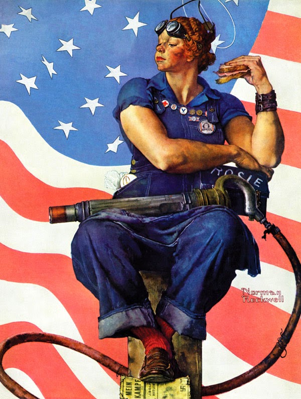 |
| “Rosie the Riveter” by Norman Rockwell |
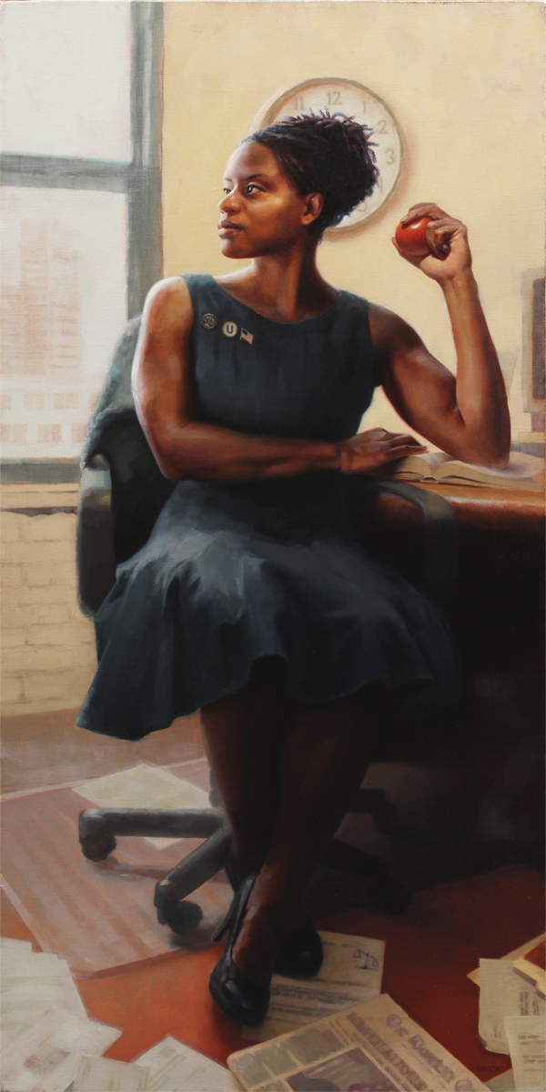 |
| “Lydia the Lawyer” by Julie Beck |
Julie Beck
In painting this portrait, Julie saw a clear parallel between her subject and the story told in Rockwell’s iconic Rosie the Riveter. Lydia the Lawyer is a contemporary take on a woman working to better her country and doing so in a field long dominated by men.
Julie has always been drawn to Rockwell’s way of telling stories through the smallest of details and found creating this homage in some ways imparted the same lessons as a master copy. Studying the details he chose to include and translating them to tell her own story was an opportunity to really explore Rockwell’s psychology and thought process. One detail which she found particularly compelling was how Rosie’s competence and strength is so perfectly captured though her nonchalant attitude.
 |
| “Wild Midnight Falls” by Robert McGinnis |
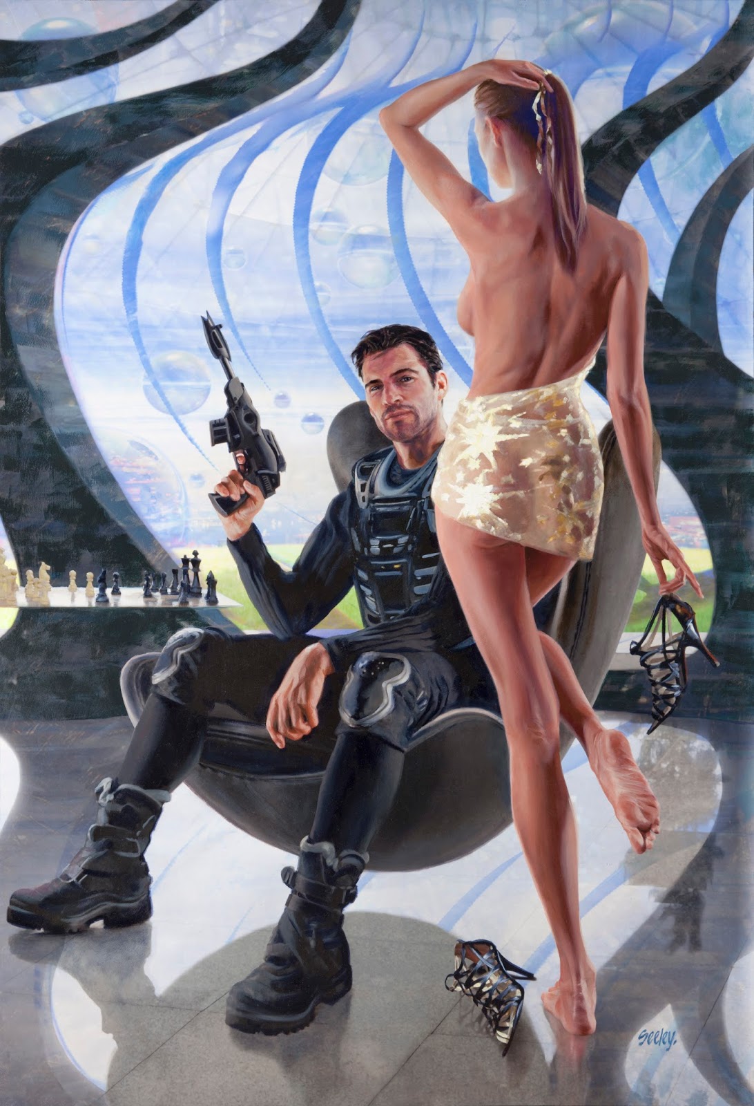 |
| “Captain Flandry” by Dave Seeley |
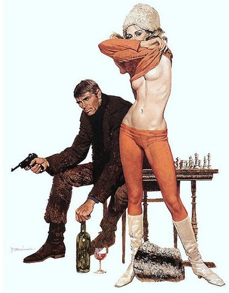
Dave Seeley
In working out concepts for this book cover, Dave knew right away that it needed a classic James Bond look. He pitched the publisher on doing the piece in the vein of McGinnis, who really defined that Bond aesthetic.
This particular cover was his inspiration (though it isn’t Bond, it is still 100% McGinnis) and he designed his take with the same emphasis on figure silhouettes in the foreground. He brought in a number of other elements, from the s-curve of the standing figure to the chessboard in the background, to help pay tribute.
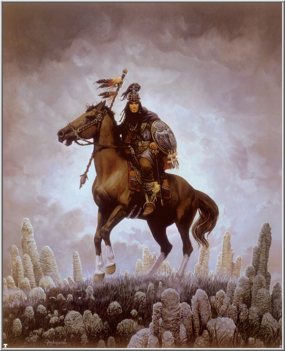 |
| “Forgotten Realms” by Keith Parkinson |
 |
| “The Swallowed Realms” by Randy Gallegos |
Randy Gallegos
Sometimes paying tribute to another artist is dictated by the client. In this case, Randy was commissioned for a D&D chapter header that would tie back to Kieth Parkinson’s original Forgotten Realms box art. The scene description was fairly specific in some aspects (see Randy’s much more detailed account here: http://gallegosart.com/blog//2008/08/tips-techniques-homage-to-parkinson.html) but there were still opportunities for exploration and reinterpretation.
What I find most interesting in comparing these pieces are choices Randy was free to make and how they depict an updated version of the character but still strongly connect to the original. The major costume elements are all there, but small changes of details prevent him from feeling like a cartoon character with a closet full of identical and never changing clothes. On the other hand, the inclusion of those very distinctive white rocks bring us back to the original piece in a way that might seem logically questionable but is absolutely pitch perfect on an emotional level.
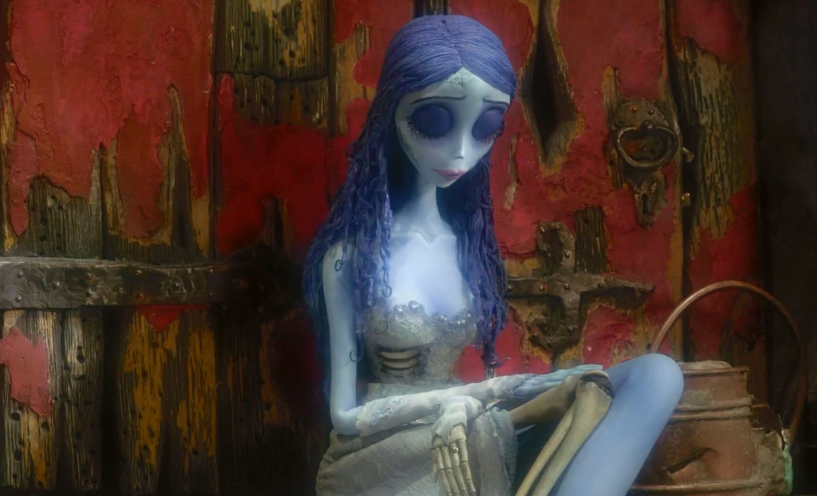 |
| Still from The Corpse Bride |
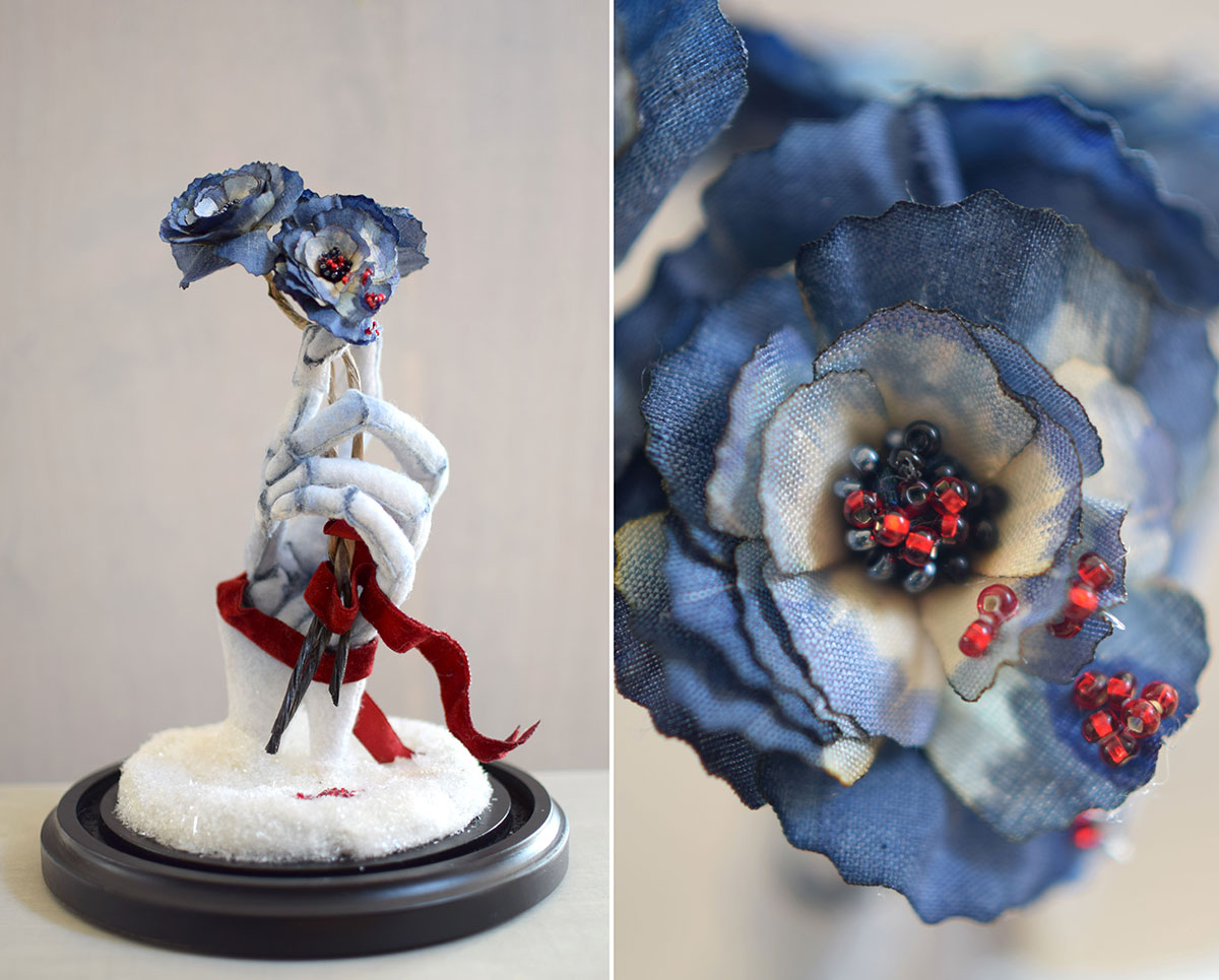 |
| “Cobalt and Crimson (Loves Me Loves Me Not)” by Lana Crooks |
Lana Crooks
When Lana was invited to participate in a traveling gallery show themed after the films of Tim Burton, her first step was to marathon her favorite Burton movies. This still from The Corpse Bride jumped out at her because of its use of color, which is less expected than Burton’s ubiquitous black and white stripes.
Similar to the evolving color pallet in the film, Lana started with an entirely monochromatic soft sculpture and gradually added color to it. She sampled colors from the still, found corresponding pantones, and mixed dyes to match. She applied them with paintbrush and airbrush, along with colored beads, to perfectly capture the feel of the source.
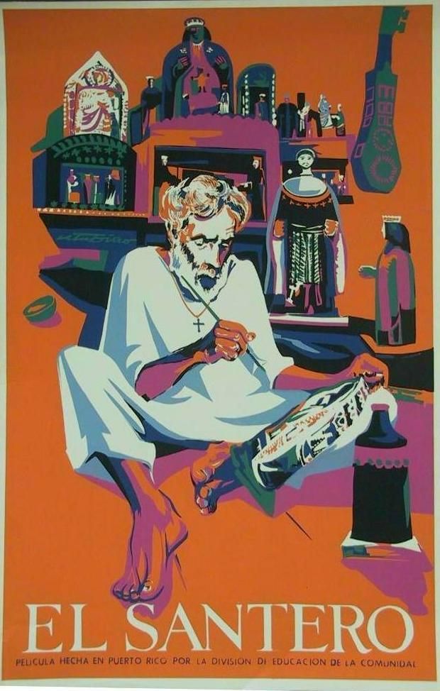 |
| “El Santero” by Rafael Tufiño |
 |
| “Kingmaker” by Goñi Montes |
Goñi Montes
Goñi grew up looking at Tufiño’s strongly graphic screen prints. Their masterful use of bold colors and flat graphic fields left a permanent impression on him and he has always admired the use of negative spaces. In his studio, Goñi has multiple Tufiño prints hanging which he sees daily while he works.
By his nature, Goñi feels that he thinks in a sculptural and dimensional way. His inclination is to render turning forms and depth, but he contrasts this deliberately with flat graphics inspired by Tufiño to achieve pieces which exist in both worlds. (you can see Goñi’s process for the above piece here: http://www.goniart.com/2015/11/kingmaker-process/)
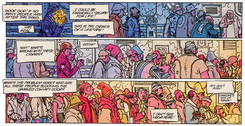 |
| excerpt from The Incal by Jean Giraud Moebius |
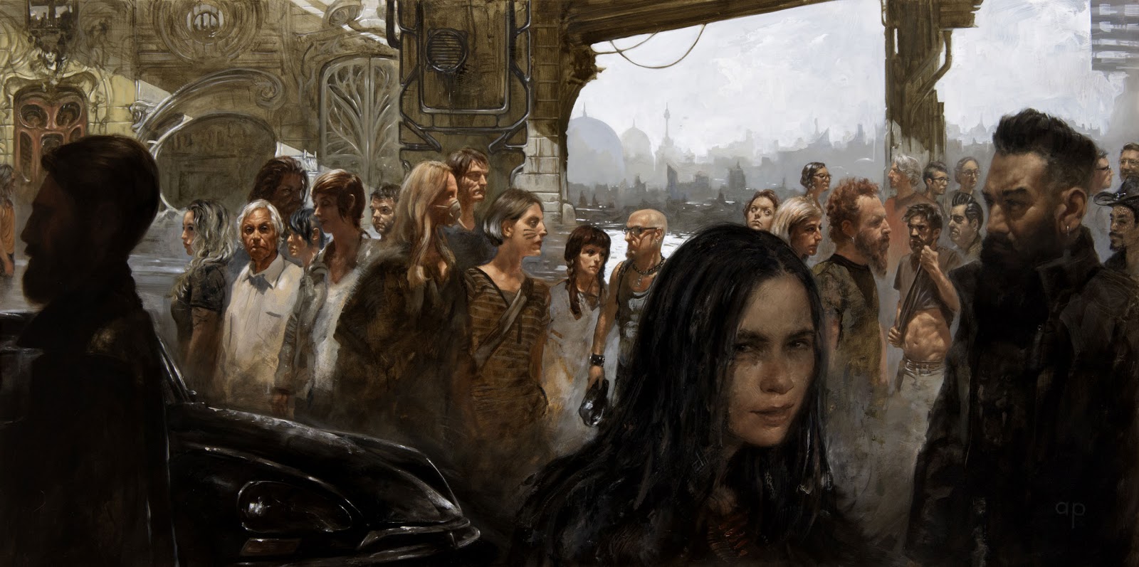 |
| “The Children” by Anthony Palumbo |
Anthony Palumbo
While I was talking to Anthony about these particular frames of this comic, he mentioned scenes from Blade Runner with a similar vibe. He mentioned earlier paintings of his that showed tight crowds in urban settings. But when I asked how directly he might have been thinking about these panels when starting this painting, his answer was “this is always in my mind.”
This painting was done almost entirely on the fly, starting with one figure (the bald fellow with glasses just left of center) and populating it one by one from there. His original impulse was to keep them relatively similar in scale like the Moebius drawings, but the piece naturally found itself needing more depth. Nods to Moebius can be found in the Parisian middleground architecture and the front end of a Citroen.
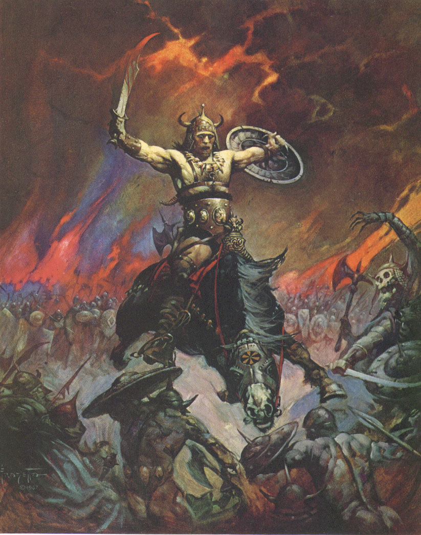 |
| “Conan the Conqueror” by Frank Frazetta |
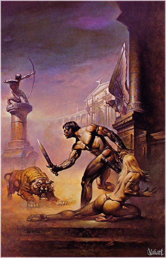 |
| “I Am A Barbarian” by Boris Vallejo |
Boris Vallejo
In the spirit of 12 year old boys everywhere, a longstanding tradition of classic fantasy art fans is debating Boris vs. Frazetta. The truth is that his admiration of Frazetta’s work was instrumental in Boris’s decision to pursue fantasy art at all.
In the late 1960s, Boris was working in advertising but his artistic interest was in bodybuilding and painting the figure. It was seeing Frazetta’s paperback covers (which were groundbreaking and contemporary at the time) that inspired Boris, very abruptly, to risk his steady work drawing product illustrations for something more exciting.
This cover (for Edgar Rice Buroughs’s “I Am A Barbarian”) was one of Boris’s earliest paperback jobs. His goal was to paint realism but with flair, and it was the start to a long and impressive career that has since inspired so many others.

Terrific post. Perhaps worth mentioning that Rockwell's Rosie the Riveter pose is itself commonly thought to have been inspired by Michelangelo's rendition of the Prophet Isaiah.
Thanks Robert, I don't know that I'd ever learned that before but I think the comparison leaves little doubt!