My assignment here was to paint Elspeth, who is one of the iconic planeswalker characters from Magic: the Gathering’s storyline. She’s been dead a while and I was asked to show her in a specific part of the underworld on the plane of Theros—a world heavily inspired by ancient Greece and Rome. She needed to have an air of determination about her as if she was about to begin her quest for escape and revenge.
(Side note: this image was being done for a planeswalker card within the game. These cards have vertical aspect ratios and typically are full-length portraits of the characters.)
Anyway…
Elspeth is, to this point, the only iconic Magic character I’ve ever depicted. Over a decade ago, I painted a seven page comic story about her (if you bother to look it up, I got better), and I had to paint her a lot. In fact, I might be the person who’s drawn and painted her the most at this point (or might not, I don’t know). So, I kind of went into the job feeling like I had a pretty good handle on who Elspeth was and what she looked like.
The interesting thing about the planeswalker characters is despite having pretty established looks and costuming, their actual faces tend to vary a fair bit depending on who’s depicting them. This degree of freedom isn’t a bug, it’s a feature—a feature that allows for a very wide range of artistic styles to be applied to the characters, while maintaining consistency through general characteristics and clothing. This in turn allows each artist an opportunity to make their mark on whatever planeswalker they’re depicting, which is pretty awesome if you ask me.
Either way, like I said, I figured I knew what she looked like, and so I took the various reference provided, tried to supplement it with my own a bit and went on to doing my sketches.
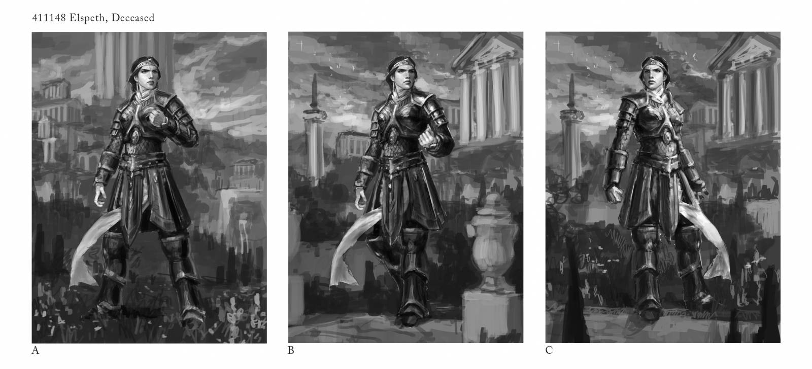
Whenever offering up individual options, Wizards prefers that they be presented on a single page. I try to keep the visual clutter to a minimum for clarity. Sometimes I include a sentence or two explaining my intentions, but this piece didn’t have a ton of elements going on and I figured the sketches were clear enough.
Sketching for stuff like this is an interesting process that involves a lot of fits and starts. Sometimes when I read an art description, I know straight away how I want to depict the image, what gags I want to employ, where to put the camera, etc. Other times, I run through a lot of iterations and false starts, eventually finding the answer among the scribbles. Given the high profile nature of the assignment, I thought it prudent to provide multiple options.
In the end, they chose sketch C, with one note. It was felt that I needed to revisit and tighten up the face. The sketch being a bit on the rough side, I went ahead and took another pass as requested and resubmitted. While it was agreed that I still hadn’t quite nailed it, the art director and I both figured I’d be able to sort it out in the paint.
Overall, the painting went smoothly enough. In fact, it was a pretty straightforward job. The concept art for the background was pretty clear and fun to paint. Her armor was an interesting challenge, and I even tried to limit my palette a bit to give myself another hurdle to jump over. In general, I was going for a mostly secondary color palette with oranges, violets and greens throughout, with violet being the most dominant—even if it was pretty muted for the most part.
Here are some process shots that aren’t as good as you, the reader deserves, but my studio is quite small and it seems to be impossible to photograph my work in there without glare from the windows or from the lights.
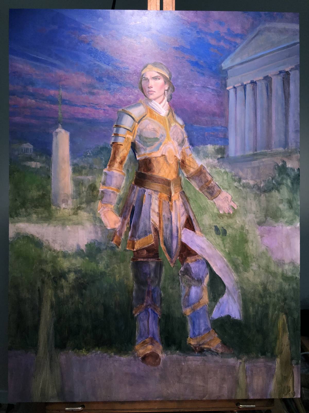
Early on, it’s just a lot of quick oil washes of local color to kind of start nailing some of the color relationships down. I also tend to start on faces to see if I can nail those down too.
After getting a few things figured out, then I just started trying to finish things from background to foreground (something I don’t always do, but somehow it felt right on this occasion).
Finishing the background for the most part and moving into the foreground.
This might feel like a big leap, but the armor was mostly completed in a day. It was a bit fiddly in some places, but it still went surprisingly quickly.
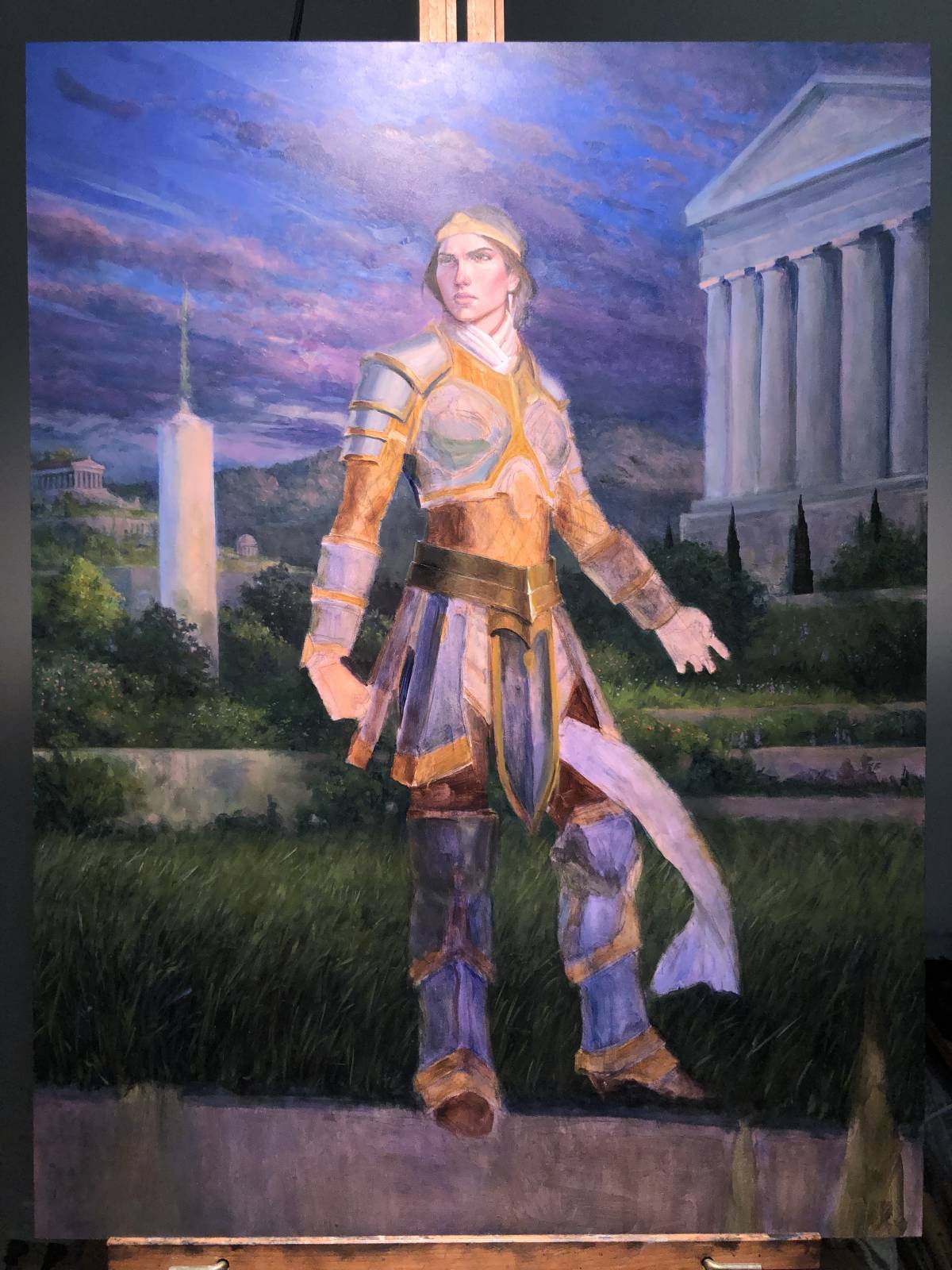
Changes here are a bit more subtle and are more refinements to the armor I’d completed than anything.
I ended up changing the hand on the right (her left) very late in the game. The original hand position kept reading as one of horror or pain rather than determination, which didn’t feel right to me.

This is about where the face landed when it was all said and done. Sort of.
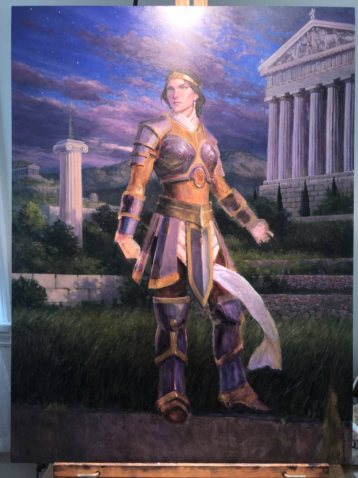
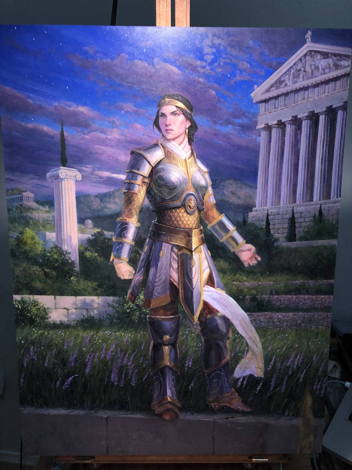
So the finish came out like this:
Eagle-eyed viewers will note that the face is a bit different to the close-up photo above. This is because I ended up reworking the face a bit digitally to give an alternate option, which I kept as a separate layer.
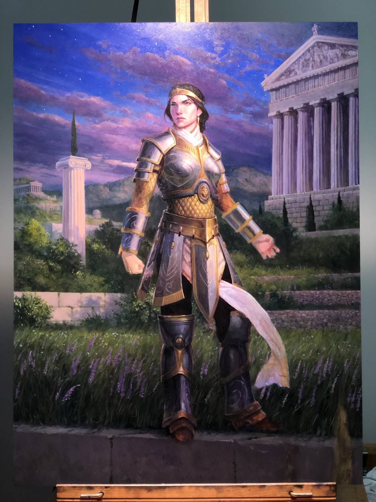
Finished? Not finished.
After handing in the piece, it turned out there were a couple of issues:
1) The palette was overall too violet and started to infringe on the aesthetic of a different setting. Reworking the sky would solve the issue.
2) The face needed another pass.
3) Lastly, a subtle continuity detail—a small puncture in Elspeth’s chest plate—had been overlooked as the art description was written and unfortunately the absence of this detail had snuck through unnoticed during the approval process.
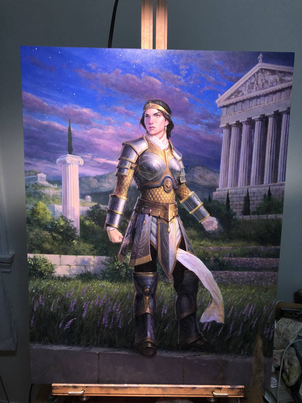
I looked through the notes (some of which were digital paint overs provided by Wizards) and headed back to the easel.
Reworking the sky was a start, but a shift in sky color also meant a shift meant reworking the reflections in the armor as well as in the reflected light in the fabric and the architecture in the background. Fortunately, fixing all that actually took less time than I’d expected and I think ended up improving the piece.
The tear in the armor was a piece of cake. Thinking back on it, though, had I known that detail needed to be there, the painting might have turned out differently as I likely wouldn’t have submitted the sketch that was ultimately chosen. I feel like the pose as it stands, by partially obscuring the tear, lessens the impact of the narrative. It’s a small detail, but an important one, and it’s something I would have tried to capitalize on. But hey, things happen.
Lastly, regarding Elspeth’s face, Wizards was kind enough to provide some additional reference which was helpful in nailing things down. I reworked the face digitally and offered up several options. After we’d settled on which version to go with, I copied the digital face in oil paint.
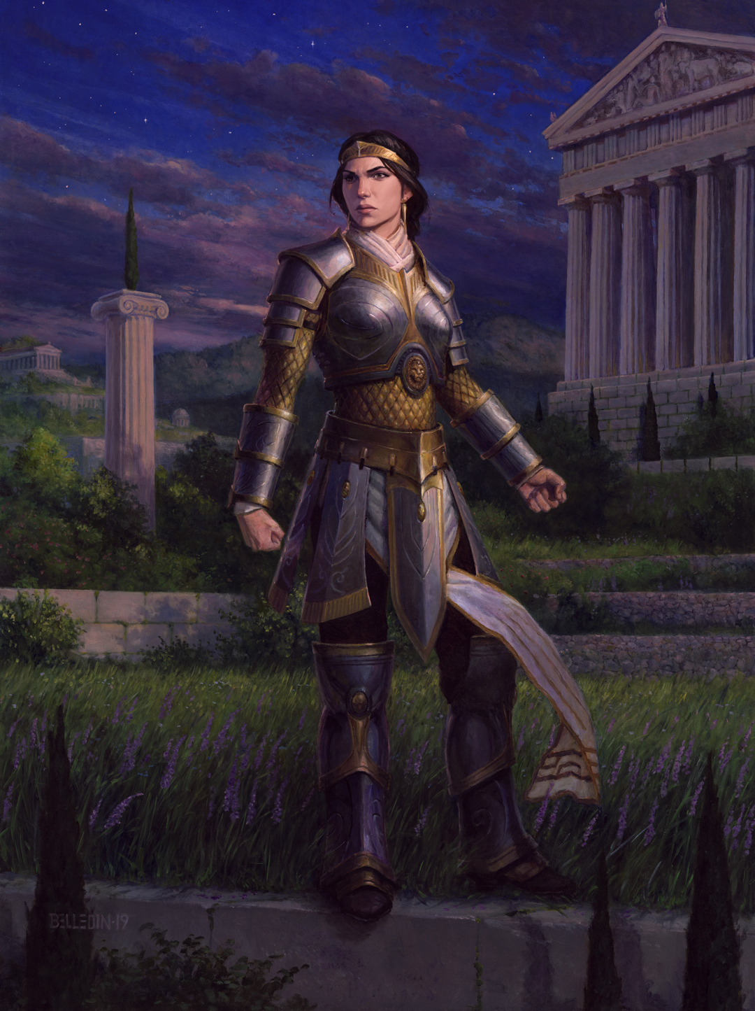
Finally finished, this is where it landed:

The finished piece is oil on gessoed hardboard and measures eighteen inches wide by twenty-four inches tall.
Sometimes jobs can be frustrating. This was one of those jobs. It could have been less frustrating if maybe I’d asked more questions or been clearer in my intentions. Certainly if I’d provided a color study, the reworking might never have been necessary. Plus, as I said above, I really should have pushed to get the face to a point that the client was happy with before I even thought of going to paint (though I probably would have been diligently painting the piece (except for the face) in the meantime in order to meet the deadline. By not nailing the face down, I was groping in the dark for what Elspeth was meant to look like, and so I was constantly going back into the face to try and “fix it” as I think the progress photos kind of show. Nailing that down in the sketch would have allowed me to go into the painting with a bit more confidence and I likely would have saved myself (not to mention the Art Director) a bit of frustration.
The missed detail of the armor tear? That doesn’t bother me. It happens. I’m one person, so my process and workflow are extremely simple and straightforward. The Art Director? Yeah, she’s not just my Art Director. She’s also my point of contact with an entire team of game designers, writers, editors, other art directors, etc. There are different folks behind the scenes responsible for story and continuity and all of that stuff. My Art Director is wrangling a ton behind the scenes and is trying to sift enough of the important stuff out to get good images out of me and 75-80 other artists at the same time. She’s got a LOT more on her plate than I do mine. Besides, I’ve known and worked with the Art Director for seventeen years and this is the first time something like this has ever happened. Regardless, the company treated me fairly and I was compensated for that particular change. Not many clients do that anymore, so I really don’t have much to complain about.
(Side note: understanding your client’s policy on revisions is VITALLY important. Typically if revision fees are offered at all, they are offered only for issues caused by the client. In this case, just the omission of the tear in the armor was covered by the fee. The other stuff was on me. Some clients build revisions into the actual illustration fee itself—in fact, I once worked for a company whose contract guaranteed them three rounds of revisions as part of the illustration fee. It was the first clause in their contract, and boy did they use those revisions! Anyway, be aware of what the contract says so you’re prepared in situations like this, and if you’re providing the contract, make sure revision fees are dealt with somewhere in it. Since revisions can cause a cascading effect on one’s schedule, understanding where one stands could expedite things.)
Twenty years in and still learning lessons. This job is great for that. And despite the occasionally frustrating gig, I wouldn’t have it any other way.
Learnt a lot with this one, the importance of knowing your client is huge, Thanks for sharing!