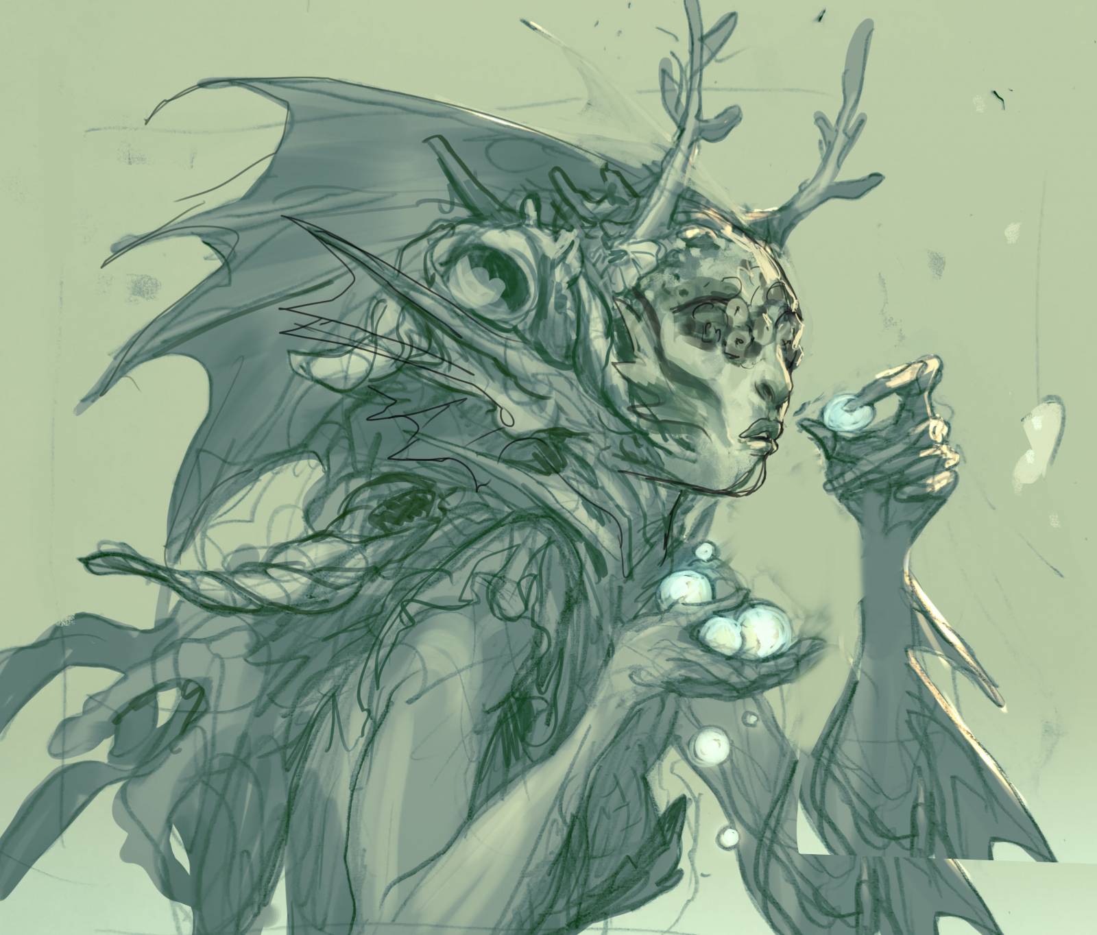
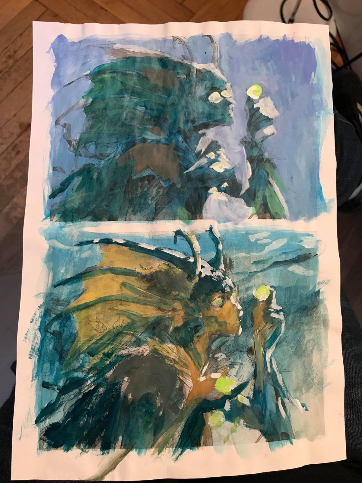
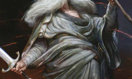
Thassa´s Oracle sounded from the art description like a normal magic card illustration: A female merfolk looking at some water pearls as if in a crystal ball, but her eyes are covered with barnacles. My idea was a torso closeup with the mermaid seen from the side holding up the water pearls as if she could still see them even with her eyes covered. I made 2 sketches and sent them for approval. I liked the top sketch best because I thought the silhouette was the clearest, but I made the second one, to have a solution that had the connection to the pearls more in focus. Only after they were sent and I showed the sketches around to the other guys at the studio, one of them asked “Is she eating the pearls?” Damn! I hadn´t seen that. Having that mental image put in my mind I could not un-see it. I could only look at, especially the bottom one, as if she was munching on ocean M&M´s and the top one as if she was savouring the taste.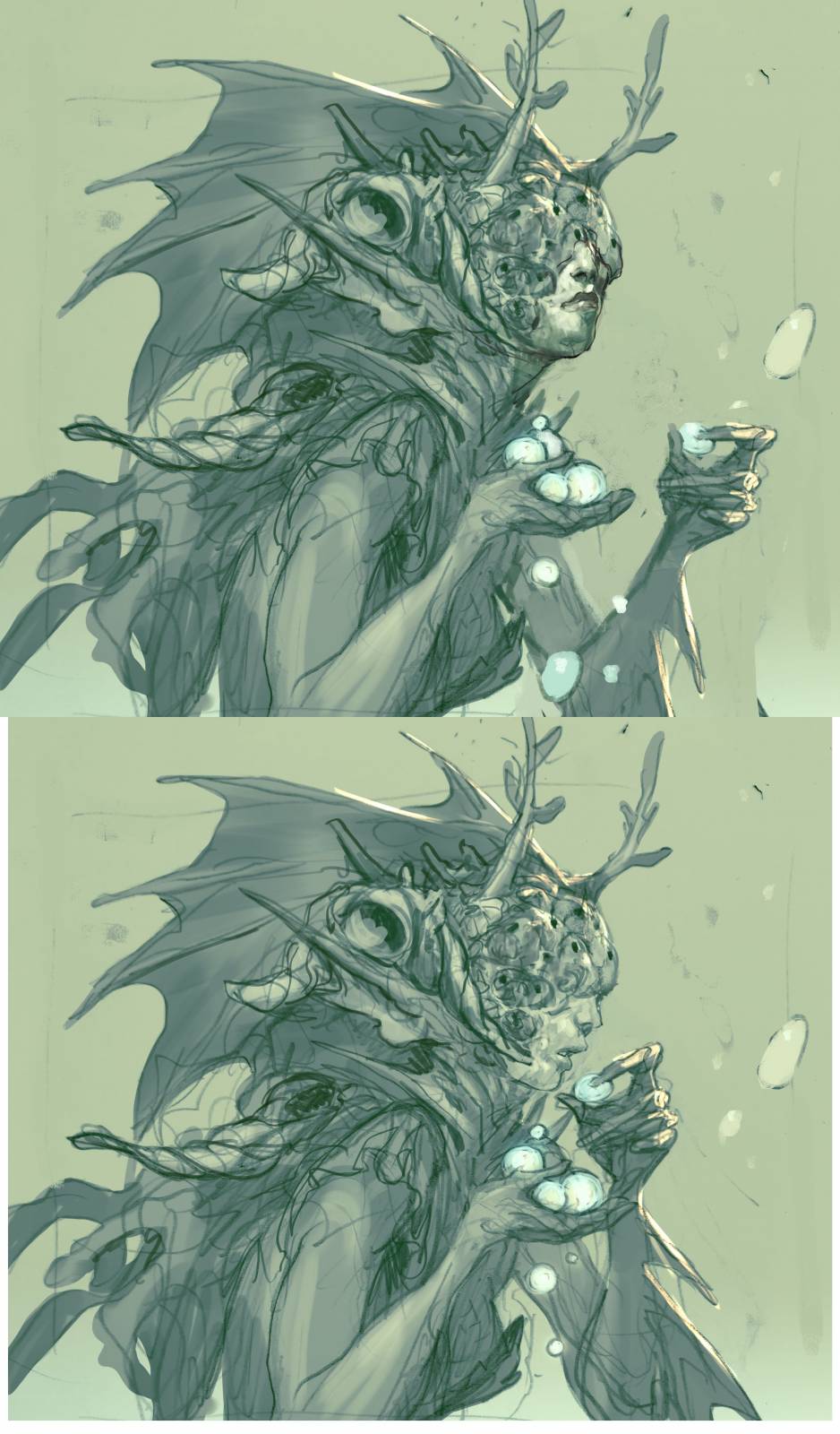
Solution came from Dawn Murrin, my art director. She asked me to loose the barnacles. They made her look like an Eldrazi spawn – a creature from Magic´s univers. I asked Dawn if I could replace her eyes with water peals? Because I really liked the idea of a Seer that could not see. And she agreed if I did not make it creepy.
Back to the drawing board. I was super excited because of the twist that the water pearly eyes made to the narrative. Perhaps she herself gave up her eyes to be able to see the future? Kind of like Odin that put his one eye in the well of Knowledge. I suddenly had an emotion or a feeling to guide me, and I ended up changing the angle of her face into a small tilt. Like she was turning her head a bit to look clearer into the pearl.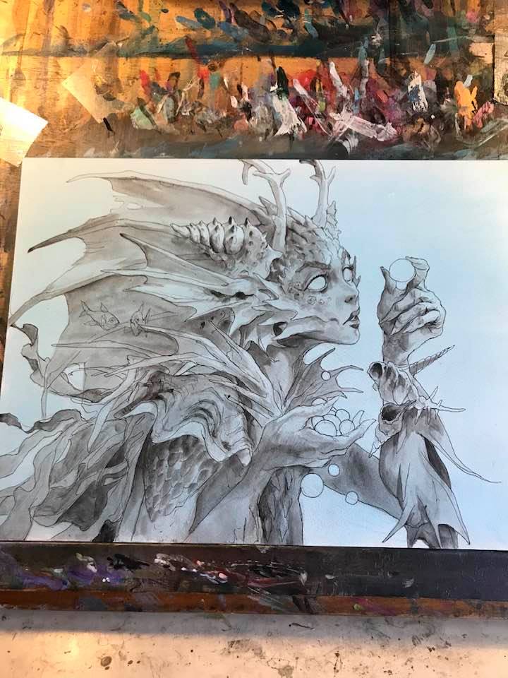
a version with less barnacles
I traced the sketch to board and inked it and added greytone in acrylics. This is a part of my technic. This way I have a full black and white preliminary that I can work on and tone how I like it. The drawing and the lines stay in the painting as much as I can and act as a guideline for my brush strokes. Also the dark drawing makes it possible for me to see the drawing through a couple of layers of paint. A pencil drawing would disappear after one saturated layer.
My color comps are different in the way that I tried 2 opposite light sources. First one has the figure in silhouette with a top down rim light. The lack of direct light obliterate local colors and would render her very monochromatic. Second one has local colors, more soft light that would allow us to see different skin colors and so on. I liked the first one for its clarity and the second one because its more interesting to paint a colorfull detailed figure than one clad in shadows. So I decided to take the best from both.
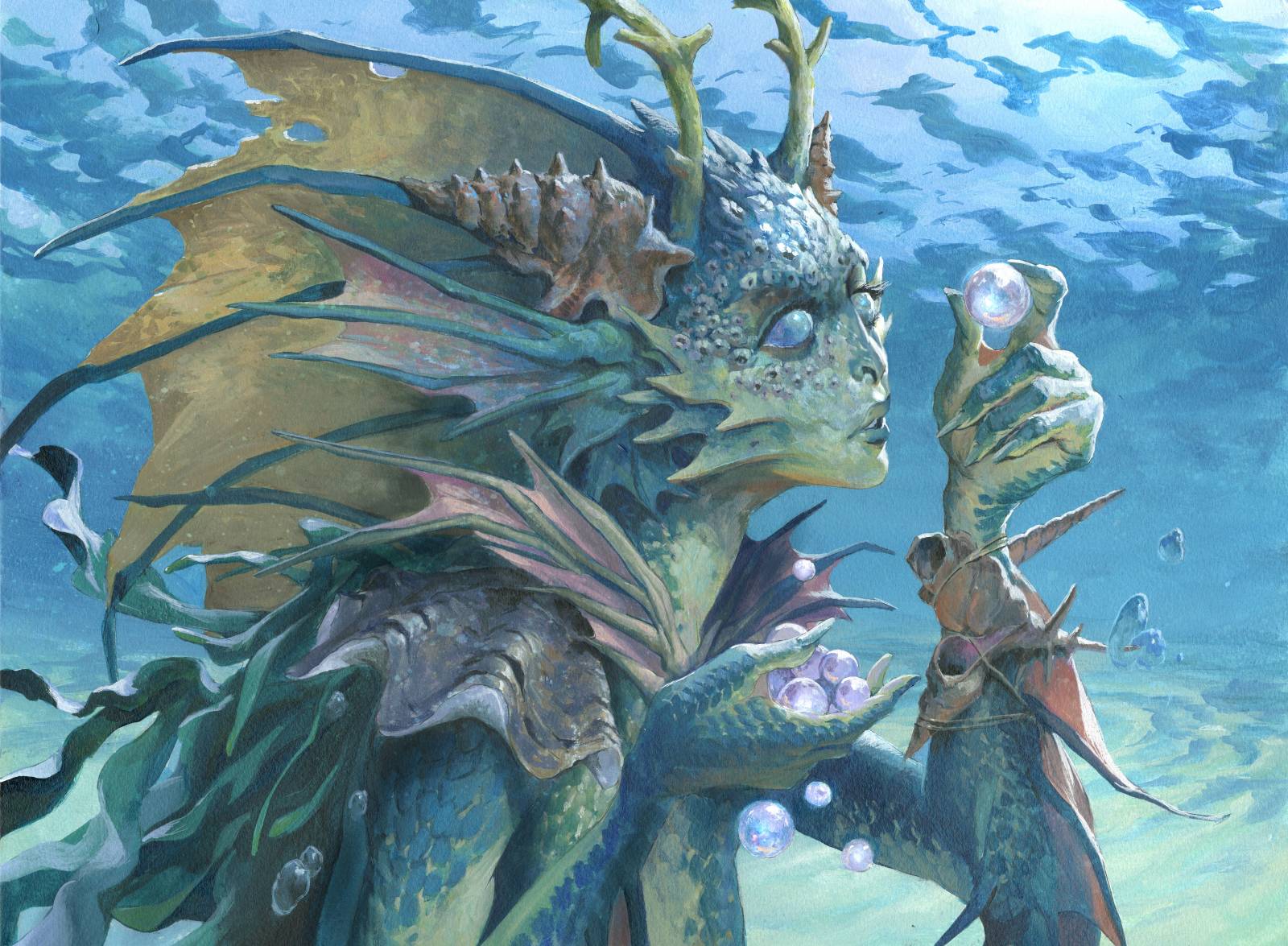
A year ago I painted another merfolk painting that I liked a lot because of the water effect. I thought I would use the same technic here. 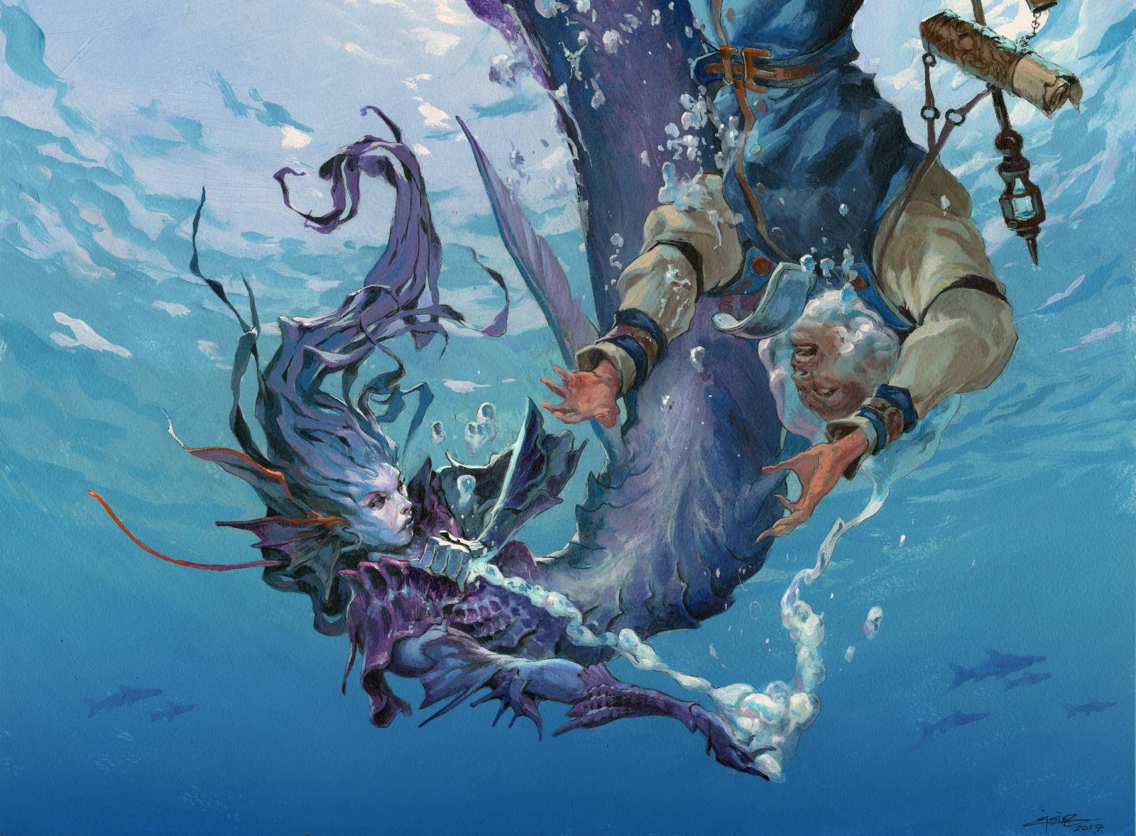 But the this image was set in a world inspired by Greek mythology and I wanted to capture the sunlit green water I remember from tons of vacation in Greece. I needed the waves on top and a sandy bottom and lots of green water. As you can see in the black and white version I did not ink the waves or the sand or the reflections. I needed everything to be done fresh and random looking and couldn’t rely on sketching every detail. I masked away the figure with frisket film that would allow me to work freely when doing the water and got to it.
First I painted a wash from the top going from light blue down to a yellowish green in the bottom. I kept the top right almost white. This was going to be the sunlight. Then I used a more greenish blue to paint all the waves. The light blue is the sky color seen up from under the water. The greener/dark blue is the reflection from underneath, the ocean and the sandy bottom. Thats why the 2 blues needed to be different in color and temperature rather than just using a darker version of the same color for waves. I had to work fast and blend it all down towards the bottom. Slowly as I reached the middle of the painting I started adding more green and slowly faded into the yellow green from my first layer. Lastly I added highlights to the sand dunes and cleaned up some blending. What I really enjoys when stuff like this succeeds is the endresult looks so simple and effortless. the minimum of layers and stroke possible to create an effect is what I aim at. Especcilally in somethisng so fluid and random as water, I did not want it to look overworked.
I pealed away the masking film and painted the figure. Only thing I constantly had to remind myself was to not go too hard on the saturation, especially in red. The light under the waves tend to make the red colors disappear first and everything would look too much like above water if I went too far in the local colors. the yellow fin and the sand color chin and palms and neck was the hardest. I constantly added layers of blue and grey to take away the warmth of it.
The last change was done digitally. You might have noticed that her nose is different from the black and white sketch to the final. I had strayed too far from the style guide and had to change the nose to fit the Theros merfolk better.

Excellent piece love the texture in this piece I wish they let you keep the barnacle blindness coz I love those sketches.
It always amazes me how you design within your sketches/comps and not seperately like you do when composing figures