Gregory Manchess
I was an early fan of Hellboy. Forget the comical name or the character himself. What grabbed me from the moment I spotted it was it’s graphic appeal. Mike Mignola designs his panels, pages, story, and dialog. They are impeccable and luscious. I want to linger on every page because my brain is always happy to fill in the blanks he leaves practically everywhere. The mark of a superior designer and draughtsman.
It’s the risks he takes with leaving things out that makes the difference. Huge explosions with barely an indication of detail, and large areas of color that he and Dave Stewart, an excellent colorist, work out together. Creatures and settings drawn from simple outlines or slightly modified cut-outs as figures. That takes commitment to leave out all the dang detail.
But it’s thirty-odd years of built-up risk-taking. You get that with training. When I scan his pages I feel the joy Mike projects as if I held the pen in my own hand. The artist in me feels his drawing chops coming through.
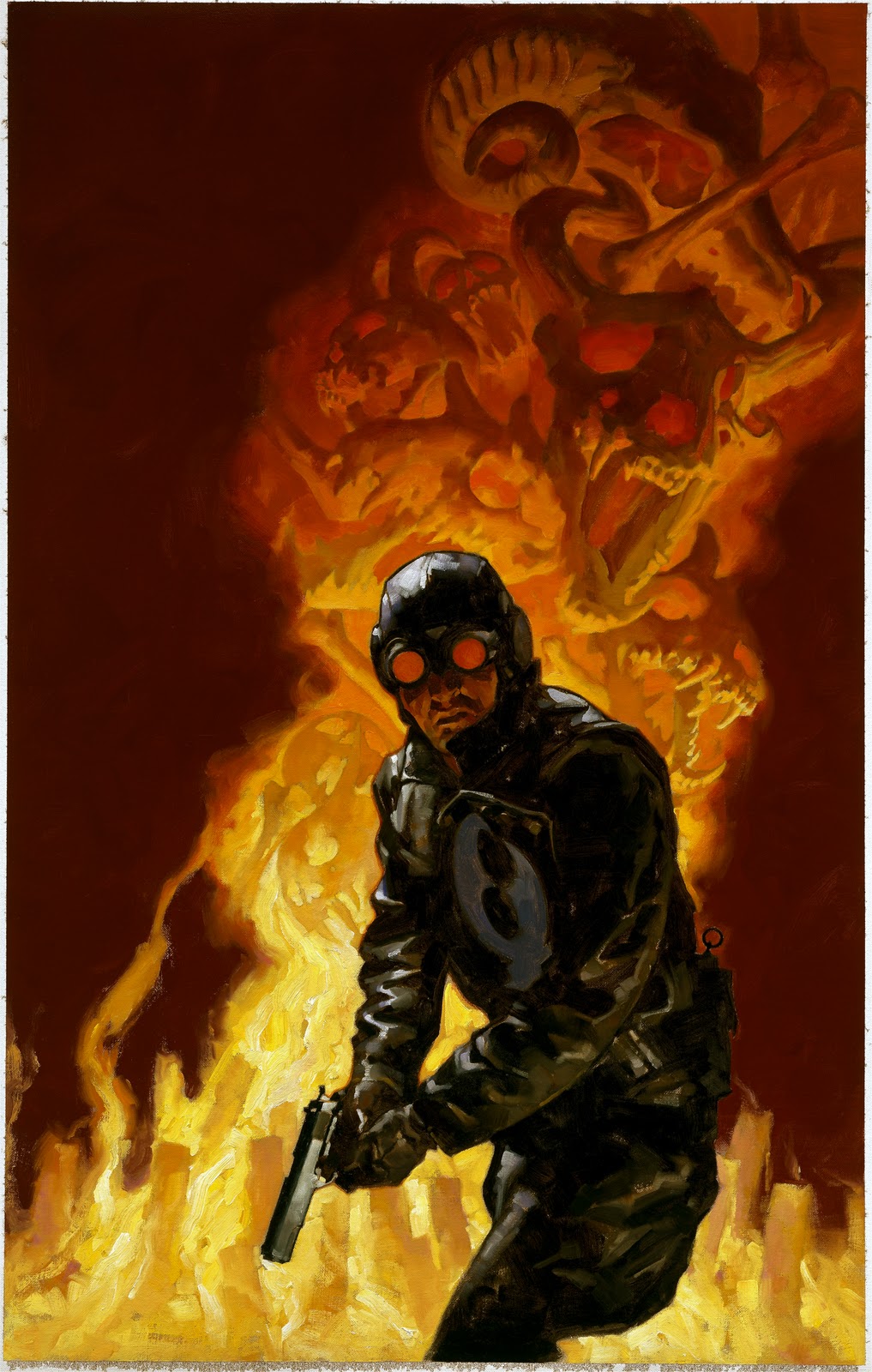
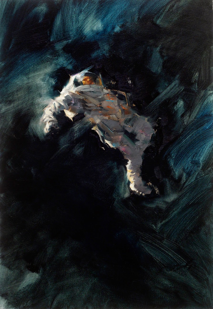
That’s what I was shooting for in my own piece based on one of Mike’s characters, Lobster Johnson. I wanted just enough detail to come through, but again, if I nailed the values, I could get away with murder.
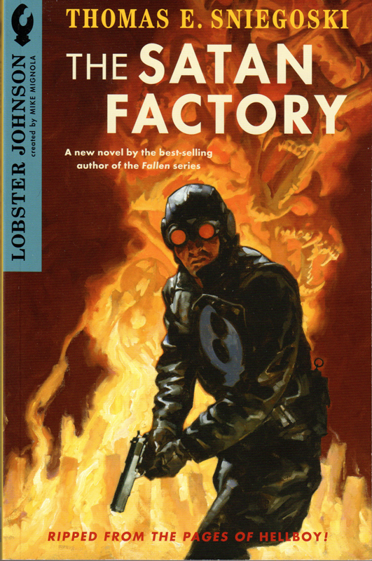
This is a cover for a trade paperback called, The Satan Factory, by Thomas E. Sniegoski, published by Dark Horse. Lia Ribacchi art directed, with Mike overseeing the process. As always, the composition is found in the thumbs.
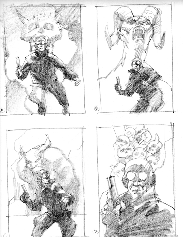
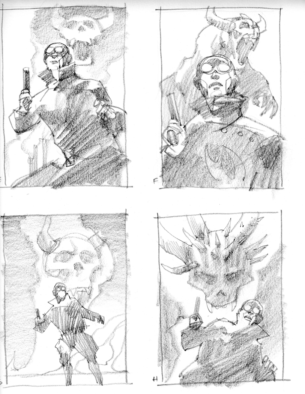
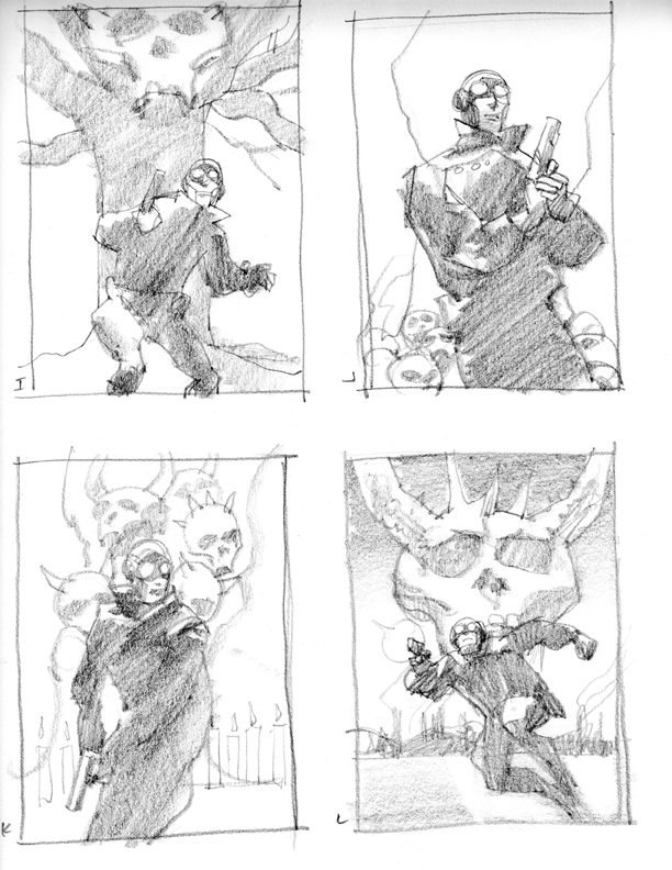
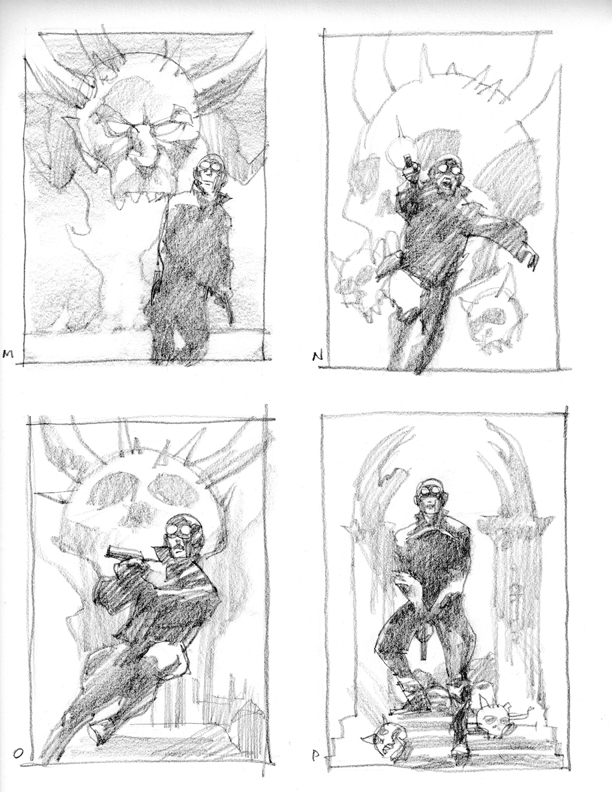
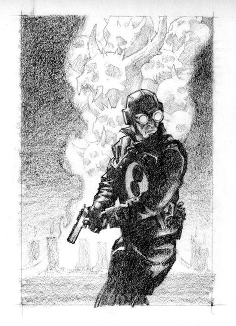
The first finished sketch wasn’t quite there. I wanted to catch Lobster in just the right hesitation, making a decision to fire or not to fire. That slight, detection-laden moment was what I wanted.
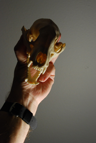
Mike guided me into the demon skulls floating in the background. I dug out some of my skulls, and lit them. Then I redrew them, modifying to fit.
Reworked sketch.

Completed painting.

wonderful!! Thanks for posting the process.
Great post Greg. This is a great composition. Love seeing the thumbnails you went through to get to this. I like how the ring of the grenade on his belt has its own little spot of backlight too. 🙂 Great textures and your brushwork is something to behold!
Howard
I've been a fan of this painting since I first saw it in Spectrum 16. One of my favorite characters by one of my favorite painters.
Also, I thought your comment on seeing the joy Mr. Mignola projects in his art to be interesting. I recall in some long ago interview that he said the drawing part was the most tedious for him. Either way, his work certainly rules.
-Chris
I second Chris's comment. I've always really loved this piece. Apart from having such strong and powerful design sense, it is just such an engaging image! It really adds to an already fascinating character.
This really works! Colorwise, the dark figure against the orangey background is very clever. It definitely has that Mignola expressionist feel to it.
Very inspiring post!!
*cries tears of joy*
Its always cool when an artist is explaining how he creates and works to get the findshed picture done. Nice job, thanx.
Fabian
(“The Hellboy Archive” – http://www.CompleteHellboy.com)
As always, great work, Mr. Manchess. Thank you for sharing your process, and for your appraisal of Mike Mignola's work. I have to say that it's taken me quite a while to warm up to Mignola; that ultra-simplified style, though it certainly has a lot of design strength, has always turned me off in the past. I am trying to get a greater appreciation for it, though.
Also, I've been reading Gene Wolfe's Wizard Knight books for the past few weeks, and I've really enjoyed seeing your drawings at the head of every chapter. It always fascinates be to see how the sensibilities of “painterly” artists such as yourself manifest themselves in pencil drawings.
Such an inspiring post, Mr. Manchess. I love the thumbnails – they really do work out the final image. It's great to see your process. 😀 <3
Awesome as usual. Now, when are you putting out an art book collecting some of your greatest works? I'm sure you could fill a few books.
Thanks for your article! I have read through some similar topics! However, your post has given me a very special impression, unlike other posts. I hope you continue to have valuable articles like this or more to share with everyone!
This is good
Mignola’s minimalist approach to Hellboy’s visuals is what truly sets it apart. It’s amazing how much he conveys with so little, trusting the reader to participate in the storytelling. It reminds me a little of the stark simplicity of the Dinosaur Game you play when your internet’s down, but applied to something far more intricate and compelling. It’s a testament to the power of suggestion in art. The interplay of light and shadow, the bold shapes – it all builds such a unique atmosphere. Stewart’s colors definitely amplify that effect!
대전출장마사지로 쉽고 간편하게 집에서 경험해볼 수 있습니다.