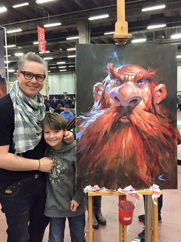
– By Jesper Ejsing
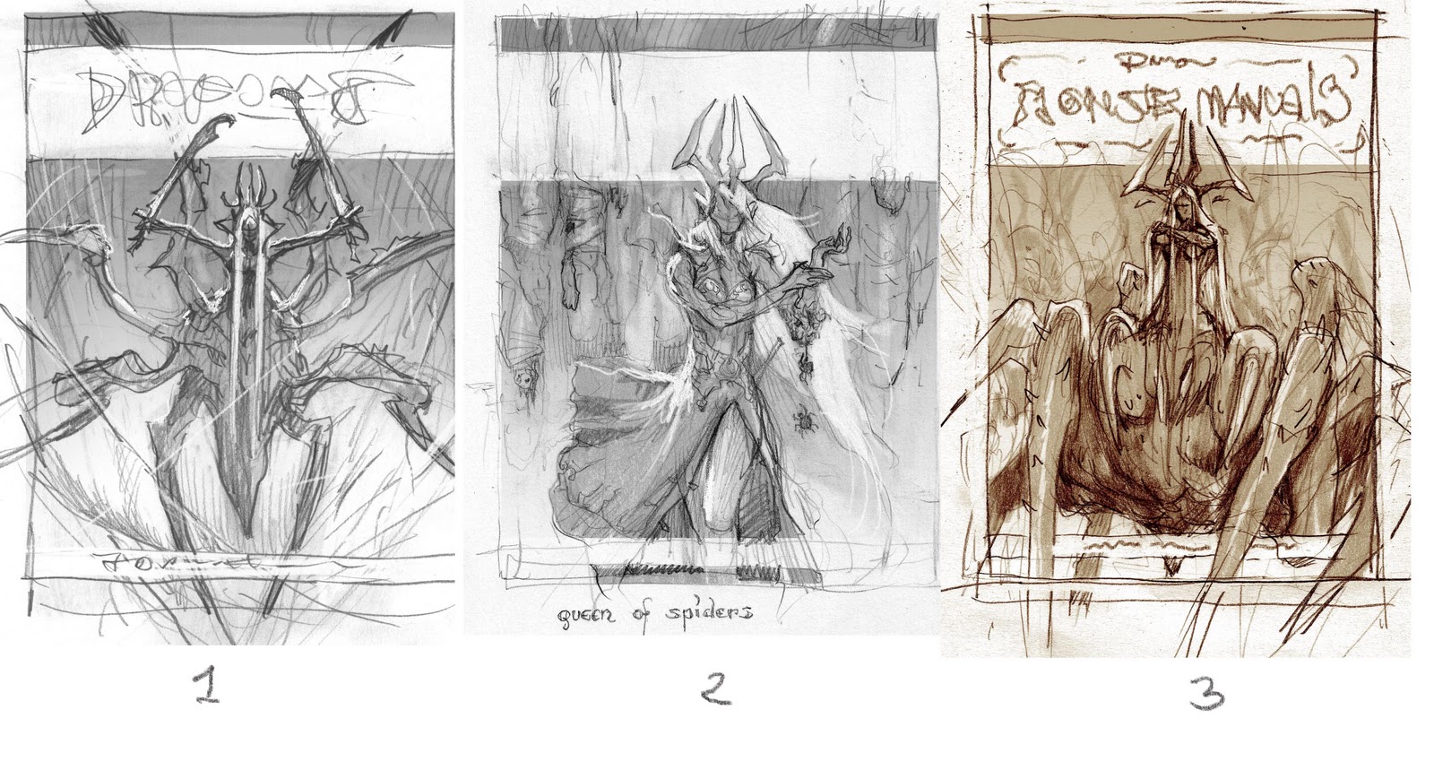
Today I want to tell you about a cover that went a little out of the ordinary way for me. I was assigned to do the cover for Dungeons & Dragons Monster Manual # 3. The Art Director asked me for 2 sketches. The figure on the cover was going to be a Drow Spider Queen God, and as she could be seen in 2 different forms, they wanted me to do a sketch of both forms before deciding. The forms were either in Drow-form or half spider-form.
I submitted two sketches, number 1 and 2. I was sure they would choose number 2, the Drow-form and was already in the middle of starting it, when I got an email asking not for number 1, not number 2, but a mix between them… Okay, I tried to combine the two and sent them number 3. It was kind of approved if I could open up her arm. Her pose looked too closed off, and I totally agree.
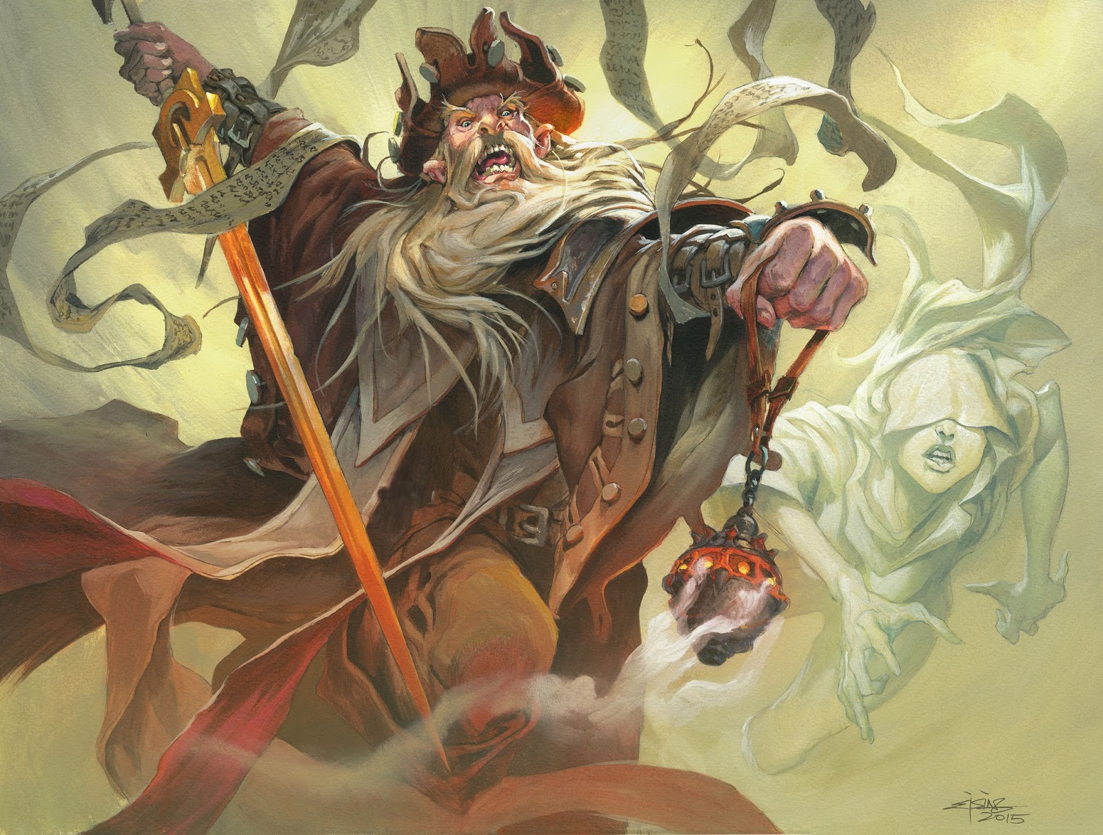
Here comes the part of this job that was kind of nice. I, for one, will not complain. When I asked one of my regular models to pose for this Drow queen she said that she couldn’t. But to compensate she hooked me up with a friend of hers, a Playboy model from Slovenia; Barbara Zatler. She thought the whole thing sounded funny and agreed to pose for me. We shot a bunch of photos with her trying to look mean and imposing, not a very easy thing to do for someone who is used to looking pretty and sexy. I used the photos and created the black and white version you see in number 4. From that stage I did a colour rough (number 5) in green/bluish tones to capture and underground mood. I then proceeded to the final. (number 6)
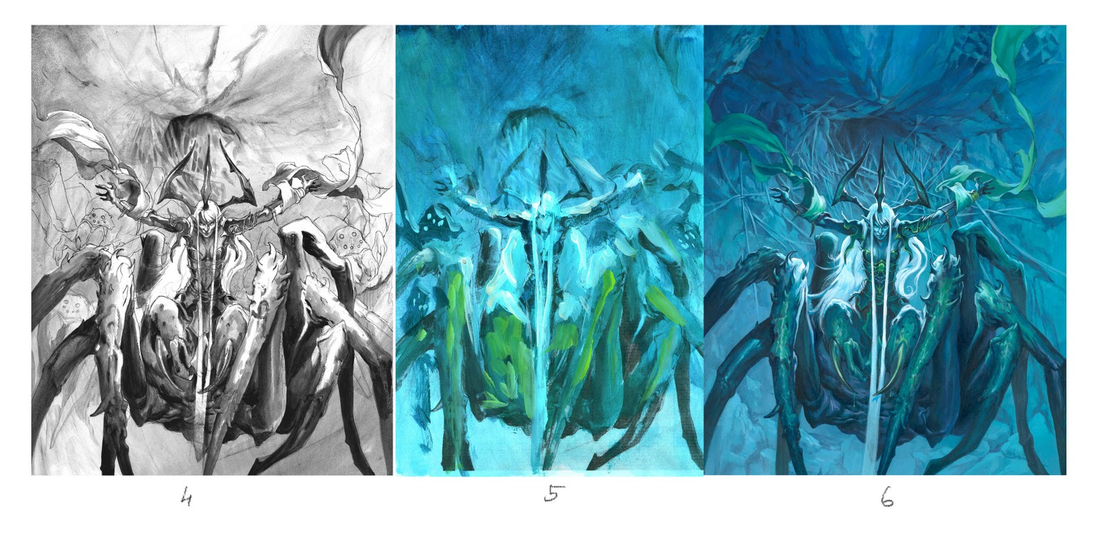
Well here comes the part I was not prepared for: The art director didn´t like it. Well she liked it but thought the whole image blended too much into the background. In order to fix it I tried adding more saturation to the cloth and I lightened the background. I tried a bunch of stuff, and nothing really worked.
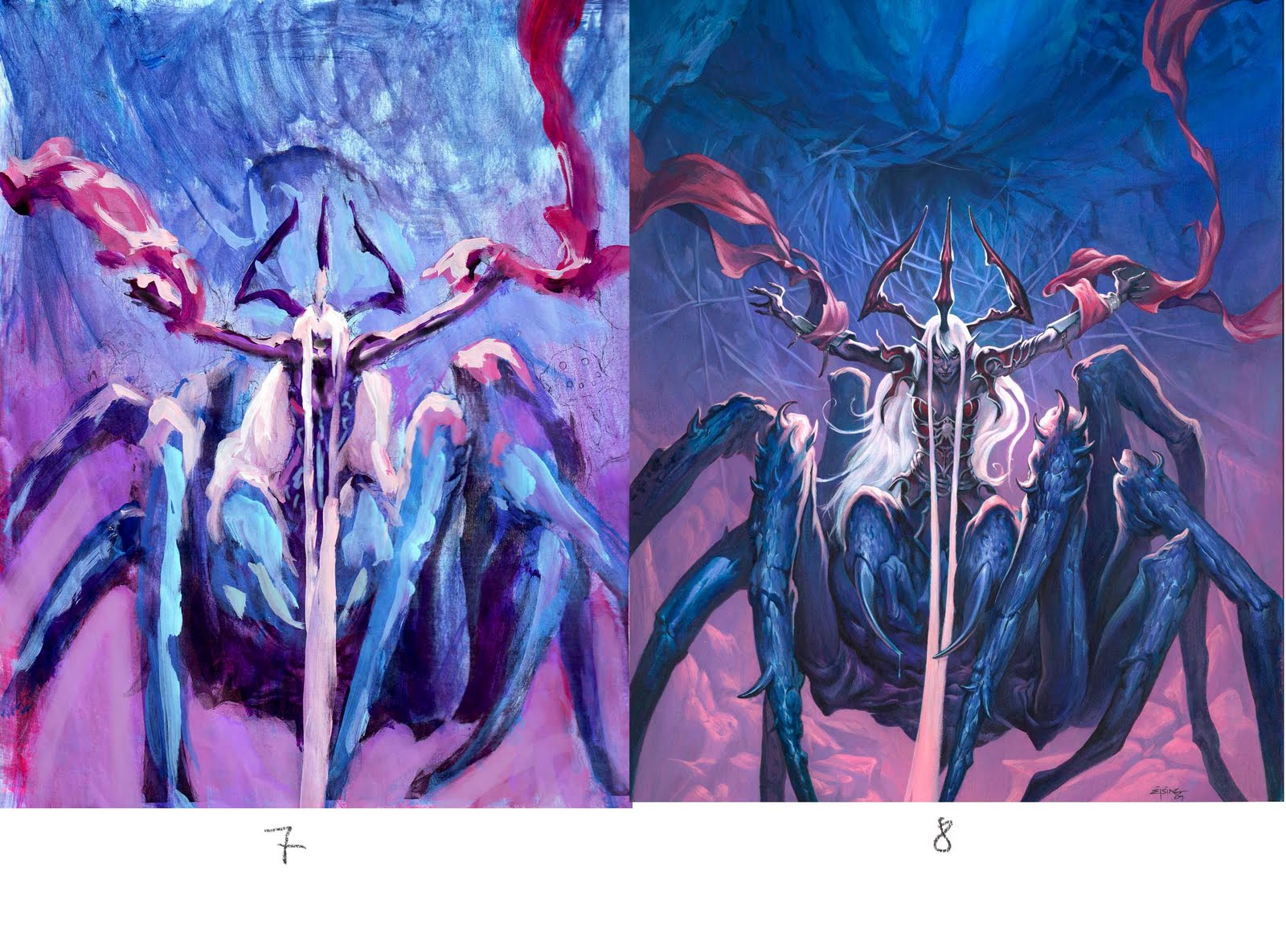
So I submitted a whole different colour rough (number 7). It hit the spot, but for me to try and tweak it digitally was hell. I am not an expert on Photoshop. In the end I really didn’t know what I was doing, so I made a rash decision… I placed the original on my table, grabbed a large brush and dipped the sucker in shocking pink! Before I would think against it I slobbered down a wash of the pink paint all over the picture. “Ha ha…nothing to it. What the hell are you making such a big fuss about, cry-baby?”, might all you digital painters out there say. But I tell you; to take a completely finished acrylic painting that you just spent 14 days on and then cover the whole thing in paint is a heartbreaking action.
So what I had to do was repaint all the image again with washes and then refine the highlights. If you compare the two, number 6 and 8, you will see that only the top of the painting is the same. I stopped my pink brush from going up there. Since it was going to be bluish anyway.
I never had to change so much of a painting before, but I am glad I took the leap and did it the old way. I like pink. I like purple.
I guess what I am trying to say is, I learned a great deal going the hard way. I know now that it can be done and from that day on I was not as nervous when painting. I have in the back of my mind a voice saying “You can change it, it is not permanent, go ahead! You can always cover it up…you did it once.”
And it made me bolder and braver.
When I chose illustration to be my career never did I think that I could end up in a photoshoot with a playboy model- but apparently it is possible 😀
Great post! I've always wondered how you traditional guys cope with having to make drastic changes at the last minute.
Thanks for sharing!
p.s. Love your work!
Reading the part where you dipped the piece in pink made me think “oh no!”, glad it turned out ok, or more than ok since that cover kicks ass.
On the technical side, what acrylics do you use?, I guess they have to be very opaque to cover the whole thing, did you have to use many layers after that?.
I'm Always curious about corrections.
Thanks!
I'm with felipe on the technical side, though I believe you used a thin transparent paint. That is one smooth gradient. This makes me wonder how I should handle the same thing in oil.
You are a brave man, and very inspiring.
Thanks for sharing such a great story. All the best 😀
There might not be an 'undo' button working traditionally, but there is always a 'pink brush' 😉
Gaining the confidence that a piece is always mutable does make quite a difference to the confidence of one's approach.
Thanks for sharing.
Amazing work, Jesper! She turned out beautifully! Your dilemma had me thinking…. what if in the case of being stuck at the point where the art director didn't like it you took progress shots of it and then played with the color changes digitally? Also…if you painted over it after she didn't like it and wanted to return it back to the original color to start again you would have some reference to work with.
Believe me, there is something to be said about being ballsy and just 'pinking' it up right on the finished piece and I appreciate the hell out of that. 😀
Amazing work Jesper. I love so much that you share these important triumphs and struggles with us. 😀 <3
insane. Kudos to you man for having the balls to paint over all that.
Felipe and Pete@
I really don´t have extended knowledge about paint. I do not know if the particular pink was opaque or what. I use mostly Liquitex medium viscocity because the way it flows reminds me of tube paint mixed with a bit of water to make it soft. i like the way it is ready to use. For some stuf I use the thin Golden paint in bottles. Mostly for the first washes.
Over the years I just kind of noticed that which ones of my browns or blues are best at glazing and which ones covers up too much. I have mostly, as you might have noticed by now, learned through trial and error…mostly errors.
Actually this particlar pink color covered up way too much and might have been the reason ehy I had to repaint the whole bottom 2 third of the painting. had I only visited a store and read on the botles, but it was a spur of the moment, a kind of last resort before starting all over on another board.
I am really glad you guys appreciate my honesty.
You have to take those risks! It's great to hear that a successful artist like yourself is still looking to grow as an artist. Bravo, Jesper!
Wow, that takes balls, what an admirable decision
I love acrylic paint! Spend enough time with them and the are very flexible. You do it so well Jesper.
I always thought you worked in oils mainly. It's always nice to see process. Knowing that what an artist creates takes hours of concentrated effort and often includes big changes is always reassuring.
great post, jesper! thanks for the additional insight behind the scenes.
i always enjoy your posts because you make the art struggle appear human – in a lot of posts, everything is boiled down to “why i did this and that – and how i realized it”. the amount of balls it takes to just smear paint over perfectly fine work, or just to dare leaving something simple, to resist the urge to spell every shape out – thats not talked about often.
im afraid to say, but i do like your color studies better tan the finished product *runs and hides*
This is a great post!
Reminds me some of my own experiences…
Thank you for sharing this!!
Wow – that's ballsy.
It's actually pretty comforting to hear that experienced artists sometimes have to do this, and even better that it works out so well for them!
Super finish.
amazing blog!
Jesper, i really like you explanations about you works, and yes, it's easy for digital painters to create a new pink level on their illos…too much easy!
one question: 14 days for color stage only, or from the sketch to the final?
thx!
Andrea@ 14 days is from skratch. I only spent 6 to 8 days on painting a cover.
I have much respect that you chose to finalize it traditionally. Basically you would have had it much easier in photoshop if you converted it into greyscale and did the whole coloring on another layer in “color-blend-mode”. This way, if you separate foreground and background on different layers, you have always the perfect control about the colors. This can also be helpful for a color sketch to submit, if you plan to finalize traditionally, a quick “digital coloration” can save you a lot time. Here´s a link for more info about this technique: http://www.photoshopessentials.com/photo-editing/layer-blend-modes
Fantasio,
It's interesting you mention this method. Because I've noticed a certain amount of weakness for values in my paintings, I'm currently working up a grayscale gouache painting and adding the colors digitally later. I find it forces me to observe value structure first and as you say, allows freedom with color later.